

ImageGP: An easy-to-use data visualization web server for scientific researchers
- PMID: 38867732
- PMCID: PMC10989750
- DOI: 10.1002/imt2.5
ImageGP: An easy-to-use data visualization web server for scientific researchers
Abstract
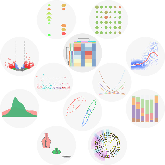
Data visualization plays a crucial role in illustrating results and sharing knowledge among researchers. Though many types of visualization tools are widely used, most of them require enough coding experience or are designed for specialized usages, or are not free. Here, we present ImageGP, a specialized visualization platform designed for biology and chemistry data illustration. ImageGP could generate generalized plots like lines, bars, scatters, boxes, sets, heatmaps, and histograms with the most common input content in a user-friendly interface. Normally plotting using ImageGP only needs a few mouse clicks. For some plots, one only needs to just paste data and click submit to get the visualization results. Additionally, ImageGP supplies up to 26 parameters to meet customizable requirements. ImageGP also contains specialized plots like volcano plot, functional enrichment plot for most omics-data analysis, and other four specialized functions for microbiome analysis. Since 2017, ImageGP has been running for nearly 5 years and serving 336,951 visits from all over the world. Together, ImageGP (http://www.ehbio.com/ImageGP/) is an effective and efficient tool for experimental researchers to comprehensively visualize and interpret data generated from wet-lab and dry-lab.
Keywords: amplicon; bioinformatics; data visualization; metagenome; microbiome; web server.
© 2022 The Authors. iMeta published by John Wiley & Sons Australia, Ltd on behalf of iMeta Science.
Conflict of interest statement
The authors declare no conflict of interests.
Figures
References
-
- O'Donoghue, Seán I. , Baldi Benedetta Frida, Clark Susan J., Darling Aaron E., Hogan James M., Kaur Sandeep, Maier‐Hein Lena, et al. 2018. “Visualization of Biomedical Data.” Annual Review of Biomedical Data Science 1: 275–304.
-
- Wong, Bang . 2012. “Visualizing Biological Data.” Nature Methods 9: 1131. 10.1038/nmeth.2258 - DOI
-
- R Core Team . 2018. R: A Language and Environment for Statistical Computing. Vienna, Austria: R Foundation for Statistical Computing.
-
- Wickham, Hadley . 2016. Ggplot2: Elegant Graphics for Data Analysis. Switzerland: Springer International Publishing Cham.
LinkOut - more resources
Full Text Sources
Miscellaneous