. 2024 Jan-Dec;16(1):2361491.
doi: 10.1080/19490976.2024.2361491. Epub 2024 Jun 13.

Gut microbiome encoded purine and amino acid pathways present prospective biomarkers for predicting metformin therapy efficacy in newly diagnosed T2D patients

Affiliations

Gut microbiome encoded purine and amino acid pathways present prospective biomarkers for predicting metformin therapy efficacy in newly diagnosed T2D patients

Ilze Elbere et al. Gut Microbes. 2024 Jan-Dec.

Abstract

Metformin is widely used for treating type 2 diabetes mellitus (T2D). However, the efficacy of metformin monotherapy is highly variable within the human population. Understanding the potential indirect or synergistic effects of metformin on gut microbiota composition and encoded functions could potentially offer new insights into predicting treatment efficacy and designing more personalized treatments in the future. We combined targeted metabolomics and metagenomic profiling of gut microbiomes in newly diagnosed T2D patients before and after metformin therapy to identify potential pre-treatment biomarkers and functional signatures for metformin efficacy and induced changes in metformin therapy responders. Our sequencing data were largely corroborated by our metabolic profiling and identified that pre-treatment enrichment of gut microbial functions encoding purine degradation and glutamate biosynthesis was associated with good therapy response. Furthermore, we identified changes in glutamine-associated amino acid (arginine, ornithine, putrescine) metabolism that characterize differences in metformin efficacy before and after the therapy. Moreover, metformin Responders' microbiota displayed a shifted balance between bacterial lipidA synthesis and degradation as well as alterations in glutamate-dependent metabolism of N-acetyl-galactosamine and its derivatives (e.g. CMP-pseudaminate) which suggest potential modulation of bacterial cell walls and human gut barrier, thus mediating changes in microbiome composition. Together, our data suggest that glutamine and associated amino acid metabolism as well as purine degradation products may potentially condition metformin activity via its multiple effects on microbiome functional composition and therefore serve as important biomarkers for predicting metformin efficacy.

Keywords: Gut microbiome; T2D; biomarkers; functional profile; metabolic analysis; metformin.


Conflict of interest statement

No potential conflict of interest was reported by the author(s).

Figures

Figure 1.
Figure 1.
Study design and corresponding study questions. ΔHbA1c was calculated by comparing baseline values with those measured after three months of metformin treatment. M0 – before metformin therapy, M3m – after 3 months of metformin therapy.
Figure 2.
Figure 2.
Comparison of HbA1c and the microbiome taxonomy parameters between responders and non-responders. Dynamics and differences between the analyzed groups and samples of (a) HbA1c values and (b) Shannon index. Samples from the same individuals are connected with lines. R – Responders, NR – Non-responders, M0 – before metformin therapy, M3m – after 3 months of metformin therapy. Differences in taxonomic profile at species level between responders and non-responders (c) before therapy (M0) and (d) after 3 months of metformin treatment (M3m). Barplots of Log2 fold change (Log2FC) coefficients from MaAsLin2 analysis, results adjusted for age. Negative (orange bar) and positive (blue bar) coefficient values represent species enriched in the responders and non-responders groups, respectively.
Figure 3.
Figure 3.
Overrepresented and underrepresented bacterial metabolic pathways in responders vs non-responders before and after metformin therapy. Non-parametric cliff’s delta values display the probability [0;1] of non-random pathway coverage differences between Responders and Non-responders. The larger the cliff’s delta deviation from 0, the more likely reads corresponding to a metabolic pathway originate from Non-responders (orange) or Responders (blue) group. Cliff delta of 0 indicates 50:50 chance of a pathway read distribution between Non-responders and Responders. The asterisk denotes statistically significant bias in pathway coverage for either Non-responders or Responders, based on 95% CI for convenience, Cliff’s delta cutoff of 0.15 and 0.2 is chosen for the written pathway names before and after the therapy, respectively. The effect size of differences in each metabolic pathway coverage is considered only for pathways that are represented by genomic reads in a full set of all annotated genes within that pathway. Color codes highlight pathways that show significantly different pathway coverage between Responders and Non-responders (green) or patient age as cofactor (yellow), when corrected for multiple comparisons using MaAsLin2 pipeline (p < 0.05; q < 0.25). Turquoise color highlights notably different pathway coverage between Responders and Non-responders 3 months after the therapy showing sign. p-value ≤0.05 but q > 0.25.
Figure 4.
Figure 4.
Differences in the normalized pathway read coverage between Responders and Non-responders at the baseline as well as 3 months after the therapy. Sparse partial least squares discriminant analysis (sPLS-DA) identifies components that separate Responders and Non-responders (a) before or (b) after the therapy based on microbiome functional pathway abundances using the mixOmics package in R. Further identification and visualization of the functional pathways within Responder and Non-responder defining components is depicted in panel c. Cohen values display the difference in mean pathway coverage normalized by the pooled SD. Negative Cohen values indicate decreased read coverage of a pathway in Responders (blue) vs Non-responders (orange) while positive values indicate increased coverage of a pathway in Responders vs Non-responders (blue). 95% CI denotes statistically significant effect size (differences in genomic read coverage) and is denoted by the red asterisk for the respective pathways. The effect size of differences in each metabolic pathway coverage is considered only for pathways that are represented by genomic reads in a full set of all annotated genes within that pathway. Pathways were visualized in metacyc and PubChem databases and linked to the barchart using arrows for better representation of potentially linked functions.
Figure 5.
Figure 5.
Random forest classification. (a) Random forest classification error plot, OOB error (overall – red, 0.206) is compared to the classification error of each group (responders – green (0.0682)), non-responders – blue (0.458)) with an increasing number of decision trees (n=500). (b) Variable importance plot showing the top 15 discriminatory metabolites identified by random forest technique and ranked by their contribution to classification accuracy (the mean decrease accuracy expresses how much accuracy the model losses by excluding each variable), the red color indicates the upregulation, but the blue color indicates downregulation of the metabolite in the group.
Figure 6.
Figure 6.
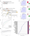
Targeted metabolomic analysis of fecal samples in metformin response groups before therapy. (a) Scatter plot representing the most relevant metabolic pathways from KEGG library arranged by adjusted p-values (obtained by Global Test pathway enrichment analysis) on Y-axis, and pathway impact values (from pathway topology analysis) on X-axis. The node color is based on its p-value and the node radius is determined based on its pathway impact values. (b) Top three biomarkers (by AUC value) from univariate ROC curve analysis, the graph on left the sensitivity (true positive rate) of the biomarker on the y-axis against its 1-specificity (false positive rate) on the x-axis, on the right graph black dots in boxplots show quantified values of biomarkers in all samples, the notch indicates 95% confidence interval around each median in metformin response groups, the mean value is showed with a yellow dot in each group, all biomarker AUC value calculations in Supplementary file 2. (c) Supervised multivariate ROC analysis curves, classification, and feature ranking method: support vector machines (SVM), the true positive rates on y-axis, the false-positive rates on x-axis. (d) Predictive accuracies (y-axis) for ROC models with different counts of features (x-axis), the model using 35 features reached the highest Predictive Accuracy (red dot). (e) Top 35 features from the most accurate ROC model (predictive accuracy 70.7%), variant importance plot based on feature Selected Frequency (%), it refers to the percentage of times a feature (metabolite) was selected as important or influential by the support vector machine (SVM) classifier. The red color on the right panel for response indicates the upregulation, but the blue color indicates the downregulation of the feature in the group. All biomarker importance calculations from this model are in Supplementary file 3.
Figure 7.
Figure 7.
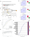
Targeted metabolomic analysis of fecal samples in metformin response groups after 3 month long therapy. (a) Scatter plot representing the most relevant metabolic pathways from KEGG library arranged by adjusted p-values (obtained by global test pathway enrichment analysis) on Y-axis, and pathway impact values (from pathway topology analysis) on X-axis. The node color is based on its p-value and the node radius is determined based on its pathway impact values. (b) Top three biomarkers (by AUC value) from univariate ROC curve analysis, the graph on left the sensitivity (true positive rate) of the biomarker on the y-axis against its 1-specificity (false positive rate) on the x-axis, on the right graph black dots in boxplots show quantified values of biomarkers in all samples, the notch indicates 95% confidence interval around each median in metformin response groups, the mean value is showed with a yellow dot in each group, all biomarker AUC value calculations in Supplementary file 4. (c) Supervised multivariate ROC analysis curves, classification, and feature ranking method: support vector machines (SVM), the true positive rates on y-axis, the false-positive rates on x-axis. (d) Predictive accuracies (y-axis) for ROC models with different counts of features (x-axis), the model using 36 features reached the highest predictive accuracy (red dot). (e) Top 36 features from the most accurate ROC model (predictive accuracy 68.3%), variant importance plot based on feature selected frequency (%), it refers to the percentage of times a feature (metabolite) was selected as important or influential by the support vector machine (SVM) classifier. The red color on the right panel for response indicates the upregulation, but the blue color indicates the downregulation of the feature in the group. All biomarker importance calculations from this model are in Supplementary file 5.
Figure 8.
Figure 8.
Changes in the representation of taxonomic and metabolic pathway profile in the Responders group during the metformin treatment. (a) Non-parametric cliff’s delta values display the probability [0;1] of non-random pathway coverage changes 3 months after metformin therapy compared to the baseline before therapy. The larger the cliff’s delta deviation from 0, the more likely the reads corresponding to a metabolic pathway are detected before the therapy (orange) or after (blue) the therapy. Cliff delta of 0 indicates equal chance of a pathway reads to be detected before as well as after the therapy. The asterisk denotes statistically significant effect size in metabolic pathway read coverage based on 95% CI. For convenience, Cliff’s delta cutoff of 0.3 is chosen for displaying written pathway names. Color codes highlight pathways that show significantly different pathway coverage between baseline and 3 month timepoint (green) or patient age as cofactor (yellow), when corrected for multiple comparisons using MaAsLin2 pipeline (p<0.05; q<0.25). (b) Bacterial taxa abundance displayed in barplots of Log2 fold change (Log2FC) coefficients from MaAsLin2 analysis, results adjusted for age. Negative (orange bar) coefficient values represent taxa more abundant before therapy (M0), whereas positive (blue bar) - after 3-month therapy (M3m).
Figure 9.
Figure 9.
Increase or decrease in the normalized pathway read coverage between baseline and 3 month cohorts in responders. (a) Sparse partial least squares discriminant analysis (sPLS-DA) identifies components that separate responders before and after the therapy based on microbiome functional pathway abundances using the mixOmics package. (b) 3D visualization identifies a single component that separates responders before and after the therapy. (c) 8 microbiome genomic pathways (selected features) within component 1 demonstrate the lowest balanced error rate in discriminating differences between baseline and 3 month responses. Visualization of other components (b) and varying feature number within each component (c) does not improve discrimination of responders at baseline and after the therapy. Further identification and visualization of the functional pathways within component 1 characterize the therapy effect in responders and are depicted in panel d. Cohen values display the difference in mean pathway coverage normalized by the pooled SD. Negative Cohen values indicate decreased read coverage of a pathway 3 months after the therapy (orange) while positive values indicate increased coverage after the treatment (blue). 95% CI denotes statistically significant effect size (differences in genomic read coverage) and is denoted by the red asterisk for the respective pathways. The effect size of differences in each metabolic pathway coverage is considered only for pathways that are represented by genomic reads in a full set of all annotated genes within that pathway. Pathways were visualized in metacyc and PubChem databases and linked to the barchart using arrows for better representation of potentially linked functions.
Figure 10.
Figure 10.
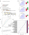
Targeted metabolomic analysis of fecal samples in responders before and after 3-month-long metformin treatment. (a) Scatter plot representing the most relevant metabolic pathways from KEGG library arranged by adjusted p-values (obtained by global test pathway enrichment analysis) on Y-axis, and pathway impact values (from pathway topology analysis) on X-axis. The node color is based on its p-value and the node radius is determined based on its pathway impact values. (b) Top three biomarkers (by AUC value) from univariate ROC curve analysis, the graph on left the sensitivity (true positive rate) of the biomarker on the y-axis against its 1-specificity (false positive rate) on the x-axis, on the right graph black dots in boxplots show quantified values of biomarkers in all samples, the notch indicates 95% confidence interval around each median in metformin response groups, the mean value is showed with a yellow dot in each group, all biomarker AUC value calculations in Supplementary file 6. (c) Supervised multivariate ROC analysis curves, classification, and feature ranking method: support vector machines (SVM), the true positive rates on y-axis, the false-positive rates on x-axis. (d) Predictive accuracies (y-axis) for ROC models with different counts of features (x-axis), the model using 36 features reached the highest predictive accuracy (red dot). (e) Top 36 features from the most accurate ROC model (predictive accuracy 63.4%), variant importance plot based on feature selected frequency (%), it refers to the percentage of times a feature (metabolite) was selected as important or influential by the support vector machine (SVM) classifier. The red color on the right panel for response indicates the upregulation, but the blue color indicates the downregulation of the feature in the group. All biomarker importance calculations from this model are in Supplementary file 7.

Similar articles

Cited by

References

    1. Rojas LBA, Gomes MB.. Metformin: an old but still the best treatment for type 2 diabetes. Diabetol Metab Syndr. 2013;5(1):6. doi:10.1186/1758-5996-5-6. - DOI - PMC - PubMed
    1. Rena G, Hardie DG, Pearson ER. The mechanisms of action of metformin. Diabetologia. 2017;60(9):1577–26. doi:10.1007/s00125-017-4342-z. - DOI - PMC - PubMed
    1. Kahn SE, Haffner SM, Heise MA, Herman WH, Holman RR, Jones NP, Kravitz BG, Lachin JM, O’Neill MC, Zinman B, et al. Glycemic durability of rosiglitazone, metformin, or glyburide monotherapy. N Engl J Med. 2006;355(23):2427–2443. doi:10.1056/NEJMoa066224. - DOI - PubMed
    1. Jeon JY, Lee SJ, Lee S, Kim SJ, Han SJ, Kim HJ, Kim DJ, Kim YS, Woo JT, Ahn KJ, et al. Failure of monotherapy in clinical practice in patients with type 2 diabetes: The Korean national diabetes program. J diabetes Invest. 2018;9(5):1144–1152. doi:10.1111/jdi.12801. - DOI - PMC - PubMed
    1. Zhang Q, Hu N. Effects of metformin on the gut microbiota in obesity and type 2 diabetes mellitus. Diabetes Metab Syndr Obes Targets Ther. 2020;13:5003–5014. doi:10.2147/DMSO.S286430. - DOI - PMC - PubMed

Publication types

MeSH terms