. 2024 Dec;30(12):3748-3757.
doi: 10.1038/s41591-024-03030-6. Epub 2024 Jun 18.

Decoding the hallmarks of allograft dysfunction with a comprehensive pan-organ transcriptomic atlas

Affiliations

Decoding the hallmarks of allograft dysfunction with a comprehensive pan-organ transcriptomic atlas

Harry Robertson et al. Nat Med. 2024 Dec.

Abstract

The pathogenesis of allograft (dys)function has been increasingly studied using 'omics'-based technologies, but the focus on individual organs has created knowledge gaps that neither unify nor distinguish pathological mechanisms across allografts. Here we present a comprehensive study of human pan-organ allograft dysfunction, analyzing 150 datasets with more than 12,000 samples across four commonly transplanted solid organs (heart, lung, liver and kidney, n = 1,160, 1,241, 1,216 and 8,853 samples, respectively) that we leveraged to explore transcriptomic differences among allograft dysfunction (delayed graft function, acute rejection and fibrosis), tolerance and stable graft function. We identified genes that correlated robustly with allograft dysfunction across heart, lung, liver and kidney transplantation. Furthermore, we developed a transfer learning omics prediction framework that, by borrowing information across organs, demonstrated superior classifications compared to models trained on single organs. These findings were validated using a single-center prospective kidney transplant cohort study (a collective 329 samples across two timepoints), providing insights supporting the potential clinical utility of our approach. Our study establishes the capacity for machine learning models to learn across organs and presents a transcriptomic transplant resource that can be employed to develop pan-organ biomarkers of allograft dysfunction.


Conflict of interest statement

Competing interests: P.J.O. is a consultant for VericiDx and Qihan Biotech. H.R., J.Y.H.Y., N.M.R. and E.P. are inventors on two pending patent applications related to the research presented in this manuscript. These applications are currently under review for novelty and, if granted, could potentially influence the interpretation of the research findings. The authors declare that this does not alter their adherence to all the Nature Medicine policies on sharing data and materials, as detailed in the guidelines for authors. All other authors declare no competing interests.

Figures

Fig. 1
Fig. 1. The PROMAD atlas: a comprehensive map of allograft dysfunction.
The PROMAD atlas encapsulates an extensive array of data, presenting a multifaceted view of allograft dysfunction through whole blood samples, PBMCs and allograft biopsies. It comprises data from heart, lung, liver and kidney transplants, encompassing four transplant outcomes, namely DGF, rejection, fibrosis and tolerance. The collection and curation process resulted in a repository of 150 datasets consisting of 12,765 molecular samples derived from more than 20 countries worldwide. We performed analysis on PROMAD, identifying common molecular and cellular signatures of dysfunction across organs and using our novel transfer learning framework to assess the effectiveness of organ-agnostic predictions of allograft dysfunction. This figure was created with BioRender.
Fig. 2
Fig. 2. Identification of a pan-organ rejection signal across solid organ transplantation.
a, Venn diagram showing the overlap and uniqueness of differentially expressed genes between biopsy samples from allografts experiencing acute rejection and otherwise stably functioning grafts. The number of overlapping genes (and number of genes expected by chance). b, Heatmap of the top 50 rejection-specific genes, with each column representing a dataset and each row a gene. c, Box plot of Cepo enrichment scores of genes from b in cell types from acute rejection and stably functioning grafts (n = 6 and n = 16 biologically independent control and allograft rejection (AR) samples were used, respectively). d, t-SNE plot of merged single-cell RNA-seq datasets, with cells colored by cell type classification. e, t-SNE plot of merged single-cell RNA-seq datasets, with cells colored by average expression of genes from b. f, Violin plot depicting the expression of rejection markers across minor cell types. The x axis represents different cell types, and the y axis represents the average expression of the rejection gene set markers from b. The width of each violin plot corresponds to the density of expression values for each cell type. g, Box plot of liquid biopsy dataset model performance measured by AUC, comparing the performance of organ-specific models from heart (n = 3 datasets from 65 biologically independent patient samples), kidney (n = 18 datasets from 2,257 biologically independent patient samples) and liver (n = 2 datasets from 100 biologically independent patient samples) compared to the pan-organ model (n = 23 datasets from 2,422 biologically independent patient samples). Each point is an evaluation of model performance on an independent dataset. Points that are joined by a line represent the same dataset. h, ROC plot of three models applied to AUSCAD: Pan-Organ model (trained on all peripheral blood datasets in PROMAD), Kidney-specific model (trained on all kidney transplant peripheral blood datasets in PROMAD) and Clinical model (creatinine, eGFR and serum albumin). Each model was evaluated using the AUC. Box plots in c and g show Q1, median and Q3, and the lower and upper whiskers show Q1 − 1.5× IQR and Q3 + 1.5× IQR, respectively. AT, alveolar type; ILC, innate lymphoid Cell; IQR, interquartile range; NK, natural killer; Q, quartile.
Fig. 3
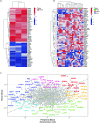
Fig. 3. PROMAD identifies a global indicator of dysfunction in allografts.
a, Heatmap of the top 50 fibrosis-specific genes, with each column representing a dataset and each row a gene. b, Scatter plot of association statistics between native and transplant organ fibrosis. The top 10 genes in each direction, indicating their degree of change between fibrotic and stably functioning grafts, are highlighted. c, Bar plot of pathways enriched for genes that are differentially expressed in transplant organ fibrosis but not in native organ fibrosis. Gene set enrichment was evaluated using a two-sided Wilcoxon rank-sum test. Each bar represents one Gene Ontology pathway where P values were adjusted for multiple comparisons using Benjamini–Hochberg correction. d,e, Pair plots of genes associated with DGF, acute rejection and fibrosis when compared to stable functioning grafts. The points in d are colored according to their appearance in the BHOT NanoString panel (orange), and genes in e are red if they appeared in the data-derived gene set. The top right panels show the correlation (Corr.) of association statistics for each gene. ROC curves compare BHOT (orange) and the data-derived panel (red) in predicting DGF (f), biopsy-proven acute rejection (g) and biopsy-proven fibrosis using the AUSCAD study as an external validation cohort (h). ROC, receiver operating characteristic.
Fig. 4
Fig. 4. The PROMAD atlas reveals pan-organ markers for allograft tolerance.
a,b, Heatmaps of the top 20 genes implicated in allograft tolerance, with each column representing a dataset and each row a gene. a corresponds to datasets that sampled PBMCs, and b corresponds to whole blood datasets. c, Box plot of model performance measured by AUC, comparing the performance of organ-specific kidney (n = 2 datasets from 68 biologically independent patient samples) and liver (n = 3 datasets from 52 biologically independent patient samples) models compared to the pan-organ model (n = 5 datasets from 120 biologically independent liver and kidney patient samples). Each point is evaluation of model performance on an independent dataset. Points that are joined by a line represent the same dataset. d, Bar plot of pathways that are enriched for genes differentially expressed in whole blood from tolerant recipients. Gene set enrichment was evaluated using a two-sided Wilcoxon rank-sum test. Each bar represents one Gene Ontology pathway where P values were adjusted for multiple comparisons using Benjamini–Hochberg correction. e, Box plot of predicted early allograft dysfunction risk on a logit scale. Each dataset contained biopsy samples before and after NMP. A two-sided t-test was used to determined significance levels between the groups (***P < 0.001, **P < 0.01 and *P < 0.05). Datasets had a varying number of biologically independent samples before and after NMP, respectively (n = 10, 10, P = 0.006; n = 6, 6, P = 0.041; n = 5, 10, P = 0.114; n = 6, 6, P = 0.157; n = 6, 6, P = 0.008; n = 5, 6, P = 0.793). f, Network plot of model coefficients for predicting DGF. Each line joins the two genes into a ratio, where the weight of the line corresponds to the magnitude of the model coefficients. Lines in red and blue are positive and negative coefficients, respectively. g, Box plot of model performance (AUC) from pre-transplant biopsies in predicting DGF (n = 7 datasets from 279 biologically independent patient samples), acute rejection (n = 3 datasets from 195 biologically independent patient samples) and fibrosis (n = 2 datasets from 124 biologically independent patient samples). Box plots from c, e and g show Q1, median and Q3, and the lower and upper whiskers show Q1 − 1.5× IQR and Q3 + 1.5× IQR, respectively. IQR, interquartile range; PreTx, pretransplantation; Q, quartile.
Extended Data Fig. 1
Extended Data Fig. 1. Schematic of the literature review workflow for transplant omics datasets.
A systematic search of the GEO and ArrayExpress databases using terms related to heart, lung, liver, and kidney transplants, yielded 13,419 datasets. Datasets underwent scrutiny for inclusion, excluding non-human or those lacking proper controls, defined as stable functioning grafts. Data were then extracted and normalized using various methods appropriate to the data type. The PROMAD repository was created, comprising 168 processed datasets available for research access, with 150 transcriptomic datasets selected for our study. Non-coding region datasets, while excluded from this study, were also included in PROMAD.
Extended Data Fig. 2
Extended Data Fig. 2. Clustering of CEPO statistics.
Correlation heatmap of cell-identity gene statistics generated from Cepo (Kim et al., 2021) for each cell type across tissues and datasets in the pan-organ allograft rejection atlas. The heatmap is hierarchically clustered by the similarity of correlation profiles. Colour bars denote tissue origin or cell type of each sample.
Extended Data Fig. 3
Extended Data Fig. 3. Liquid biopsy model from whole blood and PBMC in acute allograft rejection.
A. Heatmap of top 50 genes differentially expressed in across all PBMC datasets. Each cell is coloured by normal score in each dataset. B. Heatmap of top 50 genes differentially expressed across all whole blood datasets. Each cell is coloured by normal score in each dataset. C. Scatter plot of combined association statistics for allograft rejection in whole blood and PBMC.
Extended Data Fig. 4
Extended Data Fig. 4. Training a liquid biopsy model using PROMAD.
A. Boxplot of increasing number of ratios that are required to predict acute allograft rejection from liquid biopsy samples. Each point is an evaluation of model performance on an independent dataset. Points that are joined by a line represent the same dataset. Box plots show Q1, median and Q3, and the lower and upper whiskers show Q1 – 1.5 × IQR and Q3 + 1.5 × IQR, respectively. B. Bar plot of model coefficients for our liquid biopsy model. C. Dot plot of liquid biopsy model performance on the AUSCAD cohort with a loess smoothed curve representing the mean trend as the number of training datasets increases. The shaded area around the curve indicates the 95% confidence interval, reflecting the variability around the estimated mean trend. D. A pair of ROC curves comparing model performance on the AUSCAD cohort. Both models are trained across multiple organs, however their integration algorithms differ. TOP is coloured yellow, and ComBat is coloured blue. E. A boxplot of model performance across peripheral blood datasets within PROMAD (n = 23 datasets from 2422 biologically independent patient samples), when tissue weighting is applied to the TOP algorithm. Each point is an evaluation of model performance on an independent dataset. Box plots show Q1, median and Q3, and the lower and upper whiskers show Q1 – 1.5 × IQR and Q3 + 1.5 × IQR, respectively. A 3-way ANOVA using organ, dataset and weighting strategy was performed to assess if weighting strategy impacted AUC. F. Boxplot comparison of model performance across all datasets within PROMAD. We compare three integration algorithms (Combat, Quantile normalization and TOP). We split the model performance by technology to demonstrate TOP’s ability to cross technologies more easily. Box plots show Q1, median and Q3, and the lower and upper whiskers show Q1 – 1.5 × IQR and Q3 + 1.5 × IQR, respectively. A 2-way repeated measures anova was performed to test the impact of integration strategy on AUC.
Extended Data Fig. 5
Workflow of the Transferable Omics Prediction (TOP) framework utilised to build a regression model across multiple datasets.
Extended Data Fig. 6
Extended Data Fig. 6. Concordance between expression profiles of biopsies that are fibrotic, compared with grafts that will become fibrotic.
A. Scatter plot of association statistics between grafts that are fibrotic and grafts that will become fibrotic. Each point is a gene, where the R2 = 0.21, p < 0.0001. B. Scatter plot of association statistics between grafts that are fibrotic and grafts that will become fibrotic. A hypothesis test is performed in all 8 directions, and the top 10 genes in each direction are coloured. C. Dot plot of a two-sided Wilcoxon-rank sum test for pathways associated with biopsy proven fibrosis compared to stable functioning grafts. Each dot represents one reactome pathway where p-values were adjusted for multiple comparisons using the benjamini-hochberg correction. D. Dot plot of a two-sided Wilcoxon-rank sum test for pathways associated with stable functioning biopsies that became fibrotic compared with biopsies that remained stable. Each dot represents one reactome pathway where p-values were adjusted for multiple comparisons using the benjamini-hochberg correction.
Extended Data Fig. 7
Extended Data Fig. 7. Pan-Organ fibrosis gene set at single cell resolution.
A. ROC plot predicting biopsy proven fibrosis (IFTA > 10%) in protocol biopsies from the AUSCAD cohort. Yellow = model trained on transplant fibrosis dataset (n = 14) from the PROMAD atlas. Blue = model trained on transplant fibrosis dataset (n = 3) from the PROMAD atlas. B. Heatmap of fibrosis related gene (from Fig. 3A) expression in minor cell types of the pan-organ allograft dysfunction atlas C. tSNE projection of the cells of the pan-organ allograft dysfunction atlas. Single cells are coloured by minor cell types, as defined by our PROMAD atlas.
Extended Data Fig. 8
Extended Data Fig. 8. Quantitative analysis reveals a set of genes associated with Global Indicators of Dysfunction in Allografts.
A. Density plot of association statistics for global allograft dysfunction, and genes within the Banff Human Organ Transplant (BHOT) Nanostring panel are coloured in orange. B. Density plot of association statistics for global allograft dysfunction, and genes within the data-driven gene set panel are coloured in red. C. A 3D scatter plot of association statistics for delayed graft function (DGF), allograft rejection and fibrosis. Each point is a gene, coloured by p-value for its significance to be upregulated in each condition. D. Dot plot of a two-sided Wilcoxon-rank sum test for our data-driven gene set using the reactome database. Each dot represents one reactome pathway where p-values were adjusted for multiple comparisons using the benjamini-hochberg correction.

References

    1. Wolfe, R. A. et al. Comparison of mortality in all patients on dialysis, patients on dialysis awaiting transplantation, and recipients of a first cadaveric transplant. N. Engl. J. Med.341, 1725–1730 (1999). - PubMed
    1. Rana, A. et al. Survival benefit of solid-organ transplant in the United States. JAMA Surg.150, 252–259 (2015). - PubMed
    1. Tonelli, M. et al. Systematic review: kidney transplantation compared with dialysis in clinically relevant outcomes. Am. J. Transpl.11, 2093–2109 (2011). - PubMed
    1. ANZDATA Registry. 43rd Report, Chapter 7: Kidney Transplantation. (Australia and New Zealand Dialysis and Transplant Registry, 2020); https://www.anzdata.org.au/wp-content/uploads/2020/09/c07_transplant_201...
    1. Tsien, C. et al. Long-term outcomes of liver transplant recipients followed up in non-transplant centres: care closer to home. Clin. Med. (Lond.)21, e32–e38 (2021). - PMC - PubMed