. 2024 Jun 20:2024:gigabyte127.
doi: 10.46471/gigabyte.127. eCollection 2024.

Low-coverage whole genome sequencing for a highly selective cohort of severe COVID-19 patients

Affiliations

Low-coverage whole genome sequencing for a highly selective cohort of severe COVID-19 patients

Renato Santos et al. GigaByte. .

Abstract

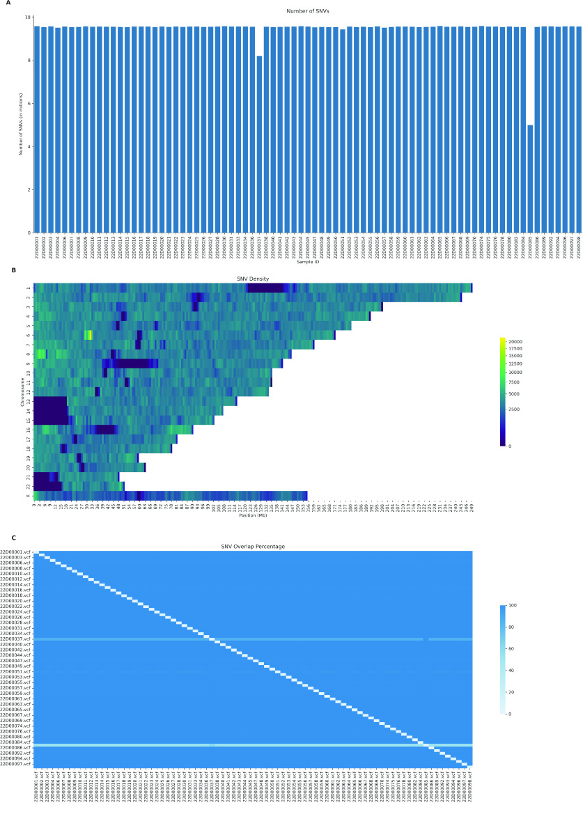
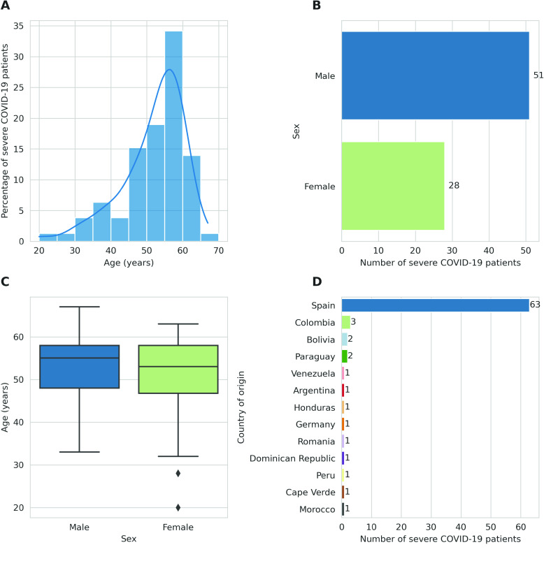
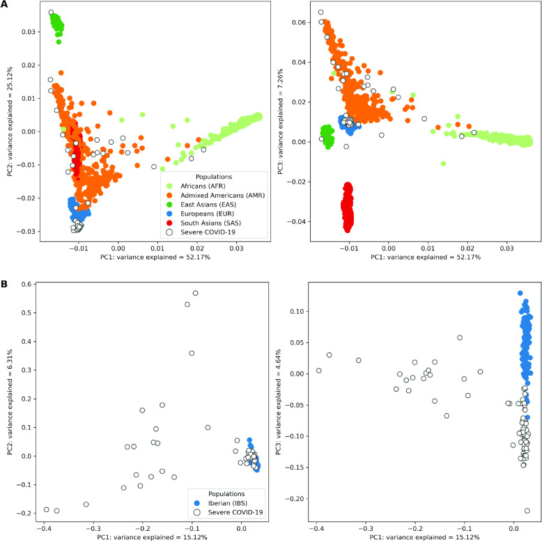
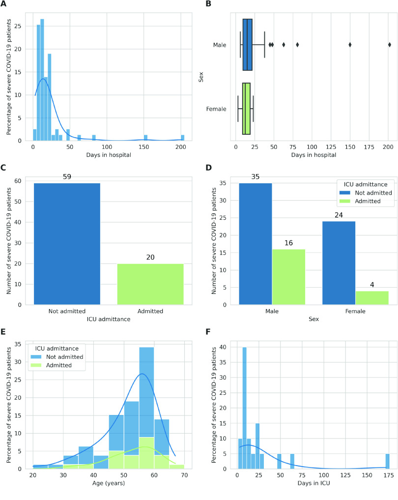
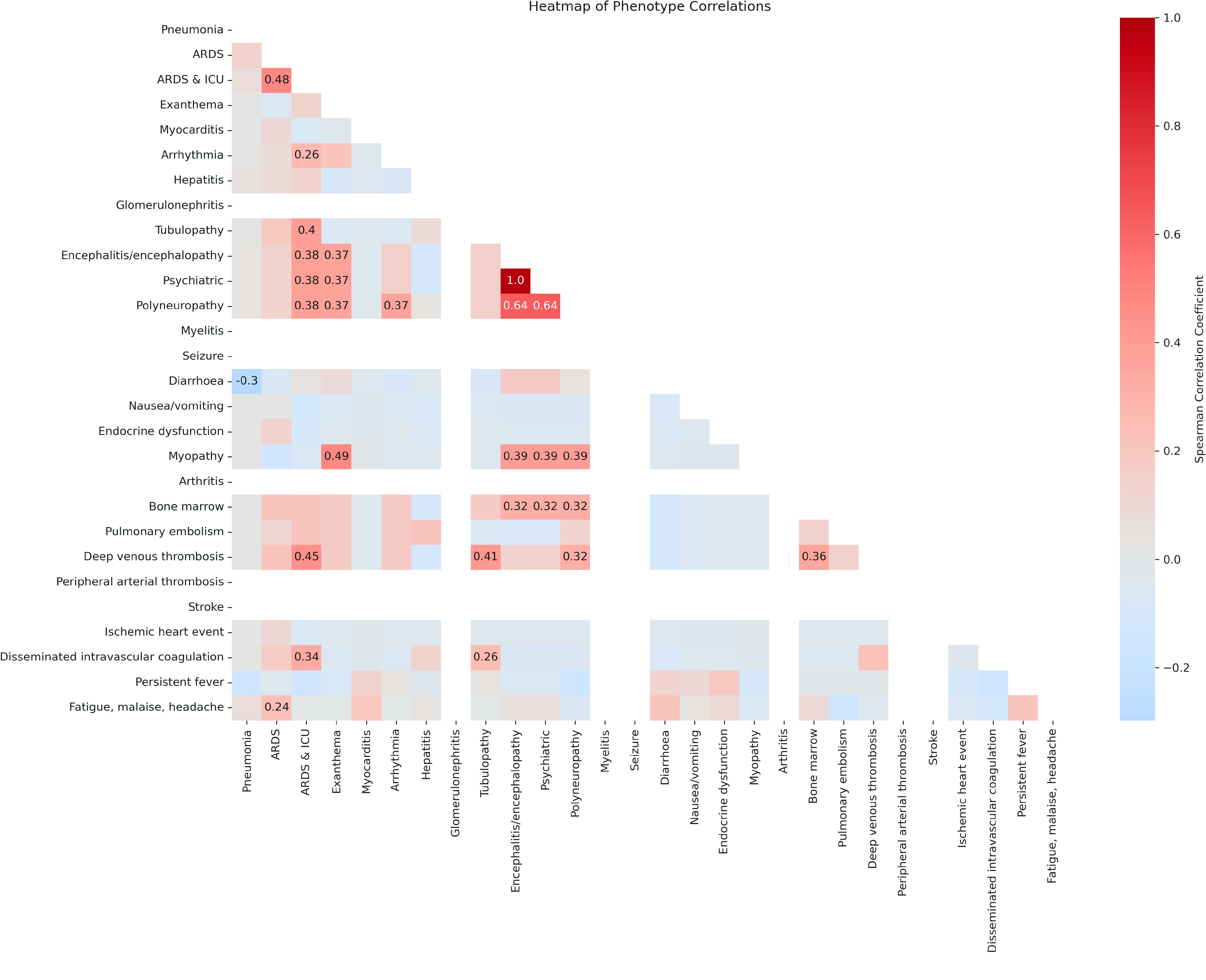
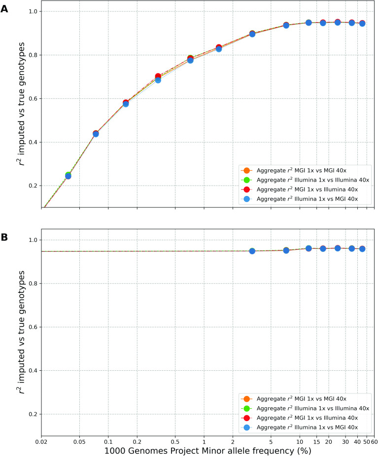
Despite the advances in genetic marker identification associated with severe COVID-19, the full genetic characterisation of the disease remains elusive. This study explores imputation in low-coverage whole genome sequencing for a severe COVID-19 patient cohort. We generated a dataset of 79 imputed variant call format files using the GLIMPSE1 tool, each containing an average of 9.5 million single nucleotide variants. Validation revealed a high imputation accuracy (squared Pearson correlation ≍0.97) across sequencing platforms, showcasing GLIMPSE1's ability to confidently impute variants with minor allele frequencies as low as 2% in individuals with Spanish ancestry. We carried out a comprehensive analysis of the patient cohort, examining hospitalisation and intensive care utilisation, sex and age-based differences, and clinical phenotypes using a standardised set of medical terms developed to characterise severe COVID-19 symptoms. The methods and findings presented here can be leveraged for future genomic projects to gain vital insights into health challenges like COVID-19.


Conflict of interest statement

MC is associated with Cambridge Precision Medicine Ltd. The other authors declare that they have no competing interests.

Figures

Figure 1.
Figure 1.
Characterisation of the genomic landscape of the imputed VCF dataset. (A) The number of high-confidence single nucleotide variants (SNVs) for the 79 VCF files in the severe COVID-19 dataset. The x-axis represents the sample IDs in the dataset, while the y-axis denotes the total counts of SNVs for each sample in millions (1 × 106). (B) SNV density across chromosomes in the dataset. The heatmap shows the distribution of SNVs along the chromosomes, with each row representing a chromosome, 1–22 and ×, and each column a bin-sized 1 megabase (Mb). The number of SNVs in each bin is weighted for the number of samples containing each variant, to represent an average sample in the dataset. Colours range from low (blue) to high (yellow) SNP density. (C) Percentage of overlap of SNVs between samples. The heatmap visualises the extent of shared SNVs across different samples, with each cell representing the overlap percentage from the sample on the x-axis to the sample on the y-axis. Therefore, the percentage value shown is the proportion of SNVs in the sample on the x-axis and also found in the sample on the y-axis. The colour gradient from light to dark blue signifies an increasing percentage of overlap.
Figure 2.
Figure 2.
Demographic and geographic characterisation of the severe COVID-19 patient cohort. (A) Distribution of patient ages with severe COVID-19 cases in our cohort. Each bar signifies an age bracket comprising 5-year increments, with its height denoting the proportion of individuals within that age range. The plot is overlaid with a Kernel Density Estimation (KDE) curve, which provides a smoothed estimation of the age distribution. (B) Patients’ stratification by sex. Each bar represents one sex, with its length indicating the number of patients belonging to that sex. (C) Distribution of patient age by sex. The boxplot presents the age distribution for each sex. Each box represents the interquartile range (IQR) of ages for either males or females, with the dividing line representing the median age. The diamonds represent outliers. (D) Distribution of patients by country of origin. Each bar corresponds to a country, and its length indicates the number of patients from that country.
Figure 3.
Figure 3.
Principal component analysis of genetic variation in the severe COVID-19 patient cohort against the 1000 Genomes Project global superpopulations and IBS (Iberian Populations in Spain) population. (A) Projection of imputed low-coverage whole-genome sequencing (lcWGS) data from severe COVID-19 patients against the backdrop of global superpopulations from the 1000 Genomes Project. Each point represents an individual, colour-coded according to their superpopulation. Severe COVID-19 patients are distinguished by points with a white fill and coloured border. The x-axis and y-axis on the two subplots represent the first and second, and first and third principal components, respectively. The percentage of variance is explained by each component indicated in the axis label. (B) Focused view of the genetic variation within the Iberian (IBS) population and the severe COVID-19 patients. Individuals from the IBS population are represented by solid-coloured points, while those with severe COVID-19 are represented by points with a white fill and coloured border. The x-axis and y-axis on the two subplots represent the first and second, and first and third principal components, respectively, with the percentage of variance explained by each component indicated in the axis label.
Figure 4.
Figure 4.
Analysis of hospital stays among the severe COVID-19 patient cohort. (A) Distribution of hospital stay durations in our cohort. Each bar corresponds to an interval of 5 days of stay at the hospital, with its height indicating the proportion of patients’stay duration within that duration interval. The plot is overlaid with a Kernel Density Estimation (KDE) curve which provides a smoothed estimate of the duration distribution. (B) Stratification of hospital stay durations by sex. This boxplot presents the distribution of hospital stays for each sex. Each box represents the interquartile range (IQR) of the duration of hospital stays for one sex, with the line inside the box marking the median duration. The diamonds represent outliers. (C) Distribution of patients admitted to the Intensive Care Unit (ICU). Each bar corresponds to either patients admitted to the ICU (green) or patients not admitted to the ICU (blue), with its height indicating the number of patients in each category. (D) Distribution of patients admitted to the ICU by sex. Each pair of bars corresponds to one sex, with their height indicating the proportion of patients of that sex admitted to the ICU. Each bar corresponds to either patients admitted to the ICU (green) or patients not admitted to the ICU (blue) and the bar’s height indicating the number of patients in that category. (E) Distribution of ages of patients admitted to the ICU. Each bar corresponds to an age group of 5 years, with the height indicating the proportion of patients in that age group. The plot is overlaid with a KDE curve, which provides a smoothed estimate of the age distribution. (F) Distribution of ICU stay durations among patients admitted to the ICU. Each bar corresponds to an interval of ICU stay durations of 5 days, with its height indicating the number of patients within that duration interval. The plot is overlaid with a KDE curve, that provides a smoothed estimate of the duration distribution. Only patients who were admitted to the ICU are represented in this plot.
Figure 5.
Figure 5.
Heatmap of phenotype correlations in the severe COVID-19 patient cohort.
Figure 6.
Figure 6.
Assessment of GLIMPSE1 imputation concordance within different minor allele frequency (MAF) bins for the IBS001 validation genome. (A) Squared Pearson correlation (r2) between high-coverage and pre-filtering imputed dosages segregated into various MAF bins. The x-axis shows MAF bins, ranging from 0 to 50%, and the y-axis shows the squared Pearson correlation coefficient (r2). The analysis was performed for chromosomes 1 to 22 and ×, within sequencing platforms (BGI 1× vs BGI 40× and Illumina 1× vs Illumina 40×) and across sequencing platforms (BGI 1× vs Illumina 40× and Illumina 1× vs BGI 40×). (B) Squared Pearson correlation (r2) between high-coverage and post-filtering imputed dosages segregated into various MAF bins.

Similar articles

Cited by

References

    1. Guo G, Ye L, Pan K et al. . New insights of emerging SARS-CoV-2: epidemiology, etiology, clinical features, clinical treatment, and prevention. Front. Cell Dev. Biol., 2020; 8: 410. doi:10.3389/fcell.2020.00410. - DOI - PMC - PubMed
    1. Tang D, Comish P, Kang R. . The hallmarks of COVID-19 disease. PLoS Pathog., 2020; 16(5): e1008536. doi:10.1371/journal.ppat.1008536. - DOI - PMC - PubMed
    1. Severe Covid-19 GWAS Group . Genomewide association study of severe Covid-19 with respiratory failure. N. Engl. J. Med., 2020; 383(16): 1522–1534. - PMC - PubMed
    1. Covid-Host Genetics Initiative . A first update on mapping the human genetic architecture of COVID-19. Nature, 2022; 608(7921): E1–E10. doi:10.1038/s41586-022-04826-7. - DOI - PMC - PubMed
    1. Thibord F, Chan MV, Chen MH et al. . A year of COVID-19 GWAS results from the GRASP portal reveals potential genetic risk factors. HGG Adv., 2022; 3(2): 100095. doi:10.1016/j.xhgg.2022.100095. - DOI - PMC - PubMed