. 2024 Aug;8(8):1599-1615.
doi: 10.1038/s41562-024-01909-5. Epub 2024 Jul 4.

Principled distillation of UK Biobank phenotype data reveals underlying structure in human variation

Affiliations

Principled distillation of UK Biobank phenotype data reveals underlying structure in human variation

Caitlin E Carey et al. Nat Hum Behav. 2024 Aug.

Abstract

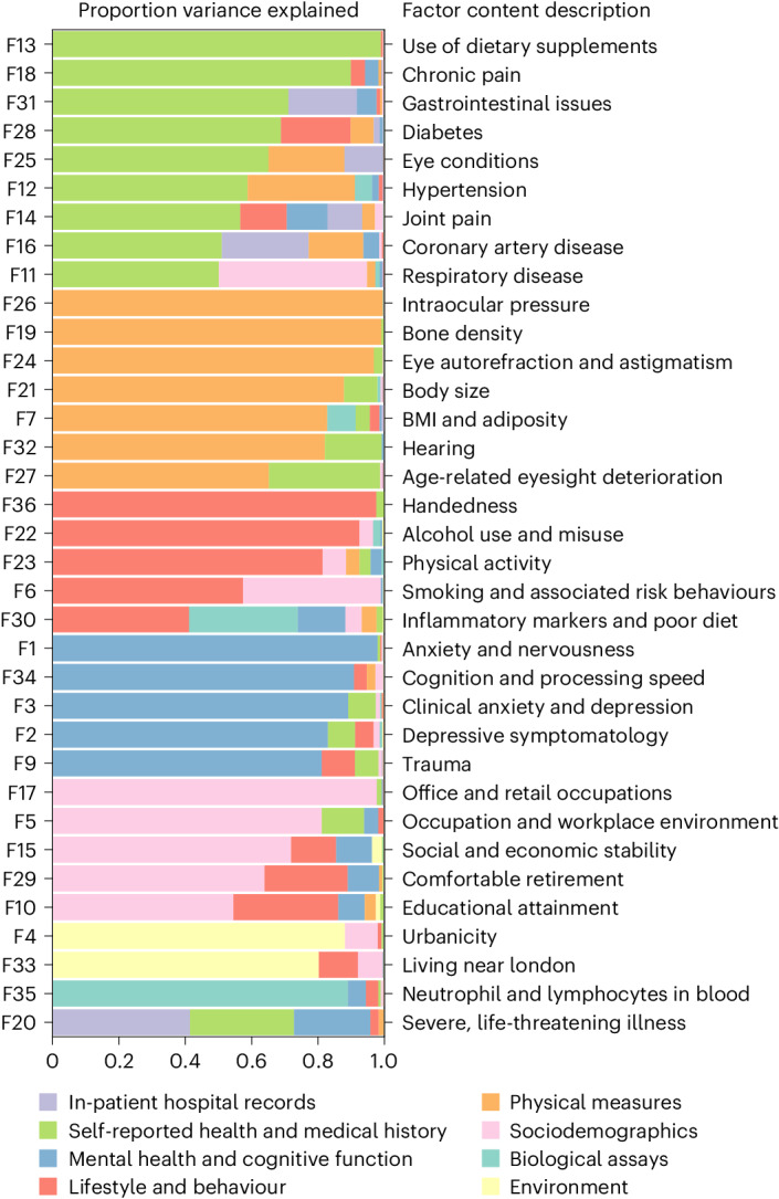
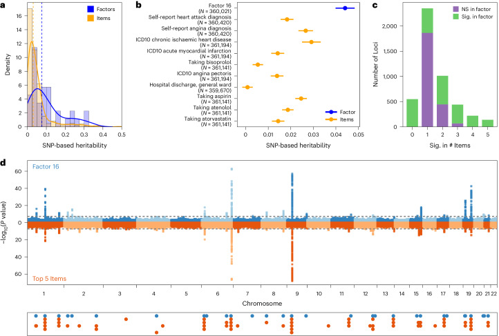
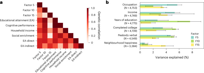
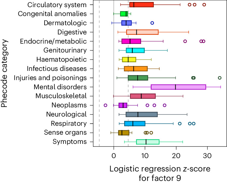
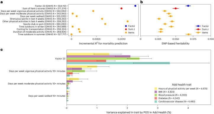
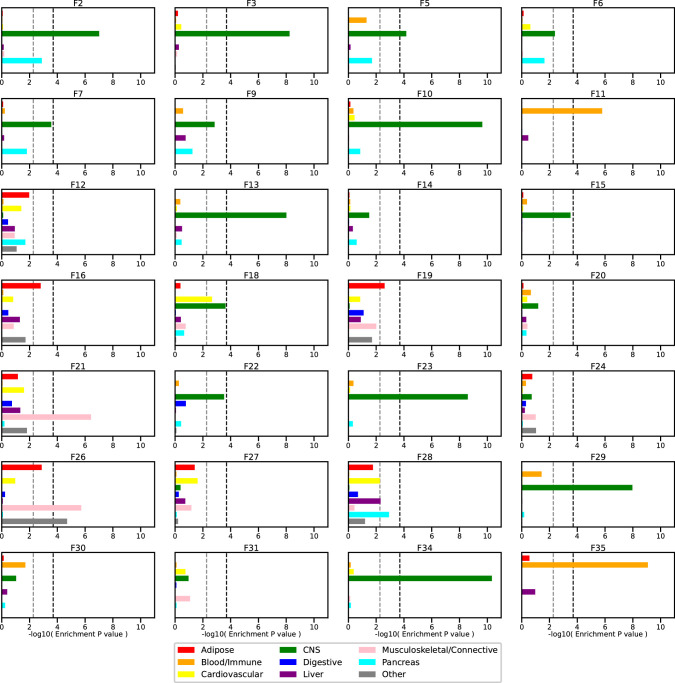
Data within biobanks capture broad yet detailed indices of human variation, but biobank-wide insights can be difficult to extract due to complexity and scale. Here, using large-scale factor analysis, we distill hundreds of variables (diagnoses, assessments and survey items) into 35 latent constructs, using data from unrelated individuals with predominantly estimated European genetic ancestry in UK Biobank. These factors recapitulate known disease classifications, disentangle elements of socioeconomic status, highlight the relevance of psychiatric constructs to health and improve measurement of pro-health behaviours. We go on to demonstrate the power of this approach to clarify genetic signal, enhance discovery and identify associations between underlying phenotypic structure and health outcomes. In building a deeper understanding of ways in which constructs such as socioeconomic status, trauma, or physical activity are structured in the dataset, we emphasize the importance of considering the interwoven nature of the human phenome when evaluating public health patterns.


Conflict of interest statement

C.E.C. is currently an employee of Novartis. R.W. is a research fellow at AnalytiXIN, which is a consortium of health-data organizations, industry partners and university partners in Indiana primarily funded through the Lilly Endowment, IU Health and Eli Lilly and Company. B.M.N. is a member of the scientific advisory board at Deep Genomics and Neumora, and a consultant of the scientific advisory board of Camp4 Therapeutics. R.K.W. has received honoraria from the Jackson Laboratory and sponsored travel from the Russell Sage Foundation in the past 36 months. G.D.S. reports Scientific Advisory Board Membership for Relation Therapeutics and Insitro. The remaining authors declare no competing interests.

Figures

Fig. 1
Fig. 1. Makeup of factors in the final model.
Horizontal bars represent proportion of variance explained in a given factor score by each of 8 major categories of assessment in UKB, estimated using hierarchical partitioning. To the left, factors are numbered in order of variance extraction in the exploratory factor analysis. To the right, brief descriptions of the items contained within a factor are listed, arrived at by expert consensus of coauthors and colleagues.
Fig. 2
Fig. 2. Prospective mortality hazard ratios and heritability estimates across all 35 factors.
a, Mortality hazards per factor. Factors are ordered by hazard ratio for mortality from time of last survey completion to the last date at which death records were available for analysis. T0 was defined as the last contact an individual had with the UK Biobank study, within the context of the items included in the factors. b, Heritability estimates for each factor, ordered by the point estimate. Results in a reflect estimated hazard ratios ±95% CIs, while results in b reflect estimated SNP heritabilities ±1 standard error. For both panels, darker blue boxes remain significant after adjustment for multiple comparisons. Covariates for both analyses included 20 genetic PCs, age, chromosomal sex, age2, age × chromosomal sex, age2 × chromosomal sex and assessment centre. Mortality analyses additionally included a covariate representing days from baseline assessment to T0.
Fig. 3
Fig. 3. Genetic properties of factors vs items.
a, Distributions of SNP-based heritability point estimates for items and factors, with density curves overlaid. Dashed vertical lines represent the median point estimate for each category. b, SNP heritability point estimates with standard error bars shown for an example factor, Factor 16, and its top 10 component items by loading. c, Number of GWAS significant loci (P < 5 × 10−8 for Bonferroni-adjusted significance within a given phenotype) across all 35 factors and their top 5 component items by loading. Loci shown in purple are significant only in GWAS of one or more top items. Loci shown in green are significant in GWAS of the factors. For example, there are 2,350 loci that are significant in GWAS of only one of a factor’s top 5 items (second bar in the graph). Of these loci, 486 are also significant in GWAS of the corresponding factor (shown in green). d, Comparison of loci identified in Factor 16 (top of Miami plot) versus its top 5 items by loading (bottom of Miami plot). Below the Miami plot are all loci across the factor (in blue) and top items (in orange), demonstrating the patterns presented in c at the single-factor level. All P values for c and d are from two-sided tests in GWAS using linear regression for each variant and the covariates described in Methods.
Fig. 4
Fig. 4. Genetic associations of factors within the SES domain.
a, Genetic correlation across factors in the SES domain and previous GWAS of SES indicators. All genetic associations are flipped to be in the direction reflecting greater SES for consistency (for example, ‘Social deprivation’ becomes ‘Social enrichment’). Colour of each box within the heat map indicates the strength of genetic overlap across the two corresponding phenotypes. b, Associations between polygenic scores derived from the SES factors and SES-related items in an outside cohort (Add Health) with corresponding sample sizes (N). Barplots show estimated incremental variance explained (change in R2 or Nagelkerke’s pseudo-R2 from adding polygenic scores to regression models for continuous or binary outcomes, respectively (Methods)) with error bars representing 95% bootstrapped confidence intervals.
Fig. 5
Fig. 5. Factor 9 associations across top-level inpatient diagnostic phecodes.
Box-and-whisker plots are shown for associations within UKB with 403 derived medical phecodes grouped by category. These associations are defined as the test statistics (that is, z-scores) for the factor score in a logistic regression model including our standard covariates (that is, first 20 genetic PCs, age, chromosomal sex, age2, age × chromosomal sex, age2 × chromosomal sex and dummy variables representing the assessment centres of origin). Boxes represent the middle quartiles of Factor 9’s test statistics across phecodes within a category, with whiskers extending to maximum and minimum observed values, excluding outliers >1.5× the interquartile range away from the middle quartiles which are plotted individually. Median values per category are indicated by individual black lines inside the boxes. The dotted grey lines represent the critical test statistics for significance at two-sided P < 0.05 after correcting for multiple comparisons across all 403 phecodes.
Fig. 6
Fig. 6. Comparative performance of Factor 23 versus individual items.
The factor score is compared to each of the top 10 items and to an unweighted sum of z-scores of those items. a, Comparison of incremental R2 for mortality prediction in N = 217,393 individuals with complete data for the included items and sufficient accuracy in the independent-variable factor scores for Factor 23 (Methods). The comparative baseline model for each included covariates for the first 20 genetic PCs, age, chromosomal sex, age2, age × chromosomal sex, age2 × chromosomal sex, dummy variables representing the assessment centres of origin and days from baseline assessment to T0. b, Comparison of point estimates of heritability. Results show estimated observed-scale SNP heritability ±1 standard error from GWAS with the listed sample size (N). c, Comparison of variance explained by polygenic scores for Factor 23 vs its top 3 component items for 5 relevant traits in the external Add Health study. Barplots show estimated variance explained (change in R2 from adding polygenic scores to linear regression models for each outcome (Methods)) with error bars representing 95% bootstrapped confidence intervals, with a lower bound of 0 for visualization purposes. See Supplementary Table 13 for comparison to all top 10 items.
Extended Data Fig. 1
Extended Data Fig. 1. Schematic of overall analytic plan.
Displays the outline of analyses performed in the study as well as number of phenotypes and participants at each step.
Extended Data Fig. 2
Extended Data Fig. 2. Representation of item types across factors.
Horizontal bars represent proportion variance explained in a given factor score by each of 6 major data types in UKB, estimated using hierarchical partitioning. To the left, factors are numbered in order of variance extraction in the exploratory factor analysis.
Extended Data Fig. 3
Extended Data Fig. 3. Comparison of EFA to PCA.
a) The expected absolute correlations across the 36 EFA factors and principal components. b) For each of the 36 EFA factors, the proportion of variance explained by all 36 PCs. c and d) Per-item scatterplots of scoring coefficients for factors vs. PCs across thematically similar pairs, demonstrating sparser loadings amongst the factor scoring coefficients vs. the PC scoring coefficients.
Extended Data Fig. 4
Extended Data Fig. 4. Phecode associations by factor.
Box-and-whisker plots are shown for associations with 403 derived medical phecodes grouped by category. These associations are defined as the test statistics (that is, z scores from estimated regression coefficients and Huber-White robust standard errors) for the factor score in a logistic regression model including our standard covariates (that is, first 20 genetic PCs, age, chromosomal sex, age2, age-x-chromosomal sex, age2-x-chromosomal sex, and dummy variables representing the assessment centers of origin). Boxes represent the middle quartiles of a factor’s test statistics across phecodes within a category, with whiskers extending to 1.5x the interquartile range. Median values per category are indicated by individual black lines inside the boxes. The dotted grey lines represent the critical test statistics for significance at two-sided p < 0.05 after correcting for multiple comparisons across all 403 phecodes.
Extended Data Fig. 5
Extended Data Fig. 5. Biomarker associations by factor.
Phenotypic associations between factors and 28 biomarkers assayed in UKB. Colors represent the magnitude and direction of correlation, and asterisks (*) indicate which associations remain significant in ordinary least squares regression with Huber-White robust standard errors after correction for multiple testing (that is, two-sided p < 0.05 / (28 biomarkers x 35 factors)).
Extended Data Fig. 6
Extended Data Fig. 6. Heritability enrichment by cell type group.
Consistent with prior guidelines, only the 28 factors with h2 z > 7 were included in these analyses. Barplots show the -log10(p-value) from the two-sided t-test in partitioned LD score regression testing enrichment of GWAS signal in regions with annotated chromatin marks in cell types from the given group. The light grey dashed line represents the threshold for FDR-corrected significance at 0.05, while the black dashed line represents Bonferroni corrected threshold for 0.05 / (28 factors x 9 cell type groups).
Extended Data Fig. 7
Extended Data Fig. 7. Genetic correlations of factors with outside traits.
The heatmap shows the estimated rg between our 35 factors and 68 selected outside summary statistics. Outside traits are grouped by general category. Color represents the magnitude and direction of genetic correlation.
Extended Data Fig. 8
Extended Data Fig. 8. Demonstration of the impact of orthogonalization on genetic architecture of Factor 28 versus an outside GWAS of Type 2 Diabetes.
The heatmap shows the estimated rg between 20 selected outside cardiometabolic summary statistics and 1) our Factor 28, 2) an outside GWAS of Type 2 Diabetes, and 3) an outside GWAS of Type 2 Diabetes adjusted for BMI. Color represents the magnitude and direction of genetic correlation.
Extended Data Fig. 9
Extended Data Fig. 9. Heritability for factors versus top items.
For each factor, density plots showing the distribution of estimated observed-scale SNP-heritability for the top items (orange) compared to the point estimate and 95% confidence interval for the SNP-heritability of the factor (blue). Orange tick marks indicate the point estimates of SNP-heritability for the items.

References

    1. Kurki, M. I. et al. FinnGen provides genetic insights from a well-phenotyped isolated population. Nature613, 508–518 (2023). 10.1038/s41586-022-05473-8 - DOI - PMC - PubMed
    1. Nagai, A. et al. Overview of the BioBank Japan Project: study design and profile. J. Epidemiol.27, S2–S8 (2017). 10.1016/j.je.2016.12.005 - DOI - PMC - PubMed
    1. Bycroft, C. et al. The UK Biobank resource with deep phenotyping and genomic data. Nature562, 203–209 (2018). 10.1038/s41586-018-0579-z - DOI - PMC - PubMed
    1. Douaud, G. et al. SARS-CoV-2 is associated with changes in brain structure in UK Biobank. Nature604, 697–707 (2022). 10.1038/s41586-022-04569-5 - DOI - PMC - PubMed
    1. Zhou, W. et al. Global Biobank Meta-analysis Initiative: powering genetic discovery across human disease. Cell Genom.2, 100192 (2022). 10.1016/j.xgen.2022.100192 - DOI - PMC - PubMed

LinkOut - more resources