. 2024 Jul 17;7(1):874.
doi: 10.1038/s42003-024-06387-z.

Urban birds' tolerance towards humans was largely unaffected by COVID-19 shutdown-induced variation in human presence

Affiliations

Urban birds' tolerance towards humans was largely unaffected by COVID-19 shutdown-induced variation in human presence

Peter Mikula et al. Commun Biol. .

Abstract

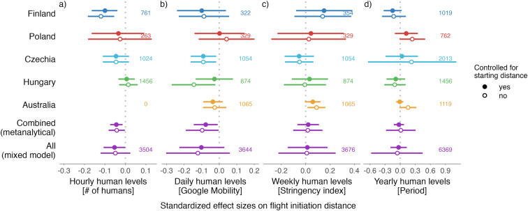
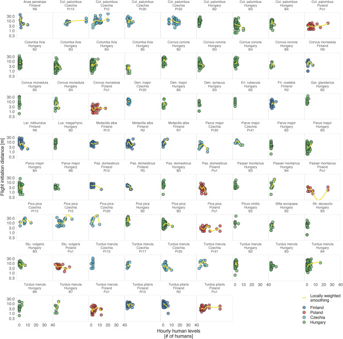
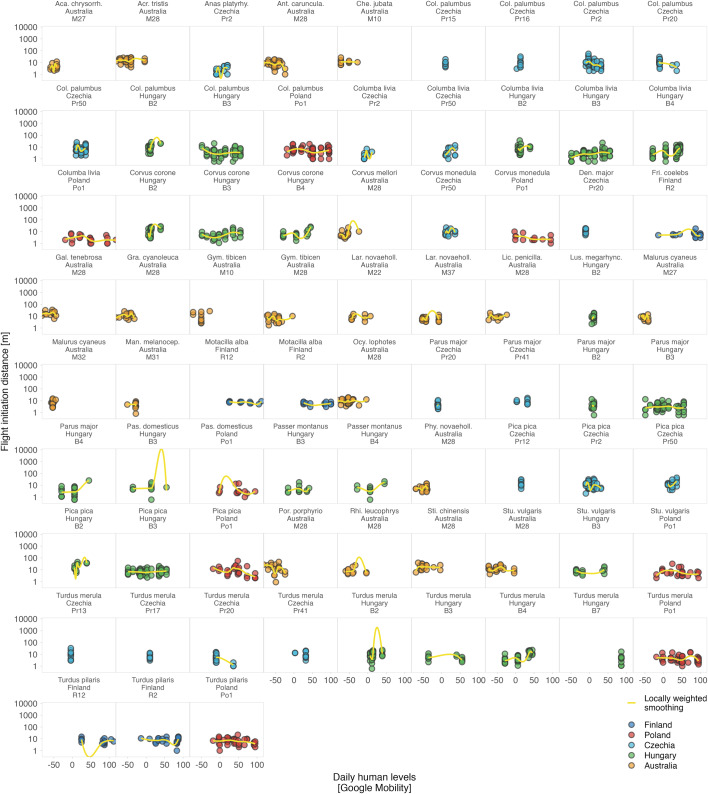
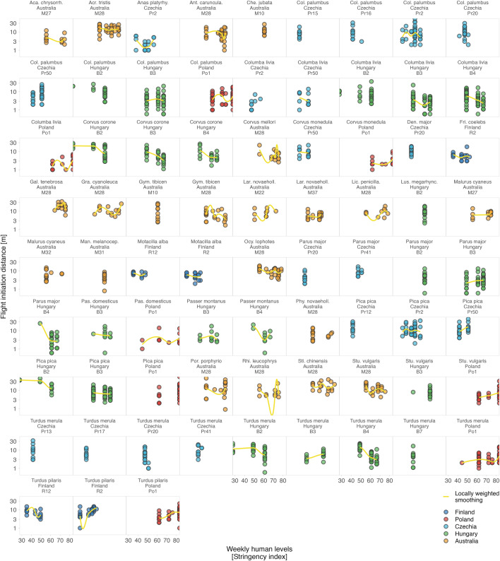
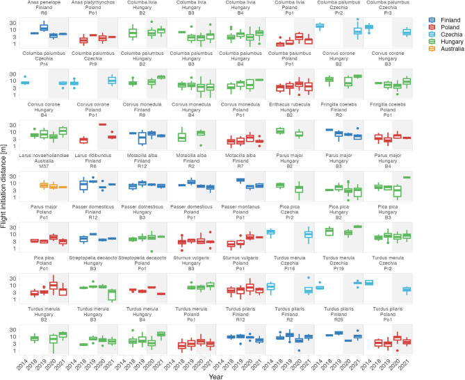
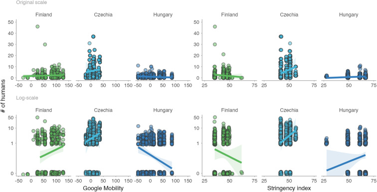
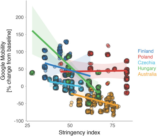
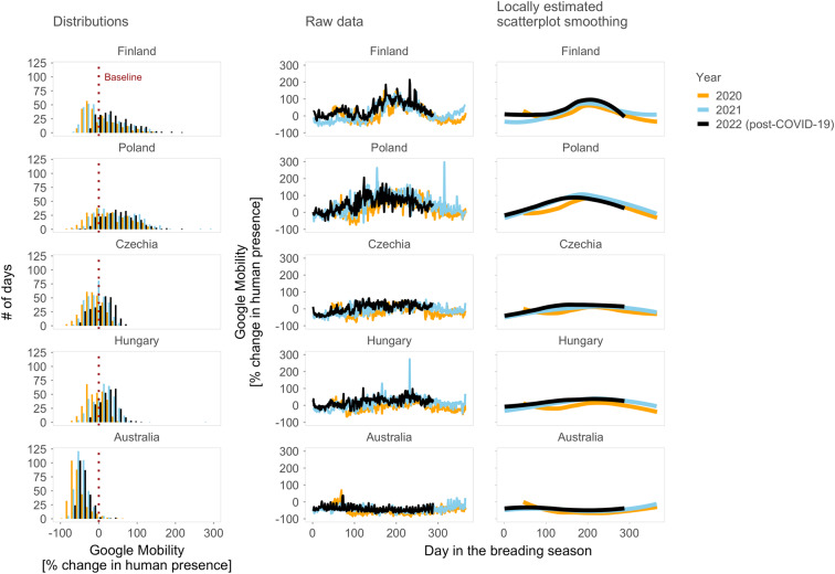
The coronavirus disease 2019 (COVID-19) pandemic and respective shutdowns dramatically altered human activities, potentially changing human pressures on urban-dwelling animals. Here, we use such COVID-19-induced variation in human presence to evaluate, across multiple temporal scales, how urban birds from five countries changed their tolerance towards humans, measured as escape distance. We collected 6369 escape responses for 147 species and found that human numbers in parks at a given hour, day, week or year (before and during shutdowns) had a little effect on birds' escape distances. All effects centered around zero, except for the actual human numbers during escape trial (hourly scale) that correlated negatively, albeit weakly, with escape distance. The results were similar across countries and most species. Our results highlight the resilience of birds to changes in human numbers on multiple temporal scales, the complexities of linking animal fear responses to human behavior, and the challenge of quantifying both simultaneously in situ.


Conflict of interest statement

The authors declare no competing interests.

Figures

Fig. 1
Fig. 1. Avian tolerance towards humans across four temporal scales.
a–d Avian tolerance according to (a) human levels (i.e. presence) during the escape distance trial (hourly scale) measured as number of humans within a 50-meter radius, b the day of the escape trial as proxied by Google Mobility (daily scale), c week of the escape trial as proxied by the stringency of governmental measures (weekly scale), and (d) the period of the escape trial, i.e. before vs during the COVID-19 shutdowns (yearly scale). The dots with horizontal lines represent estimated standardized effect size and their 95% confidence intervals, the numbers represent sample sizes. For the countries (i.e. country-specific models) and “All” (i.e. global models containing all countries), the effect sizes and 95% confidence intervals come from the joint posterior distribution of 5000 simulated values generated by the sim function from the arm package using the mixed model outputs controlled for starting distance of the observer (filled circles) or not (empty circles; Table S1; for model specification details see Methods). For the “Combined”, the estimates and 95% confidence intervals represent the meta-analytical means based on the country-specific estimates and their standard deviations (from the country-specific models), and sample size per country. Note that the effect sizes are small, and estimates tend to center around zero. For R-code generating the figure see interactive supporting material.
Fig. 2
Fig. 2. Variation in avian tolerance toward hourly human numbers during the escape trials across species and sites.
Dots represent single escape distance observations of species at specific sites (e.g. park or cemetery) during the escape trial and not corrected for other factors such as starting distance of the observer. Dot colour highlights the country. Yellow lines represent locally weighted smoothing, a non-parametric local regression fitted with the ggplot function of the ggplot2 package highlighting heterogenous (and usually unclear—close to zero) within- and between- species trends. Some species lack trend lines because data distribution hindered the smoothing and visualised are only data for species-site combinations with ≥10 escape distance observations and where number (#) of humans was estimated. The y-axes are on the log-scale. Panels are ordered alphabetically according to species names, then country and site identifier. Abbreviated genus names represent Col Columba, Den Dendrocopos, Eri Erithacus, Fri Fringilla, Gar Garrulus, Lar Larus, Lus Luscinia, Pas Passer, Str Streptopelia, Stu Sturnus, and abbreviated species name megarhync megarhynchos. For R-code generating the figure see interactive supporting material.
Fig. 3
Fig. 3. Variation in avian tolerance toward daily human levels (Google Mobility) across species and sites.
Dots represent single escape distance observations of species at specific sites (e.g. park or cemetery) and not corrected for other factors such as starting distance of the observer. Dot colour highlights the country. Yellow lines represent locally weighted smoothing, a non-parametric local regression fitted with the ggplot function of the ggplot2 package, highlighting heterogenous (and usually unclear–close to zero) within- and between- species trends. Some species lack trend lines because data distribution hindered the smoothing and visualised are only data for species-site combinations with ≥10 escape distance observations, for which Google Mobility data were available. The y-axes are on the log-scale. Panels are ordered alphabetically according to species names, then country and site identifier. Abbreviations in the species names represent Aca. chrysorrh. Acanthiza chrysorrhoa, Acr Acridotheres, Anas platyrhy. Anas platyrhynchos, Ant. caruncula. Anthochaera carunculata, Che Chenonetta, Col Columba, Den Dendrocopos, Fri Fringilla, Gal Gallinula, Gra Grallina, Gym Gymnorhina, Lar. novaehol. Larus novaehollandiae, Lic. penicilla. Lichenostomus penicillatus, Lus. megarhync. Luscinia megarhynchos, Man. melanocep. Manorina melanocephala, Ocy Ocyphaps, Pas Passer, Phy. novaeholl. Phylidonyris novaehollandiae, Por Porphyrio, Rhi Rhipidura, Sti Stigmatopelia, and Stu Sturnus. For R-code generating the figure see interactive supporting material.
Fig. 4
Fig. 4. Variation in avian tolerance toward weekly human levels (proxied by Stringency index) across species and sites.
Dots represent single escape distance observations of species at specific sites (e.g. park or cemetery) and not corrected for other factors such as starting distance of the observer. Dot colour highlights the country. Yellow lines represent locally weighted smoothing, a non-parametric local regression fitted with the ggplot function of the ggplot2 package, highlighting heterogenous (and usually unclear – close to zero) within- and between- species trends. Some species lack trend lines because data distribution hindered the smoothing and visualised are only data for species-site combinations with ≥10 escape distance observations, for which Stringency index data were available. The y-axes are on the log-scale. Panels are ordered alphabetically according to species names, then country and site identifier. Abbreviationed species names represent Aca. chrysorrh. Acanthiza chrysorrhoa, Acr Acridotheres, Anas platyrhy. Anas platyrhynchos, Ant. caruncula. Anthochaera carunculata, Che Chenonetta, Col Columba, Den Dendrocopos, Fri Fringilla, Gal Gallinula, Gra Grallina, Gym Gymnorhina, Lar. novaehol. Larus novaehollandiae, Lic. penicilla. Lichenostomus penicillatus, Lus. megarhync. Luscinia megarhynchos, Man. melanocep. Manorina melanocephala, Ocy Ocyphaps, Pas Passer, Phy. novaeholl. Phylidonyris novaehollandiae, Por Porphyrio, Rhi Rhipidura, Sti Stigmatopelia, and Stu Sturnus. For R-code generating the figure see interactive supporting material.
Fig. 5
Fig. 5. Between-year variation in avian tolerance toward humans across species and sites.
Panels are ordered alphabetically according to species names, then country and site identifier within each country (e.g. specific park or cemetery). Boxplots outline colour highlights country, background colour indicates Period (white: before the COVID-19 shutdowns; grey: during the COVID-19 shutdowns). Boxplots depict median (horizontal line inside the box), the 25th and 75th percentiles (box) ± 1.5 times the interquartile range or the minimum/maximum value, whichever is smaller (bars), and the outliers (dots). Included are only species–site combinations with ≥5 observations per Period. The y-axes are on the log-scale. Note the lack of consistent shutdowns effects within and between species, sites and countries. For R-code generating the figure see interactive supporting material.
Fig. 6
Fig. 6. Numbers of humans within 50 meters during the escape trial in association with daily human levels in parks (Google Mobility) and stringency of antipandemic governmental restrictions (Stringency index).
Dots represent individual data points (on original or log-scale), jittered to increase visibility. Lines with shaded areas represent predictions with 95% CIs from mixed effect models that controlled for the year (in case of Finland and Hungary) and non-independence of data points by including day of the week within the year as a random intercept and Google Mobility or Stringency index as a random slope (Table S3a–d). Human numbers during the escape trials were missing for Australia (all years) and Poland (during shutdowns). Note the weak and country-specific associations. For R-code generating the figure see interactive supporting material.
Fig. 7
Fig. 7. Association between daily human levels in parks (Google Mobility) and the stringency of antipandemic governmental restrictions (Stringency index).
Lines with shaded areas represent predicted relationships from country-specific mixed effect models controlled for the year and non-independence of data points by including weekday within the year as a random intercept and Stringency index as a random slope (Table S3e). Dots represent raw data, jittered to increase visibility, for days within which we collected escape distances in each city. Color indicates country. Note the generally negative but weak association between Google Mobility and Stringency index. For R-code generating the figure see interactive supporting material.
Fig. 8
Fig. 8. Changes in human levels in parks within and between years and countries.
Distributions represent histograms of daily human levels (Google Mobility), Raw data the daily values and Locally estimated scatterplot smoothing, the smoothing of the daily data across years. Dotted vertical line in Distributions indicates baseline value of human levels, separating negative values that represent decreased human presence and positive values that indicate increased human presence when compared with the country- and weekday-specific baseline human levels estimated as the median value from 3 January – 6 February 2020 (see also Methods; for weekday-specific patterns see Fig. S7). In Day in the breeding season, zeros represent the beginning of the breading season. Note that Google Mobility data were unavailable for the years before the COVID-19 pandemic (i.e. before 2020) but the year 2022 was without shutdowns in the studied countries. For R-code generating the figure see interactive supporting material.

Similar articles

Cited by

References

    1. Fang H, Wang L, Yang Y. Human mobility restrictions and the spread of the Novel Coronavirus (2019-nCoV) in China. J. Public Econ. 2020;191:104272. doi: 10.1016/j.jpubeco.2020.104272. - DOI - PMC - PubMed
    1. Gatto M, et al. Spread and dynamics of the COVID-19 epidemic in Italy: Effects of emergency containment measures. Proc. Natl Acad. Sci. USA. 2020;117:10484–10491. doi: 10.1073/pnas.2004978117. - DOI - PMC - PubMed
    1. Huang X, Li Z, Jiang Y, Li X, Porter D. Twitter reveals human mobility dynamics during the COVID-19 pandemic. PLoS One. 2020;15:e0241957. doi: 10.1371/journal.pone.0241957. - DOI - PMC - PubMed
    1. Kraemer MUG, et al. The effect of human mobility and control measures on the COVID-19 epidemic in China. Science (1979) 2020;368:493–497. - PMC - PubMed
    1. Venter ZS, Aunan K, Chowdhury S, Lelieveld J. COVID-19 lockdowns cause global air pollution declines. Proc. Natl Acad. Sci. USA. 2020;117:18984–18990. doi: 10.1073/pnas.2006853117. - DOI - PMC - PubMed

Publication types