[Preprint]. 2024 Dec 7:2024.07.24.24310941.
doi: 10.1101/2024.07.24.24310941.

Individualized Machine-learning-based Clinical Assessment Recommendation System

Affiliations

Individualized Machine-learning-based Clinical Assessment Recommendation System

Devin Setiawan et al. medRxiv. .

Abstract

Background: Traditional clinical assessments often lack individualization, relying on standardized procedures that may not accommodate the diverse needs of patients, especially in early stages where personalized diagnosis could offer significant benefits. We aim to provide a machine-learning framework that addresses the individualized feature addition problem and enhances diagnostic accuracy for clinical assessments.

Methods: Individualized Clinical Assessment Recommendation System (iCARE) employs locally weighted logistic regression and Shapley Additive Explanations (SHAP) value analysis to tailor feature selection to individual patient characteristics. Evaluations were conducted on synthetic and real-world datasets, including early-stage diabetes risk prediction and heart failure clinical records from the UCI Machine Learning Repository. We compared the performance of iCARE with a Global approach using statistical analysis on accuracy and area under the ROC curve (AUC) to select the best additional features.

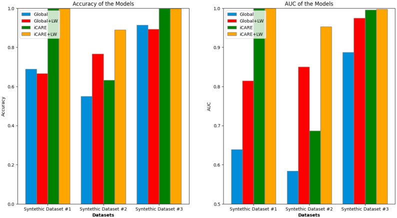
Findings: The iCARE framework enhances predictive accuracy and AUC metrics when additional features exhibit distinct predictive capabilities, as evidenced by synthetic datasets 1-3 and the early diabetes dataset. Specifically, in synthetic dataset 1, iCARE achieved an accuracy of 0·999 and an AUC of 1·000, outperforming the Global approach with an accuracy of 0·689 and an AUC of 0·639. In the early diabetes dataset, iCARE shows improvements of 1·5-3·5% in accuracy and AUC across different numbers of initial features. Conversely, in synthetic datasets 4-5 and the heart failure dataset, where features lack discernible predictive distinctions, iCARE shows no significant advantage over global approaches on accuracy and AUC metrics.

Interpretation: iCARE provides personalized feature recommendations that enhance diagnostic accuracy in scenarios where individualized approaches are critical, improving the precision and effectiveness of medical diagnoses.

Funding: This work was supported by startup funding from the Department of Psychology at the University of Kansas provided to A.A., and the R01MH125740 award from NIH partially supported J.M.G.'s work.


Figures

Figure 1:
Figure 1:. Architecture of the iCARE framework.
Data were obtained from an incoming patient (I), and weights were generated for the pool of known cases in the Similarity Calculation Module (II). Using these sample weights, we generate a weighted logistic regression model for an incoming patient (III). SHAP values are then generated using a SHAP explainer for all the subjects in the pool of known cases (IV). The Feature Recommendation Module will then gather all the individual SHAP values and produce a recommendation if there is a missing feature that can be recommended to the patient (V).
Figure 2:
Figure 2:. Experimental workflow to evaluate the iCARE framework.
The figure above highlights the main experimental workflow to evaluate the iCARE framework against traditional global feature selection. This workflow produces two distinct approaches to generating recommendations, as shown by the Global (i.e., global feature selection) and iCARE (i.e., individualized feature selection) split in part I. In addition, there are two distinct approaches to training the inference model, as shown in part II, where the logistic regression model can be trained with or without sample weights (i.e., LW or no LW). This produces four approaches: Global, Global+LW, iCARE, and iCARE+LW.
Figure 3:
Figure 3:. Synthetic dataset 1.
Two 2D scatter plots displaying the relationship between the initial feature (x-axis) and the added feature (y-axis). The red dots represent negative samples (e.g., sick patients), while the blue dots represent positive samples (e.g., healthy patients). The left plot depicts added Feature 1, exhibiting predictive power for Initial Feature < 0·5, while random noise is observed in the shaded area above Initial Feature > 0·5. The right graph illustrates added Feature 2, demonstrating predictive power for Initial Feature > 0·5, with random noise observed in the shaded area below Initial Feature < 0·5.
Figure 4:
Figure 4:. Synthetic dataset 2.
Two 2D scatter plots, similar to Figure 3, showcase the relationship between the initial feature (x-axis) and the added feature (y-axis). The red dots represent negative samples (e.g., sick patients), while the blue dots represent positive samples (e.g., healthy patients). Notably, the predictive area in this dataset exhibits a non-linear pattern, suggesting a more complex relationship between the features.
Figure 5:
Figure 5:. Synthetic dataset 3.
2D scatter plots resembling Figure 3, depicting the relationship between the initial feature (x-axis) and the added feature (y-axis). The red dots represent negative samples (e.g., sick patients), while the blue dots represent positive samples (e.g., healthy patients). Notably, the left graph demonstrates predictive power for X < 0·7, while the right graph showcases predictive power for X > 0·3. The green-shaded region highlights an overlapping area (0·3 < X < 0·7) where both features possess equal predictive power.
Figure 6:
Figure 6:. Synthetic dataset 4.
Scatter plots depicting the relationship between the initial feature and the added feature, resembling the format of Figure 3. Notably, both the left and right graphs illustrate identical predictive regions.
Figure 7:
Figure 7:. Synthetic dataset 5.
Each scatter plot represents a different feature’s predictive power. The first scatter plot demonstrates strong predictive capability, while the other two plots depict features with limited predictive utility. This visualization underscores the scenarios where one feature overpowers the other features.
Figure 8:
Figure 8:. Performance summary of Synthetic Dataset 1 – 3.
Comparison of accuracy (left) and area under the curve (AUC) (right) across three synthetic datasets. Each bar group represents a dataset, with values indicated for both global and local weighted metrics. For Dataset 1, the accuracy stands at 0·689, 0·667, 0·999, 0·999 with an AUC of 0·639, 0·814, 0·999, 1·0. In Dataset 2, the accuracy stands at 0·551, 0·767, 0·632, 0·891 with an AUC of 0·584, 0·850, 0·687, 0·953. Dataset 3 accuracy stands at 0·914, 0·894, 0·998, 0·998, along with an AUC of 0·888, 0·974, 0·996, 0·998. This comparison highlights variations in performance across the different synthetic datasets that represent ideal scenarios.
Figure 9:
Figure 9:. Performance summary of synthetic dataset 4 – 5.
Comparison of accuracy (left) and area under the curve (AUC) (right) across Synthetic Datasets 4 and 5. Each bar group represents a dataset with performance metrics for both global and iCARE. For dataset 4, accuracy values obtained were 0·747, 0·810, 0·738, 0·792, and AUC values obtained were 0·781, 0·805, 0·764, 0·787. For dataset 5, accuracy values obtained were 0·811, 0·740, 0·774, 0·742, and AUC values obtained were 0·790, 0·815, 0·799, 0·811. These results reveal two distinct scenarios where iCARE learning fails to substantially improve global learning regarding feature addition and inference.
Figure 10:
Figure 10:. Early Diabetes dataset performance summary.
This figure illustrates the mean performance of the early diabetes dataset on different feature spaces on accuracy and AUC metrics, with global and local perspectives represented by blue/orange and green/red lines, respectively. Error bars at each data point represent the standard deviation from the mean. The line graphs the maximum number of features towards the ceiling, represented by the purple line. The ceiling model represented an ML model trained on all features.
Figure 11:
Figure 11:. Heart failure dataset performance summary.
This figure presents a comprehensive overview of mean accuracy and AUC metrics across various feature spaces on the heart failure dataset, offering insights into global and local perspectives depicted by blue/orange and green/red lines, respectively. Error bars show the standard deviation, while convergence towards the maximum features underscores notable trends.
Figure 12:
Figure 12:. iCARE vs Global vs Eguided feature selection performance summary.
This figure presents a comparative overview of the F1 scores across various feature spaces on three real-world datasets (Early Diabetes, Heart Disease, Heart Failure). The graphs depict the performance of the iCARE feature selection (orange), Global (blue), and Eguided imputation-based explanation-guided feature selection (green) approaches. The x-axis represents the number of initial features, while the y-axis shows the corresponding F1 scores, providing insight into each method’s effectiveness in handling different feature subsets.

References

    1. Krzyszczyk P, Acevedo A, Davidoff EJ, et al. The growing role of precision and personalized medicine for cancer treatment. Technology 2018; 06: 79–100. - PMC - PubMed
    1. N P, MB D, T P. BRCA1- and BRCA2-Associated Hereditary Breast and Ovarian Cancer. In: Adam MP, Feldman J, Mirzaa GM, et al. , eds. GeneReviews®. Seattle (WA): University of Washington, Seattle, 1993. http://www.ncbi.nlm.nih.gov/books/NBK1116/ (accessed July 13, 2024).
    1. Fernandes JB, Teixeira F, Godinho C. Personalized Care and Treatment Compliance in Chronic Conditions. JPM 2022; 12: 737. - PMC - PubMed
    1. Beydoun MA, Weiss J, Beydoun HA, et al. Race, APOE genotypes, and cognitive decline among middle-aged urban adults. Alz Res Therapy 2021; 13: 120. - PMC - PubMed
    1. Rajan KB, McAninch EA, Wilson RS, Weuve J, Barnes LL, Evans DA. Race, APOE ɛ4, and Long-Term Cognitive Trajectories in a Biracial Population Sample. JAD 2019; 72: 45–53. - PMC - PubMed

Publication types

LinkOut - more resources