. 2024 Nov 4;12(11):1492-1507.
doi: 10.1158/2326-6066.CIR-23-1109.

The Spatial Structure of the Tumor Immune Microenvironment Can Explain and Predict Patient Response in High-Grade Serous Carcinoma

Affiliations

The Spatial Structure of the Tumor Immune Microenvironment Can Explain and Predict Patient Response in High-Grade Serous Carcinoma

Lucy B Van Kleunen et al. Cancer Immunol Res. .

Abstract

Ovarian cancer is the deadliest gynecologic malignancy, and therapeutic options and mortality rates over the last three decades have largely not changed. Recent studies indicate that the composition of the tumor immune microenvironment (TIME) influences patient outcomes. To improve spatial understanding of the TIME, we performed multiplexed ion beam imaging on 83 human high-grade serous carcinoma tumor samples, identifying approximately 160,000 cells across 23 cell types. From the 77 of these samples that met inclusion criteria, we generated composition features based on cell type proportions, spatial features based on the distances between cell types, and spatial network features representing cell interactions and cell clustering patterns, which we linked to traditional clinical and IHC variables and patient overall survival (OS) and progression-free survival (PFS) outcomes. Among these features, we found several significant univariate correlations, including B-cell contact with M1 macrophages (OS HR = 0.696; P = 0.011; PFS HR = 0.734; P = 0.039). We then used high-dimensional random forest models to evaluate out-of-sample predictive performance for OS and PFS outcomes and to derive relative feature importance scores for each feature. The top model for predicting low or high PFS used TIME composition and spatial features and achieved an average AUC score of 0.71. The results demonstrate the importance of spatial structure in understanding how the TIME contributes to treatment outcomes. Furthermore, the present study provides a generalizable roadmap for spatial analyses of the TIME in ovarian cancer research.


Conflict of interest statement

Conflict of Interest: The authors declare no potential conflicts of interest.

Figures

Fig 1.
Fig 1.. Cell segmentation and phenotyping.
(A) Computational pipeline used for single-cell segmentation and cellular phenotyping of the MIBI imaging data. The process starts with pixel classification, where a pixel classifier distinguishes between two classes: Class I for desired signals and Class II for noise and artifacts (32). The classifier's output produces feature representation (FR) maps with pixel values scaled from 0 to 1. A pretrained single-cell segmentation model is used for cell segmentation (33). Subsequently, marker expression within cell boundaries is quantified using the Class I FR maps. This data is organized into a single-cell information table, with cells listed in rows and marker expression levels in columns. Finally, unsupervised clustering algorithms utilize this single-cell information data to identify distinct cell types (34). (B) A visual run-through of the computational pipeline on a single sample (FOV ID 9) out of the 83, with 3 examples of antibody staining out of the 26 and corresponding FR maps shown (the full sets are shown in Supplementary Figures S10 and S11).
Fig 2.
Fig 2.. TIME composition across samples.
(A) A t-Distributed Stochastic Neighbor Embedding (t-SNE) (67) representation of the marker expression data of about 160k cells from the ovarian cancer tissue of 83 patients. Cell types (N=23) were identified by clustering (represented in different colors). (B) Average marker expression (for the 16 out of 26 markers used to differentiate population clusters) per cluster is shown for the identified cell types, with colors indicating their corresponding cluster in the t-SNE representation. (C) Cell type percentages summarized across the 83 original samples, sorted by decreasing tumor cell percentage. (D) Counts of the final 77 samples included in the analysis in which each of the cell types were found.
Fig 3.
Fig 3.. Median nearest neighbor distance (spatial) and contact enrichment (network) features relative to three focal cell types.
(A-C) Median nearest neighbor distance for each other cell type to tumor cells, M1 macrophages, or vascular endothelial cells (μm). (D-F) Contact enrichment scores relative to tumor cells, M1 macrophages, or vascular endothelial cells for each of the other cell types. Positive scores indicate more contacts than expected at random, 0 the same number, and negative scores fewer contacts than expected at random. All bar plots show features aggregated across samples in which the relevant cell type is found. Cell types are indicated on the x-axis and the number of samples in which this cell type is found is shown in parentheses. Samples are excluded from the features calculated relative to M1 macrophages and vascular endothelial cells respectively when samples are missing the respective focal cell type. In all subplots cell types are ordered based on how commonly they were found across samples in descending order. The box plots include a line at the median with a box extending from the first quartile to the third quartile and whiskers extending to the farthest data point that is within 1.5x the inter-quartile range from the box, with datapoints outside of this range included as flier points.
Fig 4.
Fig 4.. Assortativity coefficient (network) features.
Assortativity coefficients for each cell type indicating their tendency to cluster with cells of the same type rather than cells of a different type, aggregated across samples including at least two cells of that cell type (the number of which is indicated in parentheses) and sorted by decreasing mean across samples. The box plots include a line at the median with a box extending from the first quartile to the third quartile and whiskers extending to the farthest data point that is within 1.5x the inter-quartile range from the box, with datapoints outside of this range included as flier points. All data points are plotted over the box plots to show the full distributions.
Fig 5.
Fig 5.. Univariate Cox regression results.
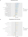
Covariates found to be significant (p<0.05) in Univariate Cox regressions for (A) OS and (B) PFS outcomes across N=77 samples (with samples removed that were missing covariate values) out of 216 covariates tested. Covariates are listed in descending order by hazard ratio. Hazard ratios are displayed with 95% confidence intervals, and a hazard ratio of 1 is indicated with a dashed line. Hazard ratio estimates are colored by feature category.
Fig 6.
Fig 6.. Random forest predictive performance results.
(A) 15 models were trained and evaluated with different combinations of four feature categories, as shown here. Predictive performance results, based on the AUC statistic are displayed for the 15 models summarized across 500 iterations of random forest training and evaluation across N=77 samples for (B) OS and (C) PFS outcomes. A red dashed line is displayed at an AUC value of 0.5, which represents the cut-off above which the model performs better than a random guess. The box plots include a line at the median with a box extending from the first quartile to the third quartile and whiskers extending to the farthest data point that is within 1.5x the inter-quartile range from the box, with datapoints outside of this range included as flier points.
Fig 7.
Fig 7.. Aggregate feature importance results.
Gini importance scores, aggregated across 500 random forest training runs across N=77 samples for the model including all features, sorted by median importance score and colored by feature type for (A) OS and (B) PFS outcomes. Top ten features by median importance score for (C) OS and (D) PFS outcomes across 500 random forest training runs, colored by feature type. The box plots include a line at the median with a box extending from the first quartile to the third quartile and whiskers extending to the farthest data point that is within 1.5x the inter-quartile range from the box, with datapoints outside of this range included as flier points.

Update of

References

    1. Lisio M-A, Fu L, Goyeneche A, Gao Z, Telleria C. High-Grade Serous Ovarian Cancer: Basic Sciences, Clinical and Therapeutic Standpoints. IJMS. 2019;20:952. - PMC - PubMed
    1. Siegel RL, Miller KD, Wagle NS, Jemal A. Cancer statistics, 2023. CA A Cancer J Clinicians. 2023;73:17–48. - PubMed
    1. Hoppenot C, Eckert MA, Tienda SM, Lengyel E. Who are the long-term survivors of high grade serous ovarian cancer? Gynecologic Oncology. 2018;148:204–12. - PubMed
    1. Garsed DW, Pandey A, Fereday S, Kennedy CJ, Takahashi K, Alsop K, et al. The genomic and immune landscape of long-term survivors of high-grade serous ovarian cancer. Nat Genet. 2022;54:1853–64. - PMC - PubMed
    1. Coscia F, Lengyel E, Duraiswamy J, Ashcroft B, Bassani-Sternberg M, Wierer M, et al. Multi-level Proteomics Identifies CT45 as a Chemosensitivity Mediator and Immunotherapy Target in Ovarian Cancer. Cell. 2018;175:159–170.e16. - PMC - PubMed