Power spectral density and similarity analysis of COVID-19 mortality waves across countries
- PMID: 39170280
- PMCID: PMC11336732
- DOI: 10.1016/j.heliyon.2024.e35546
Power spectral density and similarity analysis of COVID-19 mortality waves across countries
Abstract
Background: During the COVID-19 pandemic, the Johns Hopkins University Center for Systems Science and Engineering (CSSE) established a comprehensive database detailing daily mortality rates across countries. This dataset revealed fluctuating global mortality trends attributable to COVID-19; however, the specific differences and similarities in mortality patterns between countries remain insufficiently explored. Consequently, this study employs Fourier and similarity analyses to examine these patterns within the frequency domain, thereby offering novel insights into the dynamics of COVID-19 mortality waves across different nations.
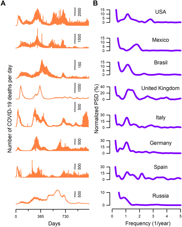
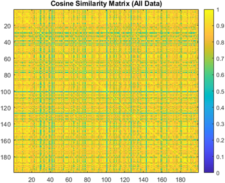
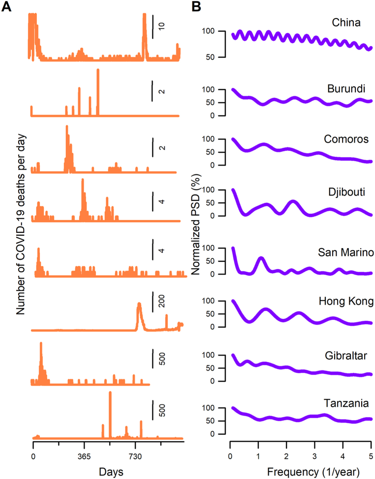
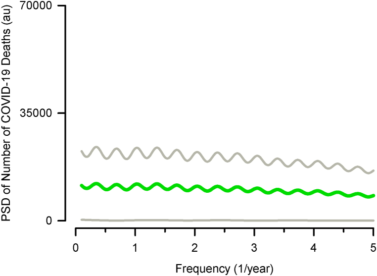
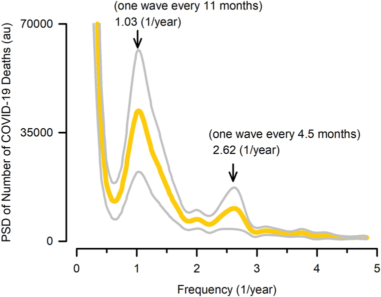
Methods: We employed the Fast Fourier transform to calculate the power spectral density (PSD) of COVID-19 mortality waves in 199 countries from January 22, 2020, to March 9, 2023. Moreover, we performed a cosine similarity analysis of these PSD patterns among all the countries.
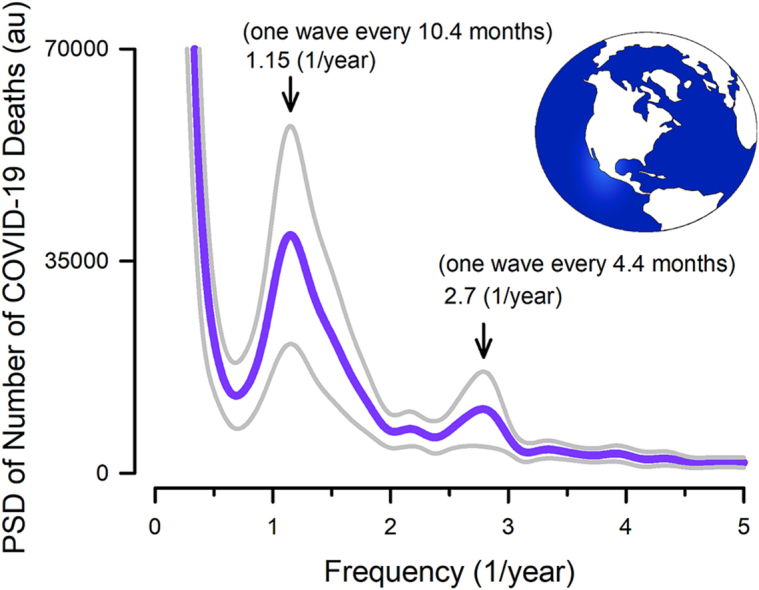
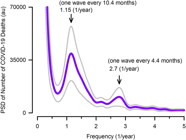
Results: We identified two dominant peaks in the grand averaged PSD: one at a frequency of 1.15 waves per year (i.e., one wave every 10.4 months) and another at 2.7 waves per year (i.e., one wave every 4.4 months). We also found a cosine similarity index distribution with a skewness of -0.54 and a global median of cosine similarity index of 0.84, thus revealing a remarkable similarity in the dominant peaks of the COVID-19 mortality waves.
Conclusion: These findings could be helpful for planetary health if a future pandemic of a similar scale occurs so that effective confinement measures or other actions could be planned during these two identified periods.
© 2024 The Authors.
Conflict of interest statement
The authors declare the following financial interests/personal relationships which may be considered as potential competing interests: Elias Manjarrez reports article publishing charges was provided by Benemérita Universidad Autónoma de Puebla. If there are other authors, they declare that they have no known competing financial interests or personal relationships that could have appeared to influence the work reported in this paper.
Figures

Similar articles
-
Effect of mutation and vaccination on spread, severity, and mortality of COVID-19 disease.J Med Virol. 2022 Jan;94(1):197-204. doi: 10.1002/jmv.27293. Epub 2021 Aug 30. J Med Virol. 2022. PMID: 34427922 Free PMC article.
-
COVID-19 trends across borders: Identifying correlations among countries.J Int Med Res. 2024 Jul;52(7):3000605241266233. doi: 10.1177/03000605241266233. J Int Med Res. 2024. PMID: 39075858 Free PMC article.
-
Variations of COVID-19 mortality are affected by economic disparities across countries.Sci Total Environ. 2022 Aug 1;832:154770. doi: 10.1016/j.scitotenv.2022.154770. Epub 2022 Mar 25. Sci Total Environ. 2022. PMID: 35341873 Free PMC article.
-
The Minderoo-Monaco Commission on Plastics and Human Health.Ann Glob Health. 2023 Mar 21;89(1):23. doi: 10.5334/aogh.4056. eCollection 2023. Ann Glob Health. 2023. PMID: 36969097 Free PMC article. Review.
-
Battling COVID-19 pandemic waves in six South-East Asian countries: A real-time consensus review.Med J Malaysia. 2020 Nov;75(6):613-625. Med J Malaysia. 2020. PMID: 33219168 Review.
References
-
- Lista F., Peragallo M.S., Biselli R., De Santis R., Mariotti S., Nisini R., D'Amelio R. Have diagnostics, therapies, and vaccines made the difference in the pandemic evolution of COVID-19 in comparison with "Spanish flu". Pathogens. 2023;12(7):868. doi: 10.3390/pathogens12070868. - DOI - PMC - PubMed
-
- Dong E., Ratcliff J., Goyea T.D., Katz A., Lau R., Ng T.K., Garcia B., Bolt E., Prata S., Zhang D., Murray R.C., Blake M.R., Du H., Ganjkhanloo F., Ahmadi F., Williams J., Choudhury S., Gardner L.M. The Johns Hopkins university center for systems science and engineering COVID-19 dashboard: data collection process, challenges faced, and lessons learned. Lancet Infect. Dis. 2022 Dec;22(12):e370–e376. doi: 10.1016/S1473-3099(22)00434-0. Epub 2022 Aug 31. Erratum in: Lancet Infect Dis. 2022 Nov;22(11):e310. PMID: 36057267; PMCID: PMC9432867. - DOI - PMC - PubMed
LinkOut - more resources
Full Text Sources