. 2024 Aug 23:26:e58502.
doi: 10.2196/58502.

Transforming Digital Phenotyping Raw Data Into Actionable Biomarkers, Quality Metrics, and Data Visualizations Using Cortex Software Package: Tutorial

Affiliations

Transforming Digital Phenotyping Raw Data Into Actionable Biomarkers, Quality Metrics, and Data Visualizations Using Cortex Software Package: Tutorial

James Burns et al. J Med Internet Res. .

Abstract

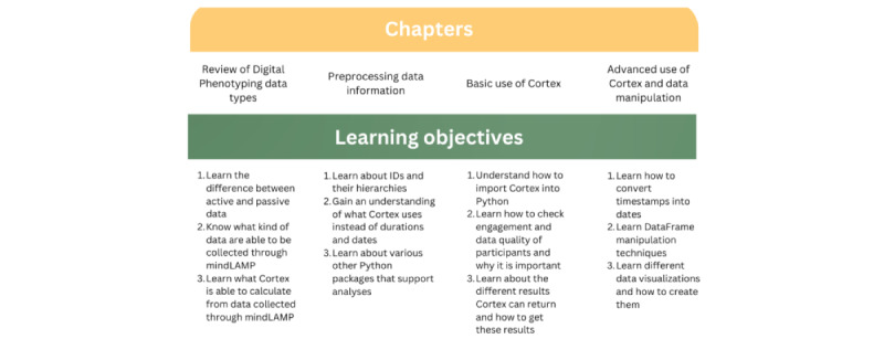
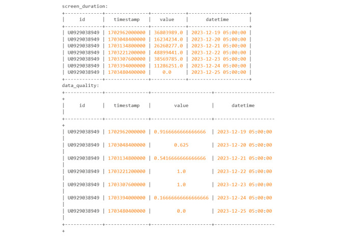
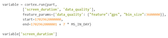
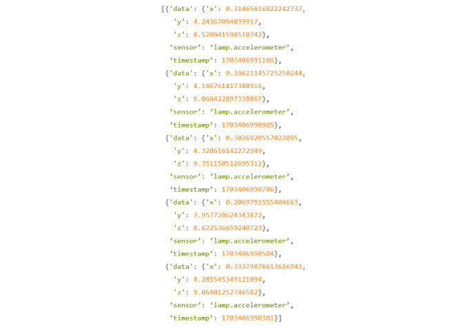
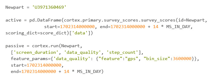
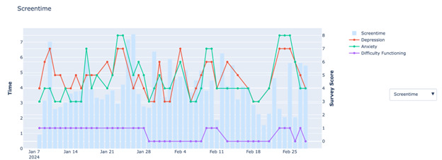
As digital phenotyping, the capture of active and passive data from consumer devices such as smartphones, becomes more common, the need to properly process the data and derive replicable features from it has become paramount. Cortex is an open-source data processing pipeline for digital phenotyping data, optimized for use with the mindLAMP apps, which is used by nearly 100 research teams across the world. Cortex is designed to help teams (1) assess digital phenotyping data quality in real time, (2) derive replicable clinical features from the data, and (3) enable easy-to-share data visualizations. Cortex offers many options to work with digital phenotyping data, although some common approaches are likely of value to all teams using it. This paper highlights the reasoning, code, and example steps necessary to fully work with digital phenotyping data in a streamlined manner. Covering how to work with the data, assess its quality, derive features, and visualize findings, this paper is designed to offer the reader the knowledge and skills to apply toward analyzing any digital phenotyping data set. More specifically, the paper will teach the reader the ins and outs of the Cortex Python package. This includes background information on its interaction with the mindLAMP platform, some basic commands to learn what data can be pulled and how, and more advanced use of the package mixed with basic Python with the goal of creating a correlation matrix. After the tutorial, different use cases of Cortex are discussed, along with limitations. Toward highlighting clinical applications, this paper also provides 3 easy ways to implement examples of Cortex use in real-world settings. By understanding how to work with digital phenotyping data and providing ready-to-deploy code with Cortex, the paper aims to show how the new field of digital phenotyping can be both accessible to all and rigorous in methodology.

Keywords: Cortex; app; apps; clinical; data analysis; data processing; data set; data visualization; digital phenotyping; mental health; methodology; mindLAMP; mobile phone; open-source; real world; smartphone; smartphones.


Conflict of interest statement

Conflicts of Interest: JT is the editor-in-chief of JMIR Mental Health at the time of this publication.

Figures

Figure 1
Figure 1
Paper schematic.
Figure 2
Figure 2
LAMP hierarchy: This figure shows the hierarchy within LAMP. Researchers, also known as investigators, are at the top. Each researcher/investigator can have multiple different studies, and within each of those studies are individual participants.
Figure 3
Figure 3
Codebook 1.
Figure 4
Figure 4
Codebook 2.
Figure 5
Figure 5
Codebook 3.
Figure 6
Figure 6
Codebook 4.
Figure 7
Figure 7
Codebook 5.
Figure 8
Figure 8
Codebook 6.
Figure 9
Figure 9
Cortex active data visualization. This figure shows the activities that a participant has completed over time using mindLAMP. The x-axis shows the date of the activities completed, while the y-axis shows how many activities were completed. The color of the bar represents which activity was completed. The blue bars represent a created survey that the participant was supposed to take twice a day. The orange bar represents a survey that the participant completed in regard to the app itself and its ease of use. The red bar is another survey that represents responses to questions on the digital working alliance. D-WAI: Digital Working Alliance Inventory.
Figure 10
Figure 10
Codebook 7.
Figure 11
Figure 11
Codebook 8.
Figure 12
Figure 12
Codebook 9.
Figure 13
Figure 13
This figure shows how many GPS data points are being collected over time. The x-axis represents the time of data point collection, and the y-axis represents the amount. Ideally, the user would want to see the blue line never drop below the red.
Figure 14
Figure 14
This figure shows how many GPS data points are being collected over time. The beginning of the x-axis represents the very start of the day, 12 AM or 00:00 in 24-hour time. Each hour is represented as a square and given a gradient of blue, with the deeper blues representing more data points collected. Each row represents 1 day and starts at the top. Ideally, the user would want each square to be blue with a little star within.
Figure 15
Figure 15
This figure shows how many accelerometer data points are being collected over time. The x-axis represents the time of data point collection, and the y-axis represents the amount. Ideally, the user would want to see the blue line never drop below the red.
Figure 16
Figure 16
This figure shows how many accelerometer data points are being collected over time. The beginning of the x-axis represents the very start of the day, 12 AM or 00:00 in 24-hour time. Each hour is represented as a square and given a gradient of blue, with the deeper blues representing more data points collected. Each row represents 1 day and starts at the top. Ideally, the user would want each square to be blue with a little star within.
Figure 17
Figure 17
Codebook 10.
Figure 18
Figure 18
Codebook 11.
Figure 19
Figure 19
Codebook 12.
Figure 20
Figure 20
Codebook 13.
Figure 21
Figure 21
Codebook 14.
Figure 22
Figure 22
Codebook 15.
Figure 23
Figure 23
Codebook 16.
Figure 24
Figure 24
Codebook 17.
Figure 25
Figure 25
Codebook 18.
Figure 26
Figure 26
Codebook 19.
Figure 27
Figure 27
Codebook 20.
Figure 28
Figure 28
Codebook 21.
Figure 29
Figure 29
Codebook 22.
Figure 30
Figure 30
Codebook 23.
Figure 31
Figure 31
Codebook 24.
Figure 32
Figure 32
Codebook 25.
Figure 33
Figure 33
Codebook 26.
Figure 34
Figure 34
Codebook 27.
Figure 35
Figure 35
Codebook 28.
Figure 36
Figure 36
Codebook 29.
Figure 37
Figure 37
Codebook 30.
Figure 38
Figure 38
Codebook 31.
Figure 39
Figure 39
Codebook 32.
Figure 40
Figure 40
Codebook 33.
Figure 41
Figure 41
Codebook 34.
Figure 42
Figure 42
Codebook 35.
Figure 43
Figure 43
Codebook 36.
Figure 44
Figure 44
Codebook 37.
Figure 45
Figure 45
Correlation matrix. This graph shows each variable and its relationship to the other variables within the final DataFrame. Correlations closer to 1 represent a positive linear correlation, whereas correlations close to negative 1 represent a negative linear correlation. Positive in this context means that both variables are going in the same direction. Negative means that the variables are heading in opposite directions.
Figure 46
Figure 46
Codebook 38.
Figure 47
Figure 47
Scatterplot of exercise score versus mood score. This graph shows the mood score with respect to the exercise score. The x-axis represents the exercise score, with higher scores meaning the participant completed more exercise that day. The y-axis represents the mood score, with higher scores representing a more positive mood. Each dot represents 1 day.
Figure 48
Figure 48
Codebook 39.
Figure 49
Figure 49
A schematic of a common deployment of mindLAMP, hosted by the Beth Israel Deaconess Medical Center team and Cortex. API: application programming interface. HIPAA: Health Insurance Portability and Accountability Act.
Figure 50
Figure 50
An example of test account data used to illustrate how 1 passive data feature screen time can be visualized in light of different symptoms and functioning metrics.

Similar articles

Cited by

References

    1. Huckvale K, Venkatesh S, Christensen H. Toward clinical digital phenotyping: a timely opportunity to consider purpose, quality, and safety. NPJ Digit Med. 2019 Sep 06;2:88. doi: 10.1038/s41746-019-0166-1. doi: 10.1038/s41746-019-0166-1.166 - DOI - DOI - PMC - PubMed
    1. Montag C, Quintana DS. Digital phenotyping in molecular psychiatry-a missed opportunity? Mol Psychiatry. 2023 Jan;28(1):6–9. doi: 10.1038/s41380-022-01795-1. https://europepmc.org/abstract/MED/36171355 10.1038/s41380-022-01795-1 - DOI - PMC - PubMed
    1. Moura I, Teles A, Viana D, Marques J, Coutinho L, Silva F. Digital phenotyping of mental health using multimodal sensing of multiple situations of interest: a systematic literature review. J Biomed Inform. 2023 Feb;138:104278. doi: 10.1016/j.jbi.2022.104278. https://linkinghub.elsevier.com/retrieve/pii/S1532-0464(22)00283-0 S1532-0464(22)00283-0 - DOI - PubMed
    1. Ebner-Priemer U, Santangelo P. Digital phenotyping: hype or hope? Lancet Psychiatry. 2020 Apr;7(4):297–9. doi: 10.1016/S2215-0366(19)30380-3.S2215-0366(19)30380-3 - DOI - PubMed
    1. Onnela JP. Opportunities and challenges in the collection and analysis of digital phenotyping data. Neuropsychopharmacology. 2021 Jan;46(1):45–54. doi: 10.1038/s41386-020-0771-3. https://europepmc.org/abstract/MED/32679583 10.1038/s41386-020-0771-3 - DOI - PMC - PubMed

LinkOut - more resources