. 2024 Sep;633(8030):634-645.
doi: 10.1038/s41586-024-07871-6. Epub 2024 Aug 28.

Cellular communities reveal trajectories of brain ageing and Alzheimer's disease

Affiliations

Cellular communities reveal trajectories of brain ageing and Alzheimer's disease

Gilad Sahar Green et al. Nature. 2024 Sep.

Abstract

Alzheimer's disease (AD) has recently been associated with diverse cell states1-11, yet when and how these states affect the onset of AD remains unclear. Here we used a data-driven approach to reconstruct the dynamics of the brain's cellular environment and identified a trajectory leading to AD that is distinct from other ageing-related effects. First, we built a comprehensive cell atlas of the aged prefrontal cortex from 1.65 million single-nucleus RNA-sequencing profiles sampled from 437 older individuals, and identified specific glial and neuronal subpopulations associated with AD-related traits. Causal modelling then prioritized two distinct lipid-associated microglial subpopulations-one drives amyloid-β proteinopathy while the other mediates the effect of amyloid-β on tau proteinopathy-as well as an astrocyte subpopulation that mediates the effect of tau on cognitive decline. To model the dynamics of cellular environments, we devised the BEYOND methodology, which identified two distinct trajectories of brain ageing, each defined by coordinated progressive changes in certain cellular communities that lead to (1) AD dementia or (2) alternative brain ageing. Thus, we provide a cellular foundation for a new perspective on AD pathophysiology that informs personalized therapeutic development, targeting different cellular communities for individuals on the path to AD or to alternative brain ageing.


Conflict of interest statement

Competing interests A.R. is a founder and equity holder of Celsius Therapeutics, an equity holder in Immunitas Therapeutics and, until 31 August 2020, was an scientific advisory board member of Syros Pharmaceuticals, Neogene Therapeutics, Asimov and Thermo Fisher Scientific. From 1 August 2020, A.R. is an employee of Genentech, a member of the Roche Group. The other authors declare no competing interests.

Figures

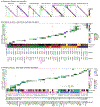
Extended Data Fig. 1 |
Extended Data Fig. 1 |. snRNA-seq libraries preprocessing and quality controls (QCs).
(a) Distributions across batches of: sex, cognitive diagnosis, Braak stage and CERAD score. (b) QC pipeline selecting 465 participants for cell atlas and 437 participants for downstream analysis including snRNA-seq libraries with a sufficient number of robustly assigned nuclei. (c) UMAP embeddings of two example snRNA-seq libraries prior to any QCs. Dot colour: predicted cell type (left) and prediction uncertainty (Shannon entropy, right). (d) Example snRNA-seq library manually curated for cells of low-quality libraries. Based on the manual curation of 10 such libraries, cell-type-specific low-quality thresholds over the number of UMIs (#UMI) and the number of unique genes (#Genes) were chosen. (e,f) Distributions of (e) # UMI and (f) #Genes threshold for low quality nuclei per cell type in the manually curated libraries, indicating selected thresholds. (g-i) Detection of doublet cells. UMAP embedding of example library annotated by (g) demultiplexing doublet annotation (demuxlet algorithm), or (h) DoubletFinder doublet-likelihood scores. (i) Distribution of the Matthews correlation coefficient (MCC) scores, reflecting prediction sensitivity, specificity and precision, for a range of thresholds over the DoubletFinder scores, per library (separate line, top), and the maximizing threshold chosen per library (dots, bottom). (j) UMAP embedding of the example library (in c) post-QCs, coloured by cell-type prediction. (k) Distribution of number of nuclei per participant. Dash line = minimum number of nuclei for a participant in the Discovery sample. (l) The average number of UMIs per cell type in each participant; Dots: individual participants (n = 465 participants per cell type). (m) Number of nuclei per cell type and participant: absolute (left) and proportions (right). Coloured by cell classes. Box: 1st and 3rd quartile, line: median, whiskers extend from box to the highest and lowest values within 1.5 times the distance between the quartiles.
Extended Data Fig. 2 |
Extended Data Fig. 2 |. Glial subpopulation diversity.
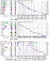
(a,d,g) Subpopulation proportions across participants for (a) microglia, (d) astrocytes and (g) oligodendroglia cells. Dots: 465 individual participants. Box: 1st and 3rd quartiles; line: median, whiskers extend to the highest and lowest values within 1.5 times the distance between the quartiles. (b,e,h) QC measures. Distributions of number of UMIs and number of Genes detected for each subpopulation of (b) microglia, (e) astrocytes and (h) oligodendroglia. (c,f,i) Selected markers and top differentially expressed genes between subpopulations. Gene expression (columns) across subpopulations (rows) of (c) microglia, (f) astrocytes and (i) oligodendroglia. Dot colour: mean expression in expressing cells. Dot size: percent of cells expressing the gene.
Extended Data Fig. 3 |
Extended Data Fig. 3 |. Comparison of glial subpopulation to previously defined gene signatures.
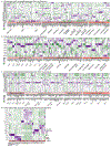
Heatmap of previous signature genes (rows) for cell subpopulations (columns) of (a) microglia, (b) astrocytes and (c) oligodendroglia, separated by signature and split by reference source. Colour-scale: row scaled expression out of expressing cells. Genes defined in multiple signatures appear multiple times. (d) Comparison of previous gene signatures to subpopulations of the vascular niche. Scaled mean signature score of published gene signatures (columns) within each subpopulation (rows). (*) = Significantly enriched signatures (U-test, FDR<0.01). Published signatures from,,.
Extended Data Fig. 4 |
Extended Data Fig. 4 |. Vascular niche- and neuronal subpopulation diversity.
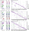
(a,d,g) Subpopulation proportions across participants for (a) vascular niche cells, (d) inhibitory neurons and (g) excitatory neurons. Dots: 465 individual participants, box: 1st and 3rd quartiles, line: median, whiskers extend to the highest and lowest values within 1.5 times the distance between the quartiles. (b,e,h) QC measures. Distributions of number of UMIs and number of Genes detected for each subpopulation of (b) vascular niche, (e) inhibitory neurons and (h) excitatory neurons. (c,f,i) Selected markers and top differentially expressed genes between subpopulations. Gene expression (columns) across subpopulations (rows) of (c) vascular niche, (f) inhibitory neurons and (i) excitatory neurons. Dot colour: mean expression in expressing cells. Dot size: percent of cells expressing the gene.
Extended Data Fig. 5 |
Extended Data Fig. 5 |. Clustering quality and neuronal subtypes annotations.
(a) Quality measures of clustering showing the cohesion within each cluster and separation between clusters. For each cluster (row) showing the distribution of shared nearest neighbours assigned to other clusters (columns) For each cell class. Coloured by the fraction of shared nearest neighbours. Rows and columns are sorted by the cluster number. (b-c) Classification of (b) excitatory and (c) inhibitory neuronal cells, by previous annotations provided by the Allen Brain Map. Heatmaps of the percentage of cells from each of our clusters assigned to each of the provided annotations (Methods) linking neuronal sub-types to marker genes of inhibitory and excitatory neurons and to cortical layers (colour bar).
Extended Data Fig. 6 |
Extended Data Fig. 6 |. CelMod predictions and endophenotype associations.
(a) Evaluation of CelMod prediction of subpopulation proportions in bulk RNA samples with matching snRNA-seq measurements in the same participant (n = 419 samples). Spearman correlation between snRNA-seq (actual) and CelMod bulk-predicted proportions, over the held-out set (test set) of participants (Methods). * = FDR corrected p-value. (b) Comparison of the estimated effect sizes regressing endophenotypes on subpopulation proportions, for the snRNA-seq (Discovery cohort, x-axis) and the bulk predictions (Replication cohort, y-axis). n = 419. The Spearman correlation between the effect sizes and FDR corrected p-value are shown for each comparison. (c) Associating subpopulation proportions to endophenotypes: CERAD score, Braak stage and AD dementia (linear regression controlled for cofounders, FDR<0.05, Methods), showing subpopulations significantly associated with at least one of the tested traits in one on the cohorts: Discovery (left, n = 437), Replication (centre, n = 673) and the meta-analysis of both cohorts (right, n = 1,110). Colour scale: t-stat. (d-h) Causal mediation models which together with Fig. 3f–i position Mic.12, Mic.13, Ast.10 and Oli.7 within the Aβ→tau→cognitive decline AD cascade, indicating direct and mediated effects, as well as proportion of effect mediated. Number of participants: (d,e,g) n = 432, (f) n = 413, (h) n = 433. (i) Validation of the structural equation model (SEM; as in Fig. 3j) in the CelMod predicted subpopulation proportions of the Replication cohort. Arrows show association directionality and relative strength.
Extended Data Fig. 7 |
Extended Data Fig. 7 |. smFISH quantification analysis.
(a) Gene expression (columns) across microglial subpopulations (rows) for selected differential genes and known markers. Dot colour: column-scaled mean expression of expressing cells. Dot size: percentage of expressing cells. (b) Gene expression of markers used for smFISH across microglial subpopulations. Dot colour and size as in (a). (c) A gallery of representative RNAscope smFISH data showing split channels by marker: CPMhigh Mic.12, TPRG1high Mic.13, and a MRC1high macrophage, together with IBA1 (green) and DAPI (blue) staining. (d) Bivariate expression distributions in snRNA-seq (top) and smFISH (bottom), coloured by assigned snRNA-seq subpopulations (top) predicted assignment in smFISH data (bottom, Methods).
Extended Data Fig. 8 |
Extended Data Fig. 8 |. Robustness of cellular landscape modelling by BEYOND.
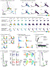
(a) 3D PHATE embedding of all 437 snRNA-seq participants, coloured by clustering of participants based on their cellular environments (Methods). (b) Distinct patterns of subpopulations along the cellular landscape manifold, showing additional subpopulations to those of Fig. 5c. Participants (dots) are coloured by the locally smoothed proportion of each subpopulation. (c) Robustness of the cellular landscape to the embedding method and set of subpopulations used in BEYOND. Participants are coloured by the locally smoothed subpopulation proportion. (d-e) Visualizing fitted pseudotime, trajectories and Shannon entropy of trajectory probabilities outputted by: (d) VIA (n = 437 participants), and (e) Palantir algorithms (n = 386, excluding participant-clusters #9 and #10 in a).(f) Robustness of trajectories and pseudotime predictions using different algorithms (over the overlapping n = 386 participants). (Top) Pseudotime assigned for each individual by Palantir compared to VIA. (Bottom) Trajectory probabilities Pearson correlations. Corrected for multiple hypothesis testing (BH). (g) Participants’ trajectory probabilities entropy drop along pseudotime, in the Palantir model. Dots are coloured by prAD minus ABA trajectory probabilities. The grey area indicates a pseudotime range (0, 0.11) in which the two trajectories are not well separated. (h) Trait-dynamics of AD-related traits along the pseudotime in each of the inferred trajectories, showing the datapoints used in fitted curves and error bands showing 0.95 CI (Methods). n = 386 participants. As in Fig. 5f. (i-j) Validation of cellular landscapes and trajectories using the Replication cohort (n = 673 non-overlapping participants, with the 62 reliable CelMod bulk-predicted subpopulations proportions to represent cellular environments). (i) The Palantir model over replication landscape as in (e). (j) Trajectory probabilities entropy drop as in (g) but over the replication landscape.
Extended Data Fig. 9 |
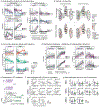
Extended Data Fig. 9 |. Cellular dynamics and communities.
(a) Distinct patterns of subpopulation dynamics, as Fig. 6a with datapoints used to fit the curves. Dots are participants (n = 386). Error bands: 0.95 CI. (b) Graph of multi-cellular communities. Nodes: Subpopulations. Edges: co-occurrences (Spearman correlation, green-purple scale) or dynamics similarity (white-red scale). Excluding edges of low similarity (correlation (−0.2, +0.4), dynamics (−0.2, +0.2)) for visualization. See Fig. 6b. (c) Distinct dynamic patterns for cellular communities across trajectories. Whole-community dynamics of community proportion along pseudotime in each trajectories. Dots are individual participants (n = 386). See Fig. 6c. Error bands: 0.95 CI. (d) Validation in the Replication cohort of coordinated subpopulation dynamics along trajectories. Presented as in Fig. 6a, but over the replication landscape. Error bands: 0.95 CI. (e-g) Spatial transcriptomics (ST, Visum, Methods) validations of cellular communities. Dots are individual participants (n = 637). (e) Discovery cohort participants included in ST validations (n = 10), and their assignment to trajectories (annotated as: Early, prAD or ABA). 2D PHATE embedding as in Fig. 5b. (f) Pearson correlation between Mic.13 and Ast.10 gene signature expression across the Visium spots for each of the participants, grouped by their trajectory assignment. Dots: signature expression in visium spots. Line: regression line. Error bands: 0.95 CI of regression line. P-value: one-sided T-test (positive association), FDR corrected for multiple hypothesis, dot fill colour indicates significance of correlation. (g) Divergent association of Ast.10 and Ast.5 between the two trajectories. Distribution of Ast.10 and Ast.5 gene signature expression for each participant (n = 10), grouped by their trajectory assignment. Per participant, significance of the differences of means were tested by one-sided t-test: (1) for prAD participants: Ast.10 levels being strictly higher than Ast.5 levels, and (2) for ABA participants: Ast.5 levels being significantly higher than Ast.10 levels (Methods). Significance level is shown by the dot fill colour.
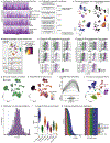
Fig. 1 |
Fig. 1 |. Cellular atlas of the human aged DLPFC in older individuals.
a, Overview of the experimental and analytic steps. b,c, Clinicopathologic characteristics of the 465 ROSMAP participants. b, Participants’ age of death, final cognitive diagnosis and distribution of pathologic hallmarks of AD, Aβ (CERAD score) and tau (Braak score) (Methods). Additional details are provided in Supplementary Table 1. c, The load of Aβ pathology (x axis) compared to the load of tau pathology (y axis) among participants. Dots and triangles indicate female and male participants, respectively, coloured by their rate of cognitive decline. d, The ageing-DLPFC atlas. UMAP embedding of 1,649,672 single-nucleus RNA profiles from the DLPFC of participants. Major cell types are noted; shades highlight some of the 95 different cell subpopulations. e, The atlas scale. The number of nuclei per cell type in each participant is shown. Dots represent individual participants (n = 465 per cell type). Additional quality-control graphs are shown in Extended Data Fig. 1. Exc., excitatory; inh., inhibitory; oligodend., oligodendrocytes. f, Cellular diversity. The proportions of cell subpopulations across participants are shown. The stacked bar plots show cell subpopulation proportions per participant within each major cell type, colour coded by cell type and shaded by subpopulations. For the box plots in b and e, the box limits show the first and third quartiles, the centre line shows the median value, and the whiskers extend to the highest and lowest values within 1.5× the distance between the quartiles.
Fig. 2 |
Fig. 2 |. Cell subpopulation diversity in DLPFC of aged individuals.
a,c, Subpopulations of microglia (a) and astrocytes (c). UMAP embeddings of single nuclei profiled using snRNA-seq, coloured by clusters, and annotated for subpopulation, indicating selected marker genes and enriched upregulated pathways. b,d, Comparison of previous gene signatures to subpopulations of microglia (b) and astrocytes (d). Scaled mean signature score of published gene signatures (columns) within each subpopulation (rows). Asterisks indicate significantly enriched signatures (U-test, FDR < 0.01). Microglial,, and astrocytic,, signatures were published previously. The ref. signatures are from an integrated atlas including the datasets of refs. ,,. eh, The diversity of oligodendroglia (e), vascular niche cells (f) and excitatory (g) and inhibitory (h) neuronal cells. UMAP embeddings of nuclei, coloured by subpopulations. Additional annotations and details on the cell atlas are provided in Extended Data Figs. 2–5 and Supplementary Table 2. DAA, disease associated astrocyte; Int, integrated cluster; Proto, protoplasmic astrocytes; MFOL, myelin forming oligodendrocytes; SMC, smooth muscle cell; aSMC, arterial SMC; vSMC ventricular SMC.
Fig. 3 |
Fig. 3 |. Associating subpopulations with AD-related endophenotypes and causality modelling along the AD cascade.
a, Overview of analysis and cohorts: the discovery analysis includes 437 participants with snRNA-seq data; the replication analysis includes 673 non-overlapping participants with CelMod-estimated subpopulation proportions from bulk RNA-seq data; and a meta-analysis of both datasets. bd, The association between subpopulation proportions and endophenotypes—neocortical Aβ load, neocortical tau load and the rate of cognitive decline (linear regression controlled for confounders, FDR < 0.05; Methods); we find subpopulations that are significantly associated with at least one of the tested traits in one on the cohorts: discovery sample (snRNA-seq measurements, n = 437 participants; b); replication sample (bulk RNA estimations, n = 673 participants; c); and meta-analysis of discovery and replication samples (n = 1,110 participants; d). The colour scale shows the association effect size, indicating the direction and strength from negative (green) to positive (purple) associations. e, The causal modelling framework for positioning a subpopulation’s effect upstream of an endophenotype, mediating the effect of one endophenotype on another, or mediating the effect of a different subpopulation on an endophenotype. fi, Causal mediation models positioning Mic.12, Mic.13 and Ast.10 within the Aβ→tau→cognitive decline AD cascade, indicating direct and mediated effects, as well as the proportion of effect mediated. The numbers of participants were as follows: n = 432 (fh) and n = 433 (i). j, SEM positioning Mic.12, Mic.13, Ast.10 and Oli.7 within the AD cascade. Integration of all of the independent mediation results (fi; Extended Data Fig. 6d–h) in a SEM. The arrows show the association directionality and relative strength, and indicate whether association was replicated in the replication sample (solid, P < 0.05) or not (dashed). The letter indicates the guiding mediation model. Nobs, number of observations (participants); r.m.s.e.a., root mean square error of approximation.
Fig. 4 |
Fig. 4 |. Distinct AD associated Mic.12 and Mic.13 subpopulations.
a,b, Enriched pathways by Mic.12 and Mic.13 subpopulations. Upregulated (purple) or downregulated (green) pathways of Mic.12 or Mic.13 compared with all microglia (a) or Mic.13 compared with Mic.12 (b). The colour scale shows the −log10[FDR] of enrichment (hypergeometric test, FDR < 0.05; Methods). c, Distinct gene expression patterns for Mic.12 and Mic.13. The dot colour shows the mean expression in expressing cells (column scaled); the dot size shows the percentage of cells expressing the gene. All microglial subpopulations are shown in Extended Data Fig. 7a. dg, Validation using RNAscope and immunohistochemistry images of independent DLPFC brain samples. d, Validation of distinct microglial cells expressing the Mic.12 or Mic.13 markers. Representative RNAscope images (out of 27,892 images) showing microglia/myeloid cells (green, anti-IBA1 immunofluorescence), nuclei (blue, DAPI), and RNAscope targeting CPM (cyan, Mic.12 marker), TPRG1 (red, Mic.13 marker) and MRC1 (magenta, macrophage marker). The arrows indicate examples of CPMhigh, TPRG1high and MRC1high cells positive for a single marker. snRNA-seq marker expression and additional images are provided in Extended Data Fig. 7b,c. e, The expression distributions of marker genes for Mic.12 and Mic.13 measured using snRNA-seq (left) and smFISH (right) analysis of IBA1+ cells. The dot colour shows the subpopulation annotation (Methods). f, Association of Mic.12 and Mic.13 RNAscope proportions with tau-tangle pathology load quantified by immunohistochemistry using anti-phosphorylated Tau antibody AT8 (as the total area occupied; Methods). Dots are coloured by participant clinical diagnosis. The error bands show the 95% confidence intervals. g, Association of Mic.12, Mic.13 and macrophage RNAscope proportions with morphological features captured in the same smFISH images (Methods). The colour scale indicates the effect size. h, Association of snRNA-seq Mic.12 and Mic.13 proportions to previous neuropathologic activated microglia classification (PAM). The PAM score is the square root of stage III activated macrophage-appearance microglial density proportion (Methods). The colour scale shows the association effect size between snRNA-seq proportions to PAM score (histopathology). Right, associations with corrected proportions of Mic.12 and Mic.13 (corrected to Mic.13 and Mic.12 proportions, respectively).
Fig. 5 |
Fig. 5 |. Modelling the cellular landscape manifold uncovered distinct trajectories of brain ageing leading to AD or ABA.
a, Schematics of the BEYOND algorithm: representing participants by their cellular environments (cellular compositions, step 1), aligning participants along trajectories of cellular change (step 2), inferring subpopulation and trait dynamics (step 3) and grouping of cellular communities (step 4). b, The structure of the cellular landscape manifold captured by BEYOND for the discovery sample. A 2D PHATE embedding of each participant (individual dots) is shown based on similarity of their cellular compositions (Methods). Dots are coloured by the difference in participants’ assigned trajectory probabilities. See also Extended Data Fig. 8a,d–f. c, Distinct patterns of subpopulation proportions along the cellular landscape manifold. The participants are coloured by the locally smoothed proportions of each subpopulation in the 2D embedding, showing distinct patterns for different subpopulations for representative examples along the cellular manifold. See also Extended Data Fig. 8b,c. d,e, Distinct patterns and dynamics of AD traits along the prAD and ABA trajectories, showing for neocortical Aβ, neocortical tau and cognitive decline distinct patterns in the cellular landscape manifold per AD trait. The plots are coloured by the locally smoothed density values of the trait per participant (embedded as in b) (d); and distinct trait dynamics along the pseudotime in each inferred trajectory (e; Methods). The error bands show the 95% confidence intervals. See also Extended Data Fig. 8g,h. f, Validation of the cellular landscape, trajectories and dynamics results by applying BEYOND to the independent replication sample (n = 673 participants) using only the 62 well-predicted subpopulations (FDR < 0.01; Extended Data Figs. 6a and 8i,j). For the replication manifold, two inferred trajectories of cellular changes (as in b) (top left); distinct densities for key subpopulations (as in c) (bottom left); and distinct AD-trait dynamics along the two directions (as in e), similar to the patterns over the discovery manifold (right) are shown. The error bands show the 95% confidence intervals.
Fig. 6 |
Fig. 6 |. Distinct multicellular communities change along each trajectory of brain ageing.
a, Subpopulation proportion dynamics along pseudotime in each trajectory. The error bands show the 95% confidence intervals. Similar dynamics were observed in the replication sample (Extended Data Fig. 9d). b, BEYOND identified multicellular communities of subpopulations (a schematic of the method is shown in Fig. 5a). Left, scaled dynamics of all subpopulations along both trajectories. Right, subpopulation similarity measures–pairwise correlations of proportions (co-occurrence, top) and dynamics similarity (bottom). Subpopulations are grouped by communities. See also Extended Data Fig. 9b. c, Distinct dynamic patterns of communities across trajectories. Community dynamics showing the cumulative change of subpopulation proportions along pseudotime in each trajectory. Right, shared pathways within specific communities. d, Associations between cellular community proportions and AD traits, coloured on the basis of the estimated effect size (linear regression t-test, FDR < 0.05). eg, Validation of cellular communities by spatial transcriptomics (Visium) of DLPFC sections from ten ROSMAP participants from the discovery sample. e, Joint densities of Mic.13 and Ast.10 marker gene expression on representative brain slices. See also Extended Data Fig. 9e. f, Intraparticipant spatial co-localization of Mic.13 and Ast.10, showing the correlation between signature levels per Visium spot (dot) for an example prAD-assigned participant (left); and all intraparticipant correlations (by trajectory assignment) (right). The dot colour shows the significance of correlation. P values were calculated using one-sided t-tests, testing higher correlations in prAD participants (FDR corrected; Extended Data Fig. 9f). g, Trajectory-specific enrichment of Ast.10 or Ast.5 gene signatures: the average signature level of participants by trajectory assignment (left); and comparison of the interparticipant log-ratio of Ast.10 to Ast.5 signature levels, per trajectory assignment (right). The dot colour indicates the significance of the intraparticipant difference (Extended Data Fig. 9g). P values were calculated using one-sided t-tests, testing interparticipant higher log-ratio in prAD participants. For the box plots in f and g, the box limits show the first and third quartiles, the centre line shows the median value, and the whiskers extend to the highest and lowest values within 1.5× the distance between the quartiles.

References

    1. Cain A et al. Multicellular communities are perturbed in the aging human brain and Alzheimer’s disease. Nat. Neurosci 26, 1267–1280 (2023). - PMC - PubMed
    1. Mathys H et al. Single-cell atlas reveals correlates of high cognitive function, dementia, and resilience to Alzheimer’s disease pathology. Cell 186, 4365–4385 (2023). - PMC - PubMed
    1. Yang AC et al. A human brain vascular atlas reveals diverse mediators of Alzheimer’s risk. Nature 603, 885–892 (2022). - PMC - PubMed
    1. Pandey S et al. Disease-associated oligodendrocyte responses across neurodegenerative diseases. Cell Rep. 40, 111189 (2022). - PubMed
    1. Luquez T et al. Cell type-specific changes identified by single-cell transcriptomics in Alzheimer’s disease. Genome Med. 14, 136 (2022). - PMC - PubMed

MeSH terms

LinkOut - more resources