Review
. 2024 Aug 29:10:e2286.
doi: 10.7717/peerj-cs.2286. eCollection 2024.

Comprehensive analysis of clustering algorithms: exploring limitations and innovative solutions

Affiliations
Review

Comprehensive analysis of clustering algorithms: exploring limitations and innovative solutions

Aasim Ayaz Wani. PeerJ Comput Sci. .

Abstract

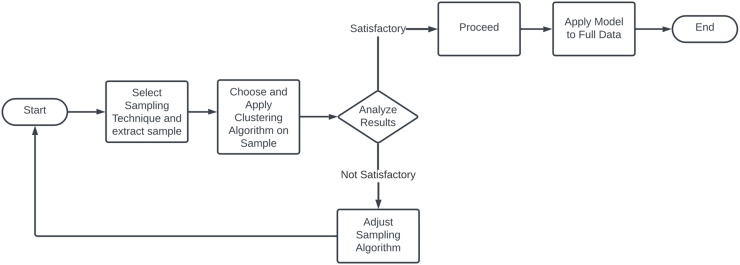
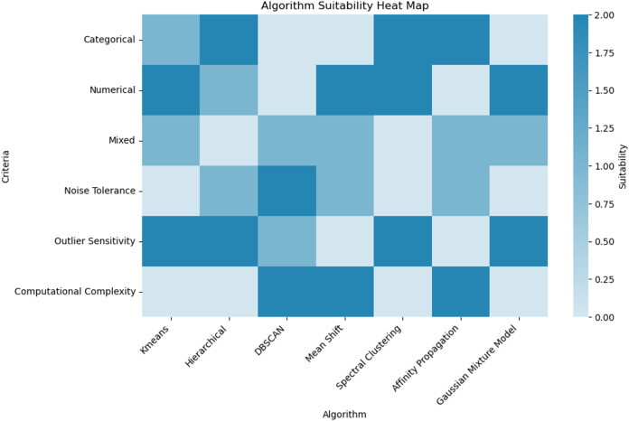
This survey rigorously explores contemporary clustering algorithms within the machine learning paradigm, focusing on five primary methodologies: centroid-based, hierarchical, density-based, distribution-based, and graph-based clustering. Through the lens of recent innovations such as deep embedded clustering and spectral clustering, we analyze the strengths, limitations, and the breadth of application domains-ranging from bioinformatics to social network analysis. Notably, the survey introduces novel contributions by integrating clustering techniques with dimensionality reduction and proposing advanced ensemble methods to enhance stability and accuracy across varied data structures. This work uniquely synthesizes the latest advancements and offers new perspectives on overcoming traditional challenges like scalability and noise sensitivity, thus providing a comprehensive roadmap for future research and practical applications in data-intensive environments.

Keywords: Centroid-based clustering; Clustering algorithms; Clustering challenges and solutions; Density-based clustering; Distribution-based clustering; Hierarchical clustering; Scalability and efficiency; Unsupervised learning.


Conflict of interest statement

The authors declare that they have no competing interests.

Figures

Figure 1
Figure 1. The plot has been generated using simulated data from sklearn.datasets ‘make blobs’.
These plots depict the results of applying the K-means clustering algorithm with incremental cluster counts (k = 2, 3, 4, 5) to a multidimensional dataset. Each panel represents the clusters identified by the algorithm with centroids marked by red crosses. The progression from k = 2 to k = 5 demonstrates the algorithm’s behavior in partitioning the data into increasingly specific groups based on the Euclidean distances between data points. This visualization serves to underscore the potential for over-segmentation inherent in K-means when increasing k without employing a rigorous method to determine the optimal number of clusters, such as the elbow method or silhouette scores. This sequence of clustering highlights the critical balance between capturing genuine data structure and avoiding the imposition of artificial divisions within the dataset.
Figure 2
Figure 2. The plot has been generated using simulated data from sklearn.datasets ‘make moons’ using the two-dimensional scatter plots.
Operational mechanics of DBSCAN Clustering: Illustrates the classification of points into core, border, and noise categories within DBSCAN, showing the algorithm’s robustness to noise and its ability to form arbitrarily shaped clusters.
Figure 3
Figure 3. The plot has been generated using simulated data from sklearn.datasets ‘make moons’ using the two-dimensional scatter plots.
The plot is highlighting the classification of data points in cluster Analysis: Depicts core, border, and noise classifications typical in density-based clustering algorithms.
Figure 4
Figure 4. K-means clustering results with and without Voronoi diagram.
The left plot demonstrates the K-means clustering result for a dataset consisting of four distinct clusters. The clusters are distributed across the plot as follows: the upper left quadrant contains a cluster of points tightly grouped around a centroid located approximately at coordinates (−5, 5); the upper right quadrant features another cluster centered around coordinates (5, 5); the lower left quadrant includes a cluster centered near coordinates (−5, −5); and the lower right quadrant has a cluster centered around coordinates (5, −5). In the right plot, the same K-means clustering result is displayed with the addition of a Voronoi diagram. The Voronoi diagram partitions the plane into regions where each region contains all the points closest to a particular cluster centroid. The partitioning lines delineate these regions. The centroids of the clusters are marked within each region, demonstrating the areas of influence each centroid has over the surrounding points.
Figure 5
Figure 5. Comparative visualization of the K-means and DBSCAN clustering algorithms.
The left plot, representing K-means clustering, demonstrates how it imposes spherical cluster shapes and evenly distributes data points among a predefined number of clusters, which may not align with the natural groupings within the data. Conversely, the right plot, representing DBSCAN clustering, effectively identifies clusters based on data density, accommodating clusters of varied shapes and sizes. This capability of DBSCAN to adapt to data distribution without pre-specifying the number of clusters is particularly advantageous for datasets with complex spatial relationships and varying densities, highlighting its superiority in scenarios where the distribution of data points is non-uniform or when the presence of noise and outliers is significant.
Figure 6
Figure 6. The plot has been generated using simulated data from sklearn.datasets ‘make circles’.
Efficiency of spectral clustering vs. K-means on concentric circles: The left plot demonstrates spectral clustering’s capability to segregate non-linearly separable structures, effectively clustering concentric circles. Conversely, the right plot illustrates K-means’ limitations, misclassifying similar datasets due to its assumption of globular cluster shapes. This comparison underscores spectral clustering’s adaptability to complex data geometries, outperforming K-Means which struggles with non-spherical distributions.
Figure 7
Figure 7. The plot has been generated using simulated data from sklearn.datasets ‘make s curves’.
Comparative analysis of K-means and Gaussian mixture model on an S-Curve Dataset: The left plot shows K-means’ limitations with linear segmentation that overlooks the dataset’s intrinsic curvature, resulting in an oversimplified cluster representation. In contrast, the right plot demonstrates how the Gaussian mixture model leverages a probabilistic approach for soft clustering, which adapts flexibly to the S-curve’s continuous nature and density variations, illustrating its effectiveness in handling non-linear data distributions.
Figure 8
Figure 8. Progressive addition of noise to clusters: plots A through D depict the effect of incrementally increasing noise on a dataset originally consisting of four clusters.
Noise points are shown in the same color as the original clustering section colours. The red stars indicate the centroids of the clusters after applying K-means clustering.
Figure 9
Figure 9. Contrasting clustering algorithms on multimodal data: the left plot illustrates K-means clustering with spherical assumptions, highlighting its limitations through misaligned centroids and overlapping clusters due to its inability to account for non-spherical distributions.
The right plot displays GMM, effectively capturing the underlying data structure with ellipsoidal components that conform to the data’s true distribution, showcasing GMM’s flexibility in modeling complex cluster shapes and orientations.
Figure 10
Figure 10. Flowchart of drift detection.
Figure 11
Figure 11. Flowchart of online clustering methodology.
Figure 12
Figure 12. Flowchart of minibatch clustering methodology.
Figure 13
Figure 13. Flowchart of sample clustering methodology.
Figure 14
Figure 14. Algorithm suitability heat map for clustering techniques.
This heat map provides a comparative analysis of various clustering algorithms against specific criteria relevant to data type and algorithm performance. Each cell is color-coded to indicate the suitability of an algorithm for a given criterion, ranging from light to dark blue. The criteria evaluated include the handling of categorical, numerical, and mixed data types, noise tolerance, outlier sensitivity, and computational complexity. This visual representation aids in selecting the most appropriate clustering algorithm based on specific requirements and data characteristics.

Similar articles

Cited by

References

    1. Aggarwal CC, Philip SY, Han J, Wang J. A framework for clustering evolving data streams. Proceedings 2003 VLDB Conference; Amsterdam: Elsevier; 2003. pp. 81–92.
    1. Al-mamory SO, Kamil IS. A new density based sampling to enhance dbscan clustering algorithm. Malaysian Journal of Computer Science. 2019;32(4):315–327. doi: 10.22452/mjcs.vol32no4.5. - DOI
    1. Ankerst M, Breunig MM, Kriegel H-P, Sander J. Optics: ordering points to identify the clustering structure. ACM Sigmod Record. 1999;28(2):49–60. doi: 10.1145/304181.304187. - DOI
    1. Arthur D. K-means++: the advantages if careful seeding. Proceeding Eighteenth Annual ACM-SIAM Symposium on Discrete Algorithms; 2007. pp. 1027–1035.
    1. Azen R, Walker CM. Categorical data analysis for the behavioral and social sciences. Milton Park: Routledge; 2021.

LinkOut - more resources