. 2025 Apr;22(4):778-787.
doi: 10.1038/s41592-024-02440-1. Epub 2024 Sep 27.

Tracking neurons across days with high-density probes

Affiliations

Tracking neurons across days with high-density probes

Enny H van Beest et al. Nat Methods. 2025 Apr.

Abstract

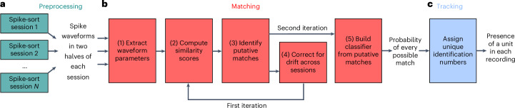
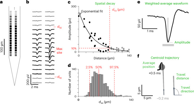
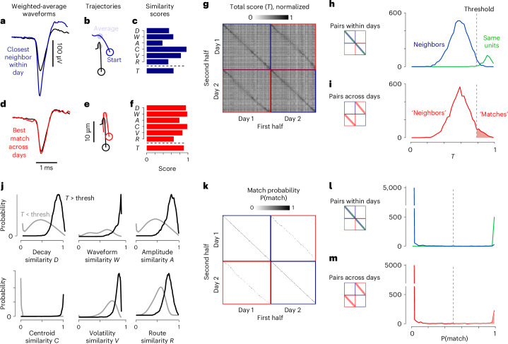
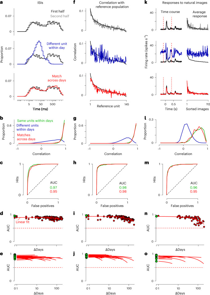
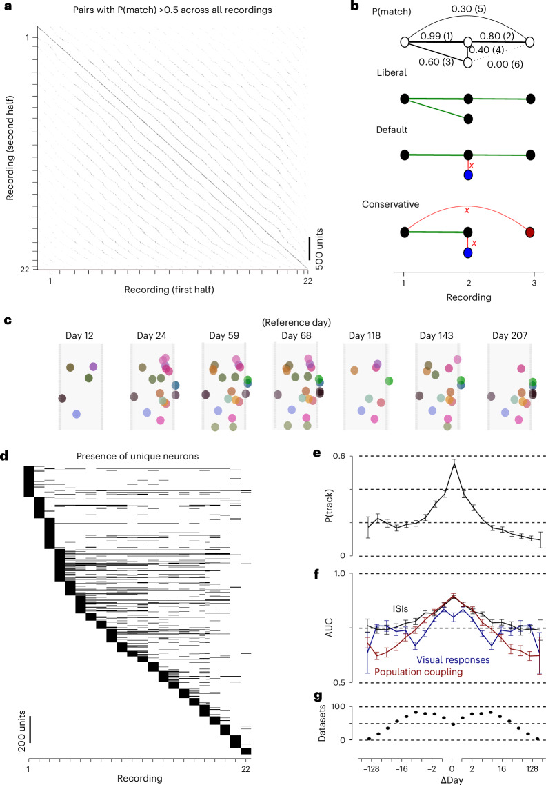
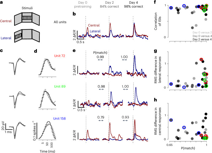
Neural activity spans multiple time scales, from milliseconds to months. Its evolution can be recorded with chronic high-density arrays such as Neuropixels probes, which can measure each spike at tens of sites and record hundreds of neurons. These probes produce vast amounts of data that require different approaches for tracking neurons across recordings. Here, to meet this need, we developed UnitMatch, a pipeline that operates after spike sorting, based only on each unit's average spike waveform. We tested UnitMatch in Neuropixels recordings from the mouse brain, where it tracked neurons across weeks. Across the brain, neurons had distinctive inter-spike interval distributions. Their correlations with other neurons remained stable over weeks. In the visual cortex, the neurons' selectivity for visual stimuli remained similarly stable. In the striatum, however, neuronal responses changed across days during learning of a task. UnitMatch is thus a promising tool to reveal both invariance and plasticity in neural activity across days.


Conflict of interest statement

Competing interests: The authors declare no competing interests.

Figures

Fig. 1
Fig. 1. The UnitMatch pipeline.
a, Preprocessing. The user performs spike sorting on each recording session and computes the average spike waveform of each unit in each half of each recording. b, Matching. UnitMatch extracts key parameters from each waveform (step 1) and uses them to compute similarity scores for each pair of units across all pairs of recordings (step 2). It then uses within-day cross-validation to identify a similarity score threshold for putative matches (step 3). It corrects for drift across recordings (step 4), and repeats steps 2 and 3 to recompute the putative matches. Finally, it builds probability distributions for the similarity scores for putative matches and feeds them to a classifier to assign a probability to every possible match across all pairs of recordings (step 5). The result is a probability for every pair of neurons across all recordings to be a match. c, Tracking. UnitMatch uses the probabilities output by the previous stage to track individual units across multiple sessions.
Fig. 2
Fig. 2. Extracting spike waveform parameters.
a, The bottom of one shank and its recording sites. b, The average spike waveform for an example unit, in the 22 recording sites marked in black in a and in 12 adjacent sites (gray). c, The amplitude of the waveform as a function of distance to ‘max site’ for the example unit. Using an exponential decay fit (curve), we defined the distance d10 at which the amplitude drops to 10% of the maximum. Spatial decay is computed from the slope of the amplitude decrease over distance. d, The distribution of d10 for all units in two example recordings, showing the median (solid line) and the 95% confidence interval (dashed lines). e, The weighted-average waveform for the example unit in b and c, computed by giving larger weight to sites near the maximum site. The unit’s amplitude is taken from this weighted-average waveform. f, The centroid trajectory of the example waveform from 0.2 ms before the peak (bottom) to 0.5 ms after the peak (top), showing the average centroid (circle). The travel direction and distance are calculated at each time point.
Fig. 3
Fig. 3. Computing similarity scores and setting up the classifier.
a, The average weighted waveform for the example unit in Fig. 2 (black) and for a different unit (the nearest physical neighbor) from the same recording (blue). b, Centroid trajectories for the two units. The average position is shown by the shaded circle on the trajectory. c, The six similarity scores between the two units and their average, the total similarity score T. df, The same as a (d), b (e) and c (f), comparing the example unit (black) with the most similar unit across days (red), which was very likely to be the same neuron. g, The total similarity score for all pairs of units within days (blue squares) and across days (red squares), for an example pair of recordings, showing the first half of each recording (columns) versus the second half (rows). The data are sorted by shank, and then by depth on the shank. h, The distribution of total similarity scores in the two halves of a recording day, shown for the same units across the two halves (green) and for other neighboring units (centroid <50 μm away; blue). i, The same as h, but for units measured across days (red) after drift correction. The threshold (thresh) for putative matching (dashed line) depends on the number of units and of recordings. j, The probability densities of each similarity score, for putative matches (black) and for putative nonmatches (gray). k, Match probability P(match) computed by the naive Bayes classifier trained with the probability distributions in i. Format as in g. l, The distribution of match probabilities across two halves of the same day for same units (green) and neighbors (blue). Format as in h. m, The same as l, but for units recorded across days (red). If probability is >0.5, UnitMatch defines a pair as a match.
Fig. 4
Fig. 4. Validation with stable functional properties.
a, Histogram of ISIs of an example unit for both halves of the recording (top), of one of its neighbors (middle) and of the example unit’s match on the next day (bottom). b, The distribution of the correlation in ISI histograms for pairs of waveforms coming from the same unit (green) or different units (blue) within days and matches across days (red). Data from two consecutive days in an example mouse. c, ROC curves when classifying the correlations in ISI histograms of the same versus different units within days (green) or matching versus nonmatching units across days (red). Data from two consecutive days in an example mouse. d, The AUC for many pairs of days, spaced by different amounts (red dots). The AUC of the same versus different units within recordings is also shown (green). Stability was estimated with a linear fit (curve). The discriminability remained highly stable, even across months. Data from an example mouse. e, AUC for many pairs of days, across many mice and recording locations. The x axis indicates the number of days between the pair. f, The correlation of the firing rate of a unit with other units forming a reference population that was tracked across days using UnitMatch. The correlation of a unit (black), one of its neighbors (top, blue) or its match on the next day (bottom, red) is shown. The neurons in the reference population were ordered by decreasing correlation with the unit from day 1 (black). gj, The same as b (g), c (h), d (i) and e (j) but using the correlation with a reference population as a fingerprint. k, Comparison of the responses with natural images for a unit and one of its neighbors (top) or its match on the next day (bottom). The responses to the images were summarized by averaging over all images to obtain the time course (left) or averaging over time to obtain the responses to individual images (right). These two profiles were then concatenated to form a single fingerprint, which was compared across units. Images were ordered by decreasing response of the black unit. lo, The same as b (l), c (m), d (n) and e (o) but using the responses to natural images as a fingerprint.
Fig. 5
Fig. 5. Tracking neurons over many recordings.
a, The match probability P(match) of every pair of neurons in every pair of sessions, for an example mouse (ID1). The ticks on the axes indicate different recording sessions. b, Top: an illustration of unit tracking for four example units across three recordings, with match probabilities ranging from 0.00 to 0.99, sorted from high to low (brackets). Bottom: the outputs of the three versions of the algorithm to track neurons across many recordings, showing connections that support (green) or block (red) units being given the same identity (same color). For example, the ‘default’ version of the algorithm finds two distinct units, one appearing in all 3 days (black) and one appearing only on day 2 (blue). c, A population of neurons that was tracked over 195 days in the example mouse. Other neurons on the probe are not shown. Note that some neurons can disappear on some days and reappear on other days. d, The presence (black) of a unique neuron across recordings, sorted by first appearance. e, The average probability of tracking a unit P(track) (±s.e.m.) as a function of days between recordings. The number of tracked neurons was divided by the total number of neurons available in the future recording (negative Δdays) or past recording (positive Δdays). The number of datasets per bin is indicated in g. f, The average AUC values (±s.e.m. across datasets) when comparing the functional similarity scores of tracked versus nontracked neurons, for ISI histogram correlations (black), correlation with reference population (red) and responses to natural images (blue). The number of datasets per bin is indicated in g. g, The number of datasets per bin.
Fig. 6
Fig. 6. Tracking units across learning.
a, Mice were implanted with chronic Neuropixels probes in the striatum and were trained to move a stimulus from the lateral screen to the central screen using a steering wheel. The responses of the neurons were then measured again during passive viewing of lateral and central stimuli. b, The average baseline (−0.2 to 0 s before stimulus onset) normalized firing rate (ΔR/R) aligned to stimulus onset (dashed line) during passive viewing of central stimuli (red) or lateral stimuli (blue), sorted by training day (left: day 0, middle: day 2, right: day 4) for the average population of tracked neurons (n = 12). Behavioral accuracy of the mouse is expressed in percentage correct. c,d, The average waveforms (c) and ISI histograms (d) across 3 days for three example tracked neurons. e, The same as in b, but for individual neurons. f, The correlation of ISIs between days 0 and 2 (light gray), days 0 and 4 (gray) and days 2 and 4 (dark gray), for individual neurons (n = 12), against match probability P(match). The example neurons are indicated by color. g, The same as f, but for the root mean square difference between (normalized) lateral responses. h, The same as f, but for the root mean square difference between (normalized) central responses.
Extended Data Fig. 1
Extended Data Fig. 1. Bombcell output distributions for an example dataset.
a-l, For all the units in an example dataset (Mouse ID 1, Extended Data Table 1) we measured 12 parameters. Each panel shows the number of units that passed (green section of the abscissa) or did not pass (red section) the selection based on that parameter. The parameters are: a, Number of detected peaks. b, Number of detected troughs. c, Somatic waveform. d, Estimated percentage of refractory period violations. e, Estimated percentage of spikes below the spike sorting algorithm's detection threshold, assuming a Gaussian distribution of spike amplitudes. f, Total number of spikes. g, Mean raw absolute waveform amplitude (μV). h, Spatial decay slope (fit). i, Waveform duration (μs). j, Waveform baseline ‘flatness’, defined as the ratio between the maximum value in the waveform baseline and the maximum value in the waveform. k, Presence ratio (of total recording time), defined as the fraction of bins that contain at least one spike. l, Signal-to-noise ratio. m, Waveforms of units that survived all quality metrics thresholds.
Extended Data Fig. 2
Extended Data Fig. 2. UnitMatch performance.
a, Left: Zoom in on Fig. 2j on some units along the main diagonal. On the diagonal we expect the matching probability P(match) to be close to 1, off diagonal we expect P(match) to be close to 0. Right: Unexpected matches (%) and nonmatches (%) by UnitMatch relative to units that were defined as good single units within a day by Kilosort. UnitMatch was either run on individually sorted data (closed circles), or on concatenated data (open circles). Colors depict individual mice, and refer to colors in c. b, Pairs of consecutive recording days (%) for acute (gray) and chronic (black) recordings as a function of the percentage of tracked units. The percentage of tracked units is defined as the number of matched units between two consecutive recording days divided by the number of units on the recording day with the least recorded units. c, Venn diagrams for five individual mice illustrating the overlapping pairs of units assigned as ’match’. d, Units matched within or across two (concatenated) consecutive days by UnitMatch (left) and Kilosort (right) for five mice. Dark parts of the bars show the overlap with curated matches, light parts of the bar the matches additionally made by the respective algorithm. e, AUC value for ISI histogram correlations (left) and reference population correlations (right) for matches versus non-matches found by UnitMatch (x-axis) versus Kilosort (y-axis) for the same five mice as in C. f, same as e, but for multiple pairs of days of mouse ID1. ΔDays given by color bar.
Extended Data Fig. 3
Extended Data Fig. 3. Expert curation.
Example of a figure seen by the six expert curators that were asked to judge whether the black and gray waveforms came from the same unit. Curators could score a pair with ‘1’ (match), ‘0’ (unsure), or ‘−1’ (not a match). This example was found to be a match by both UnitMatch and stitched Kilosort. a, Average waveform across recording sites. b, Maximum recording site indicated (note, they overlap) on a 4-shank Neuropixels. c, Centroid trajectories. d, Average waveforms. e, Normalized waveforms (peak to base stretching). f, Same as c, but shown next to each other for black and gray unit. g, Spike times (x-axis) versus amplitude (y-axis), with the amplitude distribution next to it. Note that the amplitudes for ‘gray’ are drawn above ‘black’ for visibility. h, Autocorrelogram. i, Inter spike interval distribution. j, Reference population cross-correlation, which was 1 for this specific pair. k, reference population cross-correlation values between this pair of units (black line), relative to other possible pairs of units (distribution). Rank 2 means this cross-correlation value is the second highest of all possible pairs.
Extended Data Fig. 4
Extended Data Fig. 4. Quality metrics predict whether UnitMatch can find a match for a unit.
We evaluated the predictive value of different quality measures (Bombcell output; Fabre et al., 2023) on whether a match could be found for units included in our analysis. An AUC can be computed for each quality metric to quantify whether this metric differs across matches and non-matches. If the AUC is above (or below) 0.5, it means that units for which UnitMatch could find a match had a higher (or a lower) value for this parameter than the units that were left matchless. Each plot shows the distribution of AUC values and the median AUC value, across all 189 unique chronic recording datasets in 25 mice. To assess significance, we used two-sided t-tests (uncorrected for multiple comparisons). Red color of the median line indicates p<0.01. a, spikes missing, b, number of spikes, c, presence ratio, d, number of refractory period violations, e, baseline ‘flatness’, f, peak amplitude, g, amount of drift, h, waveform duration, i, number of peaks, j, spatial decay slope, and k, signal-to-noise ratio.
Extended Data Fig. 5
Extended Data Fig. 5. Units can be tracked across pairs of recordings separated by many days.
a, Number of matched units for each pair of days in one example animal. b, AUC of the inter-spike intervals (ISI). Only pairs of recordings with at least 20 tracked units are shown. c, AUC of the correlations with a reference population. d, AUC of the natural images responses. Protocols with natural images were not performed every day, and only recordings with at least 20 matched units are shown. e-h, Other example animals. All first four recordings were performed in visual cortex, and the last one was performed in frontal cortex.
Extended Data Fig. 6
Extended Data Fig. 6. Comparison to the EMD method.
a, We tested the performance of the EMD algorithm and UnitMatch on matching neurons from two halves of the same session in five mice. Note that this is a proportion relative to Kilosort output, and a small fraction of units from Kilosort should potentially have been merged. b, We compared matching performance in 22 recordings of example mouse 1. Since inter-spike-interval (ISI) histograms are generally stable (Fig. 4), we used the area under the curve (AUC) of ISI correlations to validate the pairs found by both algorithms. AUC values were significantly (***, paired t-test; t(20)=4.57, p=0.0002) larger for UnitMatch than for the EMD algorithm.
Extended Data Fig. 7
Extended Data Fig. 7. Tracking neurons over multiple sessions.
a, Example population of neurons that was tracked over 195 days in example mouse (ID1) – after drift correction. Other neurons on the probe are not shown. We compare the liberal, default, and conservative algorithm. Note that on some days neurons can disappear, to reappear on another day. b, Average ± s.e.m. probability of tracking a unit as a function of days in between recordings: the number of tracked neurons was divided by the total number of neurons available in the future recording (negative ΔDays) or past recording (positive ΔDays). We compare the liberal (green), default (black) and conservative (red) algorithms. Number of datasets per bin indicated in Fig. 5g (also applies to c-e). c, Average ± s.e.m area under the curve (AUC) values for inter-spike-interval histogram correlations when comparing matches versus non-matches as a function of number of days in between for liberal (green), default (black) and conservative (red) algorithms. d, same as c, but for the correlation with a reference population. e, same as c, but for responses to natural images.
Extended Data Fig. 8
Extended Data Fig. 8. Relationship between match probability and functional property similarity.
a, Average correlation of the inter-spike interval across all pairs (black), pairs of clusters tracked as the same unit with the default algorithm (red), or different units (blue), as a function of the match probability for that pair (with bin size 0.05). One example animal is shown, and other animals showed similar patterns. b, Number of pairs per bin. c-d, Same as a-b, but for the correlation with a reference population. e-f, Same as a-b, but for the responses to natural images. g-l, Same as a-f, but using the liberal version of the algorithm. m-r, Same as a-f, but using the conservative version of the algorithm.
Extended Data Fig. 9
Extended Data Fig. 9. Similarity scores.
a, Area under the curve (AUC) for a receiver operating characteristic (ROC) classifying same units versus neighboring units. Large AUC values indicate that the similarity score is very informative in telling whether two waveforms come from the same unit versus whether that is not the case. Data points are 189 unique chronic recording datasets across 25 mice. b, Cross-correlation between each pair of similarity scores for example mouse. The diagonal shows histograms for the individual scores. When two parameters were very informative (large AUC scores) but correlated, we averaged them together (for example, waveform similarity is the average of waveform MSE and waveform correlations). c, Individual similarity scores for example mouse, sorted by depth shank and then depth. Thresholded at same prior as total score. Slightly smoothed to increase visibility (by averaging over 3 nearest neighbors over both columns and rows).

References

    1. Ziv, Y. et al. Long-term dynamics of CA1 hippocampal place codes. Nat. Neurosci.16, 264–266 (2013). - PMC - PubMed
    1. Peters, A. J., Lee, J., Hedrick, N. G., O’neil, K. & Komiyama, T. Reorganization of corticospinal output during motor learning. Nat. Neurosci.20, 1133–1141 (2017). - PMC - PubMed
    1. Lee, J. J., Krumin, M., Harris, K. D. & Carandini, M. Task specificity in mouse parietal cortex. Neuron110, 2961–2969.e5 (2022). - PMC - PubMed
    1. Deitch, D., Rubin, A. & Ziv, Y. Representational drift in the mouse visual cortex. Curr. Biol.31, 4327–4339.e6 (2021). - PubMed
    1. Marks, T. D. & Goard, M. J. Stimulus-dependent representational drift in primary visual cortex. Nat. Commun.12, 1–16 (2021). - PMC - PubMed

LinkOut - more resources