. 2024 Dec;27(12):2366-2383.
doi: 10.1038/s41593-024-01774-5. Epub 2024 Oct 14.

Integrated multimodal cell atlas of Alzheimer's disease

Mariano I Gabitto #  1   2 Kyle J Travaglini #  1 Victoria M Rachleff  1   3 Eitan S Kaplan  1 Brian Long  1 Jeanelle Ariza  1   3 Yi Ding  1 Joseph T Mahoney  1 Nick Dee  1 Jeff Goldy  1 Erica J Melief  3 Anamika Agrawal  4   5 Omar Kana  1 Xingjian Zhen  1 Samuel T Barlow  1 Krissy Brouner  1 Jazmin Campos  1 John Campos  3 Ambrose J Carr  6 Tamara Casper  1 Rushil Chakrabarty  1 Michael Clark  1 Jonah Cool  6 Rachel Dalley  1 Martin Darvas  3 Song-Lin Ding  1 Tim Dolbeare  1 Tom Egdorf  1 Luke Esposito  1 Rebecca Ferrer  1 Lynn E Fleckenstein  7 Rohan Gala  1 Amanda Gary  1 Emily Gelfand  1 Jessica Gloe  1 Nathan Guilford  1 Junitta Guzman  1 Daniel Hirschstein  1 Windy Ho  1 Madison Hupp  1 Tim Jarsky  1 Nelson Johansen  1 Brian E Kalmbach  1   5 Lisa M Keene  3 Sarah Khawand  3 Mitchell D Kilgore  3 Amanda Kirkland  3 Michael Kunst  1 Brian R Lee  1 Mckaila Leytze  1 Christine L Mac Donald  8 Jocelin Malone  1 Zoe Maltzer  1 Naomi Martin  1 Rachel McCue  1 Delissa McMillen  1 Gonzalo Mena  9 Emma Meyerdierks  1 Kelly P Meyers  7 Tyler Mollenkopf  1 Mark Montine  3 Amber L Nolan  3 Julie K Nyhus  1 Paul A Olsen  1 Maiya Pacleb  3 Chelsea M Pagan  1 Nicholas Peña  1 Trangthanh Pham  1 Christina Alice Pom  1 Nadia Postupna  3 Christine Rimorin  1 Augustin Ruiz  1 Giuseppe A Saldi  1 Aimee M Schantz  3 Nadiya V Shapovalova  1 Staci A Sorensen  1 Brian Staats  1 Matt Sullivan  1 Susan M Sunkin  1 Carol Thompson  1 Michael Tieu  1 Jonathan T Ting  1 Amy Torkelson  1 Tracy Tran  1 Nasmil J Valera Cuevas  1 Sarah Walling-Bell  1 Ming-Qiang Wang  1 Jack Waters  1 Angela M Wilson  3 Ming Xiao  3 David Haynor  10 Nicole M Gatto  7 Suman Jayadev  11 Shoaib Mufti  1 Lydia Ng  1 Shubhabrata Mukherjee  12 Paul K Crane  12 Caitlin S Latimer  3 Boaz P Levi  1 Kimberly A Smith  1 Jennie L Close  1 Jeremy A Miller  1 Rebecca D Hodge  1 Eric B Larson  12 Thomas J Grabowski  10   11 Michael Hawrylycz  13 C Dirk Keene  14 Ed S Lein  15
Affiliations

Integrated multimodal cell atlas of Alzheimer's disease

Mariano I Gabitto et al. Nat Neurosci. 2024 Dec.

Abstract

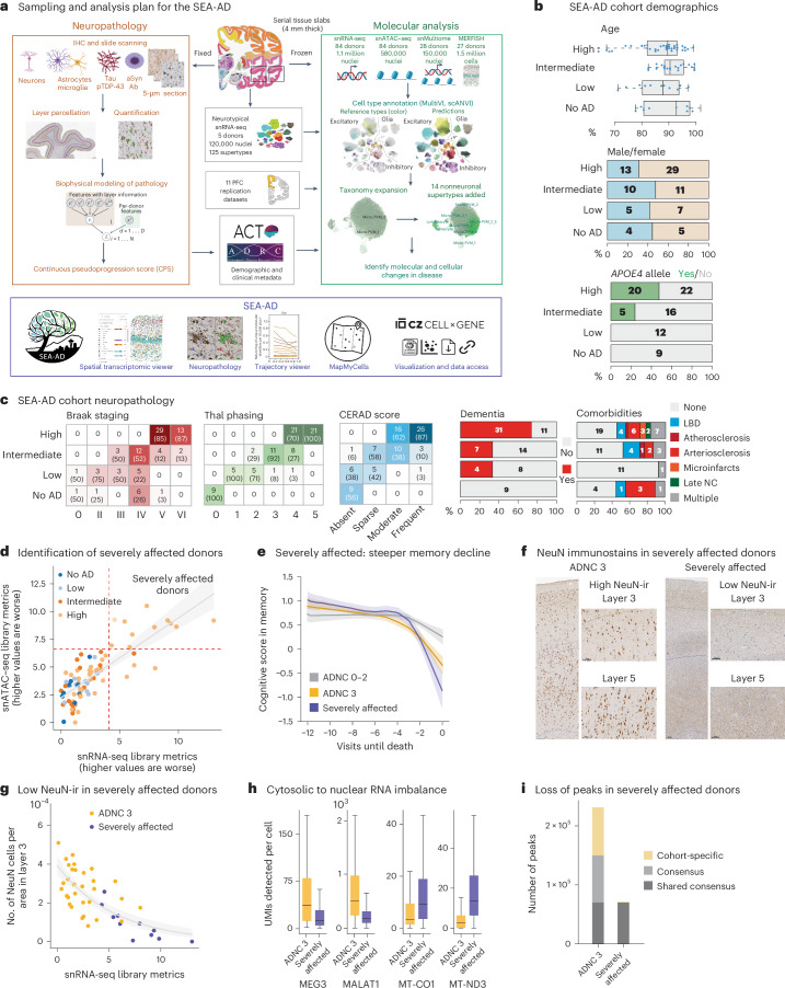
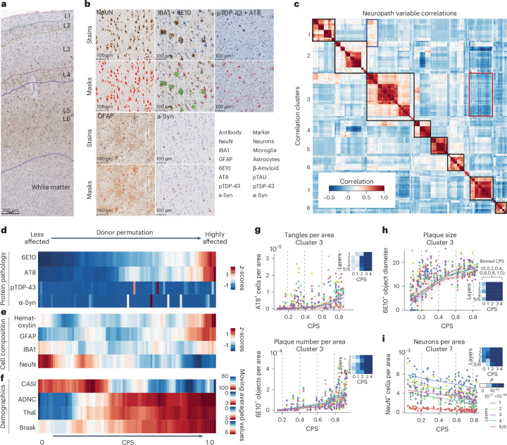
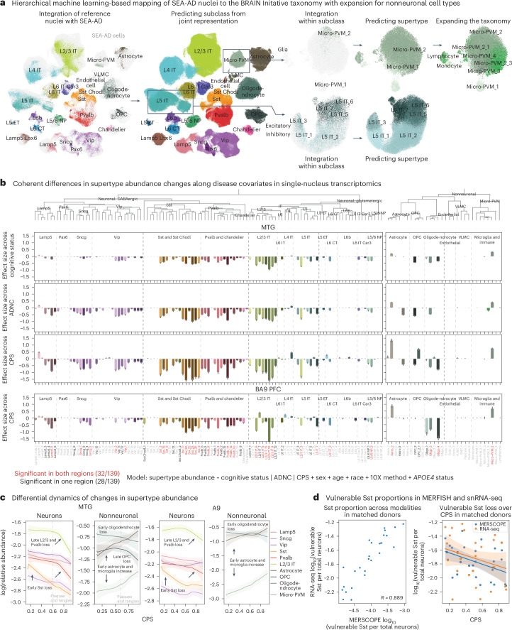
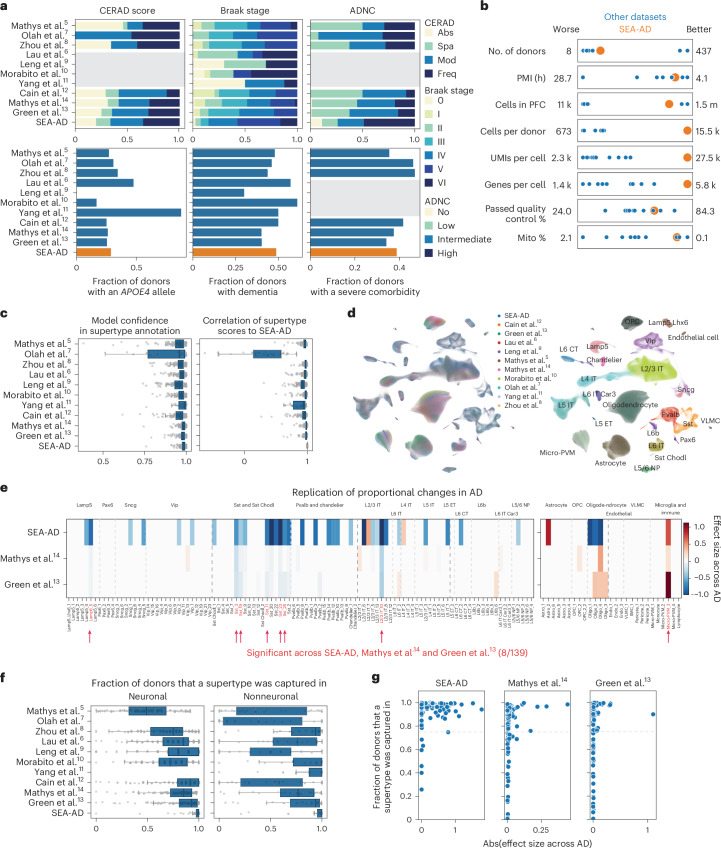
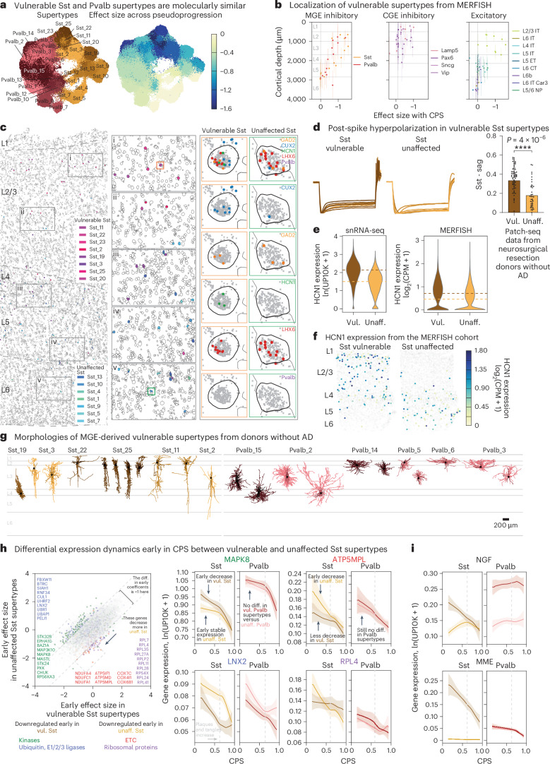
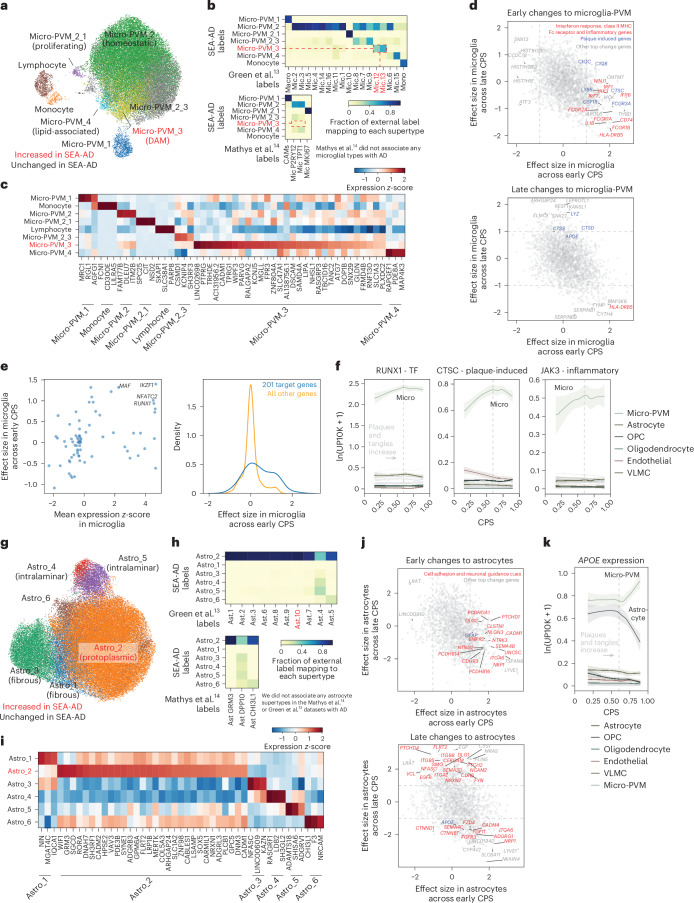
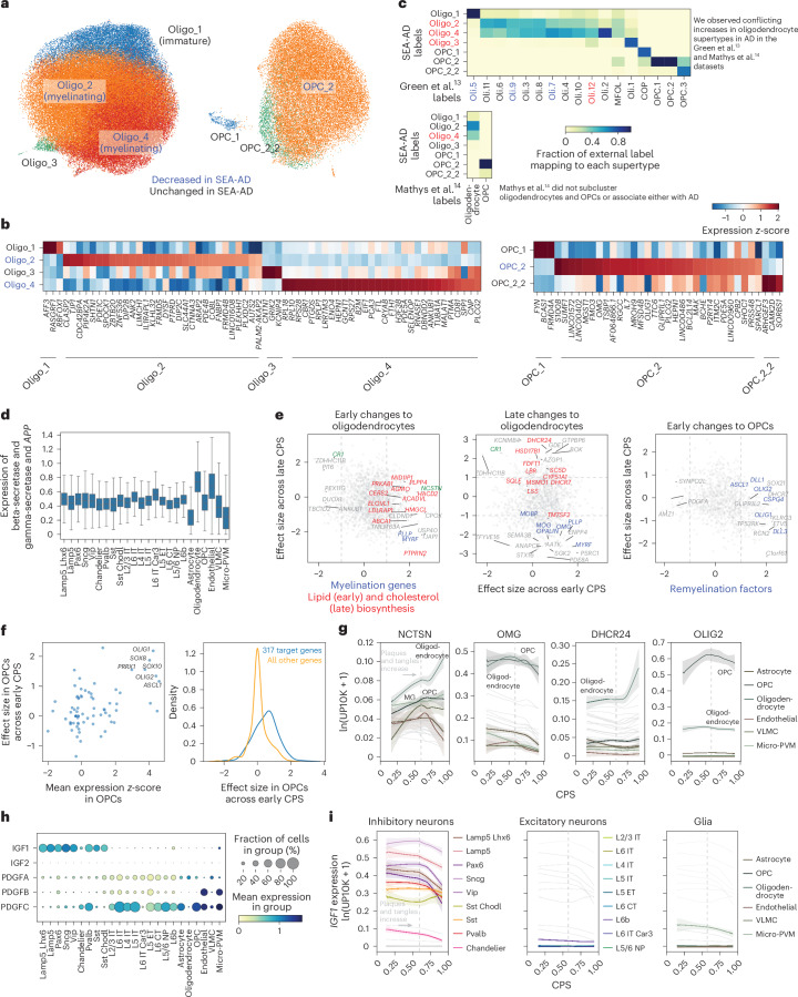
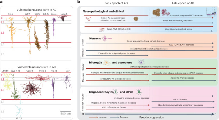
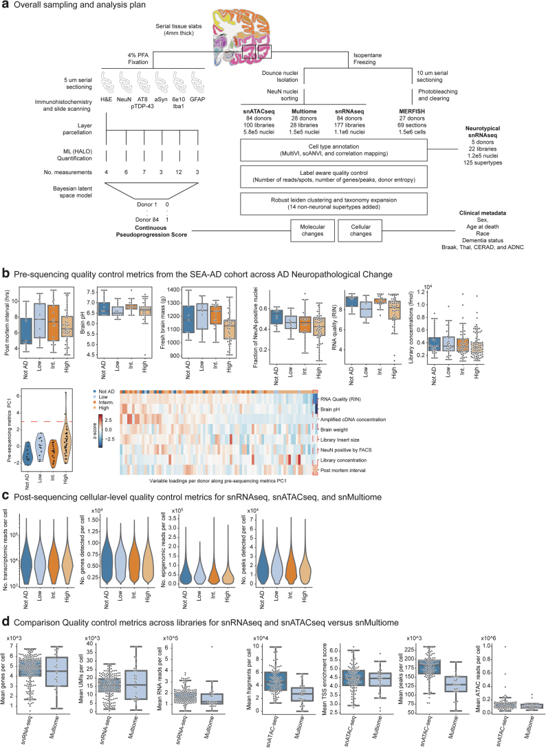
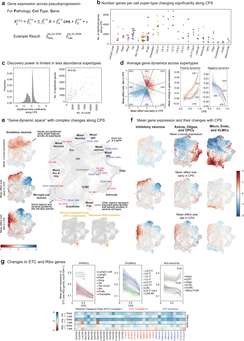
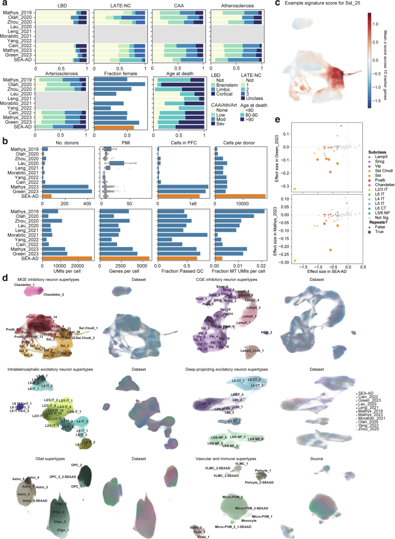
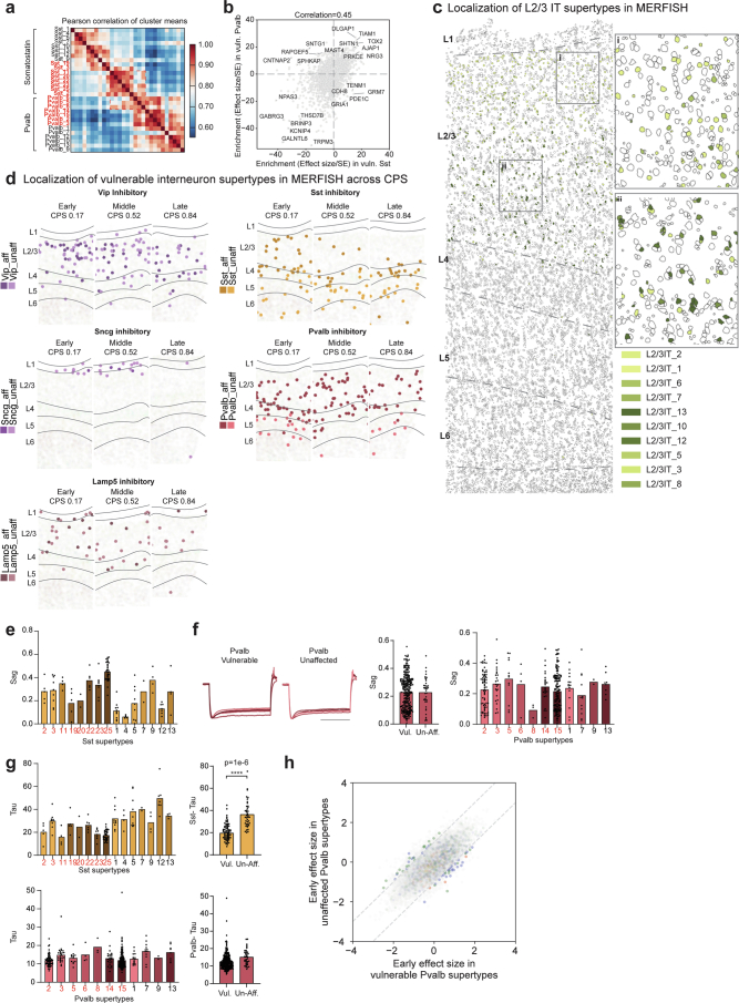
Alzheimer's disease (AD) is the leading cause of dementia in older adults. Although AD progression is characterized by stereotyped accumulation of proteinopathies, the affected cellular populations remain understudied. Here we use multiomics, spatial genomics and reference atlases from the BRAIN Initiative to study middle temporal gyrus cell types in 84 donors with varying AD pathologies. This cohort includes 33 male donors and 51 female donors, with an average age at time of death of 88 years. We used quantitative neuropathology to place donors along a disease pseudoprogression score. Pseudoprogression analysis revealed two disease phases: an early phase with a slow increase in pathology, presence of inflammatory microglia, reactive astrocytes, loss of somatostatin+ inhibitory neurons, and a remyelination response by oligodendrocyte precursor cells; and a later phase with exponential increase in pathology, loss of excitatory neurons and Pvalb+ and Vip+ inhibitory neuron subtypes. These findings were replicated in other major AD studies.


Conflict of interest statement

Competing interests: The authors declare no competing interests.

Figures

Fig. 1
Fig. 1. SEA-AD study of the MTG and cohort description.
a, Schematic detailing the experimental design for applying quantitative neuropathology, snRNA-seq, snATAC–seq, snMultiome and MERFISH to the MTG of SEA-AD donors. b, SEA-AD cohort demographics, depicting age at death, biological sex and APOE4 allele, stratified according to ADNC score. Age at death is represented by box-and-whisker plots with the box representing the interquartile range (IQR) and the whiskers representing 1.5 times the IQR. The solid line indicates the median. c, SEA-AD cohort composition stratified according to ADNC versus Braak stage Thal phase (left), and CERAD score as heatmaps, with dementia or comorbidities as bar plots. The number of donors in each box and the fraction are shown in parentheses. d, First PC for snRNA-seq versus snATAC–seq quality control metrics for each library color-coded according to ADNC category. The dashed red lines indicate the point where values are above 1.5 times the IQR. The gray line represents the linear regression (Pearson R = 0.80) e, The center lines represent the mean of the locally estimated scatter plot smoothing (LOESS) regression on longitudinal cognitive scores in the memory domain across ADNC 0–2 donors in gray, ADNC 3 donors in gold and ADNC 3 severely affected donors in purple. Uncertainty represents the s.e. from 1,000 LOESS fits with 80% of the data randomly selected in each iteration. f, Exemplar low-power and high-power micrographs showing the entire cortical column and cortical layers 3 and 5 from an ADNC3 donor (left) and a severely affected donor lacking NeuN-ir (right). Immunostaining was performed in the entire SEA-AD cohort (n = 84). g, Scatter plot showing the number of NeuN immunoreactive cells per area in cortical layer 3 versus the PC for snRNA-seq in d. Severely affected donors (purple) localize at the end of this trajectory. Gray, logistic regression; error bars, s.d. h, Box-and-whisker plots showing the number of unique molecular identifiers (UMIs) detected per cell for MEG3 and MALAT1, MT-CO1 and MT-ND3, ADNC high donors or severely affected donors. Outliers are not shown. n = 543,252 represents the total number of cells across selected donors. i, Bar plot showing the number of chromatin accessible regions in 11 randomly selected ADNC high donors or severely affected donors. ‘Shared consensus’ are regions shared across both groups; ‘consensus’ denotes regions shared across members of each group; and ‘cohort-specific’ depicts peaks unique to some members of each cohort. The cohort demographics can be found in Supplementary Table 1. f, Scale bar, 100 μm. Schematics in a created using BioRender.com.
Fig. 2
Fig. 2. MTG quantitative neuropathology orders donors according to pseudoprogression of disease.
a, Representative cortical column visualized with immunohistochemistry (IHC). Cortical layers (L1–L6) and white matter are indicated. Immunostaining was performed in the entire SEA-AD cohort (n = 84). b, Higher-powered micrographs showing IHC staining for protein aggregates and cellular populations. Bottom, masks showing positive voxels generated by HALO in red for single staining and both red and green for duplex staining. Immunostaining was performed in the entire SEA-AD cohort (n = 84). c, Heatmap showing a hierarchically organized co-correlation matrix of quantitative neuropathology variables. The black boxes on the diagonal indicate eight correlated clusters. The red box indicates the anti-correlation representing AD protein pathologies and NeuN immunoreactivity (NeuN-ir), respectively. The blue box indicates the correlation between variables related to NFTs and pTDP-43 variables. d, Heatmap showing the number of pathological protein objects detected per unit area across all cortical layers in each donor, ordered along a CPS. All values were converted to z-scores and adjusted according to a moving average. e, Heatmap showing the number of cellular objects detected per unit area across all cortical layers, ordered along the CPS. Hem, hematoxylin+ nuclei; GFAP, IBA1 and NeuN indicates the number of positive cells. All values were converted to z-scores and adjusted according to a moving average. f, Heatmap showing the cognitive scores at the last visit (CASI) and AD pathology stage (ADNC, Thal, Braak), ordered along the CPS. All values were adjusted according to a moving average. gi, Scatter plots showing how specific quantitative neuropathological variables relate to CPS. The dots represent donor values in the cortical layer; the lines are LOESS regressions within each layer. g,h, Cluster 3 consists of variables increasing along pseudoprogression, such as the number of AT8+ cells per unit area, 6E10+ objects per unit area (g) or the average 6E10+ object diameter of the 6E10-ir Aβ plaques (h). i, Cluster 7 included variables decreasing their value along CPS, such as the number of NeuN+ cells or percentage NeuN-ir cell area. The heatmap on each quantifiable neuropathological variable across layers represents the P value from a general additive model. P values are the two-tailed P values for the t-statistics of the parameters as described in the Python package statsmodels. The cohort demographics can be found in Supplementary Table 1. a, Scale bar, 200 μm.
Fig. 3
Fig. 3. Vulnerable populations in the MTG concentrate around superficial supragranular layers.
a, Schematic showing the hierarchical mapping procedure used to create the SEA-AD taxonomy and annotate all SEA-AD cells. Reference MTG cells were used to define neuronal supertypes (Methods). SEA-AD nuclei are colored light gray. Cell subclasses and supertypes are indicated. b, Bar plots showing the effect sizes for relative abundance changes in MTG associated with cognitive status (top), ADNC (middle) or CPS (bottom), controlling for sex, age, single-cell technology and APOE4 status. Below, effect sizes for A9 across CPS, controlling for sex, age at death and race. Red, significantly changed in both cortical regions; dark gray, significantly changed in one cortical region; light gray, not significantly changed. The light gray lines separate subclasses in the same cellular neighborhood; darker gray lines separate cellular neighborhoods. The bar plots and lines represent the average and s.e.m. over 139 compositional tests in which we rotated the reference population. In each test, n = 82 donors were used to fit the model. c, Center lines are the mean of the LOESS regressions relating the log-normalized relative abundance (within all neuronal or all nonneuronal nuclei) of supertypes that were significantly changed in the MTG (two plots on the left) or A9 (two plots on the right) to the CPS. Supertypes were grouped according to their subclasses to facilitate visualization of how each set of supertypes changed. Sst supertypes decreased in their relative abundance early in CPS, before an exponential increase in the number of plaques and tangles present (indicated on each plot with a dashed light gray line). In contrast, L2/3 IT and Pvalb supertypes decrease as AD pathology increases. Uncertainty in each line represents the s.e. from 1,000 LOESS fits with 80% of the data randomly selected in each iteration. d, Left, scatter plot showing the correlation of vulnerable Sst supertype relative abundance in snRNA-seq and MERFISH data from matched donors (R = 0.84). Right, scatter plot relating the relative abundance of vulnerable Sst supertypes to CPS in the snRNA-seq (orange) and MERFISH (blue) datasets from the same donors. The lines represent the linear regression fits; the error bars are the s.e. from 1,000 bootstraps using 80% of the data in each. The cohort demographics can be found in Supplementary Table 1.
Fig. 4
Fig. 4. A9 single-nucleus data integration replicates MTG vulnerable populations with AD.
a, Bar plots showing the fraction of donors in each publicly available snRNA-seq dataset harmonized in this study. Neuropathological stages (top) or possessing an APOE4 allele, dementia or a severe comorbidity (bottom). Gray boxes, unavailable metadata. Neuropathological staging included CERAD score, Braak stage and ADNC. All datasets applied snRNA-seq to the prefrontal cortex (PFC) in human donors that contained sporadic AD cases. Abs, absent; Spa, sparse; Mod, moderate; Freq, frequent. b, Scatter plots showing the relative study size, dataset depth and mean quality control metrics across publicly available snRNA-seq datasets (shown as blue dots) and SEA-AD (shown as a larger orange dot). c, Left, box-and-whisker plot showing the mapping confidence across datasets for each supertype. Right, box-and-whisker plot showing the Spearman correlation of each supertype’s signature score across all nuclei in each dataset compared to the SEA-AD. d, Scatter plot showing the uniform manifold approximation and projection (UMAP) coordinates computed from the integrated latent representation of cells and nuclei from the SEA-AD snRNA-seq dataset on A9 and each publicly available dataset color-coded according to dataset of origin (left) or subclass (right). e, Heatmap comparing the effect size of the relative abundance change of each supertype in A9 across CPS (SEA-AD) or ADNC (refs. ,), controlling for sex, age at death and race in the SEA-AD or sex, age and APOE4 status in refs. ,. Red indicates supertypes that were significantly changed in abundance across all three studies. The light gray dashed lines separate subclasses within cellular neighborhood; darker gray lines separate cellular neighborhoods. f, Box-and-whisker plots showing the fraction of donors that each supertype was captured in across all 11 integrated datasets. n as in c. n represents the total number of cells in each study dataset ordered as in the figure from top to bottom: 32,312, 11,020, 77,791, 77,631, 25,267, 44,514, 28,064, 89,358, 1,502,282, 1,420,559, 1,330,571. g, Scatter plots relating the effect size for each supertype to the fraction of donors for which the supertype was captured in. No populations captured in less than 75% of profiled donors were detected as significant across all studies. The cohort demographics can be found in Supplementary Table 1.
Fig. 5
Fig. 5. Changes in superficial vulnerable MGE-derived inhibitory interneurons with common electrophysiological feature.
a, UMAP coordinates for MGE interneurons color-coded according to supertype (left) or the effect size of the relative changes in abundance from scCODA along the CPS (right). b, Scatter plots relating the effect size of the changes in abundance to the cortical depth for each neuronal supertype. Each point indicates the MERFISH-derived mean depth of the supertype; the error bars indicate the s.d. n represents the total number of MERFISH cells with quantified cortical depth (n = 349,941). c, Example MERFISH data from early CPS (0.23), with cell locations and boundaries. Cortical layers are separated by the dashed gray lines. Vulnerable Sst neurons are indicated by pink-purple hues; unaffected neurons are indicated by green-blue hues. d, Left, electrophysiological traces showing post-spike membrane potential hyperpolarization over time (y axis) in vulnerable Sst neurons recorded from human donors without AD. Right, bar and swarm plot indicating the Sag distributions. A logistic regression test was used to identify the differential electrophysiological features (P = 4 × 10−6). The P values for the differential intrinsic features are shown in Supplementary Table 8. n represents the total number of Sst cells profiled using patch-seq (n = 209). e, Violin plots of HCN1 expression in Sst neurons in snRNA-seq (left) and MERFISH (right). The colored dashed lines represent the mean expression. ln(UP10K + 1), natural log of UMIs/10,000 + 1. log2(counts per million (CPM) + 1). The statistical test was a negative binomial regression implemented in Nebula as described in the Methods. f, Scatter plot of Sst cells indicating cell position and HCN1 expression level in an early CPS donor (0.23). Superficial Sst cells have higher HCN1 expression. g, Patch-seq-derived morphological reconstructions of vulnerable MGE-derived interneurons from donors without AD. Dendrites are colored according to supertype. h, Scatter plot relating the mean early effect size for genes in vulnerable versus unaffected Sst supertypes. Gene families with decreased expression in vulnerable types are shown in blue (ubiquitin ligases, P = 0.036) and green (kinases, P = 8.92 × 10−11). Gene families with decreased expression in unaffected types are shown in red (ETC, P value near 0) and purple (ribosomal proteins, P value near 0). The statistical test is a negative binomial regression implemented in Nebula and gene family enrichment tests as described in the Methods and Supplementary Note. Right, LOESS regression plots of mean gene expression for vulnerable (dark orange) and unaffected (light orange) Sst types and vulnerable (dark red) and unaffected (light red) Pvalb types. The center lines are the mean from the LOESS fits; uncertainly, lines represent the s.e. from 1,000 LOESS fits with 80% of the data randomly selected in each iteration. ln(UP10K + 1), natural log UMIs/10,000 + 1. i, LOESS regression plots as in h. NGF and MME gene expression decreased in vulnerable Sst supertypes. Center lines and error bars as in h. The cohort demographics can be found in Supplementary Table 1. g, Scale bar, 200 μm. Diff., difference; unaff., unaffected; vul., vulnerable.
Fig. 6
Fig. 6. Early microglial and astrocyte activation compared across publicly available datasets.
a, Scatter plot showing the UMAP coordinates for MTG micro-PVM supertypes, colored according to supertype identity. Red, disease-associated microglial state. b, Heatmaps showing confusion matrices comparing microglial annotations in refs. , with the SEA-AD cellular taxonomy. Red, SEA-AD supertypes significantly increased in all datasets. c, Heatmap showing the mean z-scored expression across microglial supertypes of marker genes identified using Nebula. d, Scatter plot relating the mean effect size of each gene across microglial supertypes in the early versus late epochs along the CPS. The gray dashed lines denote effect sizes of 1 and −1. The statistical test was a negative binomial regression implemented in Nebula, together with gene family enrichment tests as described in the Methods and Supplementary Note. e, Left, scatter plot relating transcription factor mean z-scored gene expression identified by the GRNs versus the effect size in the early disease epoch along the CPS. Right, cumulative density plot depicting the effect sizes in the early disease epoch along the CPS of the genes downstream of the transcription factors identified based on the GRNs (left, in blue) versus the effect sizes of all other genes (yellow). f, LOESS regression plots relating the mean expression of the indicated genes from families noted in d to CPS across nonneuronal supertypes organized and colored according to subclass; ln(UP10K + 1), natural log UMIs per 10,000 + 1. g, Scatter plot showing the UMAP for the MTG astrocyte supertypes colored according to supertype identity. Red, disease-associated protoplasmic astrocyte supertype. h, Heatmaps showing the confusion matrices comparing the annotations of astrocyte cells in the studies in refs. ,, with the same cells annotated with the SEA-AD cellular taxonomy. i, Heatmap showing the mean z-scored expression across astrocyte supertypes of marker genes identified by Nebula. j, Scatter plot relating the mean effect size of each gene across astrocyte supertypes in the early (x axis) versus late (y axis) epochs along the CPS. The gray dashed lines denote effect sizes of 1 and −1. k, Same LOESS regression plots as in f for the strongly disease-associated APOE gene, which decreased in expression in astrocytes and increased in expression in microglia in the late disease epoch along the CPS. The cohort demographics can be found in Supplementary Table 1. TF, transcription factor.
Fig. 7
Fig. 7. Early loss of oligodendrocytes with a remyelination program in OPCs across publicly available datasets.
a, Scatter plots showing the UMAP coordinates for MTG oligodendrocyte and OPC supertypes, colored according to supertype identity. b, Heatmap showing the mean z-scored expression across oligodendrocyte (left) and OPC (right) supertypes of marker genes identified by Nebula. c, Heatmaps showing confusion matrices comparing oligodendrocyte and OPC annotations in refs. , with the SEA-AD taxonomy. Red, SEA-AD supertypes that were significantly increased in AD in these datasets. Red and blue also denote cell types that were associated or vulnerable with disease in the original studies. d, Box-and-whisker plot showing the mean expression (natural log UMIs per 10,000 + 1) of beta and gamma-secretase components and the APP gene organized according to subclass. The center lines denote the median; the error bars are 1.5 times the IQR. Outliers are not shown. e, Scatter plot relating the mean effect size of genes across the oligodendrocyte and OPC supertypes in the early versus late epochs. Significant genes involved in fatty acid biosynthesis (left) or cholesterol biosynthesis (middle, P = 0.0040 late) are color-coded red; myelin components (P = 0.006 late) are color-coded blue. Significant genes in the OPC early phase (right) that are part of the remyelination program (P = 9.62 × 10−5 early) are color-coded blue. The statistical test used was a negative binomial regression implemented in Nebula; gene family enrichment tests were carried out as described in the Methods and Supplementary Note. f, Left, scatter plot relating transcription factor mean z-scored gene expression identified by GRNs versus their effect size in the early disease epoch along the CPS. Right, cumulative density plot depicting the effect sizes in the early disease epoch of genes downstream of the transcription factors identified (left) based on the GRNs (blue) versus the effect sizes all other genes (yellow). n represents the number of OPCs, n = 28,429. g, LOESS regression plots relating the mean expression of the indicated genes from the families in e to the CPS, colored according to subclass. ln(UP10K + 1), natural log UMIs per 10,000 + 1. h, Dot plot depicting the mean gene expression and fraction of cells in each group with nonzero expression in the SEA-AD MTG dataset organized according to the subclasses for the genes indicated. Expression is natural log UMIs per 10,000 + 1. The statistical test was negative binomial regression implemented in Nebula; gene family enrichment tests were used as described in the Methods and Supplementary Note. i, LOESS regression relating the mean expression of IGF1 to CPS, color-coded by inhibitory (left), excitatory (middle) and nonneuronal (right) subclasses. The cohort demographics can be found in Supplementary Table 1.
Fig. 8
Fig. 8. MTG cells impacted by AD, predominantly localizing to superficial layers, can be organized into two epochs: an early and a late phase.
a, Diagram illustrating cortical columns with actual neuronal reconstruction from vulnerable populations (from donors without AD) organized according to early (top) and late (bottom) disease epochs. During the early epoch, superficial Sst, Sncg and Lamp5 interneurons were lost. In the late epoch, most lost neurons localized superficially (L2/3 IT, Pvalb and Vip), with the addition of deep cortical and striatum-projecting L5 IT neurons. b, First box, the dynamic changes associated with AD progression can be organized into early and late epochs. In the early epoch, the first neuropathological event is an increase in the size of sparse Aβ plaques, subsequently followed by an exponential aggregation of both pTau and plaque burden. A decrease in NeuN+ cells occurs throughout. Second box, supragranular interneurons (Sst, Sncg, Lamp5) are lost early on. During this period, genes encoding the ETC complex, and ribosomal proteins, are downregulated broadly across neurons, except in the vulnerable Sst interneurons. In the latter cells, there is a strong downregulation of ubiquitin ligases and kinases. Later on, not only inhibitory cells (Pvalb and Vip) are lost but also long-range-projecting pyramidal neurons (L2/3 IT and L5 IT). Third and fourth boxes, nonneuronal cells accompany these changes with the early emergence of DAMs and an increase in protoplasmic astrocytes, while myelinating oligodendrocytes decrease their abundance. Concurrently, DAMs upregulate inflammatory and plaque-inducing genes, while OPCs attempt to compensate for oligodendrocyte loss by upregulating their OPC differentiating genes. Later, OPC cells are impacted and lost while myelination genes in oligodendrocytes are downregulated. The cohort demographics can be found in Supplementary Table 1. Schematics created using Biorender.com.
Extended Data Fig. 1
Extended Data Fig. 1. SEA-AD Brain Cell Atlas study design.
a) Schematic detailing experimental design for applying quantitative neuropathology, single nucleus RNA sequencing (snRNAseq), single nucleus ATAC sequencing (snATAC-seq), single nucleus Multiome (Multiome), and multiplexed error robust fluorescence in situ hybridization (MERFISH) to middle temporal gyrus (MTG) of SEA-AD donors as well as the analysis plan for construction of a pseudo-progression score from quantitative neuropathology, integration across -omics data modalities, common cell type mapping to the BRAIN initiative reference, and use of demographic and clinical metadata to identify cellular and molecular changes in AD. b) Top, boxplots showing pre-sequencing quality control metrics for donor tissue (for example PMI, RIN, brain pH and mass) and single nucleus preparations (for example fraction of NeuN positive nuclei and library concentration) organized by AD Neuropathological Change (ADNC). Bottom, A donor by metric matrix was constructed for the values indicated, using a simple average for variables that had multiple values per donor (for example multiple sequencing library concentrations). Principle component analysis (PCA) was then run on the matrix. Bottom and left, Violin plot showing the eigenvalues for each donor along the first principal component organized by ADNC. Bottom and right, heatmap showing z-scores of the pre-sequencing quality control metrics (rows) in each donor (columns). Donors and metrics are ordered based on the first principal component eigenvalues and eigenvectors. Red dashed box, two outlier values along first principal component for two donors that were driven by low RIN and brain pH. N represents the total number of donors in SEA-AD, N = 84. c) Violin plots showing cellular-level post-sequencing quality control metrics for single nucleus transcriptomics, chromatin accessibility and multiome data organized by ADNC. Significant p-values: NeuN Fraction Not AD versus High=0.05. d) Violin plots comparing library-level post-sequencing quality control metrics of snRNA-seq to snMultiome (left) and snATAC-seq to snMultiome (right). N represents the total number of libraries profiled with snRNA-seq and Multiome, N = 205. Cohort demographic can be found in Supplementary Table 1.
Extended Data Fig. 2
Extended Data Fig. 2. Altered multimodal metrics within severely affected donors.
a) Donor by metric matrices were constructed for the library-level post-sequencing quality control values indicated, using a simple average when multiple libraries were sequenced per donor. Principle component analysis (PCA) was then run on each matrix. Heatmaps showing z-scores of snATAC-seq (top) and snRNA-seq (bottom) metrics (rows) in each donor (columns). Donors and metrics are ordered based on the first principle component eigenvalues and eigenvectors. Red dashed boxes, donors with outlier eigenvalues along each PC. b) LOESS regression on longitudinal cognitive scores in the executive, visuospatial, and language domain across ADNC 0-2 (Not AD to Intermediate) in grey, ADNC 3 donors that were not severely affected in gold, and ADNC 3 donors that were in purple. Center lines are the mean from LOESS fits; uncertainty represents the standard error from 1000 LOESS fits with 80% of the data randomly selected in each iteration. Significant p-values for cognitive decline in language: SA donors versus ADNC 0-2 = 0.009, Other ADNC 3 versus ADNC 0-2 = 0.021. Statistical test is a multinomial logistic regression as described in methods’ section Testing for differential cognitive slopes. c) Heatmap showing the pairwise jaccard distances based on the peak universes from 11 randomly selected ADNC 3 donors (yellow) and all 11 severely affected donors (purple) hierarchically ordered. Red boxes, two clusters within the hierarchy that largely correspond to the separation between ADNC3 and SA donors. d) Histogram showing the distribution of peak lengths of accessible regions in ADNC 3 (yellow) and severely affected donors (purple). e) Transcription factors binding sites enriched in chromatin accessible regions uniquely found in severely affected donors organized by their gene ontology category. Transcription factors that bind to them are indicated. f) Stripplot showing the fraction of cells removed from each library for having too many mitochondrial reads during quality control organized by subclass and by severely affected donors (purple) and ADNC 0–3 donors (yellow). Cohort demographic can be found in Supplementary Table 1.
Extended Data Fig. 3
Extended Data Fig. 3. Human MTG neuropathological stains track brain-wide pathological states.
a) Schematic depicting neuropathological data acquisition pipeline (ordered 1 to 6). b) Boxplots showing the number of pTau-bearing cells per unit area organized by Braak stage (left) and number of Aβ plaques per unit area organized by Thal phase (right) across donors. Note, in later stages there is considerable variability in plaque and tangle number, underscoring limitations in classical staging. c) Boxplots showing the percent of pTDP-43-positive voxels (left) and percent of α-Syn-positive (α-Synuclein) voxels across donors organized by to LATE-NC stage (left) and Lewy Body Disease stage (right). Lewy Body Disease is coded numerically (0=Not or Incompletely Assessed, 1=Not Identified, 2=Amygdala-predominant, 3=Brainstem-predominant, 4=Limbic (Transitional), 5=Olfactory bulb only, 6=Neocortical). Note, only donors in later stages have large accumulation of co-pathology. Cohort demographic can be found in Supplementary Table 1.
Extended Data Fig. 4
Extended Data Fig. 4. MTG pseudo-progression scores orders quantitative neuropathological variables following increasing disease severity.
a) Graphical model used to infer the continuous pseudo-progression score (CPS). b, c) LOESS regression plots relating mean quantitative neuropathological (QNP) variables across layers (B) and demographic/clinical metadata (C) indicated to CPS. Dots represent individual donor values. Uncertainty in each line represents the standard error from 1000 LOESS fits with 80% of the data randomly selected in each iteration. Note, variables from (C) were not used to construct the model. CASI, Cognitive Abilities Screening Instrument; ADNC, AD Neuropathological Change; PRS, Polygenic Risk Score. d) Left, Subset of heatmap from Fig. 2c showing co-correlation of QNP variables in cluster 1. Right, Scatterplot showing how the QNP variable number of pTDP-43 positive cells per unit area, which is within correlation cluster 1, relates to CPS. Dots represent values from each donor in the cortical layer indicated, lines are LOESS regressions for measurements across donors within each layer. e) Same plots as in (D) but for clusters 2, 6, 5, and 8. Cohort demographic can be found in Supplementary Table 1.
Extended Data Fig. 5
Extended Data Fig. 5. Pipeline for the creation of the SEA-AD MTG taxonomy.
a) Schematic showing steps involved in supertype creation from snRNA-seq data in neurotypical reference donors. b) Hierarchical procedure for the creation of robustly mappable cell types, termed supertypes. Labels from 1 of 5 reference donors was systematically held out and predicted using a deep generative model (DGM) trained on the remaining 4 donors. Steps 1 to 3 represent mapping cells to one of three classes, splitting each class and mapping to one of 24 subclasses, splitting each subclass and mapping to one of 151 clusters from the original BRAIN Initiative taxonomy. 26 of 151 clusters were pruned, mostly representing cell types that were intermediates of others. Finally, in step 5 we repeat mapping with the 125 highly mappable supertypes and show consistently high F1 scores across them (box and whisker plot). c) After hierarchically mapping SEA-AD nuclei to supertypes using the same approach as above, we filtered low quality nuclei within subclasses (The microglia subclass is shown as an example). Left, scatterplots showing the UMAP coordinates of all SEA-AD and reference nuclei within the microglia subclass. In the first plot, reference nuclei are labeled and colored and SEA-AD nuclei are in light grey. In the second and third plots, we show the supertype predictions for each nucleus from the DGM as well as the uncertainty in the prediction (darker nuclei are more uncertain). In the fourth plot we show robust, high resolution Leiden clusters and color them by their quality control metrics (that is donor entropy, mean fraction of mitochondrial reads, mean doublet score, and mean number of genes detected). d) Scatterplots showing scANVI probabilities (top) and supertype signature scores (bottom) organized by cell classes. Lines represent linear regressions. Note, decreasing probabilities and signature scores for non-neuronal supertypes, but not others. e) After removing low quality nuclei new latent representations were learned with DGMs, which were then underwent robust Leiden clustering. Clusters with low fractions of nuclei from neurotypical reference donors ( < 10%) were added to the taxonomy. Cohort demographic can be found in Supplementary Table 1.
Extended Data Fig. 6
Extended Data Fig. 6. Pipeline for the annotation of chromatin accessibility data sets.
a) Schematic showing steps involved in processing the SEA-AD snATAC-seq data, which include global peak calling and modality integration, quality control filtering and subclass mapping, and within subclass peak calling and supertype mapping. b) Scatterplot showing the UMAP coordinates of all nuclei profiled in the middle temporal gyrus (MTG) color coded by indicated data modalities. c) Top and left, Same scatterplot as in (B) but color coded by low quality cell score (left) and (right) by Leiden clusters with mean low quality cell scores greater than 0.5. Violin plot to the right of the first plot shows the binary distribution of the low quality cell scores (RNA QC score). Bottom, violin plots showing the distribution of the low quality cell score per Leiden cluster, with the number of those that were flagged indicated. Top and right, box and whisker plot showing the fraction of cells in each snATAC-seq library that were filtered during quality control. d) Scatterplots showing the UMAP coordinates from (B) of only the high quality nuclei colored by neurotypical reference subclasses versus SEA-AD in light grey (left) and by predicted subclass (right). e) Scatterplots showing UMAP coordinates of nuclei from 1 example subclass (Sst) based on integrated space constructed with subclass-specific peaks. Plots are color coded by modality (left), by reference supertypes versus SEA-AD in light grey (middle) and by predicted supertype (right). Cohort demographic can be found in Supplementary Table 1.
Extended Data Fig. 7
Extended Data Fig. 7. Pipeline for the acquisition of high quality spatial transcriptomic data in the human MTG.
a) Top, SEA-AD MERFISH cohort demographics stratified by AD neuropathological change (ADNC) score. Numbers indicate the number of donors in each group. b) Histograms showing the correlation between total slide transcripts (left) or transcripts within cells (right) and bulk RNAseq across sections. c) Histogram showing the correlation between total slide transcripts and transcripts in cells. d) Left, histogram showing the correlation in total slide transcripts across sections from the same donor. Right, Histogram showing the slope from a linear regression comparing total slide transcripts across sections from the same donor. e) Box and whisker plot showing F1 scores for subclasses (left) and supertypes (right) from the procedure where 1 donor was systematically held out at a time in neurotypical reference snRNA-seq data where the model could use all genes (Full) or only the 140 genes in the MERFISH panel (MERFISH). f) Scatterplots showing the positions of excitatory IT neurons as dots from example sections from donors with an early (0.17), middle (0.52) and late (0.84) CPS color coded by their subclass. g) Barplot showing the relative abundance of excitatory IT neurons across data collection efforts in neurotypical specimens from previous studies compared to SEA-AD data. h) Heatmaps showing the average gene expression levels of genes included in the 140 gene MERFISH panel at the subclass level in snRNA-seq (top) and MERFISH (bottom) data from MTG. i) Heatmaps showing the effect sizes of relative abundance changes along each covariate from neuronal (left) and non-neuronal (right) scCODA models MTG dataset, the SEA-AD snRNA-seq A9 dataset, Green et al. (2023) snRNA-seq dataset, and Mathys et al. (2023) snRNA-seq dataset. j) Scatterplots relating the effect sizes of each supertype along CPS from scCODA model on SEA-AD MTG dataset to a similar model run on SEA-AD snATAC-seq MTG dataset, to a model run without the severely affected donors, then including post-mortem interval (PMI) and RIN as covariates (third) and grouping data by donor instead of by library. Cohort demographic can be found in Supplementary Table 1.
Extended Data Fig. 8
Extended Data Fig. 8. Construction of the gene-dynamic space.
a) Schematic for identifying differentially expressed genes in each disease epoch along CPS using a generalized linear mixed model. b) Swarmplot showing the number of genes significantly changed with the continuous pseudo-progression score (CPS) in each supertype, organized by subclass. Grey dashed line, expected false discovery rate. c) Left, histogram showing the effect sizes across all supertypes of significantly changed along CPS. Note, many significant changes had relatively small effect sizes. Right, Scatterplot showing a weak (but present, R = 0.62) correlation between the number of nuclei and number of genes called as significantly changed along CPS. d) Scatterplot relating the mean effect size across supertypes of each gene estimated using donors from the early versus late disease epochs along CPS. Genes were categorized into 8 bins given their early and late effect sizes: DU, down up. DE, down early. DC, down consistently. DL, down late. UD, up down. UE, up early. UC, up consistently. UL, up late. Right, LOESS regression relating the mean expression of all genes in each category to CPS. e) Framework to unsupervised exploration of gene expression changes. Early and late effect sizes and z-scored mean gene expression values were collected across supertypes. Next, an unsupervised low-dimensional representation is built. Right, gene low dimensional representation qualitatively annotated to show areas of genes with cell type specific expression (black labels) and CPS gene expression dynamics (blue to red labels and dashed lines). f) Scatterplots of the gene-dynamic space colored by mean z-scored expression, early and late effect size across the supertypes in the cellular neighborhoods indicated. g) Top, LOESS regression relating the mean expression of electron transport chain (ETC) and ribosomal (Ribo) genes to CPS, color coded by inhibitory (left), excitatory (middle), and non-neuronal (right) subclasses. Dashed grey line, point in CPS when pathology is increasing (CPS = 0.6); error-bars are the standard error from 1000 bootstraps using 80% of the data in each. Bottom, heatmap displaying mean effect sizes across cell class for genes within the ATP synthase complex (blue) and complexes 1 (black) and 4 (red) from the electron transport chain. Cohort demographic can be found in Supplementary Table 1.
Extended Data Fig. 9
Extended Data Fig. 9. Integration of publicly available snRNA-seq datasets.
a) Barplots showing the fraction of donors in each of the publicly available snRNA-seq datasets that we harmonized metadata for and integrated classified in co-pathology neuropathological stages (LBD, Lewy Body Disease; LATE-NC, limbic-predominant age-related TDP-43 encephalopathy neuropathologic changes; CAA, Cerebral amyloid angiopathy; Ath, Atherosclerosis; Art, Arteriosclerosis), that were female, or were in defined age groups. Grey boxes, metadata that was unavailable. b) Box and whisker or barplots showing quality control metrics across each of the publicly available datasets. Metrics for the SEA-AD A9 snRNA-seq dataset are shown at bottom in orange for comparison. c) Scatterplot showing UMAP coordinates for MGE-derived inhibitory interneuron supertypes across all publicly available and the SEA-AD A9 dataset. Nuclei or cells are colored based on the signature score for Sst_25, which are indicated with the black dashed circle. d) Scatterplots showing UMAP coordinates of all supertypes within their cellular neighborhoods (that is MGE-derived inhibitory neurons, CGE-derived inhibitory neurons, Intratelencephalic excitatory neurons, Deep-projecting excitatory neurons, glial cells, and vascular and immune cells. In each neighborhood on left are nuclei and cells colored by supertype and on right cells are colored by dataset. e) Scatterplots relating the effect size for the change in relative abundance across supertypes in the SEA-AD A9 dataset to those observed in the Green_2023 (top) and Mathys_2023 (bottom) datasets. Each point is a supertype colored by their subclass and supertypes that are significant in both datasets have bigger circles. Dashed grey lines are at 0. Note, several Sst, 1 L2/3 IT and 1 Lamp5 supertypes that have significant negative effect sizes in both datasets. Cohort demographic can be found in Supplementary Table 1.
Extended Data Fig. 10
Extended Data Fig. 10. Characteristics of vulnerable neuronal supertypes.
a) Heatmap showing the pairwise correlations of the mean expression of all genes across the MGE-derived supertypes indicated. Red labels are vulnerable supertypes. b) Scatterplot relating the mean enrichment (defined as the effect size divided by its standard error (SE) from NEBULA) of each gene in vulnerable (vuln) Sst and Pvalb supertypes compared to unaffected types in their respective subclasses. c) MERFISH-profiled brain slice in early CPS donor (CPS = 0.23) showing each cells location and boundaries defined by the cell segmentation, with cortical layers indicated (L1-L6) and separated by dashed grey lines. Vulnerable L2/3 intratelencephalic (IT) neurons are color-coded. Insets: i) L2/3 IT supertypes have characteristic depths within layers 2 and 3. d) Scatterplots showing the spatial locations of individual cells of the inhibitory neuron subclasses indicated from representative MERFISH sections in donors at increasing CPS stages. Vulnerable supertypes (aff) are shown in darker colors and unaffected supertypes (unaff) in lighter ones. e) Bar and swarm plot showing the Sag values for Sst supertypes from PatchSeq data on non-AD donors. Vulnerable supertypes are colored in red. f) Left, electrophysiological traces showing post-spike hyperpolarization of membrane potential (y-axis) over time in almost all Pvalb neurons from tissue of non-AD human donors that underwent surgical resection. Middle, bar and swarm plot showing Sag distributions in individual vulnerable (Vul) and unaffected (Unaff) Pvalb neurons. Right, Bar and swarm plot showing the Sag values for Pvalb supertypes from PatchSeq data on non-AD donors. Vulnerable supertypes are colored in red. g) Left top and bottom, Bar and swarm plot showing the Tau apparent membrane time constant values for Sst (top) and Pvalb (bottom) supertypes from PatchSeq data on non-AD donors. Vulnerable supertypes are colored in red. Middle top and bottom, Bar and swarm plots for data on left grouped by vulnerable (vul) and unaffected (un-aff) Sst (top) and Pvalb (bottom) supertypes. Logistic regression test is described in ‘Identifying differential electrophysiological features’, p-value = 1e-6. P-values for all differential electrophysiological features are in Supplementary Table 8. h) Scatterplot relating the mean early effect size of each gene (dots) in vulnerable versus unaffected Pvalb supertypes. Cohort demographic can be found in Supplementary Table 1.

Update of

  • Integrated multimodal cell atlas of Alzheimer's disease.
    Gabitto MI, Travaglini KJ, Rachleff VM, Kaplan ES, Long B, Ariza J, Ding Y, Mahoney JT, Dee N, Goldy J, Melief EJ, Brouner K, Campos J, Carr AJ, Casper T, Chakrabarty R, Clark M, Compos J, Cool J, Valera Cuevas NJ, Dalley R, Darvas M, Ding SL, Dolbeare T, Mac Donald CL, Egdorf T, Esposito L, Ferrer R, Gala R, Gary A, Gloe J, Guilford N, Guzman J, Ho W, Jarksy T, Johansen N, Kalmbach BE, Keene LM, Khawand S, Kilgore M, Kirkland A, Kunst M, Lee BR, Malone J, Maltzer Z, Martin N, McCue R, McMillen D, Meyerdierks E, Meyers KP, Mollenkopf T, Montine M, Nolan AL, Nyhus J, Olsen PA, Pacleb M, Pham T, Pom CA, Postupna N, Ruiz A, Schantz AM, Sorensen SA, Staats B, Sullivan M, Sunkin SM, Thompson C, Tieu M, Ting J, Torkelson A, Tran T, Wang MQ, Waters J, Wilson AM, Haynor D, Gatto N, Jayadev S, Mufti S, Ng L, Mukherjee S, Crane PK, Latimer CS, Levi BP, Smith K, Close JL, Miller JA, Hodge RD, Larson EB, Grabowski TJ, Hawrylycz M, Keene CD, Lein ES. Gabitto MI, et al. Res Sq [Preprint]. 2023 May 23:rs.3.rs-2921860. doi: 10.21203/rs.3.rs-2921860/v1. Res Sq. 2023. Update in: Nat Neurosci. 2024 Dec;27(12):2366-2383. doi: 10.1038/s41593-024-01774-5. PMID: 37292694 Free PMC article. Updated. Preprint.

References

    1. Masters, C. L. et al. Alzheimer’s disease. Nat. Rev. Dis. Primers1, 15056 (2015). - PubMed
    1. Jack, C. R.Jr et al. Hypothetical model of dynamic biomarkers of the Alzheimer’s pathological cascade. Lancet Neurol.9, 119–128 (2010). - PMC - PubMed
    1. Thal, D. R., Rüb, U., Orantes, M. & Braak, H. Phases of Aβ-deposition in the human brain and its relevance for the development of AD. Neurology58, 1791–1800 (2002). - PubMed
    1. Braak, H. & Braak, E. Neuropathological stageing of Alzheimer-related changes. Acta Neuropathol.82, 239–259 (1991). - PubMed
    1. Mathys, H. et al. Single-cell transcriptomic analysis of Alzheimer’s disease. Nature570, 332–337 (2019). - PMC - PubMed

Grants and funding