. 2024 Oct 24;12(1):29.
doi: 10.1186/s40170-024-00358-y.

Unraveling the glycosphingolipid metabolism by leveraging transcriptome-weighted network analysis on neuroblastic tumors

Affiliations

Unraveling the glycosphingolipid metabolism by leveraging transcriptome-weighted network analysis on neuroblastic tumors

Arsenij Ustjanzew et al. Cancer Metab. .

Abstract

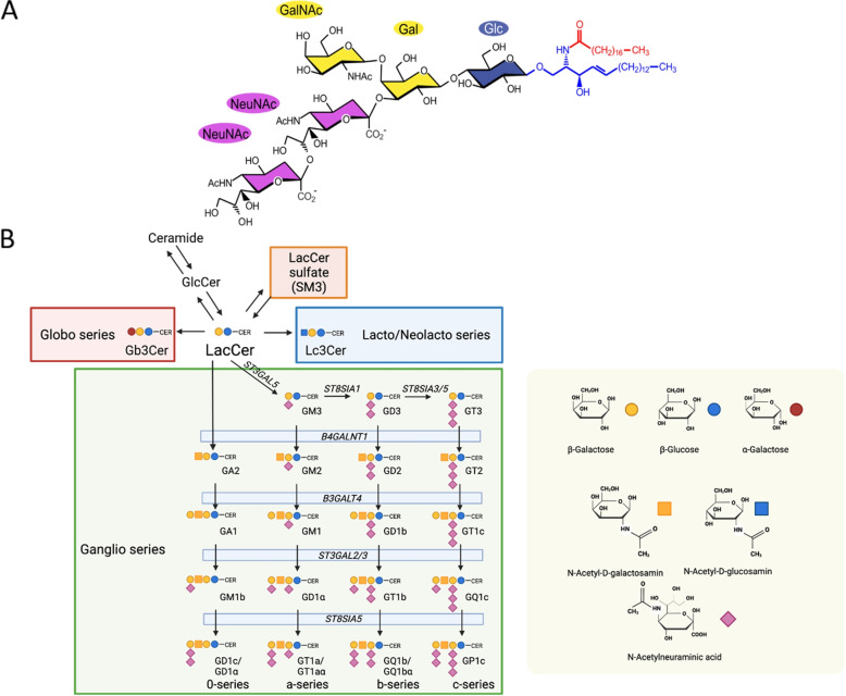
Background: Glycosphingolipids (GSLs) are membrane lipids composed of a ceramide backbone linked to a glycan moiety. Ganglioside biosynthesis is a part of the GSL metabolism, which involves sequential reactions catalyzed by specific enzymes that in part have a poor substrate specificity. GSLs are deregulated in cancer, thus playing a role as potential biomarkers for personalized therapy or subtype classification. However, the analysis of GSL profiles is complex and requires dedicated technologies, that are currently not included in the commonly utilized high-throughput assays adopted in contexts such as molecular tumor boards.

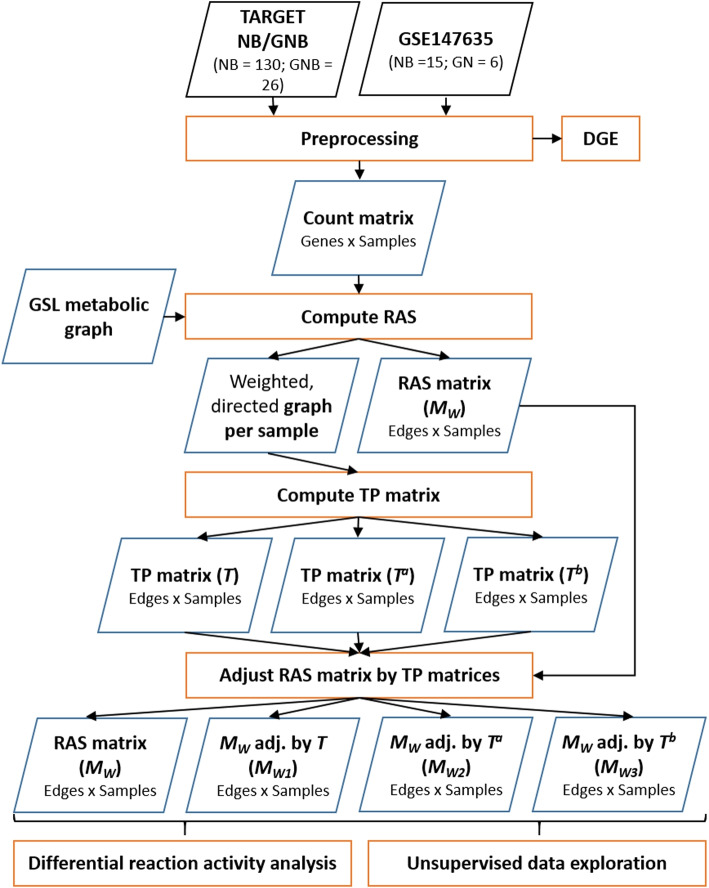
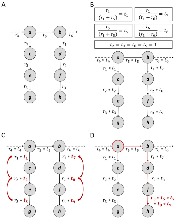
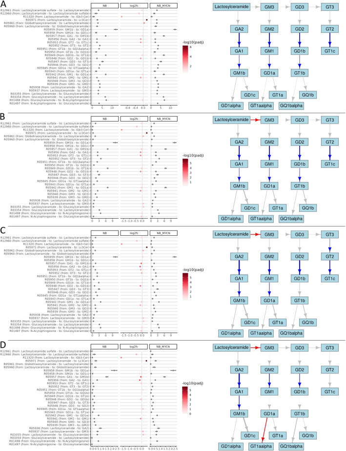
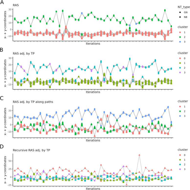
Methods: In this study, we developed a method to discriminate the enzyme activity among the four series of the ganglioside metabolism pathway by incorporating transcriptome data and topological information of the metabolic network. We introduced three adjustment options for reaction activity scores (RAS) and demonstrated their application in both exploratory and comparative analyses by applying the method on neuroblastic tumors (NTs), encompassing neuroblastoma (NB), ganglioneuroblastoma (GNB), and ganglioneuroma (GN). Furthermore, we interpreted the results in the context of earlier published GSL measurements in the same tumors.

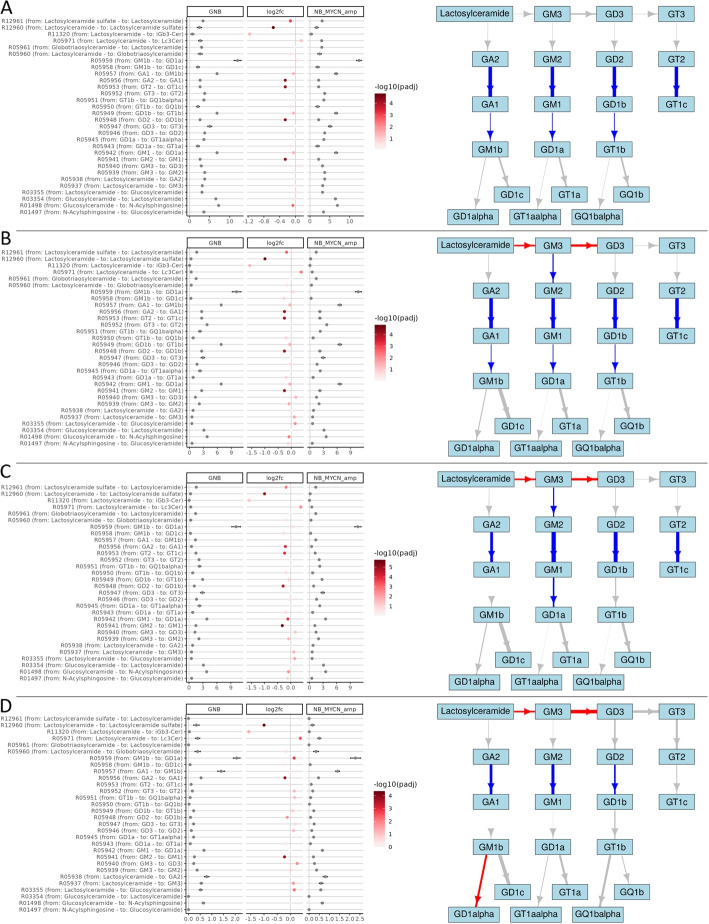
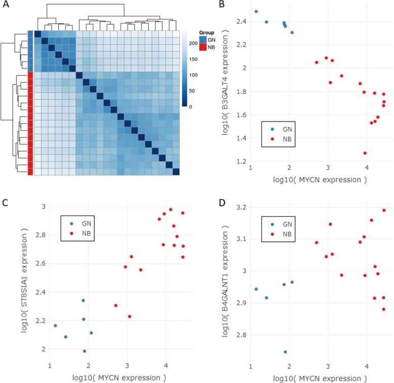
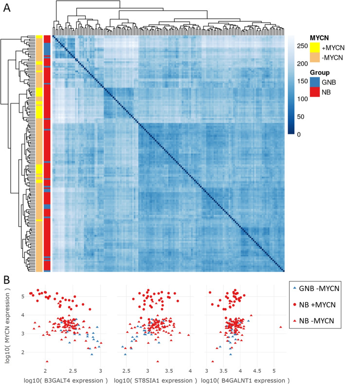
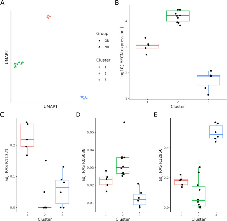
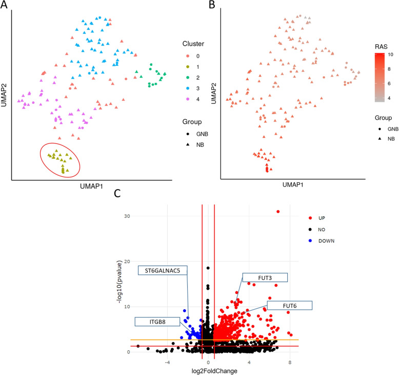
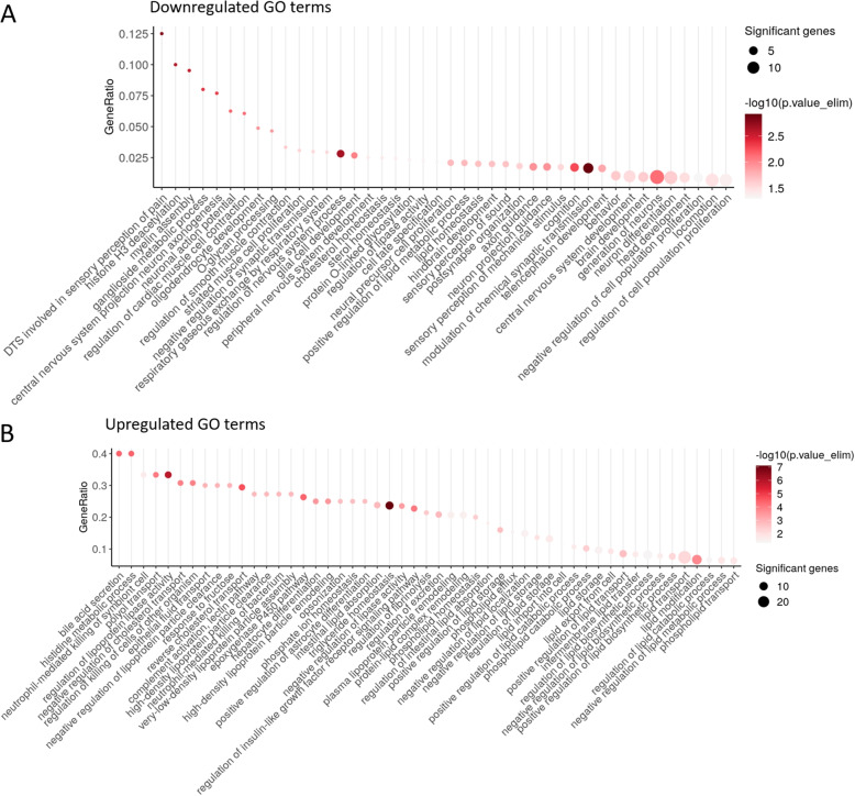
Results: By adjusting RAS values using a weighting scheme based on network topology and transition probabilities (TPs), the individual series of ganglioside metabolism can be differentiated, enabling a refined analysis of the GSL profile in NT entities. Notably, the adjustment method we propose reveals the differential engagement of the ganglioside series between NB and GNB. Moreover, MYCN gene expression, a well-known prognostic marker in NTs, appears to correlate with the expression of therapeutically relevant gangliosides, such as GD2. Using unsupervised learning, we identified subclusters within NB based on altered GSL metabolism.

Conclusion: Our study demonstrates the utility of adjusting RAS values in discriminating ganglioside metabolism subtypes, highlighting the potential for identifying novel cancer subgroups based on sphingolipid profiles. These findings contribute to a better understanding of ganglioside dysregulation in NT and may have implications for stratification and targeted therapeutic strategies in these tumors and other tumor entities with a deregulated GSL metabolism.

Keywords: GD2; Ganglioneuroblastoma; Ganglioneuroma; Ganglioside; Glycosphingolipids; Metabolic graph; Neuroblastoma; Reaction activity score.


Conflict of interest statement

The authors declare no competing interests.

Figures

Fig. 1
Fig. 1
Molecular structure of disialoganglioside GD2 and the GSL biosynthesis pathway with focus on ganglioside biosynthesis. A) Exemplarily, GD2’s head group consists of β-Glucose (Glc), linked to the ceramide backbone, β-galactose (Gal), N-acetyl-D-galactosamin (GalNAc), and two N-acetylneuraminic acid molecules (NeuNAc). The sphingoid base and the fatty acid of the ceramide anchor are respectively blue and red. B) The GSL biosynthesis pathway starts with the synthesis of glucosylceramide (GlcCer) from ceramide and the further synthesis from GlcCer to lactosylceramide (LacCer). The addition of sulfate groups to LacCer leads to lactosylceramide sulfate (SM3). From LacCer the biosynthesis pathway splits into three subseries, the globo series, the lacto- and neolacto series, and the ganglio series. The ganglio-series consists of four subseries, the 0-, a-, b-, and c-series. The genes coding for the enzymes responsible for the ganglioside biosynthesis are B4GALNT1, B3GALT4, ST3GAL2/3/5, and ST8SIA1/3/5. Figure elements created with Biorender
Fig. 2
Fig. 2
Workflow diagram representing the data processing steps (orange rectangles), the input data (black parallelograms), and the intermediate outputs (blue parallelograms). NB=Neuroblastoma; GNB=Ganglioneuroblastoma; GN=Ganglioneuroma; DGE=Differential gene expression; GSL=Glycosphingolipid; RAS=Reaction activity score; TP=Transition probability
Fig. 3
Fig. 3
Visual examples of introduced adjustment methods based on transition probability. A An exemplary graph, where nodes represent metabolites (a - h) and edges are RAS values of the respective reactions (r). Although formally the reactions from nodes a to c and b to d are separate reactions with distinct reaction IDs, the RAS values of these reactions are identical because of the involvement of the exact same genes. Therefore, we denote these reactions with identical r-numbers (r1) in this figure. The same also applies to edges r2 and r3. Ingoing and outgoing edges are dashed. B Edge weights are adjusted by multiplying the TP t with the RAS value of the respective reaction r. Exemplary calculations of the TPs are given for t1, t5, t6, and t7. The TP of t2, t3, t8, and t9 are equal to 1 because nodes c, d, e, and f have only one outgoing edge. C First alternative adjustment method, in which the TP is equal to 1, recursively takes the TP of the previously incoming edges. D Second alternative adjustment method, where exemplary the RAS value r3 is adjusted by the product of TPs along the path starting from the defined node a to node h
Fig. 4
Fig. 4
Comparison of RAS-adjusted methods on the GSL pathway between NB +MYCN and GNB. Left dot plots illustrate the adjusted RAS values of NB +MYCN (“NB_MYCN_amp” in figure) and GNB, as well as the log2 fold-change between the two groups. The whiskers indicate the standard deviation. The color intensity of log2 fold-change points indicates the negative decimal logarithm of the adjusted p-values. On the right, the subgraph containing the GSL pathway is visualized. Nodes represent the gangliosides and edges are the metabolic reactions (arrows). The arrow color describes the log2 fold-change direction, where red means that the reaction is more active in NB +MYCN compared to GNB and blue means the reaction is stronger in GNB compared to NB +MYCN. Gray arrows represent reactions that are not significant (adjusted p-value >0.05). The thickness of the arrow represents the relative log2 fold-change. The subplots show A) values from MW (RAS values), B) MW1 (RAS values adjusted by TP), C) MW2 (RAS adjusted by the recursive TP), and D) MW3 (RAS adjusted by TP of paths)
Fig. 5
Fig. 5
Comparison of RAS-adjusted methods on the GSL pathway between NB -MYCN and NB +MYCN. Left dot plots illustrate the adjusted RAS values of NB -MYCN (NB) and NB +MYCN (NB_MYCN), as well as the log2 fold-change between the two groups. The whiskers indicate the standard deviation. The color intensity of log2 fold-change points indicates the negative decimal logarithm of the adjusted p-values. On the right, the subgraph containing the GSL pathway is visualized. Nodes represent the gangliosides and edges are the metabolic reactions (arrows). The arrow color describes the log2 fold-change direction, where red means that the reaction is more active in NB +MYCN compared to NB -MYCN and blue means the reaction is stronger in NB -MYCN compared to NB +MYCN. Gray arrows represent reactions that are not significant (adjusted p-value >0.05). The thickness of the arrow represents the relative log2 fold-change. The subplots show A) values from MW (RAS values), B) MW1 (RAS values adjusted by TP), C) MW2 (RAS adjusted by the recursive TP), and D) MW3 (RAS adjusted by TP of paths)
Fig. 6
Fig. 6
A Heatmap illustrating the sample-to-sample distances of variance stabilized RNA-seq data (GN/NB dataset); GN (n = 6), and NB (n = 15); Intensity of the blue color indicates high and low similarity between samples. B Gene expression values of MYCN vs. B3GALT4. C Gene expression values of MYCN vs. ST8SIA1. D Gene expression values of MYCN vs. B4GALNT1. Red and blue dots indicate NB and GN samples, respectively
Fig. 7
Fig. 7
A Heatmap illustrating the sample-to-sample distances of variance stabilized RNA-seq data (TARGET NB/GNB) (n = 154); blue annotation = GNB (n = 25), and red annotation = NB (n = 129); yellow annotation = +MYCN (n = 31), orange annotation = -MYCN (n = 123); Intensity of the blue color indicate high and low similarity between samples. B Gene expression values of MYCN vs. B3GALT4, ST8SIA1, and B4GALNT1. Red and blue data points indicate NB and GNB samples respectively. Round-shaped data points symbolize +MYCN samples and triangle-shaped ones show -MYCN samples
Fig. 8
Fig. 8
Stability assessment of the unsupervised clustering of the adjusted RAS matrices. UMAP dimensionality reduction with HDBSCAN clustering was performed on 21 samples of the GN/NB dataset over 1000 iterations. UMAP’s parameter n_neighbor attribute was set to 3. The subplots show 50 random selected iterations of UMAP followed by HDBSCAN clustering (x-axis) for A) MW (RAS values), B) MW1 (RAS values adjusted by TP), C) MW2 (RAS adjusted by the path-specific TP), and D) MW3 (RAS adjusted by the recursive TP). The color indicates the cluster of the respective sample. GN is represented through a circle, while NBs are rectangular. The same samples are connected with lines between the iterations, indicating cluster stability. The y-axis represents the sum of x- and y-coordinates of the UMAP per sample
Fig. 9
Fig. 9
Unsupervised clustering and identification of marker reactions. A The HDBSCAN clustering of the UMAP coordinates based on the MW3 (RAS values adjusted by TP along paths) shows a clear separation between GN and NB, as well as a separation of NB samples into two distinct groups. Round symbols represent GN and triangles are NB samples. B Box plot of normalized MYCN expression grouped by identified clusters. With a t-test statistic we demonstrate characteristic reactions per cluster. As an example, the box plot in C) shows the adjustment RAS values of reaction R11321 characteristically for cluster 1, D) the reaction R06038 characteristically for cluster 2, and E) the reaction R12960 characteristically for cluster 3. Boxes range from first to third quantile, the middle line indicates the median, the whiskers show the highest and lowest values no further than 1.5IQR from the hinge. Black dots represent the samples
Fig. 10
Fig. 10
Unsupervised clustering and identification of marker reactions. A One representative UMAP representation out of the 1000 computed iterations, colored by the HDBSCAN clustering (in accord with the HDBSCAN method samples of cluster 0 are identified as outliers). Circles represent GNB and triangles are NB samples. The red selection indicates samples of cluster 1. B The same UMAP representation as in B) colored by the computed values for the R06025 reaction, which was identified as highly characteristically for cluster 1. C Volcano plot of differentially expressed genes between samples of cluster 1 and all other samples. Red dots denote upregulated genes in samples of cluster 1 compared to samples of all other clusters. Blue dots show downregulated genes in cluster 1. Not significant expressed genes are black. The red lines indicate the p-value threshold of 0.05, and log2 fold change thresholds of 0.6 and -0.6. The orange line indicates the adjusted p-value threshold of 0.05. The genes FUT3/6, ITGB8, and ST6GALNAC5 were additionally labeled
Fig. 11
Fig. 11
GO term enrichment analysis of up- and downregulated genes. A Dot plot of the GO enrichment analysis results, highlighting GO pathways enriched in the downregulated genes. Only GO terms with a p-value <0.05 and more than one significant gene are shown. The color scale represents the negative logarithm of the p-value, while the dot size indicates the number of significant genes identified in each GO term. B Dot plot of GO pathways enriched in the upregulated genes. Due to the identification of over 500 identified GO pathways with a p-value <0.05 and and more than one significant gene, the subset shown includes only those GO terms with a GeneRatio >0.2. Additionally, several lipid-related pathways are highlighted as examples. The color scale denotes the negative logarithm of the p-value, and the dot size represents the number of significant genes associated with each GO term. The GeneRatio is calculated as the number of significant genes found in a given GO term divided by the total number of genes annotated to that GO term

Similar articles

References

    1. Schnaar RL. The biology of gangliosides. Adv Carbohydr Chem Biochem. 2019;76:113–48. 10.1016/bs.accb.2018.09.002. - PubMed
    1. Sipione S, Monyror J, Galleguillos D, Steinberg N, Kadam V. Gangliosides in the Brain: Physiology. Pathophysiology and Therapeutic Applications Front Neurosci. 2020;14:572965. 10.3389/fnins.2020.572965. - PMC - PubMed
    1. Gault CR, Obeid LM, Hannun YA. An overview of sphingolipid metabolism: from synthesis to breakdown. Adv Exp Med Biol. 2010;688:1–23. 10.1007/978-1-4419-6741-1_1. - PMC - PubMed
    1. Schnaar RL, Sandhoff R, Tiemeyer M, Kinoshita T. In: Varki A, Cummings RD, Esko JD, Stanley P, Hart GW, Aebi M, et al., editors. Glycosphingolipids. 4th ed. Cold Spring Harbor (NY); 2022. pp. 129–40. 10.1101/glycobiology.4e.11.
    1. Sandhoff R, Sandhoff K. Emerging concepts of ganglioside metabolism. FEBS Lett. 2018;592(23):3835–64. 10.1002/1873-3468.13114. - PubMed

LinkOut - more resources