[Preprint]. 2024 Oct 17:2024.10.15.618303.
doi: 10.1101/2024.10.15.618303.

An Extensive Atlas of Proteome and Phosphoproteome Turnover Across Mouse Tissues and Brain Regions

Affiliations

An Extensive Atlas of Proteome and Phosphoproteome Turnover Across Mouse Tissues and Brain Regions

Wenxue Li et al. bioRxiv. .

Update in

Abstract

Understanding how proteins in different mammalian tissues are regulated is central to biology. Protein abundance, turnover, and post-translational modifications like phosphorylation, are key factors that determine tissue-specific proteome properties. However, these properties are challenging to study across tissues and remain poorly understood. Here, we present Turnover-PPT, a comprehensive resource mapping the abundance and lifetime of 11,000 proteins and 40,000 phosphosites across eight mouse tissues and various brain regions, using advanced proteomics and stable isotope labeling. We revealed tissue-specific short- and long-lived proteins, strong correlations between interacting protein lifetimes, and distinct impacts of phosphorylation on protein turnover. Notably, we discovered that peroxisomes are regulated by protein turnover across tissues, and that phosphorylation regulates the stability of neurodegeneration-related proteins, such as Tau and α-synuclein. Thus, Turnover-PPT provides new fundamental insights into protein stability, tissue dynamic proteotypes, and the role of protein phosphorylation, and is accessible via an interactive web-based portal at https://yslproteomics.shinyapps.io/tissuePPT.


Conflict of interest statement

Declaration of interests The authors declare no competing interests.

Figures
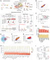
Figure 1.
Figure 1.. Generation of a high-quality protein turnover atlas across mouse tissues and brain regions.
(A) pSILAC-MS workflow used for cross-tissue protein turnover analysis in mice. The BoxCarmax-DIA and TMTpro methods were employed to improve quantification accuracy. (B) Spearman correlation of protein lifetimes across the proteome, as quantified by DIA and TMT methods. (C) Spearman correlation of protein lifetimes within each tissue, as quantified by DIA and TMT methods. (D) Summary of proteome coverage for both protein identification and protein lifetime profiling. (E) Venn diagram comparing mouse heart proteome coverage between this study and Hasper et al. (F) Spearman correlation of PT results (i.e., T50 values) between the two studies for the heart proteome. (G) Scatterplot displaying the comparison of protein abundance and lifetime between this study and Hasper et al. (red dots). (H) Density plot of protein lifetimes across 16 mouse tissue samples. (I) Violin plots summarizing the protein abundances and lifetimes of Tau and alpha-synuclein. The red dashed lines indicate the proteome-wide averaged levels of abundances and lifetimes.
Figure 2.
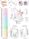
Figure 2.. Concurrent protein abundance (PA) and lifetime (PT) profiling of the mouse tissue proteome.
(A) Principal Component Analysis (PCA) of PA and PT in brain regions and solid tissues. (B) Hierarchical clustering heatmap showing Pearson correlation between tissues and brain regions based on PA and PT, respectively. (C) Selected biological processes enriched among the 5% shortest- and longest-lived proteins, based on their average PTs in brain regions and non-brain tissues. Enrichment p-values were reported by Metascape. (D) Distribution of cross-tissue Spearman correlation between PA and PT for all proteins across tissues and regions. Upper panel: Density histogram of Spearman rho values for all proteins. Lower panel: Boxplots of protein-specific Spearman rho values for selected GO terms. (E) Heat-circle (HC) plot visualization of PA and PT across tissues at different levels of cellular organization. Upper left panel: PT across all tissues, with proteome abundance normalized. Middle left panel: HC plot visualizing main cellular components across samples. Other panels: HC plot examples for individual proteins within selected protein groups. The blue-to-red color gradient denotes protein lifetime from long to short. The size of the HC plot circles is proportional to the Log2(iBAQ) value indicating PA. Triangle: iBAQ value is in the bottom 5% (i.e., Log2(iBAQ) < 6). Diamond: iBAQ value is in the top 5% (i.e., Log2(iBAQ) > 16).
Figure 3.
Figure 3.. Characterization of protein removal processes across tissues.
(A) Heat-circle (HC) plot of proteasome subunits (19S and 20S), lysosomal proteins across tissues, ad E3 ubiquitin ligases (E3s) across tissues. The color and size are defined as in Figure 2E. Those E3 proteins with PA quantified in less than 12 tissue samples were filtered. (B) Hierarchical clustering heatmap of PA profiles of the five proteins representing protein degradation machineries. The brown-to-green color bar indicates the increasing relative abundance in terms of Log2 (iBAQ values). (C) The same heatmap as (D) for PT profiles. The red-to-blue color bar indicates the increasing relative lifetime in terms of Log2 (T50 days). (D) The boxplot of standard deviation S.D. of [Log2 (PA of each protein)- Log2(PA of averaged level)] for each protein list indicating the PA variability across tissues. (E) The boxplot of standard deviation S.D. of [Log2 (T50 of each protein)- Log2(T50 of averaged level)] for each protein list indicating the PT variability across tissues.
Figure 4.
Figure 4.. Strong association between protein lifetime and protein-protein interaction (PPI) across tissues.
(A) Boxplots of correlation coefficients for PA between PPI partners, based on CORUM, Bioplex 3.0, and PCP-derived mouse tissue-specific PPI lists (Skinnider et al.). P-values were calculated using the Wilcoxon test. “In” and “Out” denote PPIs included or not described in these resources. (B) The same boxplot as in (A) for PT. (C) The same boxplot as in (A) and (B) for both PA and PT, based on PPI confidence levels retrieved from the hu.MAP database. Levels 1-5 indicate increasing PPI confidence in hu.MAP. (D) Receiver operating characteristic (ROC) curves indicating the predictive power of PA, PT, and their combined panel using logistic regression, alongside CORUM- and Bioplex-derived lists. The Extremely High and Very High confidence groups of PPIs from hu.MAP were used as true positives (TP). An equal number of randomly generated false pairs were used as false positives (FP) (Methods). AUC, Area Under the Curve. (E) Visualization of PT for PPI partners of PSMD1, LMNA, and AK2 proteins (the central nodes) in selected tissues. PT values of the central nodes are visualized using a yellow-to-green color gradient. The red-to-blue color bar denotes the relative PT difference between PPI partners and central nodes (i.e., T50 difference). The red, black, and dashed black edges represent PPIs unique to the specific tissue, all PPIs in the specific tissue (not necessarily unique), and PPIs in any of the mouse tissues (the whole dataset), respectively, according to Skinnider et al.
Figure 5.
Figure 5.. Cross-tissue multi-omic analysis and turnover control of peroxisome proteins.
(A) Proteome-wide absolute Spearman correlation between measurements of mRNA, translatome, PA, and PT across five tissues. The brain results were determined by averaging all brain regions. (B) Density plots of protein-specific Spearman correlation rho values between multi-omic layers for all measured proteins (upper panel) and tissue-enriched proteins (lower panel). Tissue-enriched proteins are defined as those with protein abundance at least four times higher than the average of other tissues. (C) Heatmap visualizing the cross-tissue Spearman correlation between multi-omic layers. (D) Heatmap of quantitative results (column-scaled) for GO Cellular Components across multi-omic layers. The blue-to-red color bar represents the summed values of proteins associated with specific GO Cellular Components. (E) Boxplots of mRNA abundance, PA, and PT levels for peroxisome proteins. (F) Heatmap of quantitative results for individual peroxisome proteins measured across five tissues and multi-omic layers.
Figure 6.
Figure 6.. Profiling site-specific phosphorylation turnover and its impact across mouse tissues.
(A) Number of quantified phosphorylation sites (P-sites) with abundance and lifetime values across tissues (Hippocampus not included for phosphoproteomics due to insufficient sample amount). (B) PCA plots of P-site abundance and lifetime across tissues. (C) Pearson correlation analysis of P-site abundance and lifetime between tissues, with the blue-to-red color bar indicating increasing Pearson correlation coefficients. (D) Distribution of Spearman correlation between T50 of the phosphorylated (phos_T50) and non-phosphorylated peptides (nonPhos_T50) for all specific P-sites across tissues, mapped to the kinase library based on kinase-substrate annotation. The 106 kinases with 30 or more putative P-site substrates (Percentile >0.99) quantified with respective T50 are shown. (E) Mapping of Spearman correlation between T50 of the phosphorylated (phos_T50) and non-phosphorylated peptides (nonPhos_T50) across tissues onto a kinase phylogenetic tree. The size of the kinase nodes represents the number of P-site substrates, and the blue-to-red color bar indicates increasing Spearman correlation coefficients (rho). (F) Volcano plots showing P-sites that increase or delay protein turnover (i.e., destabilizing or stabilizing the corresponding protein) across brain regions and non-brain tissues. The fold change in PT was determined by comparing phosphopeptides to non-phosphopeptides of the same peptide sequence. P-values were calculated using Student's t-test. Blue and red dots denote the significant P-sites (P-value <0.05, Student's t-test) showing the ∣fold change∣ >1.5 (in brain) and >1.2 (in non-brain tissues).
Figure 7.
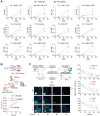
Figure 7.. Demonstration and verification of phosphorylation sites (P-sites) linked to protein turnover in mouse tissues.
(A) Heavy/Light (H/L) ratio curve examples during the labeling course for a phosphorylated (p) peptide and its non-phosphorylated (np) peptide counterpart of the same sequence and protein. (B) Validation of phosphorylation's stabilizing effect on Tau protein using the PhosTAC approach. Upper panel: The pSILAC experiment comparing Tau protein turnover after PhosTAC or DMSO treatments. Lower panel: Heavy-to-light ratio curves during treatment and pSILAC labeling. P-values were calculated using Student's t-test. (C) Validation of Tau and alpha-synuclein P-sites associated with protein degradation in primary hippocampal cortical neurons. Left panel: Neurons were infected with FLAG-tagged alpha-synuclein or Tau, either as wild type (WT) or mimicking mutants dephosphorylated (T/S to A) or phosphorylated (T/S to D). After three days of expression, neurons were treated with cycloheximide, chased for different times, stained, automatically imaged, and FLAG fluorescence intensity was measured. Right panel: Fluorescence imaging results from three independent experiments for alpha-synuclein (T81) and Tau (MAPT, S522, T525). Bars in graphs represent SEM. Statistical test: ANOVA. *p < 0.05; ****p < 0.0001. Scale bar: 5 μm.

References

    1. Glass R.D., and Doyle D. (1972). On the measurement of protein turnover in animal cells. J Biol Chem 247, 5234–5242. - PubMed
    1. Pratt J.M., Petty J., Riba-Garcia I., Robertson D.H., Gaskell S.J., Oliver S.G., and Beynon R.J. (2002). Dynamics of protein turnover, a missing dimension in proteomics. Molecular & cellular proteomics : MCP 1, 579–591. - PubMed
    1. Claydon A.J., and Beynon R. (2012). Proteome dynamics: revisiting turnover with a global perspective. Molecular & cellular proteomics : MCP 11, 1551–1565. 10.1074/mcp.O112.022186. - DOI - PMC - PubMed
    1. Ross A.B., Langer J.D., and Jovanovic M. (2021). Proteome Turnover in the Spotlight: Approaches, Applications, and Perspectives. Molecular & cellular proteomics : MCP 20, 100016. 10.1074/mcp.R120.002190. - DOI - PMC - PubMed
    1. Liu Y., Borel C., Li L., Muller T., Williams E.G., Germain P.L., Buljan M., Sajic T., Boersema P.J., Shao W., et al. (2017). Systematic proteome and proteostasis profiling in human Trisomy 21 fibroblast cells. Nature communications 8, 1212. 10.1038/s41467-017-01422-6. - DOI - PMC - PubMed

Publication types

LinkOut - more resources