. 2024 Oct;634(8036):1187-1195.
doi: 10.1038/s41586-024-07954-4. Epub 2024 Oct 30.

Temporal recording of mammalian development and precancer

Affiliations

Temporal recording of mammalian development and precancer

Mirazul Islam et al. Nature. 2024 Oct.

Abstract

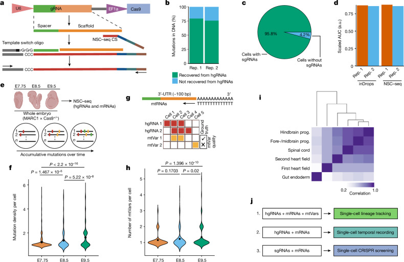
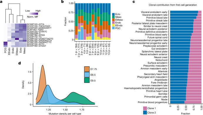
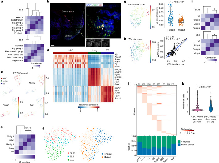
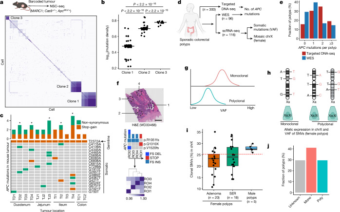
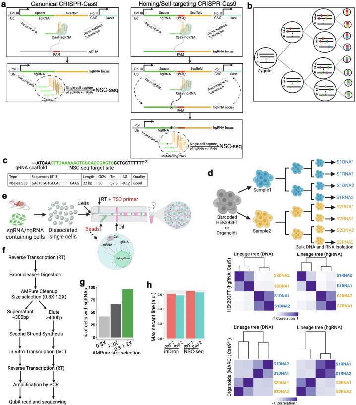
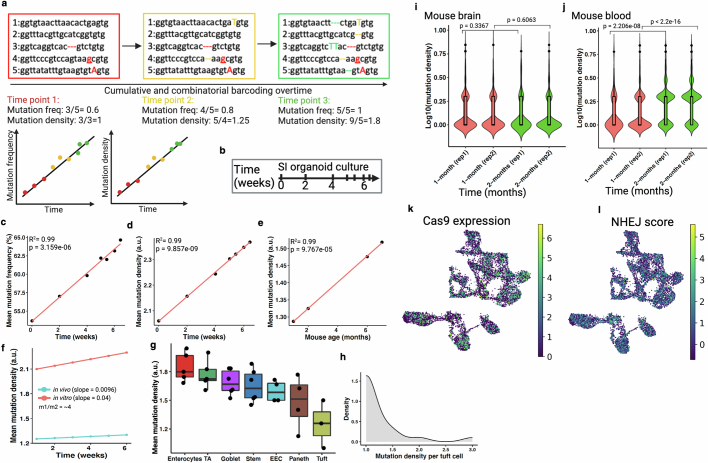
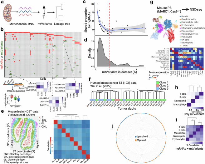
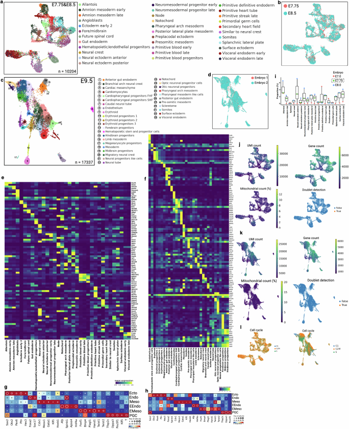
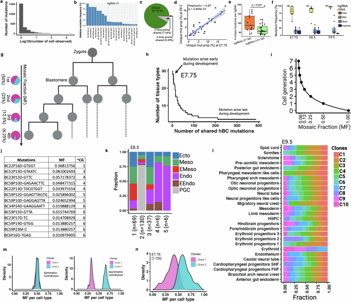
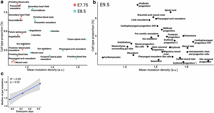
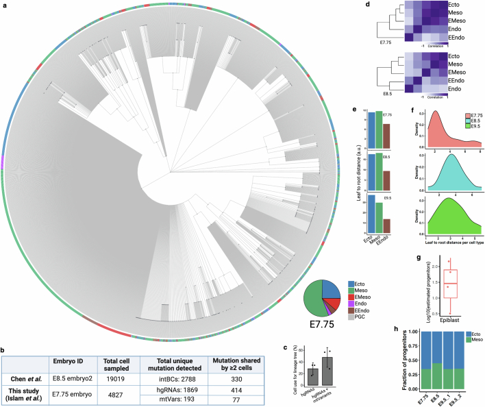
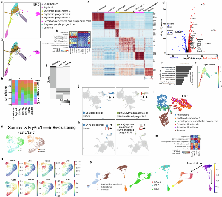
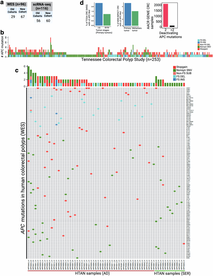
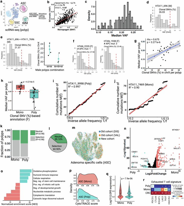
Temporal ordering of cellular events offers fundamental insights into biological phenomena. Although this is traditionally achieved through continuous direct observations1,2, an alternative solution leverages irreversible genetic changes, such as naturally occurring mutations, to create indelible marks that enables retrospective temporal ordering3-5. Using a multipurpose, single-cell CRISPR platform, we developed a molecular clock approach to record the timing of cellular events and clonality in vivo, with incorporation of cell state and lineage information. Using this approach, we uncovered precise timing of tissue-specific cell expansion during mouse embryonic development, unconventional developmental relationships between cell types and new epithelial progenitor states by their unique genetic histories. Analysis of mouse adenomas, coupled to multiomic and single-cell profiling of human precancers, with clonal analysis of 418 human polyps, demonstrated the occurrence of polyclonal initiation in 15-30% of colonic precancers, showing their origins from multiple normal founders. Our study presents a multimodal framework that lays the foundation for in vivo recording, integrating synthetic or natural indelible genetic changes with single-cell analyses, to explore the origins and timing of development and tumorigenesis in mammalian systems.


Conflict of interest statement

M.J.S. received funding from Janssen. J.C.R. is on the scientific advisory board of Sitryx Therapeutics. K.S.L. is an hourly consultant for Etiome, Inc. G.M.C. is a founder of Colossal Biosciences Inc., Dallas, TX. L.T.T. is currently an employee of Genentech. The other authors declare no competing interests.

Figures

Fig. 1
Fig. 1. Optimization of a multipurpose, single-cell capture platform.
a, gRNA capture schematic for the NSC–seq platform. The target site of gRNA scaffold anneals to NSC–seq capture sequence (CS) with a cellular barcode (blue) and unique molecular identifier (green). An additional sequence (grey) is added to the 3′-end of the complementary DNA via template switching during reverse transcription to enable downstream library amplification. This gRNA capture approach is compatible with any type of gRNA (single-guide RNA (sgRNA), hgRNA and self-targeting guide RNA) that contains the target site sequence in the scaffold (Extended Data Fig. 1). b, Cas9-induced mutation recovery by direct hgRNA capture as compared with mutations detected in DNA of the same samples. c, gRNA capture efficiency by NSC–seq assessed in an experiment in which all cells from a drug-selected cell line should contain sgRNAs. d, Comparative transcriptome capture efficiency between standard inDrops and NSC–seq experiments. e, NSC–seq experiments performed on developmentally barcoded whole embryos in which Cas9 is constitutively expressed (top). Accumulative mutations on homing barcode regions increase over time (bottom),. f, Average mutation density over embryonic time points (Extended Data Fig. 2a). Black dots represent geometric mean for each time point, and P values are derived from unpaired two-tailed t-tests. g, Somatic mtVar calling from mitochondrial RNA (mtRNA) (top). Approach to filtering informative mtVars for lineage tracking using hgRNA mutations as ground truth (bottom) (Extended Data Fig. 3b–d). h, Number of somatic mtVars per cell over embryonic time points. Black dot represents geometric mean for each time point, and P values were derived from unpaired two-tailed t-tests. i, Pearson correlation coefficient heat map of variant proportions combining hgRNAs and mtVars for selected tissue types, presented as pseudobulk from an E9.5 embryo (Extended Data Fig. 4). j, Multimodal application of the NSC–seq platform. a,e,g,j, Schematics created using BioRender (https://BioRender.com). a.u., arbitrary units; AUC, area under the curve; rep., replicate; prog., progenitor; bp, base pairs. Source Data
Fig. 2
Fig. 2. Lineage and temporal recording of mouse embryogenesis.
a, Normalized (norm.) mosaic fraction (MF) of EEM heat map for E7.75 embryo, used to reconstruct lineage relationships within the major germ layers (Extended Data Figs. 5 and 7). b, Contribution of different EEMs towards various germ layers at E7.75. c, Clonal contribution from a first-cell-generation mutation (clone 1) at E7.75 across individual tissue types (P = 1.57 × 10−13, Kolmogorov–Smirnov test for the null hypothesis of symmetry) compared with all other clones aggregated as clone 2 (Extended Data Fig. 5l–n). d, Density plots representing cumulative turnover of different tissue types across three embryonic time points. The widths of mutation density distributions represent the variation by which different cell types have proliferated across time points (Extended Data Fig. 6 and Supplementary Table 2 show mutation density per cell type). EMeso, extra-embryonic mesoderm. Source Data
Fig. 3
Fig. 3. Embryonic lineage diversification and gut development.
a, Pearson correlation coefficient heat maps of variant proportions, presented as pseudobulk within haematopoietic and somite cell types. b, Multiplex HCR RNA–FISH staining of somite (Twist1) and haematopoietic (Kit) markers in a E9.5 embryo. A cluster of haematopoietic cells (white arrowhead) in the somite area is shown in the inset (right). DAPI (i), Twist1 (ii) and Kit (iii) (Extended Data Fig. 8). Results were validated in more than three independent experiments. Scale bar, 100 μm. c, Foregut cells (E7.75) coloured by annotated tissue types. d, Heat map of differentially expressed genes among three foregut tissue types at E7.75. e, Pearson correlation coefficient heat map of distinct tissue types (Extended Data Fig. 9). f, Midgut and hindgut cells coloured by embryonic time points and regions. g, Visceral endoderm (VE) intermix score overlay onto f. Quantification of VE intermix score in hindgut compared with midgut cells (n = 3 embryos per group). Box plots show the median and first and third quartiles, with whiskers extending to 1.5× interquartile region beyond the box. Unpaired two-tailed t-test. h, Wnt signalling score overlaid onto f. Pearson correlation analysis between Wnt signalling score and VE intermix score. Correlations and P values (by F-test) and 95% confidence intervals (shaded area) are indicated. i, Pearson correlation coefficient heat maps of gut regions with VE from E7.75 and E8.5 embryos. j, Distribution of clones across cell types in adult mouse small intestinal epithelium (Extended Data Fig. 11). The plot (below) shows the fractions of parent and childless clones comprising each cell type (Extended Data Figs. 10j and 11). k, Violin plots of CBC- and pISC-rooted clone sizes. Box plots within violins show the median value and box edges represent the first and third quartiles; unpaired two-tailed t-test. EC, enterocytes; EEC, enteroendocrine cells; TA, transit-amplifying cells; TT, thyroid/thymus. Source Data
Fig. 4
Fig. 4. Clonal origin of colorectal precancer.
a, Pearson correlation coefficient heat maps of variants from mouse intestinal tumour (ApcMin/+)-derived single cells. Distinctly correlated regions are marked by three clones within the same tumour (Extended Data Fig. 12). b, Estimated mutation density for the three assigned clones in a. Black lines represent the median for each clone, unpaired two-tailed t-test. c, OncoPrint plot representing the number of Apc mutations across mouse tumours using WES. d, Overview of experimental design for profiling of clonal origin across multiple human datasets. e, Bar plots summarizing the number of APC mutations per polyp using targeted DNA sequencing and WES (Extended Data Fig. 13). f, Top, multiregion (punch biopsy) WES of a human CRC sample representing distinct APC mutations; bottom, Pearson correlation coefficient heat map of somatic mutations within regions of interest (ROI). Scale bar, 2 mm. g, Expected median VAF distribution under different clonal architectures. h, Mosaic X chromosome (chrX) inactivation patterns in female polyps can delineate the clonal origin of cells using expression-based, X-linked somatic clonal SNVs. Male polyps are considered monoclonal due to the single male X chromosome (Extended Data Fig. 14d–f and Supplementary Methods. i, Box plots representing distribution of X-linked clonal SNVs (%) between male and female polyps. Box plots show the median, box edges represent the first and third quartiles and whiskers extend to a minimum and maximum of 1.5× interquartile range beyond the box. Red dashed line is a cut-off to assign clonality in female polyps (Extended Data Fig. 14g,h). j, Summary of median VAF-based polyp profiling. a,d,g,h, Schematics created using BioRender (https://BioRender.com). H&E, haematoxylin and eosin; asterisk, polyclonal tumour; FS DEL, frameshift deletion; FS INS, frameshift insertion; STOP, stop codon. Source Data
Extended Data Fig. 1
Extended Data Fig. 1. Design and validation of NSC-seq platform.
(a) Schematic representation of canonical CRISPR-Cas9 (left) and homing/self-targeting CRISPR-Cas9 (right). In homing CRISPR, Cas9-hgRNA complex targets the DNA locus encoding the hgRNA itself. (b) Schematic representation of lineage tracking during development using Cas9-induced mutations. (c) Target site for NSC-seq capture sequence (green), along with quality metrics of the capture sequence primer. (d) Experimental design of control lineage tracking experiments using homing CRISPR-barcoded HEK293FT cell line and mouse intestinal organoids (MARC1;Cas9), where the hierarchy of the cultures are known through passage sampling. Similar lineage trees are observed from both bulk DNA and bulk hgRNA barcodes in this experiment (bottom). Cell lines were passaged after 1 week, whereas organoids were passaged after 3 days. (e) Overview of single-cell experiment using NSC-seq platform simultaneously capturing both gRNA and mRNA within the same droplet. Custom hydrogel beads are designed for NSC-seq experiment using inDrops. See supplemental table 1 for primer sequences. (f) Workflow delineating two separate library preparations (gRNA and mRNA) of NSC-seq. (g) Different cDNA size selection approaches yield varying sgRNA capture efficiencies. The use of two separate library preparation approaches in (f) results in improved capture efficiency. (h) Comparative transcriptome (mRNA) capture efficiency between inDrops and NSC-seq experiments (see Fig. 1d and supplemental method). Schematic in a adapted from ref. , Springer Nature America, and schematics in a, b, d, e, and f created using BioRender (https://BioRender.com). Source Data
Extended Data Fig. 2
Extended Data Fig. 2. Overview of temporal recording.
(a) Schematic representation of increasing mutation density and mutation frequency overtime in self-mutating CRISPR system,. Mutation frequency denotes the proportion of wild-type barcodes at a given time. Mutation density is the number of unique mutations per mutated barcode. Color indicates different timepoints. Insertion (capital), deletion (dotted line) and base substitution (underline) mutations are shown here. Theoretical expected mutation frequency and mutation density are function of time (bottom). (b) Schematic of in vitro small intestinal (SI) organoids culture over 6 weeks and subsampled to analyze accumulative mutations. (c-d) Mutation frequency and mutation density exhibit a linear increase overtime. (e) Mutation density from adult mouse duodenum (SI) displays a linear increase overtime (in vivo). Pearson’s coefficient of determinant (R2) and p value (by F-test) are indicated in c-e. (f) Comparative mutation density increases in mouse SI between in vivo and in vitro. Values derived from previous linear model (d and e) to plot under same coordinate. Slope (m) indicates relative rate of cell division. In vitro cell division rate in intestinal organoids is almost 4 times higher than the in vivo intestinal epithelial cell division. (g) Comparative cell division (mutation density) across different small intestinal epithelial cell types (see Extended Data Fig. 11i). Here, each dot is a technical replicate (NSC-seq library) from the same mouse. Box plots show the median, box edges represent the first and third quartiles, and the whiskers extend to a maximum and maximum of 1.5*IQR beyond the box. TA, Transit-amplifying; and EEC, enteroendocrine; Stem, CBC. These data support the expected notion that enterocyte turnover is higher than Paneth cells. (h) Distribution of mutation density per tuft cell reflects only a small fraction of this cell type shows turnover signature, as reported before. (i-j) Comparative mutation density between cycling (blood) and non-cycling/less-cycling (brain) tissue types over two time points. These data support that increasing mutation density is cell division dependent. Here, rep1 and rep2 are independent biological replicates and bulk DNA barcode-based mutation density assessment. Box plots inside the violin show the median value (thick line), box edges represent the first and third quartiles. P value from unpaired two-tailed t-test. (k) Cas9 expression is uniform across embryonic cell types (E7.75 and E8.5). (l) Nonhomologous end joining (NHEJ) activity score is also uniform across cell types. Panel a and b created using BioRender (https://BioRender.com). Source Data
Extended Data Fig. 3
Extended Data Fig. 3. Mitochondrial variants detection and validation for lineage analysis.
(a) Schematic of mitochondrial variants (mtVars) based lineage analysis. (b) A representative plot of mtVars (green) and hgRNA mutations (red) from same selective group of intestinal cells (top). Validation of a few mtVars using targeted deep sequencing using previously reported targeted enrichment (bottom). Box plots (bottom right) show the median (n = 9 cells), box edges represent the first and third quartiles, and the whiskers extend to a minimum and a maximum of 1.5 × IQR beyond the box. Heatmaps (bottom left) color represents unique reads per cell. See Supplemental methods for details. (c-d) Pairwise shared hgRNA mutation proportion for each mtVar (c) and density plot of mtVars across dataset (d). mtVars distributed in a smaller number of cells (~1% of dataset) are more informative for lineage inference. Regression line (c) drawn from default local polynomial regression fit (loess) in R and shaded area indicates confidence interval. (e) mtVars calling from an adult mouse brain (coronal section) special transcriptomics (ST) data. Pearson correlation coefficient heat map of mtVars proportions for distinct tissue layers in mouse left (L) and right (R) brain. Olfactory nerve layer (ONL) in between left and right is marked as middle (M). Annotations from original study are used here. Lineage tree suggests that tissue layers are established before L-R axis commitment during brain development. (f) Dendrogram of Pearson correlation coefficient heat map using only mtVars (10X ST data) from human breast cancer. mtVars can identify clonal relationship in human breast cancer tissues corresponding to copy number based clonal relationship: clone 2 and clone 3 are closely related compared to clone 1. Duct annotations from original study are used here and the dendrogram- corresponding heat map is not shown here. (g) NSC-seq encapsulation of mouse peripheral blood (PB) cells, followed by cell type annotation using marker genes (dot plot). (h) Pearson correlation coefficient heat map of variant proportions using mtVars for selected cell types is presented as pseudobulk. (i) Pearson correlation coefficient heat map of variant proportions combining hgRNAs and mtVars for selected cell types is presented as pseudobulk. (j) Reconstruction of single cell lineage tree using custom LinTiMaT pipeline. See supplemental methods and GitHub page. Cells in the leaf are broadly colored by lymphoid and myeloid lineages. Panel a and b created using BioRender (https://BioRender.com). Source Data
Extended Data Fig. 4
Extended Data Fig. 4. Cell-type annotation and data quality control metrics for mouse embryos.
(a) Uniform manifold approximation and projection (UMAP) embedding shows cell populations from two embryos. Cells are colored by annotated cell types. See supplemental note for embryonic cell type annotation. (b) Cells are colored by two embryonic time points. (c) UMAP embedding of two E9.5 embryos and cell type annotation. (d) Cells are colored by embryo number. (e-f) Heat map of mean expression of selective marker genes (y axis) for each cell type (x axis). Counts are normalized to median library size and log transformed. Separate heatmaps e and f are corresponding to a and c, respectively. (g-h) Dot plots of representative germ layers specific marker genes. Annotated cell types are grouped into germ layers for E7.75&E8.5 (g) and E9.5 (h) embryos. The size of the circle denotes the fraction of marker-positive cells, and color intensity indicates normalized group mean. (i) Box plots representing tissue proportions from E7.0, E7.75, and E8.0. Only E7.75 embryo is from this study. The proportion of shared selective cell types from wild-type embryos (E7.0 and E8.0) are calculated from GSE122187. Box plots show the median (n = 3 embryos), box edges represent the first and third quartiles, and the whiskers extend to a minimum and a maximum of 1.5 × IQR beyond the box. (j-k) UMAP plots are colored by unique molecular identifiers (UMIs), number of unique genes detected per cell, percentage of mitochondrial gene counts per cell, and predicted doublet score (Scrublet). See supplemental method and GitHub section for further data filter and quality control approaches. (l) UMAPs represent cell cycle status. Source Data
Extended Data Fig. 5
Extended Data Fig. 5. Temporal recording reveals asymmetric contribution of early embryonic clones to germ layers and tissue types.
(a) The histogram represents the number of cells in which each mutant allele is observed across three embryonic time points (3-ETP). (b) The top mutation frequency distribution is shown from a representative 21 bp long barcode of two E9.5 embryos. The mutation code along the x-axis is as follows: barcode number (BC), barcode position (P), mutation type (insertion, I; deletion, D; mismatch, M), and mutated base(s). (c) Proportion of shared and unique mutations across 3-ETP. (d) Scatter plot shows the proportion of unique mutations within each annotated cell types between E7.75 and E8.5 embryos. Pearson’s correlation (r) and p value (by F-test) are indicated. Shaded area indicates 95% confidence intervals of the regression line. See Extended Data Fig. 4 for cell type annotation. (e) Relatively fast mutation accumulation in small length hgRNAs, as reported before. Data points are calculated from 3-ETP; p value is derived from unpaired two-tailed t-test. (f) Average hgRNA activity across time points. Box plots in e and f show the median, box edges represent the first and third quartiles, and the whiskers extend to a minimum and a maximum of 1.5 × IQR beyond the box. (g) A phylogenetic tree schematic represents early embryonic development. Mosaic fraction (MF) of somatic early embryonic mutations (EEMs) that are found across all three germ layers tracks cell generation (CG) stage,. MF represents the fraction of single cells that carry a certain mutation. (h) Distribution of hgRNA mutations that are shared between ≥ 2 tissue types at E7.75. The earlier a mutation arises during development; the more tissue types would share that mutation. (i) Relationship between MF and CG (CG=log2(1/MF)). (j) EEMs and corresponding approximate CG for E7.75 embryo. Due to possible dropout in single-cell mutation detection, CG was assigned to the next closest CG stage as shown in i. (k) Unequal contribution of EEMs towards specific germ layers at E8.5. (l) MF distribution of 10 EEMs (found in >50% of tissue types) showing unequal contributions to specific tissue types at E9.5. The fraction of cells in each tissue contributed by clones C1 to C10 normalized by summing to 100%. (m) Simulated data representing symmetric (left) and asymmetric (right) contribution of first two clones (blastomeres) to tissue types during embryogenesis. (n) Asymmetric contribution of first two clones calculated from E7.75 embryo (Fig. 2c). Panel g created using BioRender (https://BioRender.com). Source Data
Extended Data Fig. 6
Extended Data Fig. 6. Catalog of cellular turnover across embryonic timepoints.
(a) Comparative mutation density that corresponds to cellular turnover between two time points (E7.75 and E8.5). Here we show only a selective list of tissue types. See supplemental table 2 for mutation density of all the tissue types. The difference between Primitive blood early vs late at E8.5, implies that this cell type is highly proliferating and/or this cell type is derived from alternative high proliferating progenitors. (b) Cellular turnover across cell types at E9.5 embryo. Hematopoietic cell types show relatively high cellular turnover compared to other somatic cell types. (c) Consistent increase of gut endoderm cellular turnover across 3-ETP. Pearson’s coefficient of determinant (R2) and p value (by F-test) are indicated. Shaded area indicates 95% confidence intervals of the regression line. Source Data
Extended Data Fig. 7
Extended Data Fig. 7. Lineage reconstruction of mouse embryogenesis.
(a) Reconstructed single-cell lineage tree from E7.75 embryo. Leaf cells are colored by germ layer colors and the proportions of cells in the tree are shown as a pie chart (inset). Nodes are colored by dark gray. Each branch represents an independent mutation event. Non-binary single-cell trees for all embryos and adult tissues can be found in NSC-seq GitHub page. (b) Table summarizing the lineage informative mutations (shared between ≥ 2 cells) detected between two studies (Chen et al. and this study) that performed similar whole mouse embryonic lineage tracking using constitutive Cas9. Here, we compared only the best reported embryo data between two studies. (c) After combining mtVars with hgRNA mutations, number of cells with lineage informative mutations increases for single-cell lineage tree reconstruction. Note that there are high variabilities in the proportion of cell that can be used for lineage tree reconstruction among samples due to multiple reasons, including the barcode detection limit, sequencing depth, number of cells captured per experiment, and time required to accumulate mutations. Bar plots, mean (n = 3 independent NSC-seq libraries); error bar, mean ± s.d. (d) Pearson correlation coefficient heat maps of variant proportions combining hgRNAs and mtVars for germ layers presented as pseudobulk. (e) Phylogenetic distance proportion was calculated (Supplemental method) from reconstructed lineage trees using reported approach. Extraembryonic endoderm (EEndo) shows less distance from root compared to ectoderm or mesoderm across embryos, supporting nearby proximity to root (zygote). (f) Distribution of normalized phylogenetic distance (leaf to root) for annotated cell types. Wide distribution of the distance across cell types are found at E8.5 and E9.5 compared to E7.75, supporting minimal lineage divergence at E7.75 stage, similar to minimal tissue-specific proliferation reported before (Fig. 2d). (g) Estimated epiblast progenitor number calculated across embryos (n = 4) using reported approach. Average number of epiblast progenitor field size is around 28, similar to previous report. High variability may reflect embryo specific constrain in pluripotent cells number that contributes to somatic lineages. Box plot shows the median, box edges represent the first and third quartiles, and the whiskers extend to a minimum and a maximum of 1.5 × IQR beyond the box. (h) Proportion of estimated progenitor population between ectoderm and mesoderm. It has been reported that the number of ectoderm progenitors is more than the number of mesoderm progenitors at the epiblast of the prestreak stage mouse embryo. Panel b created using BioRender (https://BioRender.com). Source Data
Extended Data Fig. 8
Extended Data Fig. 8. Somite-derived hematopoiesis.
(a) Force-directed layout of hematopoietic cell types and somite from E9.5 embryos. See Extended Data Fig. 4c for annotation. (b) Dot plots show overexpressed genes in EryPro1 along with yolk sac (Icam2, Kdr, and Gpr182), or endothelial (Pecam1, and Cdh5) genes. EryPro1 doesn’t express a recently reported embryonic multipotent progenitor (eMMP) marker Flt3. (c) Heat map shows differentially expressed genes among the cell types. Cell type-specific selective list of genes are marked on the right. HSPCs, hematopoietic stem and progenitor cells. (d) A volcano plot represents differentially expressed genes (DEGs) between Erythroid and EryPro1(LCF > 2, p value < 0.05). P values derived from Wilcoxon rank-sum test, not corrected for multiple testing. Red dots are upregulated in EryPro1, blue dots are upregulated in Erythroid, and black dots are statistically not significant. (e) Enriched pathways in EryPro1 group. (f) Cells are marked by EryPro1 score. The list of genes for the signature score is shown in Supplemental table 3. (g) RNA velocity overlay shows direction from somites to EryPro1, supporting cell state transition. (h) MF of EEMs shows similar contribution (asterisk) to both somite and EryPro1, supporting similar early embryonic origin (Extended Data Fig. 5l). (i) Heat map represents shared clones (barcode mutations) across three cell types. (j) UMAP co-embedding of blood progenitor cells (blue) from E8.5 (Extended Data Fig. 4a) with E9.5 cells (gray). Arrow shows EryPro1 cluster and arrowhead shows Erythroid cluster. EryPro1 cells from E9.5 are marked by red dotted line (right). EryPro1 population is present in E8.5 embryo. (k) Similar as panel j with blood progenitor cells from E7.75. There is insignificant overlapping population in EryPro1 cluster (arrow), implicating that EryPro1 is not present yet at E7.75 stage. (l) Force-directed layout of blood progenitor cell types with somites at E8.5. EryPro1 assigned from overlapping cluster (arrow) in j. (m) A list of gene upregulates in EryPro1 is shown as dot plot. (n) Force-directed layout of EryPro1 and somites and two time points using Harmony and cells are colored by time points and cell types. (o) Expression of somites- and erythroid-specific genes are shown here. Somite to EryPro1 transitioning cells show transient expression of both hematopoietic (Gata1) and somite (Twist1) markers. Post-imputed (MAGIC) gene expression values are shown here. (p) Force-directed layout of three cell types and three time points. Cells are colored by Palantir pseudo-time trajectory (right). See Fig. 3a,b. Source Data
Extended Data Fig. 9
Extended Data Fig. 9. Gut endoderm development and progenitor specification.
(a) Force-directed layout of three endoderm clusters from Extended Data Fig. 4a. Cells are colored by two embryonic time points. (b) Gene expression of definitive endoderm (Sox2, Otx2, and Ccnd2) and visceral endoderm (Afp, Pla2g12b, and Fmr1nb) specific markers. (c-d) Based on region specific marker gene expression, DE (dotted line) is divided into three clusters, supporting regionalization of gut endoderm. Here, VE is the combination of embryonic visceral endoderm (emVE), extra-embryonic visceral endoderm (exVE), and yolk sac endoderm (YsE). Heat map of selective gut specific marker genes (y axis) as mean expression for each tissue type (x axis) are shown here in d. (e) Force-directed layout of foregut cells from E7.75 embryo. Three clusters are associated with three progenitor population. HPC, hepatopancreatic cells. Gene expression of HPC (Nkx6-1, Afp), lung (Pyy, Sp5), and thyroid/thymus (Foxe1, and Eye2) clusters are shown here. See Fig. 3c for more genes. (f) Regulon activity is shown across the three tissue types. (g-h) Force-directed layout of foregut cells from E8.5 embryo. Heat map of selective marker genes (y axis) as mean expression for each tissue type (x axis). (i) Force-directed layout of epiblast cells at E7.5. This scRNA-seq data and epiblast annotations are taken from a previous study. Cells are colored by gut progenitor specific markers. (j) Force-directed layout of hindgut and midgut cells from three embryonic time points. Cells are colored by three time points and two corresponding tissue types. Midgut (Gata4, Pyy, and Hoxb1) and hindgut (Cdx2, Cdx4, and Hoxc9) specific markers are shown in the bottom. (k) Regulon activity of hindgut and midgut cells at E7.75. (l) Palantir pseudo-time and CytoTRACE score distribution in midgut and hindgut across three time points. (m) Normalized Wnt and Bmp signaling gene expression dynamics. X-axis trajectory over pseudo-time shown in l. Dot points below the plots are the pseudo-time coordinates of cells from each time point colored according to time point as in Fig. 3f. (n) Heat map shows differential gene expression between hindgut and midgut at E7.75. Cell type-specific selective list of genes are marked on the right. (o) Venn diagram of genes that were upregulated in both E7.75 and E8.5 time point of hindgut and midgut area. (p) Box plots representing normalized expression of Wnt signaling genes between hindgut and midgut for all three time points. Intestinal stem cell marker Lgr5 is overexpressed in hindgut, whereas Lgr4 and Lgr6 are overexpressed in midgut. Box plots show the median, box edges represent the first and third quartiles, and the whiskers extend to a minimum and a maximum of 1.5 × IQR beyond the box. P values are derived from unpaired two-tailed t-test. Source Data
Extended Data Fig. 10
Extended Data Fig. 10. Lineage convergence during gut endoderm development.
(a) Force-directed layout of FACS enriched scRNA-seq data with cell type annotation at E8.75 embryos from a previous study. Cells are marked by VE intermix signature that was developed from seven reported VE-specific marker genes (right). (b) Endoderm cells from E7.75 and E8.5 are marked by VE intermix score (see Extended Data Fig. 9c for annotation). High intermix score in hindgut area supports predominant VE intermix in hindgut,. VE marker gene Cthrc1, reported in a previous study, preferentially marks VE intermix cells in hindgut (right). (c) Scatter plots representing Wnt signaling gene expression (y-axis) and VE-intermix score (x-axis). Blue line represents fitted linear regression line. Spearman correlation coefficient (ρ) and p value (by F-test) are indicated. Shaded area indicates 95% confidence intervals of the regression line. (d) Discordance in Lgr4 and Lgr5 expression pattern in DE- and VE-derived cells. Here we use data from a previous study. Box plots show the median, box edges represent the first and third quartiles, and the whiskers extend to a minimum and a maximum of 1.5 × IQR beyond the box. P values are derived from unpaired two-tailed t-test. (e) Multiplex HCR-FISH co-staining of VE marker gene (Cthrc1) and Wnt target genes (Lgr5) at E9.5 embryo section. Inset is a posterior gut region adjacent to hindlimb. Results validated in more than three independent experiments. Scale bar, 300 μm. (f) Force-directed layout and re-clustering of two gut endoderm clusters from E9.5 embryos. (g) Lineage analysis of gut-derived progenitors. The large intestine (hindgut) and the small intestine (midgut) are in different branch of the dendrogram. (h) NSC-seq experiment on an E14.5 embryo. UMAP plot of epithelial cells broadly identifies as large intestinal and small intestinal using gene expression. (i) Relative proportion of VE-derived cells in large intestine and small intestine clusters are shown here. (j) Schematic of barcode-based clonal contribution analysis. If a barcode is present in more than one cell, it’s called as a parent clone (e.g., Barcode 1 and 2). Whereas, if a barcode is present in only one cell, it’s called as a childless clone (e.g., Barcode 3 and 4). Concept drawn from Bowling et al.. The ratio of parent and childless clones is the indicator of relative contribution among the cell types. (k) VE-derived cells show high parent clone ratio, supporting high contribution to epithelial development. Villin+ cells and Smoc2+ cells are used as control. (l) VE-derived cells show relatively high mutation density corresponding to high cellular turnover. Box plots inside the violin show the median value (thick line), box edges represent the first and third quartiles. (m) Developmental lineage analysis of adult mouse gut-derived tissues from two biological replicates using bulk DNA barcodes. Hindgut (green), midgut (red), and foregut (yellow)-derived tissues in dendrogram colors. Hindgut is displayed as a distinct cluster compared to foregut and midgut. (n) Schematic of lineage relationship between definitive endoderm (DE) and visceral endoderm (VE). Dotted arrow represents intermix of VE and DE that eventually form gut tube. Schematic in n is adapted from ref. , Springer Nature Limited, and created using BioRender (https://BioRender.com). Source Data
Extended Data Fig. 11
Extended Data Fig. 11. Clonal dynamics of adult intestinal epithelium.
(a) UMAP representation of adult mouse small intestinal epithelial cell types. Note that crypt-enrichment was done for normal intestinal samples to increase cell type diversity. EEC, enteroendocrine cells; CBC, crypt-based columnar cells; pISC, persister intestinal stem cells; EC; enterocytes; TA, transit-amplifying cells. (b) Dot plot showing expression of marker genes for annotated cell types. Dot size represents the fraction of cells expressing the gene, and dot color represents normalized mean expression level. (c) Cells are colored by mouse number. We excluded mouse 2 from barcode analysis due to limited number of hgRNA detection in NSC-seq experiment. (d) A list of genes (including Tob2) is used to produce the pISC signature, which could mark a unique epithelial population in UMAP. See Supplemental table 3 for the gene list. (e) pISC score marks enterocyte-related cells (black arrow) in a published study. (f) Pseudo-bulk lineage analysis of mouse small intestinal epithelium. (g) MF of EEM (n = 9) from mouse 1 across annotated cell type. Box plots show the median, box edges represent the first and third quartiles, and the whiskers extend to a minimum and a maximum of 1.5 × IQR beyond the box. (h) Single-cell lineage tree of adult intestinal epithelium from mouse 1. Inset table shows the number of estimated progenitors identified from tree topology for major intestinal cell types. (i) UMAP representation of an independent mouse small intestinal epithelium. (j) Dot plot shows expression of marker genes for annotated cell types. (k) Distribution of cell types across top 22 clones. (l) Distribution of hgRNA barcode mutations (clones) across cell types. Number at the top represents the total number of detected clones per cell type. Heat map color represents the number of cells found comprising a clone within a given cell type. A plot (below) showing the fraction of parent and childless clone comprising each cell type. (m) Violin plots represent CBC-rooted and pISC-rooted clone size. Box plots inside the violin show the median value (thick line), box edges represent the first and third quartiles. P value from unpaired two-tailed t-test. See Fig. 3j,k for more details. (n) The proportion of estimated progenitor populations among three cell types in two independent mice. Here, mouse 1 is from a and mouse 2 is from i. (o) Tob2, one of the pISC signature genes, expression in CBC and pISC population. Box plots inside the violin show the median value (thick line), box edges represent the first and third quartiles. P value from unpaired two-tailed t-test. (p) Whole-mount antibody staining of pISC marker gene Tob2 in mouse small intestinal crypt. Results validated in more than three independent experiments. Scale bar, 50 μm. Source Data
Extended Data Fig. 12
Extended Data Fig. 12. Tracking clonal composition of murine intestinal adenomas.
(a) Hematoxylin and eosin (H&E) staining of ApcMin/+ -driven mouse intestinal tumor. This mouse model generates low grade tumors that are equivalent to human adenoma or precancer. (b-c) UMAP embedding of barcoded intestinal tumor cells from NSC-seq experiment. Tumor cell cluster is assigned based on expression of tumor-associated marker genes as shown in the dot plot in panel c. (d) Cell cycle status, CytoTRACE score, and fetal gene (Marcksl1) expression across annotated cell types. (e) Clonal contribution analysis for CBCs and Tumor cells. (f) Box plots represent number of mutations per homing barcodes (hBC) across major annotated cell types. Based on mutation density, EC and Paneth cells are divided into two groups: red (T) and green (N) doted circles. Box plots show the median, box edges represent the first and third quartiles, and the whiskers extend to a minimum and a maximum of 1.5 × IQR beyond the box. Lineage analysis of EC and Paneth cells subsets with Tumor cells supports tumor cell-derived Paneth and enterocyte population. (g) Heat map represents pairwise barcode mutations correlation for lymphocytes. Peripheral blood lymphocytes are from Extended Data Fig. 3g and tumor infiltrating lymphocytes are from panel b. (h) Three clones are projected onto the UMAP. See Fig. 4a for clone assignment. (i) Differential parent clone fraction is shown for the three representative clones. (j) Dot plots represent differential distribution of pISC score, epiHR score, and coreHRC score across three clones. (k) Differential distribution of enterocyte proportion, CytoTRACE score, and iCMS2 score across clones. Box plots (middle and right panels) show the median, box edges represent the first and third quartiles, and the whiskers extend to a minimum and a maximum of 1.5 × IQR beyond the box. P value from unpaired two-tailed t-test. (l) Single-cell lineage tree is reconstructed using cells from panel b. Clones are labeled by same color as in h. See Supplemental methods for lineage tree reconstruction. (m) WES of mouse tumors. Average germline VAF (~0.5) across the tumors supports diploid genome of these tumors. Box plots show the median, box edges represent the first and third quartiles, and the whiskers extend to a minimum and a maximum of 1.5 × IQR beyond the box. P value from unpaired two-tailed t-test. WES based tumor evolution model also supports selective evolutionary pressure in mouse tumors (bottom). See Fig. 4c for Apc mutation. (n) Schematic of early embryonic clonal intermix-based clonal initiation assessment. Some tumors could show mosaic early embryonic mutations, supporting possible polyclonal initiation (more than one early embryonic clones). (o) Heat map shows mosaic distribution of early embryonic mutations across regionally distinct tumors and adjacent normal tissues from the same mouse using DNA barcode sequencing. Color represents the proportion of mutant barcode. First four mutations are widely present across tissues, representing their initiation before endoderm development. Four of the five polyclonally initiated tumors (asterisk and assigned by the number of Apc mutation) show intermix of multiple early embryonic clonal that are also found in adjacent normal epithelium. This data suggests early intermixing of clones during mouse gut epithelial development and consistent with polyclonal origins of tumors attributed in human colorectal polyps. See Supplement table 4 for location of tumors and adjacent normal tissues across intestinal epithelium. Panel n and o created using BioRender (https://BioRender.com). Source Data
Extended Data Fig. 13
Extended Data Fig. 13. APC mutation assessment of human colorectal polyps.
(a) Distribution of human polyps across cohorts. New cohort polyp samples are generated for this study. Old cohorts (DIS and VAL) are reported before and re-analyzed collectively. See Supplemental table 4 for extended sample description. (b) Here, the number of APC gene mutations per polyp is shown using targeted DNA sequencing approach. Polyps without any APC mutations are not shown here. Note that TCPS cohort is predominantly conventional adenomas, as shown in See Fig. 4e and Supplemental table 4. FS DEL, frameshift deletion; INS, insertion. (c) OncoPrint plot represents the number of APC mutations across human polyps using WES. Here we only show polyps with at least one deactivating APC mutation. (d) Quantification of the number of APC mutation in three public CRC datasets.
Extended Data Fig. 14
Extended Data Fig. 14. Multi-omic analysis of human colorectal polyps.
(a) Schematic representation of mutation calling from polyp-derived single cells. Here, we use transcriptionally assigned abnormal cells (ASC/SSC) to call somatic mutations (SNVs) as pseudo-bulk, with polyp infiltrating immune cells’ (IMM) SNVs as reference to remove germline variants from polyps. (b) Two independent approaches show similar somatic mutation detection from scRNA-seq dataset,. Spearman correlation coefficient (ρ) and p value (by F-test) are indicated. See Supplemental method for more details. (c) Density plot represents wide distribution of median VAF in polyps using SComatic. (d) VAF distribution of X-linked SNVs in a male (M) polyp. Red line indicates cut-off (0.6) for clonal and subclonal SNVs. (e) Simulation experiment, intermixing cells from two or three independent male polyps, shows reduced clonal SNVs (%) depending on the number of polyps intermixed. Note that different polyps have different number of ASC/SSC cell types. Data (dot plots in the right) are mean ± s.d. (f) Frequency plots showing proportion of clonal SNVs (%) in two female (F) polyps with known number of APC mutations. (g) Scatter plot shows significant correlation between median VAF and X-liked clonal SNVs (%) in female polyps. Spearman correlation coefficient (ρ) and p value (by F-test) are indicated. Shaded area indicates 95% confidence intervals of the regression line. (h) Box plots show median VAF per monoclonally and polyclonally initiated female polyps (assigned in Fig. 4j). Red line shows medina VAF cut-off (<0.2) to assign clonality to all polyps, including male. Box plots show the median, box edges represent the first and third quartiles, and the whiskers extend to a minimum and a maximum of 1.5 × IQR beyond the box. P value from unpaired two-tailed t-test. (i-j) Linear regression model for allele frequency distribution of sub-clonal mutations that can differentiate between neutral (R2 ≥0.98) and selective (R2 < 0.98) evolutionary processes in tumor. Here we use SNVs from WES data. These two polyps are assigned as monoclonal and polyclonally initiated using the number of APC mutations in WES data. Pearson’s coefficient of determinant (R2) is indicated. (k) Monoclonal polyps show higher proportion of selective evolution compared to polyclonally initiated polyps. (l) Overall, ~60% of the polyps show selective clonal evolution. (m) ASC cells from three cohorts. See Chen et al. for cell type assignment. (n) Volcano plot shows differential gene expression between monoclonal and polyclonally initiated ASC cells. A selective list of genes is labeled here. X-axis is truncated for monoclonal ASC. Only top and bottom median VAF polyps (10–12 polyps per group) derived cells are compared here (See Supplemental table 4). P values derived from Wilcoxon rank-sum test, not corrected for multiple testing. (o) Pathway analysis using DEG shows distinct molecular programs between monoclonal and polyclonally initiated polyps. (p) High CytoTRACE score in monoclonal ASC cells compared to polyclonal ASC cells supports higher stem cell expansion phenotype in monoclonal polyps contributing to proliferative advantage and subsequent clonal selection. (q) Expression of canonical stem cell marker LGR5 (log10) between two groups. Box plots inside the violin show the median value (thick line), box edges represent the first and third quartiles. P value from unpaired two-tailed t-test. (r) Dot plot representing exhausted T cell signature in monoclonal, polyclonal polyps, as well as CRCs infiltrating immune cells. Schematic in a created using BioRender (https://BioRender.com). Source Data

Update of

References

    1. Tanay, A. & Regev, A. Scaling single-cell genomics from phenomenology to mechanism. Nature541, 331–338 (2017). - PMC - PubMed
    1. Burrill, D. R. & Silver, P. A. Making cellular memories. Cell140, 13–18 (2010). - PMC - PubMed
    1. Church, G. M., Gao, Y. & Kosuri, S. Next-generation digital information storage in DNA. Science337, 1628 (2012). - PubMed
    1. Sheth, R. U. & Wang, H. H. DNA-based memory devices for recording cellular events. Nat. Rev. Genet.19, 718–732 (2018). - PMC - PubMed
    1. Park, J. et al. Recording of elapsed time and temporal information about biological events using Cas9. Cell184, 1047–1063 (2021). - PubMed

MeSH terms

LinkOut - more resources