. 2024 Dec;21(12):2271-2286.
doi: 10.1038/s41592-024-02471-8. Epub 2024 Oct 31.

Statistical inference with a manifold-constrained RNA velocity model uncovers cell cycle speed modulations

Affiliations

Statistical inference with a manifold-constrained RNA velocity model uncovers cell cycle speed modulations

Alex R Lederer et al. Nat Methods. 2024 Dec.

Abstract

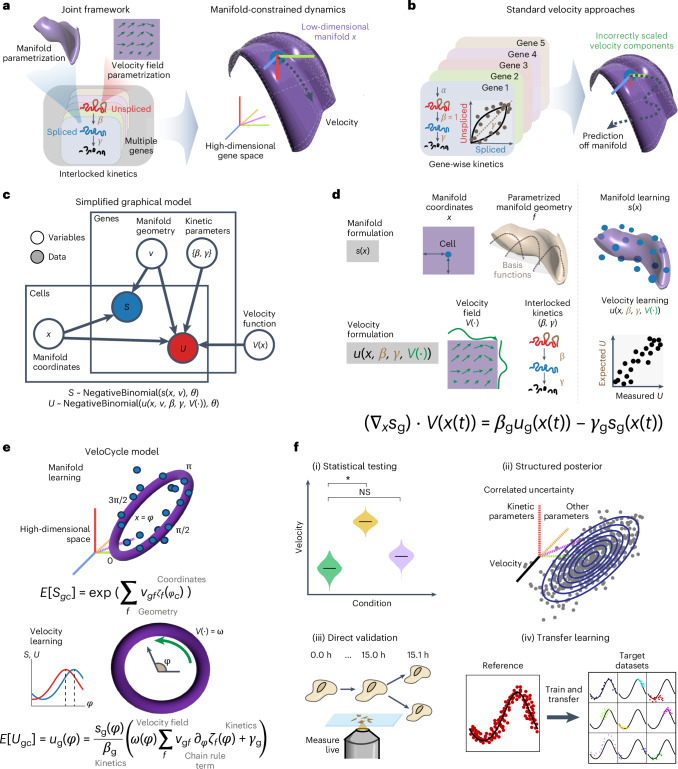
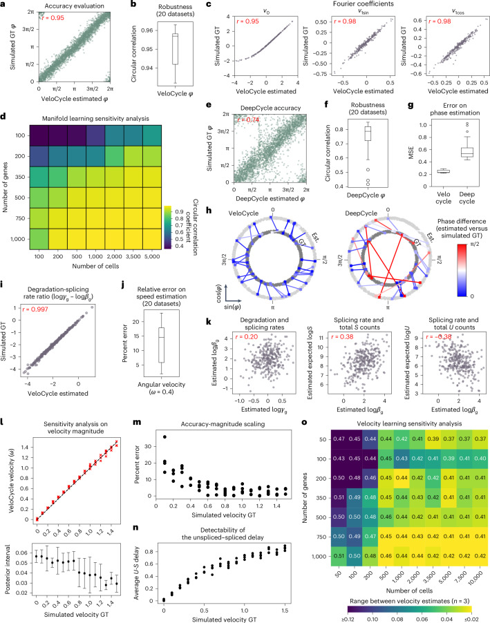
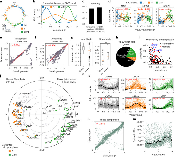
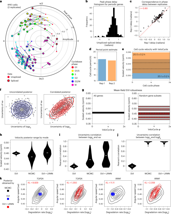
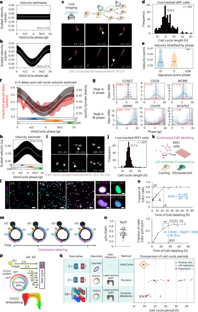
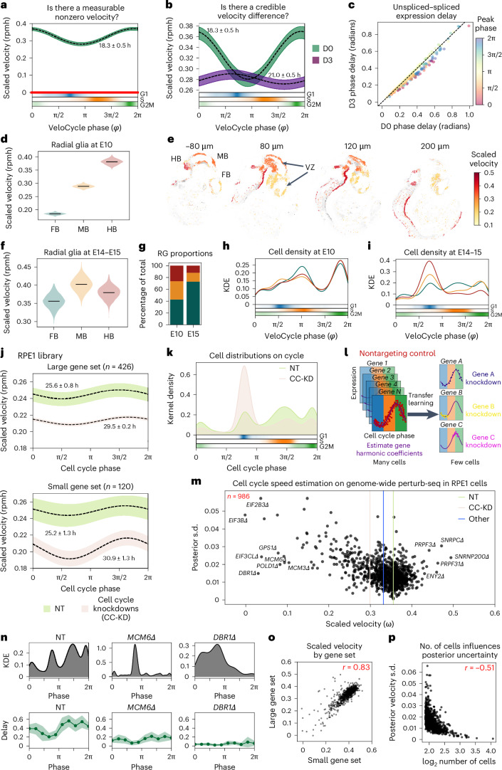
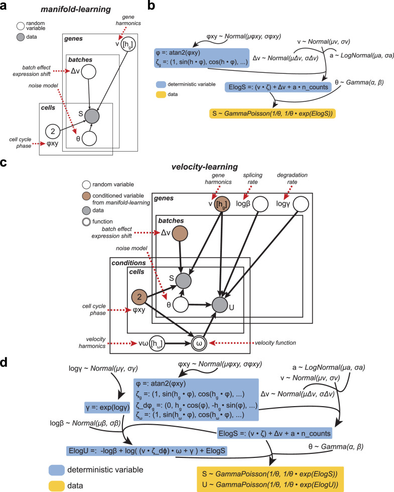
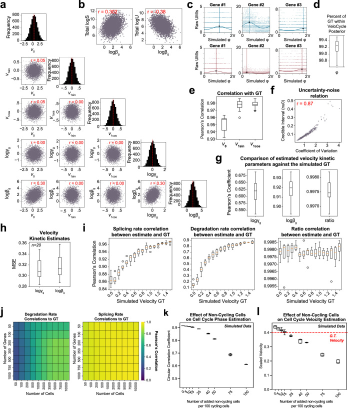
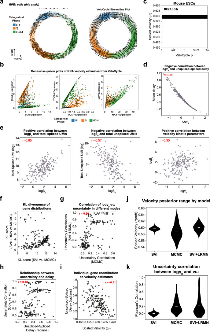
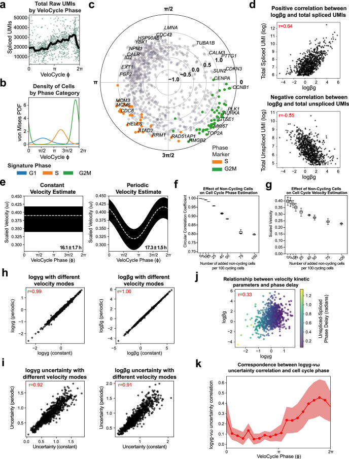
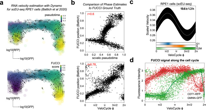
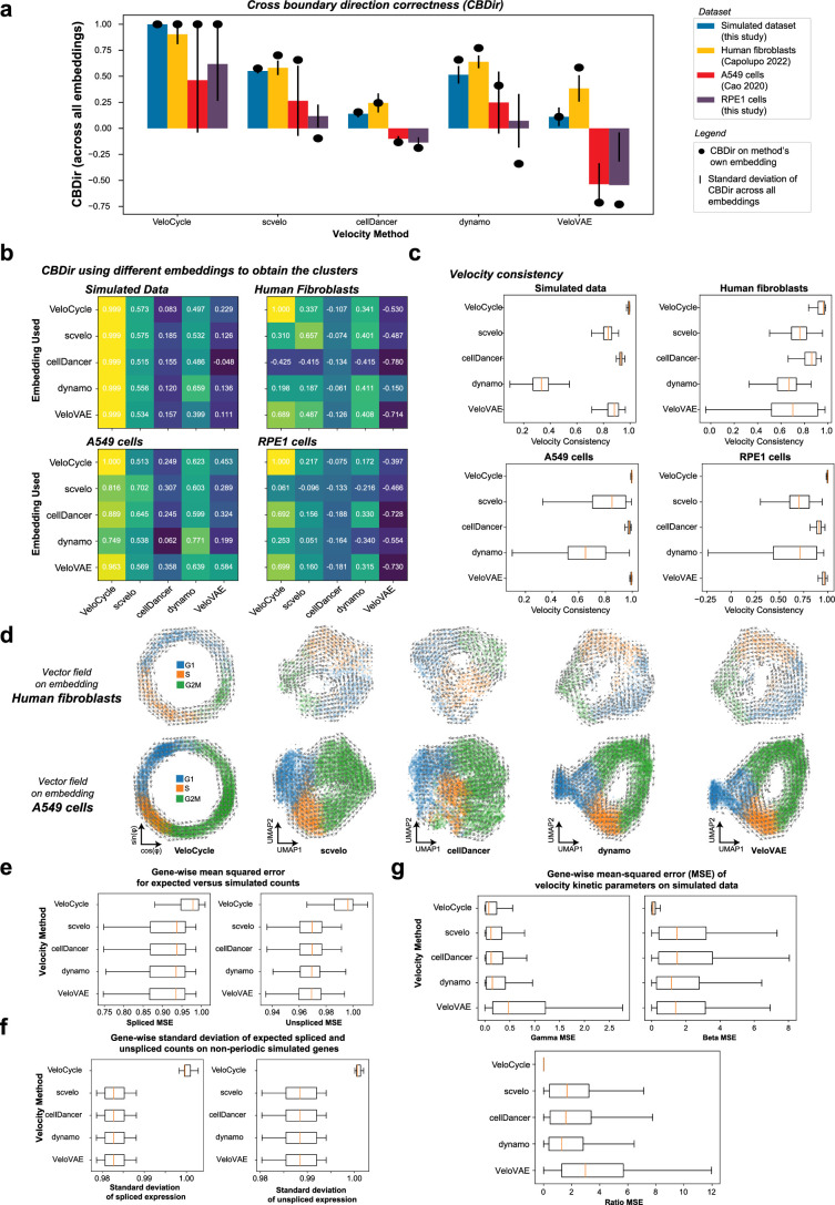
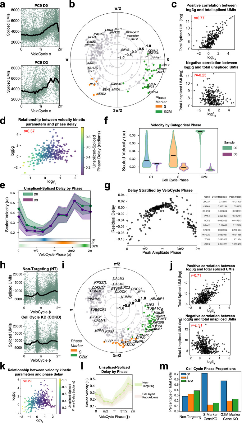
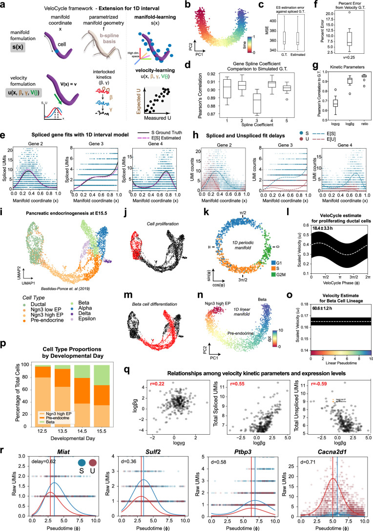
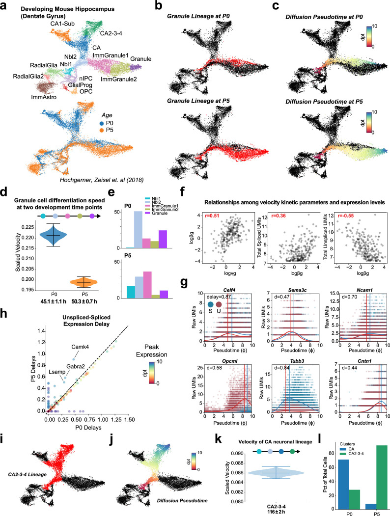
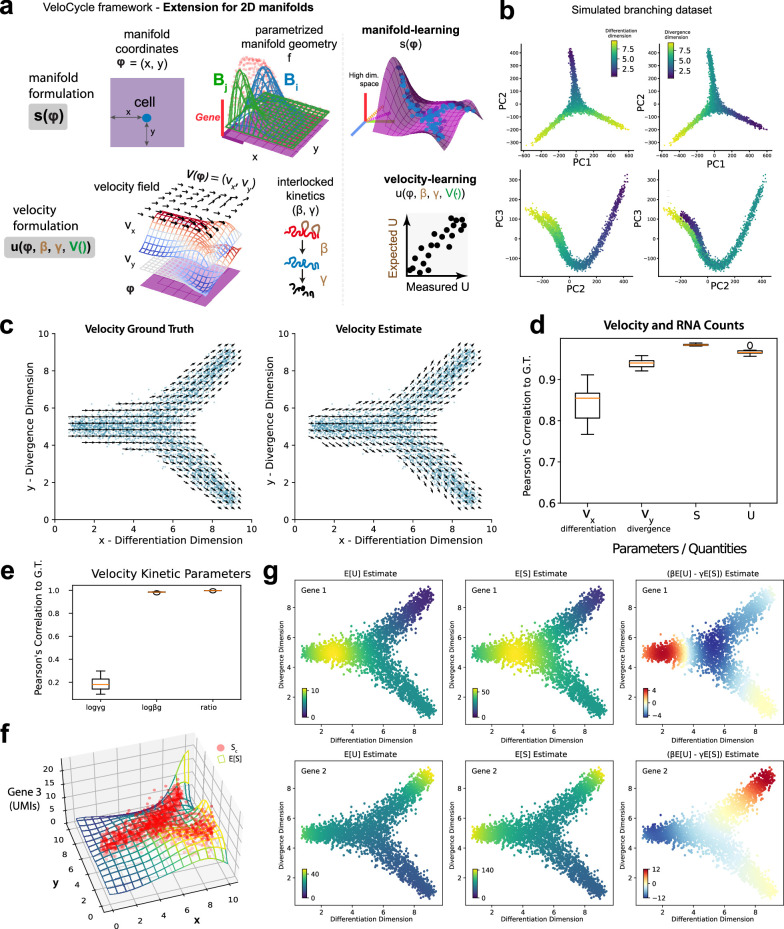
Across biological systems, cells undergo coordinated changes in gene expression, resulting in transcriptome dynamics that unfold within a low-dimensional manifold. While low-dimensional dynamics can be extracted using RNA velocity, these algorithms can be fragile and rely on heuristics lacking statistical control. Moreover, the estimated vector field is not dynamically consistent with the traversed gene expression manifold. To address these challenges, we introduce a Bayesian model of RNA velocity that couples velocity field and manifold estimation in a reformulated, unified framework, identifying the parameters of an explicit dynamical system. Focusing on the cell cycle, we implement VeloCycle to study gene regulation dynamics on one-dimensional periodic manifolds and validate its ability to infer cell cycle periods using live imaging. We also apply VeloCycle to reveal speed differences in regionally defined progenitors and Perturb-seq gene knockdowns. Overall, VeloCycle expands the single-cell RNA sequencing analysis toolkit with a modular and statistically consistent RNA velocity inference framework.


Conflict of interest statement

Competing interests: The authors declare no competing interests.

Figures

Fig. 1
Fig. 1. Statistical inference of RNA velocity with a manifold-constrained framework for the cell cycle.
a, Schematic of a joint framework for parameterization of the gene expression manifold and RNA velocity field. b, Schematic of unconstrained velocity estimation described by standard approaches. c, Plate diagram of the probabilistic relationship among latent variables and observable data. S is sampled from the expectation, manifold coordinates and manifold geometry. U is sampled from the manifold information, kinetic parameters and velocity function. Coordinates define each cell’s position on the latent space and geometry defines expression changes along the manifold. d, Manifold formulation is defined for the spliced counts (s) using cell-specific coordinates (x) and a gene-specific geometric family (f), with which observed data can be directly mapped to the high-dimensional space (top). Bottom: velocity formulation is defined for unspliced counts (u) as a velocity field function (V) with interlocked kinetic parameters (β, γ). We obtain a velocity estimate by taking the chain rule over these entities, describing velocity as a direct function of the manifold x(t). e, Schematic of manifold-constrained velocity estimation for periodic processes. First, manifold learning estimates the coordinates and geometry; second, velocity learning estimates the kinetic parameters and velocity function. f, Schematic of the new types of velocity analyses possible with VeloCycle: (i) statistical credibility testing between multiple samples and against a null hypothesis; (ii) posterior marginal distribution analysis of model parameters by MCMC sampling; (iii) velocity extrapolation to real biological time, verifiable by live microscopy; and (iv) transfer learning of the gene manifold from large references to small target datasets. The asterisk indicates statistical significance. NS, not significant.
Fig. 2
Fig. 2. Sensitivity analysis of VeloCycle on simulated data.
a, Scatterplot of cell cycle phase assignment (estimated) compared to the simulated ground truth (GT). b, Box plot of circular correlation coefficients (min, 0.932; max, 0.963; median, 0.957) between estimated and GT phases. c, Scatterplots of estimated and GT values for gene harmonic (Fourier) coefficients (v0, v1sin, v1cos) using the dataset in a. d, Heatmap of the mean circular correlation coefficient between estimated and GT phases computed with varying numbers of cells and genes (average of three simulations). e, Scatterplot of cell cycle phase estimation obtained by DeepCycle compared to GT using the dataset in a. f, Box plot of circular correlation coefficients (min, 0.416; max, 0.851; median, 0.788) between DeepCycle-estimated and GT phases across the datasets in b. g, Box plots of per-cell MSE for phase estimation with VeloCycle (min, 0.22; max, 0.29; median, 0.23) and DeepCycle (min, 0.43; max, 1.03; median, 0.53) across 20 simulations. h, Polar plots representing the phase difference between estimated (Est.) and simulated GT for 30 randomly chosen cells from one simulated dataset using VeloCycle (left) and DeepCycle (right). Each dot represents a cell, and lines connect the estimated phase assignment (light gray) to simulated GT (dark gray). i, Scatterplot of estimated kinetic ratio compared to simulated GT for 300 genes. j, Box plot of percent error (min, 2.0; max, 23.0; median, 14.5) between estimated and GT velocity (ω = 0.4). k, Scatterplots illustrating the recovered relationships among splicing rate (logβg), degradation rate (logγg), spliced counts and unspliced counts for 300 simulated genes. E[log l, Top: scatterplot of estimated and GT estimates for 16 different simulated velocities between 0.0 to 1.5 rpmh for four simulations. Bottom: point plots with s.d. of posterior uncertainty intervals corresponding to above simulations. The black dot for each plot represents the mean posterior interval across four simulations; error bands indicate 1 × s.d. m, Scatterplot of percent error between estimated and GT velocity across conditions in l. n, Scatterplot of mean unspliced–spliced expression delay across conditions in l. o, Sensitivity analysis heatmap of the range among velocity estimates for three independent simulations, using varying numbers of cells and genes. The text value in each box represents the mean velocity over the three datasets and heatmap intensity represents absolute range. The Pearson’s correlation coefficient (r) over 20 individual simulated datasets is indicated in red (a,c,e,i,k). Each green dot represents a single gene (a,e). Each purple dot represents a single gene (c,i,k). Box plot bounds (b,f,g,j) are defined by the interquartile range (IQR); whiskers extend each box by 1.5× IQR.
Fig. 3
Fig. 3. Manifold learning and gene periodicity on different datasets and technologies.
a, Scatterplot of phase assignment for 279 mES cells, colored by FACS-sorted categorical phase. b, Density plot for FACS-sorted labels across VeloCycle-assigned phases. c, Bar plot reporting categorical phase predictor obtained using a two-threshold decision tree trained on VeloCycle phase estimates alone versus a logistic regression classifier trained on the entire expression matrix. d, Representative scatterplots of genes fits. Curved black lines indicate a gene-specific Fourier series obtained with manifold learning. The ‘peak’ indicates the position of maximum expression along the cell cycle manifold (φ). e,f, Scatterplot of gene-wise peak position (e) and amplitude (f) using a small (x axis) or large (y axis) gene set during manifold learning. g, Left: box plot of gene-wise amplitude for 1,358 marker (min. −0.56; max, 0.84; median, 0.18) and nonmarker (min: −1.5; max, 0.80; median, −0.13) genes. Right: box plot of harmonic coefficient uncertainties for marker (min, 0.03; max, 0.25; median, 0.09) and nonmarker (min, 0.02; max, 0.31; median, 0.15) genes. h, Pie chart of categorical composition for the 200 periodic genes with greatest amplitude. i, Scatterplot of gene-wise total harmonic coefficient (ν) uncertainty and amplitude. Gene dots are colored as standard ‘markers’ or ‘nonmarkers’. Red dashed lines represent mean values for markers. j, Polar plot of estimated gene harmonics for human fibroblasts. Each dot represents a gene (n = 160). The position along the circle represents the phase of maximum expression, and distance from the center represents total amplitude. Colored genes (orange/green) are those used to compute a standard cell cycle score with scanpy or Seurat. k, Selected scatter-plots of genes fits for early (CDKN3, CCND1), mid (CDC6 and HELLS) and late (CDK1 and TOP2A) cell cycle markers. l, Scatter-plot of VeloCycle-estimated phases compared to DeepCycle. Circular correlation is indicated in red. m, Scatter-plot of total raw spliced UMI counts by VeloCycle phase. Black lines indicate binned mean UMI level. Box plot bounds in b,f,g,j are defined by the interquartile range (IQR); whiskers extend each box by 1.5× the IQR.
Fig. 4
Fig. 4. Analysis of delays, velocity scale, and parameter uncertainties in the choice of variational distribution.
a, Polar plot of peak unspliced–spliced expression for 106 marker genes across two replicates of RPE1 cells analyzed with manifold learning. Genes are colored by their categorical annotation in Cyclebase 3.0 (ref. ). Unspliced gene fits were inferred separately, conditioned on cell phases obtained when running manifold learning on spliced UMIs. b, Histogram of unspliced–spliced delays (in radians). c, Scatterplot of unspliced–spliced delays (r = 0.90) between replicates from a. d, Bar plot of cell cycle periods obtained with a first-order-approximate point estimate (Methods). e, Posterior estimate plot of constant, scaled cell cycle speed (rpmh) for the two replicates. Black dashed lines indicate a mean of 500 posterior predictions and the colored bar indicates the credibility interval (5th to 95th percentile). f, Schematic of the hypothetical scenarios where a gene has uncorrelated (left) and correlated (right) posterior uncertainty between logγg and νω. Blue circles represent the Gaussian kernel distribution density; red lines represent an uncertainty interval between two arbitrary fixed points. g, Posterior estimated velocity plot inferred for cultured human fibroblasts using the original SVI mode of VeloCycle and either all genes (left) or random gene subsets (50% of total genes; right). h, Violin plots of scaled velocity (in rpmh) after estimation using SVI, MCMC and LRMV (SVI + LRMN) velocity learning models. i, Violin plots of Pearson’s correlations between the degradation rate (logγg) and angular speed (νω) posterior uncertainties across 160 genes. j, Violin plots of Pearson’s correlations between degradation (logγg) and splicing (logβg) uncertainties. k, Density representation of overlapping logγgνω posterior distributions between MCMC and either SVI (top) or SVI + LRMN (bottom) for TOP2A and RRM2 (black, MCMC; blue, SVI; red, SVI + LRMN). Kullback–Leibler (KL) divergence scores are in red. Violin plots in hj are built from 500 predictive samples; the white line indicates the mean.
Fig. 5
Fig. 5. Validation of computationally inferred velocities by cell tracking and labeling experiments.
a,b, Posterior estimate plot of constant (a) and periodic (b) cell cycle speed in dHFs. c, Top: schematic of time-lapse microscopy to track consecutive cell divisions. Bottom: example images at multiple time points to illustrate tracking a single segmented dHF (pink) through two divisions. Following division of the mother cell (16:40 h), one daughter cell (indicated by white arrow) is tracked for 15 h until dividing itself (31:40 h). d, Histogram of cell cycle period for 282 dHFs tracked by live imaging. e, Violin plot of dHF cell cycle speed, stratified by categorical phase assignment (G1, 514 cells; S, 383 cells; G2M, 325 cells). Median velocities are indicated by black lines (G1, 0.35; S, 0.37; G2M, 0.48). f, Dual-axis plot of the correspondence between unspliced–spliced (U–S) expression delay (left) and velocity (right). Left: genes were grouped by phase into 20 equal bins to calculate unspliced–spliced delay. The solid red line indicates binned mean delay; red bands indicate one standard deviation. Right: scaled velocity estimate from b. Bottom: categorical phase assignment probability. g, Gene expression scatterplots for genes peaking in S and M phases. Vertical lines correspond to the peak phase of spliced (blue) and unspliced (red) counts. h, Posterior estimate plot of periodic cell cycle speed in RPE1 cells. i, Images tracking a single RPE1 cell from birth (3:20 h) to subsequent division (20:00 h). j, Histogram of cell cycle period for 337 RPE1 cells tracked by live imaging. k, Diagram of the cumulative EdU/p21 experiment. Cells were continuously exposed to EdU, fixed at different time points and subjected to EdU detection and p21 immunostaining. l, Left: images of p21 (green), 4,6-diamidino-2-phenylindole (DAPI) (cyan) and EdU (magenta) staining after cumulative EdU labeling for 2 h, 8 h and 36 h (representative from one of three experimental replicates). Scale bar, 100 μm. Right: images of individual cells with different staining combinations. Scale bar, 10 μm. m, Schematic of cumulative EdU labeling during cell cycle progression. n, Dot plot representing the average percentage of p21+ cells along the different time points. The black horizontal line indicates the mean (min, 0.24, max, 0.76, mean, 0.52), with an error bar for s.d.; each dot represents the percentage of p21+ cells for a single replicate (n = 29; a total of three replicates with ten, ten and nine time points). o, Top: line plot of the fraction of EdU+ cells at 13 time points (from 30 min to 73 h). Data show the mean of three replicates (except for 2 h, which is from two) and error bars indicate the s.d. Bottom: line plot of fraction of EdU-positive cells among quiescent cells (p21+) as a function of time. A, x value at the intersection between growth and plateau; B, y intercept of the linear fit; GF, y value of the plateau. p, Illustration of scEU-seq experimental design, which generates 24 tables used by Dynamo to produce a gold standard cell cycle period estimate. RFP, red fluorescent protein; GFP, green fluorescent protein; RPEs, retinal pigmented epithelium. q, Left: schematic of the different experimental measurements, manifold and cell path inference approaches taken by VeloCycle, Dynamo (without metabolically labeled information) and Dynamo-Metabolic (with metabolically labeled information) models. Right: plot showing the estimated cell cycle period obtained by VeloCycle, Dynamo and Dynamo-Metabolic models. The violin plot displays the posterior distribution output by VeloCycle and the circles are individual evaluations of the LAP from different start/end cells; red stars indicate the means. The red dashed line indicates the median in d and j. The white dashed line indicates the mean of 500 posterior predictions and the black bar indicates the credibility interval (5th to 95th percentile) in a,b,f (right) and h. NS, not significant; **P < 0.01.
Fig. 6
Fig. 6. Statistical velocity inference across diverse biological contexts and with transfer learning in genome-wide perturbation screens.
a, Posterior estimate plot of scaled velocity in PC9 lung adenocarcinoma cells (D0) compared to a zero-velocity control (red). b, Posterior estimate plot of scaled velocity before (D0) and after (D3) erlotinib treatment. Areas where intervals do not overlap indicate statistically significant velocity differences. Bottom: categorical phase assignment probabilities. c, Scatterplot of mean unspliced–spliced expression delay for 273 genes between D0 and D3 samples. Gene dots are colored by peak expression phase. d, Violin plots of scaled velocity estimates obtained for mouse FB, MB and HB RG progenitors at developmental stage E10. e, Spatial projection of single-cell clusters using BoneFight onto four sections of a reference E11 embryo profiled with HybISS, colored by velocity estimates. Regional domains (FB, MB and HB) and the ventricular zone (VZ) are labeled accordingly. f, Violin plots of velocity estimates for regional domains at E14–E15. g, Bar plot of regional proportions by stage of RG. h,i, Kernel density estimation (KDE) plots of cell distributions along the cell cycle manifold at E10 (h) and E14–15 (i), colored by regional domain. j, Posterior estimate plot of cell cycle speed for RPE1 cells 7 days after CRISPR-induced single-gene knockdowns with Perturb-seq, stratified by NT control (green) and cell cycle knockdown (beige) conditions. Manifold learning was performed using either a large (top) or small (bottom) gene set. k, Kernel density plot of continuous phase distributions for NT and cell cycle knockdown (CC-KD) samples from j. l, Schematic of the employed transfer-learning approach. Gene harmonic coefficients are obtained on NT controls (many cells) and applied to assign phases in specific gene knockdown conditions with few or unequally distributed cells. m, Scatterplot of velocity learning posterior estimates and s.d. for 986 individual gene knockdown (Δ) conditions in 167,119 RPE1 cells. Vertical lines correspond to mean velocity estimates for NT (green), cell cycle marker (tan) and other (blue) gene knockdowns. n, KDE (top) and binned unspliced–spliced delay (bottom) plots for NT, MCM6Δ and DBR1Δ conditions. The dark green line represents the mean delay; the light green line represents the s.d. o, Scatterplot of scaled cell cycle velocity estimates obtained for conditions in m using small and large gene sets. p, Scatterplot of total number of cells per condition and posterior velocity s.d. for conditions in m. In a,b and j, black dashed lines represent mean estimates over 500 posterior predictions; bars represent credibility intervals (5th to 95th percentile). In d and f, black lines indicate means over 500 posterior predictions. In o and p, Pearson’s correlation coefficient is indicated in red.
Extended Data Fig. 1
Extended Data Fig. 1. Plate notation diagram and mathematical formulation of VeloCycle.
(a) Plate diagram of the manifold learning procedure. The model assigns each cell to a phase along the cell cycle (φ) and fits a set of Fourier series coefficients (ν) for each gene. (b) Mathematical representation of manifold learning shown in (a). Raw spliced counts (S) are defined as the expectation (ElogS) plus noise, modeled after a negative binomial distribution. (c) Plate notation diagram of the complete velocity learning procedure. (d) Mathematical representation of velocity learning shown in (c). In (a) and (c), nodes indicate a variable (white: random variable; gray: observed data; brown: conditioned variable from manifold learning) and arrows indicate dependency. Plates (genes, cells, conditions, and batches) signal independence and contain variables with the same dimensions. In (b) and (d), blue-boxed variables are deterministic and computed from latent variables; yellow-boxed variables are conditioned on observed data.
Extended Data Fig. 2
Extended Data Fig. 2. Data generated with simulations assists in VeloCycle validation.
(a) Scatter-plots of correlation between gene harmonics coefficients (ν0, ν1sin, ν1cos) and kinetic parameters (logβg, logγg) in the ground-truth (GT) from simulated data. Diagonal: histograms for each simulated latent variable. (b) Scatter-plots of simulated data correlations among splicing rate (logβg), spliced (logS), and unspliced (logU) counts. (c) Scatter-plots of simulated gene fits for spliced (blue) and unspliced (red) counts. Solid curved lines represent gene fits; vertical lines indicate peak expression. (d) Box plot of the percent of GT phases within the uncertainty interval estimated (min: 98.6%, max: 99.5%, median: 99.25%), across 20 simulated datasets. (e) Box plots of the mean circular correlation coefficient, across 300 genes, for ν0 (min: 0.93, max: 0.96, median: 0.96), ν1sin (min: 0.96, max: 0.99, median: 0.98), and ν1cos (min: 0,97, max 0.99, median: 0.98) estimated by VeloCycle compared to the GT. (f) Scatter-plot of gene-wise coefficient of variation (a measure of noise) and credible interval obtained for ν0. (g) Box plots of the mean Pearson’s correlation coefficient between estimated and GT gene-wise values for degradation rate (logγg; min: 0.54; max: 0.69; median: 0.62), splicing rate (logβg; min: 0.89; max: 0.94; median: 0.92), and kinetic ratio (logγg-logβg; min: 0.996; max: 0.998; median: 0.997), across 20 simulated datasets. (h) Box plots of mean squared error (MSE) for logγg and logβg against the GT for data in (g). (i) Box plots of mean Pearson’s correlation coefficient between estimated and GT values for logβg, logγg, and kinetic ratio, for all genes across four simulations with 16 different velocity GT between 0.0 and 1.5. For each box plot, the orange horizontal line represents the median across four datasets. (j) Heatmaps showing the correlation between estimated and GT values for the kinetic parameters using varying numbers of cells and genes. (k) Box plots of the circular correlation coefficient between estimated and GT phase across three simulated datasets with varying proportions of non-cycling cells (from 0 to 100 non-cycling cells per 100 cycling cells). (l) Box plots of scaled velocity posterior estimates compared to the GT (red dashed line) across three simulated datasets with varying proportions of non-cycling cells. Pearson’s correlation coefficients (red) are indicated in each scatter-plot of (a), (b), and (f). Each purple dot represents a single gene in (a), (b), and (f). For box plots in (d-e), (g), (i), and (k-l), boundaries are defined by the interquartile range (IQR), and whiskers extend each box by 1.5x the IQR.
Extended Data Fig. 3
Extended Data Fig. 3. VeloCycle reveals relationships among kinetic parameters and a structured variational distribution yields better uncertainty estimates.
(a) Velocity quiver plot (left) and streamline plot (right) for 14,259 RPE1 cells from Fig. 4a-e, colored by categorical phase assignments. (b) Gene-wise velocity quiver plots for three marker gene pairs corresponding to distinct categorical phases in RPE1 cells: G1 marker SON and S marker CCNE2; S marker MCM4 and G2M marker TOP2A; G2M marker MKI67 and G1 marker SON. (c) Posterior estimate plot of cell cycle velocity inferred on mouse embryonic stem cells (mESC). White dashed lines represent the mean of 500 posterior samples; black bars indicate the full posterior interval. (d) Scatter-plot of the relationship between degradation rate (logγg) and average un/spliced delay in mESC. (e) Scatter-plots of the relationships among splicing rate (logβg), logγg, and total UMI counts (un/spliced) in mESC. (f) Scatter-plot of gene-wise Kullback–Leibler (KL) divergence comparing uncertainty distributions between SVI and MCMC (x-axis) and SVI + LRMN and MCMC (y-axis) for dermal human fibroblasts (dHF) from Fig. 4g-k. A lower KL divergence indicates a greater overlap between the two distributions. (g) Scatter-plot between the gene-wise logγg-νω uncertainties computed from the posterior of MCMC or SVI + LRMN for dHF. (h) Scatter-plot between un/spliced peak expression delay (radians) and logγg-νω uncertainty correlation, both obtained using the SVI + LRMN velocity model. (i) Scatter-plot between scaled velocity and un/spliced delay during a leave-one-out estimation approach. Each dot is positioned on the x-axis at the velocity estimate obtained when removing one particular gene (n = 160) from the gene set. Each dot is located on the y-axis at the position of the un/spiced delay (in radians) for that removed gene. (j) Violin plots of the scaled velocity for mESC, comparable to Fig. 4h. (k) Violin plots of the Pearson’s correlations between logγg and angular speed (νω) posteriors across all 189 genes for mESC, comparable to Fig. 4i. Pearson’s correlation coefficients (red) are indicated in the top right of plots in (d-e), and (g-i).
Extended Data Fig. 4
Extended Data Fig. 4. VeloCycle coupled with live-cell imaging of human fibroblasts enables experimental validation of cell cycle speed.
(a) Scatter-plot of total raw spliced counts by cell cycle phase estimated with VeloCycle for dHF. Black line indicates the binned mean. (b) Probability density plot along the VeloCycle phase estimate for cells in (a), stratified by categorical assignment. (c) Polar plot indicating phase of peak expression and amplitude for 876 cycling genes. Each dot represents a gene; genes colored orange (S) or green (G2M) represent marker genes used in categorical assignment. (d) Scatter-plots of the gene-wise relationship among splicing rate and un/spliced counts. (e) Posterior estimate plot of constant (left) and periodic (right) velocity estimates obtained for data in (a) using a medium-sized gene set. (f) Box plots of circular correlation coefficients between phase with varying proportions of non-cycling cells and phase with only cycling cells (from a-c). Contaminant cells were taken from non-cycling cell types, as annotated in the original study. (g) Box plots of scaled velocity posterior estimates with varying proportions of non-cycling cells. The box plots in (f) and (g) indicate the results across three independently sampled subsets of non-cycling cells. (h) Scatter-plots of degradation rates (left) and splicing rates (right) obtained using either constant (x-axis) or periodic (y-axis) models of velocity estimation. (i) Scatter-plots of degradation (left) and splicing (right) rate posterior uncertainties obtained from 500 posterior samples using either constant (x-axis) or periodic (y-axis) models. (j) Scatter-plot of the degradation and splicing rates obtained with the SVI + LRMN model. Gene-wise dots are colored by the un/spliced phase delay. (k) Binned plot of Pearson’s correlation coefficients between gene-wise degradation rate and velocity posterior uncertainties on dHF using the SVI + LRMN model. The solid red line indicates binned mean delay; the red bands indicate one standard deviation. Pearson’s correlations coefficients are indicated in red text in (d-e) and (h-i). Boundaries in (f) and (g) are defined by the interquartile range (IQR), and whiskers extend each box by 1.5x the IQR.
Extended Data Fig. 5
Extended Data Fig. 5. Least action path analysis of FUCCI-RPE1 cells profiled by scEU-seq.
(a) RNA velocity streamline plots obtained with Dynamo using metabolically-labeled data (scEU-seq) for 2,793 RPE1 cells, represented on the FUCCI-defined embedding space and colored by pseudotime (top) or FUCCI score (bottom). (b) Scatter-plot of cell cycle phase pseudotime from scvelo (top) and VeloCycle (bottom) compared to the ground truth FUCCI phase assignment acquired for RPE1 cells in (a). Pearson’s circular correlation coefficient is indicated in red. (c) Posterior estimate plot of velocity estimate for RPE1 cells obtained with VeloCycle. (d) Scatter-plot of per cell FUCCI signal (GMNN-GRP in green; CDT1-RFP in red) along the VeloCycle phase.
Extended Data Fig. 6
Extended Data Fig. 6. Benchmarking VeloCycle against numerous methods, metrics, and datasets.
(a) Bar plots of mean cross-boundary direction correctness (CBDir) computed on four datasets with five velocity methods. The CBDir score was computed for clusters obtained on each method’s embedding (see Methods 8.3). The black dot represents the score calculated using that specific method’s embedding, whereas the black line indicates the standard deviation across scores computed across all five embeddings and cluster annotations. (b) Heatmaps of the CBDir scores computed pairwise for each method using cluster relationships defined on each embedding, for all four datasets. (c) Box plot of cell-wise velocity consistency score (see Methods 8.4) computed on the same datasets and methods as in (a-b). (d) Low-dimensional embedding plots with grid-wise velocity vector fields computed for on fibroblasts (top) and A549 cells (bottom). Cells are colored by categorical phase to enable visual inspection of vector field direction correctness. (e) Box plots of the spliced (left) and unspliced (right) gene-wise mean squared error (MSE) obtained between expected un/spliced counts and simulated GT. (f) Box plots of gene-wise standard deviation of expected spliced (left) and unspliced (right) expression estimated. (g) Box plots of gene-wise MSE for the velocity kinetic parameters (logγg, logβg, kinetic ratio) compared to the simulated GT. For box plots in (c), (e), (f), and (g), boundaries are defined by the interquartile range (IQR), and whiskers extend each box by 1.5x the IQR.
Extended Data Fig. 7
Extended Data Fig. 7. Velocity credibility testing enables characterization of erlotinib treatment and cell cycle knockdowns with Perturb-seq.
(a) Scatter-plot of total raw spliced counts by phase estimated for PC9 cells populations before (D0; 9,927 cells) and after (D3; 3,943 cells) erlotinib treatment. Black line indicates the binned mean. (b) Polar plot indicating peak expression and amplitude for cycling genes used in (a). Each dot represents a gene; genes colored orange (S) or green (G2M) represent marker genes used in categorical phase assignment. (c) Scatter-plots of the gene-wise relationship among splicing rate and un/spliced counts for data in (a-b). (d) Scatter-plot of degradation and splicing rates obtained with the SVI + LRMN model. Gene-wise dots are colored by un/spliced phase delay. (e) Gene-binned delay in D0 and D3 samples. Solid green (D0) and purple (D3) lines indicate the binned mean delay; bands indicate one standard deviation. (f) Violin plots of scaled velocity estimates for D0 and D3, stratified by phase (G1: 2,738 cells at D0 and 1,954 cells at D3; S: 2,287 cells at D0 and 900 cells at D3; G2M: 2,902 cells at D0 and 889 cells at D3). Black horizontal lines indicate the mean by categorical phase at D0 (G1: 0.33, S: 0.34, G2M: 0.39) and D3 (G1: 0.31, S: 0.30, G2M: 0.30). (g) Left: scatter-plot of peak gene amplitude and residual un/spliced delay (D3-D0) for 273 genes. Right: top ten differentially delayed genes in D0 versus D3. (h) Scatter-plots of total UMIs along cell cycle phase for non-targeting (NT; top) and knockdown (CC-KD) strata of genome-wide Perturb-seq data from Fig. 6. (i) Polar plot indicating peak expression and amplitude for 426 cycling genes used in (h). (j) Scatter-plots of the gene-wise relationship among splicing rate and un/spliced counts for data in (h-i). (k) Scatter-plot of degradation and splicing rates; gene-wise dots are colored by mean un/spliced phase delay. (l) Gene-binned delay between maximum expression (in radians) for NT and CC-KD samples. Solid green (non-targeting) and beige (cell cycle knockdowns) lines indicate binned mean delay; bands indicate one standard deviation. (m) Bar plots of categorical phase proportions as percentage of the total number of cells, stratified by non-targeting, S phase, and G2M marker conditions.
Extended Data Fig. 8
Extended Data Fig. 8. Evaluation of a 1D interval model for manifold-constrained RNA velocity in simulated data and during pancreatic endocrinogenesis.
(a) Schematic of the 1D interval manifold model, where variation in gene expression along the manifold is estimated using B-splines instead of a Fourier series (as in VeloCycle). (b) PCA plot of two principal components colored by the manifold coordinate used (time). (c) Box plots of log mean squared error (MSE) for expected spliced counts (ES) compared to simulated raw data (S). MSE was calculated using either simulated ground truth (GT) or estimates recovered by the non-periodic manifold-constrained model (Estimated). (d) Box plots of the Pearson’s correlation coefficient between estimated B-spline coefficients and GT. (e) Scatter-plots of spliced gene expression fits along the 1D interval manifold. The solid black line indicates GT; the red dashed line indicates the estimate obtained during manifold learning. (f) Box plot of percent error for the velocity estimate compared to GT (0.25; min: 0.7%, max: 20.0%, median: 4.7%). (g) Box plot of Pearson’s correlation coefficients between estimated and GT for kinetic parameters. (h) Scatter-plots of spliced (blue) and unspliced (red) gene expression fits obtained by the model. (i) UMAP of mouse E15 pancreas, colored by published cell types. (j) UMAP of dataset in (i), colored by selected cell subsets (red) extracted to estimate cell cycle velocity (Ductal). (k) Low-dimensional plot of the cell cycle manifold estimated with VeloCycle. (l) Posterior estimate plot of cell cycle speed from VeloCycle. (m) UMAP of dataset in (i), colored by selected cell subsets (red) along the beta cell differentiation lineage (Ngn3 high EP, Pre-endocrine, Beta). (n) PCA plot of beta differentiation manifold obtained with diffusion pseudotime on the principal components. (o) Velocity posterior estimate plot obtained for beta differentiation using the 1D interval model. (p) Stacked bar plot of cell type proportions along the differentiation axis in four datasets from the original study. (q) Scatter-plots demonstrating the relationship between the kinetic parameters (logγg, logβg) and total (spliced, unspliced) counts. Pearson’s correlation coefficients are indicated in red. (r) Scatter-plots of selected genes, illustrating the estimated expected spliced (blue dashed line; ES) and unspliced (red dashed line; EU) levels along the cell cycle manifold, compared to the measured spliced (blue; S) and unspliced (red; U) counts. In (a-h), all analyses were performed across ten simulated datasets with 3,000 cells and 300 genes (see Fig. 2). In (l) and (o), the white line indicates the mean over 200 posterior samples; the black line indicates the full posterior interval. The cell cycle period (l) and beta cell differentiation process time (o) are indicated at the top left of the respective plots. For each box plot in (c-d) and (f-g), the black horizontal line represents the median; boundaries are defined by the interquartile range (IQR), and whiskers extend each box by 1.5x the IQR.
Extended Data Fig. 9
Extended Data Fig. 9. Manifold-constrained velocity analysis across cell types and developmental stages in the dentate gyrus.
(a) UMAP of mouse dentate gyrus, colored by published cell types (top) and postnatal time point (bottom). (b) UMAP in (a), colored by selected data subsets (red) used to estimate 1D interval velocity of the granule cell differentiation lineage (Nbl1, Nbl2, ImmGranule1, ImmGranule2, Granule) at P0 and P5 time points. (c) UMAP of data subsets in (b), colored by the diffusion pseudotime applied as the low-dimensional manifold during velocity inference. (d) Violin plots of the posterior estimates obtained on the entire granule cell differentiation lineage. (e) Bar plots of cell type proportions in the granule lineage at P0 and P5 relative to the total number of cells. (f) Scatter-plot of the relationships between kinetic parameters and total un/spliced counts in cells from (d). Pearson’s correlation coefficients are indicated in red. (g) Scatter-plots of three selected genes, illustrating the estimated expected spliced (blue dashed line; ES) and unspliced (red dashed line; EU) levels along granule cell differentiation (d) compared to measured spliced (blue; S) and unspliced (red; U) counts. Peak un/spliced delay is indicated by vertical lines and the value at the top left (delay). (h) Scatter-plot of mean un/spliced expression delay for 237 shared genes during granule cell differentiation between P0 and P5. Gene dots are colored by manifold time (pseudotime) at peak expression. (i) UMAP colored by selected data subsets (red) used to estimate RNA velocity of the CA differentiation lineage (Nbl1, Nbl2, CA, CA2-3-4). (j) UMAP of lineage in (i), colored by diffusion pseudotime. (k) Violin plot of the posterior estimate obtained on the CA2-3-4 cell differentiation lineage using both P0 and P5 cells. (l) Bar plots of cell type proportions in the CA and CA2-3-4 clusters relative to the total number of cells at each time point. 200 posterior samples were used in (d) and (k); the black horizontal lines indicate the 5th, 50th, and 95th percentiles. An estimate of total differentiation process duration is indicated in black at the bottom of the x-axis.
Extended Data Fig. 10
Extended Data Fig. 10. Formulation of manifold-constrained velocity analysis along a 2D axis.
(a) Schematic of the 2D manifold model, where variation in gene expression along two dimensions (defined, for example, by two principal components) is estimated using B-splines instead of a Fourier series (as in VeloCycle). (b) Simulated 2D branching dataset with estimated and ground truth (GT) velocity. Cell positions from one of the ten simulated datasets are shown in blue. Velocity and spliced mRNA counts were parameterized as 2D B-splines conditioned on the coordinates of the cells; GT velocity spline coefficients were set manually. (c) Box plots of Pearson’s correlation coefficients between the estimated and GT velocities and mean un/spliced counts. Velocities were evaluated separately along two dimensions, one corresponding to the overall differentiation process and one representing the divergence of the branches. (d) Box plots of Pearson’s correlation coefficients between the estimated and GT kinetic parameters across ten simulated datasets. Boundaries in (d) and (e) are defined by the interquartile range (IQR); whiskers extend each box by 1.5x the IQR. (e) Estimated expected un/spliced counts of two selected genes and the estimated spliced counts derivative. (f) Scatter and surface plot representing an example of a gene fit as a function of manifold location using splines. Red dots are simulated data and the mesh surface is the expectation that was fit by the manifold learning step. (g) Scatter-plots of representative genes colored by the expected S and U obtained by manifold learning and velocity learning steps. Plots on the right make the un/spliced delay easier to appreciate by coloring the scatter by a proxy for gene-wise velocity βE[U] - γE[S].

Update of

References

    1. Lederer, A. R. & La Manno, G. The emergence and promise of single-cell temporal-omics approaches. Curr. Opin. Biotechnol.63, 70–78 (2020). - PubMed
    1. La Manno, G. et al. RNA velocity of single cells. Nature560, 494–498 (2018). - PMC - PubMed
    1. Svensson, V. & Pachter, L. RNA velocity: molecular kinetics from single-cell RNA-seq. Mol. Cell72, 7–9 (2018). - PubMed
    1. Bergen, V., Lange, M., Peidli, S., Wolf, F. A. & Theis, F. J. Generalizing RNA velocity to transient cell states through dynamical modeling. Nat. Biotechnol.10.1038/s41587-020-0591-3 (2020). - PubMed
    1. Gao, M., Qiao, C. & Huang, Y. UniTVelo: temporally unified RNA velocity reinforces single-cell trajectory inference. Nat. Commun.13, 6586 (2022). - PMC - PubMed