. 2024 Nov 14;15(1):9886.
doi: 10.1038/s41467-024-54182-5.

Digital profiling of gene expression from histology images with linearized attention

Affiliations

Digital profiling of gene expression from histology images with linearized attention

Marija Pizurica et al. Nat Commun. .

Abstract

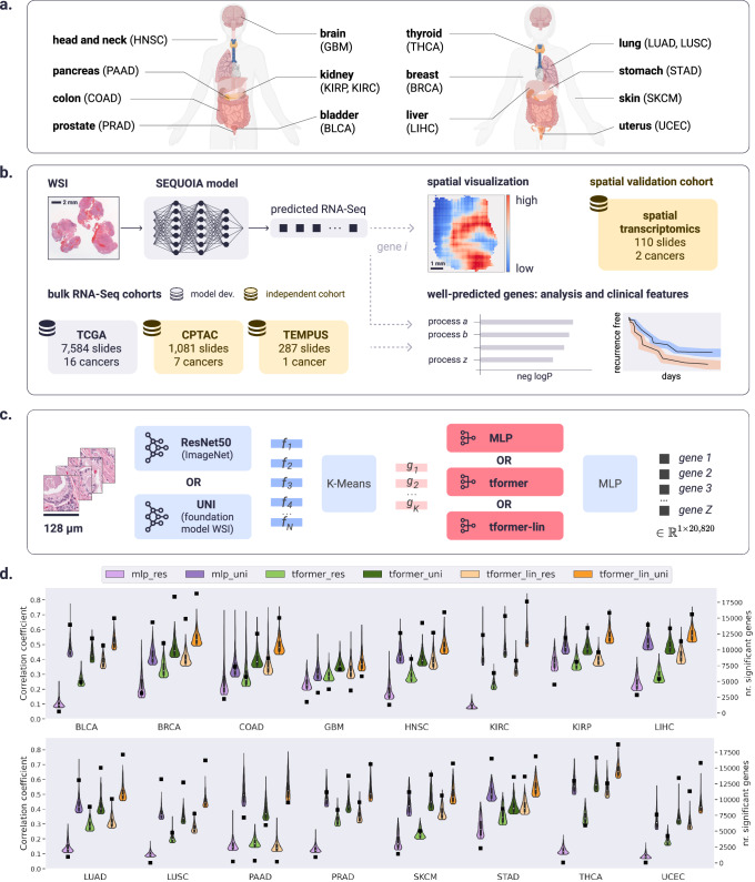
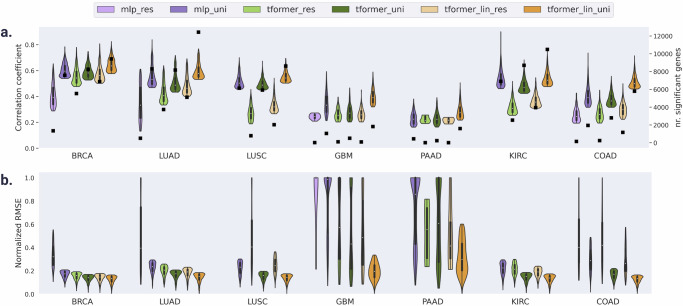
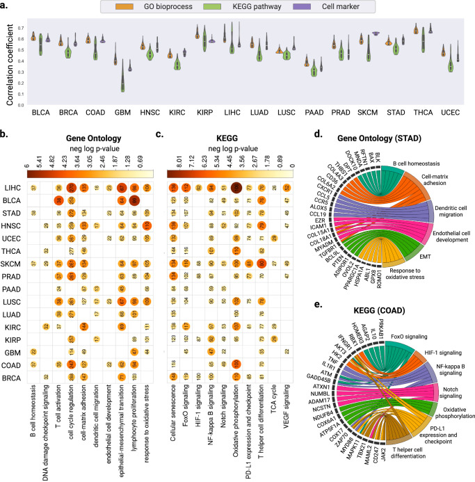
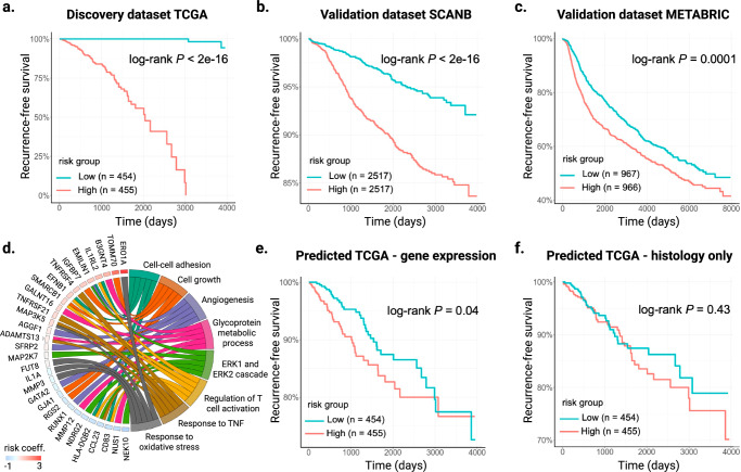
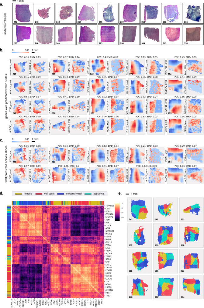
Cancer is a heterogeneous disease requiring costly genetic profiling for better understanding and management. Recent advances in deep learning have enabled cost-effective predictions of genetic alterations from whole slide images (WSIs). While transformers have driven significant progress in non-medical domains, their application to WSIs lags behind due to high model complexity and limited dataset sizes. Here, we introduce SEQUOIA, a linearized transformer model that predicts cancer transcriptomic profiles from WSIs. SEQUOIA is developed using 7584 tumor samples across 16 cancer types, with its generalization capacity validated on two independent cohorts comprising 1368 tumors. Accurately predicted genes are associated with key cancer processes, including inflammatory response, cell cycles and metabolism. Further, we demonstrate the value of SEQUOIA in stratifying the risk of breast cancer recurrence and in resolving spatial gene expression at loco-regional levels. SEQUOIA hence deciphers clinically relevant information from WSIs, opening avenues for personalized cancer management.


Conflict of interest statement

Competing interests W.Y., C.W., and A.V. are employees of F. Hoffmann-La Roche Ltd. The remaining authors have no conflicts of interest to declare.

Figures

Fig. 1
Fig. 1. Overview of the workflow for the SEQUOIA model.
a Cancer types on which the SEQUOIA model is developed and validated. Created with BioRender.com released under a Creative Commons Attribution-NonCommercial-NoDerivs 4.0 International license (https://creativecommons.org/licenses/by-nc-nd/4.0/deed.en). b The model is trained and evaluated using matched WSIs and bulk RNA-Seq data from sixteen cancer types available in the TCGA database. The model is independently validated using data from the CPTAC and Tempus cohorts. Apart from predicting tissue-level gene expression, we integrate a spatial prediction technique that elucidates region-level gene expression patterns within tumor tissues, validated using two spatial transcriptomics datasets,. Clinical utility is demonstrated by evaluating the model’s capacity to predict cancer recurrence. c SEQUOIA architecture and benchmarked variations. First, N tiles are sampled from the WSI. Feature vectors are extracted using either ResNet-50 pre-trained on ImageNet or UNI. We then cluster the feature vectors into K clusters, and within-cluster averages result in K-aggregated feature vectors. Next, either a Multi Layer Perceptron (MLP), a transformer (`tformer'), or linearized transformer (`tformer-lin') (followed by an MLP) are used to predict gene expression values. d Performance benchmarking of SEQUOIA. Violin plots illustrate the distribution of Pearson correlation coefficients (left y axis) between the predicted and ground truth gene expression values in TCGA test sets. Within each violin plot, a miniature box-and-whisker plot is shown where whiskers bound the min–max values of the data, the bounds of the box represent lower (Q1)/upper (Q3) quartiles, and the central value contains the median value. The top 1000 genes with the highest correlation coefficients obtained from each model are shown. Black squares indicate the absolute number (right y axis) of genes with significantly well-predicted expression levels. WSI Whole Slide Image. Source data for d are provided in the Source Data File.
Fig. 2
Fig. 2. Genes that validate both in TCGA test sets and in external cancer cohorts.
a Violin plots show the distribution of the Pearson correlation coefficient (left y axis) of genes that validate both CPTAC and TCGA test set. Within each violin plot, a miniature box-and-whisker plot is shown where whiskers bound the min–max values of the data, the bounds of the box represent lower (Q1)/upper (Q3) quartiles, and the central value contains the median value. The top 1000 genes with the highest correlation coefficients obtained from each model are shown. Black squares indicate the absolute number (right y axis) of genes that validate both TCGA test set and CPTAC. b Same as (a) for Normalized RMSE. Note that mlp_res did not have any significant genes that overlap between TCGA-CPTAC for LUSC, PAAD, KIRC (Supplementary Table 9) and hence violin plots for these settings do not exist. Source data are provided in the Source Data File.
Fig. 3
Fig. 3. Evaluation of gene expression predictions at the pathway level.
a Violin plots illustrating the distribution of Pearson correlation coefficients (left y axis) between the predicted and ground truth pathway enrichment scores in TCGA test sets. Within each violin plot, a miniature box-and-whisker plot is shown where whiskers bound the min-max values of the data, the bounds of the box represent lower (Q1)/upper (Q3) quartiles, and the central value contains the median value. The top 100 pathways with the highest correlation coefficients obtained from each model are shown. b, c Heatmap showing the significant P values obtained from one-sided hyper-geometric tests in b gene ontology and c KEGG pathway analysis of the well-predicted genes. Color and size of the circles represent the negative log-transformed P values. Integers represent the absolute gene count in each category, and non-significant categories are left in blank. d, e Circos plots showing the d biological process enriched with the well-predicted genes in STAD and e KEGG pathways in COAD. Gene names are displayed on the left and the corresponding biological processes are shown on the right. Source data for all panels are provided in the Source Data File.
Fig. 4
Fig. 4. Development and validation of a digital gene expression signature for predicting breast cancer recurrence.
a Kaplan–Meier curves of recurrence-free survival obtained from the TCGA discovery dataset. Patients were split by the median risk score. b, c Kaplan–Meier curves of recurrence-free survival in the b SCANB and c METABRIC validation datasets. d Circos plot showing the biological process associated with the prognostic gene signature. Gene names and the associated risk coefficients are shown on the left, and the corresponding biological processes are shown on the right. e Kaplan–Meier curves of recurrence-free survival obtained from the predicted gene expression values of the TCGA test set. Patients were split by the median risk score. f Kaplan–Meier curves of recurrence-free survival directly predicted from histology images of the TCGA test set. Patients were split by the median risk score. Source data for all panels are provided in the Source Data File.
Fig. 5
Fig. 5. Spatial visualization of gene expression predicted at the tile level.
a Whole Slide Image thumbnails from the validation cohort. b Examples of genes that are well-predicted spatially within slides, with predicted spatial gene expression shown on the left and ground truth on the right. The prediction and ground truth maps were normalized to percentile scores between 0 and 100. Above each pair of prediction and ground truth, we show the Pearson Correlation Coefficient (PCC) and Earth Mover’s Distance (EMD) metric. c Examples of genes that are spatially well-predicted across several slides. Each row shows the prediction map (on the left) and ground truth (on the right) for a particular gene across four slides. Above each pair of prediction and ground truth, we show the Pearson Correlation Coefficient (PCC) and Earth Mover’s Distance (EMD) metric. d Heatmap showing the Pearson correlation coefficients of meta-gene modules that define the transcriptional subtype and proliferation state of GBM cells. e Spatial organization of the predicted transcriptional subtypes within different slides. Transcriptional subtypes were assigned based on the meta-gene module showing the highest prediction values. Source data for panel d are provided in the Source Data File.

Update of

References

    1. Hausser, J. & Alon, U. Tumour heterogeneity and the evolutionary trade-offs of cancer. Nat. Rev. Cancer20, 247–257 (2020). - PubMed
    1. Network, C. G. A. R. Comprehensive molecular profiling of lung adenocarcinoma. Nature511, 543 (2014). - PMC - PubMed
    1. Vasaikar, S. et al. Proteogenomic analysis of human colon cancer reveals new therapeutic opportunities. Cell177, 1035–1049 (2019). - PMC - PubMed
    1. Zheng, Y., Luo, L., Lambertz, I. U., Conti, C. J. & Fuchs-Young, R. Early dietary exposures epigenetically program mammary cancer susceptibility through igf1-mediated expansion of the mammary stem cell compartment. Cells11, 2558 (2022). - PMC - PubMed
    1. Ravi, V. M. et al. Spatially resolved multi-omics deciphers bidirectional tumor-host interdependence in glioblastoma. Cancer Cell40, 639–655 (2022). - PubMed

Publication types

LinkOut - more resources