. 2025 Jan;44(1):304-329.
doi: 10.1038/s44318-024-00289-w. Epub 2024 Nov 18.

Towards routine proteome profiling of FFPE tissue: insights from a 1,220-case pan-cancer study

Affiliations

Towards routine proteome profiling of FFPE tissue: insights from a 1,220-case pan-cancer study

Johanna Tüshaus et al. EMBO J. 2025 Jan.

Abstract

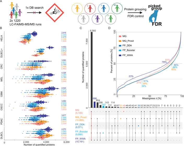
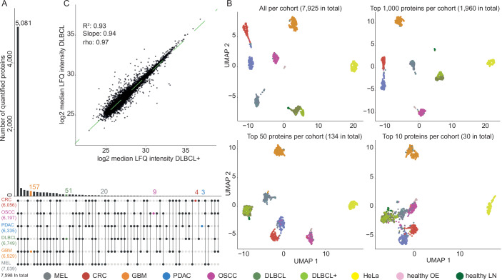
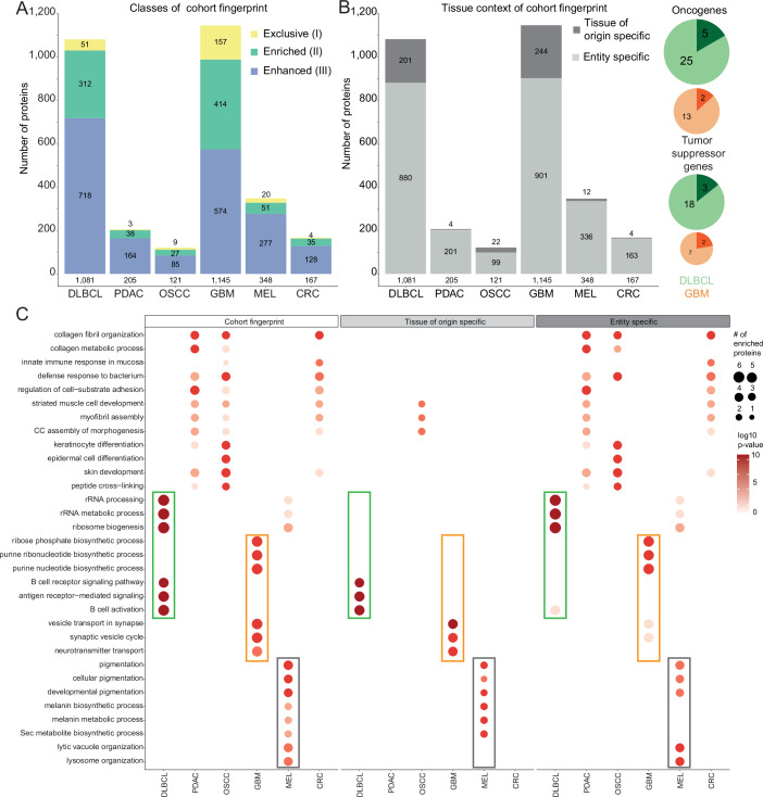
Proteome profiling of formalin-fixed paraffin-embedded (FFPE) specimens has gained traction for the analysis of cancer tissue for the discovery of molecular biomarkers. However, reports so far focused on single cancer entities, comprised relatively few cases and did not assess the long-term performance of experimental workflows. In this study, we analyze 1220 tumors from six cancer entities processed over the course of three years. Key findings include the need for a new normalization method ensuring equal and reproducible sample loading for LC-MS/MS analysis across cohorts, showing that tumors can, on average, be profiled to a depth of >4000 proteins and discovering that current software fails to process such large ion mobility-based online fractionated datasets. We report the first comprehensive pan-cancer proteome expression resource for FFPE material comprising 11,000 proteins which is of immediate utility to the scientific community, and can be explored via a web resource. It enables a range of analyses including quantitative comparisons of proteins between patients and cohorts, the discovery of protein fingerprints representing the tissue of origin or proteins enriched in certain cancer entities.

Keywords: Clinical Proteomics; Mass Spectrometry; Pan-cancer; Public Pan-cancer FFPE Resource; TIC Normalization.


Conflict of interest statement

Disclosure and competing interests statement. BK is the founder and shareholder of OmicScouts and MSAID. He has no operational role in either company. The remaining authors declare no competing interests.

Figures

Figure 1
Figure 1. Study design.
In total, 1220 FFPE tumor samples from cases of diffuse large B-cell lymphoma (DLBCL), pancreatic ductal adenocarcinoma (PDAC), oral squamous cell carcinoma (OSCC), glioblastoma (GBM), melanoma (MEL) and colorectal cancer (CRC) were proteome expression profiled over a timeframe of three years (starting date of each cohort is indicated) using the workstream shown on the right. The illustration was created with Biorender.com.
Figure 2
Figure 2. Sample loading normalization based on total ion chromatograms (TIC).
(A) Scatter plot comparing the results of protein quantification of FFPE tissue lysate determined by a colorimetric (660 nm) protein assay vs. peptide quantification of respective protein digests using UV absorption (NanoDrop). (B) Schematic illustration of the TIC MS1-only normalization strategy. Equal volumes of each of 1220 peptide digests are analyzed by a 11.5 min LC-MS1 run (left), all signals summed up (∑ MS1 TIC) and compared to a calibration curve constructed from a dilution series of HeLa cell digest analyzed in the same fashion (middle), followed by adjusting sample volumes to the same peptide quantity and subsequent analysis by 2 × 88 min LC-FAIMS-MS/MS runs (see methods for details). (C) Comparison of TIC or Qubit sample normalization using FFPE GBM samples (N = 7). The determined standard deviation (SD) is consistently smaller for TIC than Qubit for all three metrics applied: summed intensity (left, whiskers and line represent mean ± SD), the number of identified peptides (middle) and the number of identified proteins with one or two unique peptides, respectively (right, whiskers and dots represent mean ± SD). (D) Boxplots of the summed MS1 intensities of TIC normalization runs (11.5 min) and sample volume adjusted analysis runs (88 min, pale color) for all cohorts. The box represents the interquartile range (IQR) with the lower end being the 1st and the upper the 3rd quartile and its center the median of the underlying data. The whiskers show the span from the box boundaries to the lowest/highest value that is within the range of 1.5 times the IQR, since now outliers are visible this also represents the minimum/maximum value. The numbers on top show the coefficient of variation (CoV) of the TIC sum for each cohort before and after normalization. The sample numbers are 189, 204, 168, 246, 192, 145, 76 and 1220 for DLBCL, PDAC, OSCC, GMB, MEL, CRC, DLBCL+, and pan-cancer, respectively.
Figure 3
Figure 3. Comparison of different search strategies and post-processing methods for protein identification.
(A) Illustration of the database search strategy applied to the pan-cancer cohort. (B) Swarm plots showing the number of quantified protein groups for each HeLa QC sample and each FFPE tissue sample grouped by cohort and using different search engines and post-processing methods and followed by picked protein group false discovery rate (FDR) control. MaxQuant (red), MaxQuant plus Prosit (orange), FragPipe LFQ workflow without MSBooster (blue), FragPipe LFQ workflow with MSBooster (light blue) and FragPipe wide-window acquisition mode (WWA) (dark blue). The median number of quantified proteins is marked by a black dot and printed on the right. (C) Upset plot depicting how quantified proteins are shared between the different searches (colors as in (A); the total number of quantified proteins is given in brackets). The bars for and number of proteins exclusively called by one search strategy are highlighted in the respective color. (D) Cumulative density plot of the missingness of protein quantifications across all samples from all cohorts, split by the five search strategies and post-processing methods. The percentage of missingness of 25% and 50% of all proteins are indicated.
Figure 4
Figure 4. Global comparison of cancer entity proteome profiles.
(A) Upset plot depicting how quantified proteins are shared between entities. Proteins were required to be detected in at least 13% of the patients of at least one cohort. Proteins exclusive to one cohort are highlighted in color. The overall number of quantified proteins for each cohort is specified in brackets, as well as the number over all cohorts. (B) UMAP plots of patients clustered on the basis of the abundance of all quantified proteins (top left) or the top N most abundant proteins per cohort. (C) Scatter plot comparing the median log2 label-free quantification (LFQ) intensities of all proteins in the two DLBCL cohorts contained in this study. The green dashed line represents the linear regression fitted to the data (R2: coefficient of determination, rho: Pearson correlation coefficient).
Figure 5
Figure 5. Quantitative protein expression differences between patients and cancer entities.
(A) Left: Scatter plot comparing the expression of proteins detected in DLBCL cases (median protein intensity; Y axis) to the (mixed) background of all other entities combined (X axis). The dashed lines represent the chosen fold change cutoff of ±0.73 (see “Methods”). Middle and right: swarm plots showing the expression of exemplary proteins (each dot is a patient) enriched in the DLBCL cohort compared to all other cohorts. Numbers at the bottom indicate the number of patients the protein was detected in (N), the percentage of patients in which the protein was detected within the cohort in brackets and the median LFQ intensity of this protein in each cohort. (B) Same as (A) but for GBM.
Figure 6
Figure 6. Proteome fingerprints of tissue of origin and cancer entity.
(A) Bar graph of the number of proteins forming cohort-specific fingerprints: Class I—exclusive proteins: uniquely expressed in one cohort only. Class II—enriched proteins: at least 0.73 log2 fold change over the median of each individual other cohorts. Class III—enhanced proteins: at least 0.73 log2 fold change over the median of all other cohorts combined (see methods). (B) Same as A) but split by tissue of origin specificity (based on RNA-seq profiles from Uhlén et al, 2015) and cancer entity specificity (this study). Pie charts indicate oncogenes and tumor suppressor proteins (TSP) detected as cohort-specific fingerprint proteins in DLBCL or GBM. Darker color again indicates the fraction of tissue of origin-specific proteins of the fingerprint. (C) Gene ontology (GO) term enrichment analysis (biological process) of the cohort fingerprints, tissues of origin and cancer entity-specific proteins for all cohorts. The dot size represents the number of enriched proteins for the given GO term and the color scale indicates the statistical significance of the enrichment. Frames highlight examples that are tissue of origin or entity-specific or attributable to both.
Figure EV1
Figure EV1. Additional information provided by the TIC normalization approach.
(A) Three MS1 TIC chromatograms of the same exemplary patient sample. Top: pre-analytical LC-FAIMS-MS run after the first sample preparation with low quality. Middle: pre-analytical LC-FAIMS-MS run after processing the sample a second time. Bottom: final analytical LC-FAIMS-MS/MS run of the reprocessed sample. (B) Scatter plot of the log10 sum of the MS1 TIC intensity of pre-analytical LC-FAIMS-MS runs as a function of the date of the first diagnosis as a proxy for the age of the processed FFPE sample. Each dot represents one sample from the melanoma cohort.
Figure EV2
Figure EV2. Comparison of different search strategies for the analysis of the pan-cancer cohort.
(A) Swarm plot indicating the number of unique peptides for the MaxQuant-based searches and the number of unique spectra for the FragPipe-based searches per FFPE tissue sample grouped by entity using different search strategies followed by picked protein group FDR in the following order MaxQuant (red), MaxQuant+Prosit (orange), FragPipe LFQ workflow without MSBooster (blue), FragPipe LFQ workflow with MSBooster (light blue) and FragPipe WWA (dark blue). (B) Bar plot showing the median number of quantified proteins per search strategy across all cohorts (HeLa excluded). The gains of post-processing are indicated in percent. (C) left: Dot whisker plot showing the mean protein identification probability for FragPipe WWA after picked group FDR for proteins as a function of the number of search strategies the protein was quantified in. 768, 565, 419, 774 and 8560 proteins were quantified by 1, 2, 3, 4 and 5 search engines, respectively. The whiskers represent the standard deviation. Right: Violine plots showing the distribution of the protein identification probability after picked group FDR for proteins that were quantified by all search strategies (n = 8560) vs. those quantified by FragPipe WWA but not quantified by all others (n = 1631). The red numbers and the red dot indicate the mean values, the whiskers the standard deviation. (D) Bar plots showing the number of missing proteins (in bins of 5%) for all five search strategies for all cohorts separately and all cohorts combined.
Figure EV3
Figure EV3. Proteomic depth and definition of a completeness cutoff.
(A) Ridge plots showing the distribution of the median log10 iBAQ values for all cohorts separately, HeLa QC samples and all cohorts combined (excluding HeLa samples). (B) Abundance rank plot of the median log10 iBAQ intensity of all iBAQ quantified proteins over the corresponding iBAQ Rank for each cohort separately and combined (excluding HeLa samples). (C) Dot plot showing the number of quantified proteins across all samples of all cohorts as a function of the completeness. The vertical, dashed line shows the chosen cutoff of 13%. (D) The approximated first derivative of the relationship displayed in (C). The vertical, dashed line shows the chosen cutoff of 13%. (E) The approximated second derivative of the relationship displayed in (C). The horizontal line highlights zero, no change in slope. The vertical, dashed line shows the chosen cutoff of 13%. (F) Correlation plot between cohorts and heathy tissue samples indicating the Pearson correlation coefficient. Cohorts are sorted by hierarchical clustering using Euclidean distance.
Figure EV4
Figure EV4. Quantitative differences between cohorts.
(A) Volcano plot showing the −log10 P value of the performed Wilcoxon’s Rank test over the log2 fold change for all proteins between group1 and 2 (n = 609 patients each). Each patient sample was randomly assigned to one of the two groups, keeping the size of each cohort equal between the two groups. The maximum log2 fold change following this random assignment is indicated (blue). This maximum fold change observed by random chance alone gives insights into the variation in the dataset and allows to define a fold change cutoff for biological relevant comparisons used for further analyses. (B) Scatter plot comparing the expression of all proteins for CRC (n = 145) to the background of all other entities combined (n = 1075) using a Wilcoxon’s Rank test. Each dot represents a protein. The log2 fold change of the median protein intensity for the respective entity vs the median protein intensity of all other entities is given on the x axes and the median log2 iBAQ intensity for the respective cohort is given on the y-axes. The dashed lines represent the fold change cutoff of ± 0.73 determined from (A). (C) Left: Same as (B) but for PDAC (PDAC: n = 204, combined background: n = 1,1016). Middle: same as (B) but for MEL. Right: same as (B) but for OSCC (n = 168, combined background: n = 1052). (D) Exemplary protein NUCB1 showing a rather stable degree of variability across all cohorts. The numbers at the bottom indicate the number of samples the protein was quantified in per cohort, the corresponding percentage and the median LFQ intensity. (E) Exemplary proteins HDAC7, druggable by small molecule inhibitors, enriched in DLBCL. (F) In contrast to NUCB1 in D) CDK2 exhibiting a higher degree of variability in MEL compared to other cohorts.
Figure EV5
Figure EV5. Hallmark of cancer enrichment analyses and comparison to healthy tissue.
(A) Hallmark of cancer overrepresentation analysis based on a chi-squared contingency table test using the hallmark annotation database as background (MSigDB; Liberzon et al, 2015) for the cohort fingerprint, tissue of origin and cancer entity-specific proteins across all cohorts. The dot size represents the number of enriched proteins for the given Hallmark and the color scale indicates the statistical significance of the enrichment.

References

    1. Bhatia HS, Brunner AD, Öztürk F, Kapoor S, Rong Z, Mai H, Thielert M, Ali M, Al-Maskari R, Paetzold JC et al (2022) Spatial proteomics in three-dimensional intact specimens. Cell 185:5040–5058.e5019 - PubMed
    1. Buczak K, Kirkpatrick JM, Truckenmueller F, Santinha D, Ferreira L, Roessler S, Singer S, Beck M, Ori A (2020) Spatially resolved analysis of FFPE tissue proteomes by quantitative mass spectrometry. Nat Protoc 15:2956–2979 - PubMed
    1. Chang H-Y et al (2020) Crystal-C: A computational tool for refinement of open search results. J Proteome Res 19:2511–2515 - PMC - PubMed
    1. Coscia F, Doll S, Bech JM, Schweizer L, Mund A, Lengyel E, Lindebjerg J, Madsen GI, Moreira JM, Mann M (2020) A streamlined mass spectrometry-based proteomics workflow for large-scale FFPE tissue analysis. J Pathol 251:100–112 - PubMed
    1. Cox J, Mann M (2008) MaxQuant enables high peptide identification rates, individualized p.p.b.-range mass accuracies and proteome-wide protein quantification. Nat Biotechnol 26:1367–1372 - PubMed

LinkOut - more resources