. 2024 Dec;56(12):2704-2717.
doi: 10.1038/s41588-024-01961-x. Epub 2024 Nov 22.

Spatial and single-nucleus transcriptomic analysis of genetic and sporadic forms of Alzheimer's disease

Affiliations

Spatial and single-nucleus transcriptomic analysis of genetic and sporadic forms of Alzheimer's disease

Emily Miyoshi et al. Nat Genet. 2024 Dec.

Abstract

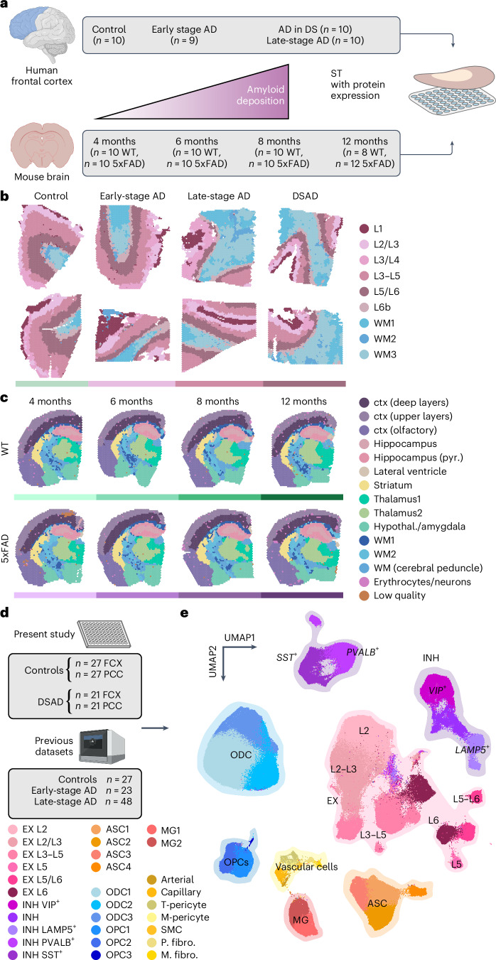
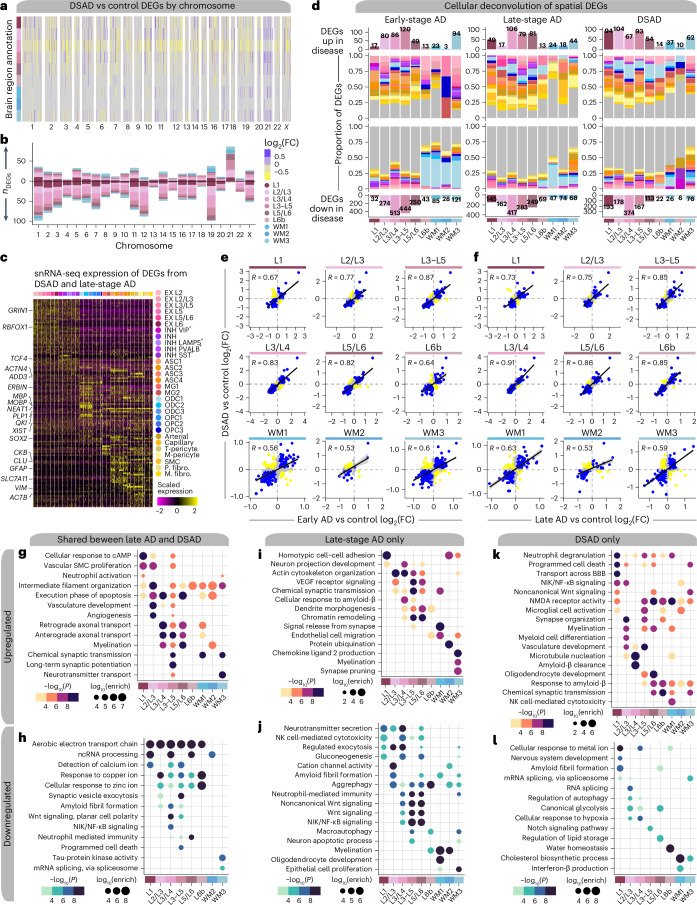
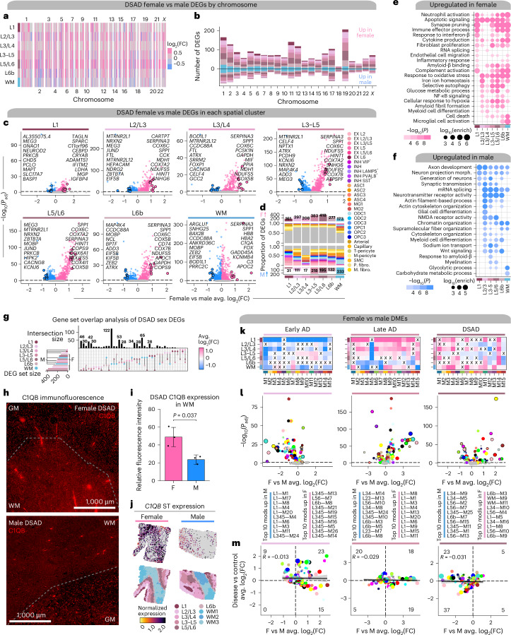
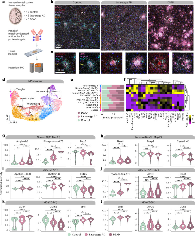
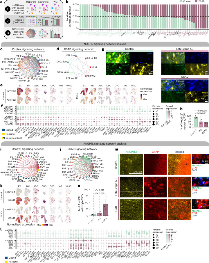
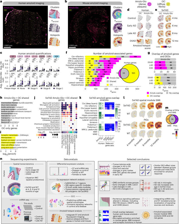
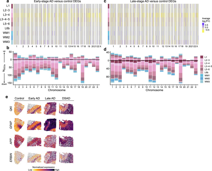
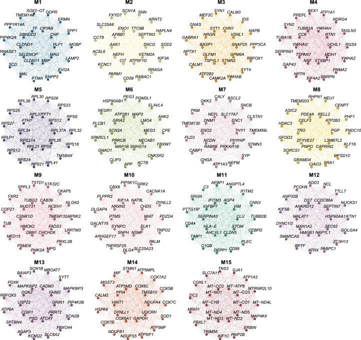
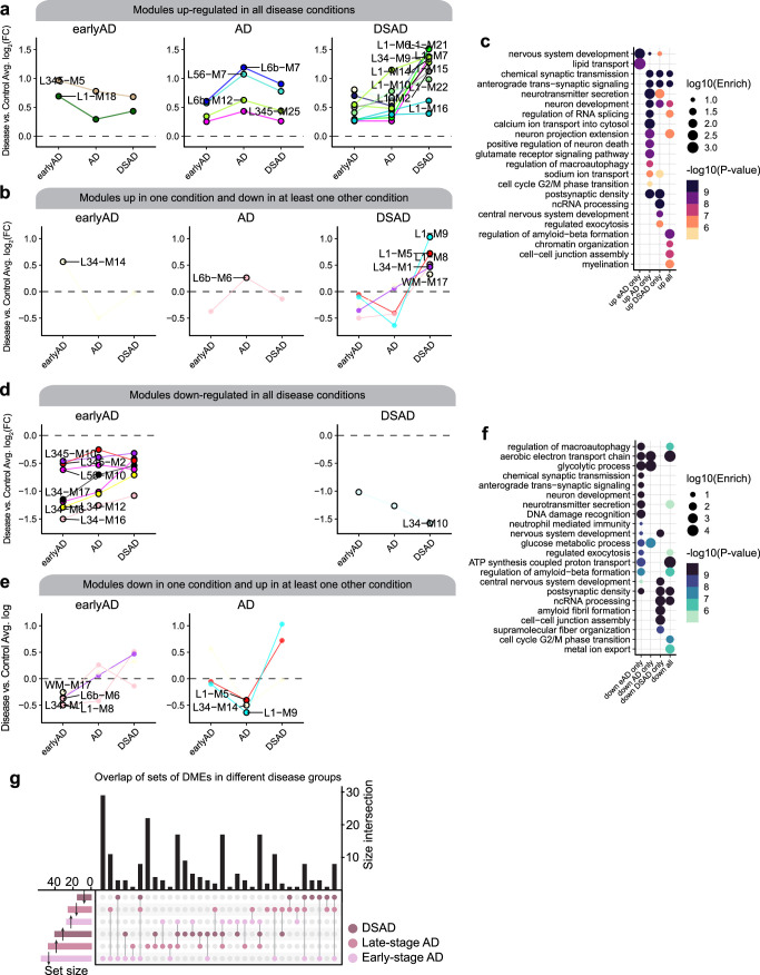
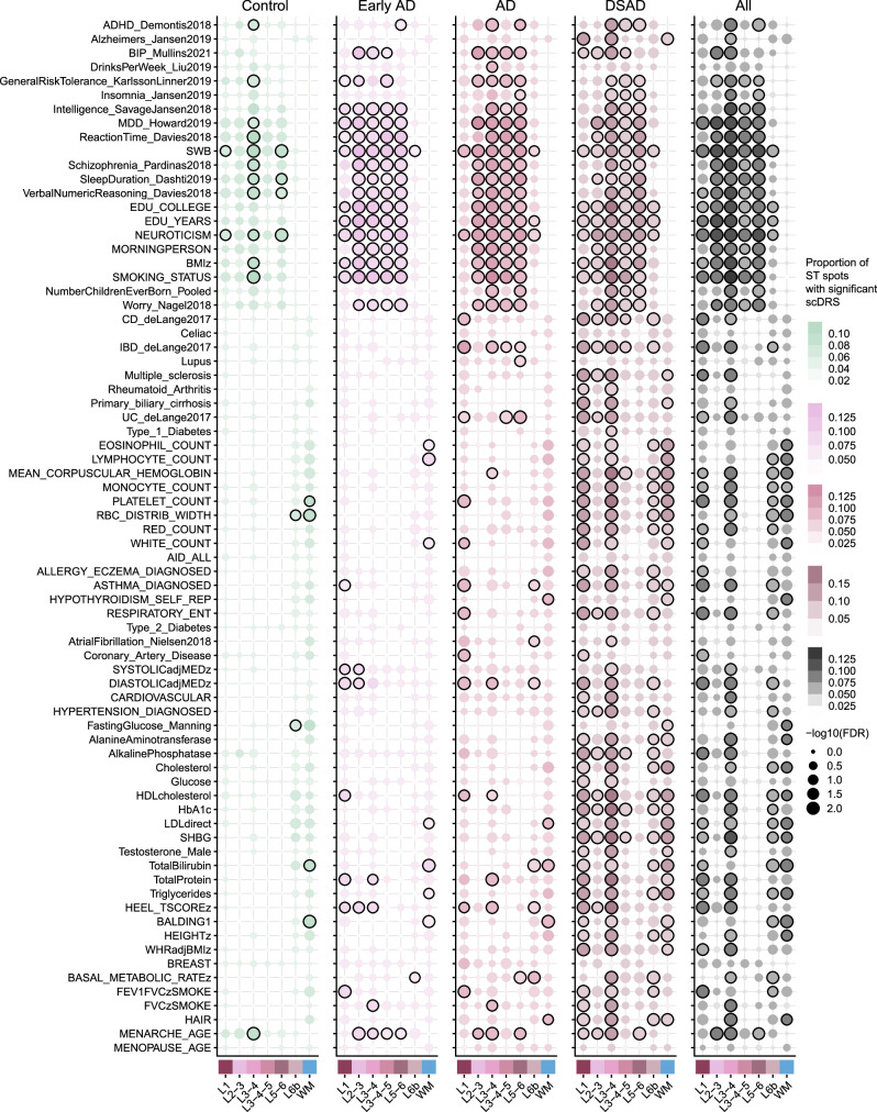
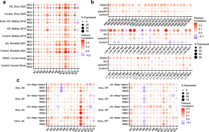
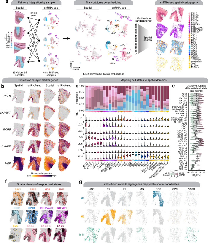
The pathogenesis of Alzheimer's disease (AD) depends on environmental and heritable factors, with its molecular etiology still unclear. Here we present a spatial transcriptomic (ST) and single-nucleus transcriptomic survey of late-onset sporadic AD and AD in Down syndrome (DSAD). Studying DSAD provides an opportunity to enhance our understanding of the AD transcriptome, potentially bridging the gap between genetic mouse models and sporadic AD. We identified transcriptomic changes that may underlie cortical layer-preferential pathology accumulation. Spatial co-expression network analyses revealed transient and regionally restricted disease processes, including a glial inflammatory program dysregulated in upper cortical layers and implicated in AD genetic risk and amyloid-associated processes. Cell-cell communication analysis further contextualized this gene program in dysregulated signaling networks. Finally, we generated ST data from an amyloid AD mouse model to identify cross-species amyloid-proximal transcriptomic changes with conformational context.


Conflict of interest statement

Competing interests: The authors declare no competing interests.

Figures

Fig. 1
Fig. 1. ST and single-nucleus transcriptomic analysis of genetic and sporadic forms of AD.
a, We performed ST experiments in the human frontal cortex and the mouse brain using 10x Genomics Visium. Human samples—n = 10 cognitively normal controls, n = 9 early-stage AD, n = 10 late-stage AD and n = 10 DSAD (median 1,316 genes per spot; n = 115,251 ST spots; Supplementary Table 1). Mouse samples—n = 10 WT and n = 10 5xFAD aged 4 months; n = 10 WT and n = 10 5xFAD aged 6 months; n = 10 WT and n = 10 5xFAD aged 8 months; n = 8 WT and n = 12 5xFAD aged 12 months (median 2,438 genes per spatial spot; n = 212,249 ST spots; Supplementary Table 2). b, Two representative human ST samples from each of the disease conditions, each spot colored by cortical annotations from BayesSpace clustering analysis. c, One representative mouse ST sample from WT and 5xFAD at each time point, each spot colored by brain region annotations derived from BayesSpace clustering analysis. d, We performed snRNA-seq in the frontal cortex and PCC from cognitively normal control donors (n = 27 FCX and n = 27 PCC) and DSAD donors (n = 21 FCX and n = 21 PCC). We also included snRNA-seq data from three previous studies of the cortex in AD (n = 27 controls, n = 23 early-stage AD and n = 48 late-stage AD). e, UMAP plot depicting a two-dimensional view of the cellular neighborhood graph of 585,042 single-nuclei transcriptome profiles. Each point in this plot represents one cell, colored by their cell-type annotations derived from Leiden clustering analysis. EX, n = 229,041; INH, n = 90,718; MG, n = 20,197; ASC, n = 57,443; OPC, n = 23,053; ODC, n = 153,182; PER, n = 4,659; END, n = 3,637; FBR, n = 2,403 and SMCs, SMC, n = 709. See Table 1 for additional cluster name abbreviations. Illustrations were created with Biorender.com. EX, excitatory neurons; INH, inhibitory neurons; MG, microglia; ASC, astrocytes; ODC, oligodendrocytes; PER, pericytes; END, endothelial cells; FBR, fibroblasts; SMCs, smooth muscle cells.
Fig. 2
Fig. 2. Altered gene expression signatures among subtypes of AD.
a, Heatmap colored by effect size from the DSAD versus control differential gene expression analysis, with genes stratified by chromosome and by spatial region. Statistically significant (FDR < 0.05) genes with an absolute average log2(FC) ≥ 0.25 in at least one region are shown. b, Stacked bar chart showing the number of DSAD versus control DEGs in each spatial region stratified by chromosome. c, Heatmap showing the gene expression values in the snRNA-seq dataset of spatial DEGs shared between DSAD and late-stage AD. d, Deconvolution of spatial DEGs using snRNA-seq cluster marker genes. Bar charts showing the number of DEGs up or down in disease for each spatial cluster are shown on the top and bottom, respectively. Proportional bar charts in the middle show the proportion of spatial DEGs that are also cluster marker genes in each of the snRNA-seq clusters. Spatial DEGs that are not in the snRNA-seq marker genes are shown in gray. e, Comparison of DE effect sizes from early-stage AD versus control and DSAD versus control. Genes that were statistically significant (adjusted P < 0.05) in either comparison were included in this analysis. Genes are colored blue if the direction is consistent, yellow if inconsistent and gray if the absolute effect sizes are smaller than 0.05. Black line represents a linear regression with a 95% confidence interval around the mean shown in gray. Pearson correlation coefficients are shown in the upper left corner of each panel. f, Comparison of DE effect sizes from late-stage AD versus control and DSAD versus control, layout as in e. g,h, Selected pathway enrichment results from DEGs that were upregulated (g) or downregulated (h) in both late-stage AD and DSAD compared to controls. i,j, Selected pathway enrichment results from DEGs that were upregulated (i) or downregulated (j) in late-stage AD exclusively. k,l, Selected pathway enrichment results from DEGs that were upregulated (k) or downregulated (l) in DSAD exclusively. One-sided Fisher’s exact test was used for enrichment analysis. VEGF, vascular endothelial growth factor; NMDA, N-methyl-D-aspartate; NK, natural killer.
Fig. 3
Fig. 3. System-level analysis of spatial gene expression programs.
a, Dendrogram shows 166 co-expression modules grouped into 15 meta-modules. Network plot represents the consensus co-expression network; each dot is a gene colored by meta-module assignment. Heatmap shows effect sizes from DME testing. Triangular heatmaps show the distance of gene sets and expression between modules (left, Jaccard; right, odds ratio). b, Comparison of effect sizes from DME testing across disease groups. Black lines linear regression with a 95% confidence interval around the mean in gray. c, Lineplots showing differentially expressed modules specific to disease groups. Top, downregulated modules. Bottom, upregulated modules. d, Selected pathway enrichment results for each meta-module. One-sided Fisher’s exact test was used for enrichment analysis. e, Heatmaps of meta-module DMEs in each disease group compared to controls. X indicates a lack of statistical significance. f, Violin plots showing MEs of selected meta-modules in mouse ST, split by age, with black line indicating the median ME. g, Lollipop plot showing module preservation analysis of the meta-modules projected into the 5xFAD mouse dataset. Z-summary preservation > 10, highly preserved; 10 > Z-summary preservation > 2, moderately preserved and 2 > Z-summary preservation, not preserved. h, st-DRS for AD in human ST clusters. Black outlines on the dots denote a significant group-level association (Monte Carlo test false discovery rate (FDR) ≤ 0.05). i, st-DRS for AD computed in mouse ST clusters. Feature plots show the st-DRS scores for representative samples in WT and 5xFAD. j, Single-cell disease relevance scores for AD in microglia in the snRNA-seq dataset, split by dataset and disease status. k, Dot plots show the percentage of ST spots in each group as the size and the correlation of the MEs and the scDRS AD enrichment as the color. mo, month.
Fig. 4
Fig. 4. Sex-related transcriptomic differences in subtypes of AD.
a, Effect sizes from DSAD female versus male differential gene expression, genes stratified by chromosome and spatial region. Significant (FDR < 0.05) genes with absolute average log2(FC) ≥ 0.25 in at least one region are shown. b, Stacked bar chart showing the number of DSAD female versus male DEGs by spatial region stratified by chromosome. c, Volcano plots showing the effect size and significance level from the DSAD female versus male DE (MAST, two-sided test). d, Number of DEGs upregulated in females or upregulated in males for each cluster on top and bottom, respectively. Proportional bar charts show the proportion of DEGs that are snRNA-seq marker genes. e,f, Selected pathway enrichment analysis from DEGs that were upregulated in females (e) or males (f). One-sided Fisher’s exact test was used for enrichment analysis. g, Overlap between sets of DEGs in spatial clusters. h, Representative images from the prefrontal cortex (PFC) of age-matched male and female patients with DSAD stained for C1QB (red). Dashed line visually separates GM and WM. i, Bar graph representing mean fluorescence intensity (relative) in ×20 images of C1QB (n = 5 brain sections from n = 3 female DSAD cases and n = 5 brain sections from n = 3 male cases) in the WM. P value from the two-sided t test is shown. Error bar shows one s.d. from the mean. j, Top, spatial feature plots showing C1QB expression in representative female (left) and male (right) DSAD samples. Bottom, samples colored by region annotations. k, Heatmap showing the meta-module DSAD female versus male DME results for each cortical layer and WM. X indicates a lack of significance. l, Volcano plot showing the effect size and significance level from DSAD female versus male DME analysis (two-sided Wilcoxon rank-sum test). m, Comparison of DME effect sizes between sex and diagnosis tests. Black line represents a linear regression with a 95% confidence interval around the mean shown in gray. Pearson correlation coefficients are shown in the upper left corner of each panel. Number of modules significant in either analysis in each quadrant is noted. F, female; M, male.
Fig. 5
Fig. 5. IMC reveals single-cell spatial proteomic changes in AD.
a, IMC was performed in postmortem human cortical tissue (n = 2 control, n = 6 late-stage AD and n = 6 DSAD) using the Hyperion Imaging System (Standard BioTools). Illustrations were created with Biorender.com. b, Representative IMC images from control, late-stage AD and DSAD samples with select targets from the panel. c, Images as in b at higher magnification and focused around amyloid plaques. d, UMAP plot showing the unbiased clustering of segmented nuclei from the IMC dataset based on their protein intensity values. Each dot represents a segmented nucleus, colored by cluster assignment. e, Stacked bar plots showing the proportion of segmented nuclei assigned to each cluster stratified by disease groups. f, Heatmap showing the relative protein intensity of each protein in each IMC cluster. Dendrograms depict hierarchical clustering results based on these relative intensities. gl, Violin plots showing the distribution of protein intensities for selected proteins in IMC clusters Neuron (Aβ+, MAP2+) (g), Neuron (NeuN+, MAP2+) (h), ASC (GFAP+) (i), ASC (GFAP+, Tau+) (j), MG (CD44+) (k), MG (CD68+) (l), stratified by disease groups. For box and whisker plots, box boundaries and lines correspond to the IQR and median, respectively. Whiskers extend to the lowest or highest data points that are no further than 1.5 times the IQR from the box boundaries. Two-sided Wilcoxon rank-sum test results are overlaid on each plot. NS, P > 0.05; **P ≤ 0.01; ***P ≤ 0.001, ****P ≤ 0.0001. IQR, interquartile range; NS, not significant; ECM, extracellular matrix.
Fig. 6
Fig. 6. Altered cell–cell communication signaling networks in DSAD.
a, Schematic representation of CCC analysis. b, Bar plot showing signaling pathways with significant differences between DSAD and controls, ranked based on their information flow (sum of communication probability among all pairs of cell populations in the network). c,d, Network plot showing the CCC signaling strength between different cell populations in controls (c) and DSAD (d) for NECTIN signaling. e, Spatial feature plots of the snRNA-seq in predicted spatial coordinates for one control sample (left) and one DSAD sample (right) for select NECTIN signaling genes. f, Dot plot showing gene expression of NECTIN signaling genes with significant CCC interactions in control (top) and DSAD (bottom). g, Representative double immunofluorescence images for Nectin2 (green), Map2 (yellow) and DAPI (blue) from postmortem human brain tissue (PFC) of control, late-stage AD and DSAD cases. h, Bar plot representing results of NECTIN colocalization analysis from ×60 images (n = 5 cognitively healthy control, n = 4 late-stage AD and n = 4 DSAD cases) using the JACoP Plugin from ImageJ and Manders' correlation coefficient. Data are presented as the average of three different fields of view (FOVs) per sample. P values from two-way t tests are shown. Error bar shows one s.d. from the mean. i,j, Network plot as in c and d in control (i) and DSAD (j) for ANGPTL signaling. k, Spatial feature plots as in e for one control sample (top) and one DSAD sample (bottom) for the ANGPTL pathway. l, Dot plot showing gene expression of ANGPTL signaling genes with significant CCC interactions in control (top) and DSAD (bottom). m, Representative double immunofluorescence images at ×10 and ×60 magnification for ANGPTL4 (green), GFAP (red) and DAPI (blue) from postmortem human brain tissue (PFC) of control, late-stage AD and DSAD cases. n, Bar plot representing results of ANGPTL colocalization analysis from ×60 images (n = 3 cognitively healthy control, n = 3 late-stage AD and n = 4 DSAD cases) using the JACoP Plugin from ImageJ and Manders' correlation coefficient. Data are presented as the average of three different FOVs per sample. P values from two-way t tests are shown. Error bar shows 1 s.d. from the mean.
Fig. 7
Fig. 7. Amyloid-associated gene expression signatures.
a,b, Representative fluorescent images from DSAD (a) and 12-month 5xFAD (b) stained with Amylo-Glo and OC to mark dense amyloid plaques and diffuse amyloid fibrils, respectively. ST data colored by cluster, amyloid quantification and hotspot analysis are below the images. c, Box and whisker plots showing the distribution of amyloid quantifications in the human ST dataset, stratifying samples by neuropathological plaque staging. Box boundaries and lines correspond to the IQR and median, respectively. Whiskers extend to the lowest or highest data points that are no further than 1.5 times the IQR from the box boundaries. Number of samples per stage—none, n = 8; stage A, n = 3; stage B, n = 7 and stage C, n = 14. Two-sided Wilcoxon test was used for pairwise comparisons. d,e, Amyloid hotspot results (Getis-Ord Gi*) for human (d) and mouse (e). f, Number of amyloid-associated genes from Amylo-Glo, shared and OC for mouse clusters. Euler diagram shows the overlap of Amylo-Glo- and OC-associated genes in the human dataset. g, Number of Amylo-Glo- and OC-associated genes that overlap with disease DEGs. h,i, Selected pathway enrichment results from amyloid-associated genes that were shared between Amylo-Glo and OC (h) and OC-specific (i) in the human ST dataset. j, Selected pathway enrichment results from amyloid-associated genes shared between Amylo-Glo and OC in the mouse ST dataset. One-sided Fisher’s exact test was used for enrichment tests. k, Heatmap showing gene set overlap results of mouse and human amyloid-associated genes, as well as with other gene sets (DAA, DAM, DOL and PIGs). NS, P > 0.05; *P ≤ 0.05; **P ≤ 0.01; ***P ≤ 0.001, ****P ≤ 0.0001. l, Expression of SM6 and PIGs modules in representative mouse ST samples. m, Euler plot showing overlap of the SM6 and PIGs. n, Overview of the experiments, data analysis and selected conclusions of this entire study. Illustrations were created with Biorender.com. DAA, disease-associated astrocytes; DAM, disease-associated microglia; DOL, disease-associated oligodendrocytes; BBB, blood–brain barrier.
Extended Data Fig. 1
Extended Data Fig. 1. Spatial transcriptomic DEGs examined by chromosome.
a, Heatmap colored by effect size from the spatial transcriptomic early-stage AD versus control differential gene expression analysis, with genes stratified by chromosome and by spatial region. Statistically significant (FDR < 0.05) genes with an absolute average log2(fold change) ≥ 0.25 in at least one region are shown. b, Stacked bar chart showing the number of spatial transcriptomic early-stage AD control DEGs in each spatial cluster stratified by chromosome. c, Heatmap colored by effect size from the spatial transcriptomic late-stage AD versus control differential gene expression analysis, with genes stratified by chromosome and by spatial region. Statistically significant (FDR < 0.05) genes with an absolute average log2(fold change) ≥ 0.25 in at least one region are shown. d, Stacked bar chart showing the number of spatial transcriptomic late-stage AD versus control DEGs in each spatial cluster stratified by chromosome. e, Spatial feature plots of four selected DEGs in one representative sample from each disease group.
Extended Data Fig. 2
Extended Data Fig. 2. Module hub gene networks for the human ST co-expression meta-modules.
Hub gene networks for each of the 15 human spatial co-expression meta-modules. The top 25 hub genes ranked by kME are visualized. Nodes represent genes, and edges represent co-expression links.
Extended Data Fig. 3
Extended Data Fig. 3. Differential module eigengenes (DMEs) among disease conditions.
a, DMEs that are upregulated in all disease conditions compared to control. Modules are grouped into different plots based on which disease condition had the highest effect size. Higher fold change values correspond to modules that are upregulated in disease. b, DMEs that are upregulated in one condition and downregulated in at least one other condition. c, Selected pathway enrichment results for the top 25 hub genes for each module for the set of modules upregulated in different disease conditions. d, DMEs that are downregulated in all disease conditions compared to control, similar to a. e, DMEs that are downregulated in one condition and upregulated in at least one other condition. f, Selected pathway enrichment results for the top 25 hub genes for each module for the set of modules downregulated in different disease conditions. g, Upset plot showing the overlap between sets of differentially expressed modules in each disease group. One-sided Fisher’s exact test was used for enrichment analysis.
Extended Data Fig. 4
Extended Data Fig. 4. Genetic enrichment analysis in human spatial transcriptomics.
Dot plots showing the results of genetic enrichment analysis performed in the human Visium ST dataset using scDRS. The scDRS Python package was run on the human ST dataset to compute spatial transcriptomic disease relevance scores (st-DRS) across a corpus of 74 traits provided by the scDRS package, resulting in spot-level disease enrichment scores and significance levels. Gene-trait association information was derived from the scDRS package, which was compiled from several genetic studies,– A Monte Carlo (MC) test was used to test for group-level significance between each trait and the ST clusters, separately for each disease group and the entire dataset together (all, right side). Black outlines on the dots denote a significant group-level association (FDR ≤ 0.05).
Extended Data Fig. 5
Extended Data Fig. 5. Correlation of co-expression network module eigengenes and scDRS genetic enrichment.
Dot plots show the percentage of snRNA-seq nuclei or ST spots in each group as the size and the correlation of the module eigengenes (MEs) as the color in the human snRNA-seq dataset (a), the human spatial transcriptomics (ST) dataset (b) and the mouse ST dataset (c). For this visualization, only groups with a significant group-level association (microglia clusters MG1 and MG2 for example) are included.
Extended Data Fig. 6
Extended Data Fig. 6. Systematic integration of spatial and single-nucleus expression profiles.
a, Pairwise integration of samples from spatial and single-nucleus transcriptomics (left). For all possible pairs of ST + snRNA-seq samples, we constructed a transcriptomic co-embedding (middle) and used a multivariate random forest (CellTrek) to predict the spatial coordinates of snRNA-seq cells in the given spatial context. The snRNA-seq dataset is shown on the right projected into two different spatial contexts (left: control sample; right: DSAD sample), split by major cell lineages and colored by cell annotations. b, Spatial feature plots of selected layer-specific marker genes, shown side-by-side in the ST dataset and the snRNA-seq dataset projected into the spatial context for one DSAD sample (left) and one control sample (right). c, Proportion of nuclei from each snRNA-seq cluster mapped to the spatial domains defined by the ST clustering. d, Distribution of spatial domain mapping probabilities for nuclei from each of the snRNA-seq clusters. e, Box and whisker plots showing differential cell composition between disease and control. Groups are organized on the y-axis by major cell types and ordered by median fold-change values within each cell type. Box boundaries and lines correspond to the IQR and median, respectively. Whiskers extend to the lowest or highest data points that are no further than 1.5 times the IQR from the box boundaries. Each data point represents a single-cell neighborhood from Milo; the number of cell neighborhoods per cluster is shown in Supplementary Table 5. f, Spatial density plot showing the snRNA-seq dataset in predicted spatial coordinates, highlighting selected cell populations. g, Spatial feature plots showing selected module eigengenes in the snRNA-seq dataset in predicted spatial coordinates.
Extended Data Fig. 7
Extended Data Fig. 7. Overview of cell–cell communication analysis.
a, Heatmap showing the differential cell–cell communication (CCC) interaction strength between AD in DS and control. Each cell represents a snRNA-seq cell population, where rows correspond to signaling sources and columns correspond to signaling targets. Bar plots on the top right show the sum of the incoming and outgoing signaling, respectively. b,c, Bar plots showing the total number of CCC interactions (b) and interaction strength (c) for control and AD in DS. d, Joint dimensionality reduction and clustering of signaling pathways inferred from AD in DS and control data based on their functional similarity. Each point represents a signaling pathway.
Extended Data Fig. 8
Extended Data Fig. 8. CD99 signaling changes between DSAD and control.
a,b, Network plot showing the CCC signaling strength between different cell populations in controls (a) and DSAD (b) for the CD99 signaling pathway. c,d, Spatial feature plots of the snRNA-seq in predicted spatial coordinates for one control sample (c) and one DSAD sample (d) for one ligand and one receptor in the CD99 pathway. e, Dot plot showing gene expression in the snRNA-seq dataset of ligands and receptors in the CD99 signaling pathway with significant interactions based on CellChat. f, Representative double immunofluorescence images for CD99 (green), CD99L2 (red) and DAPI (blue) from postmortem human brain tissue (prefrontal cortex, PFC) of control, AD and ADDS cases. Images were captured using a Nikon ECLIPSE Ti2 inverted microscope. g, Bar graph representing results of colocalization analysis from ×60 images (n = 3 cognitively healthy control, n = 3 AD and n = 4 DSAD cases) using the JACoP Plugin from ImageJ and Manders’ correlation coefficient. Data are presented as the average of three different fields of view (FOVs) per sample. P-values from two-way t-tests are shown.
Extended Data Fig. 9
Extended Data Fig. 9. Co-expression network analysis in the mouse ST dataset.
a, UMAP plot of the mouse spatial co-expression network. Each node represents a single gene, and edges represent co-expression links between genes and module hub genes. Point size is scaled by eigengene-based connectivity. Nodes are colored by co-expression module assignment. The top five hub genes per module are labeled. Network edges were downsampled for visual clarity. b, Dot plot showing selected GO enrichment results for each co-expression module. c,d, Module eigengene (ME) distributions for the ten mouse co-expression modules in each mouse age group (control, early-stage AD, late-stage AD and AD in DS) stratified by cluster for wild-type (c) and 5xFAD mice (d). One-sided Fisher’s exact test was used for enrichment analysis.
Extended Data Fig. 10
Extended Data Fig. 10. Module hub gene networks from the mouse co-expression network analysis.
Hub gene networks for each of the 10 mouse spatial co-expression modules. The top 25 hub genes ranked by kME are visualized. Nodes represent genes, and edges represent co-expression links.

Update of

References

    1. Hodge, R. D. et al. Conserved cell types with divergent features in human versus mouse cortex. Nature573, 61–68 (2019). - PMC - PubMed
    1. Tasic, B. et al. Shared and distinct transcriptomic cell types across neocortical areas. Nature563, 72–78 (2018). - PMC - PubMed
    1. Yao, Z. et al. A taxonomy of transcriptomic cell types across the isocortex and hippocampal formation. Cell184, 3222–3241 (2021). - PMC - PubMed
    1. Bandler, R. C. et al. Single-cell delineation of lineage and genetic identity in the mouse brain. Nature601, 404–409 (2022). - PMC - PubMed
    1. Bakken, T. E. et al. Comparative cellular analysis of motor cortex in human, marmoset and mouse. Nature598, 111–119 (2021). - PMC - PubMed