. 2024 Nov 8;10(22):e40246.
doi: 10.1016/j.heliyon.2024.e40246. eCollection 2024 Nov 30.

Development and validation of a nomogram model for predicting the risk of hypertension in Bangladesh

Affiliations

Development and validation of a nomogram model for predicting the risk of hypertension in Bangladesh

Merajul Islam et al. Heliyon. .

Abstract

Background and objectives: Hypertension (HTN) is a leading cause of non-communicable disease in low- and middle-income countries, including Bangladesh. Thus, the objectives of this study were to investigate the associated risk factors for HTN and develop with validate a monogram model for predicting an individual's risk of HTN in Bangladesh.

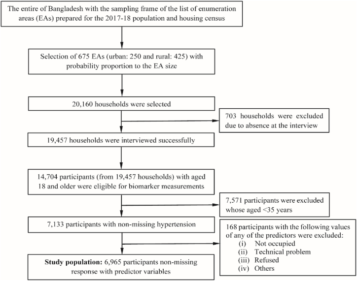
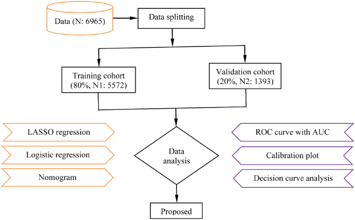
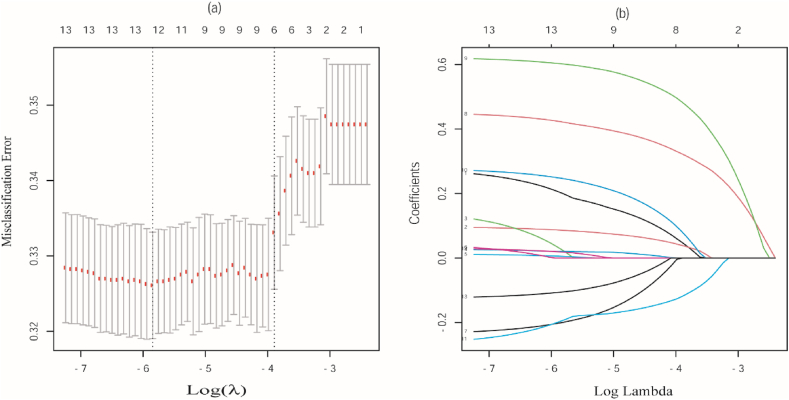
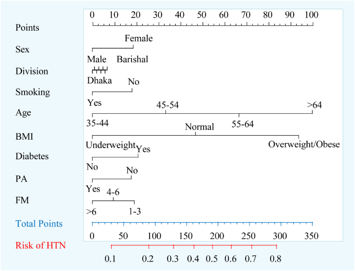
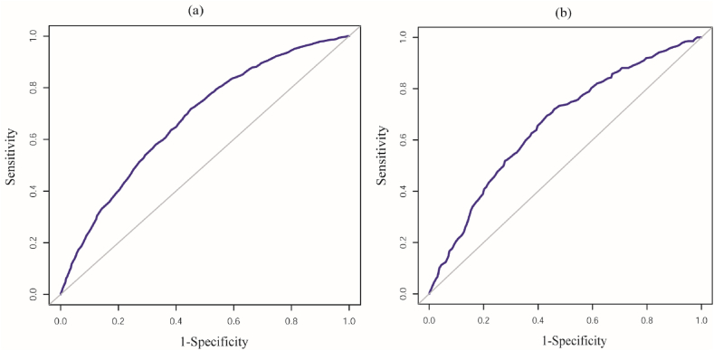
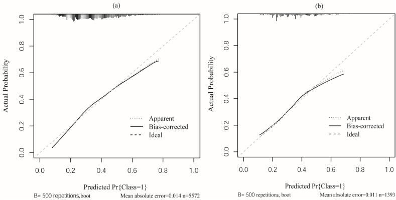
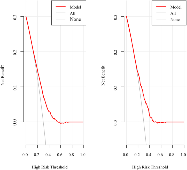
Materials and methods: This study exploited the latest nationally representative cross-sectional BDHS, 2017-18 data, which consisted of 6569 participants. LASSO and logistic regression (LR) analysis were performed to reduce dimensionality of data, identify the associated risk factors, and develop a nomogram model for predicting HTN risk in the training cohort. The discrimination ability, calibration, and clinical effectiveness of the developed model were evaluated using validation cohort in terms of area under the curve (AUC), calibration plot, decision curve analysis, and clinical impact curve analysis.

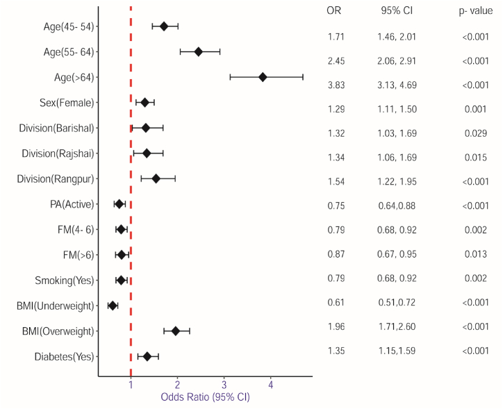
Results: The combined results of the LASSO and LR analysis demonstrated that age, sex, division, physical activity, family member, smoking, body mass index, and diabetes were the associated risk factors of HTN. The nomogram model achieved good discrimination ability with AUC of 0.729 (95 % CI: 0.685-0.741) for training and AUC of 0.715 (95 % CI: 0.681-0.729)] for validation cohort and showed strong calibration effects, with good agreement between the actual and predicted probabilities (p-value = 0.231).

Conclusion: The proposed nomogram provided a good predictive performance and can be effectively utilized in clinical settings to accurately diagnose hypertensive patients who are at risk of developing severe HTN at an early stage in Bangladesh.

Keywords: Bangladesh; Hypertension; LASSO; Logistic regression; Nomogram.


Conflict of interest statement

The authors declare no conflict of interest.

Figures

Fig. 1
Fig. 1
Sample selection procedure and sample size. EA: Enumeration area.
Fig. 2
Fig. 2
Overall study design flowchart. LASSO: Least absolute shrinkage and selection operator; ROC: Receiver operating characteristic curve; AUC: Area under the curve; N: Total sample size; N1: Training sample size; N2: Validation sample size.
Fig. 3
Fig. 3
Identification of risk factors by the LASSO regression model. (a) Tuning parameter (λ); (b) Coefficient profiles are generated on the basis of the optimal tuning parameter (λ) in (A).
Fig. 4
Fig. 4
Forest plot for significantly associated risk factors of HTN. Risk factors is represented on the Y-axis and odds ratio represented on the X-axis. The red vertical line indicates the reference line at OR = 1. The black diamond in the forest plot illustrates the summary effect estimate and its confidence interval. MS: Marital status; PA: Physical activity; FM: Family member; BMI: Body mass index; OR: Odds ratio; CI: Confidence interval.
Fig. 5
Fig. 5
Nomogram for predicting individuals' risk of HTN. The value of an individual patient is represented on each variable axis, from which a line is drawn upward to determine the points assigned for each variable value. Sum the points from all the variables to get the total points, which is locate on the "Total Points" axis, and drawn a vertical line down from the total points to identify the corresponding risk of HTN. BMI: Body mass index; PA: Physical activity; FM: Family member; MS: Marital status; PA: Physical activity; FM: Family member; BMI: Body mass index; HTN: Hypertension.
Fig. 6
Fig. 6
ROC curve of the nomogram model (a) Training cohort and (b) Validation cohort. The X-axis represented 1-specificity, also known false positive rate (FPR), while Y-axis represented sensitivity, also known true positive rate (TPR). The diagonal gray line indicates no discrimination, where the model has no ability to distinguish between HTN and non-HTN. The blue ROC curves depict the models' performance across different threshold levels.
Fig. 7
Fig. 7
Calibration plot of the nomogram (a) Training cohort and (b) Validation cohort. The nomogram model's predicted probability of HTN was represented by the X-axis, and the actual probability was represented by the Y-axis. The ideal line, depicted as a diagonal dashed line, illustrated the predicted probability aligns perfectly with the actual probability under optimal condition. The apparent line represents the predicted probabilities of outcomes directly from the nomogram model and the bias-corrected line reflects the expected performance of the model on unseen data. Together, closer these two lines to the ideal line signifies an improved nomogram model and better calibration.
Fig. 8
Fig. 8
Decision curve of the nomogram. (a) Training cohort and (b) Validation cohort. The X-axis represents different risk thresholds, while Y-axis represents net benefit. The red line indicates the net benefit of the nomogram model across different thresholds. The gray line (ALL), representing the "treat all as high risk", assumes that every individual is considered as high risk and therefore receives treatment or intervention. The gray-black line (None), representing the strategy where "no one is treated", assumes that no interventions are made based on the model.
Fig. 9
Fig. 9
Clinical impact curve of the nomogram. (a) Training cohort and (b) Validation cohort. The X-axis represents the high-risk threshold and the Y-axis represents the number of high-risk (out of 1000). The red line depicted the number of high-risk cases, while the blue line represented the number of high-risk cases associated with an event. The cost: benefit ratio represents the trade-off between the clinical costs of false positives (e.g., unnecessary treatments, tests) and the real benefits of true positives (e.g., correctly diagnosed cases, successful interventions).

References

    1. Ahmed S., Tariqujjaman M., Rahman M.A., Hasan M.Z., Hasan M.M. Inequalities in the prevalence of undiagnosed hypertension among Bangladeshi adults: evidence from a nationwide survey. Int. J. Equity Health. 2019;18:1–2. - PMC - PubMed
    1. Ali N., Akram R., Sheikh N., Sarker A.R., Sultana M. Sex-specific prevalence, inequality and associated predictors of hypertension, diabetes, and comorbidity among Bangladeshi adults: results from a nationwide cross-sectional demographic and health survey. BMJ Open. 2019;9(9) - PMC - PubMed
    1. AlKaabi L.A., Ahmed L.S., Al Attiyah M.F., Abdel-Rahman M.E. Predicting hypertension using machine learning: findings from Qatar Biobank Study. PLoS One. 2020;15(10) - PMC - PubMed
    1. Anjajo E.A., Workie S.B., Tema Z.G., Woldegeorgis B.Z., Bogino E.A. Determinants of hypertension among diabetic patients in southern Ethiopia: a case-control study. BMC Cardiovasc. Disord. 2023;23(1):233. - PMC - PubMed
    1. Bener A., Saleh N.M., Bakir A., Bhugra D. Depression, anxiety, and stress symptoms in menopausal Arab women: shedding more light on a complex relationship. Ann. Med. Health Sci. Res. 2016;6(4):224–231. - PMC - PubMed

LinkOut - more resources