. 2025 Feb;22(2):358-370.
doi: 10.1038/s41592-024-02555-5. Epub 2024 Dec 9.

Multiplexing cortical brain organoids for the longitudinal dissection of developmental traits at single-cell resolution

Affiliations

Multiplexing cortical brain organoids for the longitudinal dissection of developmental traits at single-cell resolution

Nicolò Caporale et al. Nat Methods. 2025 Feb.

Abstract

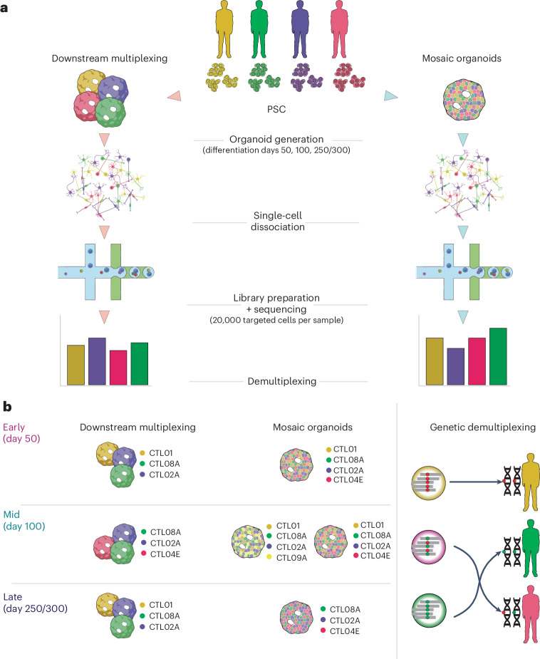
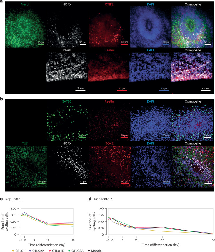
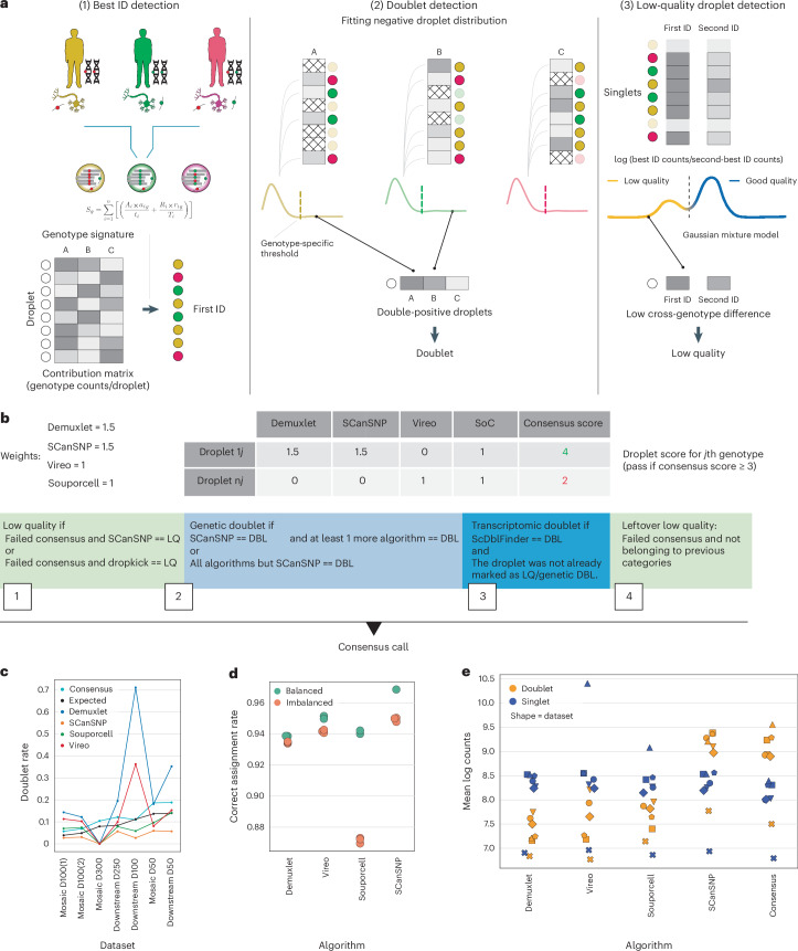
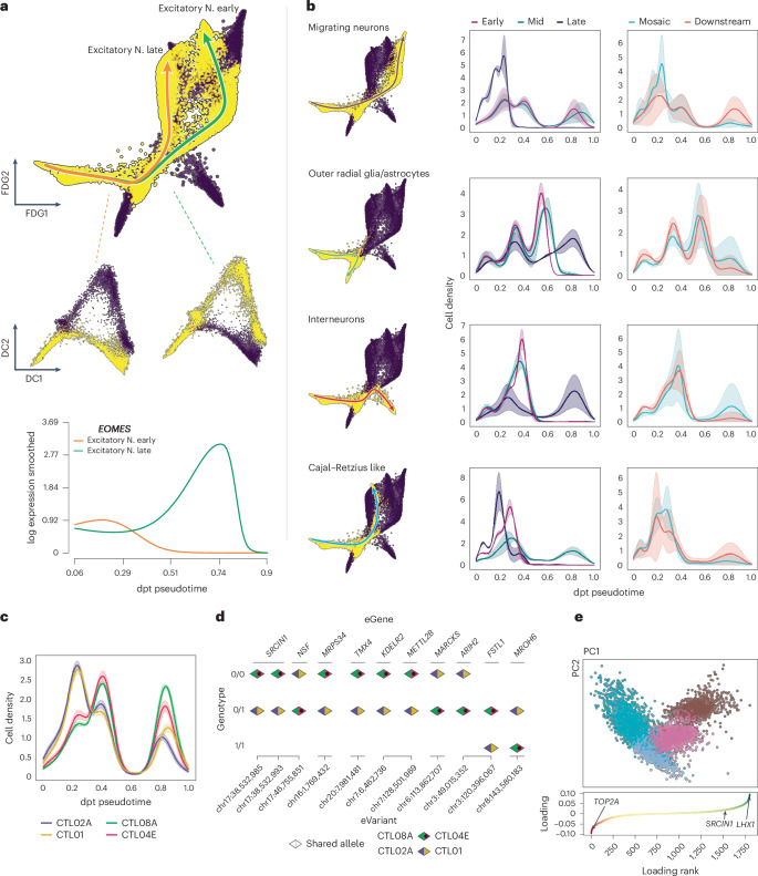
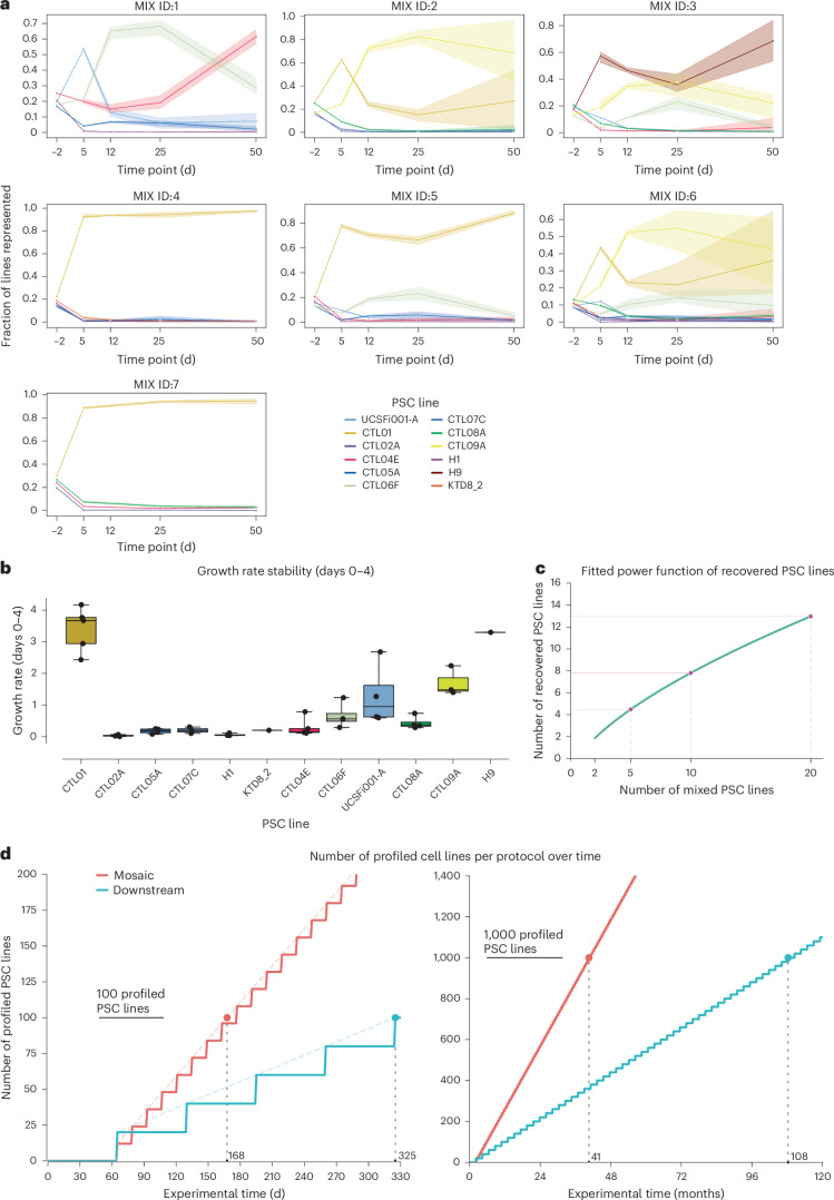
Dissecting human neurobiology at high resolution and with mechanistic precision requires a major leap in scalability, given the need for experimental designs that include multiple individuals and, prospectively, population cohorts. To lay the foundation for this, we have developed and benchmarked complementary strategies to multiplex brain organoids by pooling cells from different pluripotent stem cell (PSC) lines either during organoid generation (mosaic models) or before single-cell RNA sequencing (scRNA-seq) library preparation (downstream multiplexing). We have also developed a new computational method, SCanSNP, and a consensus call to deconvolve cell identities, overcoming current criticalities in doublets and low-quality cell identification. We validated both multiplexing methods for charting neurodevelopmental trajectories at high resolution, thus linking specific individuals' trajectories to genetic variation. Finally, we modeled their scalability across different multiplexing combinations and showed that mosaic organoids represent an enabling method for high-throughput settings. Together, this multiplexing suite of experimental and computational methods provides a highly scalable resource for brain disease and neurodiversity modeling.


Conflict of interest statement

Competing interests: F.J.T. consults for Immunai, Singularity Bio, CytoReason and Omniscope and has ownership interest in Dermagnostix and Cellarity. The other authors declare no competing interests.

Figures

Fig. 1
Fig. 1. Schematic representation of multiplexing paradigms and experimental design.
a, Representation of the two explored multiplexing paradigms. Left, downstream multiplexed organoids grown from individual lines and pooled in equal amounts after dissociation at the single-cell level. Right, mosaic organoids generated by pooling equal amounts of multiple PSC lines during organoid seeding. After single-cell dissociation, both paradigms undergo library preparation, sequencing and demultiplexing. PSCs, human pluripotent stem cells. b, Representation of experimental design and the demultiplexing approach. The CBO differentiation time points, the number of replicates for each time point and their division between the two multiplexing paradigms and the PSC lines (genotypes) used for each experiment are shown. Figure created with BioRender.com.
Fig. 2
Fig. 2. Experimental assessment of mCBOs.
a,b, Immunofluorescence-based benchmarking of neurodevelopmental markers in mCBOs. At differentiation day 50 (a), mCBOs show consistent presence of ventricular-like structures positive for the neural stem cell marker nestin and are surrounded by a layer of cells expressing the outer radial glial marker HOPX. The presence of newborn deep-layer, Coup-TFI interacting protein 2 (CTIP2)+ (BCL11B) cortical neurons can be appreciated next to HOPX+ cells. On the outer surface, mCBOs reveal the presence of reelin+ cells. At differentiation day 100 (b), mCBOs display more mature ventricular structures characterized by the presence of HOPX+ outer radial glial cells, SATB homeobox 2 (SATB2)+ intermediate layer neurons and SRY-box transcription factor 2 (SOX2)+ neural precursors. DAPI, 4,6-diamidino-2-phenylindole; PAX6, paired box 6. c,d, Fraction of cycling cells in pure lines and mosaic organoids detected by flow cytometry (Methods) performed on two differentiation replicates at relevant time points, from day −2 (organoid seeding) up to days 25 (c) and 50 (d). Source data
Fig. 3
Fig. 3. SCanSNP and consensus call overview and benchmark.
a, Main steps of SCanSNP: (1) best ID assignment, (2) doublet classification and (3) low-quality droplet detection. Colors represent different individuals and droplet identity after best ID assignment; grayscale intensity in matrices represents the number of reads; cross-patterned cells represent droplets not included in the computations; colored curves represent fitted distributions. b, Schematic representation of the consensus call. Top, an example of consensus score with weights for each algorithm. Weights are the partial score attributed from different algorithms toward a specific genotype. Bottom, final aggregation rationale. DBL, doublets; LQ, low quality; SoC, souporcell. c, Percentage of doublets detected from each algorithm across datasets. x axis, datasets ordered by the number of retrieved cells; y axis, doublet rate. Lines are colored by algorithm. D, day. d, Benchmark of demultiplexing performance against ground truth in an in silico multiplexed dataset. x axis reports different algorithms; y axis reports the deconvolution accuracy as the rate of barcodes with predicted IDs that match ground truth versus total detected barcodes per dataset. Balanced datasets are colored light green; imbalanced datasets are colored orange. Plot is bound between 0.86 and 0.98 to magnify the differences among and within tools and jittered on the y axis for readability. e, Distribution of predicted singlets and doublets from the different algorithms for each of the seven datasets. Algorithms are shown on the x axis, and mean log counts are shown on the y axis. The shape of each symbol corresponds to a dataset. Markers are colored by singlet or doublet predicted labels. Source data
Fig. 4
Fig. 4. Sample multiplexing allows identification of stage-specific neurodevelopmental cell populations.
a, Cell embeddings in a force-directed graph after preprocessing and filtering. Each dot is a cell, colored by annotated cell type. b, Dot plot of gene expression for some of the relevant markers used in the annotation. Size of dots is proportional to the number of cells expressing a marker, and color encodes the mean expression in the group (scaled log-normal counts). c, Differential abundance graph of CBO data across time points. The basis for the visualization is the force-directed graph. Dots represent groups of similar cells; color code indicates enrichment for the indicated categories (only shown for significantly enriched neighborhoods, spatial FDR < 0.1). d, Differential abundance graph of CBO data across multiplexing modalities. The basis for the visualization is the force-directed graph. Dots represent groups of similar cells; color code indicates enrichment for the indicated categories (only shown for significantly enriched neighborhoods, spatial FDR < 0.1). Source data
Fig. 5
Fig. 5. Multiplexed CBOs recapitulate key neurodevelopmental trajectories.
a, Highlight of late and early excitatory neurons (N.) branches. Top, embeddings in a force-directed graph (FDG1 and FDG2 dimensions). Middle, a magnification of isolated branches on the diffusion map (DC1 and DC2 components). Bottom, smoothed expression of EOMES for each of the two trajectories along pseudotime. b, Highlight of main developmental lineages in a force-directed graph. Next to each force-directed graph, density plots display the number of cells along pseudotime by (1) differentiation time points and (2) multiplexing paradigm. Faded color shows 1 s.d. among dataset replicates; solid line displays the mean value among dataset replicates. c, Density plot of cells along pseudotime for the isolated migrating neurons lineage. Cells are divided and colored by genotype. Faded color shows 1 s.d. across random subsampling iterations; solid lines display the mean value among dataset replicates. d, Schematics of SNPs classified as eQTLs from Jerber et al. and their allelic configuration (reference (Ref)/Ref, Ref/alternate (Alt), Alt/Alt) for the pairs of genotypes exhibiting difference in pseudotime. chr, chromosome. e, Principal-component analysis (PCA) (Harmony integrated) of the isolated migrating neurons branch. Bottom, migrating neurons-specific HVGs. Genes are ordered by their principal component (PC)1 loading, with TOP2A (cycling progenitors marker), LHX1 (migrating neurons marker) and SRCIN1 (only eGene from d also present in HVGs) highlighted. Source data
Fig. 6
Fig. 6. Scalability of mCBOs.
a, Longitudinal representation of PSC lines in seven mosaic organoids of different composition (MIX IDs, Source Data Fig. 6), as quantified by Census-seq. Each dot represents the average value of representation for a single line at that time point across three different replicates, except day −2, when only one replicate was available. Shading around the line represents the 95% confidence interval around the mean, as depicted by the solid line connecting the dots. b, Growth rate of different cell lines for different mosaic mixtures in the interval of day 0 to day 4. Different cell lines are divided along the x axis; each dot in a box represents the growth rate of the same cell line in a different experimental mixture. Displayed by each box is the median (horizontal solid line within the box), the interquartile range (upper and lower bound of the boxes) and minimum and maximum values (extension of the whiskers) among mixtures per line. c, Fitted power function of cell line recovery (Monte Carlo simulation, Extended Data Fig. 10c). The plot shows the number of mixed lines (x axis) and the number of recovered cell lines (y axis). d, Projection of the number of profilable lines over time across multiplexing approaches. The plot shows the number of profiled cell lines (y axis) and the experimental time in days (x axis). Vertical dashed lines represent the experimental time to reach 100 and 1,000 profiled cell lines in the left plot and the right plot, respectively. For the left plot, the approximation strict line is displayed for each protocol. Source data
Extended Data Fig. 1
Extended Data Fig. 1. mCBO immunofluorescence characterization.
Immunofluorescence-based benchmarking of different mosaic CBOs combinations. At differentiation day 50 (a, b), mosaic CBOs mixes 1, 6, and 7 show consistent expression of the neuronal lineage-specific tubulin TUBB3 as well as the presence of ventricular-like structures positive for the neural stem cell marker SOX2 (a). Similarly to the in vivo counterpart, these structures display high rates of proliferation as shown by the focal enrichment in mKI67 positive cells (b). Outside ventricular-like structures, the presence of neurons can be appreciated by the broad presence of NeuN positive nuclei as well as by the uniform presence of MAP2 positive cellular processes (b). At differentiation day 135 (c), mosaic CBOs mix1 display more mature ventricular-like structures characterised by reduced luminal area and a reduced and scattered expression of both SOX2 and mKI67 positive cells, whereas both NeuN positive nuclei and the sharpness of TUBB3 and MAP2 signal appears increased with longer cellular processes being clearly detected by anti-MAP2 staining.
Extended Data Fig. 2
Extended Data Fig. 2. Dataset composition by genotype.
Barplot representing number of cells by genotype according to the consensus call prior to filtering. WVS01H, WVS02A, WVS03B, WVS04A, CTL09A were not included in downstream analysis since there were no replicates across multiplexing modalities.
Extended Data Fig. 3
Extended Data Fig. 3. Demultiplexing performance assessment.
a) Doublet rate by dataset and algorithm. Lines are coloured by demultiplexing algorithm, datasets (x axis) are ordered by number of retrieved cells. b) Average log counts distribution by demultiplexing algorithm. Dots are coloured by predicted singlet or doublet identity by each algorithm; the shape of the dots encodes each of the 7 datasets. c) Alluvial plot displaying Singlets, Doublets, Unassigned and Low-quality classes mappings across demultiplexing algorithms. Cells (rows) are coloured according to SCanSNP assignment class. d) Pairwise agreement among software, divided by dataset. The agreement is expressed as a Jaccard similarity of each called identity between 2 software; x represent unassigned cells.
Extended Data Fig. 4
Extended Data Fig. 4. SCanSNP benchmarking.
a) Boxplots of precision and recall scores for evaluation of the classification of Demuxlet v2, Souporcell, Vireo and SCanSNP against barcode-based identity demultiplexing performed by cellranger multi. Displayed by each box is the median (horizontal solid line within the box), interquartile range (upper and lower bound of the boxes), min and max values (extension of the whiskers) for two independent datasets. On the right, droplets classified as low quality and doublets by either algorithm were included, on the left they were not taken into account in the comparison. Change in the y-axis scale reflects the higher performance of all algorithms against the ground truth when only singlets and good quality barcodes are considered. b) Natural logarithm of the total counts + 1 in each sample for two independent datasets. Displayed by each box is the median (horizontal solid line within the box), quartiles’ range (upper and lower bound of the boxes), min and max values (extension of the whiskers). Outliers are computed as a function of the inter-quartile range and shown as points outside the minimum and maximum range. c) Barplot showing differences in doublets and unassigned droplets rates by algorithm.
Extended Data Fig. 5
Extended Data Fig. 5. Single cell datasets characterization.
a) Embedding of cells from all datasets of force-directed graph. From left to right cells are coloured by genotype, multiplexing paradigm and stage. b) Force-directed graph coloured by expression of relevant markers. Plotted markers are divided by the cell type they are most relevant for. c) Force-directed graph coloured by transferred label from Poliudakis et al. dataset. End: endothelial; ExDp1: excitatory deep-layer1; ExDp2: excitatory deep-layer2; vRG: ventral radial microglia; oRG: outer radial glia; ExN: newborn excitatory; ExM: maturing excitatory; ExM-U: excitatory upper-layer-enriched; IP: intermediate progenitors; inCGE: interneurons caudal ganglionic eminence; inMGE: interneurons medial ganglionic eminence; Mic: microglia; OPC: oligodendrocyte precursors; Per: pericytes; PgG2M: G2M phase proliferating progenitors; PgGS: S phase proliferating progenitors; d) Plot of fraction of cells for each cell type, divided by timepoint (upper panel), and by multiplexing paradigm (lower panel). e) The scatterplot shows the number of loci with detected allele specific expression on the x axis and the total number of reads expressed in millions on the y axis; each dot represents a cell type. f) Spearman correlation on reads bringing alternative alleles / total reads (bValues) among the observed cell types. Correlation is calculated on loci that displayed allelic imbalance (binomial test fdr < 0.05) in at least one cell type and with at least 20 reads in each cell type.
Extended Data Fig. 6
Extended Data Fig. 6. Developmental trajectory analysis and power analysis.
a) On the left: Partition-based graph abstraction (PAGA) plot. Each circle represents a Paga cluster, circles are partitioned according to the fraction of cells per annotated cell type (shown as reference on the right side), weighted edges among PAGA clusters encode their transcriptional similarity. b) Plot of smoothed gene expression - obtained via tradeseq - along pseudotime (Methods). For each lineage the three most relevant decreasing and increasing genes (sorted by pVal and absolute logFC) are shown. Above each expression panel, bars coloured by cell type indicate the occupancy of each cell type along pseudotime. c) SCPOWER: Estimation of single cell eQTL power per specific cell type, depending on the sample size and numbers of cells per sample. d) Distribution of genotypes along pseudotime for Interneurons, Outer radial glia / astrocytes and Cajal Retzius-like lineages. Within each differentiation stage cells were balanced to the same amount across genotypes for correct comparison. If too few/no cells were retrieved at any differentiation stage, the whole genotype was removed from the comparison. Faded colour shows 1 standard deviation across random subsampling iterations, solid line display the mean value across random subsampling iterations.
Extended Data Fig. 7
Extended Data Fig. 7. Migrating neurons PC1 analysis.
a) Boxplot of cells’ embedding on PC1 for migrating neurons trajectory, grouped by cell type and PSC line. Above the x axis residuals values are reported for each covariate. Each dot is the embedding of a cell in PC1, boxplot display median, interquartile range, minimum and maximum values among cells of each group. b) Distribution of different genotypes along PC1 after genotypes balancing per timepoint. Solid line represents the mean, and faded colour shows 1 standard deviation value, upon 50 random subsampling iterations.
Extended Data Fig. 8
Extended Data Fig. 8. PSC growth curves.
a) Growth curves of each line coloured according to the number of passage (that is split) post-thawing. On the x axis the time in hours after splitting the cells from one plate to a new one (see Methods), the y axis the total area detected in mm2. The line depicts the mean area at that time point across the field of views, the shade shows the 95% confidence interval. b) Cumulative mean area of each PSC line at each different passage fitted as an exponential curve, as depicted by the solid line. The dots represent the empirical values.
Extended Data Fig. 9
Extended Data Fig. 9. CBO growth curves.
a, b) Growth curves of pure-line CBO (a) or mosaic CBO (b). The area detected at each time point was normalized on the area of the organoid at day 0. The lines depict the mean area across five independent replicates for all the PSC lines at all time points except CTL09A and MIX4 at day 10, when only 4 replicates were available. The shade around the mean is representative of the 95% confidence interval. The coloured line is representative of the subplot title PSC line while all the others are shown in light grey.
Extended Data Fig. 10
Extended Data Fig. 10. PSC growth dynamics in mCBO.
a) Heatmap coloured by Spearman’s correlation coefficients computed between the rate of cumulative growth (hPSC growth rate), slopes of the linear fitting (CBO growth rate) and Census-Seq weighted ranking normalized at each available time point. The text on the heatmap shows the Spearman’s correlation coefficient b) Growth rate of different cell lines for different mosaic mixtures (different dots) in the interval day 4 to day 10. Different cell lines are divided along x axis, each dot of a box represent the growth rate of the same cell line in a different experimental mixture. Displayed by each box is the median (horizontal solid line within the box), interquartile range (upper and lower bound of the boxes), minimum and maximum values (extension of the whiskers) among mixtures per line. c) Monte Carlo simulation of cell lines recovery. The plot shows the number of theoretically mixed (x axis) and recovered cell lines (y axis). The yellow line indicates the mean number of recovered cells and the faded blue indicates 1 standard deviation upon 100’000 simulations for each value of x. d) Estimation of the experimental workload and time required for large-scale experiments (see “Scalability of mosaic experiments in terms of experimental timeline”) also for the “chimeroid” approach. In this case NPC-chimeroids are dissociated and reaggregated after 25 days of differentiation, thus the same considerations of the downstream multiplexing design applies until that timepoint. The plot shows the number of profiled cell lines (y axis) and the experimental days (x axis). Vertical dashed lines represent the experimental time to reach 100 and 1000 profiled cell lines in left plot and right plot respectively. For the left plot, the approximation strict line is displayed for each protocol. Source data

References

    1. Silbereis, J. C., Pochareddy, S., Zhu, Y., Li, M. & Sestan, N. The cellular and molecular landscapes of the developing human central nervous system. Neuron89, 248–268 (2016). - PMC - PubMed
    1. Cheroni, C., Caporale, N. & Testa, G. Autism spectrum disorder at the crossroad between genes and environment: contributions, convergences, and interactions in ASD developmental pathophysiology. Mol. Autism11, 69 (2020). - PMC - PubMed
    1. Tărlungeanu, D. C. & Novarino, G. Genomics in neurodevelopmental disorders: an avenue to personalized medicine. Exp. Mol. Med.50, 1–7 (2018). - PMC - PubMed
    1. Hyman, S. E. The daunting polygenicity of mental illness: making a new map. Philos. Trans. R. Soc. Lond. B Biol. Sci. 373, 20170031 (2018). - PMC - PubMed
    1. López-Tobón, A. et al. Human cortical organoids expose a differential function of GSK3 on cortical neurogenesis. Stem Cell Reports13, 847–861 (2019). - PMC - PubMed

LinkOut - more resources