. 2024 Dec;21(221):20240376.
doi: 10.1098/rsif.2024.0376. Epub 2024 Dec 18.

Weak-form inference for hybrid dynamical systems in ecology

Affiliations

Weak-form inference for hybrid dynamical systems in ecology

Daniel Messenger et al. J R Soc Interface. 2024 Dec.

Abstract

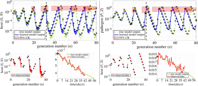
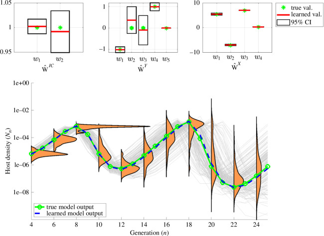
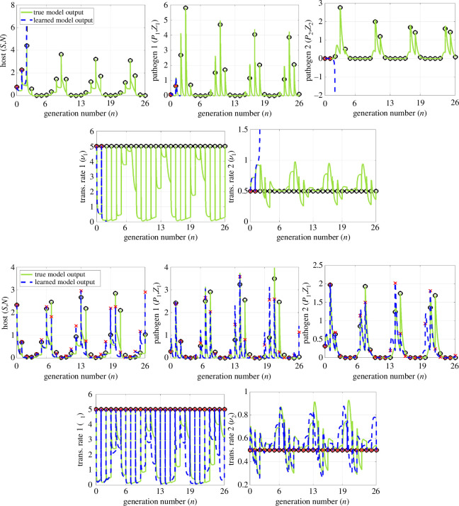
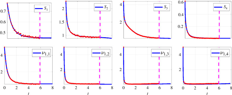
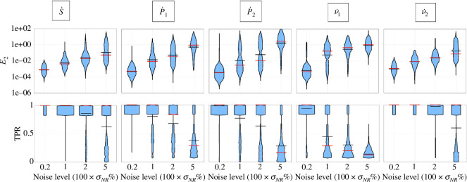
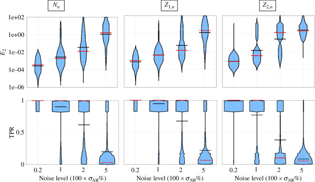
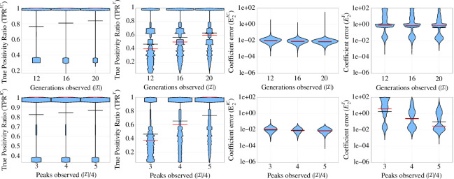
Species subject to predation and environmental threats commonly exhibit variable periods of population boom and bust over long timescales. Understanding and predicting such behaviour, especially given the inherent heterogeneity and stochasticity of exogenous driving factors over short timescales, is an ongoing challenge. A modelling paradigm gaining popularity in the ecological sciences for such multi-scale effects is to couple short-term continuous dynamics to long-term discrete updates. We develop a data-driven method utilizing weak-form equation learning to extract such hybrid governing equations for population dynamics and to estimate the requisite parameters using sparse intermittent measurements of the discrete and continuous variables. The method produces a set of short-term continuous dynamical system equations parametrized by long-term variables, and long-term discrete equations parametrized by short-term variables, allowing direct assessment of interdependencies between the two timescales. We demonstrate the utility of the method on a variety of ecological scenarios and provide extensive tests using models previously derived for epizootics experienced by the North American spongy moth (Lymantria dispar dispar).

Keywords: WSINDy; data-driven modelling; hybrid systems; multi-scale model; parameter estimation; system identification.


Conflict of interest statement

The authors declare no competing interests.

Figures

Example: noise, accurate predictions up to 80 generations
Figure 1.
Example: 1% noise, accurate predictions up to 80 generations. Left and right columns visualize performance of WSINDy-ECO in predicting the host and pathogen densities, respectively. The top plots display learned model outputs overlapping the true model output for all 80 generations (n0.5(𝐰^)=80, black dashed lines), given |I|=18 samples from the first three host density peaks. The lower left plots in each column display the observed data, with black dots for discrete (Nn,Zn) variables and red lines for continuous (Sn,Pn) variables over each generation. The modest 1% noise level in (Sn,Pn) is visualized for the n=0 generation in the bottom right plots of each column. By sampling the output parameters 𝐰^ using the learned covariance 𝐒^ and simulating the resulting models, 95% prediction regions can be ascribed to the peak locations and heights (red rectangles, with width and height given by 95% prediction intervals around mean peak location and height, respectively, with yellow dots for means), which in each case contain the true peaks and amplitudes. Note that although the parameter distribution is Gaussian (𝐰N(𝐰^,𝐒^)), the uncertainty does not propagate linearly through the nonlinear dynamical system, resulting in non-symmetric prediction regions (hence yellow dots do not align with peaks).
Example: noise, accurate predictions up to 32 generations.
Figure 2.
Example: 5% noise, accurate predictions up to 32 generations. Similar to figure 1, only now with 5% noise in (S,P) (see lower right plots in each column), and |I|=18 randomly sampled generations. The larger noise level limits accurate predictions to n0.5(𝐰^)=32 generations. The 95% prediction regions contain the true peaks up to n0.5(𝐰^), after which the 95% CI for peak location still contains the true peak, but the true heights fall narrowly outside of the 95% CI.
Advantages of WENDy regression in long-term prediction.
Figure 3.
Advantages of WENDy regression in long-term prediction. Both plots depict the performance of WSINDy-Eco with data sampled from the first five host peaks (see figure 7 for sampling related performance), with ordinary least squares (OLS) regression on the left (MaxIts = 0) and WENDy regression on the right (MaxIts = 5). Employing WENDy increases predictive capabilities from 20 to 60 generations on average for data with 1.25% noise in the continuous variables. OLS does not allow for effective model learning at higher noise levels, leading to models that cannot predict well forward in time, while WENDy is still able to predict 45, 32 and 10 generations forward at 2.5%, 5% and 10% noise, respectively.
UQ under correct model identification. In this example with 5% noise (same data as in figure 2),
Figure 4.
UQ under correct model identification. In this example with 5% noise (same data as in figure 2), the learned model is able to capture the data well (blue versus green curve). The added uncertainty quantification allows the WSINDy-Eco approach to provide a view into the validity and usefullness of the model. Confidence intervals around learned parameter values (top plots) each contain the true value and show model parameter uncertainty, indicating low uncertainty (narrow intervals) and good identification. Similarly, model trajectories (grey curves) obtained via parametric bootstrap samples from the WENDy parameter distribution, provide visualization of the uncertainty in state trajectories themselves. They also allow quantification of the spread of predictive values and propagation of uncertainty into forward predictions (orange kernel density estimates) at any point in time. Figure 5 displays corresponding results for the case of a misidentified model.
UQ under misidentified model, pre-manual model pruning.
Figure 5.
UQ under misidentified model, pre-manual model pruning. In the case of a misidentified model (also from data with 5% noise), the learned model output still fits the data well (blue versus green curves). However, uncertainty in trajectories is large, with different trajectories showing wildly different behaviour. Information provided by WENDy, combined with domain knowledge, can be used to manually rule out terms that do not seem biologically realistic; the next figure displays the results obtained from re-solving the system after eliminating {w2,w3,w4,w6} from 𝐰^IC, {w4,w6,w7} from 𝐰^Y and w1 from 𝐰^X, due to disproportionately smaller magnitudes and/or larger confidence intervals (top plots).
UQ for the misidentified model described in figure 5, post model pruning.
Figure 6.
UQ for the misidentified model described in figure 5, post model pruning. After having eliminated {w2,w3,w4,w6} from 𝐰^IC, {w4,w6,w7} from 𝐰^Y and w1 from 𝐰^X (see figure 5) and resolving the system using WENDy, a clearer trajectory pattern is revealed with tighter spread of oscillations. In particular, the next host population peak is predicted to occur at n=8 with a high degree of certainty.
Violin plots comparing aggregate performance for random and peak sampling strategies.
Figure 7.
Violin plots comparing aggregate performance for random and peak sampling strategies. Left to right column: TPRX (model recovery accuracy for the discrete dynamics), E2X (coefficient accuracy for discrete dynamics) and n0.5 (prediction length) for data with 5% noise in the continuous variables equations (4.6)–(4.9). Top and bottom rows display results for random and peak sampling, respectively. In each violin plot, the sample mean and median are displayed with black and red lines, respectively. For visualization, values with E2X>100 have been removed, representing approximately 40%, 36% and 19% of values for random sampling and 6.2%, 1.8% and 2.6% of values for peak sampling. It can be observed from the left plots that sampling three peaks only is sufficient to identify the dynamics in the vast majority of cases with average TPR above 0.8, whereas random sampling average TPR is below 0.6 even with the equivalent of five peaks worth of data. Correspondingly, the right plots show that peak sampling with only three peaks doubles the accurate prediction length to 20 generations on average, compared with the equivalent data quantity random sampling with 12 generations.
Visualization of sparsity threshold selection in MSTLS.
Figure 8.
Visualization of sparsity threshold selection in MSTLS. Left to right: selection of thresholds for the initial conditions map, continuous dynamics and discrete dynamics. Top and bottom: 1% noise and 5% noise. There is a clear relationship between the selected threshold and the level of noise in the data, with higher noise levels corresponding to the need for (and the selection of) a larger threshold κ^, and consequently less complex models. In the case of the continuous dynamics (middle plots) the loss function becomes flatter, indicating that there are potentially multiple models describing the data equally well. In these examples all sub-models were identified correctly with the exception of the continuous dynamics at 5% noise, yet the recovered model is accurate enough to enable identification of the discrete dynamics (recall this depends on the outputs of the simulated learned continuous dynamics).
Two-pathogen example: noise, in-sample and out-of-sample predictions.
Figure 9.
Two-pathogen example: 1% noise, in-sample and out-of-sample predictions. Top: ground truth data (green, black) used to learn the two-pathogen model in table 5 with WSINDy-Eco, as well as corresponding simulations (blue, red) from a representative model learned on the ground truth data with 1% noise added (similar to figure 1 in the main text). Bottom: simulations from the same learned model tested on an out-of-sample dataset (i.e. initialized at a new random initial condition).
Two-pathogen example: sharp transition rate dynamics.
Figure 10.
Two-pathogen example: sharp transition rate dynamics. Example data (red) and simulation (blue) used to obtain Sn(T) and ν1,n(T) for the first four generations (the vertical dashed magenta line indicates the maximum time observed, beyond which simulation from the learned model is used to obtain values at time T=8). As can be seen in the bottom row, the continuous ν1 dynamics are imperceptible at this sampling rate, leading to low recovery rates for the ν˙1 equation (see figure 11). The data are the same as in figure 9.
Aggregate performance of WSINDy-Eco in identifying continuous two-pathogen dynamics.
Figure 11.
Aggregate performance of WSINDy-Eco in identifying continuous two-pathogen dynamics. Coefficient error (E2, top) and model accuracy (TPR, bottom) of recovery of the continuous dynamics of the two-pathogen system using WSINDy-Eco.
Aggregate performance of WSINDy-Eco in identifying discrete two-pathogen dynamics.
Figure 12.
Aggregate performance of WSINDy-Eco in identifying discrete two-pathogen dynamics. Coefficient error (E2, top) and model accuracy (TPR, bottom) of recovery of the discrete dynamics of the two-pathogen system using WSINDy-Eco.
Aggregate performance of WSINDy-Eco in predicting two-pathogen dynamics.
Figure 13.
Aggregate performance of WSINDy-Eco in predicting two-pathogen dynamics. Number of generations predicted accurately (n0.5(𝐰^)) in applying WSINDy-Eco to the two-pathogen example using in-sample testing, out-of-sample testing and out-of-sample testing for learned models with correctly identified Z2 dynamics (TPR = 1).
Violin plots comparing aggregate performance for random and peak sampling strategies (figure 7 cont.).
Figure 14.
Violin plots comparing aggregate performance for random and peak sampling strategies (figure 7 cont.). Left to right: TPRIC (model recovery accuracy for the initial conditions map), TPRY (model recovery accuracy for the continuous dynamics), E2IC (coefficient accuracy for initial conditions map), E2Y (coefficient accuracy for the continuous dynamics). Top and bottom rows display results for random and peak sampling, respectively.
Violin plots comparing aggregate performance for peak sampling at 10% noise.
Figure 15.
Violin plots comparing aggregate performance for peak sampling at 10% noise. Left to right: TPRIC (model recovery accuracy for the initial conditions map), TPRY (model recovery accuracy for the continuous dynamics), TPRX (model recovery accuracy for the discrete dynamics). At 10% noise, it is clear that more samples are needed to achieve good long-term prediction. Sampling over five peaks yields correct identification of the discrete map in the majority of cases (third plot), which does not necessarily correspond to correct identification of the initial conditions map or the continuous dynamics (first and second plots). However, the predictive capability is still sufficient to accurately predict five generations ahead on average, even with only three peaks sampled (fourth plot), which may be sufficient for many applications. When five peaks are observed, 10 generations on average may be predicted.

References

    1. Hilborn R, Mangel M. 2013. The ecological detective: confronting models with data (MPB-28). Princeton, NJ: Princeton University Press.
    1. Bolker BM. 2008. Ecological models and data in R. Princeton, NJ: Princeton University Press. (10.1515/9781400840908) - DOI
    1. King AA, Ionides EL, Pascual M, Bouma MJ. 2008. Inapparent infections and cholera dynamics. Nature 454, 877–880. (10.1038/nature07084) - DOI - PubMed
    1. Burnham KP, Anderson DR. 2007. Model selection and multimodel inference: a practical information-theoretic approach. New York, NY: Springer.
    1. Burnham KP, Anderson DR, Huyvaert KP. 2011. AIC model selection and multimodel inference in behavioral ecology: some background, observations, and comparisons. Behav. Ecol. Sociobiol. 65, 23–35. (10.1007/s00265-010-1029-6) - DOI

LinkOut - more resources