. 2024 Dec 3:15:1485109.
doi: 10.3389/fimmu.2024.1485109. eCollection 2024.

A new perspective on macrophage-targeted drug research: the potential of KDELR2 in bladder cancer immunotherapy

Affiliations

A new perspective on macrophage-targeted drug research: the potential of KDELR2 in bladder cancer immunotherapy

Zhiyi Zhao et al. Front Immunol. .

Abstract

Introduction: Bladder cancer was recognized as one of the most common malignant tumors in the urinary system, and treatment options remained largely limited to conventional surgery, radiotherapy, and chemotherapy, which limited patient benefits.

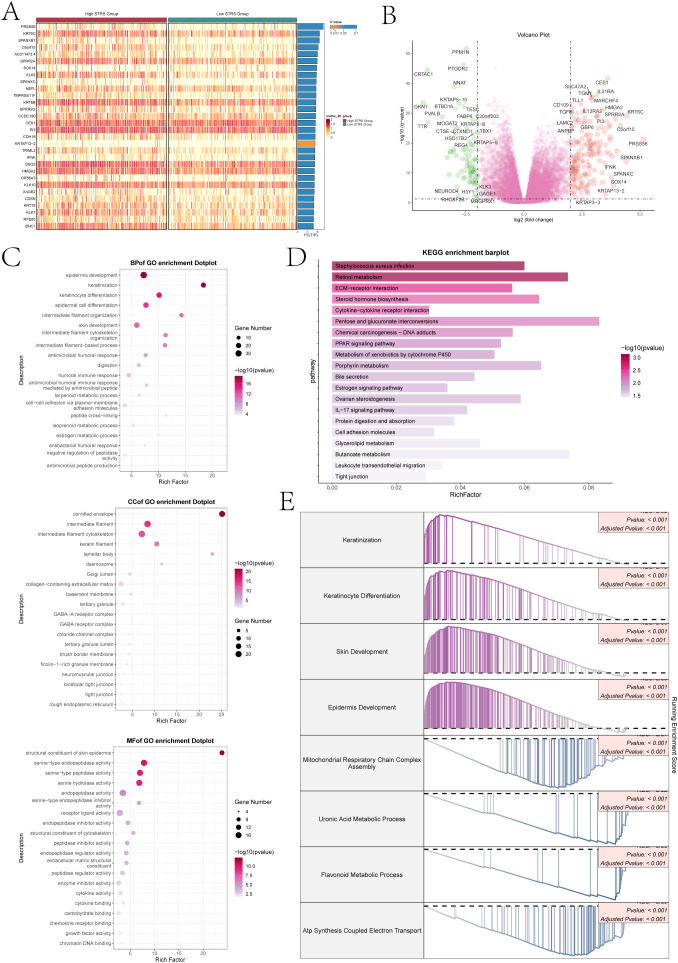
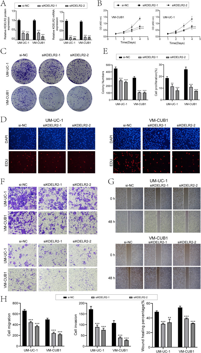
Methods: Researchers constructed an RNA transcriptome map of bladder cancer by integrating single-cell RNA sequencing and clinical data, identifying potential molecular targets for diagnosis and treatment. We also verified the antitumor activity of the target through in vitro experiment.

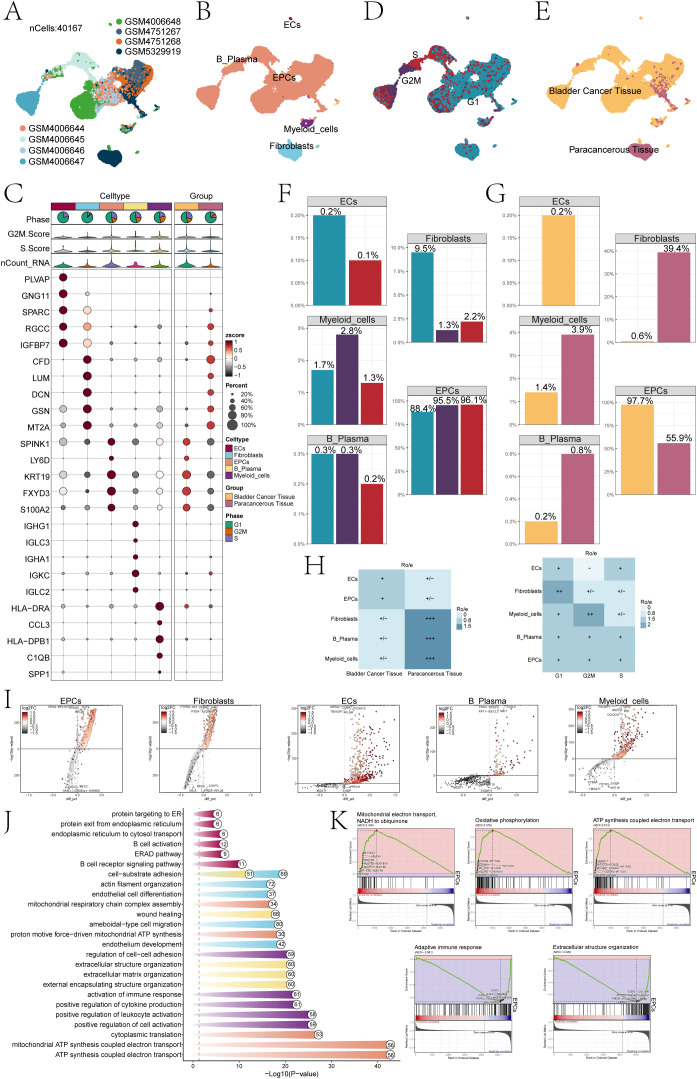
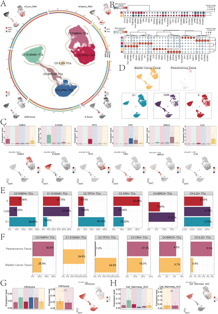
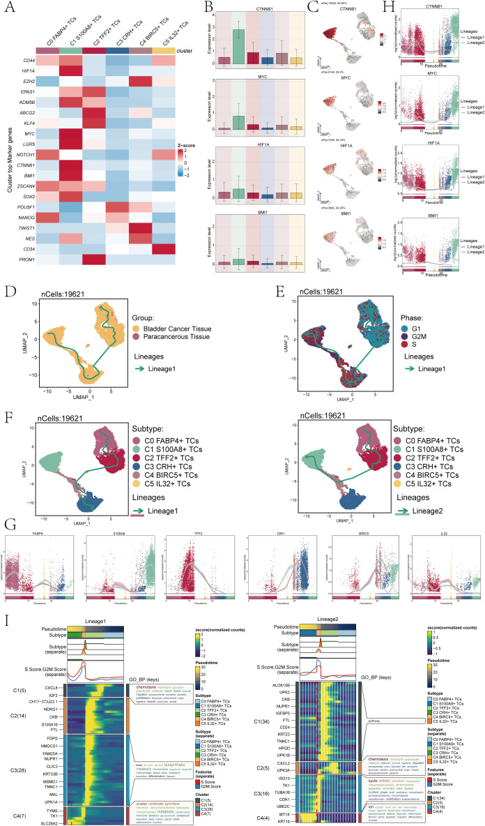
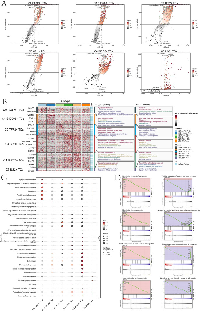
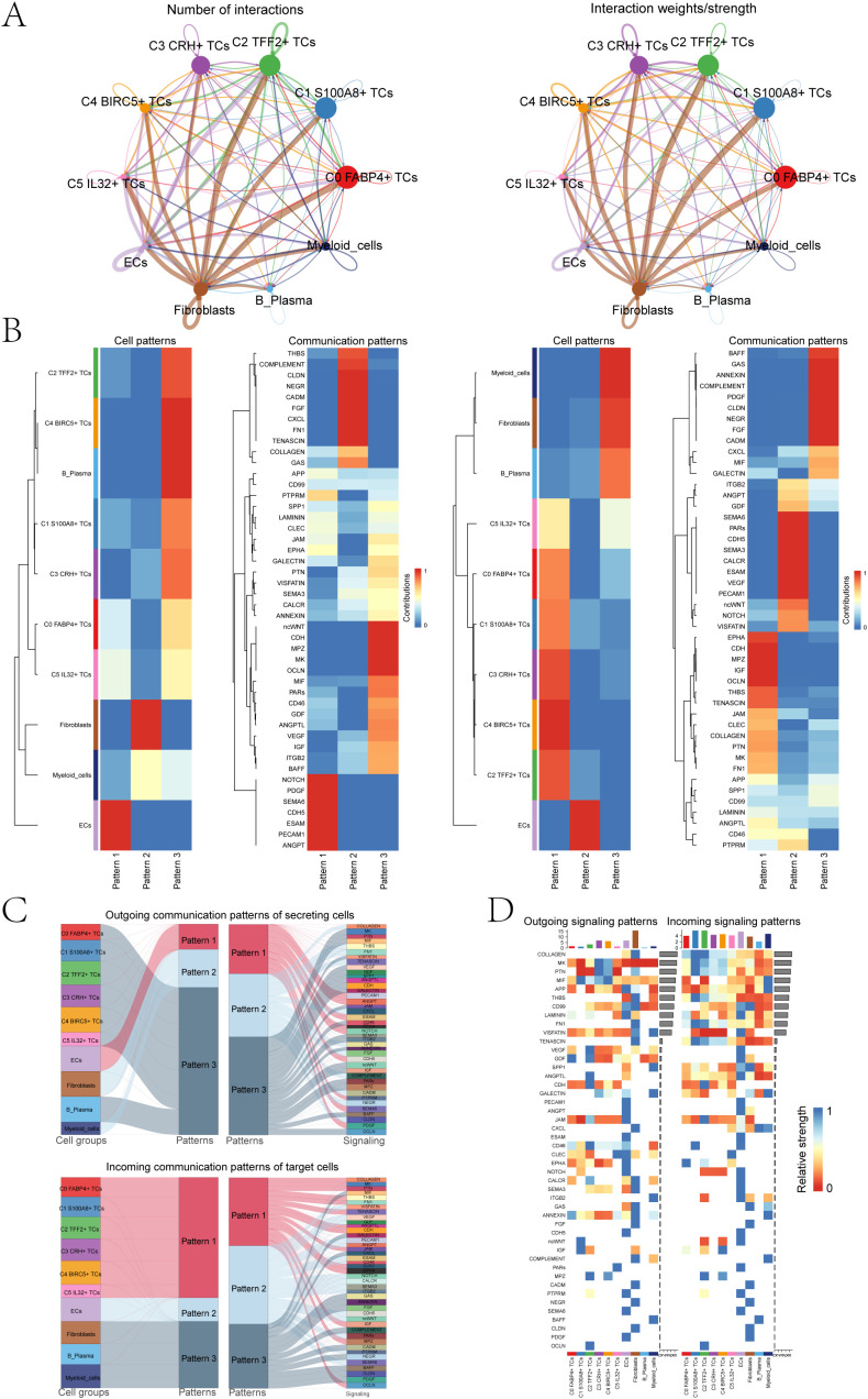
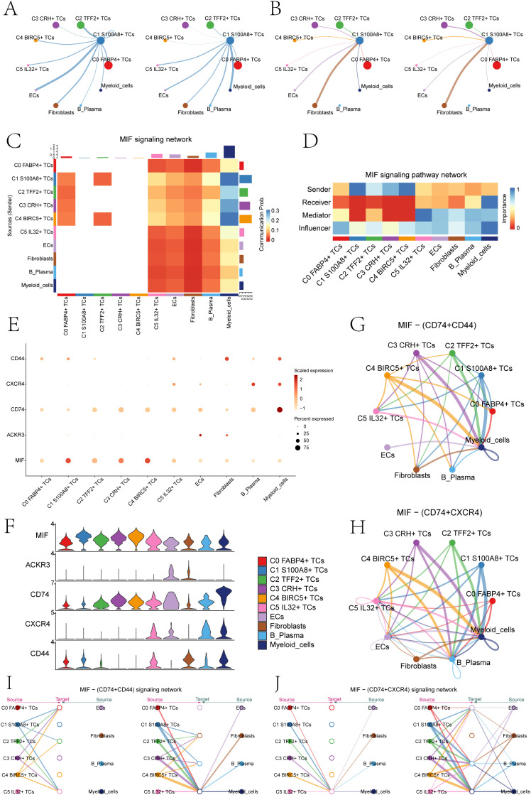
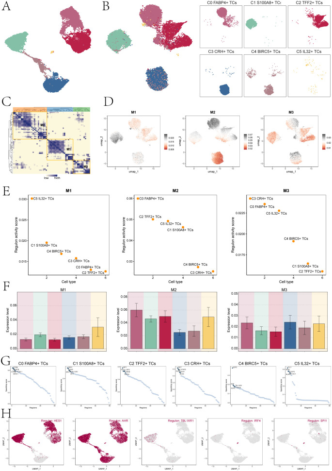
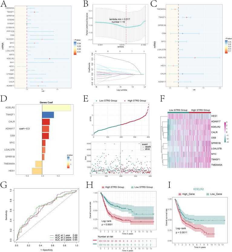
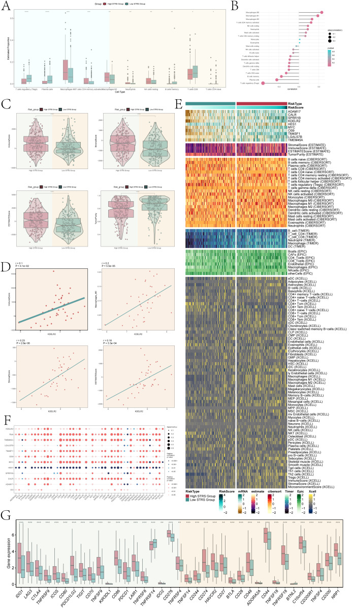
Results: A distinct tumor cell subpopulation characterized by elevated S100A8 expression exhibited high copy number variation, high stemness, and low differentiation. It interacted with myeloid cells via the MIF-(CD74+CD44) and MIF-(CD74+CXCR4) signaling pathways. This study underscored KDELR2's role in promoting cell proliferation, invasion, and migration, providing new therapeutic insights. Prognostic analysis revealed that KDELR2 correlated with poor survival, higher immune scores, and increased macrophage infiltration.

Discussion: The findings suggested that patients with high KDELR2 expression might benefit from immune checkpoint therapy. KDELR2 was also shown to enhance bladder cancer cell proliferation, invasion, and migration, highlighting it as a promising target for macrophage-focused drug development.

Keywords: KDELR2; S100A8; TCs; bladder cancer; macrophage.


Conflict of interest statement

The authors declare that the research was conducted in the absence of any commercial or financial relationships that could be construed as a potential conflict of interest.

Figures

Figure 1
Figure 1
Single-cell profiling of bladder cancer identified 5 cell types. (A) The UMAP plot visualized the analysis encompassing all cells from eight bladder cancer samples sourced from seven patients,by using single-cell RNA sequencing method(n=40,167). (B) UMAP plot showed clusters of five different types of cells (ECs; EPCs; B plasma cells; myeloid cells; fibroblasts). (C) The bubble chart displayed the top 5 marker genes associated with each individual cell cluster. The bar charts were color-coded by cell subpopulation, and the pie charts illustrated the proportion of each phase. The violin plots visualized the expression levels of G2M.Score, S.Score, and nCount-RNA, with bubble size representing the percentage of gene expression and color indicating z-score. (D) UMAP plot illustrated the cellular distribution at three different cell cycle phases (Phase: G1, G2M, S). (E) UMAP plot showed the distribution of cell samples from bladder cancer tissue and paracancerous tissue. (F) The bar charts represented the proportions of three cell phases in five different types of cells. (G) The bar charts represented the proportions of bladder cancer tissue and paracancerous tissue in 5 different types of cells. (H) The heatmap revealed the distribution preferences of different cell subpopulations in terms of sample origin and cell cycle phase. (I) Volcano plots showed different expressed genes in 5 types of cells. (J) Enrichment analyses of DEGs across all cells unveiled their key biological roles and functions. (K) GSEA identified both positively and negatively enriched biological pathways in EPCs, including mitochondrial electron transport, NADH-ubiquinone reduction, oxidative phosphorylation coupled ATP synthesis, adaptive immune response, and extracellular structure organization.
Figure 2
Figure 2
S100A8+ TCs specifically expressed in malignant EPCs and are associated with cell stemness. (A) The circle plot represented the clustering of the six tumor cell subpopulations identified in bladder cancer. and the contour curve outlines the boundaries of each cell subpopulation. The outer axis of the circle plot represents the logarithmic scale of the entire cell count in each cell category. The three-color tracks representative the ratio of each tumor cell subpopulation in cell types, cell sample types, and cell phases, respectively, and are colored according to cell categories. The UMAP graphs in the four corners start from the upper left corner and go clockwise to show the expression distribution of nCount-RNA, nFeature-RNA, S.score, and G2M.score across all TCs was shown. (B) The bubble charts showed the manifestation of marker genes in two sample tissues (top) and in six tumor cell clusters (bottom). (C) The bar charts and UMAP plots collectively presented the expression profiles of six marker genes FABP4, S100A8, TFF2, CRH, BIRC5, and IL32 across six tumor cell clusters. (D) UMAP visualized the distribution of TCs in bladder cancer tissue, paracancerous tissue, and G1, G2M, and S phases. (E) The bar charts showed the percentage of G1, G2M, and S phases in six tumor cell clusters. (F) The bar charts illustrated the percentage of bladder cancer tissue and paracancerous tissue across six tumor cell clusters. (G) The bar plots illustrated the CNV score expression levels across six tumor cell clusters, bladder cancer tissue, and paracancerous tissue. Meanwhile, the UMAP plot visualized the distribution pattern of CNV scores. ****P < 0.0001. (H) The bar plots showed the AUC score of cell stemness for six tumor cell clusters and bladder cancer tissue and paracancerous tissue. The UMAP plot showed the distribution of cell stemness AUC score. "ns" was used to say that there was no significant difference.
Figure 3
Figure 3
Analysis of tumor cell clusters for cell pluripotency and analysis of the developmental trajectory of cells. (A) The heatmap showed the z-scores of the marker genes related to cellular stemness in six cell clusters. (B) The bar plots displayed the expression levels of four key genes associated with cell stemness across six cellular clusters. (C) The UMAP plots showed the dispersion of the four genes related to cellular stemness within all TCs. (D) The UMAP plot illustrated the tumor cellular trajectory changes inferred based on bladder cancer tissue and paracancerous tissue. (E) The UMAP plot illustrated the temporal trajectories of tumor cellular differentiation, depicted based on three cell cycle phases: G1, G2M, and S. The lineage showed the trajectory from G1 and S to G2M. (F) The UMAP plots showed the two lineages of cellular differentiation over time for the six tumor cell clusters discussed. The lineage showed the trajectory from C0 FABP4+ TCs to C3 CRH+ TCs(left), another lineage showed the trajectory from C0 FABP4+ TCs to C1 S100A8+ TCs (right). (G) The dynamic trend graphs showed the expression of six marker genes over time at different differentiation stages. (H) The dynamic trend graphs showed the expression of four stemness genes over time at different stages. (I) The heatmaps showed GO enrichment pathways during the differentiation process of TCs. The top bar chart represents pseudo-time and six different types of cells. The faceted mountain plot showed the distribution density of six tumor cell subpopulations spanning various pseudo-time stages. The trajectory plot showed the expression of S.Score and G2M. Score (red represented S.Score, blue represented G2M. Score) as they changed with pseudotime.
Figure 4
Figure 4
Perform gene and pathway enrichment analysis for each tumor cluster set. (A) The volcano plots showed the differential gene expression signatures across the six clusters. (B) The heatmap displayed the top five enrichment pathways among the six clusters identified through GO-BP and KEGG enrichment analysis. (C) The bubble plot showed the GSEA results of the six tumor cell clusters. (D) GSEA analyzed eight positively or negatively enriched pathways in C1 S100A8+ TCs.
Figure 5
Figure 5
Bladder cancer cells was characterized by cell-to-cell signaling networks. (A) The circle charts summarized the quantity and intensity of interactions between six tumor cell clusters and four distinct cell types, providing insights into their interconnectedness. (B) The heatmaps separately showed the contributions of the six tumor cell clusters and four cell types in the outgoing (left) and incoming (right) signaling under three cell communication patterns, as well as the contributions of various proteins in the three communication patterns. (C) The Sankey diagrams illuminated the outbound communication pattern of secretory cells and the inbound communication pattern received by target cells. (D) The bar charts compared the relative signaling strengths of six tumor cell clusters and four cell types in both incoming and outgoing patterns. Complementarily, the heatmaps visualized the reception intensities of various proteins within these communication patterns across the same cell groups.
Figure 6
Figure 6
The MIF signaling network was the main communication method between S100A8+ TCs and Myeloid cells. (A) The circle diagrams showed TCs as the signal emitter and other cells as signal receiver The left side represented the communication strength, while the right side represented the number of communications. (B) The circle diagrams showed other cells as the signal emitter and TCs as signal receiver. The left side represented the communication strength, while the right side represented the number of communications. (C) The heatmap showed the communication probability of various cell clusters based on the MIF signaling pathway. There was a high probability of communication between C1 S100A8+ TCs and Myeloid cells. (D) The heatmap showed that C1 S100A8+ TCs mainly acted as signal senders, while myeloid cells mainly played a signal receiver and influencer in the MIF pathway. (E, F) The bubble chart and violin plots displayed that in the MIF pathway, the communication crosstalk between C1 S100A8+ TCs and myeloid cells through the MIF- (CD74+CD44) and MIF-(CD74+CXCR4) ligand receptor pair. (G, H) The circle diagrams showed the interactions between C1 S100A8+ TCs and myeloid cells in the MIF- (CD74+CD44) and MIF- (CD74+ CXCR4) signaling pathways. (I, J) The hierarchy diagrams illustrated the autocrine and paracrine interactions between the six tumor cell clusters and ECs, fibroblasts, B plasma cells, and myeloid cells on the MIF- (CD74+CD44) and MIF- (CD74+ CXCR4) signaling pathway.
Figure 7
Figure 7
Cluster analysis of TFs and the top five TFs in C1 S100A8+ TCs. (A) The UMAP plot displayed tumor cell clustering based on gene expression levels. (B) The UMAP plots visualizations highlighted distinct clustering patterns among TCs, grouped according to the activation levels of various TFs. (C) The heatmap displayed three modules M1, M2, and M3 of transcription factor hierarchical clustering. (D) The UMAP plots depicted the distinct expression patterns of TFs across the three tumor cell modules. (E) The dot plots displayed the ranking of transcription factor regulatory activity scores for different tumor cell clusters in three modules. (F) The bar charts showed the expression levels of six cell clusters in three modules. (G) Ranking of the top 5 transcription factor activity scores of different cell types. (H) The UMAP plots displayed the expression of the top five TFs in C1 S100A8+ TCs.
Figure 8
Figure 8
Constructing a risk prediction model through a combined approach of univariate Cox proportional hazards analysis and Lasso regression. (A) The forest plot displayed the top 21 genes obtained from univariate Cox analysis that were associated with prognosis. (aHR > 1 indicated poor prognosis). (B) By setting the lambda.min = 0.017 for LASSO regression curve, we obtained 10 prognostic-related genes(up). Each line depicted the coefficient assigned to a distinct variable, selected for its significant prognostic value. (bottom). (C) The forest plot displayed the top 10 genes obtained from multivariate Cox analysis that were associated with prognosis. (aHR > 1 indicated poor prognosis). (D) The bar plot showed gene coefficients about those 10 prognostic-related genes. (E) A curve graph compared the risk scores between patients in the low and high STRS groups, while a scatter plot visualized survival outcomes, with blue dots indicating survival events and red dots signifying death events. (F) The heatmap contrasted the expression levels of ten risk genes between the high and low STRS groups, providing insights into their differential activation patterns. (G) The ROC curve analysis, along with its corresponding AUC value, offered a quantitative assessment of the predictive performance of the model in estimating patient survival cycles. (H) A Kaplan-Meier survival analysis was conducted to compare the survival outcomes between patients in the high STRS group and those in the low STRS group. (I) A Kaplan-Meier survival analysis distinguished survival trends between patients stratified into high KDELR2 group and low KDELR2 group.
Figure 9
Figure 9
Differential gene expression and enrichment analysis. (A) The heatmap illustrated distinct patterns of gene expression between the high and low STRS groups. (B) The volcano plot visually displayed the variation in expression levels among genes that exhibited differential expression. (C) The dot plots sequentially displayed Biological Process (BP), Cellular Component (CC), and Molecular Function (MF) categories from the GO enrichment analysis. (D) KEGG enrichment bar plot showed top 20 enrichment pathways. (E) Eight GSEA pathways that were positively and negatively enriched.
Figure 10
Figure 10
Infiltration of immune cells in high STRS group and low STRS group. (A) The box plot showed estimated proportion of immune cells that were statistically different between high STRS group and low STRS group. (B) Lollipop chart showed the correlation between different immune pathways and risk scores, with bubble size representing the abs(correlation) and color indicating p-value. (C) Immune-score, stromal-score, ESTIMATE-score, tumor-purity between high STRS group and low STRS group. (D) The scatter diagram showed the correlation among KDELR2 and immune-score, macrophages-M0, stromal-score, ESTIMATE-score. (E) The heatmap showed risk scores for different immune cells in the high STRS group and the low STRS group. (F) The bubble plot showed the degree of association between risk genes and immune checkpoints. (G) The box plot showed immune checkpoints with statistical differences in the high STRS group and the low STRS group. *P < 0.05, **P < 0.01, ***P < 0.001 and ****P < 0.0001.
Figure 11
Figure 11
In vitro experiments confirmed the effects of KDELR2 knockdown. (A) The bar charts depicted the altered patterns of gene-encoded protein (left) and gene RNA (right) expression in UM-UC-1 and VM-CUB1 cell lines, comparing three groups: si-NC, siKDELR2-1, and siKDELR2-2. Following targeted KDELR2 knockdown, notable reductions in both mRNA and protein abundance levels were evident. (B) The line plot showed the longitudinal growth of three distinct groups across two cell lines. (C) Colony-formation assay revealed a significant reduction in cell viability subsequent to KDELR2 knockdown, in contrast to the unaltered control group. (D) The EDU staining assay confirmed that KDELR2 knockdown exerted an inhibitory effect on cell proliferation. (E) The bar plots showed the colony numbers and cell proliferation of three groups in two cell lines. (F) The transwell assay assessed the migratory and invasive potential of three distinct groups across two cellular lines, offering quantitative insights into their motility and aggressiveness. (G) Post-treatment migration capacity of TCs was quantitatively assessed using wound healing assays. (H) KDELR2 knockdown led to a statistically significant decrease in cell migration, invasion, and wound healing capacities, as evident from bar graph analysed. **P < 0.01, ***P < 0.001.

Similar articles

Cited by

References

    1. Dobruch J, Daneshmand S, Fisch M, Lotan Y, Noon AP, Resnick MJ, et al. . Gender and Bladder Cancer: A Collaborative Review of Etiology, Biology, and Outcomes. Eur Urol. (2016) 69:300–10. doi: 10.1016/j.eururo.2015.08.037 - DOI - PubMed
    1. Lenis AT, Lec PM, Chamie K, Mshs MD. Bladder Cancer: A Review. Jama. (2020) 324:1980–91. doi: 10.1001/jama.2020.17598 - DOI - PubMed
    1. Whitmore WJ. Bladder cancer: an overview. CA Cancer J Clin. (1988) 38:213–23. doi: 10.3322/canjclin.38.4.213 - DOI - PubMed
    1. Chang SS, Bochner BH, Chou R, Dreicer R, Kamat AM, Lerner SP, et al. . Treatment of Non-Metastatic Muscle-Invasive Bladder Cancer: AUA/ASCO/ASTRO/SUO Guideline. J Urol. (2017) 198:552–59. doi: 10.1016/j.juro.2017.04.086 - DOI - PMC - PubMed
    1. Wei H, Ma W, Lu X, Liu H, Lin K, Wang Y, et al. . KDELR2 promotes breast cancer proliferation via HDAC3-mediated cell cycle progression. Cancer Commun (Lond). (2021) 41:904–20. doi: 10.1002/cac2.12180 - DOI - PMC - PubMed

MeSH terms

LinkOut - more resources