. 2024 Dec 17:17:11137-11160.
doi: 10.2147/JIR.S496328. eCollection 2024.

Single-Cell Sequencing Combined with Transcriptome Sequencing to Explore the Molecular Mechanisms Related to Skin Photoaging

Affiliations

Single-Cell Sequencing Combined with Transcriptome Sequencing to Explore the Molecular Mechanisms Related to Skin Photoaging

Xinru Hu et al. J Inflamm Res. .

Abstract

Background: The aging of skin is a diversified biological phenomenon, influenced by a combination of genetic and environmental factors. However, the specific mechanism of skin photoaging is not yet completely elucidated.

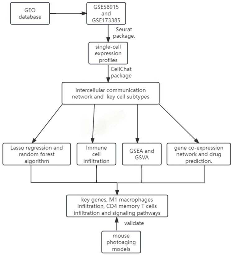
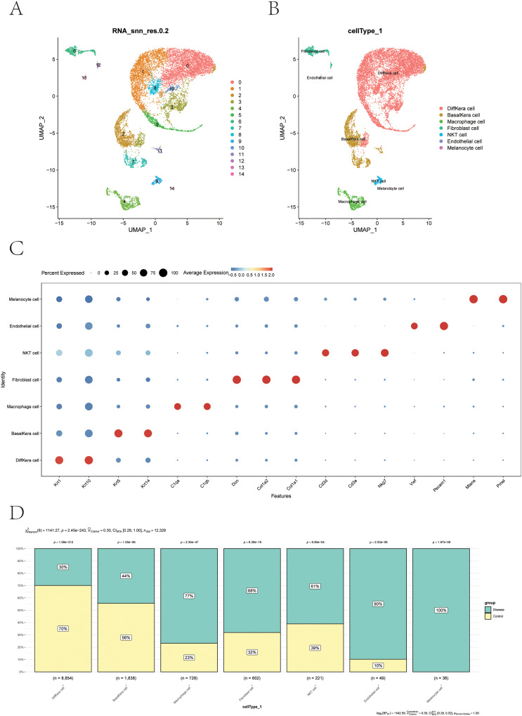
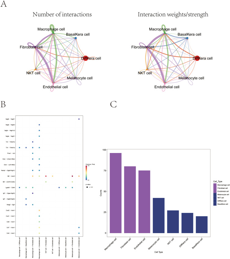
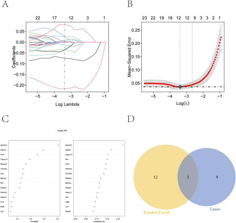
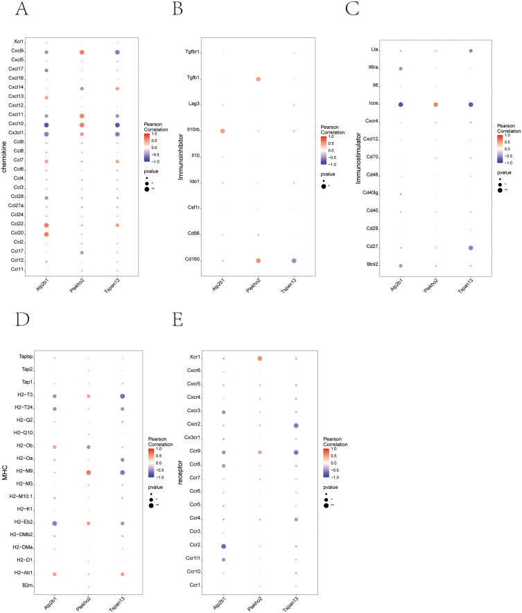
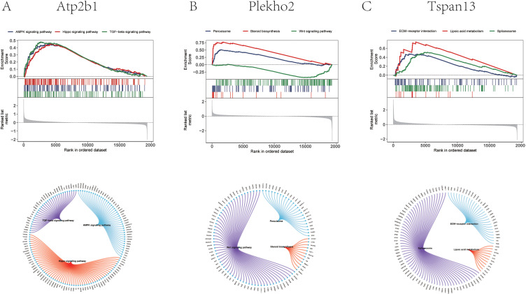
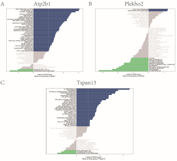
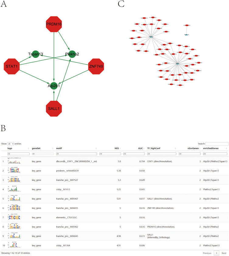
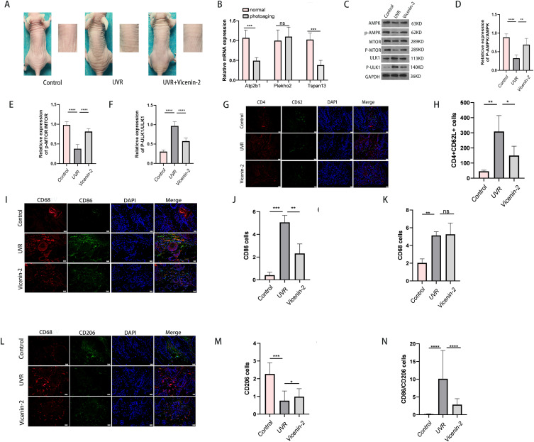
Methods: Gene expression profiles for photoaging patients were obtained from the Gene Expression Omnibus (GEO) collection. We conducted single-cell and intercellular communication investigations to identify potential gene sets. Predictive models were created using LASSO regression. The relationships between genes and immune cells were investigated using single sample gene set enrichment analysis (ssGSEA) and gene set variance analysis (GSVA). The molecular processes of important genes were studied using gene enrichment analysis. A miRNA network was created to look for target miRNAs connected with important genes, and transcriptional regulation analysis was used to identify related transcription factors. Finally, merging gene co-expression networks with drug prediction shows molecular pathways of photoaging and potential treatment targets. Furthermore, we validated the role of key genes, immune cell infiltration, and the Adenosine 5'-monophosphate (AMP)-activated protein kinase (AMPK) pathway in photoaging, which were identified through bioinformatics analysis, using in vivo reverse transcription quantitative PCR (RT-qPCR), immunofluorescence labeling, and Western blotting.

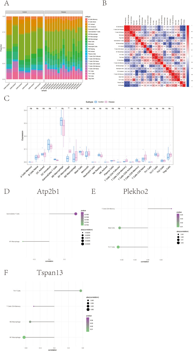
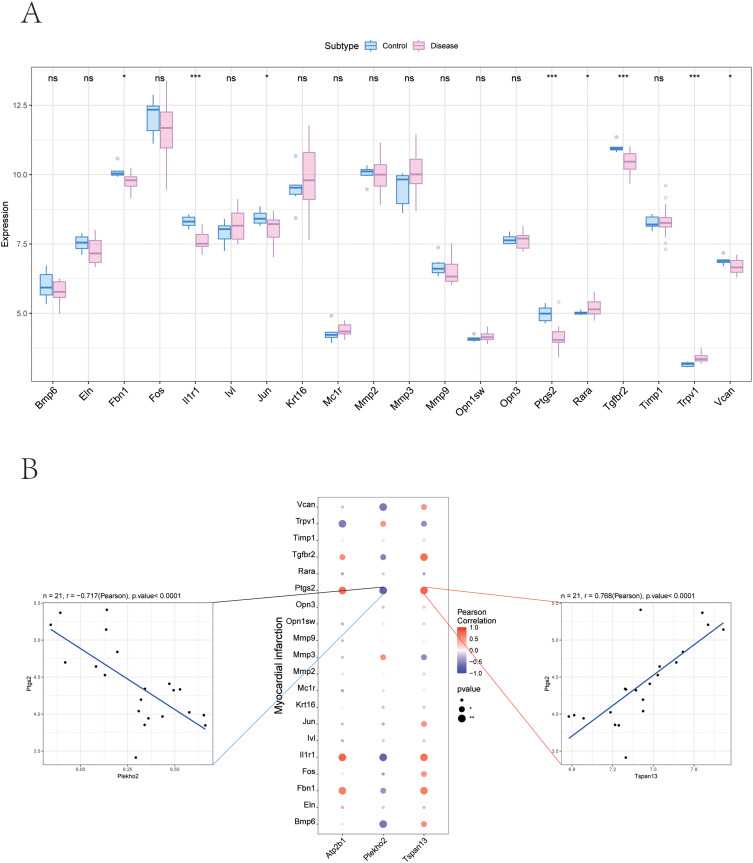
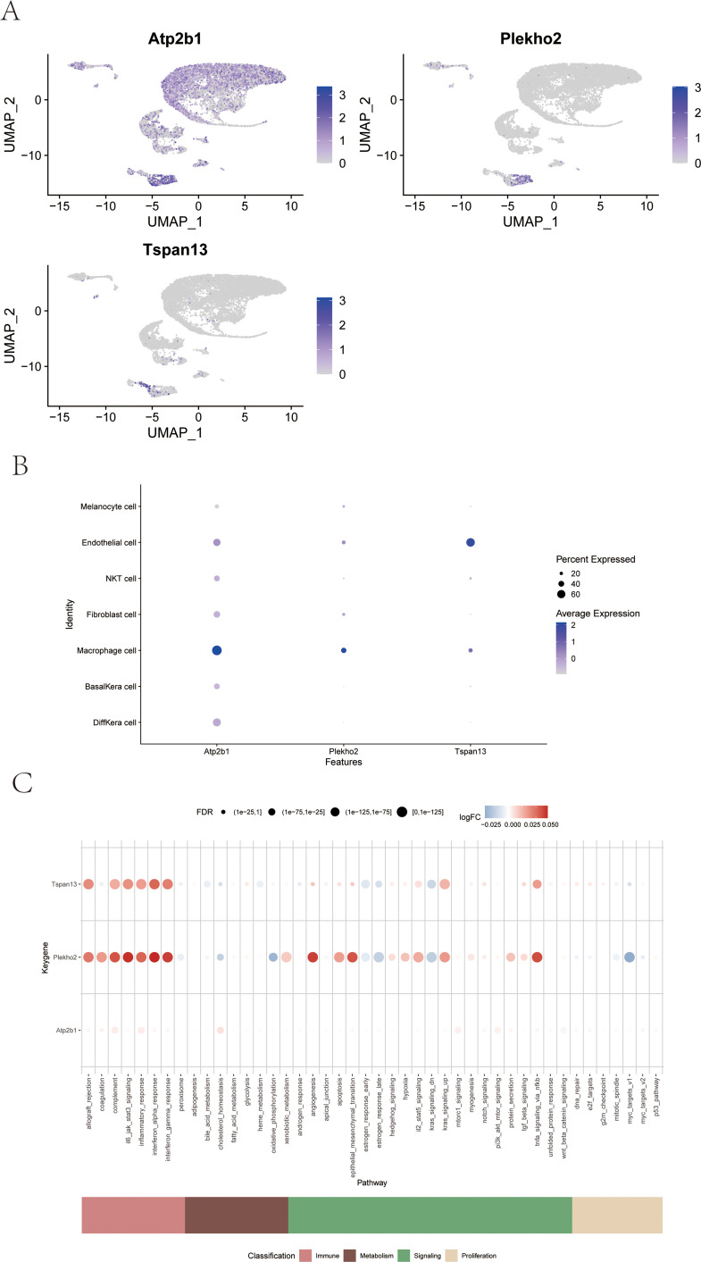
Results: This study discovered three key genes, including Atp2b1, Plekho2, and Tspan13, which perform crucial functions in the photoaging process. Immune cell infiltration analysis showed increased M1 macrophages and CD4 memory T cells in the photoaging group. Further signaling pathway analysis indicated that these key genes are enriched in multiple immune and metabolic pathways. The significant roles of Atp2b1, Plekho2, Tspan13, M1 macrophages infiltration, CD4 memory T cells infiltration and the AMPK pathway in photoaging was validated in vivo.

Conclusion: This research revealed the underlying molecular mechanisms of photoaging, indicating that key genes such as Atp2b1 and Tspan13 play crucial roles in the regulation of immune cell infiltration and metabolic pathways. These findings provide a new theory for the treatment of photoaging and provide prospective targets for the advancement of relevant drugs.

Keywords: AMPK pathway; Atp2b1; Plekho2; Tspan13; immune cell infiltration; skin photoaging.


Conflict of interest statement

The authors declare that they have no competing interests.

Figures

Figure 1
Figure 1
Workflow of the study.
Figure 2
Figure 2
Annotation of cells (A) UMAP showing cell clustering results (based on RNA expression, resolution 0.2). Each dot represents a cell, and the color distinguishes different clustering groups. The X-axis and Y-axis are UMAP dimensionality reduction coordinates, indicating the heterogeneity between cells (B) UMAP showing cell type annotation results. Based on the clustering results, the cells are further annotated into different cell types, such as Stem cells, Differentiated cells, Immune cells, etc. Different colors and labels indicate the distribution of different cell types. (C) Bubble maps show the expression patterns of specific genes in various cell types. The X-axis represents genes and the Y-axis represents cell types. The size of the bubble indicates the percentage of cells expressed that the gene was detected in the corresponding cell type, and the color indicates the average amount of gene expression (red for high expression, blue for low expression). (D) Histogram of cell type distribution under different sample conditions. Each column represents a sample, and the color inside the column distinguishes the composition ratio of cell types. The X-axis is the sample condition, the Y-axis is the cell composition ratio, and the numerical value shows the percentage of each cell type. The bar chart shows the P-value of significance, which is used to compare changes in cell type distribution under different conditions.
Figure 3
Figure 3
Cell communication (A) cell-to-cell interaction network analysis. Left: The Number of interactions between cell types. The nodes represent cell types, the thickness of the lines indicates the number of interactions, and the colors label different cell types. Right: Interaction weights/strength between cell types. The thickness of the line indicates the intensity of the interaction, and the depth of the color indicates the intensity. The analysis demonstrated the centrality and critical role of different cell types in cell communication. (B) Heat maps of cell-cell interactions. The x and y axes represent different cell types. The color of each square indicates the intensity of the interaction between the two cell types (the darker the color, the higher the intensity). This diagram shows the communication characteristics and possible biological connections between specific cell types. (C) Histogram of cell type distribution. The x axis represents the different cell types and the y axis represents the number or proportion of cells. Different colors indicate different cell states or conditions. The graph shows the abundance distribution of various cell types and their differences under a particular sample or condition.
Figure 4
Figure 4
Construction of LASSO and random forest models (A) Variable screening path graph of LASSO regression model. The X-axis represents the logarithmic values of the regularized parameters (Log Lambda), and the Y-axis represents the regression Coefficients (Coefficients). Each color curve represents the variation trend of the regression coefficient of different variables. As the regularization intensity increases (Lambda increases), some variables are gradually shrunk to zero. The dashed line represents the best Lambda value for the cross-validation selection. (B) Cross-validated Mean Squared Error (MSE) curve of LASSO regression model. The X-axis represents the logarithm value of the regularized parameter (Log Lambda), and the Y-axis represents the mean square error of cross-validation. The red dot represents the MSE corresponding to each Lambda value, and the error bar is the standard deviation. The dashed line represents the optimal Lambda value chosen, corresponding to a model with minimal bias or superior complexity. (C) Ranking charts of important characteristic variables. Left: Variable Importance based on random forest algorithm with importance scores on the X-axis and feature names on the Y-axis. Right: Absolute ranking of the variables screened based on LASSO algorithm and their regression coefficients, X-axis is regression coefficient, Y-axis is feature name. The two methods show the sorting results of key variables under different algorithms. (D) Wayne diagrams of important features screened by random forest and LASSO regression. The yellow area represents the features independently screened by the random forest model, the blue area represents the features independently screened by the LASSO model, and the overlapping part is the feature variables jointly screened by the two methods. The diagram shows the similarities and differences between the two approaches to important features.
Figure 5
Figure 5
Immune infiltration (A) Accumulation histogram of major gene expression levels in different groups. The figure shows the relative expression distribution of major genes in each group (Control, Disease), classified by genotype. (B) Heat maps of inter-gene correlation. The chart shows the correlation between major gene expression, showing the strength of the positive correlation (red) versus the negative correlation (blue) in color and correlation coefficient values. (C) Boxmaps of the distribution of gene expression levels in different groups. The X axis of gene name and Y axis of gene expression were compared between Control group and Disease group.(*p<0.05, **p<0.01, **p<0.01). (DF) Expression significance of three key genes Atp2b1, Plekh02 and Tspan13 in different cell populations. The figure shows statistical significance (P-value) and gene expression trends in different cells, with the size and color of the dots indicating the level of significance and the amount of expression.
Figure 6
Figure 6
Relationship between key genes and immune factors (AE) Bubble map of correlation between key genes and chemokine, Immunoinhibitor, Immunostimulator, MHC and receptor. Each subgraph shows Pearson correlation coefficient and significance level between different types of genes and key genes. Blue indicates a negative correlation and red indicates a positive correlation.
Figure 7
Figure 7
GSEA analysis of key genes (AC) Combined results of gene set enrichment analysis (GSEA) and interaction network analysis for three key genes, Atp2b1, Plekh02, and Tspan13. The above section shows GSEA results based on correlated signaling pathways: different curves in each subgraph represent enrichment scores (ES) for correlated signaling pathways (eg Wnt, Hippo, Notch, etc.). The horizontal axis shows the ranking of the gene in the expression data, and the vertical axis shows the cumulative enrichment score. The degree of enrichment of the signaling pathway reveals the biological processes that the target gene may regulate. The lower part is divided into the network diagram of the target gene and other genes: the circular network diagram shows the relationship between the target gene and its significantly related genes and signaling pathways. The color represents the direction of gene expression (red is up-regulated, blue is down-regulated), and the width of the connecting lines reflects the strength of the correlation.
Figure 8
Figure 8
GSVA analysis of key genes (AC) Gene Set Enrichment analysis (GSVA) of Atp2b1, Plekh02, and Tspan13 genes. Each subgraph shows the sequencing results of functional pathways (up-regulated and down-regulated) that are significantly associated with the target gene, with blue representing up-regulated pathways in which the gene is significantly involved, green representing down-regulated pathways, and gray representing non-significant pathways with low NES.
Figure 9
Figure 9
Key gene-related transcriptional regulation and miRNA network (A) Transcriptional regulatory network of key genes. Green represents key genes and red represents transcription factors. (B) All enriched motifs and corresponding transcription factors of key genes are displayed. (C) miRNA network of key genes, triangles represent mRNA and circles represent miRNA.
Figure 10
Figure 10
Correlation between key genes and disease progression genes (A) Box chart of differential expression analysis: showing the expression distribution of genes in the Control group and the Disease group: The horizontal axis is the gene name and the vertical axis is the expression quantity. The blue box diagram represents the Control group, and the pink box diagram represents the Disease group. “ns” means that the difference is not significant, and an asterisk indicates the level of significance (*p<0.05, ***p<0.001). The results showed that several genes were significantly upregulated or downregulated in the Disease group, suggesting a possible disease correlation. (B) Gene correlation: In the middle is the correlation bubble map between genes, the horizontal axis is the target gene, and the vertical axis is its potential regulatory factors; Bubble color represents Pearson correlation coefficient (red is positive correlation, blue is negative correlation), and bubble size represents significance level. The scatterplots of linear correlations of two genes (eg Timp1 and Tspan13) are shown on the left and right sides, respectively. The lines are fitted curves with correlation coefficients and significance P-values.
Figure 11
Figure 11
Potential therapeutic drugs for diseases (A) 9-methyl-5H-quinolino[8,7-c][1,2]benzothiazine 6.6-dioxide: (A) complex heterocyclic compound containing a quinoline and benzothiazine core structure with a dioxide modification. Its structural characteristics suggest possible pharmacological activity, especially in the field of anti-infection. (B) Temozolomide: a broad class of alkylating agent chemotherapy drugs. Its purine skeleton and carbonyl functional group enable it to cause methylation damage in DNA and play an anti-disease role. (C) Valproic Acid: a drug with a short chain fatty acid structure and a carboxylic acid group. It exerts its therapeutic effects by regulating the release of neurotransmitters and epigenetic mechanisms. (D) Zebularine: a nucleoside analogue with a pyrimidine and ribose structure. It is widely studied as an inhibitor of DNA methyltransferase and plays an important role in epigenetic research.
Figure 12
Figure 12
Expression profile of single cells (A) UMAP showed the expression distribution of Atp2b1, Plekh02 and Tspan13 genes in single-cell transcriptome data. The color depth of the dots represents the level of gene expression, and UMAP_1 and UMAP_2 represent the two principal components after dimensionality reduction. The expression location and intensity distribution of different genes in the cell population reveal their possible cell-specific functions. (B) The bubble map shows the expression of Atp2b1, Plekh02, and Tspan13 genes in major cell types (such as macrophages, endothelial cells, NK cells, etc.): genes on the horizontal axis and cell types on the vertical axis; The bubble size represents the proportion of genes expressed, and the color indicates the average expression level (dark blue is high expression). The results showed that these three genes had an expression advantage in specific cell types. (C) Bubble map of pathway enrichment analysis: It shows the significant enrichment results of Atp2b1, Plekh02 and Tspan13 genes in different functional pathways: the horizontal axis is the functional pathway, and the vertical axis is the gene; The bubble size represents the enrichment significance level (FDR value), and the color represents the enrichment effect direction (red is up-regulated, blue is down-regulated). The classification labels below further group pathways (eg, metabolism, immunity, signaling, etc).
Figure 13
Figure 13
Experimental validation. (A) The treatment effect of Vicenin-2 in photoaging mice model; (B) Relative mRNA expression levels of Atp2b1, Plekho2, Tspan13 in controls, UVR and Vicenin-2 mice (n = 5); (C) Photoaging model was induced UVA and UVB, pre-treated with Vicenin-2 and the expression levels of protein were determined by Western blot; (D) Relative expression levels of p-ULK1/ULK1 (n = 5); (E) Relative expression levels of p-AMPK/AMPK, (n = 5); (F) Relative expression levels of P-MTOR/MTOR (n = 5); (G and H) Immunofluorescence double labeling results of CD4+CD62L+ cells in different groups (n = 5, scale bar =20 μm); (IN) Immunofluorescence single labeling of CD68 and immunofluorescence double labeling of CD68/CD86 and CD68/CD206 in different groups (n = 3, scale bar =20μm). Data represent mean ± SD, *P < 0.05, **P < 0.01, ***P < 0.001 ****P < 0.0001 ns: no significance.

Similar articles

References

    1. Kammeyer A, Luiten RM. Oxidation events and skin aging. Ageing Res Rev. 2015;21:16–29. doi:10.1016/j.arr.2015.01.001 - DOI - PubMed
    1. Tanveer MA, Rashid H, Tasduq SA. Molecular basis of skin photoaging and therapeutic interventions by plant-derived natural product ingredients: a comprehensive review. Heliyon. 2023;9(3):e13580. doi:10.1016/j.heliyon.2023.e13580 - DOI - PMC - PubMed
    1. He X, Wan F, Su W, Xie W. Research Progress on Skin Aging and Active Ingredients. Molecules. 2023;28(14). doi:10.3390/molecules28145556 - DOI - PMC - PubMed
    1. Han HJ, Kim JC, Park YJ, Kang HY. Targeting the dermis for melasma maintenance treatment. Sci Rep. 2024;14(1):949. doi:10.1038/s41598-023-51133-w - DOI - PMC - PubMed
    1. Weng T, Zhang X, He J, Yang Y, Li C. Bioinformatics-based analysis of the relationship between plasminogen regulatory genes and photoaging. J Cosmet Dermatol. 2024;23(6):2270–2278. doi:10.1111/jocd.16266 - DOI - PubMed

LinkOut - more resources