

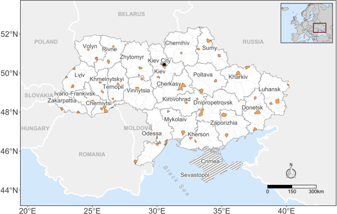
Estimation of internal displacement in Ukraine from satellite-based car detections
- PMID: 39738242
- PMCID: PMC11685971
- DOI: 10.1038/s41598-024-80035-8
Estimation of internal displacement in Ukraine from satellite-based car detections
Abstract
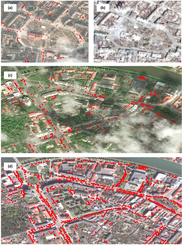
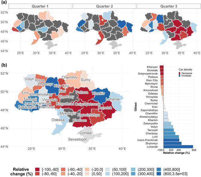
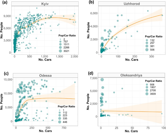
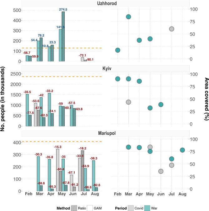
Estimating the numbers and whereabouts of internally displaced people (IDP) is paramount to providing targeted humanitarian assistance. In conflict settings like the ongoing Russia-Ukraine war, on-the-ground data collection is nevertheless often inadequate to provide accurate and timely information. Satellite imagery may sidestep some of these challenges and enhance our understanding of the IDP dynamics. Our study thus aimed to evaluate whether internal displacement patterns can be estimated from changes in car counts using multi-temporal satellite imagery. We collected over 1000 very-high-resolution images across Ukrainian cities between 2019 and 2022, to which we applied a state-of-the-art computer vision model to detect and count cars. These counts were then linked to population data to predict displacements through ratio or non-linear models. Our findings suggest a clear East-to-West movement of cars in the first months following the war's onset. Despite data sparsity hindered fine-grained evaluation, we distinguished a clear positive and non-linear trend between the number of people and cars in most cities, which further allowed to predict the sub-national people dynamics. While our approach is resource-saving and innovative, satellite imagery and computer vision models present some shortcomings that could mask detailed IDPs dynamics. We conclude by discussing these limitations and outline future research opportunities.
Keywords: Car Detection; Convolutional Neural Network; Crisis Response; Migration; Satellite Imagery; Societal Computing.
© 2024. The Author(s).
Conflict of interest statement
Declarations. Competing interests: The authors declare no competing interests.
Figures
References
-
- UNHCR. Protecting internally displaced persons: a handbook for national human rights institutions. UNHCR Blog Netw.https://www.undp.org/publications/protecting-internally-displaced-person... (2022).
-
- UNHCR. Global displacement hits another record, capping decade-long rising trend. UNHCR Blog Netw.https://www.unhcr.org/asia/news/press/2022/6/62a9d2b04/unhcr-global-disp... (2022).
-
- IDMC. IDMC’s 2023 global report on internal displacement. iDMC Blog Netw.https://www.internal-displacement.org/publications/2023-global-report-on... (2023).
-
- Checchi, F. et al. Public health information in crisis-affected populations: a review of methods and their use for advocacy and action. Lancet390, 2297–2313. 10.1016/S01406736(17) (2018). - PubMed
Publication types
MeSH terms
LinkOut - more resources
Full Text Sources
