. 2025 Feb;638(8050):499-509.
doi: 10.1038/s41586-024-08356-2. Epub 2025 Jan 1.

Gliomagenesis mimics an injury response orchestrated by neural crest-like cells

Affiliations

Gliomagenesis mimics an injury response orchestrated by neural crest-like cells

Akram A Hamed et al. Nature. 2025 Feb.

Abstract

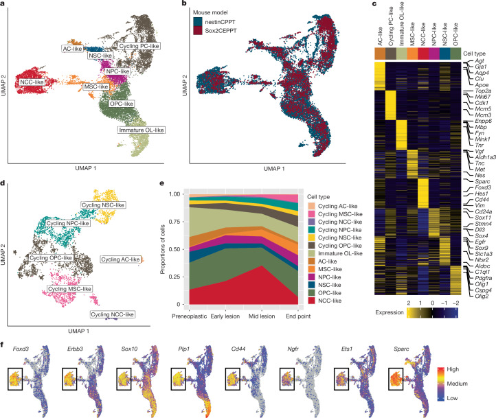
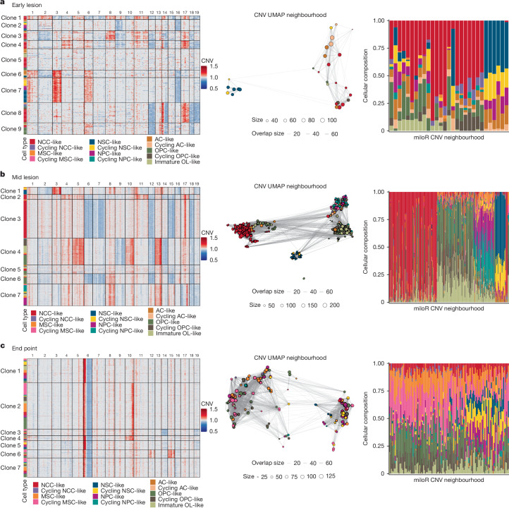
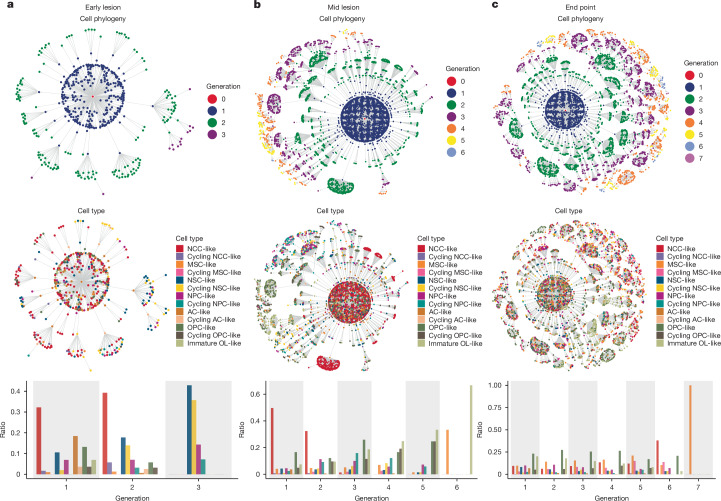
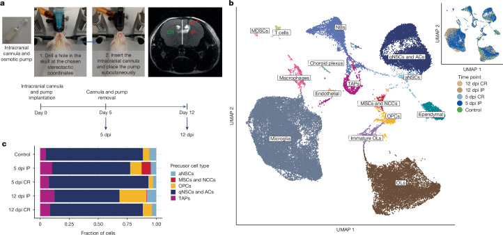
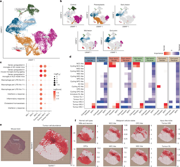
Glioblastoma is an incurable brain malignancy. By the time of clinical diagnosis, these tumours exhibit a degree of genetic and cellular heterogeneity that provides few clues to the mechanisms that initiate and drive gliomagenesis1,2. Here, to explore the early steps in gliomagenesis, we utilized conditional gene deletion and lineage tracing in tumour mouse models, coupled with serial magnetic resonance imaging, to initiate and then closely track tumour formation. We isolated labelled and unlabelled cells at multiple stages-before the first visible abnormality, at the time of the first visible lesion, and then through the stages of tumour growth-and subjected cells of each stage to single-cell profiling. We identify a malignant cell state with a neural crest-like gene expression signature that is highly abundant in the early stages, but relatively diminished in the late stage of tumour growth. Genomic analysis based on the presence of copy number alterations suggests that these neural crest-like states exist as part of a heterogeneous clonal hierarchy that evolves with tumour growth. By exploring the injury response in wounded normal mouse brains, we identify cells with a similar signature that emerge following injury and then disappear over time, suggesting that activation of an injury response program occurs during tumorigenesis. Indeed, our experiments reveal a non-malignant injury-like microenvironment that is initiated in the brain following oncogene activation in cerebral precursor cells. Collectively, our findings provide insight into the early stages of glioblastoma, identifying a unique cell state and an injury response program tied to early tumour formation. These findings have implications for glioblastoma therapies and raise new possibilities for early diagnosis and prevention of disease.


Conflict of interest statement

Competing interests: The authors declare no competing interests.

Figures

Fig. 1
Fig. 1. Single-cell mapping of tumour formation from the preneoplastic stage to end-point tumours.
a, MRI images of three mouse brains highlighting the appearance and progression of brain lesions from the preneoplastic stage until reaching the end-point stage. The lesions (tumours) are indicated by the red arrows. b, Left: MRI images highlighting lesions in the left (IP) hemispheres as indicated by the T2-FLAIR-bright mass (red arrows) compared to normal areas in the right (CR) hemispheres (yellow arrows). Right: H&E-stained sections of the brains, highlighting areas in the lesions (red dashed outline) and the normal brain (yellow dashed outline). Scale bars, 100 µm. c, Uniform manifold approximation and projection (UMAP) plot with Louvain clustering of about 100,000 individual cells obtained from scRNA-seq of 30 tumour and control samples (Extended Data Table 1), highlighting 14 transcriptionally and biologically distinct cell populations (Extended Data Fig. 1). Each dot represents a single cell, and colours correspond to the distinct cell populations. MDSCs, myeloid-derived suppressor cells; NBs, neuroblasts; TAPs, transient amplifying progenitors; VLMCs, vascular leptomeningeal cells. d, UMAP plots as in c, but each is highlighting the cells belonging to one of the five sample groups. Colours highlight the cells from each of the five groups (control, green; preneoplastic, blue; early lesion, purple; mid lesion, orange; end point, red).
Fig. 2
Fig. 2. Analysis of malignant cells reveals an abundance of NCC-like cells during the early stages of tumorigenesis.
a, UMAP plot highlighting the eight malignant cellular states identified across the tumour samples collected from the Sox2CEPPT and nestinCPPT mouse models. Each dot represents a single cell, and colours correspond to the various cell states. b, UMAP plots as in a but highlighting the cells belonging to each of the two mouse models. Colours highlight the cells from each of the two mouse models (red, Sox2CEPPT; blue, nestinCPPT). c, Heat map showing the top 100 differentially expressed genes identified per cellular state from analysing the cells in a (Supplementary Table 2). Colour scale indicates the scaled mean expression levels, and the cell type bar colours correspond to the distinct cellular states identified in a. Some of the marker genes used in the annotation are highlighted on the right side of the heat map. d, UMAP plot with Louvain clustering of the cycling PC-like cells showing the main subtypes of cycling malignant cells identified (Methods). Colours correspond to the subtypes identified. e, Area plot showing the proportion of the individual malignant cellular states in each of the four stages of tumorigenesis. Colours correspond to the malignant cell states. f, UMAP plots as in a but highlighting the expression of the NCC and Schwann cell markers: Foxd3, Erbb3, Sox10, Plp1, Cd44, Ets1, Ngfr and Sparc.
Fig. 3
Fig. 3. Changes in the tumour cellular composition reflect an evolving clonal hierarchy between early and late tumorigenesis.
a, Left: heat map highlighting the genetic clones identified on the basis of the inferred CNAs of malignant cells in early-lesion replicate no. 1. Clones are separated on the basis of the chromosomal amplifications and deletions identified in the malignant cells (Methods). The numbers on the top represent the chromosomes and the coloured bar on the left indicates the cellular state of the malignant cells in each clone (see the colour legend at the bottom). CNV, copy number variation. Middle: neighbourhood graph of the CNA profiles of the malignant cells in early-lesion replicate no. 1, generated using the R package miloR (Methods). Nodes are neighbourhoods of CNAs, with colours indicating the cell state of the neighbourhood index cell, and the size corresponding to the number of cells in the neighbourhood. Graph edges depict the number of cells shared between neighbourhoods. The layout of nodes is determined by the position of the neighbourhood index cell in the copy-number-based UMAP. Right: bar plot showing the proportions of the cell states within each neighbourhood. Colours correspond to the cellular states of malignant cells. b, Same analysis as a but in mid-lesion replicate no. 1. c, Same analysis as a but in end-point replicate no. 3.
Fig. 4
Fig. 4. Gliomagenesis mirrors a developmental hierarchy.
a, Top: phylogenetic tree highlighting the clonal generations of the malignant cells in early-lesion replicate no. 1. Generation of each cell node was defined as the step it takes to go from the root node to the cell node (Methods). Middle: phylogenetic plot as above but highlighting the cellular states of the malignant cells. Bottom: bar plot showing the relative fraction of the distinct malignant cellular states in each of the clonal generations indicated in the above panels. Colours correspond to the malignant cellular states identified in each clonal generation. b, Same analysis as a but in mid-lesion replicate no. 1. c, Same analysis as a but in end-point replicate no. 2.
Fig. 5
Fig. 5. Brain injury induces transient MSC- and NCC-like cell states.
a, Images highlighting the main procedure of the intracranial cannula implantation surgery with an MRI scan (right panel) of a mouse brain post injury showing tissue damage (indicated by the red arrow) in the IP hemisphere compared to the CR side. Shown on the lower panel is a schematic highlighting the experimental design of the brain injury experiment. b, UMAP plot of >50,000 individual cells obtained from 10 scRNA-seq samples of injured and control mouse brains (Supplementary Fig. 9a), highlighting 15 transcriptionally and biologically distinct cell types (Extended Data Fig. 8b). Each dot represents a single cell. Colours on the main panel correspond to the distinct cell types identified in the dataset; colours in the inset panel identify the cells from each of the five sample groups (control, green; 5 dpi IP, dark blue; 5 dpi CR, light blue; 12 dpi IP, dark brown; 12 dpi CR, light brown). aNSCs, active NSCs; qNSCs, quiescent NSCs. c, Bar plot showing the relative fraction of the distinct PC types in each time point. Colours correspond to the PC types (blue, quiescent NSCs and ACs; purple, TAPs; light blue, active NSCs; red, MSCs and NCCs; yellow, OPCs).
Fig. 6
Fig. 6. Glioma initiation mimics a brain injury response.
a, UMAP plot highlighting the microglia (MG) subtypes identified in the control and tumour samples. Each dot represents a single cell and colours correspond to the seven distinct microglia subtypes identified (Supplementary Fig. 10a,b). b, UMAP plots as in a but each highlighting the cells belonging to one of the five sample groups. Colours correspond to the microglia subtypes identified in a. c, Dot plot showing representative enriched terms of highly expressed genes in the microglia subtypes, with dot size representing the overall enrichment score and colour scale reflecting the significance level (Methods and Supplementary Table 8). AD, Alzheimer’s disease; ALS, amyotrophic lateral sclerosis; peri LPS, peripheral lipopolysaccharide. d, Heat map summarizing the signalling roles of the different cell states and types in representative signalling pathways across the four stages of tumorigenesis. The heat map has either panels, two for each stage of tumorigenesis labelled by the top annotation bars. For the first panel in each stage, the red scale reflects the importance of each cell state and type as a sender in the corresponding pathways and similarly, the blue scale in the second panel in each stage reflects the role as a receiver (Methods and Supplementary Figs. 11 and 12). e, Left: H&E-stained section of a mouse brain showing an end-point malignant lesion. The tumour area is highlighted by the dashed outline. Spatial transcriptomic analysis using the 10x Visium platform was performed on that section. Right: spatial feature plot showing the abundance of the malignant cell states in the spatial transcriptomic sample (Methods). f, Spatial feature plots showing the abundance of eight representative cell type and state signatures in the spatial transcriptomic sample. Cell type signatures were obtained from the scRNA-seq dataset in Figs. 1c and 2a.
Extended Data Fig. 1
Extended Data Fig. 1. Related to Fig. 1.
a, UMAP plot with Louvain clustering of ~100 K individual cells obtained from scRNA-seq of 30 tumour and control samples, highlighting 54 distinct clusters. Each dot represents a single cell and colours correspond to the distinct clusters. b, Heatmap showing the top 75 DE genes identified per cluster from analyzing the 54 clusters in panel (a) (see Supplementary Table 1). Colour scale indicates the scaled mean expression levels and the cell type bar colours correspond to the distinct cell types identified in the atlas. Some of the marker genes used in the annotation of the clusters are highlighted on the right side of the heatmap. Shown on the top is a stacked bar plot showing the normalized relative fraction of each of the 54 clusters in the 5 sample groups. Colours on the stacked bars correspond to the 5 sample groups (control: green – preneoplastic: blue – early lesion: purple – mid lesion: orange – endpoint: red). Abbreviations as in Fig. 1.
Extended Data Fig. 2
Extended Data Fig. 2. Related to Fig. 2.
a, UMAP plots as in Fig. 2a but highlighting the cells corresponding to each the 4 stages of tumourgenesis (preneoplastic – early-lesion – mid-lesion - endpoint). b, Box plot showing the proportion of the malignant cellular states (from Fig. 2a) in each of the 4 stages of tumourigenesis. The cellular states are grouped into 4 categories: Non cycling lineage PC-like (includes OPC-like, NPC-like, NSC-like and MSC-like cells), Differentiated-like (includes immature OL-like, AC-like and cycling AC-like cells), Cycling lineage PC-like (includes cycling OPC-like, cycling NPC-like, cycling NSC-like and cycling MSC-like cells), NCC-like (includes NCC-like and cycling NCC-like cells). Colours correspond to the 4 stages of tumourigenesis. The central lines of the boxes represent the median while the outer lines represent the 1st and 3rd quartiles, and the upper and lower whiskers extend to ±1.5x of the interquartile range. Sample size (replicates from different mice): preneoplastic n = 3, early-lesion n = 5, mid-lesion n = 2, Endpoint n = 4. c, Bar plot showing the fraction of cycling cells in the total number of “cycling + non-cycling cells” for each precursor-like cellular state in each sample (from Fig. 2a) across the 4 stages of tumourigenesis (see Methods). Colours correspond to the 4 stages of tumourigenesis. Data are presented as mean ± SEM. Sample size (replicates from different mice): preneoplastic n = 3, early-lesion n = 5, mid-lesion n = 2, Endpoint n = 4. d, UMAP plots highlighting the malignant cellular states identified from the scATAC- and scRNA-sequencing of cells from mid-lesion rep#1. Colours on the main panel correspond to the various malignant cell states identified in the samples while colours in the inset panel correspond to the cells belonging to the scRNA-seq sample (blue) and the scATAC-seq sample (red). e, Bar plot showing the fraction of the 8 malignant cellular states in each of the scRNA- and scATAC-seq samples obtained from mid-lesion rep#1 and endpoint rep#1 tumour samples. Colours correspond to the 4 samples. f, Heatmap showing the top differentially accessible peaks between the malignant cell states identified from analyzing the scATAC-seq data of the cells in panel (d). g, A graph summary of the enriched TF binding motifs in the malignant cells from the scATAC-seq of mid-lesion rep#1 tumour sample. Circular nodes represent the malignant cellular states identified while oval nodes represent the TF binding motifs, labelled as in the CIS-BP database (suffix number removed for simplicity). Edges connect a motif node to the corresponding cell state(s) in which it was enriched, with edge thickness indicating the significance level (–log10p) and colour indicating source cell state. Grey means the motif is enriched in more than one cell type while yellow represents unique enrichment. The size of each cell type node reflects the number of enriched motifs. Abbreviations as in Fig. 2. Source data are provided with this paper.
Extended Data Fig. 3
Extended Data Fig. 3. Related to Fig. 3.
a, Left panel: heatmap highlighting the genetic clones identified based on the inferred CNAs of malignant cells in early-lesion rep#2. Clones are separated based on the chromosomal amplifications and deletions identified in the malignant cells (see Methods). The coloured bar on the left indicates the cellular state of the malignant cells in each clone (see the colour legend on the bottom). Middle panel: neighborhood graph of the CNA profiles of the malignant cells in early-lesion rep#2, generated using R package miloR (see Methods). Nodes are neighborhoods of CNAs, with colours indicating cell state of the neighborhood index cell, and size corresponding to the number of cells in the neighborhood. Graph edges depict the number of cells shared between neighborhoods. The layout of nodes is determined by the position of the neighborhood index cell in the CN-based UMAP. Right panel: bar plot showing the cell states proportions within each neighborhood. Colours correspond to the cellular states of malignant cells. b, Same analysis as (a) but in early-lesion rep#3. c, Same analysis as (a) but in mid-lesion rep#2. d, Same analysis as (a) but in endpoint rep#1. Abbreviations as in Figs. 1 and 2. Source Data
Extended Data Fig. 4
Extended Data Fig. 4. Related to Fig. 3.
a, Left panel: heatmap highlighting the genetic clones identified based on the inferred CNAs of malignant cells in endpoint rep#2. Clones are separated based on the chromosomal amplifications and deletions identified in the malignant cells (see Methods). The coloured bar on the left indicates the cellular state of the malignant cells in each clone (see the colour legend on the bottom). Middle panel: neighborhood graph of the CNA profiles of the malignant cells in endpoint rep#3, generated using R package miloR (see Methods). Nodes are neighborhoods of CNAs, with colours indicating cell state of the neighborhood index cell, and size corresponding to the number of cells in the neighborhood. Graph edges depict the number of cells shared between neighborhoods. The layout of nodes is determined by the position of the neighborhood index cell in the CN-based UMAP. Right panel: bar plot showing the cell states proportions within each neighborhood. Colours correspond to the cellular state of the malignant cells. b, Same analysis as (a) but in endpoint rep#4. c, Bar plot showing the fraction of clones that contain NCC-like cells from the inferred CNA analysis in the various samples from Fig. 3 and Extended Data Figs. 3, 4. d, Bar plot showing the fraction of neighborhoods that contain NCC-like cells from the neighborhood graph of the CNA profiles of the malignant cells in the various samples from Fig. 3 and Extended Data Figs. 3, 4. Abbreviations as in Figs. 1 and 2.
Extended Data Fig. 5
Extended Data Fig. 5. Related to Fig. 4.
a, Top panel: phylogenetic tree highlighting the clonal generations of the malignant cells in early-lesion rep#2. Generation of each cell node was defined as the step it takes to go from the root node to the cell node (see Methods). Middle panel: phylogenetic plot as above but highlighting the cellular states of the malignant cells. Lower panel: bar plot showing the relative fraction of the distinct malignant cellular states in each of the clonal generations indicated in the above panels. Colours correspond to the malignant cellular states identified in each clonal generation. b, Same analysis as (a) but in early-lesion rep#3. c, Same analysis as (a) but in mid-lesion rep#2. Abbreviations as in Figs. 1 and 2.
Extended Data Fig. 6
Extended Data Fig. 6. Related to Fig. 4.
a, Top panel: phylogenetic tree highlighting the clonal generations of the malignant cells in endpoint rep#1. Generation of each cell node was defined as the step it takes to go from the root node to the cell node (see Methods). Middle panel: phylogenetic plot as above but highlighting the cellular states of the malignant cells. Lower panel: bar plot showing the relative fraction of the distinct malignant cellular states in each of the clonal generations indicated in the above panels. Colours correspond to the malignant cellular states identified in each clonal generation. b, Same analysis as (a) but in endpoint rep#3. c, Same analysis as (a) but in endpoint rep#4. d, Visualization of the malignant cells over pseudotime using PHATE. The lineage trajectories are overlaid on the plot and were inferred by SlingShot (see Methods). Each dot represents a single cell and colours correspond to the distinct cellular states. e, Heatmaps highlighting the variable genes across two of the pseudotime lineage trajectories identified in panel (a). The coloured bars on the top indicate the cellular states of the cells across each lineage trajectory. Abbreviations as in Figs. 1 and 2.
Extended Data Fig. 7
Extended Data Fig. 7. Related to Fig. 4.
a, Visualization/ordering of the malignant cells over pseudotime using diffusion map (see Methods). Each dot represents a single cell and colours correspond to the distinct cellular states. b, Visualization/ordering of the malignant cells over pseudotime using PAGA (see Methods). Colours in the left panel correspond to the malignant cellular states identified across the tumour samples. Colours in the middle panel correspond to the 2 mouse models (red: Sox2CEPPT – blue: NesCPPT). Colours in the right panel correspond to the different samples. c-e, Visualization, trajectory and dendrogram analyses of the malignant cells conducted using scFates. f, Bifurcation analysis using scFates, which discerned two distinct gene modules that align with the two branches: differentiating cells (oligodendrocytes) and proliferating/cycling precursors. Abbreviations as in Figs. 1 and 2.
Extended Data Fig. 8
Extended Data Fig. 8. Related to Fig. 5.
a, UMAP plot as in Fig. 5b but colours identify the cells from each of the 5 sample groups (control: green – 5dpi_IP: dark blue – 5dpi_CR: light blue – 12dpi_IP: dark brown – 12dpi_CR: light brown). b, Heatmap showing the top 100 DE genes identified per cell type from analyzing the cells in Fig. 5b (see Supplementary Table 3). Colour scale indicates the scaled mean expression levels and the cell type bar colours correspond to the distinct cell types identified in the dataset. Some of the marker genes used in the annotation of the clusters are highlighted on the right side of the heatmap. c, Bar plot showing the relative fraction of the microglia cell type categories in each timepoint (see Extended Data Fig. 9a,b). Colours correspond to the 2 distinct cell type categories (blue: disease/injury microglia – purple: steady state microglia). d, Bar plot showing the relative fraction of the oligodendrocyte cell type categories in each timepoint (see Extended Data Fig. 9c,d). Colours correspond to the 2 distinct cell type categories (green: disease/injury oligodendrocytes – light blue: steady state oligodendrocytes). e, UMAP plot as in Fig. 5b but highlighting the type of samples based on the FACS GFP+/GFP gating. f, PCA plots of the MSC/NCC, OPCs and immature OL cells identified across all timepoints from Fig. 5b. The top left panel shows the cells from all timepoints while each of the other 5 plots highlights cells belonging to one of the timepoints (control – 5dpi_IP – 5dpi_CR – 12dpi_IP – 12dpi_CR). Each dot represents a single cell and colours correspond to the three cell types (red: MSCs/NCCs, green: OPCs, light green: immature OLs). The lineage trajectory is overlaid on the top left plot (see Methods). Abbreviations as in Figs. 1 and 5.
Extended Data Fig. 9
Extended Data Fig. 9. Related to Fig. 5.
a, UMAP clustering highlighting the clusters identified in the microglia cells from Fig. 5b. Each dot represents a single cell and colours correspond to the various clusters. b, Heatmap showing the top 100 DE genes identified per cluster from analyzing the clusters in panel (a) (see Supplementary Table 4). Colour scale indicates the scaled mean expression levels and the cell type bar colours correspond to the distinct clusters in panel (a). Some of the marker genes used in the annotation of the disease/injury microglia are highlighted on the right side of the heatmap. c, UMAP clustering highlighting the clusters identified in the oligodendrocyte cells from Fig. 5b. Each dot represents a single cell and colours correspond to the various clusters. d, Heatmap showing the top 100 DE genes identified per cluster from analyzing the clusters in panel (c) (see Supplementary Table 5). Colour scale indicates the scaled mean expression levels and the cell type bar colours correspond to the distinct clusters in panel (c). Some of the marker genes used in the annotation of the disease/injury oligodendrocytes are highlighted on the right side of the heatmap. Abbreviations as in Figs. 1 and 5.
Extended Data Fig. 10
Extended Data Fig. 10. Related to Fig. 6.
a, UMAP plot highlighting the non-malignant oligodendrocyte subtypes identified in the control and tumour samples. Colours correspond to the 5 distinct oligodendrocyte subtypes identified (see Supplementary Information Fig. 10c). b, UMAP plots as in panel (a) but each highlighting the cells belonging to 1 of the 5 sample groups (control – preneoplastic – early-lesion – mid-lesion – endpoint). Colours correspond to the distinct subtypes identified in (a). c, Violin plots showing the expression of the oligodendrocyte markers (Plp1 and Mbp) and the injury/disease-associated oligodendrocyte markers (C4b, B2m and H2-D1) in the oligodendrocyte subtypes from panel (a). d, Heatmap summarizing the signaling roles of the different cell states/types in representative signaling pathways across the four stages of tumourigenesis. The heatmap has 8 panels, 2 for each stage of tumourigenesis labelled by the top annotation bars (preneoplastic – early-lesion – mid-lesion – endpoint). For the first panel in each stage, the red scale reflects the importance of each cell state/type as a sender in the corresponding pathways (see Methods). Similarly, the blue scale in the second panel in each stage reflects the role as a receiver. The heatmap shows pathways related to the regulation of cell proliferation (see Supplementary Information Figs. 11, 12). e, UMAP plot highlighting the malignant cellular states identified in the tumour samples harvested from the Sox2CEPT mouse model. Colours correspond to the distinct cell states identified (see Supplementary Information Fig. 13a,c). f, Stack plot showing the relative fraction of the malignant cellular states from panel (e) in each tumour sample. Colours correspond to the distinct malignant cell states. Abbreviations as in Figs. 2 and 5.
Extended Data Fig. 11
Extended Data Fig. 11. Tumour multiclonality is reflected in the spatial organization of genetic clones containing diverse cellular states.
a, Left: heatmap highlighting the genetic clones identified based on the inferred CNA analysis for all Visium spots harboring malignant/normal cells in the sample from Fig. 6e (see Methods). The bar on the left indicates the clonal groups which were identified based on hierarchical clustering of all Visium spots. Shown on the right is a bar plot highlighting the abundance of the different normal and malignant cell type/state signatures for each of the Visium spots. Cell type signatures were obtained from the scRNA-seq dataset in Figs. 1c and 2a. b, Spatial transcriptomics plot highlighting the genetic clones identified in panel (a) from the inferred CNA analysis. c, Left panel: H&E-stained section of a mouse brain showing an endpoint malignant lesion. The tumour area is highlighted by the dashed outline. Spatial transcriptomic analysis using the 10X Visium platform was performed on that section. Shown on the right panel is a spatial feature plot showing the abundance of the malignant cell states in the spatial transcriptomic sample (see Methods). d, Spatial feature plots showing the abundance of eight representative cell type/state signatures in the spatial transcriptomic sample. The plots show the abundance of two normal cell types (NBs/Neurons and OPCs), four malignant cellular states (OPC-like, NCC-like, NPC-like and NSC-like) and two injury-like microenvironmental cell types (Tumour MG and Tumour OLs). Cell type signatures were obtained from the scRNA-seq dataset in Figs. 1c and 2a. e, Spatial transcriptomics plot highlighting the genetic clones identified in panel (f) from the inferred CNA analysis. f, Left: heatmap highlighting the genetic clones identified based on the inferred CNA analysis for all Visium spots harboring malignant/normal cells in the sample from panel (c) (see Methods). The bar on the left indicates the clonal groups which were identified based on hierarchical clustering of all Visium spots. Shown on the right is a bar plot highlighting the abundance of the different normal and malignant cell type/state signatures for each of the Visium spots. Cell type signatures were obtained from the scRNA-seq dataset in Figs. 1c and 2a. Abbreviations as in Figs. 1 and 2.
Extended Data Fig. 12
Extended Data Fig. 12. Related to Extended Data Fig. 11.
a, Left panel: H&E-stained section of a human GBM sample (#UKF260_T_ST) in which spatial transcriptomics was performed by Ravi et al.. Shown on the right panel is a spatial feature plot showing the abundance of the malignant cell states in the spatial transcriptomic sample (see Methods). b, Spatial feature plots showing the abundance of eight representative cell type/state signatures in the spatial transcriptomic sample, the plots show the abundance of six malignant cellular states and two injury-like microenvironmental cell types. Cell type signatures were obtained from the scRNA-seq dataset in Figs. 1c and 2a. c, Spatial transcriptomics plot highlighting the genetic clones identified in panel (d) from the inferred CNA analysis. d, Left: heatmap highlighting the genetic clones identified based on the inferred CNA analysis for all Visium spots in the sample from panel (a). The bar on the left indicates the clonal groups which were identified based on hierarchical clustering of all Visium spots. Shown on the right is a bar plot highlighting the abundance of the different malignant and microenvironmental cell type/state signatures for each of the Visium spots. Cell type signatures were obtained from the scRNA-seq dataset in Figs. 1c and 2a. e, Bar plot highlighting the proportion of the different malignant cellular states across the genetic clones identified in 18 human GBM and astrocytoma samples from Ravi et al. (see Methods). Abbreviations as in Figs. 1 and 2.

References

    1. Neftel, C. et al. An integrative model of cellular states, plasticity, and genetics for glioblastoma. Cell178, 835–849 (2019). - PMC - PubMed
    1. Patel, A. P. et al. Single-cell RNA-seq highlights intratumoral heterogeneity in primary glioblastoma. Science344, 1396–1401 (2014). - PMC - PubMed
    1. Singh, S. K. et al. Identification of human brain tumour initiating cells. Nature432, 396–401 (2004). - PubMed
    1. Alcantara Llaguno, S. et al. Malignant astrocytomas originate from neural stem/progenitor cells in a somatic tumor suppressor mouse model. Cancer Cell15, 45–56 (2009). - PMC - PubMed
    1. Alcantara Llaguno, S. R. et al. Adult lineage-restricted CNS progenitors specify distinct glioblastoma subtypes. Cancer Cell28, 429–440 (2015). - PMC - PubMed

MeSH terms