. 2025 Jan 6;23(1):19.
doi: 10.1186/s12967-024-05977-z.

Single-cell RNA sequencing highlights the unique tumor microenvironment of small cell neuroendocrine cervical carcinoma

Affiliations

Single-cell RNA sequencing highlights the unique tumor microenvironment of small cell neuroendocrine cervical carcinoma

Tianyou Wang et al. J Transl Med. .

Abstract

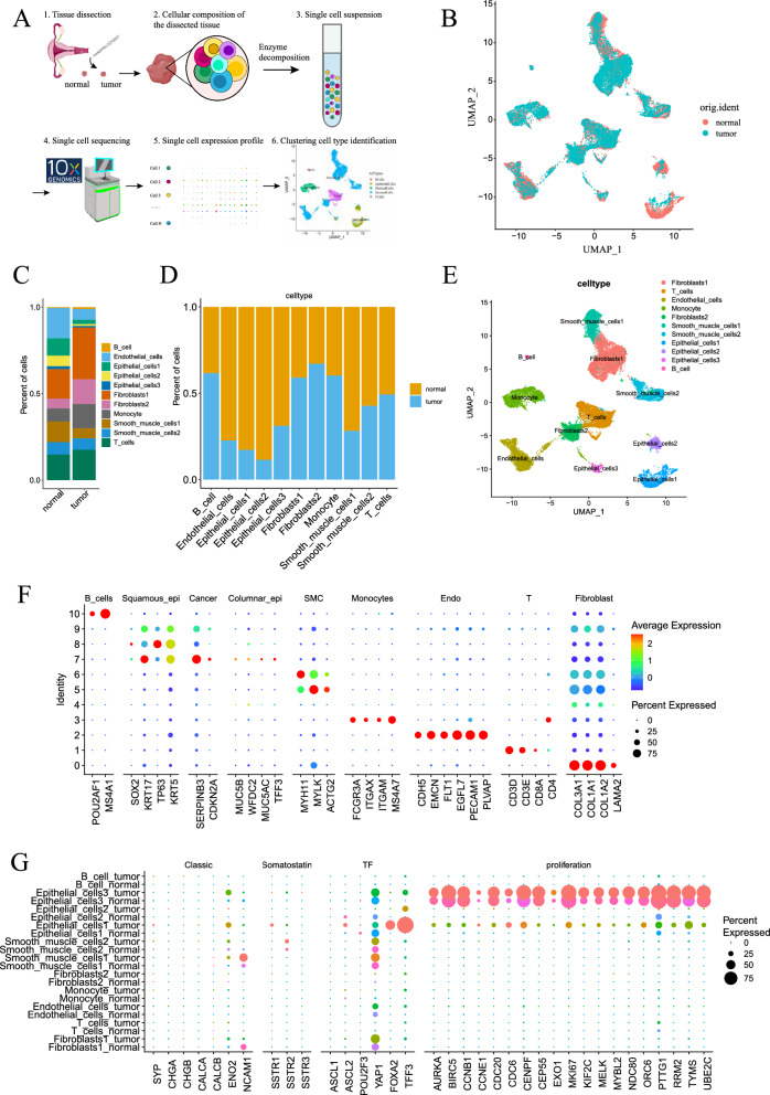
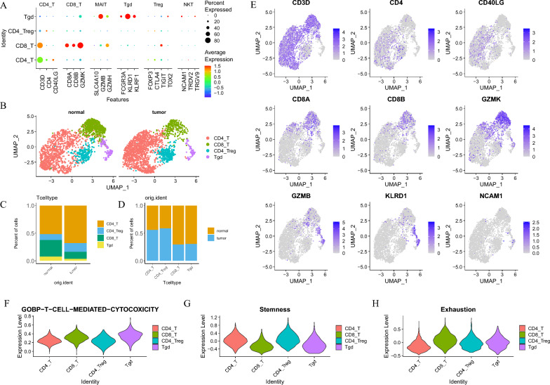
Small cell neuroendocrine cervical carcinoma is a highly aggressive tumor characterized by early metastasis, a high recurrence rate, and poor prognosis. This study represents the first instance of single-cell sequencing conducted on small cell neuroendocrine carcinoma of the cervix worldwide. Analysis of gene expression regulatory networks revealed that the transcription factor TFF3 drived up-regulation of ELF3. Furthermore, our findings indicated that the neuroendocrine marker genes and gene regulatory networks associated with small cell neuroendocrine cervical carcinoma differed from those observed in lung, small intestine, and liver neuroendocrine carcinoma within the GEO database, suggesting tissue-specific origins for these malignancies. Overall, this study addresses a significant research in understanding small cell neuroendocrine cervical carcinoma in vivo and provides valuable insights for guiding radiotherapy, chemotherapy, and targeted therapy.

Keywords: Cervical cancer; Neuroendocrine; Single-nucleus RNA sequencing; Tumor microenvironment.


Conflict of interest statement

Declarations. Ethics approval and consent to participate: The study was conducted in accordance with the Declaration of Helsinki, and approved by the Ethics Committee of Obstetrics and Gynecology Hospital of Fudan University(2024-113). Informed consent was obtained from all subjects involved in the study. Written informed consent has been obtained from the patient to publish this paper. Consent for publication: Not applicable. Competing interests: The authors declare no conflicts of interest.

Figures

Fig. 1
Fig. 1
Single-cell data annotation and small cell neuroendocrine tumor cell identification. A A schematic diagram showing the single-cell sequencing process. B UMAP dimensionality reduction plot of single-cell sequencing data from normal and tumor samples, where each point represents a single cell. C, D Bar plots showing the proportion and difference of different cell types in normal and tumor samples. E At UMAP resolution of 0.1, the samples were clustered into 11 cell subgroups. F The correspondence between the 11 cell subgroups obtained from UMAP dimensionality reduction clustering and the classic cell marker genes. G Comparison of the expression of classic neuroendocrine markers, growth inhibitory receptors, neuroendocrine-related transcription factors, and cell proliferation markers in each cell subgroup by sample
Fig. 2
Fig. 2
CNV analysis and re-clustering of epithelial cells. A Expression proportion and intensity of classic neuroendocrine marker genes (SYP, CHGA) and transcription factors (ASCL1, ASCL2, POU2F3) in each cell subgroup. B Using the Epithelial_cells1, 2, 3 of normal samples as the reference cell group (upper heat map), and the Epithelial_cells1, 2, 3 cell groups of tumor samples (lower heat map) as the observation cell group for CNV analysis and the results of inferCNV. The horizontal axis represents the 22 chromosomes arranged in order, and the different colors on the vertical axis correspond to different cell subgroups. C According to the results of inferCNV, the heat map of all epithelial cells in normal and tumor samples after re-clustering (kmeans_class = 3). The horizontal axis represents the genes on chromosomes 1–22. D Share the same legend as C, it shows the CNV quantification of the 3 cell subgroups after re-clustering. E UMAP reduction plot showing the distribution of different CNV score cells by sample. F UMAP reduction plot showing the distribution of class 2 and class 3 cell after CNV re-clustering by sample
Fig. 3
Fig. 3
Pseudotime analysis and GO enrichment of re-clustered epithelial cells 2 and 3. AF Pseudo-temporal plot of the Epithelial Cells 2 and 3 cell group after re-clustering, where each point represents a single cell. A The color gradient from dark to light indicates the progression of pseudotime. B Branch node 1 divides the cell group into 3 states. C The origin of samples. D The distribution of CNV scores. E The classification of each cell after CNV re-clustering. F The group of epithelial cells to which each cell belongs. G Heatmap showing the differential gene expression patterns of cells with different cell destinies at branch point 1. Rows represent genes, and columns represent cells. In the heatmap, the redder (bluer) the color, the higher (lower) the gene expression level. H Stacked polar bar chart showing the results of GO enrichment of cluster1 genes in G. The color gradient of the central column represents the p-value of the GO term; the height of the column represents the number of differential genes enriched to the GO term. I Stacked polar bar chart showing the results of GO enrichment of cluster2 genes in G. J, K, L, M, N Showing the changes in the expression levels of important differential genes (ELF3, CALD1, COL1A1, COL1A2, MKI67) as pseudotime progresses. Shared legend and horizontal axis: Each point represents the expression level of the gene in a cell. The horizontal axis represents pseudotime, and the vertical axis represents gene expression level. O, P, Q, R, S Survival curve plots of small cell lung cancer patients grouped by high and low gene expression, corresponding to J, K, L, M, N. The dashed lines on the horizontal and vertical axes represent the median survival time and median survival rate, respectively
Fig. 4
Fig. 4
Analysis of gene expression regulatory network of tumor neuroendocrine cell subsets. A Heat map of comparing gene expression regulatory networks in different cell populations after CNV re-clustering, showing regulon activity in different cell subsets. B Heat map of comparing the regulatory network of gene expression in epithelial cell. C Epithelial cell Regulon Specificity Score (RSS) plot showes the cell type-specific regulon in each epithelial cell groups. The size of the dot represents the RSS score, and the yellower color of the dot, the higher specificity of this regulon in this cell type. D RSS plot of cell groups after CNV re-clustering shows the specific regulon of each cell type after CNV re-clustering. The legend is as same as Fig. 4C. E, F, G, H, I The top 3 regulon in each cell group of epithelial cells and CNV re-clustered cells. J Distribution of regulon TFF3_173g in UMAP dimensionality reduction results; K The upper ridge plot and the lower violin plot show the distribution of TFF3_173g in different epithelial cell subsets. L Ridge plot and violin plot below show the distribution difference of TFF3_173g among cell groups after CNV re-clustering. M K-M survival curve of TFF3 high expression group and low expression group in small cell lung cancer patients. The N, O, P and Q plots are similar to J, K, L and M, respectively, showing the distribution of regulon CEBPB_117g in UMAP dimension reduction results, the distribution difference among different cell subsets and the K-M survival curve of small cell lung cancer
Fig. 5
Fig. 5
Neuroendocrine markers and gene expression regulatory network analysis of lung, small intestine, and liver neuroendocrine carcinoma in GEO data. A Bar graphs: the bar graphs display the composition of major cell types in different GEO single-cell sequencing datasets. GSM5870250, GSM5870256, GSM5870258 represent lung adenocarcinoma; GSM4159164 indicates small intestine neuroendocrine carcinoma (primary lesion); GSM4159165 denotes liver neuroendocrine carcinoma (metastatic lesion). B Cell type proportions: the bar graphs show the proportions of different cell types across various GEO single-cell sequencing datasets (neurons: small cell lung cancer cells, Neurons1/2: small intestine/liver neuroendocrine tumor cells). C Dot plots: the dot plots of GEO data illustrate the expression levels of classic neuroendocrine markers, somatostatin receptors, and transcription factors across different cell subgroups; D RSS plots: the RSS plots reveal regulons specific to neuroendocrine tumor cells (Neurons) in lung neuroendocrine carcinoma. The size of the dots represents the RSS score, and the more yellow the color, the higher the specificity of the regulon in that cell type. E The RSS plots reveal regulons specific to neuroendocrine tumor cells (Neurons1/2) in small intestine and liver neuroendocrine carcinoma. Legends are as same as decribed in D. F Distribution of CEBPD_13g: the distribution of CEBPD_13g within the UMAP dimensionality reduction results is depicted (left) while the ridge plot (top right) and violin plot (bottom) both illustrate the distribution differences of CEBPD_13g across various samples. G, H, I TFs’ Distribution: G, H, and I display the distribution differences of NFIB_39g, ETV1_20g, and FOS_60g across different samples, with legends corresponding to F. J Network diagram: the network diagram reveals the intersection of gene expression regulatory networks between small cell neuroendocrine cervical carcinoma and small cell neuroendocrine lung carcinoma. Blue represents transcription factors common to both; green denotes transcription factors or target genes shared by both
Fig. 6
Fig. 6
T cell subgroups. A The dot plot illustrates the expression of cellular markers corresponding to T cells after re-dimensionality reduction clustering. B Comparative UMAP dimensionality reduction plots reveal the distributional differences between normal and tumor T cells in two-dimensional space. C Stacked bar plots depict the percentage differences in the distribution of T cell subpopulations between normal and tumor samples. D Histograms show the percentage differences in the distribution of T cell subpopulations between normal and tumor samples. E Feature plots demonstrate the expression patterns of various marker genes on the UMAP dimensionality reduction plots. F, G, H Violin plots present the scoring of each T cell subpopulation on gene sets associated with GOBP_T_CELL_MEDIATED_CYTOTOXICITY, Stemness, and Exhaustion
Fig. 7
Fig. 7
Subgroups of monocytes. A Dot plot illustrating the expression of cell markers corresponding to monocytes subgroups after further dimensionality reduction clustering. B UMAP dimensionality reduction plot comparing the distribution differences of normal and tumor monocytes in two-dimensional space. C Stacked bar chart showing the percentage distribution differences among monocyte subgroups between normal and tumor samples. D Bar chart displaying the percentage distribution differences of monocyte subgroups between normal and tumor samples. E, F, G, H Violin plots revealing the scores of each monocyte subgroup in angiogenesis, antigen processing, phagocytosis, and MDSC gene sets
Fig. 8
Fig. 8
Comparison analysis of cell–cell communication analysis in SCNECC. AF Network diagrams: nodes of different colors represent various cell subgroups. Each line indicates a signal from the sender to the receiver, with thickness representing the number or strength of interactions between subgroups. C and F show differences in cell communication networks between samples, with red (or blue) lines indicating increased (or decreased) signals in small cell neuroendocrine cervical tumor compared to normal samples. C (/F) represents the difference between panels A and B (/D and E). G, H Differential network analysis heatmaps: Display variations in the number or strength of interactions between different cell groups. The colored bar at the top indicates the sum of incoming signals (columns), and the colored bar on the right indicates the sum of outgoing signals (rows). Red (or blue) squares indicate increased (or decreased) signals in tumors compared to normal samples. I, J Ranking of important signaling pathways based on inferred overall information flow differences between Normal and Tumor within the network. The top signaling pathways colored red were enriched in Normal samples, while the bottom signaling pathways colored green were enriched in Tumor samples. K, L, M, N Comparisons of DESMOSOME and EPHA signaling pathways between normal and tumor samples; O, P Comparative distribution of gene expression related to DESMOSOME and EPHA signaling pathways between normal and tumor samples

Similar articles

Cited by

References

    1. Chao A, Wu RC, Lin CY, et al. Small cell neuroendocrine carcinoma of the cervix: from molecular basis to therapeutic advances. Biomed J. 2023;46(5): 100633. - PMC - PubMed
    1. Society of Neuroendocrine Neoplasm of China Anti-Cancer Association. China Anti-Cancer Association guideline for diagnosis and treatment of neuroendocrine neoplasm (2022 edition). China Oncol. 2022;32(6):545–79.
    1. Mahdi H, Joehlin-Price A, Elishaev E, et al. Genomic analyses of high-grade neuroendocrine gynecological malignancies reveal a unique mutational landscape and therapeutic vulnerabilities. Mol Oncol. 2021;15(12):3545–58. - PMC - PubMed
    1. Saraei P, Heshmati A, Hosseini S. Small-cell neuroendocrine carcinoma of the female genital tract: a comprehensive overview. J Neuroendocrinol. 2024;36(6): e13394. - PubMed
    1. Lyu YH, Liu HX, Han X, et al. Clinicopathologic characteristics and prognostic factors of patients with surgically treated high-grade neuroendocrine carcinoma of the cervix: a multicenter retrospective study. Int J Gynaecol Obstet. 2024. - PubMed

MeSH terms