. 2025 Jan 8;15(1):1371.
doi: 10.1038/s41598-024-84027-6.

Balancing fairness and efficiency in dynamic vaccine allocation during major infectious disease outbreaks

Affiliations

Balancing fairness and efficiency in dynamic vaccine allocation during major infectious disease outbreaks

Zi-Xuan Dai et al. Sci Rep. .

Abstract

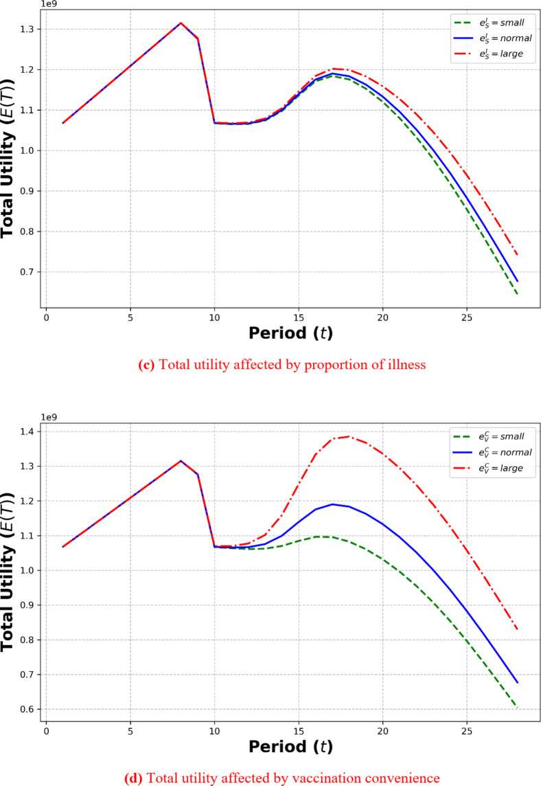
The outbreak of novel infectious diseases presents major public health challenges, highlighting the urgency of accelerating vaccination efforts to reduce morbidity and mortality. Vaccine allocation has become a crucial societal concern. This paper introduces a dynamic vaccine allocation model that considers demand uncertainty and vaccination willingness, focusing on the trade-off between fairness and efficiency. We develop a multi-period dynamic vaccine allocation model, evaluating optimal strategies over different periods. The model addresses structural differences among vaccination groups, strategy selection, dynamic demand, and vaccination willingness. Our findings suggest that prioritizing efficiency in the initial outbreak stages may lead to inequitable distribution, causing adverse social impacts, while overemphasizing fairness can undermine overall utility. Therefore, we propose a dynamic optimization-based strategy balancing fairness and efficiency at different pandemic stages. Our results indicate that allocation strategies should shift from efficiency to fairness as the pandemic evolves to enhance vaccine utility. Additionally, macro-level interventions like reducing free-rider behavior and increasing vaccination convenience can improve total vaccine utility. This study offers new perspectives and methodologies for dynamic vaccine allocation, highlighting the trade-off between fairness and efficiency, providing crucial insights for policy formulation and pandemic response.

Keywords: Decision preference; Dynamic vaccine allocation; Major Novel Infectious diseases; Vaccination willingness.


Conflict of interest statement

Declarations. Competing interests: The authors declare no competing interests.

Figures

Fig. 1
Fig. 1
Basic structure of vaccine supply chain. A single disease control agency is responsible for the procurement and distribution of vaccines. The vaccines are distributed unidirectionally from the disease control agency to the vaccination sites, with no returns or inter-site transfers allowed. Residents are assigned to vaccination sites based on proximity, so the total number of residents covered by vaccination site formula image is fixed at formula image.
Fig. 2
Fig. 2
Vaccination willingness and demand function. The solid line formula image in the figure indicates that the probability distribution of residents’ willingness to get vaccinated follows U[formula image]. The portion of formula image exceeding the vaccination decision threshold formula image generates vaccine demand, which corresponds to the area covered by formula image.
None
Algorithm: Get the dtm, ntm, qtm.
Fig. 3
Fig. 3
Total Utility Curve for Different Decision Preferences Over the Entire Planning Period. It can be observed that when formula image is 0.54, the total utility formula image over the entire planning period reaches its maximum, i.e., 30,542,908,154. Thus, if the decision preference for fair distribution remains unchanged over the planning period, allocating vaccines according to a decision preference of 54% fairness achieves the maximum total utility over the entire planning period.
Fig. 4
Fig. 4
Total utility variation with decision preferences in each period. The figure illustrates the changes in the total utility of vaccinations over 28 sub-period as formula image increases from 0 to 1. The red dots in the figure indicate the peak values of the total vaccination utility in each sub-period.
Fig. 5
Fig. 5
Impact of vaccination willingness factors on total utility. Where the darkness of colors represents the level of utility, and red pentagrams and triangles indicate the optimal and better-than-initial utility values, respectively. “N” denotes no change in the coefficient, “L” indicates coefficient enlargement, and “S” indicates coefficient reduction. The red pentagrams denote the factor adjustment strategies with the maximum formula image, while the red triangles represent all factor adjustment strategies that exceed the initial formula image.
Fig. 6
Fig. 6
Impact of single-factor changes on total utility. The positional relationships of the three curves in (a) indicate a negative correlation between vaccination utility and the free-riding mentality formula image, when formula image is smaller, the utility curve reaches its first peak later, while the second peak is reached almost simultaneously across different values of formula image, however, a smaller formula image consistently results in higher utility. (b) Shows that the impact of the recovery rate formula image on vaccination utility follows a trend similar to that of formula image, but the magnitude of the effect is much greater. In (c), the positional relationships of the three curves indicate a positive correlation between vaccination utility and the infection rate formula image, but the effect is relatively minor and only becomes significant at the second peak. (d) demonstrates that the influence of vaccination convenience formula image is similar to formula image in terms of trend, but the impact is far greater, leading to a significant increase in utility during the second upward phase when formula image is higher.
Fig. 6
Fig. 6
Impact of single-factor changes on total utility. The positional relationships of the three curves in (a) indicate a negative correlation between vaccination utility and the free-riding mentality formula image, when formula image is smaller, the utility curve reaches its first peak later, while the second peak is reached almost simultaneously across different values of formula image, however, a smaller formula image consistently results in higher utility. (b) Shows that the impact of the recovery rate formula image on vaccination utility follows a trend similar to that of formula image, but the magnitude of the effect is much greater. In (c), the positional relationships of the three curves indicate a positive correlation between vaccination utility and the infection rate formula image, but the effect is relatively minor and only becomes significant at the second peak. (d) demonstrates that the influence of vaccination convenience formula image is similar to formula image in terms of trend, but the impact is far greater, leading to a significant increase in utility during the second upward phase when formula image is higher.

Similar articles

References

    1. Vahdani, B. et al. Fair-split distribution of multi-dose vaccines with prioritized age groups and dynamic demand: the case study of COVID-19. Eur. J. Oper. Res.310, 1249–1272 (2023). - PMC - PubMed
    1. Ferranna, M. Causes and costs of global COVID-19 vaccine inequity. Semin. Immunopathol. (2024). - PMC - PubMed
    1. Zhao, J. et al. Vaccine equity implementation: exploring factors influencing COVID-19 vaccine delivery in the Philippines from an equity lens. (2024). - PMC - PubMed
    1. Ayers, C. K. et al. Disparities in H1N1 vaccination rates: a systematic review and evidence synthesis to inform COVID-19 vaccination efforts. J. GEN. INTERN. MED.36, 1734–1745 (2021). - PMC - PubMed
    1. Yarmand, H., Ivy, J. S., Denton, B. & Lloyd, A. L. Optimal two-phase vaccine allocation to geographically different regions under uncertainty. Eur. J. Oper. Res.233, 208–219 (2014).

Publication types

Substances

LinkOut - more resources