Comparative Study
. 2025 Jan 10;10(1):23.
doi: 10.1038/s41392-024-02113-7.

Comparing acute versus AIDS ART initiation on HIV-1 integration sites and clonal expansion

Affiliations
Comparative Study

Comparing acute versus AIDS ART initiation on HIV-1 integration sites and clonal expansion

Jun Wang et al. Signal Transduct Target Ther. .

Abstract

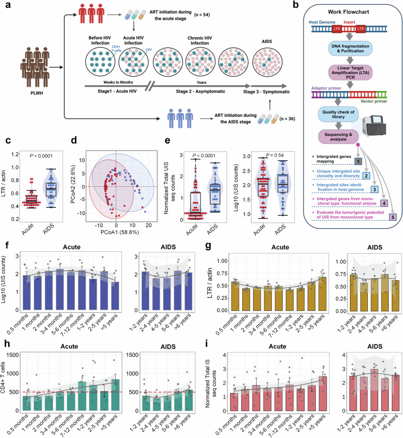
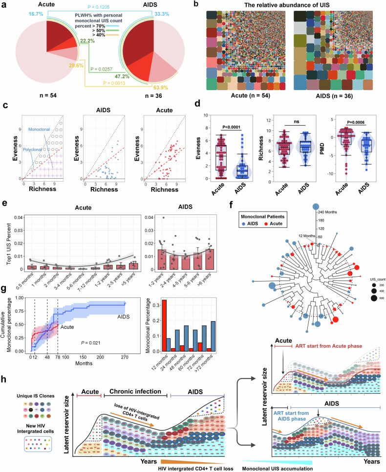
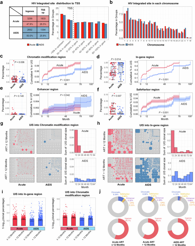
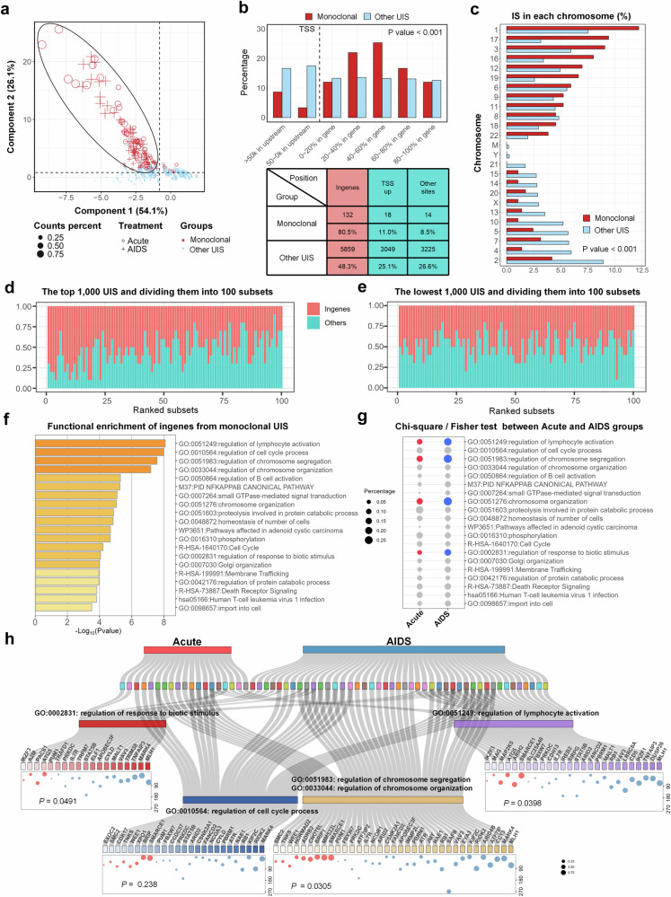
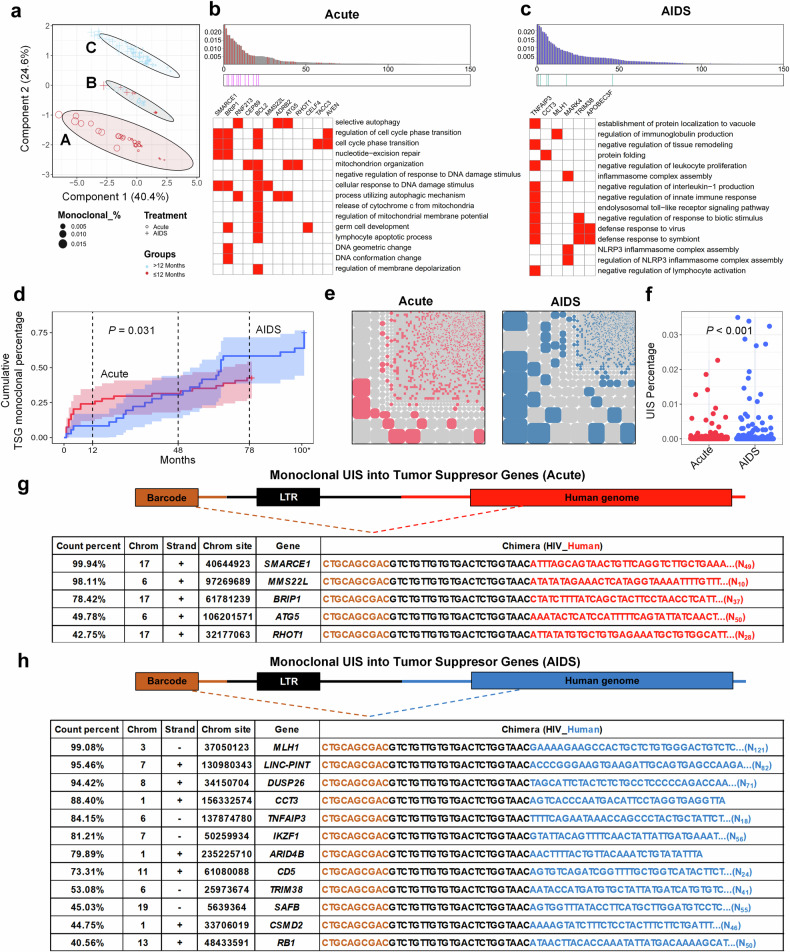
Early antiretroviral therapy (ART) initiation is known to limit the establishment of the HIV reservoir, with studies suggesting benefits such as a reduced number of infected cells and a smaller latent reservoir. However, the long-term impact of early ART initiation on the dynamics of the infected cell pool remains unclear, and clinical evidence directly comparing proviral integration site counts between early and late ART initiation is limited. In this study, we used Linear Target Amplification-PCR (LTA-PCR) and Next Generation Sequencing to compare unique integration site (UIS) clonal counts between individuals who initiated ART during acute HIV infection stage (Acute-ART group) and those in the AIDS stage (AIDS-ART group). Our analysis revealed distinct clonal distribution patterns, with greater UIS heterogeneity in Acute-ART group and more homogeneity in AIDS-ART group. Monoclonal UIS accumulation, predominantly in-gene regions, was influenced by ART timing and duration, with early treatment delaying this process. Host cell genes integrated by HIV provirus as monoclonal types were enriched in cell cycle and lymphocyte activation pathways. Tumor suppressor genes (TSGs) were more frequently integrated as monoclonal types in AIDS-ART group, suggesting potential risk factors. Overall, we introduced a sequencing method to assess provirus size in human peripheral blood and identified the widespread presence of monoclonal distribution of UIS in AIDS-ART group after long-term treatment. The early intervention helps slow the progress of clonal expansion of infected cells, reducing the formation of stable and persistent reservoirs, and ultimately posing fewer barriers to achieving a functional cure.


Conflict of interest statement

Competing interests: The authors declare no competing interests.

Figures

Fig. 1
Fig. 1
Comparative analysis of HIV total DNA, integration sites, and UIS in Acute-ART vs. AIDS-ART group. a Schematic representation of cohort construction and HIV infection stages. This diagram outlines the stages of HIV infection—Acute, Chronic, and AIDS—highlighting the distinct characteristics of each, such as decreased CD4 + T cell counts (dark green circles) and elevated HIV viral replications (magenta dots). The schematic emphasizes the importance of early diagnosis and timely initiation of ART. PLWH are categorized based on the timing of ART initiation: Acute-ART group, refers to PLWH who initiate ART during the acute stage (n = 54); AIDS-ART, refers to PLWH who initiate ART during the AIDS stage group (n = 36). The image was created using Biorender (https://biorender.com/). b Flowchart illustrating the process of provirus integration site sequencing using LTA-PCR and next-generation sequencing, followed by sequencing analysis. Detailed experimental procedures and analytical methodologies are available in the Methods section of the main text and in the Supplementary Files. The image was created using Biorender (https://biorender.com/). c Comparison of HIV total DNA levels. Violin plots showing relative gene copies of LTR relative to β-actin (LTR/β-Actin) based on LTR RT-PCR for PLWH who initiated ART during the acute stage (red dot, n = 54) versus those who started treatment during the AIDS stage (blue dot, n = 36). Wilcoxon test (d) PCA plot illustrating the separation of patient groups based on LTR levels relative to glyceraldehyde 3-phosphate dehydrogenase (GAPDH) and β-actin (LTR/GAPDH; LTR/β-actin), along with CD4 + T cell counts. The Acute-ART group (red dots, n = 54) and the AIDS-ART group (blue dots, n = 36) are distinctly separated along two principal components (Component 1: 58.6%; Component 2: 22.6%), highlighting the differences in these markers that effectively differentiate the two groups of PLWH. e Normalized total UIS counts (left panel) and Log10-transformed UIS counts (right panel) for the Acute-ART group (red dots, n = 54) versus the AIDS-ART group (blue dots, n = 36). The y-axis represents total UIS sequence counts normalized to CD4 + T cell percentage (left panel), and the UIS counts, log10-transformed (right panel). f, g Longitudinal analysis of [Log10 UIS] counts and total LTR DNA levels over time in PLWH initiating ART during the acute stage (left panel, n = 54) versus those during the AIDS stage (right panel, n = 36). The X-axis represents different ART treatment time groups, and the Y-axis represents Log10-transformed UIS counts (f) and LTR/Actin counts (g), respectively. The gray line indicates the trend line, and the gray shaded area represents the 95% confidence interval (CI) distribution. h, i Longitudinal analysis of CD4 + T cell counts (h) and normalized total IS seq counts (i) over time in PLWH initiating ART during the acute stage (left panel, n = 54) versus those during the AIDS stage (right panel, n = 36). The X-axis represents different ART treatment time groups, and the Y-axis represents CD4 + T cell counts (h) and Normalized Total IS (integration site) seq counts (i), respectively. The gray line indicates the trend line, and the gray shaded area represents the 95% confidence interval (CI) distribution. (Note: Distinct dots represented as each measurement in each bar chart and data are represented as mean ± SEM; p < 0.05 indicates statistical significance; Wilcoxon test for c and e; PERMANOVA test for (d) PCoA plot; the terms ‘Acute’ and ‘AIDS’ in all figures refer to PLWH who initiated ART during the acute stage (also referred to as the Acute-ART group) and those who initiated ART during the AIDS stage (also referred to as the AIDS-ART group), respectively)
Fig. 2
Fig. 2
Comparative analysis of UIS clonality in Acute-ART group vs. AIDS-ART group. a Pie chart analysis of monoclonal UIS proportions. The pie chart compares the proportion of monoclonal UIS in PLWH who initiated ART during the acute phase (n = 54) versus those who began treatment during the AIDS stage (n = 36). Colored bands around the outer edge of the pie chart represent the percentage of PLWH with personal monoclonal UIS counts >70% (blue), 50% (green), and 40% (yellow), respectively. Significant differences between groups are indicated by P-values by Chi-square test (P = 0.1205 for 70%, P = 0.0257 for 50%, P = 0.0013 for 40%). b Mosaic chart of UIS distribution. This mosaic chart shows the relative percentages of the top 5000 UIS in two groups: the Acute-ART group (left, n = 54) and the AIDS-ART group (right, n = 36). Larger blocks indicate greater homogeneity in clonal distribution patterns, while a higher number of smaller blocks represents a greater prevalence of monoclonal UIS within the group, and vice versa. c PMD analysis. This method assesses UIS clonality based on two dimensions: Richness (variety of UIS) and Evenness (distribution uniformity). The panel categorizes UIS as polyclonal or monoclonal, with the AIDS-ART group (middle) exhibits greater monoclonality, while the Acute-ART group (right) showing higher evenness. d Comparative analysis of PMD analysis in Acute-ART group vs. AIDS-ART group. The plot compares the evenness, richness, and PMD data between PLWH initiating ART during the acute stage (red dot) versus those during the AIDS stage (blue dot). e Longitudinal analysis of individual Top1 UIS percentage. This panel presents the percentage of the top 1 UIS counts for PLWH initiating ART during the acute stage (left panel) versus those during the AIDS stage (right panel). The X-axis represents different ART treatment time periods, and the Y-axis shows the top 1 UIS percentage. The gray line indicates the trend, with the gray shaded area representing the 95% confidence interval (CI). f Clustering of monoclonal UIS by Evenness, Richness, and ART duration. Patients are clustered based on Evenness and Richness data, with ART duration factored into the analysis. Monoclonal individuals in the AIDS group are shown in blue, while those in the acute group are shown in red. The black dashed line represents the 12 month mark. The bubble sizes represent for the UIS counts. The lager bubble represent for more UIS counts. g Cumulative curve of individuals percentage with monoclonal UIS during ART duration. The cumulative curve (left) displays the percentage of individuals with monoclonal UIS over time in the Acute-ART group (red line) versus AIDS-ART group (blue line). The curve shows a rapid increase in the percentage of PLWH initiating ART during the acute stage with monoclonal UIS within the first 12 months, followed by a more moderate rise. In contrast, PLWH initiating ART during the AIDS stage experience a substantial and immediate increase, reaching nearly 78% after 180 months. The bar chart (right) indicates the PLWH’ percentage with monoclonal UIS during different ART time periods, with red bars representing PLWH who initiated ART during the acute stage and blue bars representing those who started ART during the AIDS stage. h Schematic representation of proviral integration dynamics. The upper panel illustrates the dynamics of proviral integration across different stages of HIV infection, emphasizing the high rate of new integration events and the expansion of the latent reservoir. The diagram traces the progression from initial infection to detectable clonal expansion, where most newly infected cells perish, but a subset forms detectable clones. During the acute phase, there is increased diversity in provirus-integrated cells and UIS clones. Monoclonal UIS and cell clonality peak towards the end of the acute phase and then decline during the chronic infection stage, accompanied by a loss of HIV-integrated CD4 + T cells, as shown by the black trend line. In the AIDS stage, monoclonal UIS and cell clonality continue to accumulate. The middle panel demonstrates that initiating ART during the acute phase reduces the overall size of the latent reservoir and delays monoclonal UIS accumulation, leading to fewer integration site clones, as indicated by the red trend line. The lower panel shows that PLWH initiating ART during the AIDS stage have a larger latent reservoir and a higher prevalence of monoclonal UIS, along with increased homogeneity of monoclonal integration sites, as indicated by the blue trend line. The image was created using Biorender (https://biorender.com/). (Note: Distinct dots represented as each measurement in each bar chart and data are represented as mean ± SEM; p < 0.05 indicates statistical significance; Wilcoxon test for d; random linear regression test for g; the terms ‘Acute’ and ‘AIDS’ in all figures refer to PLWH who initiated ART during the acute stage (also referred to as the Acute-ART group) and those who initiated ART during the AIDS stage (also referred to as the AIDS-ART group), respectively)
Fig. 3
Fig. 3
Chromatin modification and safe harbor regions are preferential sites for HIV integration in the Acute-ART group than AIDS-ART group but are more prone to loss during treatment. a Distribution of HIV integration across genomic regions. The bar chart compares the frequency of HIV proviral DNA integration into in-gene regions versus upstream promoter regions (TSS up) in PLWH initiating ART during the acute stage (n = 54, red) and those in the AIDS stage (n = 36, blue). No significant differences are observed in the distribution of integration sites in host genome between the two groups (left). The accompanying table indicates that ART in the acute-phase group, 47.8% (3299) of integrations occur in in-gene regions, and 26.5% (1833) in upstream promoter regions. In contrast, in the AIDS group, 50.0% (2692) of integrations occur in in-gene regions, with 25.8% (1394) in upstream promoter regions (right). b Chromosomal distribution of HIV integration sites. The bar chart illustrates the distribution of HIV integration across different chromosomes in both groups, revealing no obvious variation between those initiating ART during the acute phase (red) and the AIDS stage (blue). cf Cumulative preference for HIV integrated UIS into chromatin regions over time. The comparison shows the percentage of HIV integration in all patients from two groups: those initiating ART during the acute phase (red) and those in the AIDS stage (blue) (left panels). The cumulative curves illustrate the preference for HIV integration into different genomic regions over time (y-axis representing cumulative % in UIS, x-axis representing months) (right panels). These regions include chromatin modifications (c), in-gene regions (d), enhancer regions (e), and safe harbor regions (f). g, h Mosaic chart of UIS distribution across chromatin modification and in-gene regions among different disease groups. This mosaic chart displays the UIS in Chromatin modification region (g) and in-genes region (h) in four groups—Acute-initiated ART (≤12 months and >12 months) and AIDS-stage initiated ART (≤12 months and >12 months) (left panel). The bar charts in (g) and (h) display the total UIS clonal sizes across various time periods (right panel). i Normalized and Log-transformed clonal percentage of UIS into region of in-gene regions (left panel) and chromatin modification (right panel) in four groups. j Donut charts illustrating HIV integration preferences across different groups. PLWH who initiate ART within the first 12months of the acute stage show a higher number of UIS integrated into chromatin modification regions (blue), and more UIS integrated into safe harbor regions (yellow) and CpG islands (orange) beyond 12 months in Acute-ART group. In contrast, PLWH initiating ART after 12 months during the AIDS stage exhibit fewer of these clonal UIS types, with integration primarily occurring in in-gene regions (red). (Note: Distinct dots represented as each measurement in each bar chart and data are represented as mean ± SEM; p < 0.05 indicates statistical significance; Wilcoxon test for (cf) left panel; random linear regression test for (cf) right panel; the terms ‘Acute’ and ‘AIDS’ in all figures refer to PLWH who initiated ART during the acute stage (also referred to as the Acute-ART group) and those who initiated ART during the AIDS stage (also referred to as the AIDS-ART group), respectively)
Fig. 4
Fig. 4
Monoclonal UIS accumulation preferentially occurs at HIV proviral integration sites within in-gene regions during the AIDS treatment stage, with functional enrichment analysis revealing the involvement of these host cell genes in key biological processes. a PCA plots distinguishing monoclonal UIS (red dot, n = 164) from other UIS (blue dot), the cluster based on LTR percentage, Richness, Evenness and PMD. The plot shows clear distinction between monoclonal UIS with other UIS by two principal components (Component 1, 26.1%; Component 2, 54.1%). b Comparison of UIS clonality distribution across different genomic regions (x-axis), indicating that monoclonal UIS (red bars) are more likely to integrate into in-genes (Dashed line, right side) than non-monoclonal UIS (blue bars) are more likely to integrate into transcription start site (TSS) upstream (Dashed line, left side) (up panel). The accompanying table indicates that the sites of most monoclonal UIS, 80.5% (132) of integrations occur in in-gene regions, 11.0% of integrations occur in TSS upstream regions, 8.5% of integrations occur in other sites. In contrast, other clonal types, 48.3% (5859) of integrations occur in in-gene regions, with 25.1% (3049) in upstream promoter regions, with 26.6% (3225) in other sites (below panel). c Chromosomal distribution of monoclonal UIS, highlighting a higher frequency of integration into chromosomes 1, 3, 16, 17, 12, and 19 in monoclonal UIS (red bar) and chromosomes 2, 4, 5, 7, 10, 13, 14, 15, 21, and Y in other UIS (blue bar). d, e Ranking analysis of all UIS, grouped into sets of 100. Ranking the top 1000 UIS and dividing them into 100 subsets, each containing 10 UIS further organized into subsets of 100. The percentage of UIS integrated into in-gene regions (red) was higher in the top-ranked subset and gradually decreased across the ranks (d). In the lowest 1000 UIS, nearly 50% were integrated into genes across the ranks (e). f Functional enrichment analysis of in-gene regions from 164 monoclonal UIS, highlighting genes enriched in the top 20 biological processes. The x-axis represents-log10(p-value), with larger values indicating higher statistical significance of enrichment. g Chi-square/Fisher test comparing UIS genes percentage in enriched pathways between the Acute- and AIDS-ART groups, showing differences in the percentage of integrated genes across 20 enriched pathways. Blue dots represent pathways with significant differences in the AIDS-ART group compared to the Acute-ART group, indicated by red dots. Dot size reflects the percentage of integrated genes from each pathway in two groups, with larger dots indicating higher percentages. h Sankey bubble plot for GO-term classification. This chart illustrates enriched genes associated with lymphocyte activation (GO: 0051249), chromosome segregation (GO: 0051983), chromosome organization (GO: 0033044), regulation of cell cycle process (GO: 0010564), and response to biotic stimulus (GO: 0002831) for two groups—PLWH who initiated ART during the acute stage (red) and those who initiated ART during the AIDS stage (blue). Bubble size represents the UIS count percentage relative to each group, and the y-axis indicates ART duration (in months). (Note: p < 0.05 indicates statistical significance; Kruskal-Wallis test for (b, c) Chi-square / Fisher’s exact test for (g, h) the terms ‘Acute’ and ‘AIDS’ in all figures refer to PLWH who initiated ART during the acute stage (also referred to as the Acute-ART group) and those who initiated ART during the AIDS stage (also referred to as the AIDS-ART group), respectively)
Fig. 5
Fig. 5
HIV provirus integrated into TSGs is more likely to result in monoclonal expansion in AIDS-ART group, posing a higher cancer risk compared to those in Acute-ART group. a PCA plot analysis of monoclonal UIS. The PCA plot highlights differences in monoclonal UIS between Acute-ART group (dots) and AIDS-ART group (crosses). All the monoclonal UIS clustered into 3 group, A, B and C. Blue indicates PLWH with ART duration over 12 months, while red indicates those with ART duration of less than 12 months. b, c Ranked GSEA of clusters A and C based on clonal normalized size, with similarity analysis on the top 100 enriched pathways, distilled to 15 key pathways and their associated core genes (upper panel). The x-axis represents clonal normalized size, while the y-axis shows the top 100 enriched pathways. The heatmap (lower panel) illustrates the 15 key pathways and corresponding core genes within each pathway for the Acute-ART group (b) and the AIDS-ART group (c). d Cumulative curve of individuals percentage with TSGs monoclonal during ART duration. The cumulative curves displayed the percentage of individuals with TSGs monoclonal (y-axis) over time (x-axis) in the Acute-ART group (red line) versus AIDS-ART group (blue line), illustrate the preference for HIV integration into TSGs over time. e Mosaic chart of TSG monoclonal UIS distribution. This chart illustrates the relative percentage of TSGs monoclonal in two groups—Acute-ART group (left, n = 54) and AIDS-ART group (right, n = 36). A larger block area indicates a higher prevalence and greater homogeneity of TSGs monoclonal, while a smaller block area reflects increased heterogeneity in clonal distribution patterns. f The bar chart shows the comparison of the percentage of TSGs monoclonal among all PLWH from two groups: those initiating ART during the acute phase (red) and those during the AIDS stage (blue). g, h TSGs integrated by HIV to be monoclonal UIS. List of UIS (count percent < 40%) into TSGs, when disrupted by HIV integration into in-genes region and subjected to clonal expansion, become monoclonal types. This poses a greater cancer risk in Acute-ART group (g) compared to AIDS-ART group (h). (Note: p < 0.05 indicates statistical significance; Wilcoxon test for (f); Random linear regression for (d); the terms ‘Acute’ and ‘AIDS’ in all figures refer to PLWH who initiated ART during the acute stage (also referred to as the Acute-ART group) and those who initiated ART during the AIDS stage (also referred to as the AIDS-ART group), respectively)

Similar articles

Cited by

References

    1. Archin, N. M. et al. Administration of vorinostat disrupts HIV-1 latency in patients on antiretroviral therapy. Nature487, 482–485 (2012). - PMC - PubMed
    1. Elliott, J. H. et al. Short-term administration of disulfiram for reversal of latent HIV infection: a phase 2 dose-escalation study. Lancet HIV2, e520–e529 (2015). - PMC - PubMed
    1. Leth, S. et al. Combined effect of Vacc-4x, recombinant human granulocyte macrophage colony-stimulating factor vaccination, and romidepsin on the HIV-1 reservoir (REDUC): a single-arm, phase 1B/2A trial. Lancet HIV3, e463–e472 (2016). - PubMed
    1. Armani-Tourret, M. et al. Selection of epigenetically privileged HIV-1 proviruses during treatment with panobinostat and interferon-α2a. Cell187, 1238–1254.e14 (2024). - PMC - PubMed
    1. Gunst, J. D. et al. Impact of a TLR9 agonist and broadly neutralizing antibodies on HIV-1 persistence: the randomized phase 2a TITAN trial. Nat. Med29, 2547–2558 (2023). - PMC - PubMed

Publication types

Substances

LinkOut - more resources