. 2025 Jan 21;24(1):28.
doi: 10.1186/s12943-025-02231-y.

Comprehensive single-cell atlas of colorectal neuroendocrine tumors with liver metastases: unraveling tumor microenvironment heterogeneity between primary lesions and metastases

Affiliations

Comprehensive single-cell atlas of colorectal neuroendocrine tumors with liver metastases: unraveling tumor microenvironment heterogeneity between primary lesions and metastases

Yiqiao Deng et al. Mol Cancer. .

Abstract

Background: Colorectal neuroendocrine tumors with liver metastases (CRNELM) are associated with a poorer prognosis compared to their nonmetastatic counterparts. A comprehensive understanding of the tumor microenvironment (TME) heterogeneity between primary lesions (PL) and liver metastases (LM) could provide crucial insights for enhancing clinical management strategies for these patients.

Methods: We utilized single-cell RNA sequencing to analyze fresh tissue samples from CRNELM patients, aiming to elucidate the variations in TME between PL and LM. Complementary multidimensional validation was achieved through spatial transcriptomics, bulk RNA sequencing, and multiplex immunohistochemistry/immunofluorescence.

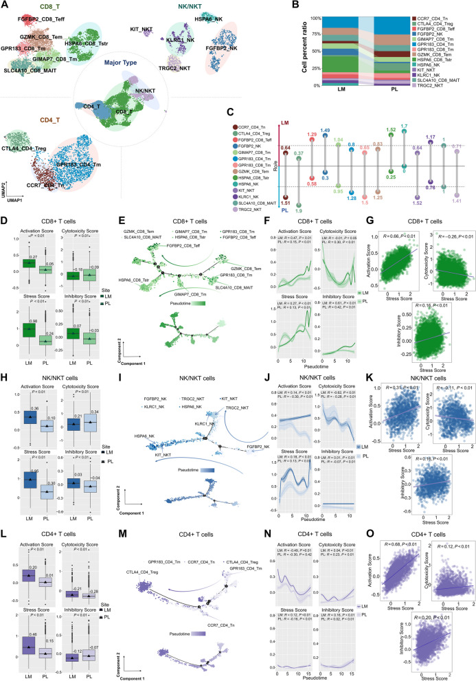
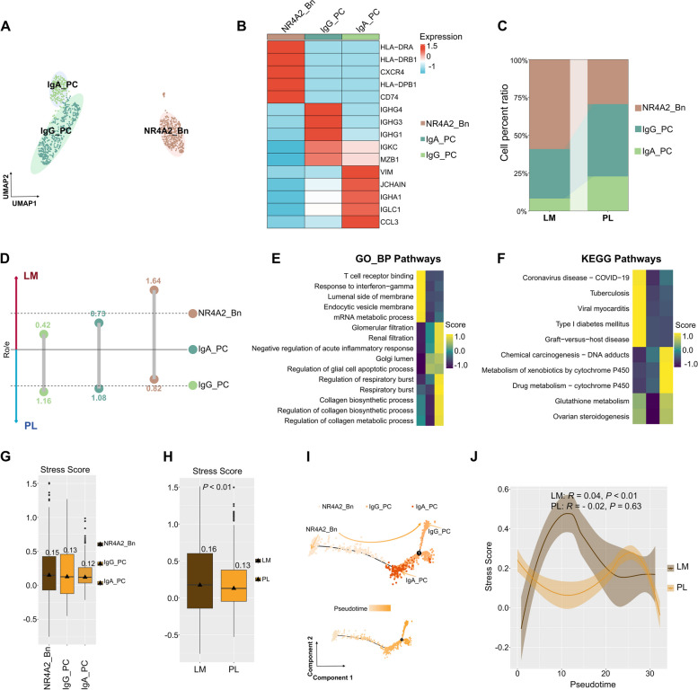
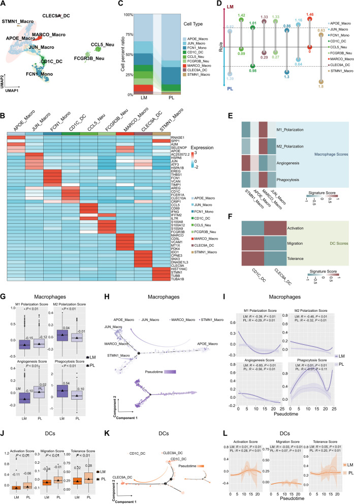
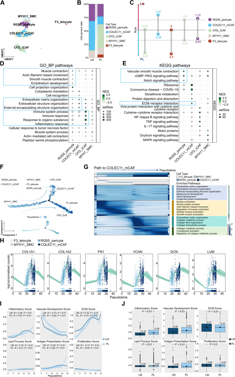
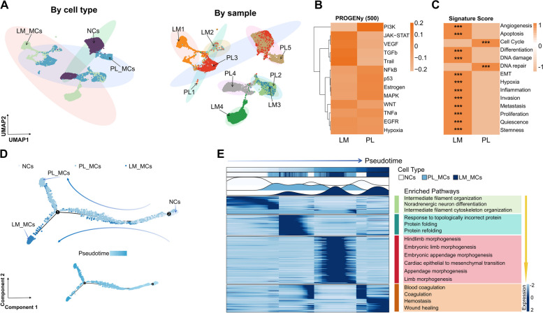
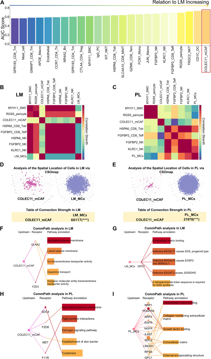
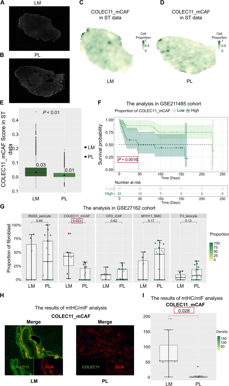
Results: Our single-cell RNA sequencing analysis revealed that LM harboured a higher proportion of CD8 + T cells, CD4 + T cells, NK cells, NKT cells, and B cells exhibiting a stress-like phenotype compared to PL. RGS5 + pericytes may play a role in the stress-like phenotype observed in immune cells within LM. MCs in PL (PL_MCs) and LM (LM_MCs) exhibit distinct activation of tumor-associated signaling pathways. Notably, COLEC11 + matrix cancer-associated fibroblasts (COLEC11_mCAFs) were found to be significantly associated with LM_MCs. Cell communication analysis unveiled potential targetable receptor-ligand interactions between COLEC11_mCAFs and LM_MCs. Multidimensional validation confirmed the prominence of the characteristic stress-like phenotypes, including HSPA6_CD8_Tstr, HSPA6_NK, and COLEC11_mCAFs in LM. Moreover, a higher abundance of COLEC11_mCAFs correlated with poorer survival rates in the neuroendocrine tumor patient cohort.

Conclusion: Overall, our study provides the first single-cell analysis of the cellular and molecular differences between PL and LM in CRNELM patients. We identified distinct cell subsets and receptor-ligand interactions that may drive TME discrepancies and support metastatic tumor growth. These insights highlight potential therapeutic targets and inform strategies for better managing CRNELM patients.

Keywords: Colorectal neuroendocrine tumour; Heterogeneity; Liver metastases; Single-cell RNA sequence; Spatial transcriptomics; Tumour microenvironment.


Conflict of interest statement

Declarations. Ethics approval and consent to participate: The study was approved by the Institutional Review Board of the Cancer Hospital, Chinese Academy of Medical Sciences (ID: NCC2021C-515), and informed consent was obtained from all the patients. The patients/participants provided written informed consent to participate in this study. The authors are accountable for all aspects of the work and for ensuring that questions related to the accuracy or integrity of any part of the work are appropriately investigated and resolved. Consent for publication: Not applicable. Competing interests: The authors declare no competing interests.

Figures

Fig. 1
Fig. 1
The single-cell landscape of PL and LM of CRNELM patients A Workflow depicting the overall experimental design for scRNA-seq profiling of CRNELM. B UMAP visualization of eight major cell clusters (top) and corresponding cell density (bottom) from all samples showing the distribution between LM (left) and PL (right). In the cell density plot, a high relative cell density is indicated by brighter regions. C Heatmap depicting the expression of marker genes across eight defined major cell clusters. The colour intensity reflects average scaled gene expression. The expression intensity of markers is shown. D The bar plot illustrates relative proportions of 8 major cell types across PL and LM
Fig. 2
Fig. 2
Characterization of T, NK, and NKT cells between PL and LM of CRNELM patients. A UMAP plot illustrating distinct T, NK and NKT cell subclusters across all samples, color-coded by cell type. At the center are the primary cell types identified: CD4 + T cells, CD8 + T cells, and NK/NKT cells. The top-left quadrant shows six subclusters of CD8 + T cells. The bottom-left quadrant displays three subclusters of CD4 + T cells. The top-right quadrant presents five subclusters of NK/NKT cells. B The bar plot illustrates the relative proportions of all T, NK and NKT cell subclusters between LM and PL. C The lollipop chart depicts the prevalence of all T, NK, and NKT cell subclusters between LM and PL, as quantified by the Ro/e ratio. Subclusters that favor LM are situated above the baseline, while those that favor PL are situated below. A higher numerical value indicates a stronger preference, with an Ro/e ratio exceeding 1 (marked by dashed lines above and below) considered indicative of a significant bias. D Boxplot comparing the activation (top left), cytotoxicity (top right), stress (bottom left), and inhibitory (bottom right) scores of CD8 + T cells between LM and PL. The position of the CD8 + T cells is annotated below the boxplot. The boxes represent the median (indicated by the horizontal line with a numerical value), encompass the second to third quartiles (forming the body of the box), and extend with Tukey-style whiskers beyond the box to depict the data range. Wilcoxon rank-sum test. E Monocle trajectory analysis of CD8 + T cell differentiation unveiled two primary divergent pathways. The top panel displays the pseudotime map composed of various CD8 + T cell subsets, while the bottom panel illustrates the directional progression of pseudotime in a smaller, more focused pseudotime trajectory plot. The cells are color-coded based on their pseudotime. F Correlation analysis between the pseudotime of LM (depicted in dark green) and PL (depicted in light green), and the activation (top left), cytotoxicity (top right), stress (bottom left), and inhibitory (bottom right) scores of CD8 + T cells. Each plot highlights the correlation coefficients and P-values for LM (above) and PL (below), utilizing Pearson correlation and a generalized additive model. G Correlations between the stress score (shown below) and the activation score (top left plot), cytotoxicity score (top right plot), and inhibitory score (bottom plot) of all CD8 + T cells. Each plot is annotated with the correlation coefficient and P-value at the top, utilizing Pearson correlation with a linear model. H Boxplot comparing the activation (top left), cytotoxicity (top right), stress (bottom left), and inhibitory (bottom right) scores of NK and NKT cells between LM and PL. The position of the NK and NKT cells is annotated below the boxplot. The boxes represent the median (indicated by the horizontal line with a numerical value), encompass the second to third quartiles (forming the body of the box), and extend with Tukey-style whiskers beyond the box to depict the data range. Wilcoxon rank-sum test. I Monocle trajectory analysis of all NK and NKT cells differentiation unveiled two primary divergent pathways. The top panel displays the pseudotime map composed of various NK and NKT cells subsets, while the bottom panel illustrates the directional progression of pseudotime in a smaller, more focused pseudotime trajectory plot. The cells are color-coded based on their pseudotime. J Correlation analysis between the pseudotime of LM (depicted in dark blue) and PL (depicted in light blue), and the activation (top left), cytotoxicity (top right), stress (bottom left), and inhibitory (bottom right) scores of NK and NKT cells. Each plot highlights the correlation coefficients and P-value for LM (above) and PL (below), utilizing Pearson correlation and a generalized additive model. K Correlations between the stress score (shown below) and the activation score (top left plot), cytotoxicity score (top right plot), and inhibitory score (bottom plot) of all NK and NKT cells. Each plot is annotated with the correlation coefficient and P-value at the top, utilizing Pearson correlation with a linear model. L Boxplot comparing the activation (top left), cytotoxicity (top right), stress (bottom left), and inhibitory (bottom right) scores of CD4 + T cells between LM and PL. The position of the CD4 + T cells is annotated below the boxplot. The boxes represent the median (indicated by the horizontal line with a numerical value), encompass the second to third quartiles (forming the body of the box), and extend with Tukey-style whiskers beyond the box to depict the data range. Wilcoxon rank-sum test. M Monocle trajectory analysis of CD4 + T cell differentiation unveiled one primary divergent pathway. The top panel displays the pseudotime map composed of various CD4 + T cell subsets, while the bottom panel illustrates the directional progression of pseudotime in a smaller, more focused pseudotime trajectory plot. The cells are color-coded based on their pseudotime. N Correlation analysis between the pseudotime of LM (depicted in dark purple) and PL (depicted in light purple), and the activation (top left), cytotoxicity (top right), stress (bottom left), and inhibitory (bottom right) scores of CD4 + T cells. Each plot highlights the correlation coefficients and P-values for LM (above) and PL (below), utilizing Pearson correlation and a generalized additive model. O Correlations between the stress score (shown below) and the activation score (top left plot), cytotoxicity score (top right plot), and inhibitory score (bottom plot) of all CD4 + T cells. Each plot is annotated with the correlation coefficient and P-value at the top, utilizing Pearson correlation with a linear model
Fig. 3
Fig. 3
Characterization of B and plasma cells between PL and LM of CRNELM patients. A UMAP plot illustrating distinct B and plasma cell subclusters across all samples, color-coded by cell type. B Heatmap depicting the expression of marker genes across three defined B and plasma cell clusters. The colour intensity reflects average scaled gene expression. The expression intensity of markers is shown. C The bar plot illustrates the relative proportions of all B and plasma cell subclusters between LM and PL. D The lollipop chart depicts the prevalence of all B and plasma cell subclusters between LM and PL, as quantified by the Ro/e ratio. Subclusters that favor LM are situated above the baseline, while those that favor PL are situated below. A higher numerical value indicates a stronger preference, with an Ro/e ratio exceeding 1 (marked by dashed lines above and below) considered indicative of a significant bias. E Heatmap displaying the expression of functional pathways activated in different B and plasma cell subclusters via GO analysis. The heatmap is based on scaled gene signature scores. F Heatmap displaying the expression of functional pathways activated in different B and plasma cell subclusters via KEGG analysis. The heatmap is based on scaled gene signature scores. G Boxplot comparing the stress scores of three B and plasma cell subclusters. The subcluster is annotated below the boxplot. The boxes represent the median (indicated by the horizontal line with a numerical value), encompass the second to third quartiles (forming the body of the box), and extend with Tukey-style whiskers beyond the box to depict the data range. H Boxplot comparing the stress scores of B and plasma cells between LM and PL. The position of the B and plasma cells is annotated below the boxplot. The boxes represent the median (indicated by the horizontal line with a numerical value), encompass the second to third quartiles (forming the body of the box), and extend with Tukey-style whiskers beyond the box to depict the data range. Wilcoxon rank-sum test. I Monocle trajectory analysis of all B and plasma cells differentiation unveiled one primary divergent pathway. The top panel displays the pseudotime map composed of various subclusters, while the bottom panel illustrates the directional progression of pseudotime in a smaller, more focused pseudotime trajectory plot. The cells are color-coded based on their pseudotime. J Correlation analysis between the pseudotime of LM (depicted in dark orange) and PL (depicted in light orange), and stress scores of B and plasma cells. The highlights the correlation coefficients and P-values for LM (above) and PL (below), utilizing Pearson correlation and a generalized additive model
Fig. 4
Fig. 4
Characterization of myeloid cells between PL and LM of CRNELM patients. A UMAP plot illustrating distinct myeloid cell subclusters across all samples, color-coded by cell type. B Heatmap depicting the expression of marker genes across 9 defined myeloid cell clusters. The colour intensity reflects average scaled gene expression. The expression intensity of markers is shown. C The bar plot illustrates the relative proportions of all myeloid cell subclusters between LM and PL. D The lollipop chart depicts the prevalence of all myeloid cell subclusters between LM and PL, as quantified by the Ro/e ratio. Subclusters that favor LM are situated above the baseline, while those that favor PL are situated below. A higher numerical value indicates a stronger preference, with an Ro/e ratio exceeding 1 (marked by dashed lines above and below) considered indicative of a significant bias. E Heatmap displaying the expression of curated gene signatures across 4 macrophage subclusters. The heatmap is based on scaled gene signature scores. F Heatmap displaying the expression of curated gene signatures across 2 dendritic cell subclusters. The heatmap is based on scaled gene signature scores. G Boxplot comparing the M1 polarization (top left), M2 polarization (top right), angiogenesis (bottom left), and phagocytosis (bottom right) scores of macrophages between LM and PL. The position of the macrophages is annotated below the boxplot. The boxes represent the median (indicated by the horizontal line with a numerical value), encompass the second to third quartiles (forming the body of the box), and extend with Tukey-style whiskers beyond the box to depict the data range. Wilcoxon rank-sum test. H Monocle trajectory analysis of macrophages differentiation unveiled one primary divergent pathway. The top panel displays the pseudotime map composed of various macrophage subsets, while the bottom panel illustrates the directional progression of pseudotime in a smaller, more focused pseudotime trajectory plot. The cells are color-coded based on their pseudotime. (I) Correlation analysis between the pseudotime of LM (depicted in dark purple) and PL (depicted in light purple), and the M1 polarization (top left), M2 polarization (top right), angiogenesis (bottom left), and phagocytosis (bottom right) scores of macrophages. Each plot highlights the correlation coefficients and P-values for LM (above) and PL (below), utilizing Pearson correlation and a generalized additive model. J Boxplot comparing the activation (left), migration (middle), and tolerance (right) scores of DCs between LM and PL. The position of the DCs is annotated below the boxplot. The boxes represent the median (indicated by the horizontal line with a numerical value), encompass the second to third quartiles (forming the body of the box), and extend with Tukey-style whiskers beyond the box to depict the data range. Wilcoxon rank-sum test. K Monocle trajectory analysis of DCs differentiation unveiled one primary divergent pathway. The top panel displays the pseudotime map composed of various DCs subsets, while the bottom panel illustrates the directional progression of pseudotime in a smaller, more focused pseudotime trajectory plot. The cells are color-coded based on their pseudotime. L Correlation analysis between the pseudotime of LM (depicted in dark orange) and PL (depicted in light orange), and the activation (left), migration (middle), and tolerance (right) scores of DCs. Each plot highlights the correlation coefficients and P-values for LM (above) and PL (below), utilizing Pearson correlation and a generalized additive model
Fig. 5
Fig. 5
Characterization of fibroblasts between PL and LM of CRNELM patients. A UMAP plot illustrating distinct fibroblast subclusters across all samples, color-coded by cell type. B The bar plot illustrates the relative proportions of all fibroblast subclusters between LM and PL. C The lollipop chart depicts the prevalence of all fibroblast subclusters between LM and PL, as quantified by the Ro/e ratio. Subclusters that favor LM are situated above the baseline, while those that favor PL are situated below. A higher numerical value indicates a stronger preference, with an Ro/e ratio exceeding 1 (marked by dashed lines above and below) considered indicative of a significant bias. D, E Bubble plot showing gene set enrichment analysis via GO_BP (D) and KEGG (E) term in distinct fibroblast subclusters. The color scale represents the normalized enrichment score (NES) value, and the bubble size represents the gene enrichment ratio of each pathway. F Monocle trajectory analysis of all fibroblasts differentiation unveiled two primary divergent pathways. The top panel displays the pseudotime map composed of various fibroblast subclusters, while the bottom panel illustrates the directional progression of pseudotime in a smaller, more focused pseudotime trajectory plot. The cells are color-coded based on their pseudotime. G Heatmap showing the dynamic DEGs and their enriched pathways along the pseudotime trajectory transition to COLEC11_mCAF. These DEGs were divided into four main clusters. H Changes in common matrix genes (including COL1A1, COL1A2, FN1, VCAN, DCN and LUM) during the pseudotime transition to COLEC11_mCAFs are shown. I Correlation analysis between the pseudotime of LM (depicted in dark blue) and PL (depicted in light blue), and the inflammatory (top left), vascular development (top middle), ECM (top right), lipid process (bottom left), antigen presentation (bottom middle) and proliferative (bottom right) scores of fibroblasts. Each plot highlights the correlation coefficients and P-values for LM (above) and PL (below), utilizing Pearson correlation and a generalized additive model. J Boxplot comparing the inflammatory (top left), vascular development (top middle), ECM (top right), lipid process (bottom left), antigen presentation (bottom middle) and proliferative (bottom right) scores of fibroblasts between LM and PL. The position of the fibroblasts is annotated below the boxplot. The boxes represent the median (indicated by the horizontal line with a numerical value), encompass the second to third quartiles (forming the body of the box), and extend with Tukey-style whiskers beyond the box to depict the data range. Wilcoxon rank-sum test
Fig. 6
Fig. 6
Characterization of epithelial cells between PL and LM of CRNELM patients. A UMAP plot depicting all epithelial cells, coloured according to cell type (left) and sample (right). B Heatmap illustrating the diverse PROGENy activity scores for LM_MCs (left) and PL_MCs (right), based on normalized gene signature scores. Deeper tangerine hues signify higher enrichment levels. C Heatmap displaying the expression of curated gene signatures across LM_MCs (left) and PL_MCs (right). The heatmap is based on scaled gene signature scores. D Monocle trajectory analysis of epithelial cells differentiation unveiled one primary divergent pathway. The top panel displays the pseudotime map composed of various epithelial cells subsets, while the bottom panel illustrates the directional progression of pseudotime in a smaller, more focused pseudotime trajectory plot. The cells are color-coded based on their pseudotime. E Heatmap showing the dynamic DEGs and their enriched pathways along the pseudotime trajectory transition from NCs to LM_MCs. These DEGs were divided into four main clusters
Fig. 7
Fig. 7
Pivotal role of COLEC11_mCAFs in supporting LM_MCs in the TME at the LM site. A Bar chart displaying the Augur scores of the cell types across all the cell clusters. The length of each bar indicates the Augur score, with longer bars indicating a stronger association with the LM site. B, C Correlations between the proportions of selected cell clusters in LM (B) and PL (C); redder hues indicate stronger correlations between the two cell subpopulations; Spearman correlation coefficient was used. D CSOmap unveiling the spatial distribution of COLEC11_mCAF and LM_MCs in LM. Each dot represents a cell, and its color represents the corresponding cell state. The upper panel displays their spatial locations, while the lower table summarizes the connection strength between COLEC11_mCAF and LM_MCs calculated using the CSOmap algorithm; *** indicates P < 0.001. E CSOmap unveiling the spatial distribution of COLEC11_mCAF and PL_MCs in PL. Each dot represents a cell, and its color represents the corresponding cell state. The upper panel displays their spatial locations, while the lower table summarizes the connection strength between COLEC11_mCAF and PL_MCs calculated using the CSOmap algorithm; *** indicates P < 0.001. F Pathway-mediated communication from LM_MCs to COLEC11_mCAFs in LM via CommPath. The figure displays the top 4 significantly enriched pathways in COLEC11_mCAFs compared to other cells within LM, along with the corresponding ligand-receptor interactions. Thicker lines between ligands and receptors indicate stronger signal intensity. The dots at the receptors represent the average log2 fold change (log2FC) and -log10(P) value of receptor expression in COLEC11_mCAFs relative to all other cells in LM, with larger and darker dots indicating higher expression and significance. The bars in the Pathway annotation column represent the average difference in pathway scores and the -log10(P) value of pathway scores for COLEC11_mCAFs in LM compared to all other cells, with longer and darker bars indicating greater differences and significance. G Pathway-mediated communication from COLEC11_mCAFs to LM_MCs in LM via CommPath. The figure displays the top 4 significantly enriched pathways in LM_MCs compared to other cells within LM, along with the corresponding ligand-receptor interactions. Thicker lines between ligands and receptors indicate stronger signal intensity. The dots at the receptors represent the average log2 fold change (log2FC) and -log10(P) value of receptor expression in LM_MCs relative to all other cells in LM, with larger and darker dots indicating higher expression and significance. The bars in the Pathway annotation column represent the average difference in pathway scores and the -log10(P) value of pathway scores for LM_MCs in LM compared to all other cells, with longer and darker bars indicating greater differences and significance. H Pathway-mediated communication from PL_MCs to COLEC11_mCAFs in PL via CommPath. The figure displays the top 4 significantly enriched pathways in COLEC11_mCAFs compared to other cells within PL, along with the corresponding ligand-receptor interactions. Thicker lines between ligands and receptors indicate stronger signal intensity. The dots at the receptors represent the average log2 fold change (log2FC) and -log10(P) value of receptor expression in COLEC11_mCAFs relative to all other cells in PL, with larger and darker dots indicating higher expression and significance. The bars in the Pathway annotation column represent the average difference in pathway scores and the -log10(P) value of pathway scores for COLEC11_mCAFs in PL compared to all other cells, with longer and darker bars indicating greater differences and significance. I Pathway-mediated communication from COLEC11_mCAFs to PL_MCs in PL via CommPath. The figure displays the top 4 significantly enriched pathways in PL_MCs compared to other cells within PL, along with the corresponding ligand-receptor interactions. Thicker lines between ligands and receptors indicate stronger signal intensity. The dots at the receptors represent the average log2 fold change (log2FC) and -log10(P) value of receptor expression in PL_MCs relative to all other cells in PL, with larger and darker dots indicating higher expression and significance. The bars in the Pathway annotation column represent the average difference in pathway scores and the -log10(P) value of pathway scores for PL_MCs in PL compared to all other cells, with longer and darker bars indicating greater differences and significance
Fig. 8
Fig. 8
Multidimensional validation of COLEC11_mCAF through spatial transcriptomics analysis, bulk RNA sequencing datasets, and multiplex immunohistochemistry/immunofluorescence (mIHC/IF) analysis. A, B ssDNA images of LM (A) and PL (B). C, D Spatial distributions of the proportions of COLEC11_mCAFs in LM (C) and PL (D), as estimated by CARD. E Boxplot comparing the representative scores of COLEC11_mCAF between LM and PL. The position is annotated below the boxplot. The boxes represent the median (indicated by the horizontal line with a numerical value), encompass the second to third quartiles (forming the body of the box), and extend with Tukey-style whiskers beyond the box to depict the data range. Wilcoxon rank-sum test. F Kaplan–Meier (KM) survival curve stratified by the proportion of COLEC11_mCAFs in the GSE211485 cohort. The cutoff value for stratification was determined using the survdiff method. A log-rank test was employed to assess whether the difference in survival between the two groups was statistically significant. If the P-value was less than 0.01, it was considered that the survival difference between the two groups was significant. G The distribution of distinct fibroblast subclusters in the GSE27162 cohort was compared between two groups using the Wilcoxon rank-sum test. H mIHC/IF images showing positive expression of COLEC11_mCAFs in LM (right) and PL (left). Scale bar, 50 µm. I Quantification of the density of COLEC11_mCAFs between LM and PL via the Wilcoxon rank-sum test

Similar articles

References

    1. Yao JC, Hassan M, Phan A, et al. One hundred years after “carcinoid”: epidemiology of and prognostic factors for neuroendocrine tumors in 35,825 cases in the United States. J Clin Oncol. 2008;26(18):3063–72. - PubMed
    1. Sahani DV, Bonaffini PA, Fernández-Del Castillo C, et al. Gastroenteropancreatic neuroendocrine tumors: role of imaging in diagnosis and management. Radiology. 2013;266(1):38–61. - PubMed
    1. Bagante F, Spolverato G, Merath K, et al. Neuroendocrine liver metastasis: The chance to be cured after liver surgery. J Surg Oncol. 2017;115(6):687–95. - PubMed
    1. Riihimäki M, Hemminki A, Sundquist K, et al. The epidemiology of metastases in neuroendocrine tumors. Int J Cancer. 2016;139(12):2679–86. - PubMed
    1. Pavel M, Grossman A, Arnold R, et al. ENETsS consensus guidelines for the management of brain, cardiac and ovarian metastases from neuroendocrine tumors. Neuroendocrinology. 2010;91(4):326–32. - PubMed

Substances