. 2025 Mar;22(3):621-633.
doi: 10.1038/s41592-024-02537-7. Epub 2025 Jan 27.

A genome-wide atlas of human cell morphology

Affiliations

A genome-wide atlas of human cell morphology

Meraj Ramezani et al. Nat Methods. 2025 Mar.

Abstract

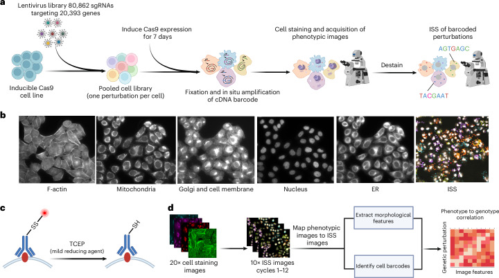
A key challenge of the modern genomics era is developing empirical data-driven representations of gene function. Here we present the first unbiased morphology-based genome-wide perturbation atlas in human cells, containing three genome-wide genotype-phenotype maps comprising CRISPR-Cas9-based knockouts of >20,000 genes in >30 million cells. Our optical pooled cell profiling platform (PERISCOPE) combines a destainable high-dimensional phenotyping panel (based on Cell Painting) with optical sequencing of molecular barcodes and a scalable open-source analysis pipeline to facilitate massively parallel screening of pooled perturbation libraries. This perturbation atlas comprises high-dimensional phenotypic profiles of individual cells with sufficient resolution to cluster thousands of human genes, reconstruct known pathways and protein-protein interaction networks, interrogate subcellular processes and identify culture media-specific responses. Using this atlas, we identify the poorly characterized disease-associated TMEM251/LYSET as a Golgi-resident transmembrane protein essential for mannose-6-phosphate-dependent trafficking of lysosomal enzymes. In sum, this perturbation atlas and screening platform represents a rich and accessible resource for connecting genes to cellular functions at scale.


Conflict of interest statement

Competing interests: C.H.J. and J.Y. are employees of Calico Life Sciences LLC. S.S. and A.E.C. serve as scientific advisors for companies that use image-based profiling and Cell Painting (A.E.C: Recursion, SyzOnc and S.S.: Waypoint Bio, Dewpoint Therapeutics) and receive honoraria for occasional talks at pharmaceutical and biotechnology companies. P.C.B. is a consultant to or holds equity in 10X Genomics, General Automation Lab Technologies/Isolation Bio, Celsius Therapeutics, Next Gen Diagnostics, Cache DNA, Concerto Biosciences, Stately, Ramona Optics, Bifrost Biosystems and Amber Bio. The laboratory of P.C.B. also received research funding from Merck and Genentech for work related to genetic screening. The Broad Institute and MIT may seek to commercialize aspects of this work, and related applications for intellectual property have been filed, including WO2019222284A1 ‘In situ cell screening methods and systems’. The other authors declare no competing interests.

Figures

Fig. 1
Fig. 1. Pooled optical screens with PERISCOPE.
a, The experimental workflow for PERISCOPE screens. b, Example images of five phenotypic stains and fluorescent ISS. c, A schematic of the destaining strategy to enable ISS after fluorescence imaging of phenotypic stains. SS, disulfide linked fluorophore; SH, reduced disulfide linkage. d, An overview of the PERISCOPE analysis pipeline including extraction of phenotypic features, deconvolution of barcodes and genotype–phenotype correlation. Figure created with BioRender.com.
Fig. 2
Fig. 2. Summary of the results from two PERISCOPE screens at the whole-genome scale performed in HeLa cells in two growth media (DMEM and HPLM).
a, A bar graph representing the number of hit genes identified. Green represents hit genes based on individual compartments (ER, mitochondria (mito), actin, DNA and Golgi/membrane) and blue represents hit genes based on the overall profile. b, The distribution of hit genes based on individual compartments (from a). It is possible for a gene to be hit in multiple compartments without being a whole-cell hit, see Extended Data Fig. 4c–f for details. c, Pie charts showing the average normalized fraction of the number of features significantly different from controls in each phenotypic channel for the genes in the indicated set. Filled wedges represent the channel in which the protein products are known to be present. d, The distributions of optical profile correlations between random hit gene pairs (blue) versus correlations between gene pairs in CORUM4.0 protein complexes (red). e, A boxen plot (letter-value plot) representing STRING scores divided into bins based on PERISCOPE profile correlation between gene pairs, n = 1,930 genes for DMEM and n = 1,553 genes for HPLM. The boxen plots display the data as a distribution where the center line represents the median, the central box represents the interquartile range from 25th to 75th percentile and the subsequent boxes represent increasingly narrower quantiles calculated for half of the remaining data. f,g, UMAP embedding of the hit gene profiles from the HeLa DMEM (f) or HPLM (g) dataset. Each dot represents a genetic perturbation and distance implies the correlation of profiles in a two-dimensional embedding. Manual annotation of cluster functions are presented for highlighted clusters based on GO datasets. Example insets show coherent clustering of related genes. h, The distribution of morphological signal scores for essential and nonessential genes (DepMap gene effect at −0.5 threshold) for all perturbations in the HeLa DMEM and HPLM datasets.
Fig. 3
Fig. 3. PERISCOPE identifies media-specific perturbation signatures.
a, Enrichment map for biological processes based on profile signal strength between the HeLa DMEM and HPLM screens. The enrichment map was generated using a preranked GSEA analysis with a list of all genes ordered based on the calculated signal strength as described in methods. The GO: Biological Processes (GO:BP) gene set was employed for the enrichment analysis. Some of the labels and single/double nodes are not shown here for clarity. LSU rRNA, large subunit ribosomal RNA; snRNA, small nuclear RNA. b, A schematic for the generation of comparative diagonally merged heat maps. cf, The heat maps display the Pearson’s correlation between gene profiles from both HeLa screens and are hierarchically clustered using Ward’s method on a single screen, with the sister screen plotted in the same order: we observed gene clusters enriched in both screens (for example, maturation of small subunit RNA (c) and PI3K AKT mTOR signaling (d)), as well as gene clusters enriched only in the DMEM condition (for example, the iron sulfur cluster assembly (e)) or HPLM condition (for example, the cellular response to gamma radiation (f)). The heat maps present hit genes in the GO:BP maturation of the small subunit ribosomal ribonucleic acid (SSU rRNA) gene set (GO:0030490) (c), hit genes in the hallmark PI3K AKT mTOR signaling gene set (d), hit genes in the GO:BP iron sulfur cluster assembly genes set (GO:0016226) (e) and hit genes in the GO:BP cellular response to gamma radiation (GO:0071480) (f).
Fig. 4
Fig. 4. A genome-wide perturbation map in A549 cells.
A summary of the whole-genome PERISCOPE screen performed in A549 cells. a, Hit genes identified in the screen include some single compartment and some impacting multiple compartments in the cell. Green represents hit genes called based on a subset of cell compartments (ER, mitochondria (mito), actin, DNA and Golgi/membrane) and blue represents hit genes called based on the overall profile. b, Hit genes called based on a single compartment are distributed across all five measured compartments. It is possible for a gene to be a hit in multiple compartments without being a whole-cell hit, see Extended Data Fig. 3a,b for more details. c, Distributions of optical profile correlations among all possible gene pairs versus correlations among gene pairs representing CORUM4.0 protein complexes that have at least one-third of complex subunits within hit genes. d, A boxen (letter-value) plot representing STRING scores divided into bins based on PERISCOPE profile correlation between gene pairs, n = 1,089 genes. The boxen plots display the data as a distribution where the center line represents the median, the central box represents the interquartile range from 25th to 75th percentile and the subsequent boxes represent increasingly narrower quantiles calculated for half of the remaining data. e, UMAP embedding of the hit gene profiles from the A549 dataset. Each dot represents a genetic perturbation and distance implies the correlation of profiles in a two-dimensional embedding. Manual annotation of cluster functions is presented for highlighted clusters based on GO datasets. Example insets show the coherent clustering of related genes. f,g, Heat maps representing Pearson correlation between gene profiles after hierarchical clustering using Ward’s method: gene complexes/processes were enriched in the A549 dataset based on the preranked GSEA analysis and show hit genes belonging to the GO:BP microtubule nucleation genes set (GO:0007020) (f) and hit genes belonging to the GO:BP histone modification (GO:0016570) (g).
Fig. 5
Fig. 5. Identifying biological pathways using individual subcellular image features.
a, GO enrichment is found in many individual features in a manner that is fairly evenly distributed across the cellular structures (that is, channels) imaged in PERISCOPE. The outer ring is the total number of features in our feature-selected dataset. The inner ring is the number of features that show GO enrichment. b, GO enrichment in individual features is not distributed evenly across classes of features. The outer ring is the total number of features in our feature-selected dataset. The inner ring is the number of features that show GO enrichment. c, Given gene groups whose protein products are expected to function specifically in a cellular structure imaged in PERISCOPE are specifically enriched in hit lists for features in those compartments. The outer ring indicates the channel in which enrichment is expected. The inner ring is the breakdown of actual channels that show enrichment for the gene group. d, Disruption of the vacuolar ATPase (either V0 or V1 subunit) causes a specific decrease in the screen feature WGA granularity 1, with compensatory increases across larger granularities. Each trace is a single gene. The bold lines are the mean of all genes in the group. Only hit genes are plotted. e, An example visualization of the signal measured at each granularity is shown for a single cell in the WGA channel.
Fig. 6
Fig. 6. TMEM251 is essential for M6P-dependent trafficking of lysosomal enzymes.
a, GSEA of genes preranked by cosine similarity to TMEM251 KO morphology. b, A waterfall plot of the distribution of cosine similarities to TMEM251 morphology. Representative genes involved in glycosylation, trafficking and lysosomal acidification are highlighted. c, TMEM251 localization was examined in cells expressing fluorescent reporter of either GALNT2 (Golgi) or TMEM192 (lysosome) and stained for TMEM251. d, WGA and LAMP1 costaining of cells with KD of genes indicated. See Supplementary Fig. 1 for other perturbations. e,f, Quantification of lysosomal WGA staining after CRISPRi KD of TMEM251, SLC35A2, UNGP2, GNPTAB, WDR7, VPS11, ATP6V1G1, ATP6AP1, ATP6V1E1 (e) and IGF2R and M6PR (f). Plotted are the upper quartiles of median per-cell lysosomal WGA intensity in two biological replicates. g, A box plot of LAMP1–mScarlet fluorescence lifetimes, which correlates with lysosomal pH, for the indicated perturbations. Each point represents the median lifetime of lysosomal fluorescence in an image (n = 30 for GNPTAB and TMEM251; n = 15 for the remaining conditions; boxes and mid-lines indicate Q1, Q2 and Q3, with whiskers marking the data points closest to and within 1.5× (Q3–Q1)). h,i, Log10 fold-changes of glucosylceramidase and beta-galactosidase activity relative to nontargeting controls for the indicated CRISPRi KDs. Each point represents the per-cell total MFI in two biological replicates. The colocalization experiment in c was performed once, with ~150 cells imaged over 20 fields per condition. The confocal images in d are representative of two biological replicates. Statistical analysis: two-tailed t-test versus nontargeting for ei. βGal, beta-galactosidase; LFC, log fold-change; NES, normalized enrichment score.
Extended Data Fig. 1
Extended Data Fig. 1. Example barcode calling based on twelve in-situ cycles.
An example of a group of cells tracked over the twelve cycles of in-situ sequencing to call barcodes. Cells I and II highlight how the signal from fluorescent nucleotides are translated into a barcode read over twelve cycles.
Extended Data Fig. 2
Extended Data Fig. 2. Technical summary of the HeLa whole genome screens.
The distribution for the number of cells per gene and per guide present in the HeLa DMEM (a) and HPLM (b) dataset. (c-d) The distribution of normalized mean intensity in the mitochondrial channel from guide aggregated profiles in HeLa DMEM (c) and HeLa HPLM (d). Every dot overlaid on the boxplots represents a sgRNA (n=4 for guides targeting the TOMM20 gene and n=450 for nontargeting guides). The boxplots display the data as a distribution where the box spans from the first to the third quartile with the median as the center line. The whiskers extend to the maximum range of the distribution within 1.5 times the interquartile range. (e-f) Comparison of the relative abundance of sgRNA barcodes as quantified by NGS or in situ sequencing in HeLa DMEM (R2 = 0.89) (e) and HeLa HPLM (R2 = 0.92) (f), n= 75,000. Comparison of the relative abundance of barcodes as quantified by in situ sequencing among 3 different biological replicates representing individual viral transductions in HeLa DMEM (R1to22 = 0.97, R1to32 = 0.95, R2to32 = 0.96) (g) and HeLa HPLM (R1to22 = 0.97, R1to32 = 0.96, R2to32 = 0.96) (h), n=84,000. The correlation coefficients in (e-h) are calculated using Pearson correlation, and the solid black line represents a linear regression fit of the data, with the shaded region around the regression line indicating the 95% confidence interval calculated using the standard error of the regression.
Extended Data Fig. 3
Extended Data Fig. 3. Number of hits and levels of guide similarity at different false discovery rates for the HeLa DMEM screen.
(a) Bar graph of the number of hit genes identified in the HeLa DMEM screen at different false discovery rates. Green represents hit genes called based on single compartments (ER, Mitochondria, Actin, DNA and Golgi/Membrane) and blue represents hit genes called based on overall gene profile. Detailed description in the methods section. (b) Bar graph of the mean average precision (mAP) for hit perturbations in the HeLa DMEM screen at different false discovery rates. mAP was calculated by scoring each guide's ability to retrieve other guides targeting the same gene from the pool of all non-targeting guides based on cosine similarity and is a measure of phenotypic activity.
Extended Data Fig. 4
Extended Data Fig. 4. Hit genes can be called in multiple channel combinations.
Genes called as hits in the HeLa DMEM (a-b), HeLa HPLM (c-d), and A549 (e-f) screens can be called as hits because of significant perturbation to their whole profile, any individual screen channel, or any combination thereof. Specific combinations without any hit genes are omitted from the bar plots (a,c,e) and whole profile hit information is omitted from the Venn diagrams (b,d,f) for clarity.
Extended Data Fig. 5
Extended Data Fig. 5. Clustering by optical profiles from all hit perturbations from whole genome screens.
Heatmaps representing Pearson’s correlation between gene profiles after hierarchical clustering using Ward's method. The gene profiles come from the hit perturbations from HeLa DMEM (a), HeLa HPLM (b), and A549 (c) datasets. High resolution versions are available at https://github.com/broadinstitute/2022_PERISCOPE.
Extended Data Fig. 6
Extended Data Fig. 6. Hierarchical clustering of high dimensional morphological profiles captures physical interactions and signaling pathway relationships in HeLa DMEM data.
(a) Ribosomal genes show enrichment in clusters that recapitulate known protein complexes as highlighted in the heatmap. Ribosome image created with Biorender. (b) The PI3K/AKT Signaling Pathway forms clusters where the correlation/anti-correlation in morphological profiles recapitulates the known activatory/inhibitory effects of genes, as annotated. Heatmaps are of Pearson’s correlation between gene profiles after hierarchical clustering using Ward's method.
Extended Data Fig. 7
Extended Data Fig. 7. Morphological signal score is not well correlated with gene dependency or baseline gene expression.
Comparison of the distribution of morphological signal scores and gene dependency scores for the HeLa DMEM (a), HeLa HPLM (b) and A549 (c) datasets. The gene dependency score was estimated using DEMETER2 for HeLa cells and DepMap for A549 cells. The dashed red line at −0.5 threshold highlights likely essential genes. Comparison of the distribution of morphological signal scores and gene expression TPM values for genes with TPM value > 0 for the A549 (d), the HeLa DMEM (e) or HeLa HPLM dataset (f). TPM values are inferred from RNA-seq data in DepMap data using the RSEM tool. In all panels, blue points indicate all perturbations, red points compartment hits, and yellow points whole cell hits.
Extended Data Fig. 8
Extended Data Fig. 8. Technical summary of the A549 whole genome screen.
(a) The distribution for the number of cells per gene and per guide present in the A549 dataset (not including nontargeting guides). (b) Comparison of the relative abundance of barcodes as quantified by NGS or in situ sequencing (R2 = 0.84), n=65,000. (c-e) Comparison of the relative abundance of barcodes as quantified by in situ sequencing among 3 different biological replicates representing individual viral transductions (R1to22 = 0.85, R1to32 = 0.85, R2to32 = 0.94), n=80,000. The correlation coefficients in (b-e) are calculated using Pearson correlation, and the solid black line represents a linear regression fit of the data, with the shaded region around the regression line indicating the 95% confidence interval calculated using the standard error of the regression. (f) The distribution of normalized mean intensity in the mitochondrial channel from guide aggregated profiles in the A549 dataset. Every dot overlaid on the boxplots represents a sgRNA (n=4 for guides targeting the TOMM20 gene and n=450 for nontargeting guides). The boxplots display the data as a distribution where the box spans from the first to the third quartile with the median as the center line. The whiskers extend to the maximum range of the distribution within 1.5 times the interquartile range.
Extended Data Fig. 9
Extended Data Fig. 9. Guide representation affects profile strength and similarity in pooled CRISPR screens.
Mean average precision (mAP) was calculated at different representation levels subsampled from Funk et al. by scoring each guide's ability to retrieve other guides targeting the same gene from the pool of all non-targeting guides based on cosine similarity (see Methods for calculation). mAP is a proxy for profile strength and similarity. Highlighted points represent mAP at specified mean guide-level representation from the PERISCOPE datasets for comparison.
Extended Data Fig. 10
Extended Data Fig. 10. Examples of single cell images with strong morphological profiling phenotypes detected in individual channels.
Representative single cell images showing each of the acquired channels, a five-color merge, and cell mask for non-targeting control (a) and five specific perturbations (b-f) from the HeLa DMEM dataset. Representative perturbations from gene sets highlighted in Fig. 2c were selected for having a large number of significantly perturbed features in a specific channel (red box) and therefore showing a strong phenotype by morphological profiling that may or may not be visible by eye. Representative cells are shown with light gray shading in Mask downsample panel and neighboring cells with the same perturbation are shown with dark gray shading.

Update of

References

    1. Doench, J. G. Am I ready for CRISPR? A user’s guide to genetic screens. Nat. Rev. Genet.19, 67–80 (2018). - PubMed
    1. Bock, C. et al. High-content CRISPR screening. Nat. Rev. Methods Primers2, 8 (2022). - PMC - PubMed
    1. Adamson, B. et al. A multiplexed single-cell CRISPR screening platform enables systematic dissection of the unfolded protein response. Cell167, 1867–1882.e21 (2016). - PMC - PubMed
    1. Dixit, A. et al. Perturb-Seq: dissecting molecular circuits with scalable single-cell RNA profiling of pooled genetic screens. Cell167, 1853–1866.e17 (2016). - PMC - PubMed
    1. Datlinger, P. et al. Pooled CRISPR screening with single-cell transcriptome readout. Nat. Methods14, 297–301 (2017). - PMC - PubMed

Substances

LinkOut - more resources