. 2025 Feb;26(2):215-229.
doi: 10.1038/s41590-024-02064-9. Epub 2025 Jan 31.

Temporal profiling of human lymphoid tissues reveals coordinated defense against viral challenge

Affiliations

Temporal profiling of human lymphoid tissues reveals coordinated defense against viral challenge

Matthew L Coates et al. Nat Immunol. 2025 Feb.

Abstract

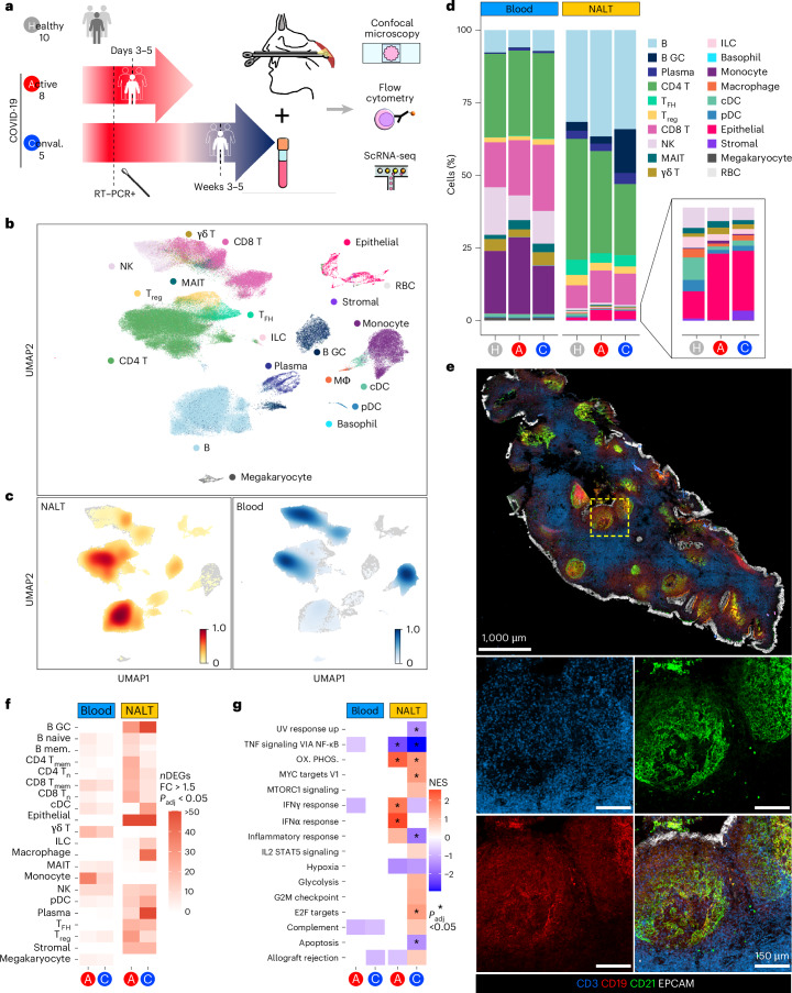
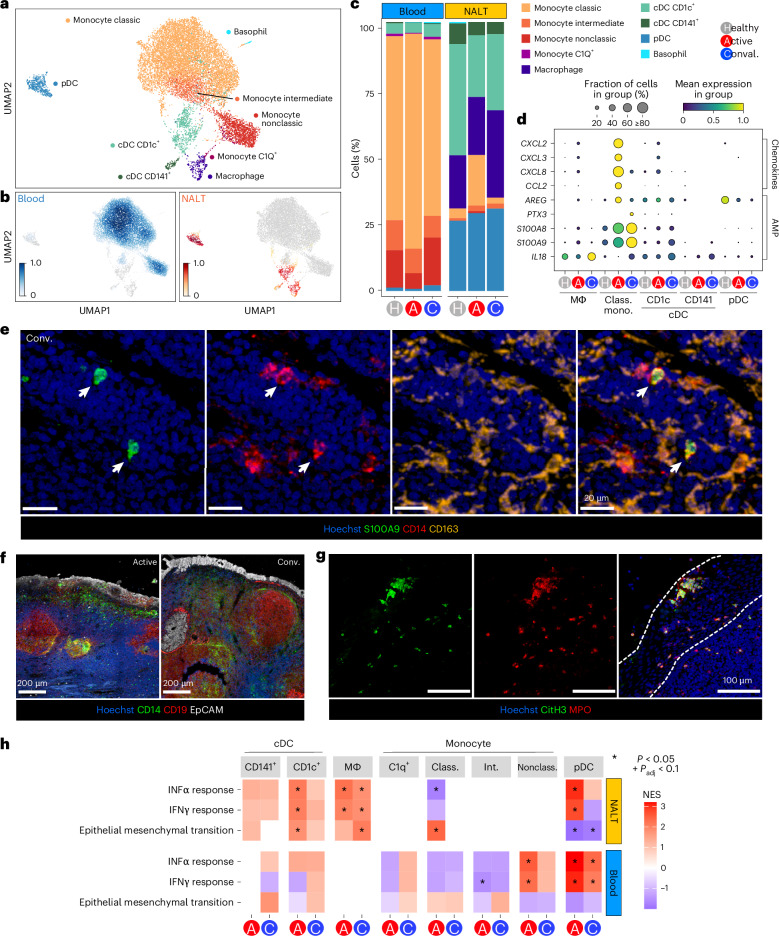
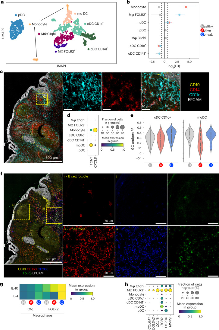
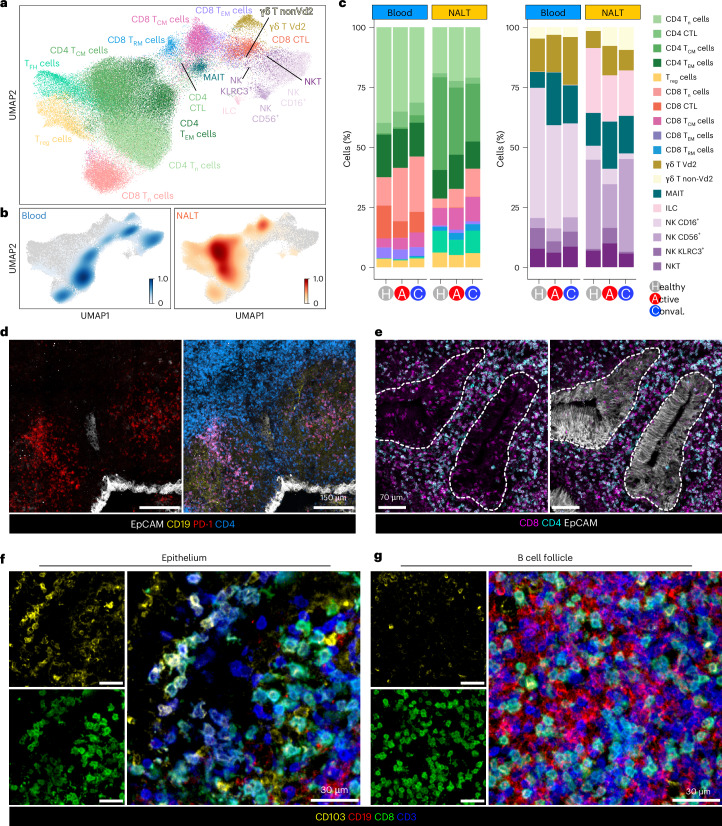
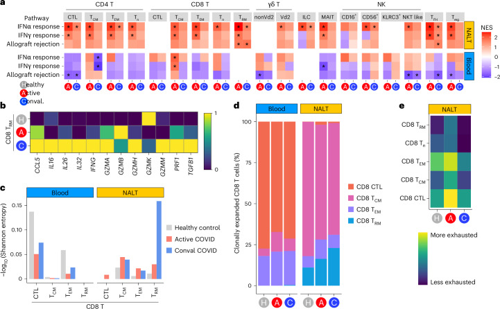
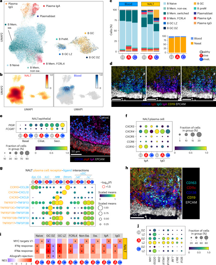
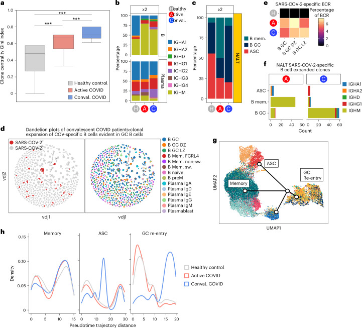
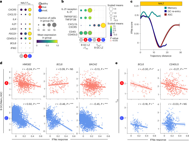
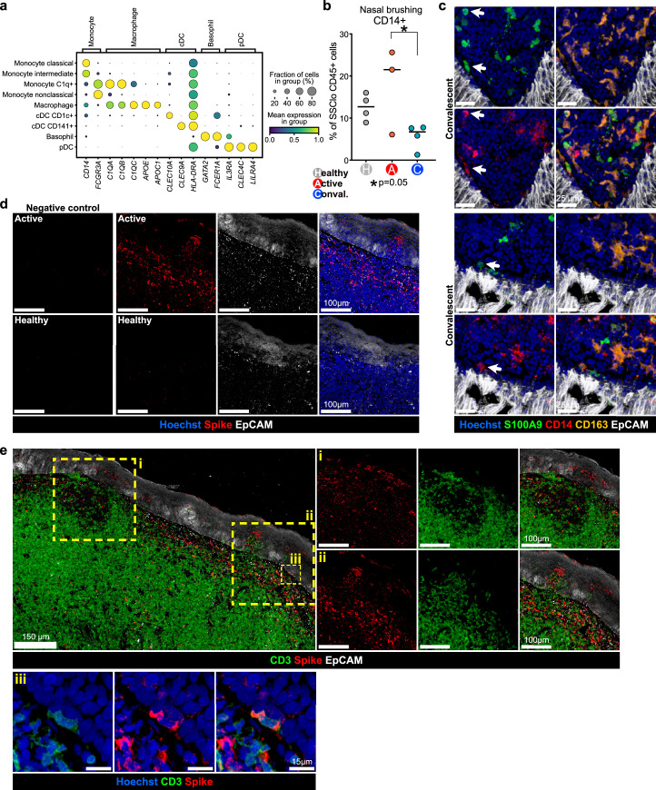
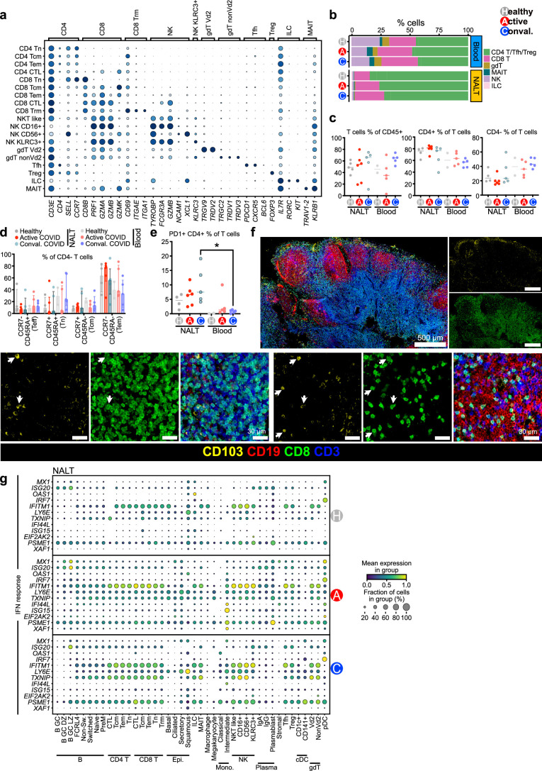
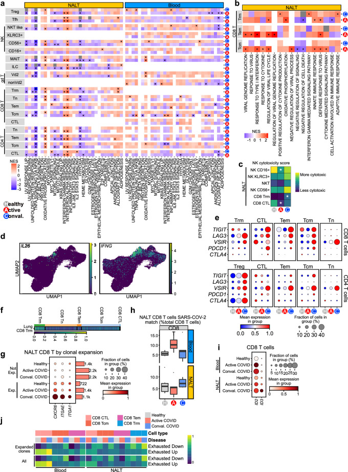
Adaptive immunity is generated in lymphoid organs, but how these structures defend themselves during infection in humans is unknown. The nasal epithelium is a major site of viral entry, with adenoid nasal-associated lymphoid tissue (NALT) generating early adaptive responses. In the present study, using a nasopharyngeal biopsy technique, we investigated longitudinal immune responses in NALT after a viral challenge, using severe acute respiratory syndrome coronavirus 2 (SARS-CoV-2) infection as a natural experimental model. In acute infection, infiltrating monocytes formed a subepithelial and perifollicular shield, recruiting neutrophil extracellular trap-forming neutrophils, whereas tissue macrophages expressed pro-repair molecules during convalescence to promote the restoration of tissue integrity. Germinal center B cells expressed antiviral transcripts that inversely correlated with fate-defining transcription factors. Among T cells, tissue-resident memory CD8 T cells alone showed clonal expansion and maintained cytotoxic transcriptional programs into convalescence. Together, our study provides unique insights into how human nasal adaptive immune responses are generated and sustained in the face of viral challenge.


Conflict of interest statement

Competing interests: The authors declare no competing interests.

Figures

Fig. 1
Fig. 1. Experimental overview and cellular landscape of blood and NALT in SARS-CoV-2 infection.
a, Schematic of experimental design with number of participants and timing of sampling in each group, sample types (paired NALT and peripheral blood) taken from participants and the techniques used to analyze processed samples. Conval., convalescent. b, Uniform Manifold Approximation and Projection (UMAP) of all cells in participants with COVID-19 and healthy controls, with major cell annotations. MΦ, macrophage; γδ T, gamma–delta T cell; RBC, red blood cell. c, UMAP of Scanpy embedding density (scanpy.tl.embedding_density), represented as a scaled Gaussian kernel density estimation, of all cells by sample type. NALT embedding density is shown in orange and blood embedding density in blue. d, Stacked bar charts showing proportional split (as percentage) of NALT and blood samples by cell type and disease type, with nested bar chart showing proportions, by disease type, of nasal NK cells, MAIT cells, γδ T cells, ILCs, monocytes, macrophages, cDCs, pDCs and epithelial and stromal cells. H, healthy control. e, Representative confocal images of a section of a postnasal space biopsy sample in a 19-year-old female from the convalescent COVID-19 group. The yellow dashed box indicates the region magnified in the four boxes in the lower part of the image panel (n = 1). f, Number of DEGs for disease versus healthy control samples in NALT and blood samples by fine cell-type cluster and disease type, where expression fold-change (FC) is >1.5 and Bonferroni’s adjusted P value (Padj) is <0.05. Two-sided Wilcoxon’s rank-sum test was used for computing DEGs. mem., memory. g, Hallmark GSEA of DEGs between disease participants and healthy controls for all (combined) cells by sample type and disease state. Ox. phos., oxidative phosphorylation. NES, normalized enrichment score: *Benjamini–Hochberg Padj < 0.05. NESs were calculated in the fgsea package with P-value estimation using an adaptive, multi-level, split Monte-Carlo scheme.
Fig. 2
Fig. 2. Recruited monocytes and inflammatory DCs form a defensive shield in the subepithelium.
a, UMAP of MNPs reclustered in isolation, with assigned subset cell-type cluster labels shown. b, Scanpy embedding density (Gaussian kernel estimation) UMAP of reclustered MNP subset cell types showing scaled density of cells by sample type (blood or NALT) across the UMAP. NALT embedding density is shown in orange and blood embedding density in blue. c, Stacked bar chart showing proportional representation of MNP cell types in blood and nasal samples by disease status. d, Selected chemokine and antimicrobial peptide-scaled expression in NALT MNP subsets. Class. mono., classical monocyte. The size of the dot indicates the fraction of cells in the group expressing the gene and the color the scaled mean gene expression. e, Representative confocal imaging of section of NALT from a convalescent patient with COVID-19. The white arrowheads highlight the co-expression of S100A9 and CD14 (n = 1). f, Representative confocal imaging of sections of NALT from an active (left) and convalescent (right) patient (n = 2 per group). g, Representative confocal imaging of section of NALT from a patient with active COVID-19. The white dotted lines show the edges of the epithelium (n = 1). h, Heatmap of GSEA Hallmark gene-set enrichment for DEGs in MNP subsets by disease group against healthy control samples. Class., classical; Int., intermediate; Nonclass., nonclassical. The color of the tile shows the NES. Red shows increased gene-set enrichment and blue decreased gene-set enrichment relative to healthy controls, and white or no color shows no enrichment of the gene set. *Statistical significance P < 0.05 and Benjamini–Hochberg’s Padj < 0.1. NESs were calculated in the fgsea package with P-value estimation using an adaptive, multi-level, split Monte-Carlo schemeαγ.
Fig. 3
Fig. 3. Tissue-resident macrophages take on pro-repair phenotype in convalescence.
a, UMAP of NALT MNPs in isolation for participants with COVID-19 and healthy controls reclustered in isolation, with assigned subset cell-type cluster labels shown. b, Proportional difference in abundance of NALT MNP cell types in active COVID-19 (red) and convalescent COVID-19 (blue), relative to healthy controls. Nonsignificant values (P > 0.05) relative to healthy controls, following permutation testing, are shown in gray. The bars indicate the bootstrapped 95% CI. FD, fold distribution. c, Representative confocal imaging of a section of NALT from a convalescent COVID-19 participant. The yellow dashed box indicates a region magnified in the three boxes on the right-hand side (n = 1). d, Dotplot showing expression of FCN1 and CXCL8 in NALT MNP subsets. The size of the point indicates the fraction of cells in each group expressing the corresponding gene and the color the scaled mean expression of the corresponding gene in each named cell-type group. e, Violin plot showing expression of antigen processing and presentation gene ontology (GO) term genes (GO antigen PP) in conventional CD1c+ cDC compared with moDC cell subsets. Each point represents a cell. f, Representative confocal imaging of a section of NALT from a convalescent participant with COVID-19. The yellow dashed boxes indicate the regions magnified in the boxes on the right-hand side (n = 1). g, Heatmap indicating expression of genes associated with IL-4 or IL-10 stimulation in macrophage subsets, calculated as scaled gene-set expression scores using reference IL-10- or IL-4-stimulated macrophage gene sets. h, Dotplot showing NALT MNP expression of COL6A1, COL6A2, CCL18, ITGB2, LILRB4 and MMP9. The size of the point indicates the fraction of cells in each group expressing the corresponding gene and the color the scaled mean expression of the corresponding gene in each named cell-type group.
Fig. 4
Fig. 4. NALT CD8 TRM cells exhibit clonal expansion and prolonged activation.
a, UMAP of T cells and innate lymphocytes from participants with COVID-19 and healthy controls, reclustered in isolation, with assigned subset cell-type cluster labels shown. b, Scanpy embedding density (Gaussian kernel estimation) UMAP of T cells and innate lymphocytes showing scaled density of cells by sample type (blood or nasal) across the UMAP where 1 is a high density of cells of the indicated sample type. c, Stacked bar charts showing proportional representation of CD4 and CD8 T cells (left, paired bar chart) and innate lymphocytes (right, paired bar chart) divided by sample type (blood or NALT) and disease status. d, Representative confocal imaging of subepithelial B cell follicles on a section of NALT from a convalescent COVID-19 participant (n = 1). e, Representative confocal imaging of section of NALT from a convalescent COVID-19 participant (n = 1). f,g, Representative confocal imaging of the epithelium (f) and a B cell follicle (g) on a section of NALT from a convalescent COVID-19 participant. The arrows indicate co-expression of CD8 and CD103 (n = 1).
Fig. 5
Fig. 5. NALT CD8 TRM cells exhibit clonal expansion and prolonged activation.
a, Heatmap of a DEG enrichment of selected GSEA Hallmark gene sets in T cell and innate lymphocyte subsets by COVID status against healthy control samples. The color of the tile shows the NES. Red shows increased gene-set enrichment and blue decreased gene-set enrichment relative to healthy controls. *Statistical significance P < 0.05 and Benjamini–Hochberg Padj < 0.1. b, Scaled heatmap of mean NALT CD8 TRM lymphocyte (CD8 TRH cell) gene expression by disease group, showing selected gene transcripts highly expressed in CD8 TRM cells in active and convalescent COVID-19 participants compared with healthy controls. c, TCR clonality assessment in CD8 T cell subtypes. CD8 T cell TCR diversity is indicated by a Shannon entropy index and shown by cell subset and sample type, in active COVID-19 (red) and convalescent COVID-19 (blue) compared with healthy controls (gray). The Shannon entropy value has been −log10(transformed) so that higher values indicate lower TCR diversity or greater TCR clonality. d, Bar chart showing proportional representation of clonally expanded (clone size ≥2) CD8 T cell subsets in active and convalescent COVID-19 participants compared with healthy controls, as determined by single-cell TCR analysis, split by sample type. e, Heatmap showing expression (calculated as AddModuleScore) of human CD8 T cell viral ‘exhaustion’ signature in NALT CD8 T cell subsets.
Fig. 6
Fig. 6. GC and PC expansion in NALT after COVID infection.
a, UMAP of B cells and PCs from patients with COVID-19 and healthy controls, reclustered in isolation, with assigned subset cell-type cluster labels shown. b, Scanpy embedding density (Gaussian kernel estimation) UMAP of B cells and PCs showing scaled density of cells by sample type. NALT embedding density is shown in orange and blood embedding density in blue. c, Stacked bar chart showing proportional representation of B cells and PCs in blood and NALT samples by disease status. The nested bar chart on the right shows the proportional split of B cells and PCs by disease type and sample type. Mem., memory; non-sw., nonswitched; GC, germinal center; LZ, light zone; DZ, dark zone; preM, prememory. d, Representative confocal imaging of subepithelial space on a section from a convalescent COVID-19 participant (n = 1). e, Dotplot showing PIGR and FCGRT expression in epithelial cell subset populations in NALT by disease state (left) and representative confocal imaging of epithelium on a section from a convalescent COVID-19 participant (right) (n = 1). Ciliat., ciliated; Secr., secretory. f, Dotplot showing selected chemokine receptor expression in PC populations in NALT, split by isotype. g, Dotplot showing CellPhoneDB cell–cell interaction prediction analysis for NALT PCs and ciliated epithelial cells, ILCs, macrophages, cDCs and stromal cells. The size and color of the dot indicate scaled mean, where the mean value refers to the total mean of the individual partner average expression values in the corresponding interacting pairs of cell types. The red dot border highlight indicates significance (−log10(P) > 1.5). The P values were calculated in the CellPhoneDB package using 1,000 permutations. h, Representative confocal imaging of the subepithelial space on a section from a convalescent COVID-19 patient (n = 1). i, Heatmap of DEG enrichment of GSEA Hallmark gene sets in B cell and PC subsets by COVID status against healthy control samples. The color of the tile shows the NES (red is increased gene-set enrichment and blue decreased gene-set enrichment relative to healthy controls), *Statistical significance P < 0.05 and Padj < 0.1. NESs were calculated in the fgsea package with P-value estimation using an adaptive, multi-level, split Monte-Carlo scheme. j, Dotplot showing expression of selected, highly expressed, type I IFN response genes in B cell subsets in NALT. DZ, dark zone; LZ, light zone. In e, f and j, the size of the point indicates the fraction of cells in each group expressing the corresponding gene and the color of the point indicates the scaled mean expression of the corresponding gene in each named cell-type group.
Fig. 7
Fig. 7. Type I IFN response and GC cell fate and progression.
a, Box plot of NALT BCR Gini centrality index, as a measure of B cell clonality, split by disease state. Gini index values are on a scale from 0 to 1, where 1 indicates a monoclonal, highly mutated clonal response and 0, conversely, a polyclonal and unmutated response. Data are shown as box plots (median, box as 25th and 75th percentiles and whiskers as 1.5× the interquartile range). ***P < 0.001, two-sided Wilcoxon’s rank-sum test (n = 10 healthy, n = 8 active, n = 5 convalescent). b, Bar chart showing proportional representation of Ig heavy chain isotypes in expanded NALT BCR clones (clone size ≥2), split by cell type and disease state. c, Bar chart showing proportional representation of memory, GC cells and ASCs in expanded NALT BCR clones. d, Single-cell BCR network plots for convalescent COVID-19 participants. Each circle or node corresponds to a single B cell with a corresponding set of BCR(s). Each clonotype is presented as a minimally connected graph with edge widths scaled to 1 per d + 1 for edge weight d, where d corresponds to the total (Levenshtein) edit distance of BCRs between two cells. The left-hand plot shows SARS-COV-2-specific clones (red) in the context of all B cell clones and the right-hand plot the assigned cell-type labels derived from gene expression data. e, Heatmap showing SARS-COV-2-specific BCRs as a percentage of total sequenced single-cell BCRs in GC B cells, by condition. f, Stacked bar chart showing counts of expanded (≥2) SARS-COV-2-specific B cell clones in NALT, by disease state, cell type and isotype. The x axis shows the cell type and the y axis the count; the color shows the isotype. B mem, memory B cell. g, B lineage cell Slingshot pseudotime trajectories, plotted in UMAP (corresponding to Fig. 6a). The start point is pinned on to B_GZ_LZ (light zone GC, royal blue). h, Cell density map along pseudotime trajectory distance for memory, GC re-entry and ASC lineages, split by disease state. The x axis indicates the pseudotime trajectory distance and the y axis the density of cells.
Fig. 8
Fig. 8. Type I IFN response and GC cell fate and progression.
a, Dotplot showing gene expression in NALT TFH cells, by disease state, of selected core genes associated with TFH cell polarization and function. The size of the point indicates the fraction of cells in each group expressing the corresponding gene and the color of the point the scaled mean expression of the corresponding gene in each disease group. b, Dotplot showing CellPhoneDB cell–cell interaction prediction analysis for NALT light zone GC B cells (B GC LZ) and TFH cells. The size and color of the dot indicate the scaled mean, where the mean value refers to the total mean of the individual partner average expression values in the corresponding interacting pairs of cell types. The red dot border highlight indicates the significance (−log10(P) > 1.5). c, Line graph of type I IFN response gene-set (GSEA Hallmark IFNα response) AddModuleScore in memory, GC and antibody-secreting B lineage cells along a pseudotime trajectory distance for memory, GC re-entry and ASC trajectories (trajectories shown in Fig. 6d). Memory is teal, GC re-entry dark blue and ASC red. d, Scatter plot with linear regression line plotting expression of type IFN response (GSEA Hallmark IFNα response) AddModuleScore against HMGB2, BCL6 and BACH2 expression in GC and memory B cells and PCs. The linear regression line is shown with a shaded area representing the 95% CI. *P < 0.05, **P < 0.01, ***P < 0.001, NS (nonsignificant) P > 0.05. e, Scatter plot with linear regression line plotting expression of the type IFN response (GSEA Hallmark IFNα response) AddModuleScore against BCL6 and CD40L in TFH cells. The linear regression line is shown with a shaded area representing the 95% CI. *P < 0.05, **P < 0.01, ***P < 0.001, NS P > 0.05.
Extended Data Fig. 1
Extended Data Fig. 1. Experimental overview and cellular landscape of blood and NALT in SARS-CoV-2 infection.
a, Endoscopic nasal view during an office-based postnasal space biopsy procedure in an awake human subject under topical local anaesthesia. Tilley-Henkel forceps are seen towards the bottom of the image. b, Boxplot of subject reported experience data during stages of local anaesthetic NALT biopsy procedure in 15 subjects. Median score represented by line, with red diamond showing mean score. c, Expression of canonical markers by assigned cell type label. Horizontal axis shows assigned broad cell labels, with genes grouped by canonical expression groups on vertical axis. Dot size shows percentage of gene expression by cells in group, with colour indicating normalised mean gene expression by cells in group. d, Stacked barplots showing cell type proportions by subject, condition and sample type. e, Serial boxplot showing cell type proportions by disease state, plotted by subject and sample. f, UMAP of scANVI integration of data and cell type labels from this paper with adult inferior turbinate and bronchial brushing data in SARS-CoV-2 subjects and controls previously published. g, Proportional representation of airway sample data from e presented by sampling location and predicted cell type following scANVI integration. Cell type percentages are of total cells by sample location. h, Scanpy embedding density UMAP showing showing density of cells by sampling location on UMAP projection in e. Cell numbers by sample location are printed in the bottom right of the projection.
Extended Data Fig. 2
Extended Data Fig. 2. MNPs contribute to lymphoid tissue defence and repair.
a, Expression of canonical markers by assigned MNP cell label for MNP cell subset. Vertical axis shows assigned broad cell labels, with genes grouped by canonical expression groups on horizontal axis. Size of point indicates fraction of cells in each group expressing corresponding gene, colour of point indicates scaled mean expression of corresponding gene in each named cell type group. b, Flow cytometry on inferior turbinate nasal brushing showing % of CD14+ cells in SSClo CD45+ live single cells. Each point represents a subject. Horizontal lines indicate median value. * p = 0.05 (Tukey HSD test). c, Confocal imaging of section of NALT from a convalescent COVID-19 subject. White arrowheads highlight co-expression of S100A9 and CD14. Related to Fig. 2e. n = 1. d, Representative confocal imaging of section of NALT from a healthy control and an active COVID-19 subject. n = 1 each. e, Confocal imaging of section of NALT from an active COVID-19 subject with indicated regions shown at higher magnification. n = 1.
Extended Data Fig. 3
Extended Data Fig. 3. Monocytes localize at the subepithelium during acute SARS-COV-2 infection.
a, Example of subepithelial marking strategy used in b-c. A 25 pt intensity thresholder has been applied to CD14 staining. Epithelium marked in dotted red line using EpCAM staining with fixed subepithelial area width marked in yellow dotted line. b, Barplot showing comparison of CD14+ staining in samples from c as a percentage of subepithelial region. c, Confocal imaging of sections of NALT from two separate healthy controls and active COVID-19 subjects. d, Slingshot pseudotime trajectories for MNP subset cell types, plotted in UMAP space. Black lines indicate Slingshot lineage trajectories, starting from Classical monocyte cluster. e, Heatmap showing all significantly enriched Hallmark pathways in MNP cell types following Gene set enrichment analysis of differentially expressed genes between COVID-19 disease groups and healthy control subjects. Only pathways containing at least one significant enrichment (p < 0.05 and Benjamini-Hochberg adjusted p value < 0.1) in MNP cell types are shown. Colour indicates normalised enrichment score (NES), with red indicating greater pathway enrichment in disease group compared with healthy controls, and blue indicating increased pathway enrichment in healthy controls than disease group.
Extended Data Fig. 4
Extended Data Fig. 4. Tissue resident macrophages take on pro-repair phenotype in convalescence.
a, Expression of canonical markers by assigned nasal MNP subset cell label. Horizontal axis shows assigned broad cell labels, with genes grouped by canonical expression groups on vertical axis. Size of point indicates fraction of cells in each group expressing corresponding gene, colour of point indicates scaled mean expression of corresponding gene in each named cell type group. pDC, plasmacytoid Dendritic Cell; Mφ, macrophage, moDC, monocyte-derived DC; cDC, conventional DC. b, Representative confocal imaging of section of NALT from a convalescent COVID-19 subject. Related to Fig. 3f. n = 1. c, Heatmap showing expression of genes associated with macrophage polarisation in all MNP subset cell types, split by disease type and sample type, calculated as scaled geneset expression scores (AddModuleScore) using reference experimentally derived macrophage stimulation gene-sets. Stimulation agent used for each gene-set shown on y-axis label, in correspondence to the original publication. Inflam., Inflammatory; FA, Fatty Acids. d, Column scatter graph showing percentage of CD206+ cells in live CD45 + CD14+ cells as determined by flow cytometry in blood, NALT and inferior turbinate nasal brushing samples. *, p(adj)<0.05 (Tukey HSD).
Extended Data Fig. 5
Extended Data Fig. 5. Temporal characterization of T cells and innate-like lymphocytes.
a, Expression of canonical markers by assigned nasal T/innate lymphocyte subset cell label. Vertical axis shows assigned broad cell labels, with genes grouped by canonical expression groups on horizontal axis. Size of point indicates fraction of cells in each group expressing corresponding gene, colour of point indicates scaled mean expression of corresponding gene in each named cell type group. b, Stacked barcharts showing combined proportional representation of CD4 T cells, CD8 T cells and innate lymphocytes, grouped into broad cell type categories and split by sample type and disease status. c, Grouped scatter plot of T cell proportions, as determined by flow cytometry, split by disease type and sample type. Left, percentage of T cells in live CD45+ cells; center and right, percentage of CD4+ (centre) and CD4- (right) T cells. Each point represents an individual subject sample. Lines represent group median value. d, Grouped scatter and bar plot showing percentage T cell subsets based on CCR7 and CD45RA expression assessed by flow cytometry. Each point represents an individual subject sample. Bars represent median values, with lines showing interquartile range. Teff, T effector; Tn, T naïve; Tcm, T central memory; Tem, T effector memory. e, Grouped scatter plot showing percentage of CD4 + PD1 + T cells by tissue and condition. Each point represents an individual subject sample. Lines represent group median value. *, adjusted p < 0.05 (Šidák multiple comparisons test). f, Representative confocal imaging of section of NALT from a convalescent COVID-19 subject with higher magnification shown below. Related to Fig. 4f, g. n = 1. g, Scaled expression of selected leading edge genes in NALT cell types that were enriched in Hallmark Interferon Alpha Response and Hallmark Interferon Gamma Response (IFN Response) gene sets following gene set enrichment analysis of differentially expressed genes in COVID-19 subjects compared with healthy controls. Size of point indicates fraction of cells in each group expressing corresponding gene, colour of point indicates scaled mean expression of corresponding gene in each named cell type group. Epi, Epithelial; Mono., Monocyte.
Extended Data Fig. 6
Extended Data Fig. 6. Clonally expanded NALT CD8 Trm cells show prolonged activation.
a, Heatmap showing all all significantly enriched Hallmark pathways in T/innate lymphocyte cell types following gene set enrichment analysis of differentially expressed genes between COVID-19 disease groups and healthy control subjects. Only pathways containing at least one significant enrichment (p < 0.05 and Benjamini-Hochberg adjusted p value < 0.1) in T cell types are shown. Colour indicates normalised enrichment score (NES), with red indicating greater pathway enrichment in disease group compared with healthy controls, and blue indicating increased pathway enrichment in healthy controls than disease group. Results are split by sample type (NALT/Blood). b, Selected significantly enriched Gene Ontology (GO) terms in NALT CD8 T cell memory subsets, following Geneset Enrichment Analysis of differentially expressed genes in COVID-19 disease states compared with healthy controls. NES, Normalised Enrichment Score, *, p value < 0.05 + Benjamini-Hochberg adjusted p value < 0.1. c, Heatmap showing Gene-set scoring (AddModuleScore) of KEGG Natural killer cell mediated cytotoxicity gene set in NALT CD8 T and NK cell subsets. *, p value < 0.05. d, UMAP showing expression of IL26 and IFNG within subset re-clustered T/innate lymphocyte UMAP. Scale bars indicate level of gene expression. e, Dotplot showing expression of canonical T cell exhaustion marker genes in CD4 and CD8 T cell subsets. Size of point indicates fraction of cells in each group expressing corresponding gene, colour of point indicates scaled mean expression of corresponding gene in each named cell type group. f, Heatmap of single cell transcriptomic data showing enrichment of human lung CD8 Trm signature in CD8 T cell subsets by assigned label. g, Single cell gene expression dotplot of NALT CD8 T cells showing expression of canonical CD8 Trm marker genes by disease type and clonal expansion status, with expanded clones of size >=2. Bars to right of plot indicate absolute number of cells in each group. h, Boxplot showing GLIPH2 identified SARS-CoV-2 specific CD8 T cells, as a proportion of total CD8 T cell population by subject and sample type and plotted by disease status. SARS-COV-2 cells were identified through TCRb similarity matching with MHC-I identified SARS-COV-2 reactive T cell sequences in the ImmunoCODE and VDJdb databases. i, Single cell gene expression dotplot of all CD8 T cells showing selected short- and long-term memory associated genes by disease type and sample type location. j, Heatmap showing enrichment of Human HIV exhaustion signatures split by cell type, sample type, disease type and clonal expansion (TCR clone size ≥2) status. Exhausted Up indicates genes upregulated in exhausted vs non-exhausted CD8 T cells and Exhausted Down indicated genes downregulated in exhausted vs non-exhausted CD8 T cells. Top two rows indicate cell type and disease status for each column.
Extended Data Fig. 7
Extended Data Fig. 7. Local anti-viral germinal centre response in NALT.
a, Expression of canonical markers by assigned B lymphocyte subset cell label. Vertical axis shows assigned broad cell labels, with genes grouped by canonical expression groups on horizontal axis. Size of point indicates fraction of cells in each group expressing corresponding gene, colour of point indicates scaled mean expression of corresponding gene in each named cell type group. b, UMAP showing gene set enrichment score (AddModuleScore) of experimentally derived Germinal centre B cell signatures in germinal centre B cell clusters. c, Single cell gene expression matrixplot of germinal centre B cell light zone (B_GC_LZ) and dark zone (B_GC_DZ) labelled cells, showing relative enrichment of experimentally derived mouse (2010) and human (2012) light zone (LZ) and dark zone (DZ) germinal cell B cell specific cell signatures. d, Grouped scatter plot showing percentage of CD19+ cells in live CD45+ cells, as determined by flow cytometry. Each point represents an individual subject sample. Lines show group median value. Data is divided by disease and sample type. *, p < 0.05 (Wilcoxon test). e, Grouped scatter and bar plot of CD19+ cell subpopulation proportions by IgD and CD27 expression, as determined by flow cytometry. Each point represents an individual subject sample. Bars represent median values, with lines showing interquartile range. NSw Mem, Non-switched memory; Sw. Mem, Switched memory. f-g, Representative confocal imaging of section of NALT from a convalescent COVID-19 subject (f) with higher magnification for three of the markers (g). n = 1. h, Dotplot showing selected chemokine expression across NALT Epithelial cells, ILCs, Macrophages (MΦ), Stromal cells and conventional dendritic cells. Size of point indicates fraction of cells in each group expressing corresponding gene, colour of point indicates scaled mean expression of corresponding gene in each named cell type group.
Extended Data Fig. 8
Extended Data Fig. 8. V(D)J rearrangement and selection in NALT.
a, Heatmap showing all significantly enriched Hallmark pathways in B lymphocyte/plasma cell types following gene set enrichment analysis of differentially expressed genes between COVID-19 disease groups and healthy control subjects. Only pathways containing at least one significant enrichment (p < 0.05 and Benjamini-Hochberg adjusted p value < 0.1) in B cell types are shown. Colour indicates normalised enrichment score (NES), with red indicating greater pathway enrichment in disease group compared with healthy controls, and blue indicating increased pathway enrichment in healthy controls than disease group. Results are split by sample type (NALT/Blood). b, Density plot of BCR junction length in light zone and dark zone germinal centre B cells, split by condition. Vertical lines indicate mean junction length for each disease group.
Extended Data Fig. 9
Extended Data Fig. 9. Local production of anti-SARS-COV-2 antibodies in NALT following infection.
a, Schematic summarising the strategy for identifying SARS-COV-2 specific B cells from the single cell CDR3-L and CDR3-H sequences shared with CoV-AbDab. b, Enriched CD3-heavy chain motifs between Cov-AbDab and B cells from Active/Conval COVID-19 subjects. c, Stacked bar plot showing proportional split by isotype of expanded (clone size >=2) SARS-COV-2 specific B cell clones by disease state. d, UMAP showing SARS-COV-2 specific B cell clones plotted using co-ordinates from B/Plasma UMAP seen in Fig. 6a. Cells forming part of expanded BCR clones (clone size >=2) are shown in dark red, with clonally unexpanded SARS-COV-2 specific B cells shown in pink. e, Stacked barplot showing absolute numbers of SARS-COV-2 specific B cells identified by both Gliph2 and Levenschtein distance heavy chain matching with CDR3 sequences from Cov-AbDab11 presented by sample type, disease type and assigned cell type label. f, Stacked barplot showing proportional representation of isotypes in SARS-COV-2 specific B cells from Convalescent COVID-19 subecjts, identified by both Gliph2 and Levenschtein distance heavy chain matching with CDR3 sequences from Cov-AbDab.
Extended Data Fig. 10
Extended Data Fig. 10. Type I interferon may inhibit the progression of the GC reaction during infection.
a, Violin plot of per-cell transcriptomic entropy for B cells by subset cell type label. b, Boxplot of enrichment of a T cell activation signature induced by controlled SARS-COV-2 infection in T cells from NALT and peripheral blood by disease status. Two sided significance is indicated by *. c, Single cell gene expression dotplot showing expression of selected inhibitory and lymphoid homing receptors in T regulatory cells by sample type and disease status. d, Extended figures from Fig. 6k, showing plots split by cell type and disease type for interferon alpha response scores plotted against expression of HMGB2 (upper left), BCL6 (upper right), and BACH2 (lower left). Linear regression line is shown with a shaded area representing the 95% confidence interval. r, Pearson correlation statistic; p, p-value. *, p < 0.05; **, p < 0.01; ***, p < 0.001; ns, p > 0.05. e, Dotplot showing expression of genes shown in Fig. 8d in NALT germinal centre B cells, split by cell type and disease type. Size of point indicates fraction of cells in each group expressing corresponding gene, colour of point indicates scaled mean expression of corresponding gene in each cell type and disease group.

References

    1. Liu, Y. J., Zhang, J., Lane, P. J., Chan, E. Y. & MacLennan, I. C. Sites of specific B cell activation in primary and secondary responses to T cell-dependent and T cell-independent antigens. Eur. J. Immunol.21, 2951–2962 (1991). - PubMed
    1. Han, S. et al. Cellular interaction in germinal centers. Roles of CD40 ligand and B7-2 in established germinal centers. J. Immunol.155, 556–567 (1995). - PubMed
    1. Linterman, M. A. et al. IL-21 acts directly on B cells to regulate Bcl-6 expression and germinal center responses. J. Exp. Med.207, 353–363 (2010). - PMC - PubMed
    1. Victora, G. D. et al. Germinal center dynamics revealed by multiphoton microscopy with a photoactivatable fluorescent reporter. Cell143, 592–605 (2010). - PMC - PubMed
    1. Gitlin, A. D., Shulman, Z. & Nussenzweig, M. C. Clonal selection in the germinal centre by regulated proliferation and hypermutation. Nature509, 637–640 (2014). - PMC - PubMed