. 2025 Apr;640(8057):165-175.
doi: 10.1038/s41586-024-08548-w. Epub 2025 Feb 12.

Learning produces an orthogonalized state machine in the hippocampus

Affiliations

Learning produces an orthogonalized state machine in the hippocampus

Weinan Sun et al. Nature. 2025 Apr.

Abstract

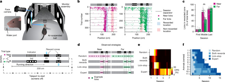
Cognitive maps confer animals with flexible intelligence by representing spatial, temporal and abstract relationships that can be used to shape thought, planning and behaviour. Cognitive maps have been observed in the hippocampus1, but their algorithmic form and learning mechanisms remain obscure. Here we used large-scale, longitudinal two-photon calcium imaging to record activity from thousands of neurons in the CA1 region of the hippocampus while mice learned to efficiently collect rewards from two subtly different linear tracks in virtual reality. Throughout learning, both animal behaviour and hippocampal neural activity progressed through multiple stages, gradually revealing improved task representation that mirrored improved behavioural efficiency. The learning process involved progressive decorrelations in initially similar hippocampal neural activity within and across tracks, ultimately resulting in orthogonalized representations resembling a state machine capturing the inherent structure of the task. This decorrelation process was driven by individual neurons acquiring task-state-specific responses (that is, 'state cells'). Although various standard artificial neural networks did not naturally capture these dynamics, the clone-structured causal graph, a hidden Markov model variant, uniquely reproduced both the final orthogonalized states and the learning trajectory seen in animals. The observed cellular and population dynamics constrain the mechanisms underlying cognitive map formation in the hippocampus, pointing to hidden state inference as a fundamental computational principle, with implications for both biological and artificial intelligence.


Conflict of interest statement

Competing interests: The authors declare no competing interests.

Figures

Fig. 1
Fig. 1. Mice exhibit systematic behavioural strategy changes when learning the 2ACDC task.
a, Diagram of the virtual reality behavioural setup (top) and illustration of the task (bottom). The diagram of the virtual reality behavioural setup was created by J. Kuhl. b, Example lick patterns of a single mouse across sessions for both the near (magenta) and far (green) trial types. Each dot represents a single lick within a trial, and the dashed lines indicate separation between daily sessions. c, Percentage of licks at the correct reward locations for both the near and the far trial types for the first session, an intermediate session and the last session in which the mice show expert performance (n = 11 mice; **P = 0.004, two-sided, paired Student’s t-test; bar graph showing mean ± s.e.m.). d, Illustration of four different behavioural strategies that mice exhibit during learning. The coloured shadings denote the non-zero regions within the basis functions for regression against licking density across track locations. e, Coefficients of partial determination (CPDs) for the four behavioural strategies for one example mouse. f, Dominant strategy for all mice over sessions (ranked by learning speed). The asterisk denotes the mouse shown in e. The values in e,f are calculated by splitting each session into two parts of equal duration (start and end). For the number of sessions per strategy (mean ± s.e.m.), 1.9 ± 0.7 (random), 2.0 ± 2.5 (both rewards), 3.3 ± 2.8 (lick–stop) and 3.6 ± 0.5 (expert). Source Data
Fig. 2
Fig. 2. Progressive decorrelation of neural activity during learning.
a, Diagram of the CA1 imaging implant. The diagram of the CA1 imaging implant was created using BioRender (https://biorender.com). b, Example field of view, cell segmentations and extracted fluorescent signals. The cyan dashed lines mark the boundary between individual scanning stripes. Similar imaging and segmentation quality were observed across all 11 mice. c, Trial-averaged neural activity versus track position for both the near and the far trials on session 2 in a representative mouse (mouse 7 in Fig. 1f). Cells ordered by the centre of mass of the largest place field by indicated trial type (top) and cells ordered by the opposite trial type (bottom) are shown. Dashed lines mark the boundaries of indicator and reward cues. d, Similar to c, but for session 9 of the same mouse. e, Near-versus-far population vector (PV) cross-correlation matrices along track positions for sessions 1, 2, 3, 4 and 9 for the same example mouse. f, PV correlation averaged for different regions on the cross-correlation matrix across sessions, for off-diagonal grey region correlations (grey), pre-R2 region (light blue), pre-R1 region (dark blue), initial region (red), indicator region (orange) and end region (cyan) shown for each mouse and averaged across all mice. Dashed lines in the matrix mark the boundaries of indicator and reward cues. The curves represent mean values, with shading indicating s.e.m. Comparing all sessions showed significant difference between pre-R1 and pre-R2 regions (two-sided Wilcoxon signed-rank test, ***P = 9.96 × 10−5, 97 total sessions from 11 mice). Comparisons between the first and the last session revealed significant changes in pre-R2, pre-R1, indicator (decreasing) and initial regions (increasing; ***P < 0.001; n = 11 mice). For the off-diagonal region, a significant decrease in correlation was observed (**P = 0.002; n = 11 mice). Changes in the end region were not significant (NS). g, 3D UMAPs and state diagrams of the neural manifold across learning for the five sessions and the same example mouse in e, with 2D views chosen to best illustrate learning dynamics captured by the 3D structure. Track diagrams for near and far trials (similar to Fig. 1a) are shown (cf) for readability of the graphs. Source Data
Fig. 3
Fig. 3. Single-cell tuning changes during learning.
a, Positional tuning for four example cells tuned to grey regions across near trials during stage 1–2 transition (first three sessions; top), and the cumulative percentage of the spatial dispersion index for grey region-tuned cells in near trials, session 1 versus session 3 (bottom; plot showing mean ± s.e.m., two-sided Wilcoxon rank-sum test, ***P < 1 × 10−6; n = 11 mice). b, Session-averaged activity for near or far trials across nine sessions for two pre-R2-tuned cells (top), and the cumulative percentage of ΔF/F0 difference in pre-R2 between trial types for tuned cells, sessions 1 versus 9 (bottom; plot showing mean ± s.e.m., two-sided Wilcoxon rank-sum test, ***P < 1 × 10−6; n = 11 mice). c, Similar to b for the pre-R1 region (plot showing mean ± s.e.m., ***P < 1 × 10−6; n = 11 mice). d, Correlation coefficient versus difference score scatter plot for cells with activity of more than 2 s.d. above the mean in the expert session. The x axis indicates the near–far correlation coefficient, and the y axis denotes the difference score D = |A_near − A_far|/max(A_near, A_far), in which A_near and A_far are peak neural activities in near and far trials. Example cells were manually selected and colour-coded based on their relative location within the plot. eg, Trial-averaged tuning curves for near (magenta) and far (green) trials for example cells from d, labelled by tuning phenotype. h, Scatter plots (left) showing learning progression (novice, intermediate and expert) for cells with maximum tuning in the initial or end regions (grey), indicator region (red), and reward or pre-reward regions (cyan), and normalized density plots (right) across mice for each track-segment-tuned population. i, Percentage of place cell and place-splitter cell (P/P-S), splitter cell (S) and remapping splitter cell (RS) responses across training (categorized by correlation = 0.2, difference score = 0.5 thresholds; mean ± s.e.m.; n = 11 mice). j, Distribution of response types along track regions at the expert stage (mean ± s.e.m.; n = 11 mice). Track diagrams for near and far trials (similar to Fig. 1a) are shown (ac,h) for readability of the graphs. Source Data
Fig. 4
Fig. 4. Representational structure during learning for mice and different models.
a, HMM diagram showing latent states and transition probabilities with fixed emission probabilities. b, CSCG diagram with 100 clones per sensory symbol. c, Final transition graph of the CSCG trained on the 2ACDC task, showing distinct latent states and their sensory inputs. Coloured circles indicate specific track regions similar to Fig. 2g. d, CSCG (top) and CA1 (bottom) cross-correlation matrices between near and far trials during learning (the CA1 data are the same as Fig. 2e; sessions 1, 3, 4 and 9). Track diagrams for near and far trials (similar to Fig. 1a) are shown for readability of the graphs. e, RNN diagram showing sensory input processing (X(t)) through recurrent units, which produce the hidden state Y(t), to predict next input (X^(t + 1)). f,g, Final correlation matrices for near versus far trial representations across models. Polynomial softmax uses 8th power normalization. h, Schematic showing how correlated high-dimensional activity (green and red vectors) can yield orthogonal outputs through readout projection (yellow plane). i, Mean final correlation matrix quantification across mice (n = 11) and models (independent simulations runs: n = 20 (CSCG), n = 10 (Hebbian-RNN), n = 42 (vanilla RNN exponential softmax), n = 47 (polynomial softmax), n = 10 (rectified linear (ReLU)), n = 10 (LSTM) and n = 10 (transformer); two-sided unpaired Student’s t-tests with Bonferroni correction for multiple comparisons). j, Time for key regions to reach correlation threshold (0.3), normalized to training duration. Data from model runs (n = 18 (CSCG), n = 8 (Hebbian-RNN), n = 15 (vanilla RNN exponential softmax) and n = 39 (polynomial softmax)) and mice (n = 11 mice; two-sided paired Student’s t-tests without correction for multiple comparisons). The bar graphs in i,j show mean ± s.e.m.; *P < 0.05, **P < 0.01 and ***P < 0.001. Source Data
Fig. 5
Fig. 5. State machines can be flexibly used in novel settings.
a, Original and novel indicator pairs. b, Number of trials required to reach high performance (75% or more correct licking) for each indicator pair. For original indicators, n = 3 mice; for novel indicators, n = 11 training periods across the same 3 mice; *P = 0.039, two-sided unpaired Student’s t-test. The bar graphs show mean ± s.e.m.; the dots represent individual training periods. c, PV cross-correlation between the neural activity for trials with the original and new indicators for the same trial type (near (top left) and far (top right)), and between near and far trials for the new indicators (bottom left). Quantification of the diagonal cross-correlations in three cross-correlation matrices (line and shading indicate mean ± s.e.m.; n = 3 mice) is also shown (bottom right). d, Conceptual diagram for the incorporation of new indicator states into an existing state machine. e, Place field locations in the stretched near trials plotted against those in the regular near trials (n = 3 mice, data pooled together). The histograms of field locations in the two stretched regions are plotted to the right (line and shading indicate mean ± s.e.m.; n = 3 mice). f, Similar to e but for the far trials. Track diagrams for near and far trials (similar to Fig. 1a) have been added to c,e,f. Source Data
Extended Data Fig. 1
Extended Data Fig. 1. Changes in licking behavior and speed during learning across all animals.
(a) Each dot indicates a single lick made by an animal relative to its position on the track in either a ‘near’ (magenta) or ‘far’ trial type (green). Horizontal dashed lines indicate the end of a session. Blue and red shading denote correct and incorrect licking zones, respectively. (b) Spatially binned speed profiles of all animals across training sessions during ‘near’ and ‘far’ trial types. Vertical dashed lines indicate the location of the indicator and reward cues. ‘A4’, ‘A5’… denote animal nicknames.
Extended Data Fig. 2
Extended Data Fig. 2. Overview of imaging alignment across sessions.
(a) Left, schematic view of the alignment steps for registering the field-of-view across imaging sessions. Right, the axis that can be controlled in each alignment step. (b) Headbar alignment, focused light from a guide LED was projected through the optical path and reflected of the cover glass in the implanted canula. The position of the resulting spot on the camera sensor was used to ensure consistent alignment relative to the cover glass. (c) Image plane alignment. (left) A reference image z-stack was taken on day 1 of training. (right) The heigh, tip, and tilt of the imaging surface was adjusted on each day to achieve optimal alignment to the reference stack. (d) Example image of the field-of-view on day 1 from same animal shown in e. Dashed lines indicate the location of the imaging stripes (see Methods). (e) Heatmap of the remaining z error after alignment. (f) Online motion correction. (left) Locations of the left (orange), center (purple), and right (green) imaging stripes. (right) Online adjustment of individual imaging stripe positions during an example recording. (g) Example of post hoc registration. (left) Magnitude of elastic, non-rigid, deformation across the field-of-view. (right) Amount of deformation in x and y. (h) Location of ROIs shown in i. (i) Result of post hoc registration step. Each row shows a single ROI comparing the image on day 1 to that of day 2, 5, or 10. Third and fourth column shows the overlay of the two images with day 1 in green and the comparison day in magenta both before and after registration. Note that the outline of the cells now overlap (white pixels) indicating that the same cells can be monitored across days. Similar alignment and registration results were obtained across all 11 mice.
Extended Data Fig. 3
Extended Data Fig. 3. Identification of consistent cell masks across imaging sessions.
(a) Schematic of computational pipeline. (left) Activity-based cell mask extraction is performed for each individual session using Suite2p (see Methods). (center) The overlap between identified cell masks across all imaging sessions after registration was calculated and used to perform hierarchical clustering. The resulting clusters are used to calculate a single ‘template’ cell mask based on the median of present pixels across all sessions. Cell mask clusters that were not detected in the majority of sessions, or whose template mask was too small, were discarded (see Methods for additional details). (right) The template masks were projected back to the spatial reference frame of each individual imaging session and used for calcium trace extraction. (b) Example of clustered cell masks across imaging sessions. (c) Resulting cell mask templates of the same cells shown in b. (d) Same cropped region around example cells across multiple sessions. Last column is final recording session (day 26). Cells can be tracked stably across weeks. (e) Map of all detected cells and how often they were detected across sessions. Observability was not affected by location in the field-of-view. Note that we rejected cells residing within 25 µm of the boundaries between scanning stripes. (f) Histogram of the percentage of spatial overlap of clustered cell masks with their resulting template mask averaged across animal (mean ± s.d., n = 11 animals). (g) Average variability in the center of clustered cell masks for all animals (box plots: center line, median; box limits, 25th and 75th percentiles; whiskers, range, n = 11 animals). (h) Histogram of observed detection rates of clustered cell masks as percentage of all sessions averaged across animals (mean ± s.d., n = 11 animals). Red line indicates the used inclusion threshold detection rate (50%) for all further analysis. (i) Relationship between cell detection rate and a cell activity score determined as the averaged deconvolved fluorescence signal across all sessions. Histogram values are averaged across all animals (mean ± s.d., n = 11 animals).
Extended Data Fig. 4
Extended Data Fig. 4. Near vs Far trial cross-correlation matrices for all 11 animals through all training sessions.
Animals are ordered by the number of cells registered across sessions.
Extended Data Fig. 5
Extended Data Fig. 5. Changes in PV angle mirror the progressive decorrelation dynamics.
(a) Top: Near-versus-Far PV Cross-correlation matrices along all track positions for sessions 1, 2, 3, 4, 9 for an example animal. Bottom: Near-versus-Far PV angle matrices along all track positions for the same animal. (b) PV angle averaged for different regions on the angle matrix across sessions, for the off-diagonal gray region correlations (gray), pre-R2 region (light blue), and pre-R1 region (dark blue), Initial region (red), Indicator region (orange), End region (cyan) shown for each animal separately and averaged across all of them. Comparing all sessions, a significant difference was observed between the pre-R1 and pre-R2 regions (two-sided Wilcoxon signed-rank test, P = 0.001***, n = 11 animals). Comparisons between the first and last session revealed significant changes in Off-diagonal gray regions, pre-R2, pre-R1, Indicator (angle increasing over sessions), and Initial region (angle decreasing over sessions) with P = 0.019*. In contrast, changes in the End region were not significant (N.S.). These results qualitatively mirror those in Fig. 2f. Lines and shadings indicate mean ± s.e.m.
Extended Data Fig. 6
Extended Data Fig. 6. Licking behavior and neural activity coevolve during learning.
(a) Correlation coefficient for the off diagonal (Off Diag), pre-R1, pre-R2 regions between the Near and Far trials plotted against the CPD (%) for various basis functions for all sessions for each animal (scatter plot color coded based on individual animals). (b) Expanding the last panel in (a) into individual animals. The transparency of the filled dots indicates stage of training, with earlier sessions more transparent. Lines indicate linear regression fits, with R2 and P values shown on top of each plot.
Extended Data Fig. 7
Extended Data Fig. 7. UMAP for all 11 animals through all training sessions.
Animals are ordered by the number of cells registered across sessions. Note that while UMAPs shed light on the dynamics of neural activity, our conclusions are primarily driven by the representational structure reflected by the PV angles and PV correlations. The utility of UMAP, influenced by the choice of hyperparameters and cell count, can yield a range of representations. Some may appear visually streamlined while others might seem noisy or fragmented. Even though their visual presentation may differ, these manifolds can offer potential insights into underlying neural dynamics. For example, the discovered manifolds can help reveal individual variability. In some animals, UMAP and correlation matrices both indicated lack of decorrelation at the track’s end (Extended Data Fig. 4). In other cases, UMAP revealed otherwise less visible aspects, such as error trials showing single trial UMAP trajectory jumping between the embeddings of correct Near and Far trial types and a novel map appearing during learning (animal A4, this form of ‘remapping’ in an unchanging environment has also been observed and modeled in the entorhinal cortex,).
Extended Data Fig. 8
Extended Data Fig. 8. Hidden Markov learning in Clone-Structured Causal Graph recapitulates animal’s learning process.
(a) The transition graph of CSCG during different learning stages recapitulates the low-dimensional neural manifolds observed in animals during learning. (b) Matrix depicting the correlation of probabilities over clones averaged for different regions: off-diagonal gray regions (gray), pre-R2 region (light blue), pre-R1 region (dark blue), Initial region (red), Indicator region (orange), End region (cyan) shown for all individual simulations that fully learned, for an example simulation, and average across all simulations (Curves represent the mean values, with shading indicating ± s.e.m). Comparing over time, a significant difference was observed between the pre-R1 and pre-R2 regions (two-sided Wilcoxon signed-rank test, P < 0.0001****, n = 900 datapoints compared from 18 simulations). Comparisons between beginning and end of training revealed a significant decrease in correlation for off-diagonal gray regions, pre-R2, and pre-R1 (two-sided Wilcoxon signed-rank test, P < 0.0001****, n = 18 simulations). (c) Schematic representation of different possible sensory symbol sequences mimicking the animal’s experience, including different orders of visual and reward experiences, and a separate reward or a combined code for reward and visual. (d) Time taken for the correlation between vectors of probability over clones of pre-R1 (dark blue) and pre-R2 (light blue) between the near and far trial types to drop below 0.3. Boxplot showing the median and quartiles of the dataset, and whiskers showing 1.5 times the interquartile range. For a visual symbol followed by the same reward, the time taken to decorrelate pre-R1 significantly exceeds the time taken to decorrelate pre-R2 (n = 15 simulations, two-sided paired Student’s t-test, P < 0.01**). In contrast, for other sequences, the time taken to decorrelate pre-R1 is either not significantly different from (visual then different reward, n = 20 simulations) or significantly less than the time taken to decorrelate pre-R2 (P < 0.01**, same reward then visual, n = 20, P < 0.0001****, different reward then visual, n = 19). Simulations that did not fully decorrelate both pre-R1 and pre-R2 were excluded. (e-f) Conceptual illustration of task and CSCG. (e) The world state, determined by the position and trial type, is not directly accessible to the model. Instead, the system can access sensory experiences generated based on the world state, which is used to learn a world model that accurately predicts the next sensory experience. (f) Schematic of the CSCG and the learned transition sequence. Each sensory stimulus is associated with a set of clones or hidden states. The system learns transition probabilities between these clones to generate a world model. Gray sensory stimuli are observed at distinct locations on the near and far trials, so different gray clones learn to represent these distinct locations. For less ambiguous stimuli, such as the indicator, most clones remain unused. (g-i) Toy examples illustrating orthogonalization in CSCG. (g) An example “world” comprising two sequences of observations: ‘A, G, B’ and ‘C, G, D,’ where observation G is common to both. The CSCG architecture considered includes a clone for each observation (A1, B1, etc.), except for G, which has two clones (G1 and G2). Transitions that cannot produce valid sensory sequences have been removed, leaving only the feasible transitions (gray arrows). Two model CSCGs with different transition probabilities (indicated by arrow width and numerical values) are shown. In model 1, both trials utilize both G1 and G2 clones, resulting in correlated state probabilities for G across the two trials. When the first observation is A, the sequence ‘A, G, B’ can be generated through two latent state sequences: A1 → G1 → B1 and A1 → G2 → B1 (black arrows), each with a probability of 0.25, leading to an overall probability of 0.5. This lower probability arises because this model could also produce unobserved sequences like ‘A, G, D’. In model 2, when the first observation is A, the sequence ‘A, G, B’ is generated by a single latent sequence: A1 → G1 → B1 with a probability of 1. The alternative sequence ‘A, G, D’ has a probability of 0. This transition matrix maximizes the likelihood of observed sequences in the toy world by utilizing G1 and G2 clones separately for each trial, thereby orthogonalizing the representation of G across the two trials. (h) Illustration of an HMM with a different architecture with 3 latent clones for observation ‘G’. The transition matrix depicted uses multiple clones ‘G1’ and ‘G2’ for the 1st trial, yet it maximizes the observation sequence by utilizing distinct clones across the two trials (‘G1, G2’ vs ‘G3’). This suggests that representations must be orthogonal, but not necessarily highly sparse. (i) A different example “world” consisting of two sequences of observations: ‘A, G, B’ and ‘C, G, B,’ where the observation G appears after distinct cues (‘A’ vs. ‘C’) but is followed by the same cue (‘B’). Illustration of a particular transition matrix, where both trials utilize G1 and G2 clones. If the first observation is A, the sequence ‘A, G, B’ can be generated through two latent state sequences: A1 → G1 → B1 and A1 → G2 → B1 (black arrows), each with a probability of 0.5, which results in a combined probability of 1, despite correlated representations of G across the two trials. Since G is followed by the same observation (‘B’), it is possible to maximize the probability of observation sequence without needing to decorrelate the representation of G. This helps explain why the end of the track remains correlated across near and far trials in many animals.
Extended Data Fig. 9
Extended Data Fig. 9. Model Comparisons and analysis of behavioral and neural activity during stretched trials.
Reward symbol prediction accuracy (a) and final correlation matrices (b) for various models. (c) Quantification of the mean final correlation matrix. Data are presented as mean ± s.e.m. Regularization strength was incremented progressively; the final level was selected when subsequent increase began to degrade test performance (Regularization strength: Correlation penalization ‘Corrpen’: 0.1; L1: 2; Dropout: 0.5). Correlation penalization involved storing hidden state activations for both a Near and a Far trial. The sum of all entries within the cross-correlation matrix between the two trial types was then added to the training loss. Bar graph showing mean ± s.e.m, *, **, *** indicate P < 0.05, 0.01, 0.001, respectively (two-tailed, unpaired Student’s t-test, number of independent simulations: n = 12 for Vanilla RNN (sigmoid); n = 4 for LSTM (corrpen); n = 8 for LSTM(dropout); n = 20 for LSTM (no regularization)). (d) Example licking patterns (top row) and the licking position distribution over a single session (bottom row) in both near and far trials for normal (black) and stretched (gray) trials. (e) PV Correlation between the average neural population activity in normal and in stretched trials for both near (left column) and far (right column) trials. Each row corresponds to a single animal.
Extended Data Fig. 10
Extended Data Fig. 10. Hebbian-RNN recapitulates learned representations of animals at the population and single-cell level, though the precise learning trajectory differs from animals.
(a) Schematic representation of a recurrent neural network (RNN) used to model the hippocampus. (b) Trial-averaged neural activity plotted against track position for both near and far trial types, at early and late stages of learning. Left: Cells ordered by their activity in the near trial type. Right: Cells ordered by their activity in the far trial type. Initially, the same cells encode both trial types (except the indicator region), but as learning progresses, cells coding for regions from the indicator to R2 become trial type specific. (c) Same as (b), but only showing the active firing cells for the expert stage of near (left) and expert stage of far (right). (d) Near vs far PV Matrix depicting the correlation of probabilities over clones averaged for different regions: off-diagonal gray regions (gray), pre-R2 region (light blue), pre-R1 region (dark blue), Initial region (red), Indicator region (orange), End region (cyan) shown for all individual simulations and average across all simulations (Curves represent the mean values, with shading indicating ± s.e.m). Comparing over time, a significant difference was observed between the pre-R1 and pre-R2 regions (two-sided Wilcoxon signed-rank test, P < 0.0001****, n = 400 datapoints from 8 simulations). Here, the pre-R1 region (navy blue) decorrelates before the pre-R2 region (sky blue), an order different from that observed in most animals. Comparisons between beginning and end of training revealed no significant difference in correlation for indicator and end region but a decrease for the initial region (two-sided Wilcoxon signed-rank test, P < 0.01**, n = 8 simulations). However, the change in correlation appears to be non-monotonic with an initial decrease and subsequent increase for Initial and End regions of the track. (e) Dynamics of positional tuning for RNN cells replicate aspects of the single-cell dynamics observed in animals. Left: Example cells involved in the transition from stage 1 to stage 2, where neurons tuned to multiple gray regions become selective to one. Middle: Example cells tuned to pre-R1 and R1 regions for both trial types become selective to one trial type. Right: Example cells tuned to pre-R2 and R2 regions for both trial types become selective to one trial type. (f) Example cells exhibiting selective firing at various locations along the track in the near trial type. This includes a backward shift in cells 7 to 10, loss of selectivity in cells 11 and 12, and a stable field in cell 13.

References

    1. O’Keefe, J. & Nadel, L. The Hippocampus as a Cognitive Map (1978).
    1. Tolman, E. C. Cognitive maps in rats and men. Psychol. Rev.55, 189–208 (1948). - PubMed
    1. O’Keefe, J. & Dostrovsky, J. The hippocampus as a spatial map. Preliminary evidence from unit activity in the freely-moving rat. Brain Res.34, 171–175 (1971). - PubMed
    1. O’Keefe, J. Place units in the hippocampus of the freely moving rat. Exp. Neurol.51, 78–109 (1976). - PubMed
    1. Moser, M.-B., Rowland, D. C. & Moser, E. I. Place cells, grid cells, and memory. Cold Spring Harb. Perspect. Biol.7, a021808 (2015). - PMC - PubMed

LinkOut - more resources