. 2025 Feb 14;8(1):235.
doi: 10.1038/s42003-025-07625-8.

Deconvolution and inference of spatial communication through optimization algorithm for spatial transcriptomics

Affiliations

Deconvolution and inference of spatial communication through optimization algorithm for spatial transcriptomics

Zedong Wang et al. Commun Biol. .

Abstract

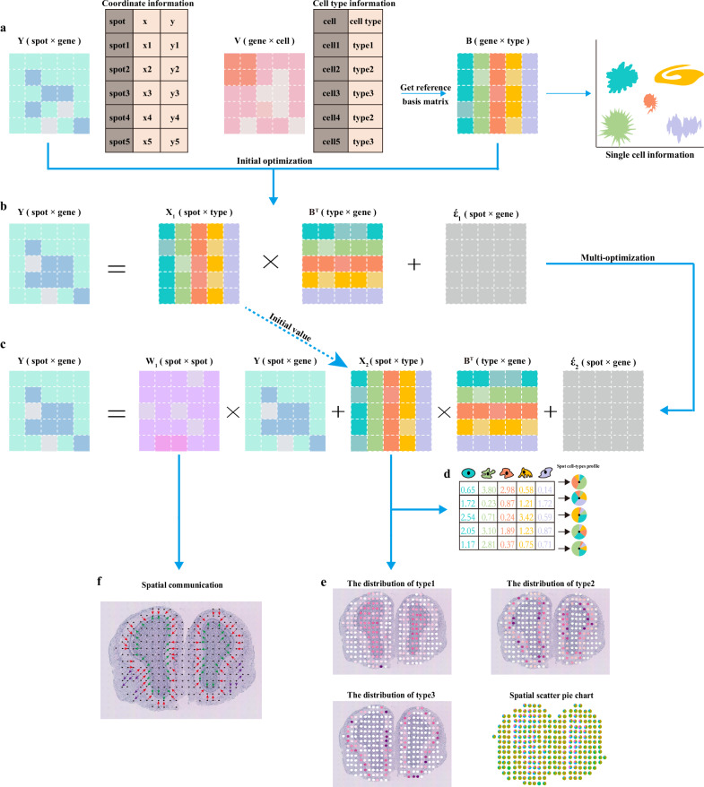
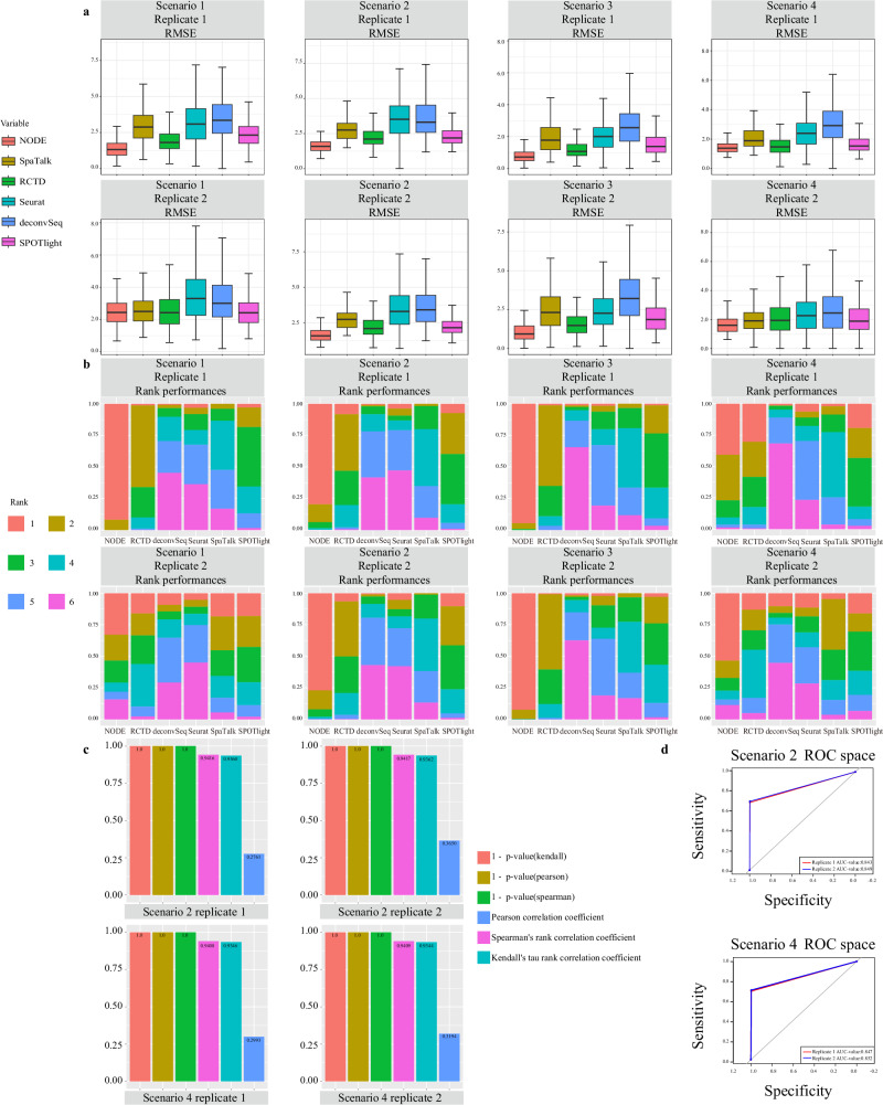
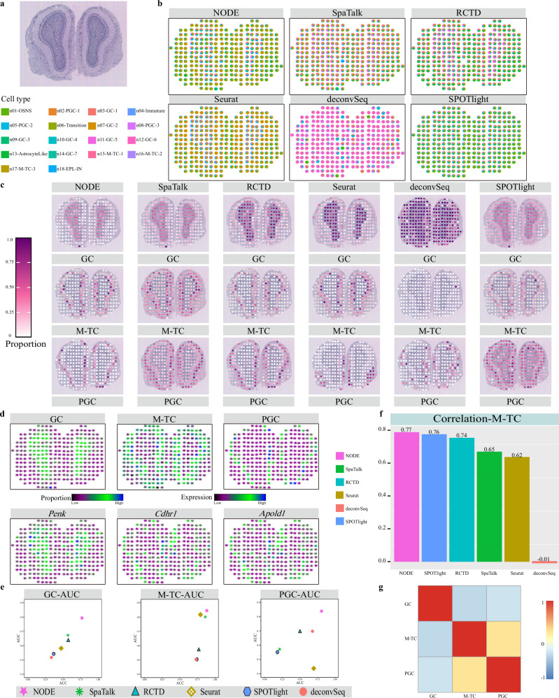
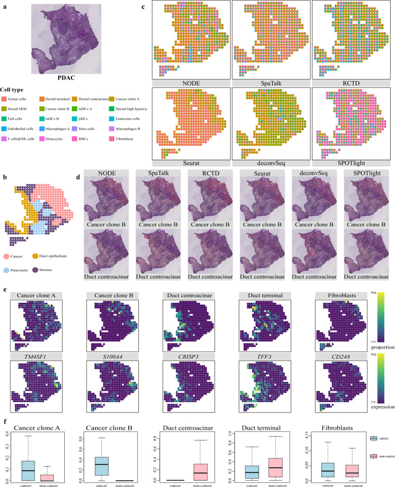
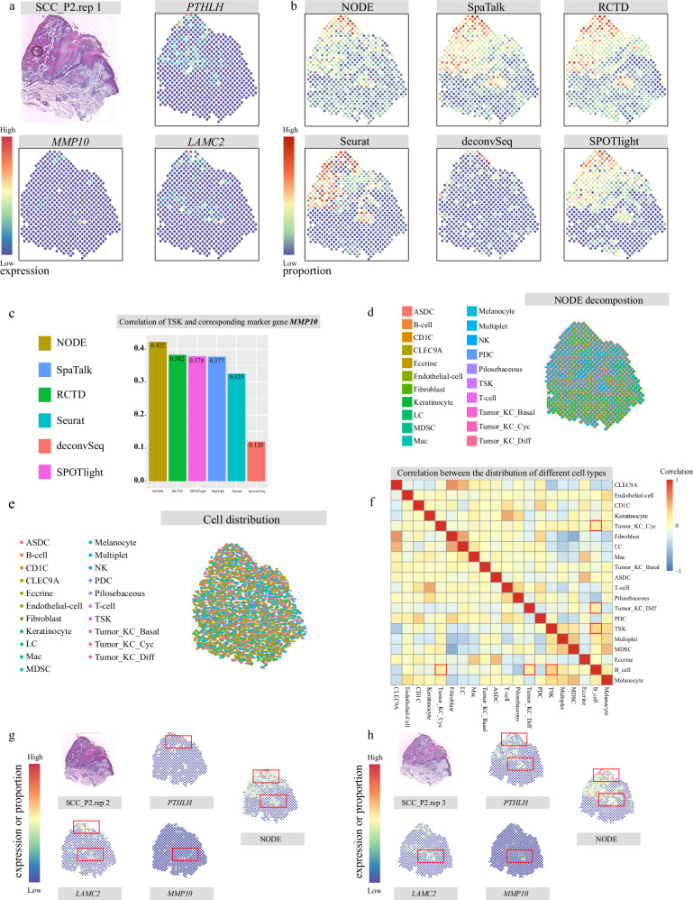
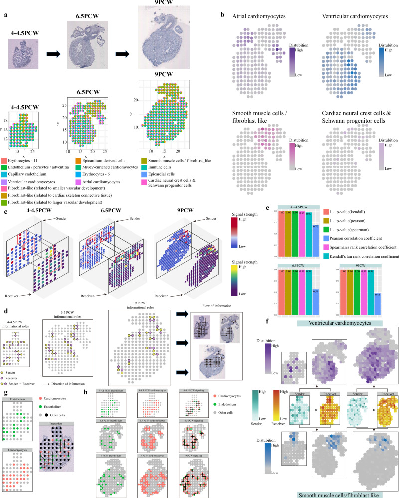
Spatial transcriptomics technologies can capture gene expression at spatial loci. However, at certain resolutions, the obtained gene expression reflects the sum of either a heterogeneous or homogeneous set of cells, rather than individual cell. This limitation gives rise to the deconvolution algorithm to make cell-type inferences at each location. Yet, the vast majority of deconvolution methods that have been developed ignore the spatial information of the tissue and the communications between the cells or spots. To overcome these afflictions, we proposed a deconvolution method, non-negative least squares-based and optimization search-based deconvolution (NODE), that combines cell-type-specific information from single-cell RNA sequencing (scRNA-seq) and intercellular communications in tissue. NODE deconvolution algorithm, incorporating the spatial information of the tissue, allows us to quantify intercellular communications at the same instant. NODE can not only utilize optimization method to infer the deconvolution results of spatial transcriptomics data and reduce the probability of overfitting situations, but also make reasonable inferences for spatial communications. Subsequently, we applied NODE to four datasets to validate the correctness of the NODE deconvolution results and compare them with existing deconvolution algorithms. NODE also inferred spatial communications and validated them in tissue development of human heart.


Conflict of interest statement

Competing interests: The authors declare no competing interests.

Figures

Fig. 1
Fig. 1. The schematic overview of NODE.
NODE is an optimization method to deconvolute the cell number of spots and cell distribution of tissue from spatial transcriptomics data. Except deconvolution, NODE can also explore spot-to-spot communications at spatial resolutions. NODE performs and returns functions both the results of the deconvolution and the inferred results of the spatial communications. a For cell-type deconvolution and spatial communications, it is necessary to provide single-cell RNA sequencing data and spatial transcriptomics data. Meanwhile, cell types information can be obtained from scRNA-seq data, and spatial coordinate’s information with coordinate annotation comes from spatial transcriptomics data. b NODE carries out the construction of initial models (Y=X1×BT+ε´1) and initial optimizations to find the main parts of the cellular composition and distribution matrix X1. c On the basis of the initial optimization, X1 was used as the initial value of X2 on the model (Y=W1×Y+X2×BT+ε´2), NODE calculated the spatial communications (the communication matrix W1) and quantifies the effects into gene expression, leading to a more accurate deconvolutional solution for the cellular composition and distribution matrix X2. d, e In this process, NODE can obtain the composition of cells at different spatial locations, and the distribution of cells with single-cell resolution from the cell position and distribution matrix X2. f In addition, NODE can also obtain the information flow of spatial communications between spots from the communication matrix W1.
Fig. 2
Fig. 2. Analysis of deconvolution and spatial communications in simulations.
The simulated data consisted of four scenarios, each containing two replicates. In scenario 1, simulated data is the base state and all methods use scRNA-seq data matched to spatial transcriptomics data. In scenario 2, add different spatial patterns to the spatial transcriptomics data of scenario 1. In scenario 3, added a different cellular model to scenario 1 for cell culling. At the same time, we used the single-cell data after adding the cellular model for the construction of simulated data and all methods use scRNA-seq data matched to spatial transcriptomics data. In scenario 4, we incorporated both different cellular and spatial models to construct spatial transcriptomics data. All methods use scRNA-seq data matched to spatial transcriptomics data. a RMSE of cell distributions inferred by different deconvolution methods with simulated data for all simulated scenarios. The comparative deconvolution methods (x-axis) are NODE (red), SpaTalk (dark yellow), RCTD (green), Seurat (cyan), deconvSeq (blue), and SPOTlight (purple). We computed the RMSE of the deconvolution results versus the true values in each spot and tallied all the computed results as a box plot. In the figure, lower values of RMSE (y-axis) indicate more accurate deconvolution results. Each box plot ranges from the third and first quartiles with the median as the horizontal line, while whiskers represent 1.5 times the interquartile range from the lower and upper bounds of the box. b Comparison of deconvolution accuracy of different methods in simulations under all simulated scenarios. The comparative deconvolution methods (x-axis) are NODE, SpaTalk, RCTD, Seurat, deconvSeq, and SPOTlight. We further ranked the RMSE across methods for each simulated replicate and calculated the proportion of times that a method was ranked as a specific rank. Rank performances were displayed in the form of stacked bar plots with different colors representing ranks 1–6. c Performance of NODE in inferring spatial communications in simulated data with spatial models added. The four bar charts shows the degree of correlation and significance test results between NODE’s inferred results on spatial communications and the simulated data results in different scenarios and replicates. d The ROC space and AUC value of scenario 2 and scenario 4. “Scenario 2 ROC space” and “Scenario 4 ROC space” subfigures’ AUC values of NODE’s inferred results are calculated based on the original simulated results, and the AUC values show the degree of similarity between the two.
Fig. 3
Fig. 3. The deconvolution results for MOB.
a H&E staining of the olfactory bulb displays three anatomic layers that are organized in an inside-out fashion the GCL, MCL, and GL. Among them, the characteristic cell of the GCL layer is GC, the characteristic cell of the MCL layer is M-TC, and the characteristic cell of the GL layer is PGC. b The spatial scatter pie chart displays the proportion and composition of cells at each spatial location in the inferred results of different deconvolution methods. c The distribution of granule cells (GC), mitral/tufted cells (M-TC), and periglomerular cells (PGC) in the inferred results of different deconvolution methods. The results of GC, M-TC, and PGC inferred by different methods are arranged in order. Color is scaled by the proportion value. We compared the inferred results from different deconvolution methods (NODE, SpaTalk, RCTD, Seurat, donvSeq, and SPOTlight) for the three cells, and also compared these cells with MOB tissue sections. d “GC”, “M-TC”, and “PGC” subfigures represent the proportion of each of the three cell types (GC, M-TC, and PGC) inferred by NODE on each spatial location. The “Penk”, “Cdhr1”, and “Apold1” subfigures represent the expression levels of the three corresponding cell-type-specific marker genes (Penk, Cdhr1, and Apold1). Color is scaled by the proportion or gene expression value. e Comparison of AUC and ACC values for different deconvolution inference results. Higher values of AUC and ACC indicate that the cellular distribution of the inferred results is consistent with the distribution of the marker genes. Compared deconvolution methods include SpaTalk, RCTD, Seurat, deconvSeq, SPOTlight, and NODE. Briefly, we set cell thresholds and gene thresholds based on the color of each spatial location in Fig. 3d (details in Method). We then used these two thresholds and gene distributions with the cell distributions of inferred results of different deconvolution methods to construct confusion matrices and calculate the AUC (y-axis) and ACC (x-axis). f Comparison of the correlation coefficients of M-TC distribution vector with the expression vector of marker gene corresponding to M-TC by different deconvolution methods. The GCs and PGCs are in Supplementary Fig. 20, 21. g Correlations in cell-type proportion across spatial locations between pairs of cell types inferred by NODE. Color is scaled by the correlation value.
Fig. 4
Fig. 4. The deconvolution in PDAC Data.
a H&E staining of the PDAC. b Scatter plot displays four regions annotated from the original publication: cancer, pancreatic, ductal, and stroma regions. We manually segmented all the spots based on the original publication. c The spatial scatter pie chart displays the proportion and composition of cells at each spatial location in the inferred results of different deconvolution methods. d The cancer clone B cells and duct centroacinar cells in the inferred results of different deconvolution methods. The deconvolution methods in the figure are NODE, SpaTalk, RCTD, Seruat, deconvSeq, and SPOTlight. e “Cancer clone A”, “cancer clone B”, “duct centroacinar”, “duct terminal” and “fibroblasts” subfigures indicate the proportion of each cell types inferred by NODE on each spatial location. The “TM4SF1”, “S100A4”, “CRISP3”, “TFF3”, and “CD248” subfigures represent the expression levels of corresponding cell-type-specific marker genes. f Comparison of the proportion of cell types inferred from NODE in cancerous areas (n = 150) versus non-cancerous areas (n = 278) (x-axis), The y-axis represents the proportion of cells in different areas at each spatial location. Briefly, we counted the percentage of cells in all the spots that were in the cancerous vs. non-cancerous areas, and plotted them as a box-and-line graph. Each box plot ranges from the third and first quartiles with the median as the horizontal line, while whiskers represent 1.5 times the interquartile range from the lower and upper bounds of the box (cancerous areas is blue box and non-cancerous areas is pink box).
Fig. 5
Fig. 5. The deconvolution analysis for SCC.
a H&E staining of the SCC_P2.rep1 and heat map of marker genes (PTHLH, MMP10, LAMC2) corresponding to tumor specific keratinocyte (TSK). b The distribution of tumor specific keratinocyte (TSK) in the inferred results of different deconvolution methods. Color is scaled by the proportion value. c Correlation between TSK and corresponding marker gene MMP10. We calculated the correlation coefficients of TSK cells and their marker genes. Specifically, we consider the expression of marker genes in all spots as a vector, and the expression of TSK cells in all spots in the deconvolution results as a vector, and calculate the correlation coefficients of the two vectors. We calculated the correlation coefficients between TSK cells and the three marker genes (PTHLHs and LAMC2s in Supplementary Fig. 33, 34), separately. The comparative deconvolution methods (x-axis) are NODE (dark yellow), SpaTalk (blue), RCTD (green), Seurat (cyan), deconvSeq (red), and SPOTlight (purple). A higher correlation (y-axis) indicates that the distribution of cells in the deconvolution result matches the distribution of marker genes more closely. d The spatial scatter pie chart displays the proportion and composition of cells at each spatial location in the inferred results of NODE deconvolution methods. e Cell-type decomposition by NODE at single-cell resolution for human skin SCC ST data. f Correlations in cell-type proportion across spatial locations between pairs of cell types inferred by NODE. Color is scaled by the correlation value. Co-localization of tumor and immune cells is boxed in red. g H&E staining of the SCC_P2.rep2, the heat map of marker genes (PTHLH, LAMC2, MMP10) corresponding to tumor specific keratinocyte (TSK) and distribution of TSK cells in NODE deconvolution results. Color is scaled by the proportion value. h H&E staining of the SCC_P2.rep3, the heat map of marker genes (PTHLH, LAMC2, MMP10) corresponding to tumor specific keratinocyte (TSK) and distribution of TSK cells in NODE deconvolution results. Color is scaled by the proportion value. We have labeled the aggregation of cells or marker genes with dark colors. The closer the color to red, the higher the percentage of TSK cells or marker genes.
Fig. 6
Fig. 6. Cellular distribution and spatial communications in development of human heart.
a The spatial scatter pie chart displays the proportion and composition of cells at each spatial location in the inferred results of NODE deconvolution methods. The three datasets are from the 4-4.5PCW, 6PCW, and 9PCW periods of the developing heart. The resulting pie charts of the deconvolution of each data reflect different cellular compositions and proportions, with each different color representing different cell types. b The distribution of atrial cardiomyocytes, ventricular cardiomyocytes, smooth muscle cells / fibroblast like, and cardiac neural crest cells & schwann progenitor cells in the inferred results of NODE deconvolution methods. Color is scaled by the proportion value c. Heatmap of spatial signal strength received or emitted at each spatial location during different periods of the developing heart. The sender represents the signal emitted state at different spatial locations of the slice, and the receiver represents the signal received state at different spatial locations of the slice. Color is scaled by the signal strength value (d) “4-4.5PCW informational roles”, “6.5PCW informational roles”, and “9PCW informational roles” subfigures demonstrate the informational roles of the spots in the spatial transcriptomics data during the three developmental periods, with yellow representing the spot that sends out signals, and purple representing the spot that receives signals. The “flow of information” subfigure demonstrates the flow of information between the spatial location in the tissue during the three developmental periods. e Correlation and significance calculations between the spatial communication matrix solved by NODE and the spatial signal transduction matrix calculated based on CellChat. Three correlation coefficients (Pearson correlation coefficient, Spearman’s Rank Correlation Coefficient, and Kendall’s rank correlation coefficient) and significance between the spatial signal matrices inferred by NODE and the spatial signal matrices computed based on CellChat in the three developmental periods. In the calculation of significance, we used the 1 - p value. f Spatially, the effect of signaling in tissues on specific cells in the developing human heart. The “ventricular cardiomyocytes” heatmap sufigure indicates the distribution of ventricular cardiomyocytes at different developmental periods with the degree of aggregation in different spatial locations. Color is scaled by the proportion value. The “sender” and “receiver” heatmap subfigures demonstrate the action signals received and sent at different spatial locations in slices from the first two developmental periods (4-4.5PCW and 6.5PCW). The heatmap with arrows indicates that the signals, after acting on a specific cell type, have an effect on a specific cell, causing the distribution of the specific cell to change accordingly to the period of development. In heatmap, color is scaled by the signal strength value. Finally, the “smooth muscle cells/fibroblast like” heatmap subfigure indicates the distribution of smooth muscle cells/fibroblast like at different developmental periods with the degree of aggregation in different spatial locations. Color is scaled by the proportion value. g The “endothelium” and “cardiomyocytes” subfigures demonstrate the distribution of endothelium in contact with cardiomyocytes and the distribution of cardiomyocytes in contact with endothelium, respectively. In these scatter plot, red or green dots represent cardiomyocytes or endothelium, and grey dots represent other cells. The “interaction” subfigure is the schematic diagram of the communications between cardiomyocytes and the spot where endothelium is located. The colors in each scatter pie chart represent the cellular composition at this spatial location, with different colors representing different cell types. h NODE-predicted signaling from endocardial cardiomyocytes to epicardial cardiomyocytes in three different periods of the heart. The “4-4.5 PCW endothelium”, “6.5 PCW endothelium”, and “9 PCW endothelium” subfigures demonstrate the distribution of endothelium in contact with cardiomyocytes during three developmental periods. The “4-4.5 PCW cardiomyocytes”, “6.5 PCW cardiomyocytes”, and “9 PCW cardiomyocytes” subfigures demonstrate the distribution of cardiomyocytes in contact with endothelium in three developmental periods. Finally, The “4-4.5 PCW signaling”, “6.5 PCW signaling”, and “9 PCW signaling” subfigures indicate NODE-predicted signaling between cardiomyocytes from the endocardial cells locations-epicardial cells locations. Arrows indicate the direction of signal transmission. The colors in each scatter pie chart represent the cellular composition at this spatial location, with different colors representing different cell types.

Similar articles

Cited by

References

    1. Burgess, D. J. Spatial transcriptomics coming of age. Nat. Rev. Genet.20, 317–317 (2019). - PubMed
    1. Soldatov, R. et al. Spatiotemporal structure of cell fate decisions in murine neural crest. Science (New York, N.Y.)364, 10.1126/science.aas9536 (2019). - PubMed
    1. Prinz, M., Priller, J., Sisodia, S. S. & Ransohoff, R. M. Heterogeneity of CNS myeloid cells and their roles in neurodegeneration. Nat. Neurosci.14, 1227–1235 (2011). - PubMed
    1. Svensson, V., Teichmann, S. A. & Stegle, O. SpatialDE: identification of spatially variable genes. Nat. Methods15, 343–346 (2018). - PMC - PubMed
    1. Dries, R. et al. Giotto: a toolbox for integrative analysis and visualization of spatial expression data. Genome Biol.22, 78 (2021). - PMC - PubMed

LinkOut - more resources