. 2025 Feb 15;16(1):1654.
doi: 10.1038/s41467-025-56827-5.

Learning and actioning general principles of cancer cell drug sensitivity

Affiliations

Learning and actioning general principles of cancer cell drug sensitivity

Francesco Carli et al. Nat Commun. .

Abstract

High-throughput screening of drug sensitivity of cancer cell lines (CCLs) holds the potential to unlock anti-tumor therapies. In this study, we leverage such datasets to predict drug response using cell line transcriptomics, focusing on models' interpretability and deployment on patients' data. We use large language models (LLMs) to match drug to mechanisms of action (MOA)-related pathways. Genes crucial for prediction are enriched in drug-MOAs, suggesting that our models learn the molecular determinants of response. Furthermore, by using only LLM-curated, MOA-genes, we enhance the predictive accuracy of our models. To enhance translatability, we align RNAseq data from CCLs, used for training, to those from patient samples, used for inference. We validated our approach on TCGA samples, where patients' best scoring drugs match those prescribed for their cancer type. We further predict and experimentally validate effective drugs for the patients of two highly lethal solid tumors, i.e., pancreatic cancer and glioblastoma.


Conflict of interest statement

Competing interests: The authors declare no competing interests.

Figures

Fig. 1
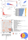
Fig. 1. Training a machine learning framework for predicting cancer cell sensitivity to drugs.
A Schematic workflow of the pipeline from dataset acquisition and model training through to benchmarking and external validation. Leveraging large-scale transcriptomics datasets, several machine learning models are trained on Genomics of Drug Sensitivity in Cancer (GDSC) and Profiling Relative Inhibition Simultaneously in Mixtures (PRISM) viability screening datasets. A Large Language Model (LLM) assists the curation of drug Mechanisms of Action (MOA), enhancing model interpretability and facilitating feature selection. Three model types are trained: one using cell transcriptomics and drug features, another using only transcriptomics, and a third using a selected subset of transcriptomic data informed by pathways identified by the LLM. These models undergo benchmarking across 20 distinct train/validation/test splits. The best-performing model is then applied in inference on The Cancer Genome Atlas (TCGA) bulk RNA-seq data and on external patient datasets for pancreatic ductal adenocarcinoma (PDAC) and glioblastoma multiforme (GBM). Predictions are externally validated on TCGA data using National Cancer Institute (NCI) cancer drug indications to assess the recovery of known information, as well as experimentally on primary (GBM dataset) and commercial (PDAC dataset) cancer cell lines; B Bar plot comparing the performance of different model architectures (MLP, XGBoost and literature baselines) and input feature representations (cell features and drug features) in terms of Pearson correlation with observed drug sensitivities. Different colors denote different learning algorithms (e.g., light blue XGBoost and purple MLP). Etched bars highlight models using only transcriptomic data (no drug featurizations). Results are obtained by averaging results across 20 distinct test splits. Error bars represent SD of the results; C Bar plot depicting Mean Squared Error (MSE) for the same models and features as in (B). Also in this case results are obtained by averaging results across 20 distinct test splits. Error bars represent SD of the results; D Histogram of the distribution of Pearson correlation coefficients for drug-specific models using all genes, indicating the median, mean, and standard deviation; E Box plots illustrating the variability in the distribution of Pearson correlation coefficients across 20 different random training/testing splits. Each box plot represents a specific model and displays the median correlation (central line), interquartile range (box edges), and variability outside the upper and lower quartiles (whiskers). Source data are provided as a Source Data file.
Fig. 2
Fig. 2. GDSC model interpretability.
A Target recovery for the top 25 ligand-target pairs. The length of the bars on the left indicates the fraction of recovery (# of times the drug-specific model identifies the putative gene as important out of 20 train/test splits). Red lines represent the 95th percentile of the Hit Fraction distribution across all genes for a given drug. The length of the bars on the right shows the median pearson correlation for each drug-specific model; B SHAP (teal) and correlation delta (orange) importances for the Venetoclax drug. Permutation importance reflects the decrease in the model’s prediction accuracy when a feature’s values are shuffled, indicating its importance (greater drops signify higher importance). SHAP importance represents a feature’s contribution to the model’s prediction, with larger absolute values indicating greater importance; C An integrated assessment of the Venetoclax model across various cell lines (X axis). The top plot (in black) shows the experimental IC50 z-scores, while the second plot (in gray) depicts the predicted IC50 values, providing a comparison of model performance against experimental data. The third and fourth plots (in teal and red) respectively represent the SHAP values and expression levels of BCL2. Overall, the figure shows how lower IC50 values (higher drug efficacy) are associated with higher BCL2 expression levels and correctly identified impact (negative SHAP value) of the gene on predicted IC50. Source data are provided as a Source Data file.
Fig. 3
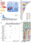
Fig. 3. Analysis of Drug MOAs and Gene Essentiality via GDSC Models.
A Workflow depicting the use of a large language model (LLM) for generating drug MOAs and identifying semantically relevant pathways. Starting from the drug’s available metadata, an LLM is repeatedly tasked with specialized prompts to generate a drug textual description. In parallel, PubMed is queried programmatically with the drug name to retrieve abstracts related to the drug. The information is integrated in a final textual description. The obtained drug description is used by a “Guided” LLM to choose which are the Reactome pathways which are most likely to modulate drug efficacy. This last procedure is repeated 5 different times and only pathways selected at least two times are retained; B Venn diagram showing the different drugs(top) and pathways (bottom) recovered using the LLM procedure as compared to pathway match based on drugs’ and target’s names; C Heatmap of significant MOA-pathways for various drug models, filtered by a correlation threshold ρ > 0.5. Drug names and involved pathways are labeled along the x-axis and y-axis, respectively. Starred squares highlight pathways linked to drugs via at least one annotation criterion. Adjacent bar plots show the count of significantly enriched elements per row/column in light gray, with those annotated by the pipeline in dark gray. A vertical dashed line highlights the presence of a group of drugs that most frequently recover pathways and known MOAs; D number of significantly enriched MOA-pathways obtained from different annotation criteria; E tissue-wise statistics of number of cell lines (top), number of core essential genes (middle), recall of essential genes at different important genes (SHAP) stringencies (top k 10, 20, 50, 100); F STRING PPI network of lung core essential genes recovered by SHAP importances. Nodes’ have diameters proportional to node degree and are colored according to SHAP values (the brighter the more important). Source data are provided as a Source Data file.
Fig. 4
Fig. 4. PRISM model performance and interpretation.
A scatter plot of PRISM drug-specific model correlations and MSEs. Dots are colored according to IQR values, ranging from blue to red for increasing values of IQR. The density plots located at the top and left of figure  compares the distribution of correlation and MSE values between all models (in blue) and models with an IQR greater than 1 (in red); B scatter plot of predicted vs experimental IC50 values from models with correlation ρ > 0.2; C barplot statistics of PRISM models with corr ρ > 0.2 (salmon) and corr ρ > 0.2 and target recovered, stratified by putative target protein families (red); D fraction of target recovery for the top 25 ligand-target pairs (same plot as 2 A but for PRISM). Red lines represent the 95th percentile of the Hit Fraction distribution across all genes for a given drug. The length of the bars on the right shows the median pearson correlation for each drug-specific model; E heatmap showing significant MOA-pathways (rows) for drug models (columns) with corr ρ > 0.5 (same plot as 3E but for PRISM); F Venn diagram comparing MOA-pathway significantly enriched on PRISM’s and GDSC’s drug model important genes. Source data are provided as a Source Data file.
Fig. 5
Fig. 5. MOA-driven models.
A comparison of the correlation distribution of all-genes (red) vs MOA-primed (blue) GDSC models; B scatter plot of predicted vs experimental IC50 values from GDSC MOA-primed models. The coloring of the dots on the scatterplot indicates the density of points around a particular area; C comparison of the correlation distributions of all-genes (red) vs MOA-primed (blue) PRISM models (considering only models with IQR > 1); D scatter plot of predicted vs experimental IC50 values from PRISM MOA-primed models with correlation ρ > 0.2. The coloring of the dots on the scatterplot indicates the density of points around a particular area; E boxplot of correlation distributions for GDSC models showing the greatest correlation improvement of the MOA-primed vs all-genes models. Each box plot represents a specific drug model and displays the median correlation (central line), interquartile range (box edges), and variability outside the upper and lower quartiles (whiskers); F boxplot of correlation distributions for PRISM models showing the greatest correlation improvement of the MOA-primed vs all-genes models. Boxplots follow the structure of (5E). Source data are provided as a Source Data file.
Fig. 6
Fig. 6. Drug sensitivity predictions on TCGA samples.
A Schema of a drug response prediction workflow leveraging Bulk RNA sequencing data from TCGA patients, as well from new PDAC and GBM cohorts. The process begins with data harmonization using Celligner, followed by drug inhibitory concentration (IC50) predictions through CellHit. Patients are then ranked by their predicted predIC50 values and quantile score to assess drug efficacy. Validation involves comparing TCGA predictions with NCI cancer drug metadata and refining tumor-specific predictions by clustering patient responses within cancer subtypes for experimental validation.; B recall of the recovered drug indications, from NCI cancer drugs, for the TCGA best ranked samples (top 600), according to either predicted IC50 (predIC50) or quantile score metrics; C stacked barplot of the GDSC drugs scoring among the top 600 samples patients with cancer types matching the prescription according to NCI drugs. The height of the barplot’s stacks corresponds to the number of unique samples and the color of the specific cancer type; D circle plot showing drugs predicted for the same pool of patients, i.e., suggesting combination therapies. Circle diameter is proportional to the number of unique samples, among the top 600, best scoring for both drug models. Colors indicate the level of support for that combination, i.e., approved (red) or sharing indication for the same cancer type (dark green); E Inference on TCGA data for the 20 best performing non-oncological drug models in the PRISM dataset. The height of the barplot’s stacks corresponds to the number of unique samples and the color of the specific cancer type (highlighting potential drug repurposing opportunities). Colors are shared with panel C. Source data are provided as a Source Data file.
Fig. 7
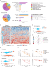
Fig. 7. CellHit predictions on distinct PDAC subtypes and experimental validation.
A Enrichment of predicted cancer cell lines that react most similarly to the available drugs for the Glandular (GL) and Transitional (TR) subtypes. Classification of the tissue types of cell lines (oncotree system) is shown; B Heatmap of predicted IC50 (predIC50) of GDSC drugs derived by CellHit prediction in PDAC samples. K-means clustering (n_clusters=2, method=Euclidean distance) was performed. Subtype annotations are shown for each sample; C Violin plot showing the predicted IC50 (predIC50) of Gemcitabine for the Glandular (GL) and Transitional (TR) subtypes; D Euclidean distance derived from Celligner between each PDAC cell line (CFPAC-1, PANC-1) and each selected tumor type (Pancreatic, Esophagogastric, Invasive Breast, Head and Neck); E Violin plot showing the predicted IC50 (predIC50) of Irinotecan and Etoposide for the Glandular (GL) and Transitional (TR) subtypes; F percentage of cell viability of CFPAC-1 and PANC-1 cells treated with increasing concentrations of Irinotecan or Etoposide at 24, 48 and 72 h. Individual values represent the average of three independent experiments ±SD. Source data are provided as a Source Data file.
Fig. 8
Fig. 8. GBM patient samples inference and experimental validation.
A predicted lnIC50 of drugs AZD5991 (blue) and AZD5582 (red) for samples Gb130 and Gb107. Horizontal dashed lines indicate the median of the experimental lnIC50 of each drug on GDSC cell lines. Error bars are obtained by computing SD across models in the ensemble to estimate the overall model uncertainty; B predicted quantile scores of drugs AZD5991 (blue) and AZD5582 (red) for samples Gb130 and Gb107; Dose-response curves for the two patient-derived primary cultures of GBM, C Gb130 and E Gb107 using the Crystal Violet assay. The curves illustrate the response to treatment in terms of reduction of cell viability with AZD5991 and AZD5582, measured 72 h post-treatment for Gb107 (C) and Gb130 (E). The IC50 values for both drugs are provided. The dose-response curves are also compared across the two cell lines for AZD5991 (D) and AZD5582 (F). The AZD5991 curve is represented by blue lines, while red lines are used for AZD5582. The profiles for Gb107 are depicted with dashed lines and triangles marking the points, while those for Gb130 are represented with solid lines and circles marking the points. The threshold for a 50% reduction in cell viability is indicated by a dark dashed line. Error bars on plots (C, F) are computing considering data from assys performed three times in triplicates. Source data are provided as a Source Data file.

References

    1. Chang, K. et al. The cancer genome atlas pan-cancer analysis project. Nat. Genet.45, 1113–1120 (2013). - PMC - PubMed
    1. Barretina, J. et al. The cancer cell line encyclopedia enables predictive modelling of anticancer drug sensitivity. Nature483, 603–607 (2012). - PMC - PubMed
    1. Iorio, F. et al. A landscape of pharmacogenomic interactions in cancer. Cell166, 740–754 (2016). - PMC - PubMed
    1. Rees, M. G. et al. Correlating chemical sensitivity and basal gene expression reveals mechanism of action. Nat. Chem. Biol.12, 109–116 (2016). - PMC - PubMed
    1. Corsello, S. M. et al. Discovering the anti-cancer potential of non-oncology drugs by systematic viability profiling. Nat. Cancer1, 235–248 (2020). - PMC - PubMed

MeSH terms

Substances

LinkOut - more resources