. 2025 Feb 15;8(1):105.
doi: 10.1038/s41746-025-01496-3.

Self supervised artificial intelligence predicts poor outcome from primary cutaneous squamous cell carcinoma at diagnosis

Affiliations

Self supervised artificial intelligence predicts poor outcome from primary cutaneous squamous cell carcinoma at diagnosis

Nicolas Coudray et al. NPJ Digit Med. .

Abstract

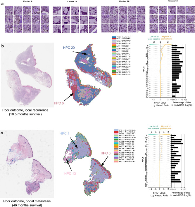
Primary cutaneous squamous cell carcinoma (cSCC) is responsible for ~10,000 deaths annually in the United States. Stratification of risk of poor outcome at initial biopsy would significantly impact clinical decision-making during the initial post operative period where intervention has been shown to be most effective. Using whole-slide images (WSI) from 163 patients from 3 institutions, we developed a self supervised deep-learning model to predict poor outcomes in cSCC patients from histopathological features at initial diagnosis, and validated it using WSI from 563 patients, collected from two other academic institutions. For disease-free survival prediction, the model attained a concordance index of 0.73 in the development cohort and 0.84 in the Mayo cohort. The model's interpretability revealed that features like poor differentiation and deep invasion were strongly associated with poor prognosis. Furthermore, the model is effective in stratifying risk among BWH T2a and AJCC T2, known for outcome heterogeneity.


Conflict of interest statement

Competing interests: The authors declare the following competing interests: A.T. is a co-founder of Imagenomix; N.C. is a scientific advisor for Imagenomix. The other authors declare that they have no competing interests.

Figures

Fig. 1
Fig. 1. Adaptation of the self-supervised Histological Phenotype Learning pipeline to study cutaneous squamous cell cancer.
a The slides were first tiled into smaller images of 224 ×224 pixels at 0.5 um/pixel (equivalent to a magnification of 20×). b A subset of those tiles were used to train the self-supervised Barlow-Twins architecture. c Once trained, all the tiles from the three cohorts were then projected onto the trained network to extract their tile vector representations z, a 128 vector coding each image. d Those vector representations are then over-clustered using the Leiden approach in order to get homogeneous clusters (called Histomorphological Phenotype Clusters, HPC) and visually identify artifacts from tissue representations. In this UMAP of the tile vector representation z, each dot represents a tile, and each color a different HPC. e Tiles belonging to HPCs identified as highly enriched in artifacts are removed from the study. f The cleaned dataset is then subject to more detailed analysis and subjected to a new round of Leiden clustering. This UMAP of the cleaned tile vector representations z shows 26 HPCs corresponding to 26 groups of self-identified phenotypes, and representative tile for the top 5 clusters corresponding to the example slides in panel (c). g The resulting HPCs can then be used to generate heatmaps showing simplified slide representations and analyzed to identify potential correlations between those phenotypes identified by the self-supervised approach and patients’ outcome. Here, the heat maps corresponding to the example slide section in panel (a) is shown, with the top 5 clusters numbered and corresponding to the ones in panel (f). All tiles are shown after Reinhard’s color normalization.
Fig. 2
Fig. 2. Unsupervised approach generates clusters enriched in tiles from patients with poor outcome, with good representation of the three cohorts, and predicting disease-free survival while providing tile clusters important for that prediction.
a UMAP with the 26 Leiden clusters found at resolution 0.75. b PAGA representation of the Leiden clusters with node connections. The size of the nodes is proportional to the number of tiles and their color is proportional to the proportion of tiles associated with good/poor outcome patients. c UMAP with colors showing tiles associated with good/poor outcome patients (green/orange). Each dot is a tile. d Univariate analysis comparing the c-index (average of a 3-fold cross validation) for the prediction of the RFS for the development cohort (NYU + UCSF) and on the external cohorts (CAUSA, Mayo). c-index below 0.5 (green) indicates lower risk of poor outcome, while c-index above 0.5 (orange) indicates higher risk of poor outcome. e Details of panel c for two clusters where the development cohort and the external cohort show the same trend (See Supplementary Fig. 6 for all clusters). Error bars show the confidence interval. f Projection on the PAGA of the HPCs showing coherent trends for both the cross-validation on the development cohort, and on the external cohorts. g Kaplan–Meier curve of predicted high and low risk patients of having a poor outcome from the unsupervised HPL approach using a Cox regression, 3-fold cross-validation on the development cohort (NYU + UCSF). First row is computed using the whole dataset, while second and third show a subset of patient with stage T2a (BWH staging) and T2 (AJCC staging) only. Error bars show 95% confidence interval (CI). 95% CI of hazard ratio (logrank) is shown between brackets. The median value computed on the whole dataset is used to split low from high risk patients. h Same as g but using the Mayo as a test cohort. i Same as g but using the CAUSA as a test cohort.
Fig. 3
Fig. 3. PAGA graph shows a coherent organization of features found on cutaneous squamous cell carcinoma whole slide images.
Annotations provided by a group of Mohs surgeons, of which included tiles randomly selected from the development cohort (NYU + UCSF + BWH) for each HPC (annotation taken from Supplementary Table 6) and are projected on the PAGA graph from Fig. 2b.
Fig. 4
Fig. 4. Example of tiles from HPCs associated with higher risk of poor outcome.
a Example of tiles randomly selected from certain HPCs leading to risk prediction of poor outcome. b, c Examples of data from patients with poor outcome shortly after surgery (10.5 months, local recurrence) and with poor outcome a few years after surgery (46 months, nodal metastasis). For each case, a small portion of the original slide is shown as well as the corresponding heatmap and the associated SHAP decision plot. The color of the heatmap shows the HPC associated with each tile, with the proportion of tile belonging to each HPC shown in the legend (percentages computed over the whole slide(s) available for each patient). The top of the SHAP decision plot shows the predicted value which determines the color of the curve. Reading from bottom to top, the SHAP values for each HPC are cumulatively summed, and the HPCs are ordered according to the absolute SHAP weight. On the right, the proportion of tiles associated with each cluster is shown on a Log10 scale. All tiles are shown after Reinhard’s color normalization.
Fig. 5
Fig. 5. Example of tiles from HPCs associated with lower risk of poor outcome.
a Example of tiles randomly selected from certain HPCs leading to prediction of good outcome. b The interaction analysis between HPCs shows two groups of HPCs which tend to be adjacent on slides; each column shows the normalized proportion of interactions each tile associated with a given HPC has with HPCs associated with its adjacent tiles. The dendrograms correspond to bi-hierarchical clustering of HPCs. c, d Examples of data from patients who have not recurred and have been followed for more than three years. For each case, a small portion of the original slide is shown as well as the corresponding heatmap and the associated SHAP decision plot. The color of the heatmap shows the HPC associated with each tile, with the proportion of tile belonging to each HPC shown in the legend (percentages computed over the whole slide(s) available for each patient). The top of the SHAP decision plot shows the predicted value which determines the color of the curve. Reading from bottom to top, the SHAP values for each HPC are cumulatively summed, and the HPCs are ordered according to the absolute SHAP weight. On the right, the proportion of tiles associated with each cluster is shown on a Log10 scale. All tiles are shown after Reinhard’s color normalization.
Fig. 6
Fig. 6. Specific HPCs are correlated with poor outcome.
a, b Projection on the UMAP and PAGA graph of the HPCs associated with high and low risk of poor outcome. c Ultimately, we anticipate such a deep-learning tool, which identifies patients at higher risk with poor outcome and provides histomorphological interpretability, could assist treating physicians in making decisions on an increased post-operative follow-up and management strategy. Panel (c) created with biorender.com.

Update of

References

    1. Lomas, A., Leonardi-Bee, J. & Bath-Hextall, F. A systematic review of worldwide incidence of nonmelanoma skin cancer. Br. J. Dermatol.166, 1069–1080 (2012). - PubMed
    1. Waldman, A. & Schmults, C. Cutaneous Squamous Cell Carcinoma. Hematol. Oncol. Clin. North Am.33, 1–12 (2019). - PubMed
    1. Stang, A. et al. Incidence and mortality for cutaneous squamous cell carcinoma: comparison across three continents. J. Eur. Acad. Dermatol. Venereol.33, 6–10 (2019). - PMC - PubMed
    1. Leiter, U. et al. Incidence, Mortality, and Trends of Nonmelanoma Skin Cancer in Germany. J. Invest. Dermatol.137, 1860–1867 (2017). - PubMed
    1. Van Lee, C. B. et al. Recurrence rates of cutaneous squamous cell carcinoma of the head and neck after Mohs micrographic surgery vs. standard excision: a retrospective cohort study. Br. J. Dermatol.181, 338–343 (2019). - PubMed

LinkOut - more resources