[Preprint]. 2025 Jan 28:2025.01.26.634557.
doi: 10.1101/2025.01.26.634557.

Temporal and spatial composition of the tumor microenvironment predicts response to immune checkpoint inhibition

Affiliations

Temporal and spatial composition of the tumor microenvironment predicts response to immune checkpoint inhibition

Noah F Greenwald et al. bioRxiv. .

Abstract

Immune checkpoint inhibition (ICI) has fundamentally changed cancer treatment. However, only a minority of patients with metastatic triple negative breast cancer (TNBC) benefit from ICI, and the determinants of response remain largely unknown. To better understand the factors influencing patient outcome, we assembled a longitudinal cohort with tissue from multiple timepoints, including primary tumor, pre-treatment metastatic tumor, and on-treatment metastatic tumor from 117 patients treated with ICI (nivolumab) in the phase II TONIC trial. We used highly multiplexed imaging to quantify the subcellular localization of 37 proteins in each tumor. To extract meaningful information from the imaging data, we developed SpaceCat, a computational pipeline that quantifies features from imaging data such as cell density, cell diversity, spatial structure, and functional marker expression. We applied SpaceCat to 678 images from 294 tumors, generating more than 800 distinct features per tumor. Spatial features were more predictive of patient outcome, including features like the degree of mixing between cancer and immune cells, the diversity of the neighboring immune cells surrounding cancer cells, and the degree of T cell infiltration at the tumor border. Non-spatial features, including the ratio between T cell subsets and cancer cells and PD-L1 levels on myeloid cells, were also associated with patient outcome. Surprisingly, we did not identify robust predictors of response in the primary tumors. In contrast, the metastatic tumors had numerous features which predicted response. Some of these features, such as the cellular diversity at the tumor border, were shared across timepoints, but many of the features, such as T cell infiltration at the tumor border, were predictive of response at only a single timepoint. We trained multivariate models on all of the features in the dataset, finding that we could accurately predict patient outcome from the pre-treatment metastatic tumors, with improved performance using the on-treatment tumors. We validated our findings in matched bulk RNA-seq data, finding the most informative features from the on-treatment samples. Our study highlights the importance of profiling sequential tumor biopsies to understand the evolution of the tumor microenvironment, elucidating the temporal and spatial dynamics underlying patient responses and underscoring the need for further research on the prognostic role of metastatic tissue and its utility in stratifying patients for ICI.


Figures

Figure 1.
Figure 1.. Study design, workflow and feature extraction
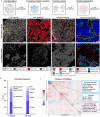
a) Schematic overview of the collection of tumor tissue for MIBI analysis from patients accrued in the TONIC trial (NCT02499367). Tissue was collected from the primary tumor, as well as metastatic samples at baseline, after induction (pre-nivo), and after three cycles of nivolumab (on-nivo). b) Venn diagram showing the number of patients who have overlapping data from the three modalities (DNA, RNA and MIBI) included in the study. c) Schematic overview of the data generation and feature extraction workflow for DNA, RNA and MIBI data. d) Schematic representation of static and dynamic feature data. All features were calculated and compared to response on four separate, static timepoints. In addition, the dynamic change between pairs of timepoints was also calculated and compared against patient response. e) Full FOV: MIBI field of view (FOV) color overlay of a representative tumor biopsy. Inset 1 and 2 show blowups at increased magnification from the original image. Color overlay: Additional color overlays from the same FOV. Cell lineage: Cell mask with cells colored by cell classification. Compartment: Cell mask with cells colored by tumor compartment. Scale bars: 100um. f) Heatmap showing the identified cell clusters (y-axis) with the average expression of the markers in the MIBI panel (x-axis) split by marker type. Cell lineage markers were used to generate
Figure 2.
Figure 2.. SpaceCat feature extraction pipeline
a) Four categories of features (cell abundance, functional marker positivity, diversity scores, and spatial organization) calculated by SpaceCat, with an example feature belonging to each of those categories. Each column shows one example image with a high value of the feature and one example image with a low value of the feature. Scale bars: 100um. b) Distribution of extracted features according to the category of the feature (left) and cell type associated with that feature (right). The category cell phenotype (n=453) includes features based on functional markers (n=357) and morphology (n=96). The category structural organization (n=85) includes features based on extracellular matrix (n=78) and tumor compartments (n=7). The category interactions (n=30) include features based on linear distances (n=24) and the mixing of cells (n=6). The category diversity (n=58) includes features for cellular diversity (n=38) and regional diversity (n=20). The category cell density (n=232) includes features for density (n=90), proportional density (n=49) and density ratios of cells (n=93). c) Clustered pairwise correlation of features across all regions of interest in the TONIC cohort. The colored squares indicate clusters of features that are characteristic of a distinct biological process, e.g., immune diversity, morphology, or hypoxia. Nuc: nuclear. Cyto: cytoplasmic. Perim: perimeter.
Figure 3.
Figure 3.. Extracted microenvironmental characteristics associated with patient response
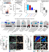
a) Volcano plot showing significance (t-test, y axis) and effect size (difference in medians, x-axis) of features to predict patient response, colored by overall ranking. b) Comparison of cell ratios and individual cell densities to predict outcome. The score for each of the ratios in the top 100 features is shown on the left hand side. For each ratio, which is composed of two different cell types, the cell type density with the higher score is plotted on the right. T / Cancer ratio; ratio between T cells and cancer cells. T density; density of T cells. c) Enrichment within the top 100 features for features calculated within each of the tumor compartments, or those calculated across the whole image. d) Enrichment within the top 100 features for features that do and do not require spatial information to be calculated. e) Top 50 features associated with response grouped by category. The first five rows for each feature indicate which compartment(s) show(s) an association with outcome for that feature, while the bottom row illustrates whether the feature is positively or negatively associated with outcome. Ratios between cell types are detonated with a ‘/’, e.g. T cell to Cancer cell ratio is T / Cancer. Neighborhood diversity is a spatial metric that takes into account the immediate neighbors of a given cell type, whereas other diversity metrics are calculated using the total count of cells within a compartment. Scale bars: 100um. f) Representative example of a top feature (PD-L1+CD68+ Macrophages). The boxplot on the left shows the feature stratified by outcome. The overlays on the right show four specific examples (highlighted in the box plot) of patients with high and low levels of PD-L1+CD68+ Macrophages. Data is from the on-nivo timepoint. g) Representative example of a top feature (diversity in the cancer border region). The boxplot on the left plots this feature stratified by responder/non-responder status. The overlays on the right show two specific examples (highlighted in the box plot) of patients with high and low border diversity. The top row shows the image compartments (same coloring as in 3c and 3e), and the bottom row shows the cell types present in the cancer border compartment. Data is from the on-nivo timepoint. Scale bars: 100um.
Figure 4.
Figure 4.. Evolution of features associated with response
a) The number of features from the top 100 that are derived from each timepoint. b) Heatmap showing the overlap of the top features across different timepoints. In order to be included in the visualization, a feature needs to be within the top 100 most predictive. Using this list of features, we then plot those features in any timepoint where a feature is ranked within the top 350 features. Features are colored by their overall ranking, and boxed in red if they are within the top 100. c) The top row of box plots shows the ratio of T cells to cancer cells within the cancer border broken down by response. This is plotted across all four timepoints to show the change in association with outcome. Underneath are representative overlays showing the compartments within each image, followed by the T cells and cancer cells within the border compartment. Scale bars: 100um.
Figure 5.
Figure 5.. Multivariate modeling to predict response
a) The AUC (y axis) of the multivariate models stratified by assay and timepoint (x axis). Each dot is a replicate from nested cross validation. On the right, data from Wang et al. 2023 was replotted on the same axis. b) Representative features derived from the MIBI data that were strongly associated with patient outcome. The number of distinct channels required to calculate each feature is shown with a horizontal bar, along with the relevant timepoint and the analysis method (univariate or multivariate) that identified the feature. c) Same as b), but for RNA-based features, showing the number of transcripts instead of number of channels. d) The cumulative sum of the weights of the features that can be calculated (y axis) as more channels are included in the imaging panel (x axis).

References

    1. Larkin J. et al. Combined Nivolumab and Ipilimumab or Monotherapy in Untreated Melanoma. N. Engl. J. Med. 373, 23–34 (2015). - PMC - PubMed
    1. Hodi F. S. et al. Improved survival with ipilimumab in patients with metastatic melanoma. N. Engl. J. Med. 363, 711–723 (2010). - PMC - PubMed
    1. van Dijk N. et al. Preoperative ipilimumab plus nivolumab in locoregionally advanced urothelial cancer: the NABUCCO trial. Nat. Med. 26, 1839–1844 (2020). - PubMed
    1. Forde P. M., Chaft J. E. & Pardoll D. M. Neoadjuvant PD-1 Blockade in Resectable Lung Cancer. The New England journal of medicine vol. 379 e14 (2018). - PubMed
    1. Necchi A. et al. Pembrolizumab as Neoadjuvant Therapy Before Radical Cystectomy in Patients With Muscle-Invasive Urothelial Bladder Carcinoma (PURE-01): An Open-Label, Single-Arm, Phase II Study. J. Clin. Oncol. 36, 3353–3360 (2018). - PubMed

Publication types