. 2025 Mar 12;5(3):100775.
doi: 10.1016/j.xgen.2025.100775. Epub 2025 Feb 21.

Multiomic QTL mapping reveals phenotypic complexity of GWAS loci and prioritizes putative causal variants

Collaborators, Affiliations

Multiomic QTL mapping reveals phenotypic complexity of GWAS loci and prioritizes putative causal variants

Timothy D Arthur et al. Cell Genom. .

Abstract

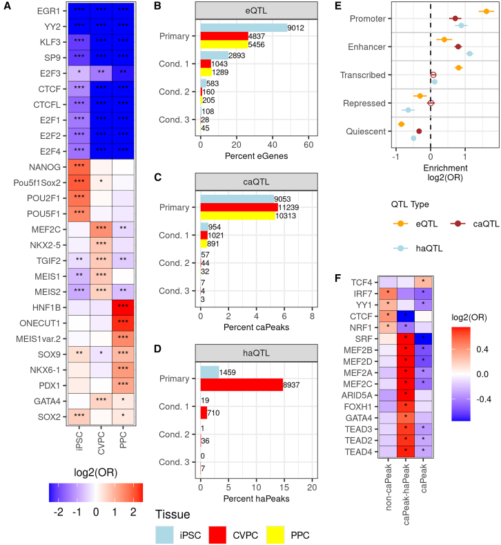
Most GWAS loci are presumed to affect gene regulation; however, only ∼43% colocalize with expression quantitative trait loci (eQTLs). To address this colocalization gap, we map eQTLs, chromatin accessibility QTLs (caQTLs), and histone acetylation QTLs (haQTLs) using molecular samples from three early developmental-like tissues. Through colocalization, we annotate 10.4% (n = 540) of GWAS loci in 15 traits by QTL phenotype, temporal specificity, and complexity. We show that integration of chromatin QTLs results in a 2.3-fold higher annotation rate of GWAS loci because they capture distal GWAS loci missed by eQTLs, and that 5.4% (n = 13) of GWAS colocalizing eQTLs are early developmental specific. Finally, we utilize the iPSCORE multiomic QTLs to prioritize putative causal variants overlapping transcription factor motifs to elucidate the potential genetic underpinnings of 296 GWAS-QTL colocalizations.

Keywords: GWAS; QTLs; chromatin accessibility QTLs; expression QTLs; histone acetylation QTLs; iPSC-derived cardiovascular progenitors; iPSC-derived pancreatic precursors; induced pluripotent stem cells; multiomic QTLs; quantitative trait loci.


Conflict of interest statement

Declaration of interests J.C.I.B. is the Founding Scientist and Director of the San Diego Institute of Science at Altos Labs.

Figures

None
Graphical abstract
Figure 1
Figure 1
Overview of iPSCORE multiomic samples Overview of the iPSCORE molecular samples generated from blood, reprogrammed iPSCs, and derived tissues. Of the 1,261 molecular samples, 861 were previously published and 400 were newly released in this study. In addition to the 393 samples in the four new molecular datasets (indicated by asterisks), 7 of the 220 iPSC RNA-seq samples were not previously published. WGS analyses identified 16,360,123 single-nucleotide polymorphisms (SNPs). The RNA-seq, ATAC-seq, and H3K27ac ChIP-seq libraries were sequenced to median depths of 71.7, 90.9, and 52.1 million reads, respectively (see methods). Created in Biorender. https://BioRender.com/d18y377.
Figure 2
Figure 2
Characterization of multiomic regulatory variation in early developmental tissues (A) Heatmap showing TFBS enrichments in iPSC-, CVPC-, and PPC-specific ATAC-seq peaks. Two-sided Fisher’s exact tests were performed to test the enrichment (odds ratio) of the predicted TFBSs in each of the three ATAC-seq peak sets. TFBSs depleted in all three of the tissue-specific ATAC-seq peaks are considered shared. Each cell is filled with the log2(odds ratio) of the association between predicted TFBSs (y axis) and tissue-specific ATAC-seq peaks (x axis). Asterisks indicate significant enrichments (Benjamini-Hochberg adjusted ∗∗∗p < 5 × 10−10; Benjamini-Hochberg adjusted ∗∗p < 5 × 10−3; Benjamini-Hochberg adjusted ∗p < 0.05). Limits for Log2(odds ratio) were set to −2.5 and 2.5 for plot legibility. (B–D) Bar plots showing the percent of qElements (eGenes, caPeaks, and haPeaks) with at least one eQTL (B), caQTL (C), and haQTL (D). For eQTLs, variants (MAF > 0.05) within 1 Mb of each gene were tested for an association with gene expression. For chromatin QTLs, variants (MAF > 0.05) within 100 kb of each peak were tested for an association with chromatin accessibility (C) or histone acetylation (D). If a QTL was discovered for a gene or peak, up to three additional conditional QTLs were tested by using the lead variant as a covariate. The reported numbers reflect the conditional QTLs remaining after the filtering step. The x axis is the percent of qElements with a QTL for each tissue and the y axis is QTL type (i.e., primary or conditional). Each bar is colored by tissue (iPSC, light blue; CVPC, red; PPC, yellow). (E) Plot showing the enrichment of primary CVPC eQTLs, caQTLs, and haQTLs in chromatin states. The x axis is the enrichment log2(odds ratio) and the y axis contains the five collapsed chromatin states. The points are colored by the QTL type (eQTL, orange; caQTL, brown; and haQTL, light blue). The whiskers represent the log2 upper and lower 95% confidence intervals. Significant enrichments are represented by filled circles and non-significant enrichments are represented by circles without a fill. Enrichment of primary iPSC eQTLs, caQTLs, and haQTLs in chromatin states is shown in Figure S9. (F) Heatmap showing the enrichment of TFBSs in CVPC ATAC-seq peaks without caQTLs (non-caPeaks), with caQTLs overlapping haQTLs (caPeak-haPeak), and with caQTLs not overlapping haQTLs (caPeaks). For each category, a two-sided Fisher’s exact test was performed to test the enrichment of TFBSs, using the other two categories as background. The y axis represents the TFBSs, the x axis corresponds to the ATAC-seq peak annotation, and each cell is filled with the corresponding log2(odd ratio) from the Fisher’s exact test. Asterisks (∗) indicate significant enrichments (Benjamini-Hochberg adjusted p < 0.05). Limits for Log2(odds ratio) were set to −0.75 and 0.75 for plot legibility.
Figure 3
Figure 3
Characterization of EDev-specific QTLs (A) Boxplot showing the correlation of EDev-specific, adult-specific, and shared eQTL effect sizes between the EDev-like and adult GTEx tissues. The x axis is the eQTL specificity, the y axis is the Pearson correlation coefficient (r2) and each point represents the effect size correlation between one of the 3 EDev-like tissues and one of the 47 adult GTEx tissues. Student’s t tests were performed to test effect size correlation differences between each group and the p values are reported for each comparison. (B) Bar plot showing the fraction of iPSCORE EDev-specific eQTLs found in the three tissues. The x axis are the tissues, and the y axis is the fraction of EDev-specific eQTLs. The bars are labeled with the number of EDev-specific eQTLs found in the indicated tissue. (C) Boxplot showing the differences in effect size between iPSCORE EDev-specific and shared eQTLs by tissue. The x axis is the tissue, the y axis is the absolute effect size of the eQTLs and the boxes are filled by category (EDev, red; shared, turquoise). A two-sided Mann-Whitney U test was performed to test the difference between the groups and the asterisks (∗p < 5 × 10−5, ∗∗p < 5 × 10−20) indicate that the tests are significant. The whiskers represent 1.5-times the interquartile range (IQR) and the line in the box represents the median. Outliers are not shown for plot legibility.
Figure 4
Figure 4
Characterization of the 5,672 complex QTLs affecting multiple qElements (A) Bar plot showing the number of qElements associated with each of the 5,672 complex QTLs. The x axis is the number of complex QTLs, the y axis represents the number of qElements, and the bars are colored by tissue (iPSC, light blue; CVPC, red; and PPC, yellow). (B–D) Pie charts showing the number of complex QTLs characterized based on their associated molecular qElements (i.e., eQTLs, caQTLs, and haQTLs). (E) Overlaid histogram showing the different distributions of the distance between the lead variant and the TSS of the nearest expressed gene between complex and singleton QTLs for the three molecular phenotypes in CVPCs. The x axis is the minimum distance between the lead variant and the nearest TSS in kilobases, the y axis is the log10 of the number of QTLs, and the bars show the number of QTLs in each category (complex QTLs, dark orange; and singleton QTLs, light orange). The maximum distance for eQTLs was set to 1 Mb and the maximum distance for chromatin QTLs was set to 100 kb.
Figure 5
Figure 5
Chromatin QTLs capture distal GWAS loci missed by eQTLs (A and B) Bar plots showing the percent of GWAS loci that are explained by QTLs in the iPSCORE EDev-like tissues for (A) all traits combined and (B) independently. The x axis contains the GWAS trait name, along with the total number of GWAS loci for each trait, and the y axis shows the proportion of GWAS loci that colocalize with iPSCORE QTLs. The bars were colored according to the colocalized QTL types (i.e., caQTL-haQTL-eQTL, eQTL-haQTL, eQTL-caQTL, caQTL-haQTL, eQTL, caQTL, haQTL), and the numbers correspond to the number of GWAS loci that colocalized with the QTL types. At the top of each bar, we indicate the total number and percent of GWAS loci that colocalized with the QTLs. (C) Boxplot showing the distance to the nearest TSS for colocalized GWAS loci (n = 540) by QTL types. The x axis is the distance between the colocalized GWAS loci index and the TSS of the nearest protein-coding gene in kilobases, and the y axis is the combination of QTLs that colocalize with a GWAS locus. The whiskers represent the 1.5× IQR and the line in the box represents the median. For plot legibility, the maximum distance was set to 350 kb. (D) Boxplot showing the distance to the nearest TSS for GWAS loci by colocalization status. The x axis is the distance between the GWAS loci index and the TSS of the nearest protein-coding gene in kilobases, and the y axis is the GWAS loci colocalization status. The asterisks (∗∗) indicate that there is significantly different distribution (two-sided Mann-Whitney U test p = 1.2 × 10−11) between GWAS loci with and without colocalization. The whiskers represent the 1.5× IQR and the line in the box represents the median. For plot legibility, the maximum distance was set to 250 kb. (E) Plot showing the relative enrichment of GWAS loci colocalization with complex and singleton QTLs. We categorized each complex and singleton QTL based on their associated molecular phenotype(s). Two-sided Fisher’s exact tests were performed to test the relative enrichment (odds ratio) of each QTL category for GWAS colocalization compared with all other categories. In the first three rows of the x axis, the black circles indicate the QTL composition categories (i.e., QTLs affecting different combinations of qElements). In the last two rows of the x axis, red circles indicate the QTL category (i.e., complex or singletons). The y axis is the log2(odds ratio) enrichment. Tests that had p < 0.05 were considered significant (colored in black). The whiskers represent the log2 upper and lower 95% confidence intervals.
Figure 6
Figure 6
Multiomic QTLs improve the characterization of causal GWAS variants (A) Histogram showing the size of 99% credible sets for the 992 colocalized QTLs (both complex and singleton) across molecular phenotypes. The x axis describes the numbers of variants in the credible set, the y axis is the percent of GWAS-QTL colocalizations, and the bars are colored by QTL molecular phenotype (caQTL, brown; eQTL, orange; and haQTL, light blue). (B) Bar plot showing the number of the GWAS signals that are associated with a high-confidence credible set SNP that overlaps a TF motif in each of the three tissues. The x axis is the number of GWAS-QTL colocalizations, the y axis divides the 15 GWAS traits into bars colored by tissue (iPSC, light blue; CVPC, red; and PPC, yellow). (C) A type 2 diabetes signal colocalized with PPC complex QTL 122 containing one eGene, and two caPeaks. The genomic coordinates are on the x axes, and the –log10(p values) for the associations between the genotype of the tested variants and gene expression, chromatin accessibility or type 2 diabetes are plotted on the y axes. Horizontal lines indicate genome-wide significance thresholds for QTL (p = 5 × 10−5, red) and GWAS (p = 5 × 10−8, blue) for plotting purposes. Each variant was colored according to their LD with the lead fine-mapped variant (purple diamond; rs849133, chr13:28152661:C>T, causal PP = 61.4%) using the 1000 Genomes Phase 3 Panel (Europeans only) as reference. rs1635852 (yellow diamond; chr7:28149792:T>C, causal PP = 1.4%) disrupts TF motifs and is the validated causal variant. (D) Binding site motifs for PDX1 and NKX6-1 are affected by a high-priority MOPCV (rs1635852; chr7:28149792:T>C) for type 2 diabetes. The light blue arrow indicates which position in the motifs is affected by rs1635852.

Update of

References

    1. GTEx Consortium The GTEx Consortium atlas of genetic regulatory effects across human tissues. Science. 2020;369:1318–1330. doi: 10.1126/science.aaz1776. - DOI - PMC - PubMed
    1. Nguyen J.P., Arthur T.D., Fujita K., Salgado B.M., Donovan M.K.R., iPSCORE Consortium. Matsui H., Kim J.H., D’Antonio-Chronowska A., D’Antonio M., Frazer K.A. eQTL mapping in fetal-like pancreatic progenitor cells reveals early developmental insights into diabetes risk. Nat. Commun. 2023;14:6928. doi: 10.1038/s41467-023-42560-4. - DOI - PMC - PubMed
    1. D’Antonio M., Nguyen J.P., Arthur T.D., iPSCORE Consortium. Matsui H., D’Antonio-Chronowska A., Frazer K.A. Fine mapping spatiotemporal mechanisms of genetic variants underlying cardiac traits and disease. Nat. Commun. 2023;14:1132. doi: 10.1038/s41467-023-36638-2. - DOI - PMC - PubMed
    1. Strober B.J., Elorbany R., Rhodes K., Krishnan N., Tayeb K., Battle A., Gilad Y. Dynamic genetic regulation of gene expression during cellular differentiation. Science. 2019;364:1287–1290. doi: 10.1126/science.aaw0040. - DOI - PMC - PubMed
    1. Jerber J., Seaton D.D., Cuomo A.S.E., Kumasaka N., Haldane J., Steer J., Patel M., Pearce D., Andersson M., Bonder M.J., et al. Population-scale single-cell RNA-seq profiling across dopaminergic neuron differentiation. Nat. Genet. 2021;53:304–312. doi: 10.1038/s41588-021-00801-6. - DOI - PMC - PubMed