. 2025 Apr;640(8060):1072-1082.
doi: 10.1038/s41586-025-08633-8. Epub 2025 Feb 26.

Programs, origins and immunomodulatory functions of myeloid cells in glioma

Affiliations

Programs, origins and immunomodulatory functions of myeloid cells in glioma

Tyler E Miller et al. Nature. 2025 Apr.

Abstract

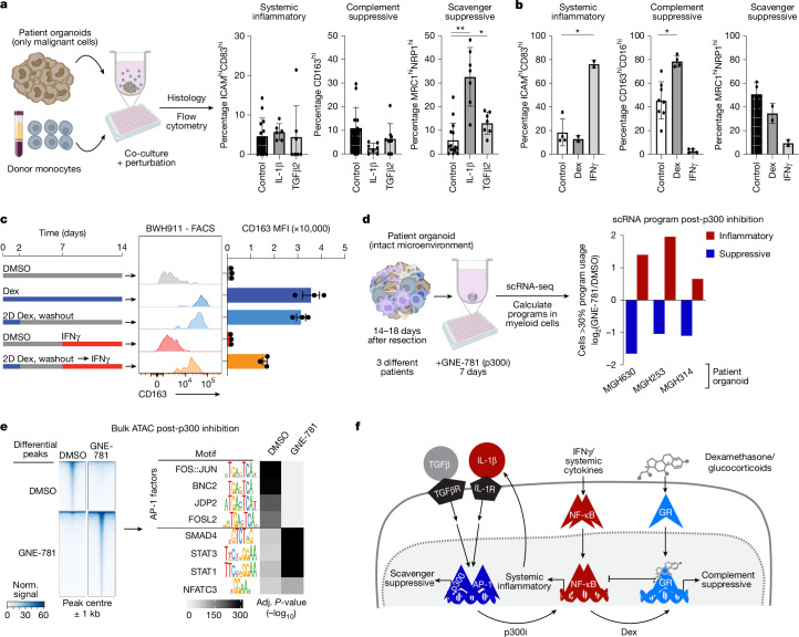
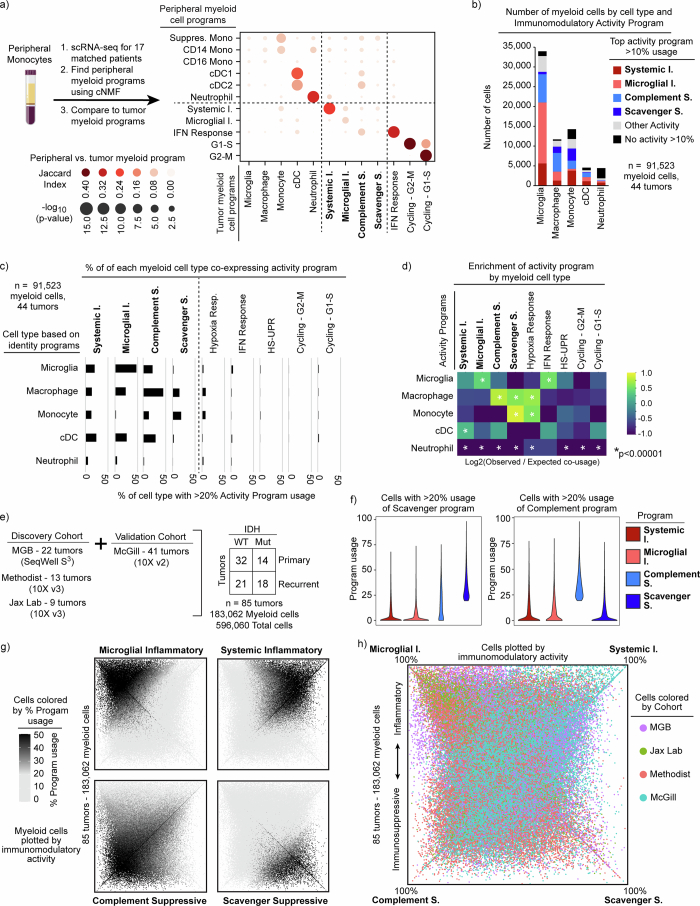
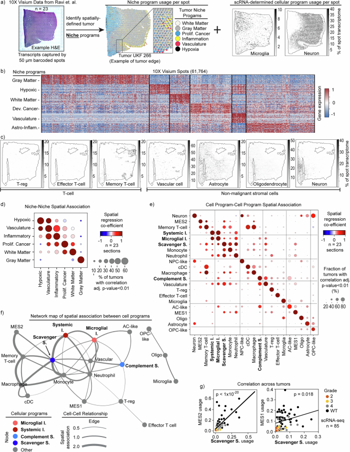
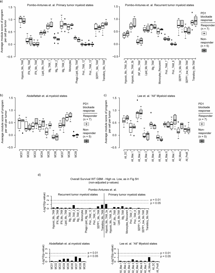
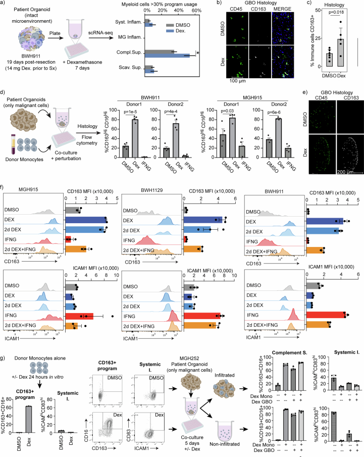
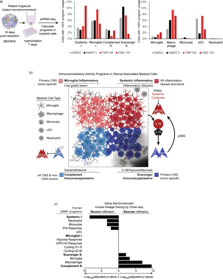
Gliomas are incurable malignancies notable for having an immunosuppressive microenvironment with abundant myeloid cells, the immunomodulatory phenotypes of which remain poorly defined1. Here we systematically investigate these phenotypes by integrating single-cell RNA sequencing, chromatin accessibility, spatial transcriptomics and glioma organoid explant systems. We discovered four immunomodulatory expression programs: microglial inflammatory and scavenger immunosuppressive programs, which are both unique to primary brain tumours, and systemic inflammatory and complement immunosuppressive programs, which are also expressed by non-brain tumours. The programs are not contingent on myeloid cell type, developmental origin or tumour mutational state, but instead are driven by microenvironmental cues, including tumour hypoxia, interleukin-1β, TGFβ and standard-of-care dexamethasone treatment. Their relative expression can predict immunotherapy response and overall survival. By associating the respective programs with mediating genomic elements, transcription factors and signalling pathways, we uncover strategies for manipulating myeloid-cell phenotypes. Our study provides a framework to understand immunomodulation by myeloid cells in glioma and a foundation for the development of more-effective immunotherapies.


Conflict of interest statement

Competing interests: T.E.M. has financial interests in Reify Health, Care Access Research and Telomere Diagnostics. C.P.C. has financial interest in Axoft. L.N.G.C. receives consulting fees from Elsevier, Oakstone Publishing, Prime Education, BMJ Best Practice and Servier, and research funding from Merck & Co (to the Dana-Farber Cancer Institute). J.L.G. is consultant and serves on the scientific advisory board of Array BioPharma, AstraZeneca, BD Biosciences, Carisma, Codagenix, Duke Street Bio, GlaxoSmithKline, Kowa, Kymera, OncoOne and Verseau Therapeutics, and receives research support from Array BioPharma/Pfizer, Eli Lilly, GlaxoSmithKline and Merck. M.L.S. is an equity holder, scientific co-founder and advisory board member of Immunitas Therapeutics. A.K.S. receives compensation for consulting and/or scientific advisory board membership from Honeycomb Biotechnologies, Cellarity, Ochre Bio, Relation Therapeutics, FL86/Quotient Therapeutics, Parabalis Medicines, Passkey Therapeutics, IntrECate Biotherapeutics, Danaher, Senda Biosciences and Dahlia Biosciences that is unrelated to this work. B.E.B. has financial interests in Fulcrum Therapeutics, HiFiBio, Arsenal Biosciences, Chroma Medicine and Cell Signaling Technologies. The other authors declare no competing interests.

Figures

Fig. 1
Fig. 1. Identification of consensus superimposable myeloid-cell identity and activity programs.
a, Analysis pipeline for identifying recurrent myeloid programs across three discovery glioma cohorts. Mut, mutant. b, Heatmap depicting similarity of the gene spectra scores of each program in the three discovery cohorts. Consensus programs created from their average scores are also included. HS-UPR, heat shock–unfolded protein response; IFN, interferon. c, Heatmap depicting expression of genes in recurrent myeloid programs (rows) in single cells (columns) grouped by cell type, as defined by myeloid-identity program usage. Intermediate (Int) cells express both adjacent identity programs. Right, selected marker genes for each program. d, Box plots depicting the percentage of cells per tumour that express the corresponding myeloid program (far left in c) across the three discovery cohorts. The line represents the median and boxes represent the first and third quartiles; n = 44 tumours, 91,523 myeloid cells. e, Quadrant plot positioning myeloid cells from the discovery and validation cohorts according to their relative expression of four prominent immunomodulatory programs. Diagonal axes correspond to the differential between microglial inflammatory and scavenger immunosuppressive program usage or between systemic inflammatory and complement immunosuppressive program usage. Programs at opposite ends of the diagonal axes are largely exclusive in individual cells. Each dot is a small pie chart depicting the prevalence of each immunomodulatory program (colours) and the combination of all other programs (grey) in that cell. f, Quadrant plots depicting myeloid cell identity usage for cells positioned as in e. Four prominent immunomodulatory activity programs are each used across multiple myeloid cell types.
Fig. 2
Fig. 2. Immunomodulatory myeloid programs associated with spatial tumour niches.
a, Scatter pie plot (left) of a representative 10× Visium section of a glioma specimen from ref. . Each pie chart depicts expression of the indicated tumour niche programs (colours) in a spot. The scatter plots (right) show the same section with spots shaded by expression of the indicated cNMF myeloid cell or malignant cell program. AC, astrocyte; MES, mesenchymal; NPC, neural progenitor cell; OPC, oligodendrocyte progenitor cell; prolif., proliferative. b, Dot plot depicting intraspot correlation between niche and cell program scores, calculated independently for each sample. The dot size shows the proportion of samples with a significant correlation (adjusted P < 0.01, two-sided, from Pearson correlation probability density function) and the colour indicates a positive (red) or negative (blue) correlation. c, Cell–niche map illustrating the conserved spatial relationships of myeloid, malignant and neural cell types (circles) and transcriptomic niches (shaded areas) across spatial samples. These spatial analyses show that the immunomodulatory myeloid programs are enriched in distinct niches in a conserved tumour architecture.
Fig. 3
Fig. 3. Clinical correlates of immunomodulatory myeloid programs.
a, Quadrant plot with myeloid cells positioned as in Fig. 1e and coloured by the grade of the originating tumour. b, Box plot depicting the distribution of microglial inflammatory program module scores computed for 484 glioma datasets. For all the box plots in this figure, each dot represents a tumour, and lines represent median and quartiles. The whiskers represent 1.5 times the interquartile range. False discovery rate (FDR)-corrected P-values were calculated using two-sided Wilcoxon rank sum tests: *P < 0.05, **P < 0.01, ***P < 0.001; NS, not significant. Not all comparisons are shown. GBM, glioblastoma; LGG, low-grade glioma. c, Dot plot depicting the linear regression coefficient between the average usage of each myeloid program per glioma sample and the corresponding patient’s pre-surgery daily Dex dose. P-values are from ordinary least-squares regression model. d, Box plot showing average complement immunosuppressive program usage in glioma samples stratified by Dex dose; n = 37 IDH-WT glioma; P-values calculated using a two-sided Wilcoxon rank sum test. e, Box plot showing average usage of programs in glioma samples stratified by Dex use (hypoxic samples excluded). P-values were calculated using two-sided Wilcoxon rank sum tests. f, Box plot depicting the percentage of cells expressing the scavenger immunosuppressive program across glioma specimens from an anti-PD1 immunotherapy trial, stratified by response (P = 0.017, FDR when considering all measurements in Extended Data Fig. 8f  = 0.088). g, Quadrant plots positioning the individual myeloid cells in f from radiographic response (left) and non-response (right) samples according to their expression of the immunomodulatory programs. h, Dot plot depicting the association between the indicated programs and Treg cell abundance across 85 gliomas. Adj. P-value, adjusted P-value. i, Kaplan–Meyer curve of overall survival for IDH-WT glioblastomas stratified by scavenger immunosuppressive program expression in GLASS and GSAM cohorts. The P-value was calculated using a two-sided log-rank test.
Fig. 4
Fig. 4. Regulatory circuits associated with immunomodulatory myeloid programs.
a, Heatmap depicting the accessibility of candidate regulatory loci (rows) associated with each immunomodulatory program in pseudobulk profiles aggregated from snATAC-seq data for glioma-associated myeloid cells with preferential expression of a single program (columns). Norm., normalized. b, Heatmap depicting enrichment of the indicated TF motifs (rows) in accessible elements associated with each program (columns). P-values were calculated using one-sided Fisher’s exact test. c, Heatmap displaying the specificity scores for TF regulons (rows) in cells with discrete immunomodulatory program usage (columns). Scores were calculated from scRNA-seq by SCENIC. d,e, Bar charts showing the expression of ligands predicted to target TFs of the system inflammatory program (d) or the scavenger immunosuppressive program (e). Values indicate expression in the program with the highest expression of the ligand (indicated by bar colour). f, Volcano plot depicting differentially expressed genes in macrophages treated with Dex for 24 h (ref. ). The top 20 genes in each program are plotted and coloured according to the program. g, Genomic view showing snATAC profiles aggregated for each program over the top GR target loci. The GR ChIP–seq data in the bottom row show top GR-bound loci. h, Dot plot showing GR binding signal over rank-ordered target sites. Selected complement immunosuppressive program genes near GR target sites are labelled. Together, epigenetic data shed light on the TF regulatory mechanisms underlying immunomodulatory program expression in glioma-associated myeloid cells.
Fig. 5
Fig. 5. Functional induction and reversal of immunosuppressive programs.
a,b, Experimental design and bar plots of flow results from ligand perturbation experiments of IL-1β and TGFβ2, which specifically induce the scavenger immunosuppressive program (a) and Dex and IFNγ, which specifically induce the complement immunosuppressive program and systemic inflammatory programs, respectively (b). Data points represent individual GBOs. Plots show mean ± s.d. P-values for induction over control were calculated using Fisher’s exact test; *P < 0.05, **P < 0.01. c, Experimental design and flow-cytometry results from evaluations of the durability of the Dex phenotype. Bar plots show mean signal ± s.d. Data points each represent two pooled GBOs. FACS, fluorescence-activated cell sorting; MFI, mean fluorescence intensity. d, Experimental design and results for p300i treatments of GBOs. Bars represent a combination of inflammatory programs (red) or immunosuppressive programs (blue) computed from scRNA-seq. P = 0.0036, calculated by two-tailed Student’s t-test of change in suppressive program versus change in inflammatory program across three samples. e, Heatmaps depict differentially accessible candidate regulatory elements between myeloid cells treated with p300i or DMSO control. TF motifs enriched in the differential elements are shown on the right. P-values were calculated using one-sided Fisher’s exact test. f, Schematic depicting the interconnected feedback loops of the immunomodulatory programs and the cytokines, TFs and small molecules that can affect them. 96-well plate (a and d) and PBMC tube (a) created in BioRender. Shalek, A. (2005) https://BioRender.com/b15i535.
Extended Data Fig. 1
Extended Data Fig. 1. Identification of consensus myeloid programs in discovery and validation cohorts.
a) Computational pipeline used to identify recurrent myeloid programs in scRNA-seq data from three discovery cohorts, and applied separately to validation cohort (McGill). b) UMAP for all cells in the MGB discovery cohort colored by nominal cell type. c) Same UMAP with cells annotated by the presence (black) or absence (gray) of copy number variations. d) Heatmap depicts the expression of genes in recurrent myeloid programs (rows) across cells (column) grouped by cell type, analogous to Fig. 1c, but for the validation cohort (McGill). Cell type determined from the usage of cNMF myeloid identity programs. e) Boxplots depict the percentage of cells per tumor expressing the corresponding myeloid program (far left) across the validation cohort. Line represents median and boxes represent 1st and 3rd quartiles. Consensus myeloid programs were highly consistent between discovery and validation cohorts.
Extended Data Fig. 2
Extended Data Fig. 2. Identification and comparison of cNMF programs in peripheral myeloid cells to tumor programs.
a) cNMF programs identified from scRNA-seq profiles of peripheral blood from glioma patients. Plot compares cNMF programs between peripheral myeloid cells and glioma-associated myeloid cells. Heat and dot size correspond to Jaccard Index between gene spectra. b) For each myeloid cell type, stacked bar shows the absolute number of cells with top usage of indicated activity programs. c) For each myeloid cell type (rows), horizontal bars indicate the percent of cells with >20% usage of the indicated activity program. d) Heatmap shows relative enrichment of the indicated activity programs (columns) across the different cell identities (rows). P value calculated using hypergeometric distribution. e) Schematics depicts expansion of the cohort to include the McGill samples in all subsequent analyses. f) Violin plots shows the usage of each immunomodulatory program in cells with >20% usage of the Scavenger Immunosuppressive program (left) or the Complement Immunosuppressive program (right). g) Quadrant plots position cells (dots) by their expression of the immunomodulatory programs as in Fig. 1e. Grayscale depicts usage of the indicated immunomodulatory program. The position of each dot represents the difference in the usage of immunosuppressive and inflammatory programs by that cell (the upper part of the plot is more inflammatory, while the lower part is more immunosuppressive). h) Quadrant plot as in g but with cells colored by cohort. Overall, the four immunomodulatory programs are shared across myeloid cell types, but are rarely utilized by the same cells. PBMC tube, Shalek, A. (2005) https://BioRender.com/b15i535.
Extended Data Fig. 3
Extended Data Fig. 3. Direct comparison of Louvain clustering and cNMF programs.
a) UMAP displays the Louvain clusters of batch-corrected singlet myeloid cells of the MGB cohort. b) UMAPs of the same MGB cohort with cells annotated by their usage of the cell identity (top) and cell activity programs (bottom). c) Louvain clusters in panel a were annotated based on differential gene expression analysis (left), or by the name and frequency of most frequent cell type per cNMF identity program usage (middle). For each Louvain cluster (rows), bar chart (right) indicates the percent of cells with high expression of the indicated activity program (columns). d) (Top) UMAP exhibiting the Louvain clusters of batch-corrected singlet myeloid cells of the Abdelfattah et al. cohort. (Bottom) UMAPs of the myeloid cells of the Abdelfattah et al. cohort demonstrating the usage of indicated programs at the top of each UMAP. e) (left) Annotations of Louvain clusters in (d) based on standard differential gene expression analysis of clusters by Abdelfattah et al. (Right) bar chart of the average usage of identity and activity cNMF programs in the cells of the Louvain clusters in (d). The clusters are composed of cells that are heterogeneous combinations of the cNMF programs, with the clusters largely segregating by identity program usage, while the activity programs are shared across clusters and cell types.
Extended Data Fig. 4
Extended Data Fig. 4. Myeloid cNMF programs compared to published gene sets and evaluated in other tumor types.
a-d) Plots compare top genes in our consensus myeloid cNMF programs to published gene sets for myeloid clusters. Heat and dot size correspond to Jaccard Index and significance between the top genes in our cNMF programs and gene sets derived from the published studies (a-c) or between gene sets from the published studies (d). Gene sets from the other studies were typically derived from differential gene expression of Louvain/Leiden clusters. Our immunomodulatory programs derived from cNMF were mostly distinct from prior gene sets. e) Heatmap of average usage of our consensus cNMF programs in myeloid cells from published scRNA-seq datasets for other tumor types. For cancer types with multiple studies, weighted average was used based on the number of tumors in the cohort. Full list of studies and sources in Supplemental Table 4. The Microglial Inflammatory program was unique to the brain, while the Scavenger Immunosuppressive program was specific to primary brain tumors.
Extended Data Fig. 5
Extended Data Fig. 5. Convergent phenotypes of microglia- and bone marrow-derived myeloid cells.
a) MAESTER analysis pipeline for inferring the origins of myeloid cells in glioma based on detection of mtDNA mutations in scRNA-seq data. b) Plot depicts the enrichment difference between PBMC-specific and Resident-specific variants. Each dot represents the enrichment level for cells with the indicated identity in one patient. X-axis denotes the scaled difference between GSVA enrichment of PBMC-specific variants and Resident variants. c) Stacked bar charts indicate the average usage of the immunomodulatory programs in myeloid cells with the indicated cell identities for the four tumors shown in panel b. The “other programs” category encompasses the other identity and activity programs. d) Experimental design (top) and flow cytometry plots (bottom) for matched patient derived PBMCs applied to immune cell-depleted GBOs. Results are from a combination of 8 GBOs per condition. T cells were used as gating control for P2RY12 and TMEM119. e) Representative immunofluorescence images show PBMCs infiltrated into a GBO. f) Representative immunofluorescence images of organoid sections from different patients using the same experimental setup as in (d) except using normal donor monocytes. g) Pie charts depict quantification of images in (f). Results are from 4 GBOs combined for each condition. h) Flow cytometry plots evaluate the percent of CD45+ cell infiltration into the GBOs. Credit: 96-well plate and PBMC tube, Shalek, A. (2005) https://BioRender.com/b15i535.
Extended Data Fig. 6
Extended Data Fig. 6. Spatial associations of myeloid cells and glioma niches.
a) Schematic illustrates the analysis approach for spatial transcriptomics samples: cNMF was applied to spatial transcriptomic data from Ravi et al. to define broad transcriptomic tumor niche programs; in parallel, the cell content of each spot was inferred based on scRNA-seq signatures (RCTD demultiplexing; see Methods). Spatial Pie plot (middle) of a representative 10X Visium section depicts tumor niche programs. Each pie represents a spot and is colored by expression of the indicated tumor niche programs. Spatial plot (right) of the same section depicts relative expression of the indicated cell type programs (gray scale indicates RCTD-predicted spot proportions). b) Heatmap shows expression of genes (rows) grouped by niche program across all spots (columns) in the cohort of spatial transcriptomic samples. Top 40 genes of each niche program are shown. Gene expression data is column normalized, then log normalized and scaled by variance. c) Spatial plots show relative expression of cellular programs in the 10X Visium section shown in Fig. 2a (gray scale indicates RCTD-predicted spot proportions). d) Dotplot displays the spatial proximity enrichment score between niche programs, calculated independently per sample (p-value ordinary least squares, see Methods). Dot size denotes the proportion of samples showing a significant correlation (p-adj <0.01), while color signifies a positive (red) or negative (blue) correlation. e) Dotplot displays the spatial proximity enrichment score between cell programs, calculated independently per sample (p-value ordinary least squares, see Methods). f) Network graph illustrates recurrent spatial relationships of cell types in tumor microenvironment across spatial transcriptomic samples. Nodes denote cell types, with edges marking significantly enriched proximities between cell types, observed in at least 40% of samples with an average enrichment score >0.1. Edge width reflects this average score. g) Scatter plot exhibits the mean Scavenger Immunosuppressive program score (x-axis) versus the MES2 or MES1 cancer program score (y-axis) across glioma samples in the scRNA-seq dataset. Ordinary least square results are shown (line, and p-value).
Extended Data Fig. 7
Extended Data Fig. 7. Myeloid program composition varies with histopathological tumor grade.
a) Quadrant plot with myeloid cells positioned as in Fig. 1e with each cell colored by the IDH mutation status of the corresponding tumor. b) Box plots show the average usage of cell activity (left) and identity (right) programs in myeloid cells from the single-cell RNA-Seq cohorts, stratified by IDH mutation status of the corresponding tumor. For all box plots in figure, each dot represents a tumor, and lines represent median and quartiles. The whiskers represent 1.5 times the interquartile range. FDR corrected p-value calculated using two-sided Wilcoxon Rank Sum Test: * <0.05, ** <0.01, ***<0.001. c) Box plot exhibiting the program average module scores in tumors of the TCGA cohort stratified by IDH mutation status. d) Quadrant plots as in panel (a) in which the black color indicates whether a myeloid cell is from a grade 2 (left), grade 3 (center), or grade 4 (right) glioma. e) Box plots depict the average usage of each immunomodulatory program in myeloid cells from gliomas stratified by grade. f) Box plot shows the average usage of the G2M cycling program in myeloid cells in single-cell RNA-Seq data for the glioma cohorts, stratified by grade and IDH mutation status. g) Boxplot shows the odds ratio of cycling for myeloid cells expressing the indicated programs, calculated independently for each tumor. ‘Cycling’ and program defined by a cell usage >20% of both cycling and indicated program. h) Quadrant plot as in Fig. 3a with indication of cycling cells.
Extended Data Fig. 8
Extended Data Fig. 8. Immunomodulatory programs associated with immunotherapy resistance.
a) Boxplot displays the average usage of the myeloid cell identity programs stratified by use of dexamethasone in IDH-WT tumors with low hypoxic program usage in the MGB cohort. For all box plots in figure, each dot represents a tumor, and lines represent median and quartiles. The whiskers represent 1.5 times the interquartile range. FDR corrected p-value calculated using two-sided Wilcoxon Rank Sum Test: * <0.05, ** <0.01, ***<0.001. b) Boxplot shows the percent of peripheral myeloid cells with the indicated peripheral myeloid programs in blood from glioma patients, stratified by administration of Dex treatment. c) Scatterplot depicts average Complement Immunosuppressive program usage in glioma-associated myeloid cells versus average CD163+ Immunosuppressive Monocyte usage in peripheral myeloid cells in matched patients stratified by Dex treatment. Only tumors with low hypoxic program usage are included. P-value from ordinary least-squares regression. d) Quadrant plot positions individual myeloid cells from an anti-PD1 immunotherapy trial (as in Fig. 3g), based on the expression of our immunomodulatory activity programs, highlighting SIGLEC9 expression heterogeneity (grayscale). SIGLEC9 expression was not enriched in any of the immunomodulatory programs. e) Boxplot of SIGLEC9-positive cells from the same immunotherapy trial, grouped by expression of our immunomodulatory programs, then stratified by corresponding tumor response to immunotherapy. Average per tumor plotted. SIGLEC9 expression only stratified patients by response when it was co-expressed with the Scavenger Immunosuppressive program. f) Boxplot of per tumor calculation of cells positive for SIGLEC9 or immunomodulatory program (# p-value = 0.017, FDR = 0.088). When calculated on a per tumor basis, overall SIGLEC9 expression shows no significant difference between responding and non-responding patients.  Credit: PBMC tube, Shalek, A. (2005) https://BioRender.com/b15i535.
Extended Data Fig. 9
Extended Data Fig. 9. Comparisons of clinical outcomes to previously published gene sets.
a-c) Boxplot shows the relative module score of published myeloid gene sets from Pombo-Antunes et al. (a), Abdelfattah et al. (b) and Lee et al. (c) in gliomas from Mei et al. stratified by response to immunotherapy. Boxplots represent median and quartiles, with whiskers representing 1.5 times the interquartile range. Significance calculated by FDR-corrected two-sided Wilcoxon Rank Sum Test. All were >0.25. d) Barplots show P-values calculated using a two-sided log-rank test (y-axis) to determine whether the indicated gene sets (x-axis) from Pombo-Antunes et al., Abdelfattah et al., and Lee et al. are associated with survival differences. None met significance of p < 0.05.
Extended Data Fig. 10
Extended Data Fig. 10. TF circuits associated with the immunomodulatory programs.
a) Schematic of the snATAC-seq analysis pipeline for deriving pseudo-bulk accessibility profiles for the respective immunomodulatory programs. b) Heatmap depicts relative accessibility over candidate regulatory sites for each immunomodulatory program, as in Fig. 4a but including Monocyte and Microglial populations. c) Heatmap shows the average TF expression and percent of cells expressing the TF in myeloid cells with discrete Systemic or Scavenger program expression. d) Barchart shows enrichments of 50 most downregulated genes within 24 h of Dex treatment in human macrophages (KEGG gene sets). Regulated genes derived from Table S1B from Jubb et al. P-value generated by gProfiler using default settings. e) Boxplot of TNFAIP3 expression in macrophages after 1 h of Dex treatment (Jubb et al.). Boxplots represent median and quartiles, with whiskers representing 1.5 times the interquartile range. Significance is adjusted p value (FDR) taken from Table S1A of Jubb et al.
Extended Data Fig. 11
Extended Data Fig. 11. Dexamethasone rapidly and durably induces the Complement Immunosuppressive program.
a) Experimental design and bar graph shows the percentage of myeloid cells expressing the immunomodulatory programs in scRNA-seq data for GBOs treated with Dex for 7 days or control. 16 GBOs from BWH11 were pooled per condition and sequenced; error bars were calculated from the binomial standard error. p-value = 0.018 by Fisher’s Exact test, all other comparisons not significant. b) Immunofluorescence images of a GBO with intact endogenous TME cultured for 7 days with 100 nM Dex or DMSO control. c) Barplot shows mean quantification of marker positive cells in sectioned organoids. Each dot represents an organoid. P-value calculated with 2-tailed student’s T-test. Error bars represent S.D. d) Experimental design and flow cytometry results for peripheral monocytes applied to immune cell-depleted GBOs in the presence of Dex or IFN-gamma. Data points represent 3 pooled GBOs. Error bars represent S.D. e) Representative histology section of a GBO in the experiment shown in (d). f) Flow cytometry results of GBOs from multiple patients show consistent phenotypes. Experimental design as in Fig. 5c. Top row shows CD163, a marker of the Complement Immunosuppressive program. Bottom row shows ICAM1, a marker of the Systemic Inflammatory program. BWH911 CD163 plot is the same as shown in Fig. 5c. Barplots show mean signal +/− S.D. Data points (4) each represent 2 pooled GBOs. g) Experimental design and results from Dex treatment of infiltrating GBO model. Flow cytometry results after 24 h of treatment, prior to adding cells to GBOs (bottom left). Barcharts show the mean of 3 wells of monocytes treated from the same patient. Error bars +/− S.D. Representative flow plot is shown. Middle schematic shows experimental design after pretreated cells were applied to GBOs. Barchart on the right shows mean flow cytometry results for infiltrated and non-infiltrated myeloid cells, stratified by treatment. Data points (4) each represent 3 pooled wells (for non-infiltrated) or GBOs (for infiltrated). Error bars +/− S.D. Peripheral monocytes exposed to Dex prior to being cultured with GBOs turned on Complement markers and maintained program marker expression after GBO infiltration and through differentiation. The Complement Immunosuppressive marker expression in the GBO was equivalent regardless of exposure timing or duration, indicating monocytes have a memory of Dex exposure even when put in different microenvironments. Credit: 96-well plate and PBMC tube, Shalek, A. (2005) https://BioRender.com/b15i535.
Extended Data Fig. 12
Extended Data Fig. 12. Impact of microenvironment and perturbations on immunomodulatory programs.
a) Experimental design and barplot for evaluations of the impact of epigenetic inhibitors on glioma-associated myeloid cell activity and identity programs. 25 GBOs from MGH630 were pooled per condition and sequenced b) Schematic of the four immunomodulatory activity programs in glioma-associated myeloid cells, along with the microenvironmental associations, TF enrichments, and perturbations shown to induce or reverse program expression. Myeloid cell types depicted in each program quadrant are an approximation of the distribution of cell types expressing the respective program. Program distribution across CNS and non-CNS malignancies also noted. c) Bar plots of gene set enrichments from mouse lineage tracing data (Kirschenbaum et al.). Gene sets derived from Top 100 genes in myeloid cells most correlated with recent infiltration (closer to 12 h) or Top 100 genes most correlated with remote infiltration (being in the tumor for up to 48 h). Gene list taken from Kirschenbaum et al. Supplemental Table 2, sheet “Table_S3_Isotype_Control_Time”. P-value generated by gProfiler using default settings with a custom gene set matrix consisting of our cNMF programs. Credit: 96-well plate and PBMC tube, Shalek, A. (2005) https://BioRender.com/b15i535.

Update of

References

    1. Gutmann, D. H. & Kettenmann, H. Microglia/brain macrophages as central drivers of brain tumor pathobiology. Neuron104, 442–449 (2019). - PMC - PubMed
    1. Sørensen, M. D., Dahlrot, R. H., Boldt, H. B., Hansen, S. & Kristensen, B. W. Tumour-associated microglia/macrophages predict poor prognosis in high-grade gliomas and correlate with an aggressive tumour subtype. Neuropathol. Appl. Neurobiol.44, 185–206 (2018). - PubMed
    1. Wang, E. J. et al. Immunotherapy resistance in glioblastoma. Front. Genet.12, 750675 (2021). - PMC - PubMed
    1. Ruffell, B. & Coussens, L. M. Macrophages and therapeutic resistance in cancer. Cancer Cell27, 462–472 (2015). - PMC - PubMed
    1. Klemm, F. et al. Interrogation of the microenvironmental landscape in brain tumors reveals disease-specific alterations of immune cells. Cell181, 1643–1660 (2020). - PMC - PubMed

MeSH terms

LinkOut - more resources