. 2025 Feb 27;87(4):50.
doi: 10.1007/s11538-025-01426-0.

Epidemiological Dynamics in Populations Structured by Neighbourhoods and Households

Affiliations

Epidemiological Dynamics in Populations Structured by Neighbourhoods and Households

Abby Barlow et al. Bull Math Biol. .

Abstract

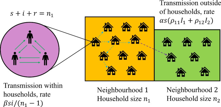
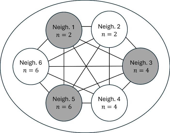
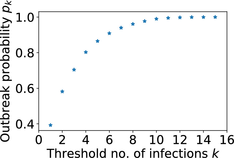
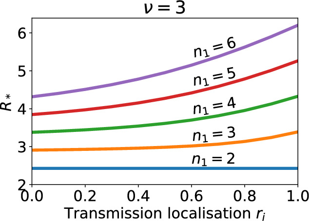
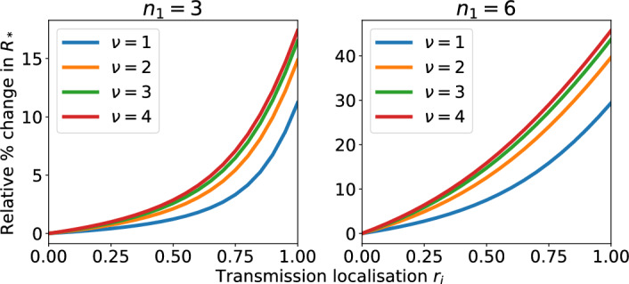
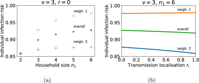
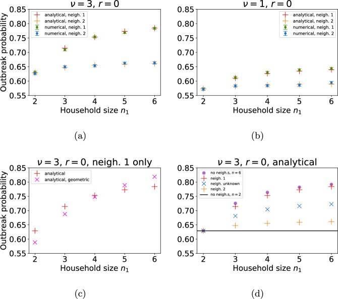
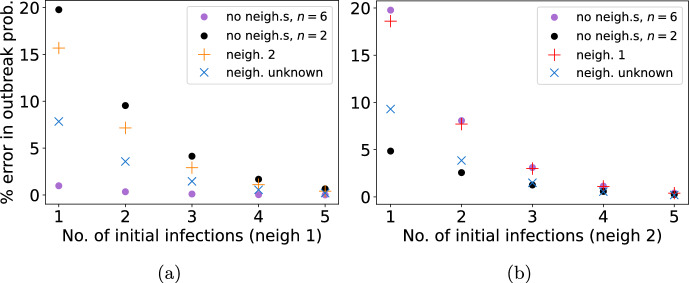
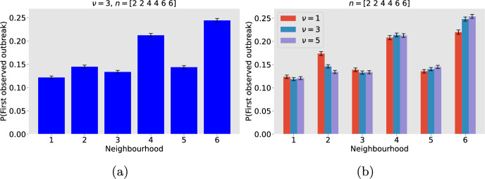
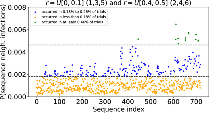
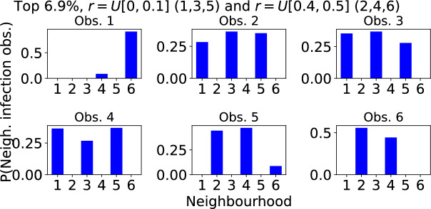
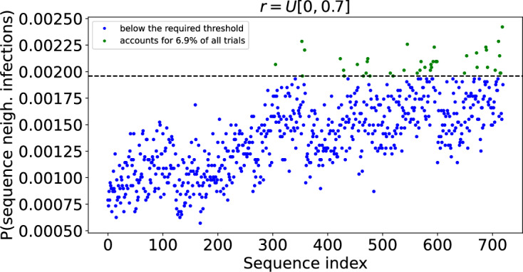
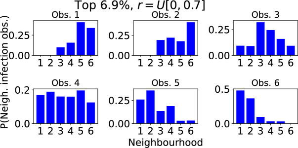
Epidemiological dynamics are affected by the spatial and demographic structure of the host population. Households and neighbourhoods are known to be important groupings but little is known about the epidemiological interplay between them. In order to explore the implications for infectious disease epidemiology of households with similar demographic structures clustered in space we develop a multi-scale epidemic model consisting of neighbourhoods of households. In our analysis we focus on key parameters which control household size, the importance of transmission within households relative to outside of them, and the degree to which the non-household transmission is localised within neighbourhoods. We construct the household reproduction number R over all neighbourhoods and derive the analytic probability of an outbreak occurring from a single infected individual in a specific neighbourhood. We find that reduced localisation of transmission within neighbourhoods reduces R when household size differs between neighbourhoods. This effect is amplified by larger differences between household sizes and larger divergence between transmission rates within households and outside of them. However, the impact of neighbourhoods with larger household sizes on an individual's risk of infection is mainly limited to the individuals that reside in those neighbourhoods. We consider various surveillance scenarios and show that household size information from the initial infectious cases is often more important than neighbourhood information while household size and neighbourhood localisation influences the sequence of neighbourhoods in which an outbreak is observed.

Keywords: Epidemiology; Household; Mathematical model; Metapopulation; Neighbourhood; Outbreak probability; Reproduction number; Surveillance.


Figures

Fig. 1
Fig. 1
Schematic of the two neighbourhood model. There are two levels of connectivity: contacts within households and contacts outside of households either with individuals from an individual’s own neighbourhood or from another neighbourhood
Fig. 2
Fig. 2
Schematic of the 6 neighbourhood model. The bigger circle represents the total population and the smaller circles denote each neighbourhood. The neighbourhoods are numbered as in Table 3 with neighbourhood household sizes detailed in each. The lines denote the connectivity between all the neighbourhoods. The shading of the neighbourhoods distinguish between the strengths of the localisation of their contacts with all other neighbourhoods. The shaded neighbourhoods represent weaker localisation (stronger connectivity) and non-shaded neighbourhoods hold stronger localisation (weaker connectivity)
Fig. 3
Fig. 3
The probability pk of a large outbreak occurring after k household infections have been observed. The Gillespie SSA was used to produce 10, 000 realisations of the model with a single neighbourhood composed of households of size n=2. Other parameters were ν=3, α=0.27 and β=0.8. A realisation was classified as a large outbreak if it led to a total of at least 15 infected households
Fig. 4
Fig. 4
The household reproduction number for a population structured into two neighbourhoods as the localisation of transmission outside of households varies from proportional mixing to complete isolation. Each curve is for a different household size in neighbourhood 1 (n2=2 is fixed). n1=2,3,4,5,6 corresponds to the blue, orange, green, red and purple lines respectively. Contact rate parameters are α=0.27, β=0.8, which gives R=2.4 when n1=2
Fig. 5
Fig. 5
The relative change in the value of the household reproduction number R in a model with two neighbourhoods as localisation of transmission outside of households varies from proportional mixing between neighbourhoods to complete isolation. In both plots n2=2 but household size in neighbourhood 1 differs which modifies the baseline value of R when ri=0; see Fig. 4. Each curve represents a different ratio of within household contacts to outside of household contacts. ν=1,2,3,4 corresponds to the blue, orange, green and red lines respectively (Color figure online)
Fig. 6
Fig. 6
Individual infection risk over entire outbreak when neighbourhoods have different household sizes and the degree of localisation of neighbourhood transmission is varied. a Household size in neighbourhood 1 is varied from n1=2 to 6. Household size in neighbourhood 2, n2=2. Individual infection risks of individuals from neighbourhood 1, 2 and overall are shown as blue crosses, orange pluses and green stars respectively. Infection risk is defined as the probability an individual has been infected (and is recovered) by the time the outbreak ends. b Households sizes are fixed at n1=6 and n2=2. The localisation of neighbourhood contacts ri varies from proportional mixing to complete isolation. Infection risk of individuals from neighbourhoods 1, 2 and overall are displayed as blue, orange and green curves respectively
Fig. 7
Fig. 7
a and b The probability of an outbreak originating from a single infectious individual in neighbourhood 1 (higher curve; green dots and red pluses) or a single infectious individual from neighbourhood 2 (lower curve; blue dots and orange pluses), depending on the household size in neighbourhood 1. Dots denote outbreak probabilities found via 50, 000 Gillespie SSA realisations (95% CIs are indicated by bars in these cases); pluses denote the multi-type branching process approximation detailed in Subsection 2.6.2. Household size remains fixed at n2=2 in neighbourhood 2 and neighbourhood localisation corresponds to portionate mixing (ri=0). All other parameters are the same as in Table 1 unless stated otherwise. a The ratio of within household contacts to outside of household contacts is set to ν=3 and b ν=1, and α,β are such that β=να and R=2.4. c Probability of an outbreak originating from a single infectious individual in neighbourhood 1 (calculated analytically), as in (a), with for comparison, naive branching process approximation based on a geometric offspring distribution shown as pink crosses. d Probability of an outbreak calculated on the assumption that the initial infectious individual is: from neighbourhood 1 (red pluses); from neighbourhood 2 (orange pluses); from neighbourhood 1 or 2 with equal probability (blue crosses); from a population of households of size n1 with no neighbourhood structure (purple dots). The solid black line denotes the outbreak probability given a single infected individual from a population of households of size n2=2 (fixed) (Color figure online)
Fig. 8
Fig. 8
The relative error in the probability of an outbreak originating from k=1,2,,5 initial infectious individuals a from neighbourhood 1, n1=6 and b from neighbourhood 2, n2=2 calculated under various assumptions. In all cases ν=3 and r=0. Assumptions: population of households size n1=6 with no neighbourhood structure (blue pluses); population of households size n2=2 with no neighbourhood structure (orange pluses); initial infected individuals all in the other neighbourhood (green crosses) and all in unknown neighbourhood (red stars) (Color figure online)
Fig. 9
Fig. 9
Probability that an outbreak is first observed in a given neighbourhood. The model has six neighbourhoods. Neighbourhoods 1 and 2 have households of size 2, neighbourhoods 3 and 4 have households of size 4, neighbourhoods 5 and 6 have households of size 6. Neighbourhoods 1, 3 and 5 have weak localisation of contact outside of households. Neighbourhoods 2, 4 and 6 have intermediate localisation. An outbreak is ‘observed’ in a neighbourhood when there have been at least 6 infected households in that neighbourhood. Outbreak observation probabilities were calculated from 500, 000 Gillespie SSA realisations of the model. For each realisation, the localisation parameters ri were assigned randomly from the distribution U[0, 0.1] (neighbourhoods 1, 3, 5) or U[0.4, 0.5] (neighbourhoods 2, 4, 6) and the initial condition introduced a single infected individual into a randomly selected neighbourhood. The 95% confidence intervals are represented as black lines. a ν=3 b ν=1,3,5 in red, blue and purple respectively (Color figure online)
Fig. 10
Fig. 10
Probability an outbreak is observed in given sequences of neighbourhoods when neighbourhoods are grouped according to both household size and degree of localisation. There are 720 possible sequences of 6 neighbourhoods. Each point in the scatter plot corresponds to a unique sequence and shows the proportion of outbreaks in which the outbreak was observed in that sequence of neighbourhoods. The sequence index numbers are arbitrary. A table detailing the sequences corresponding to each index can be found at https://github.com/ahb48/Neighbourhoods_and_households. A total of 50, 000 Gillespie SSA trials were computed. Those that did not result in large outbreaks were discarded, leaving 36, 724 trials. Initially a single individual was infected in a randomly chosen neighbourhood. ν=3 and r was assigned a value from the distribution U[0, 0.1] (neighbourhoods 1,3,5) or U[0.4, 0.5] (neighbourhoods 2,4,6). The points above the first dashed line (coloured blue) correspond to sequences that occurred in 0.18% of the outbreaks. Those above the second dashed line (coloured green) occurred in 0.46% of outbreaks. Clustering was performed using the BIRCH algorithm in the ‘sklearn.cluster’ library (Color figure online)
Fig. 11
Fig. 11
Typical sequence in which an outbreak is observed in different neighbourhoods when neighbourhoods are grouped according to both household size and degree of localisation. The model output is the same as in Fig. 10 but limited to the most common neighbourhood sequences accounting for a total of 6.9% of trials. The top left panel shows the probability that each neighbourhood is the first in which the outbreak is observed. Subsequent panels show the probabilities that each neighbourhood is the 2nd, 3rd,..., 6th in which an outbreak is observed. ν=3 and r takes value from either the distribution U[0, 0.1] (neighbourhoods 1,3,5) or U[0.4, 0.5] (neighbourhoods 2,4,6)
Fig. 12
Fig. 12
Probability an outbreak is observed in given sequences of neighbourhoods when neighbourhoods are grouped by household size but not the degree of localisation. There are 720 possible sequences of 6 neighbourhoods. Each point in the scatter plot corresponds to a unique sequence and shows the proportion of outbreaks in which the outbreak was observed in that sequence of neighbourhoods. The sequence index numbers are arbitrary. A table detailing the sequences corresponding to each index can be found at https://github.com/ahb48/Neighbourhoods_and_households. Calculated from 50, 000 Gillespie SSA trials with those that did not result in large outbreaks discarded, leaves 36, 759 trials. Initially a single individual was infected in a randomly chosen neighbourhood. ν=3 and r is assigned a value from the distribution U[0, 0.7]. The green points above the first dashed line correspond to the most common sequences that account for a total of 6.9% of all trials
Fig. 13
Fig. 13
Typical sequence in which an outbreak is observed in different neighbourhoods when neighbourhoods are grouped by household size but not the degree of localisation. The model output is as in Fig. 12 but limited to the most common neighbourhood sequences accounting for a total of 6.9% of trials. The top left panel shows the probability that each neighbourhood is the first in which the outbreak is observed. Subsequent panels show the probabilities that each neighbourhood is the 2nd, 3rd,..., 6th in which an outbreak is observed. ν=3 and r takes value from the distribution U[0, 0.7]

Similar articles

References

    1. Adams B (2016) Household demographic determinants of Ebola epidemic risk. J Theor Biol 392:99–106 - PubMed
    1. Arinaminpathy N, McLean A (2009) Evolution and emergence of novel human infections. Proceed Royal Soc B: Biol Sci 276(1675):3937–3943 - PMC - PubMed
    1. Athreya K, Ney P (1972) Branching processes. New York
    1. Ball F, Lyne OD (2001) Stochastic multi-type SIR epidemics among a population partitioned into households. Adv Appl Probab 33(1):99–123
    1. Ball F, Neal P (2002) A general model for stochastic SIR epidemics with two levels of mixing. Math Biosci 180(1–2):73–102 - PubMed

MeSH terms

LinkOut - more resources