. 2025 Feb 28;9(1):57.
doi: 10.1038/s41698-025-00844-6.

Ligand-receptor interactions combined with histopathology for improved prognostic modeling in HPV-negative head and neck squamous cell carcinoma

Affiliations

Ligand-receptor interactions combined with histopathology for improved prognostic modeling in HPV-negative head and neck squamous cell carcinoma

Bohai Feng et al. NPJ Precis Oncol. .

Abstract

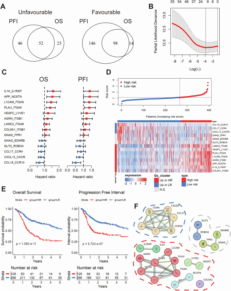
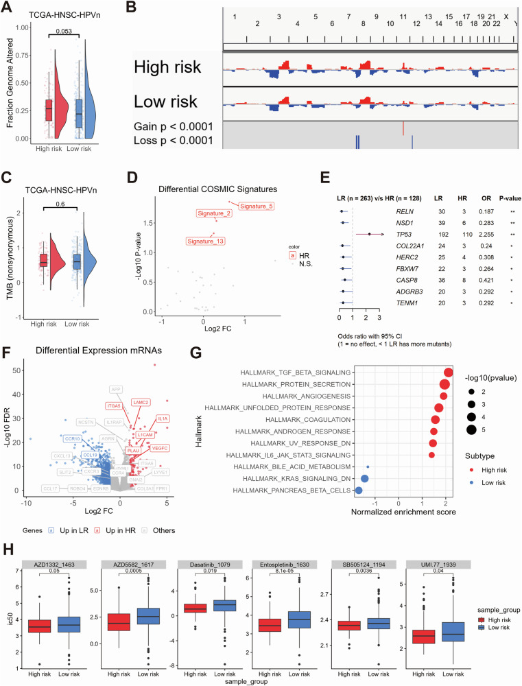
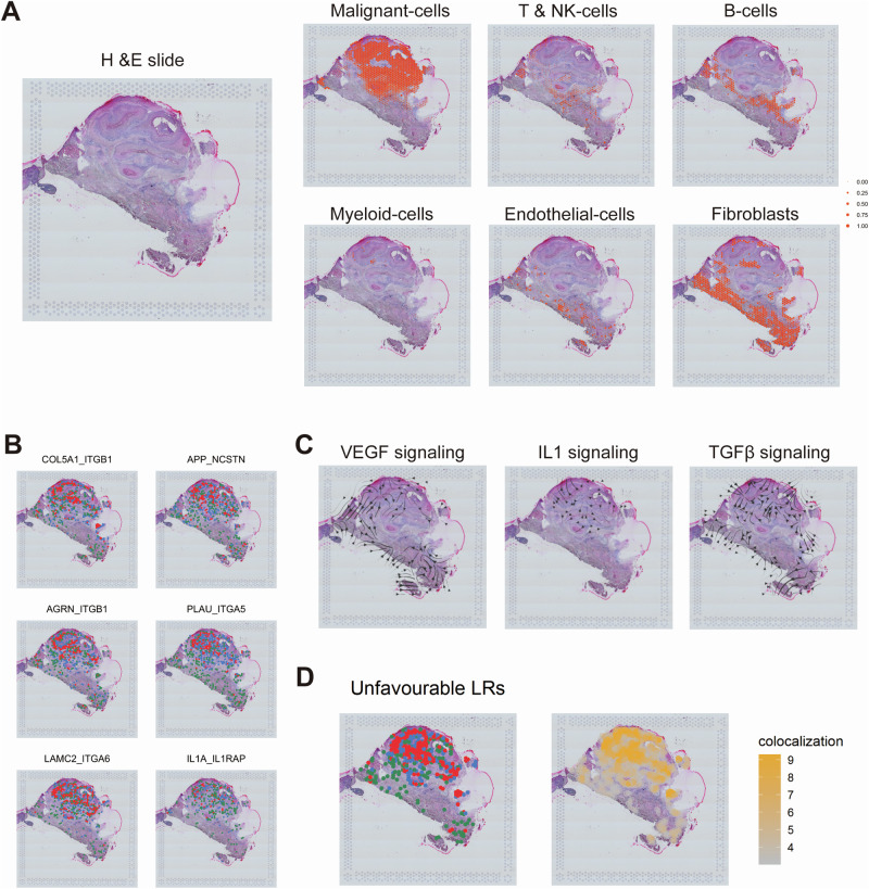
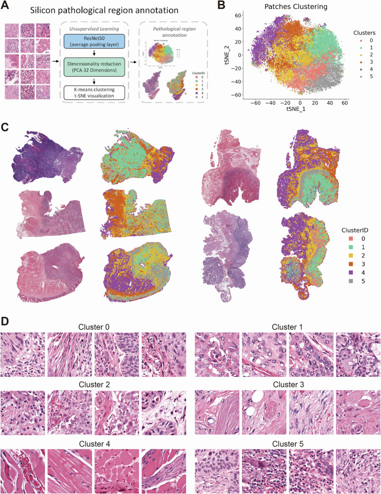
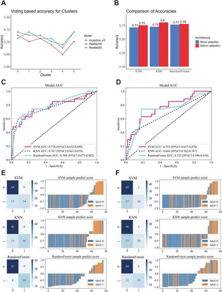
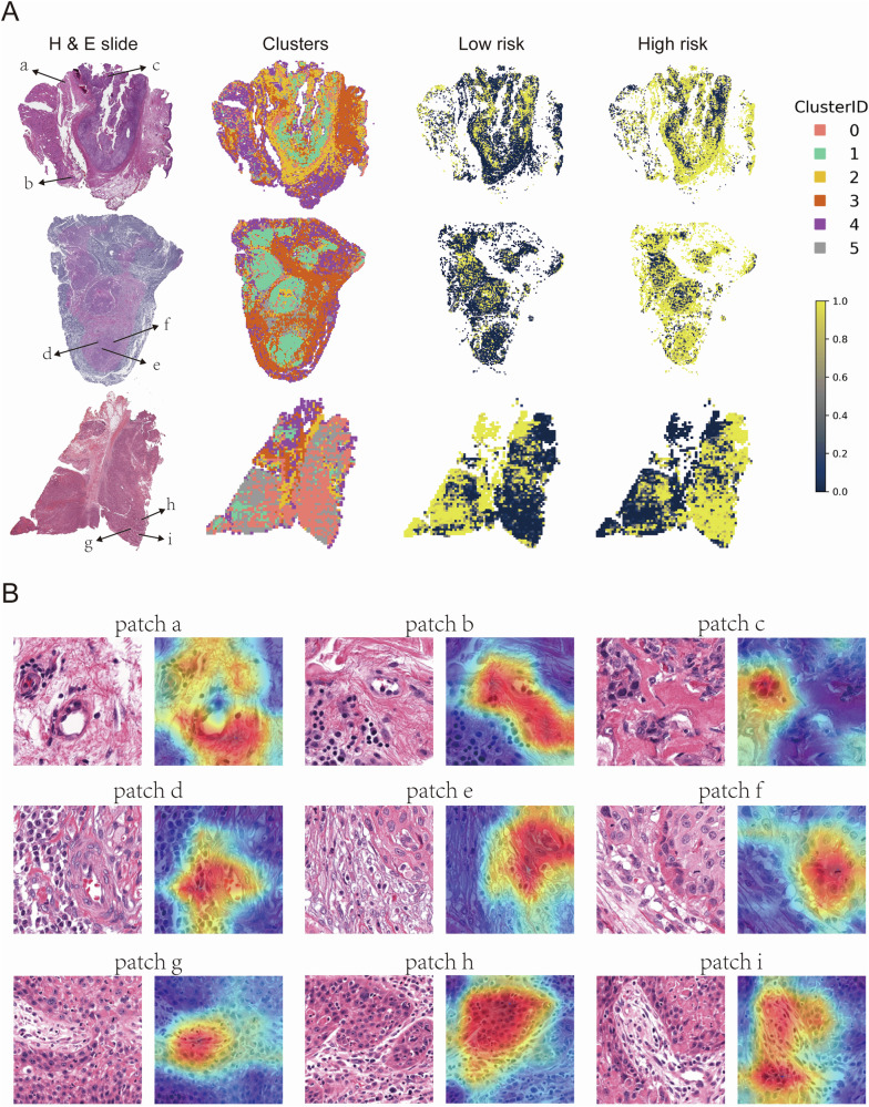
Head and neck squamous cell carcinoma (HNSC) is a prevalent malignancy, with HPV-negative tumors exhibiting aggressive behavior and poor prognosis. Understanding the intricate interactions within the tumor microenvironment (TME) is crucial for improving prognostic models and identifying therapeutic targets. Using BulkSignalR, we identified ligand-receptor interactions in HPV-negative TCGA-HNSC cohort (n = 395). A prognostic model incorporating 14 ligand-receptor pairs was developed using random forest survival analysis and LASSO-penalized Cox regression based on overall survival and progression-free interval of HPV-negative tumors from TCGA-HNSC. Multi-omics analysis revealed distinct molecular features between risk groups, including differences in extracellular matrix remodeling, angiogenesis, immune infiltration, and APOBEC enzyme activity. Deep learning-based tissue morphology analysis on HE-stained whole slide images further improved risk stratification, with region selection via Silicon enhancing accuracy. The integration of routine histopathology with deep learning and multi-omics data offers a clinically accessible tool for precise risk stratification, facilitating personalized treatment strategies in HPV-negative HNSC.


Conflict of interest statement

Competing interests: The authors declare no competing interests.

Figures

Fig. 1
Fig. 1. Machine learning-driven establishment of a prognostic model based on ligand-receptor pairs in the TCGA-HNSC-HPV-negative cohort.
Venn diagram depicting the overlap between favorable and unfavorable ligand-receptor pairs with significant differences in overall survival (OS) and progression-free interval (PFI), identified using the optimal cut-off method (A). Dot plot showing the ligand-receptor pairs most associated with prognosis selected using Lasso Cox modeling based on the minimum partial likelihood deviance (B). Forest plots illustrating the univariate regression analysis for OS and PFI across the candidate ligand-receptor pairs (C). Dot plot (top) and heatmap (bottom) illustrate the stratification of samples based on the Lasso Cox-derived risk score, segmented by the optimal threshold for OS (D). Kaplan-Meier curves showing the prognostic differences in OS and PFI between the stratified sample risk groups (E). Network showing the protein-protein interaction (PPI) of genes associated with the ligand-receptor pairs, with clustering performed on the associated genes using k-means (F).
Fig. 2
Fig. 2. Multi-omics analysis of genomic alterations, gene expression, and drug sensitivity between high-risk and low-risk groups.
Combined box and violin plot showing the differences in whole genome alteration levels between the high-risk and low-risk groups (A). Copy number variation (CNV) plot illustrating the differences in CNV levels across chromosomes between the high-risk and low-risk groups (B). Combined box and violin plot showing the differences in tumor mutational burden (TMB) levels between the high-risk and low-risk groups (C). Dot plot illustrating the differences in COSMIC mutational signatures between the high-risk and low-risk groups (D). Forest plot showing the genes with statistically significant differences in mutation frequency between the high-risk and low-risk groups (E). Volcano plot displaying differentially expressed genes between the high-risk and low-risk groups, with colors indicating the direction of gene expression changes. Highlighted genes correspond to those included in the ligand-receptor pair risk model (F). Dot plot showing the GSEA analysis of Hallmark gene sets between the high-risk and low-risk groups. The size of the dots represents the log10(p-value), and the color indicates the direction of Hallmark gene set enrichment (G). Box plot showing the oncopredict-predicted drugs with higher sensitivity in the high-risk group (H).
Fig. 3
Fig. 3. Cellular localization of ligand-receptor pairs and cell component mapping in the TCGA-HNSC-HPV-negative cohort.
UMAP clustering plots showing HNSCC cells from the 34 HPV-negative patients across three public databases. Each cell is color-coded for Seurat clusters, databases, cell types, total counts, total features, and cell density (A). Dot plot showing the expression of marker genes across different cell types, illustrating the distribution of marker gene expression for each cell type (B). UMAP density plots showing the cell-type-specific localization of ligand-receptor pair genes in the low-risk group (C) and high-risk group (D). Dot plot showing the differences in cellular components between the high-risk and low-risk groups in the TCGA-HNSC-HPV-negative cohort, mapped from single-cell data using the Prism algorithm. Red dots indicate higher abundance in the high-risk group, while blue dots indicate higher abundance in the low-risk group (E). UMAP density plots showing the expression distribution of IL1A and TREM1 within myeloid cells (F). Box plots showing the differences in NF-kappaB pathway activity between ILRAP1+ and ILRAP1- malignant cells (left) and between the high-risk and low-risk groups in the TCGA-HNSC-HPV-negative cohort (right; (G)).
Fig. 4
Fig. 4. Spatial mapping and colocalization of ligand-receptor pairs and signaling pathways in HNSC tissue.
Mapping of different single-cell-derived cell types to tissue spots in HNSC, illustrating the spatial distribution of various cell types within the tissue (A). Colocalization of some ligand-receptor pairs within HNSC tissue for high-risk group (B). Blue dots represent regions with high ligand expression, green dots represent regions with high receptor expression, and red dots indicate areas where both ligand and receptor are highly expressed. Storm plots showing the distribution and propagation direction of different signaling pathways (VEGF, IL1, TGF-β) within HNSC tissue (C). Combined spatial distribution (left) and colocalization scores (right) of eight highly expressed ligand-receptor pairs in the high-risk group within HNSC tissue (D).
Fig. 5
Fig. 5. Deep learning-based clustering and spatial visualization of pathological regions in H&E-stained WSIs (whole slide images).
Workflow of Silicon pathological region selection. Deep learning features are extracted from patches using a ResNet50 network, followed by dimensionality reduction using Principal Component Analysis (PCA). The reduced features are then clustered using K-means, and the resulting patch clusters are annotated based on histopathological characteristics (A). 2D t-distributed Stochastic Neighbor Embedding (t-SNE) visualization of K-means clustering based on deep learning features extracted from patches (B). Visualization of the spatial distribution of patches from different clusters on WSI of HE-stained histopathological sections (C). Representative images of patches from each cluster (D).
Fig. 6
Fig. 6. Performance comparison of weakly supervised deep learning models with and without Silicon pathological region selection.
Line plot showing the prediction accuracy of weakly supervised learning using different convolutional neural network (CNN) models (Inception_v3, ResNet18, ResNet50) and a voting method across various patch clusters (A). Bar plot comparing the accuracy of weakly supervised deep learning models with different machine learning algorithms, contrasting Silicon pathological region selection and non-selection (B). Receiver Operating Characteristic curve (ROC) and corresponding Area Under the Curve (AUC) values for multiple machine learning models, comparing the performance of Silicon pathological region selection (C) with non-selection (D). Confusion matrices and sample prediction score plots illustrate the performance of different machine learning models with deep learning architectures, highlighting the differences between Silicon pathological region selection (E) and non-selection (F).
Fig. 7
Fig. 7. Spatial distribution and representative patches from H&E-stained whole slide images in the high-risk group.
Representative WSI images from the high-risk group. The left column shows H&E-stained whole slide images, the second column displays clusters of patches derived from deep learning features, while the third and fourth columns illustrate the spatial distribution of low-risk and high-risk patches, respectively. Clusters are color-coded by Cluster ID (0-5), with yellow representing high-risk areas and dark blue representing low-risk areas (A). Representative patches from the H&E-stained slides in (A). Each patch (a–i) is annotated with a corresponding Grad-CAM heatmap overlay, highlighting regions of interest identified by deep learning models (B).
Fig. 8
Fig. 8. Spatial distribution and representative patches from H&E-stained whole slide images in the low-risk group.
Representative WSI images from the low-risk group. The left column shows HE-stained whole slide images, the second column displays clusters of patches derived from deep learning features, while the third and fourth columns illustrate the spatial distribution of low-risk and high-risk patches, respectively. Clusters are color-coded by Cluster ID (0-5), with yellow representing high-risk areas and dark blue representing low-risk areas (A). Representative patches from the HE-stained slides in (A). Each patch (a–i) is annotated with a corresponding Grad-CAM heatmap overlay, highlighting regions of interest identified by deep learning models (B).

References

    1. Bray, F. et al. Global cancer statistics 2018: GLOBOCAN estimates of incidence and mortality worldwide for 36 cancers in 185 countries. CA Cancer J. Clin.68, 394–424 (2018). - PubMed
    1. Sung, H. et al. Global Cancer Statistics 2020: GLOBOCAN estimates of Incidence and Mortality Worldwide for 36 Cancers in 185 Countries. CA Cancer J. Clin.71, 209–249 (2021). - PubMed
    1. Johnson, D. E. et al. Head and neck squamous cell carcinoma. Nat. Rev. Dis. Prim.6, 92 (2020). - PMC - PubMed
    1. Taberna, M. et al. Human papillomavirus-related oropharyngeal cancer. Ann. Oncol.28, 2386–2398 (2017). - PubMed
    1. Cadoni, G. et al. Prognostic factors in head and neck cancer: a 10-year retrospective analysis in a single-institution in Italy. Acta Otorhinolaryngol. Ital.37, 458–466 (2017). - PMC - PubMed

LinkOut - more resources