. 2025 Apr;640(8057):176-185.
doi: 10.1038/s41586-025-08637-4. Epub 2025 Mar 5.

Fine-scale patterns of SARS-CoV-2 spread from identical pathogen sequences

Affiliations

Fine-scale patterns of SARS-CoV-2 spread from identical pathogen sequences

Cécile Tran-Kiem et al. Nature. 2025 Apr.

Abstract

Pathogen genomics can provide insights into underlying infectious disease transmission patterns1,2, but new methods are needed to handle modern large-scale pathogen genome datasets and realize this full potential3-5. In particular, genetically proximal viruses should be highly informative about transmission events as genetic proximity indicates epidemiological linkage. Here we use pairs of identical sequences to characterize fine-scale transmission patterns using 114,298 SARS-CoV-2 genomes collected through Washington State (USA) genomic sentinel surveillance with associated age and residence location information between March 2021 and December 2022. This corresponds to 59,660 sequences with another identical sequence in the dataset. We find that the location of pairs of identical sequences is highly consistent with expectations from mobility and social contact data. Outliers in the relationship between genetic and mobility data can be explained by SARS-CoV-2 transmission between postcodes with male prisons, consistent with transmission between prison facilities. We find that transmission patterns between age groups vary across spatial scales. Finally, we use the timing of sequence collection to understand the age groups driving transmission. Overall, this study improves our ability to use large pathogen genome datasets to understand the determinants of infectious disease spread.


Conflict of interest statement

Competing interests: A.L.G. reports contract testing from Abbott, Cepheid, Novavax, Pfizer, Janssen and Hologic, research support from Gilead, and salary and stock grants for LabCorp, an immediate family member, outside of the described work. The other authors declare no competing interests.

Figures

Fig. 1
Fig. 1. Temporal and spatial signature of spread in clusters of identical SARS-CoV-2 sequences.
a, Clustering of identical pathogen sequences across population groups reflects underlying disease transmission patterns at the population level and can be used to characterize spread patterns between groups. Each colour represents a different cluster of identical sequences. b, Probability for two individuals separated by a fixed number of transmission generations of being infected by viruses at a given genetic distance assuming a Poisson process for the occurrence of substitutions (at a rate μ = 8.98 × 102 substitutions per day) and gamma-distributed generation time (mean, 5.9 days; s.d., 4.8 days). c, Size distribution of clusters of identical sequences in the WA dataset. Clusters of size 1 correspond to singletons and are therefore not included in the RR computations. d, Spatiotemporal dynamics of sequence collection in two large clusters of identical sequences. The black diamonds indicate the location of Seattle, the largest city in WA. e, Radius of clusters of identical sequences (red line) and probability for all sequences within a cluster of identical sequences of remaining in the same spatial units (black lines) as a function of time since first sequence collection. In e, the cluster radius is computed as the mean spatial expansion of clusters of identical sequences. f, Definition of the RR of observing pairs of sequences in two subgroups as a measure of enrichment. g, RR of observing pairs of sequences within the same county as a function of the genetic distance separating them. The grey points correspond to values for individual counties. The orange triangles correspond to the median across counties. For a, d and f, maps were generated using shapefiles from the US Census Bureau.
Fig. 2
Fig. 2. Identical sequences reveal patterns of spread between WA counties.
a, Illustration of the pairwise RR of observing identical sequences between counties, using sequences shared between Stevens County (red point) and other counties in WA as an example. Similar maps for the other counties are depicted in Supplementary Fig. 3. b, RR of observing pairs of identical sequences by counties’ adjacency status. c, RR of observing pairs of identical sequences as a function of the geographical distance between counties’ centroids. d, Similarity between WA counties obtained from MDS based on the RR of observing pairs of identical sequences in two counties. Counties are coloured by east–west region membership. e, RR of observing pairs of identical sequences by counties’ adjacency status stratified by counties east–west region membership. f, RR of observing pairs of identical sequences as a function of the geographical distance between counties’ centroids stratified by counties east–west region membership. g, Proportion of pairs of identical sequences observed in EWA and WWA that were first observed in WWA. In c and f, the lines correspond to LOESS curves on the logarithmic scale. In b and e, P values calculated using Wilcoxon tests are as follows: ***P < 0.0001, **P < 0.001, *P < 0.05; NS, P ≥ 0.05. In b, Wwithin,adjacent = 6,195 (P = 3.7 × 10−12) and Wadjacent,non-adjacent = 65,542 (P < 2.2 × 10−16). In e, for within EWA, Wwithin,adjacent = 120.5 (P = 6.7 × 10−6) and Wadjacent,non-adjacent = 4,555.5 (P = 4.0 × 10−6). For within WWA, Wwithin,adjacent = 95 (P = 9.9 × 10−7) and Wadjacent,non-adjacent = 3626 (P = 1.1 × 10−4). For between EWA and WWA, W = 2,719 (P = 0.17). For a and d, maps were generated using shapefiles from the US Census Bureau.
Fig. 3
Fig. 3. Comparison of the location of identical sequences with expectations from mobility data reveals spread between WA male prison postcodes.
a, Relationship between the RR of observing identical sequences in two counties and the RR of movement between these counties as obtained from mobile phone mobility data. The trend line corresponds to the predicted RR of observing identical sequences in two regions from a GAM. The R2 indicates the variance explained by the GAM. b, Scaled Pearson residuals of the GAM plotted in a as a function of the number of pairs of identical sequences observed in pairs of counties. c, Map of male state prisons in WA. Mason, Walla Walla and Franklin male prisons are coloured. d, RR of observing identical sequence between Mason and Franklin County’s postcodes. e, RR of observing identical sequence between Mason and Walla Walla County’s postcodes. f, Centrality score (eigenvector centrality) for each postcode that is the home of a male state prison. g, Week of sequence collection within eight large clusters of identical sequences identified in postcodes with WA male state prisons. In g, the top coloured segments indicate the period during which each cluster was identified. For c, maps were generated using shapefiles from the US Census Bureau.
Fig. 4
Fig. 4. Patterns of SARS-CoV-2 transmission between age groups in WA.
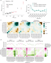
a, RR of observing pairs of identical sequences in two age groups as a function of the RR of contact between these age groups. b, Impact of the spatial scale on the RR of observing pairs of identical sequences in the 0–9 year and other age groups. We display similar plots for the other age groups in Extended Data Fig. 7. c, RR of observing identical sequences between two age groups across all pairs of sequences, only pairs in different postcodes and only pairs in different counties. d, Proportion of pairs of identical sequences observed in age groups A and B that were first collected in age group A across different epidemic waves (heat maps). The dot plots depict the earliness scores of age group A across epidemic waves. In a and b, the vertical segments correspond to the 95% subsampling CIs. In d, the vertical segments correspond to the 95% binomial CIs. In d, the heat maps represent symmetric matrices P = (pi,j) characterized by pi,j + pj,i = 1.
Extended Data Fig. 1
Extended Data Fig. 1. The magnitude of the relative risk of observing sequences at a given genetic distance within the same county is impacted by transmission intensity.
A. Relative risk of observing sequences at a given genetic distance within the same county across multiple epidemic waves. We defined waves as: March 2021-June 2021 (Wave 4), July 2021-November 2021 (Wave 5), December 2021-February 2022 (Wave 6) and March 2022-August 2022 (Wave 7). In A, circular points correspond to individuals counties and triangles correspond to the median across counties. B. Median relative risk of observing pairs sequences within the same county (with IQR) as a function of genetic distance stratified by variant during Wave 6. C. A higher transmission intensity results in larger clusters of identical sequences that tend to be more mixed across groups. In C, the two clusters are simulated using a branching process with mutation by assuming the probability for an infector and an infectee to have the same consensus sequence equal to 0.69 and a probability for an infectee of being in the same groups as its infector of 0.7. We consider a reproduction number of 1.2 for the lower transmission intensity scenario and of 2.0 in the higher transmission intensity scenario.
Extended Data Fig. 2
Extended Data Fig. 2. Our measure of relative risk corrects for uneven sequencing between regions.
A. Proportion of pairs of identical sequences shared between counties A and B among pairs observed in county A as a function of the proportion of pairs of identical sequences observed in county B. B. Relative risk for pairs of identical sequences of being observed in counties A and B as a function of the proportion of pairs of identical sequences observed in county B. C. Proportion of pairs of identical sequences shared between counties A and B as a function of the number of sequences available in county B. D. Relative risk for pairs of identical sequences of being observed in counties A and B as a function of the number of sequences available in county B.
Extended Data Fig. 3
Extended Data Fig. 3. Simulation study exploring the impact of sequencing bias on results from a discrete trait analysis and from our RR framework.
A. Comparison between migration rates estimated from a discrete trait analysis and the true migration rates used to simulate the sequence data. B. Comparison between the relative risk of observing identical sequences between two demes and the weekly migration probability between demes. C. Comparison between migration rates inferred from a sequence dataset generated in a biased sampling and an unbiased sampling scenario. D. Comparison between the relative risk of observing identical sequences in two groups from a sequence dataset generated in a biased sampling and an unbiased sampling scenario. For the RR, segments indicate 95% subsampling confidence intervals. For the migration rates, segments indicate 95% highest posterior density intervals. For each plot, we indicate the Spearman correlation coefficient (and the associated p-value).
Extended Data Fig. 4
Extended Data Fig. 4. Comparison between the relative risk of observing identical sequences and the relative risk of movement at the county level.
A. Relationship between the relative risk of observing identical sequences in two counties and the relative risk of movement between these counties as obtained from mobile phone mobility data. B. Scaled Pearson residuals of the GAM plotted in A as a function of the number of pairs of identical sequences observed in pairs of counties. C. Relationship between the relative risk of observing identical sequences in two counties and the relative risk of movement between these counties as obtained from workflow mobility data. D. Scaled Pearson residuals of the GAM plotted in C as a function of the number of pairs of identical sequences observed in pairs of counties. E. Relationship between the relative risk of observing identical sequences in two counties and the Euclidean distance between counties centroids. F. Scaled Pearson residuals of the GAM plotted in E as a function of the number of pairs of identical sequences observed in pairs of counties. In B, D and F, we label pairs of non-adjacent counties sharing at least 100 pairs of identical sequences and for which the absolute value of the Scaled Pearson residual is greater than 3. The trend lines correspond to predicted relative risk of observing identical sequences in two regions from each GAM. R2 indicate the variance explained by each GAM.
Extended Data Fig. 5
Extended Data Fig. 5. Relative risk for pairs of identical sequences of being observed between two age groups.
Vertical segments correspond to 95% confidence intervals obtained through subsampling.
Extended Data Fig. 6
Extended Data Fig. 6. Relative risk for pairs sequences of being observed between two age groups depending on their genetic distance.
Vertical segments correspond to 95% confidence intervals obtained through subsampling.
Extended Data Fig. 7
Extended Data Fig. 7. Impact of the spatial scale on the relative risk for pairs sequences of being observed between two age groups.
Vertical segments correspond to 95% confidence intervals obtained through subsampling.
Extended Data Fig. 8
Extended Data Fig. 8. Impact of non-sampled locations on the computation of the RR.
A. Comparison between the relative risk of observing identical sequences between Western WA counties using only sequence in Western WA counties or the entire sequence dataset. B. Comparison between the relative risk of observing identical sequences between Eastern WA counties using only sequence in Eastern WA counties or the entire sequence dataset.
Extended Data Fig. 9
Extended Data Fig. 9. Impact of the pathogen’s mutation rate on the optimal Hamming distance threshold to apply our RR framework.
Boxplots indicate Spearman correlation coefficients between the relative risk of pairs of sequences below the genomic distance threshold of being observed in two regions and the daily migration probability between these two regions. Boxplots indicate the 2.5%, 25%, 50%, 75% and 97.5% percentiles. See Methods for a description of the simulation approach.

Update of

References

    1. Pybus, O. G. & Rambaut, A. Evolutionary analysis of the dynamics of viral infectious disease. Nat. Rev. Genet.10, 540–550 (2009). - PMC - PubMed
    1. Grubaugh, N. D. et al. Tracking virus outbreaks in the twenty-first century. Nat. Microbiol.4, 10–19 (2019). - PMC - PubMed
    1. Frost, S. D. W. et al. Eight challenges in phylodynamic inference. Epidemics10, 88–92 (2015). - PMC - PubMed
    1. Baele, G., Dellicour, S., Suchard, M. A., Lemey, P. & Vrancken, B. Recent advances in computational phylodynamics. Curr. Opin. Virol.31, 24–32 (2018). - PubMed
    1. Featherstone, L. A., Zhang, J. M., Vaughan, T. G. & Duchene, S. Epidemiological inference from pathogen genomes: a review of phylodynamic models and applications. Virus Evol.8, veac045 (2022). - PMC - PubMed

MeSH terms