. 2025 Apr;22(4):813-823.
doi: 10.1038/s41592-025-02617-2. Epub 2025 Mar 13.

Optimizing Xenium In Situ data utility by quality assessment and best-practice analysis workflows

Affiliations

Optimizing Xenium In Situ data utility by quality assessment and best-practice analysis workflows

Sergio Marco Salas et al. Nat Methods. 2025 Apr.

Abstract

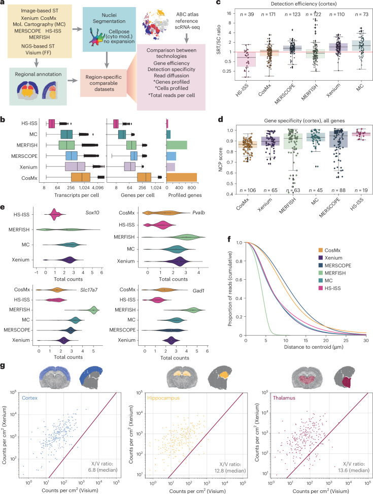
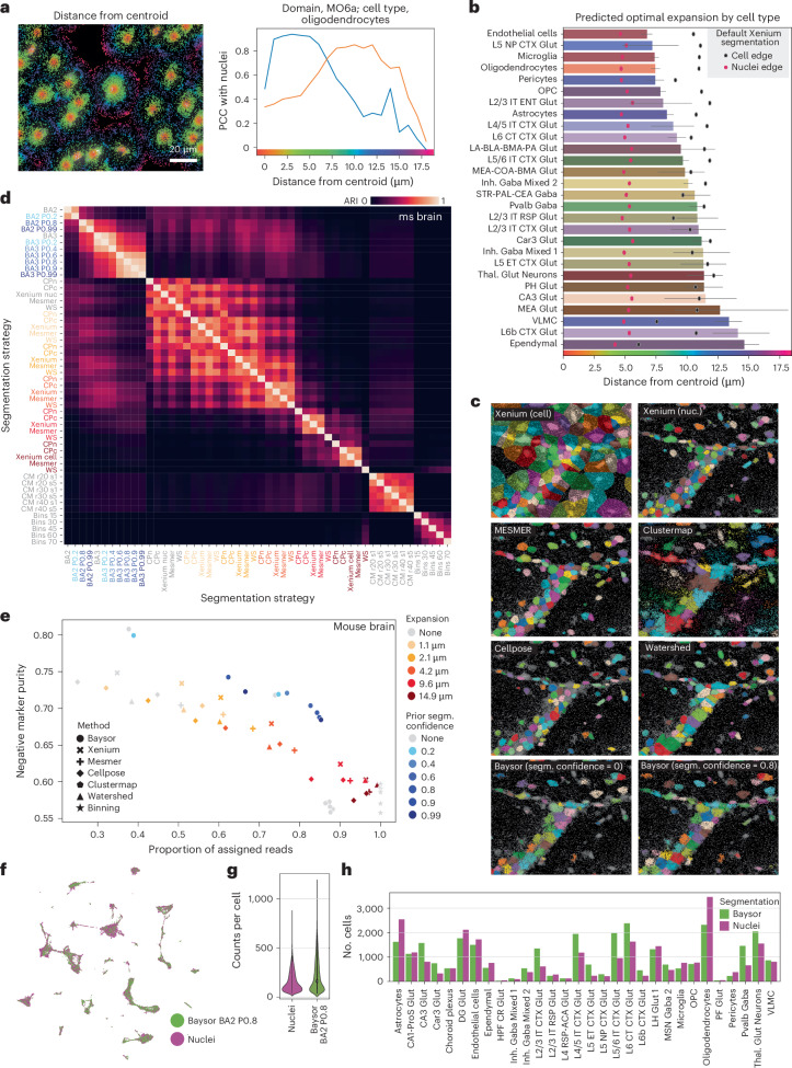
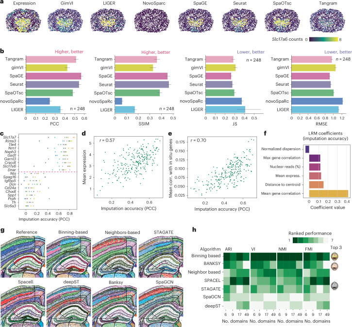
The Xenium In Situ platform is a new spatial transcriptomics product commercialized by 10x Genomics, capable of mapping hundreds of genes in situ at subcellular resolution. Given the multitude of commercially available spatial transcriptomics technologies, recommendations in choice of platform and analysis guidelines are increasingly important. Herein, we explore 25 Xenium datasets generated from multiple tissues and species, comparing scalability, resolution, data quality, capacities and limitations with eight other spatially resolved transcriptomics technologies and commercial platforms. In addition, we benchmark the performance of multiple open-source computational tools, when applied to Xenium datasets, in tasks including preprocessing, cell segmentation, selection of spatially variable features and domain identification. This study serves as an independent analysis of the performance of Xenium, and provides best practices and recommendations for analysis of such datasets.


Conflict of interest statement

Competing interests: M.N. was an advisor for 10x Genomics when this manuscript was initially submitted, but he is no longer involved in any advisory role for the company. F.J.T. consults for Immunai, Singularity Bio, CytoReason and Omniscope, and has ownership interest in Dermagnostix and Cellarity. M.D.L. contracted for the Chan Zuckerberg Initiative and received speaker fees from Pfizer and Janssen Pharmaceuticals. S.M.S., C.M.L. and M.G. are co-founders of Spatialist, a data-analysis company focused on spatial omics. The remaining authors declare no competing interests.

Figures

Fig. 1
Fig. 1. Overview of the analysis and Xenium’s main characteristics.
a, Overview of the analysis performed on Xenium datasets. b. Summary table of the Xenium datasets, detailing dataset characteristics, descriptors and quality metrics. IDC, invasive ductal carcinoma; DCIS, ductal carcinoma in situ; ILC, invasive lobular carcinoma; MS, multiple sclerosis. c, Uniform manifold approximation and projection (UMAP) of cells in seven mouse brain sections, colored by cell type. ACA, anterior cerebral artery; ARH, arcuate nucleus of the hypothalamus; BLA, basolateral amygdala; BMA, basomedial amygdala; CA1, cornu ammonis area 1; CA3, cornu ammonis area 3; Car3, carbonic anhydrase 3; CEA, central amygdala; Chol, cholinergic; CR, calretinin; CT, cortical transition; CTX, cortex; DG, dentate gyrus; ENT, entorhinal cortex; ET, embryonic time; GABA, gamma-aminobutyric acid; Glut, glutamate; Gpi, globus pallidus pars interna; HPF, hippocampal formation; IT, interneuron; LA, lateral amygdala; LH, lateral hypothalamus; L5, layer 5; L6, layer 6; MEA, medial amygdala; MSN, medium spiny neuron; NDB, nucleus of the diagonal band; NP, nucleus pontis; OPC, oligodendrocyte precursor eell; Otp, orthopedia homeobox; PAL, pallidum; PF, Purkinje fiber; PH, posterior hypothalamus; ProS, prosubiculum; PSTN, pre-subthalamic nucleus; PVH, paraventricular hypothalamus; Pvp, paraventricular nucleus, posterior part; RSP, rostral superior parietal; RT, reticular thalamus; Scg, superior cervical ganglion; SI, substantia innominata; Slc17a6, solute carrier family 17 member 6; STN, subthalamic nucleus; STR, striatum; STRv, striatum ventral part; Thal, thalamus; VLMC, vascular leptomeningeal cells; ZI, zona incerta. d, Spatial map of cell types in c; replicate 1 is shown. The green square highlights the region of interest (ROI) in e. e, Spatial maps illustrating 3D coherence in Xenium datasets, including xy, xz and yz views of the ROI. f, Box plot of subcellular distribution for genes enriched in nuclei and cytoplasm in mouse brain (left) and glioblastoma (right) datasets. The box plot represents percentiles (0, 25, 50, 75 and 100), excluding outliers, with the center representing the median. g,h, Spatial maps showing transcript locations of specific genes in mouse brain (g) and glioblastoma (h) datasets. i, Map of transcripts in oligodendrocytes, colored by Points2Regions cluster in one of the mouse brain datasets (msbrain2). j, Box plot of the distribution of the Points2Regions clusters 0, 37, 46, 80 and 89 in i in relation to their distance to the nuclei edge. The box plot represents percentiles (0, 25, 50, 75 and 100), excluding outliers, with the center representing the median. k, Differentially expressed genes for each subcellular cluster in i.
Fig. 2
Fig. 2. Benchmarking Xenium against other SRT platforms.
a, Overview of the workflow for comparing SRT platforms. In the ‘Comparison between technologies’ box, the asterisk indicates that the values for the metric differ between experiments. Cyto mod, cellpose cytoplasm model. b, Box plot showing the numbers of transcripts per cell and genes per cell for each dataset (left and center). The box plots represent percentiles (0, 25, 50, 75 and 100), excluding outliers, with the center representing the median. The bar plot (right) shows the number of profiled genes per platform. c, SRT/scRNA-seq (SRT/SC) gene efficiency ratios for various SRT platforms. Gene efficiency refers to the proportion of transcripts of a certain gene of interest detected using a given platform. The box plot represents gene efficiency in quartiles, excluding outliers, with individual dots showing gene-specific ratios. n, number of genes. d, Box plot showing NCP scores, ranging from 0 to 1, in quartiles excluding outliers, reflecting the percentage of non-coexpressed pairs in single-cell data that remain non-coexpressed in situ. n, number of pairs. e, Violin plot of transcripts detected per gene across datasets, focusing on clusters with highest marker expression. f, Cumulative proportion of reads by distance from the cell centroid across platforms. Values indicate the proportions of reads that are found at distances greater than or equal to the specified distance. g, Scatter plot of reads per gene per square centimeter in Visium versus Xenium across brain regions. X/V ratio, Xenium to Visium ratio.
Fig. 3
Fig. 3. Exploring segmentation in Xenium.
a, Mouse brain region with reads overlaid on DAPI staining, colored by distance to the nearest cell centroid (left). The line plot (right) shows the PCC of oligodendrocytes to the nuclear signature (blue) and to the background signature (orange), depending of the distance to the cell centroid. b, Bar plot showing the distance in micrometers of the intersection between nuclei and the domain-specific regions, as in a, across cell types. Error bars represent the 95% confidence intervals. Mean nuclei and cell radius are also shown. c, Comparison of cells identified with different segmentation algorithms in an ROI (160 × 160 µm), using DAPI background. d, Adjusted rand index (ARI) comparison of segmentation outputs (52 top performers) when applied to one of the mouse brain samples profiled (mouse brain section 2). e, Scatter plot of reads assigned versus negative marker purity for segmentation strategies applied to mouse brain section 2. Prior segm. confidence refers to the value given to the parameter named 'prior segmentation confidence' in Baysor-based segmentation. f, UMAP from coprocessed cells using Baysor and Xenium’s nuclear segmentation in a mouse brain ROI. g, Violin plot comparing cell counts segmented by Baysor versus Xenium nuclear segmentation methods. h, Bar plot of cell counts per population using different segmentation strategies.
Fig. 4
Fig. 4. Assessing the best preprocessing methods for Xenium.
a, Workflow diagram showing simulation of Xenium-like datasets from CELLxGENE Census single-cell data. b, Heatmap ranking preprocessing workflows on the basis of alignment with reference cell types, with workflows sorted from best (blue) to worst (white). A summary of the processing setups is included (right), with colors indicating the preprocessing steps chosen, as indicated in Extended Data Fig 6b. Epith., epithelium; p.z., peripheral zone; t.z., transition zone; duod-jejunal junct., duodenojejunal junction. c, Top 20 preprocessing paths, with the best path marked in red. PCs, principal components; MCV, Markov cluster algorithm. d. Bar plot of ARI, showing the effects of different preprocessing steps on clustering consistency relative to ground truth. e, Bar plot of ARI. comparing workflow consistency across real Xenium datasets with different preprocessing steps. f, Heatmap of SVF scores across algorithms in a breast-cancer dataset. Example spatial maps of non-SVF, partial and SVF are shown (top). g,h, Mean agreement (Kendall’s tau) (g) and Jaccard similarity index (h) showing agreement in SVF gene rankings across datasets. i, Proportion of genes (left) and control probes (right) identified as SVFs across Xenium datasets. Algorithm colors indicate whether each algorithm used 5,000 cells or the full sample. j. Scatter plot comparing the proportion of control probes with features identified as SVFs by the algorithm, with colors representing 5,000-cell or full-sample input.
Fig. 5
Fig. 5. Benchmarking imputation and domain identification algorithms with Xenium.
a, Detected and imputed expression of Slc17a6 in mouse brain dataset 1 using various imputation algorithms. b, Performance of imputation methods assessed with four metrics: PCC, SSIM, JS and RMSE; data are shown as mean ± 95% confidence intervals. c, Imputation accuracy (PCC) across genes, highlighting the ten best and ten worst predicted genes. d, Scatter plot showing the correlation between PCC for imputation accuracy and mean gene expression. e, Relationship between gene-specific imputation accuracy (PCC) and mean gene correlation with other detected genes in situ. f, Bar plot of linear regression model (LRM) coefficients indicating feature importance for predicting gene-specific imputation accuracy. g, Spatial map of manually annotated domains in a mouse brain section (replicate 1) compared with domains identified by various algorithms. h, Ranked performance of algorithms in domain identification using the manual segmentation as a reference, evaluated with ARI, variability index (VI), normalized mutual information (NMI) and Fowlkes–Mallows index (FMI), for different domain numbers,,,.
Extended Data Fig. 1
Extended Data Fig. 1. Extended analysis of the mouse brain datasets.
a. Comparison between two Xenium biological replicates, including a scatter plot representing the total transcripts of each gene in the preview 1 dataset compared to the total transcripts of each gene in preview dataset 2 (up), with axes represented in log10 scale. In addition, a scatter plot representing the abundance of each cell type identified in the preview dataset 1 compared to the preview dataset 2 is included (down). Axes are represented in log10 scale b. UMAP representation of cells from the 7 mouse brain datasets, colored by the experiment of origin. c. Violin plot representing the transcripts/cell (up) and genes/cell (bottom) identified on each of the mouse brain datasets. Violins are colored by the experiment of origin. d. Scatter plot representing the mean transcripts/cell of each gene in the home made datasets compared to their mean transcripts/cell on the preview datasets. Axes are represented in log10 scale. e. Scatter plot representing the abundance of each cell type identified in the home made datasets compared to the preview datasets. Axes are represented in log10 scale. f. Density plot illustrating the density of reads depending on their distance to their assigned cell centroid. Individual lines represent different samples. A violin plot quantifying the subcellular distribution of reads experiment is included (bottom, right). g. Spatial map of the mouse brain section 1, colored by annotated tissue domains h. UMAP representations of the cells analyzed from the 7 mouse brain datasets obtained from using only nuclear information (up) or expanded segmentation masks (bottom) to assign reads to individual cells. Cells are colored by the annotated tissue domain where they are found. i. UMAP representations of specific populations including astrocytes (up), microglia (middle) and oligodendrocytes (bottom) defined using nuclei-based segmentation masks (left) and projected onto the cells’ expanded segmentation masks (right). Cells are colored by the tissue domain where they are found, according to panel G.
Extended Data Fig. 2
Extended Data Fig. 2. SSAM segmentation-free analysis of Xenium datasets.
a. Spatial map of the clusters obtained from the SSAM segmentation-free analysis applied on the mouse brain section 2. Reads are colored following the colormap used on Fig. 1c to represent cell types. Regions of interest are highlighted in the whole map (up) and visualized in the bottom part of the panel. b. 3D-coherence map of the dataset analyzed in panel A. Colors represent the cosine similarity, with low values representing regions with a low top-bottom signal coherence, indicating potentially overlapping cells. ROIs selected as examples of regions of low 3D- coherence are indicated using colored squares c. Umap of the signatures identified by SSAM analysis included in mouse brain section 2, colored by the cell types represented in Extended Data Fig. 2ad. 3-D visualization of the ROIs with low 3D-coherence regions, as indicated in panel B. e. Spatial maps illustrating the 3D nature of Xenium datasets. A second region of interest with a low 3D-coherence is presented, indicating the presence of overlapping cell types. The coherence map (left) is complemented by X- and Y-axis (XY maps) of the ROI, viewed from the bottom and top (mid) and XZ and YZ maps (right). Each spot represents an individual read, colored based on the cell type assignment done using SSAM and following the color code presented in Fig. 1c.
Extended Data Fig. 3
Extended Data Fig. 3. Subcellular analysis of Xenium datasets with Points2Regions.
a. Spatial map of the entire mouse brain 2 dataset (up), with reads colored by their Points2Regions cluster. The color map used is shown in panel B. Two regions of interest (1,2) are highlighted in the entire map and visualized (bottom). b. Confusion matrix between the Points2Regions clusters and the segmentation-based clusters represented in Fig. 1c. Points2Regions clusters are annotated based on (1) a number (2), the cell type its reads had been mostly assigned to in the segmentation-based analysis and (3) the main subcellular localization of the reads assigned to each cluster (cyto or nuclei). Points2Regions clusters that have a majority of their reads within the nuclei boundaries, defined using DAPI staining, are annotated as nuclei clusters. Oppositely, clusters with most of their reads outside the nuclei boundaries are annotated as cytoplasmic clusters (cyto). On the other hand, cytoplasmic clusters (cyto) present most of their reads outside the segmented nuclei. Nuclear clusters are represented by the presence of a circle in the confusion matrix. This circle is placed, for the rows where it’s needed, in the cell with the highest value of the row, with the highest similarity between a segmentation-based cluster and the Points2Regions’ cluster represented on the row. c. Box plot representing the distribution of reads assigned to the Points2Regions clusters in astrocytes in relation to their distance to the nuclei edge. Red horizontal dashed line at y=0 represents the nuclear edge. Box plot represents percentiles excluding outliers (0,25,50,75,100), with center representing median distance. d. Differentially expressed genes for each subcellular cluster found in astrocytes. Y-axis represents the relative percentage of reads of a certain gene assigned to the interrogated cluster. Note that this relative percentage is computed considering only the astrocytic clusters, meaning that, overall, the sum of all percentages in all astrocytic clusters should sum 1.
Extended Data Fig. 4
Extended Data Fig. 4. Comparison of Xenium with SRT platforms.
a. Spatial map of SRT datasets, colored by region. The scRNA-seq dataset is represented as a UMAP colored by region of origin. b. Stacked bar plot representing the percentage of transcripts assigned to cells in each datasets after Cellpose. c. SRT/scRNA-seq gene efficiency ratios of different SRT methods in the hippocampal (left) and thalamic (right) regions. Boxplots represent the distribution of the efficiencies, divided in quartiles, where the central line represents the median efficiency. Gene ratios are represented as individual dots. d. Box plot representing the negative coexpression purity (NCP) of each SRT method, including only genes with an efficiency ratio below 1. Boxplots represent the distribution of the NCP scores, divided in quartiles, where the central line represents the median NCP. NCP scores are represented as individual dots for each method. e. Pairwise comparison of the detection efficiency between each SRT and scRNA-seq dataset in the cortical region. For each pair, a scatter plot of the number of transcripts detected per gene in SRT method 1 (y-axis) and SRT method 2 (x-axis) is included. Only common genes are included in the comparison. Red line represents x=y. The median of ratios for each pair of methods is included (bottom,right). Spots of each subplot are colored by the method that presented a higher median in each comparison. f. Density plots illustrate the cumulative proportion of reads depending on their distance from the centroid for individual genes across technologies. Values indicate the proportions of reads that are found at distances greater than or equal to the specified distance. g. Regions of interest corresponding to resegmented datasets across platforms. DAPI staining is shown as a background and reads assigned to resegmented cells are overlaid as yellow dots.
Extended Data Fig. 5
Extended Data Fig. 5. Extended benchmarking of segmentation strategies.
a Localization of regions of interest represented in Extended Data Fig. 5b and Fig. 3c. b. Regions of interest representing the cells identified using different segmentation algorithms in a region of interest outlined in Extended Data 5B. DAPI background is represented as a background and individual isolated color-specific masks represent individual cells. Segmentation strategies were selected to represent different segmentation outputs, as described in Fig. 3c. Each ROI represents an area of 160 × 160 μm. c. Heat map representing the segmentation metrics of all segmentation strategies described in Fig. 3d. d. Adjusted rand index (ARI) between the different outputs produced by combinations of segmentation algorithms, hyperparameters and expansions when applied to human breast sections. Segmentation methods included Cellpose (CPn: nuclei, CPc: cyto models), binning (bins), clustermap (CM), watershed (WA), Mesmer, Baysor (BA) and Baysor with prior segmentation (Baysor Px.x). Xenium segmentation were also included in the comparison (XENIUM cel, XENIUM nuc). Hyperparameters for each method are described in methods. Methods on the y-axis were colored depending on the expansion performed after segmentation. 315 evaluated configurations of the grid search were reduced to the shown 52 top performers per hyperparameter group (highest negative marker purity e. Scatter plot representing the number of reads assigned (x-axis) and the negative marker purity (y-axis) of different assessed segmentation strategies in human breast tumor samples. The name and color of each segmentation strategy are represented as in Fig. 3d.
Extended Data Fig. 6
Extended Data Fig. 6. Extended analysis on preprocessing.
a. Workflow of the different preprocessing steps and parameters considered in the assessment of the best preprocessing workflow. b. Heat map representing the Adjusted Rand Index (ARI) between the clusters derived from the different preprocessing workflows and the ground truth cell type labels. Preprocessing workflows are sorted from best (bottom) to worst (top) based on their median ARI. Datasets are also sorted based on their median ARI, indicating in which datasets it was possible to recover the original cell type labels better (right) and in which ones it was more difficult to achieve (left). A summary of the processing setups is summarized on the left part of the panel, with every row representing a specific step in the preprocessing workflow and every color representing the specific hyperparameter/ algorithm chosen. In addition, specific characteristics of the simulated datasets are included on the top part of the panel in the form of dot plot c. Heat map representing the mean Adjusted Rand Index (ARI) between the clusters obtained when applying the most optimal preprocessing workflow (identified in Fig. 4c) to different Xenium datasets and the clusters obtained with the same workflow, but modifying different preprocessing steps, specified in the x-axis, in the different Xenium datasets (y-axis). A reduced ARI signifies decreased similarity between clustering outputs, highlighting a more pronounced impact on the workflow when altering a specific parameter. d. Same as C, but using Fowlkes-Mallows Index (FMI) to measure the similarity between the clustering outputs. A low FMI indicates differences between the clustering outputs, suggesting a more pronounced impact on the workflow when altering a specific parameter. e. Same as C, but using the variability index (VI) to measure the similarity between the clustering outputs. A high VI indicates important differences between the clustering outputs, suggesting a more pronounced impact on the workflow when altering a specific parameter.
Extended Data Fig. 7
Extended Data Fig. 7. Extended exploration of the SVF identification algorithms.
a. Running time of the different algorithms used to identify SVFs. The running times depending on the number of cells used as an input are shown as a line plot (left), together with a bar plot representing the processing times of different algorithms when using 5.000 cells (middle) and the predicted running times for each algorithm when using a full dataset (~150.000 cells) (right). b. Spatial map of the manually annotated domains identified in the mouse brain section (ROI2) (replicate 1, left) and the domains identified by different algorithms. c. Ranked performance of different algorithms in identifying tissue domains in mouse brain sections (ROI 2), using the manually segmented domains as a reference. Four metrics are used: Adjusted Rand index (ARI), variability index (VI), NMI and Fowlkes-Mallows Index (FMI). Different numbers of domains are predicted, based on the number of domains included in the hierarchical annotation of the tissue done manually,,,.

References

    1. Chen, K. H., Boettiger, A. N., Moffitt, J. R., Wang, S. & Zhuang, X. Spatially resolved, highly multiplexed RNA profiling in single cells. Science348, aaa6090 (2015). - PMC - PubMed
    1. Shah, S., Lubeck, E., Zhou, W. & Cai, L. In Situ transcription profiling of single cells reveals spatial organization of cells in the mouse hippocampus. Neuron92, 342–357 (2016). - PMC - PubMed
    1. Gyllborg, D. et al. Hybridization-based in situ sequencing (HybISS) for spatially resolved transcriptomics in human and mouse brain tissue. Nucleic Acids Res.48, e112 (2020). - PMC - PubMed
    1. Shi, H. et al. Spatial atlas of the mouse central nervous system at molecular resolution. Nature622, 552–561 (2023). - PMC - PubMed
    1. Janesick, A. et al. High resolution mapping of the tumor microenvironment using integrated single-cell, spatial and in situ analysis. Nat. Commun.14, 8353 (2023). - PMC - PubMed

LinkOut - more resources