. 2025 Apr;22(4):834-844.
doi: 10.1038/s41592-025-02624-3. Epub 2025 Mar 13.

Feature selection methods affect the performance of scRNA-seq data integration and querying

Affiliations

Feature selection methods affect the performance of scRNA-seq data integration and querying

Luke Zappia et al. Nat Methods. 2025 Apr.

Abstract

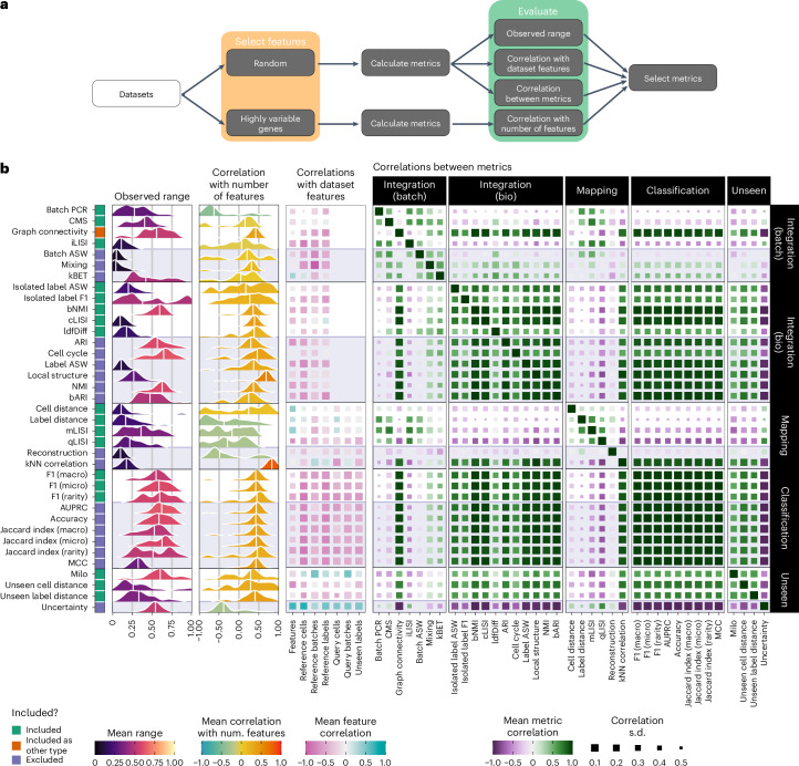
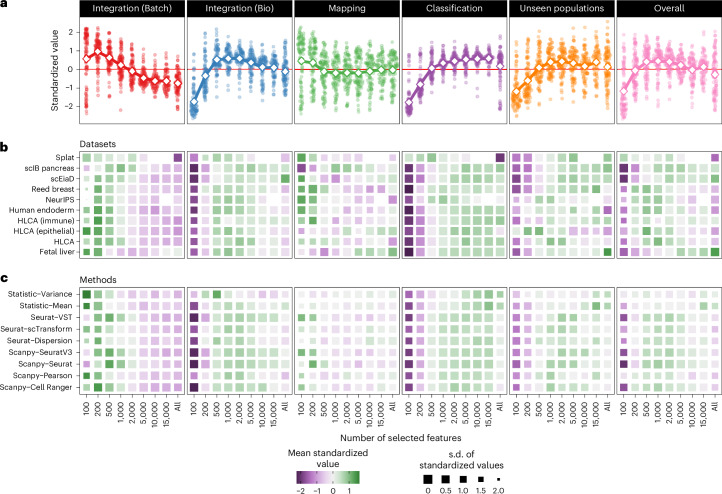
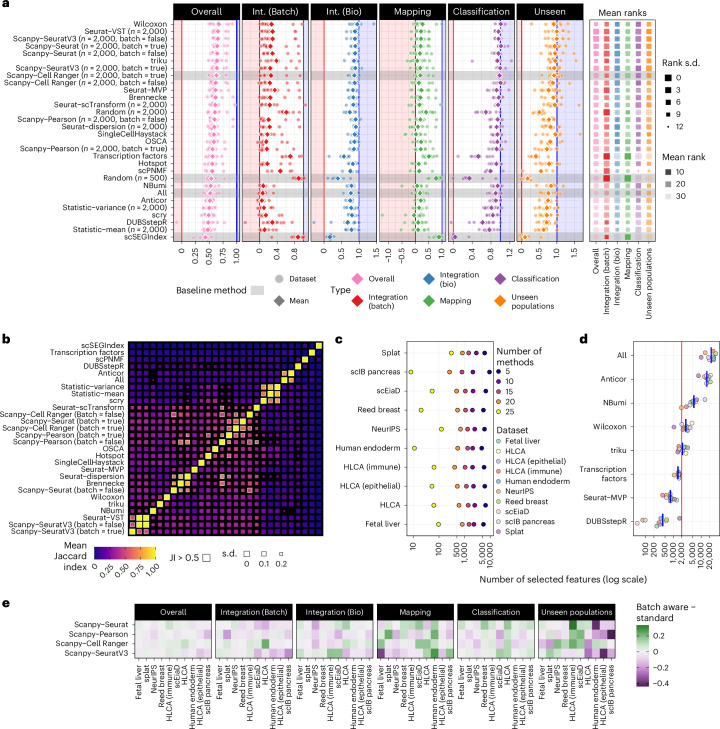
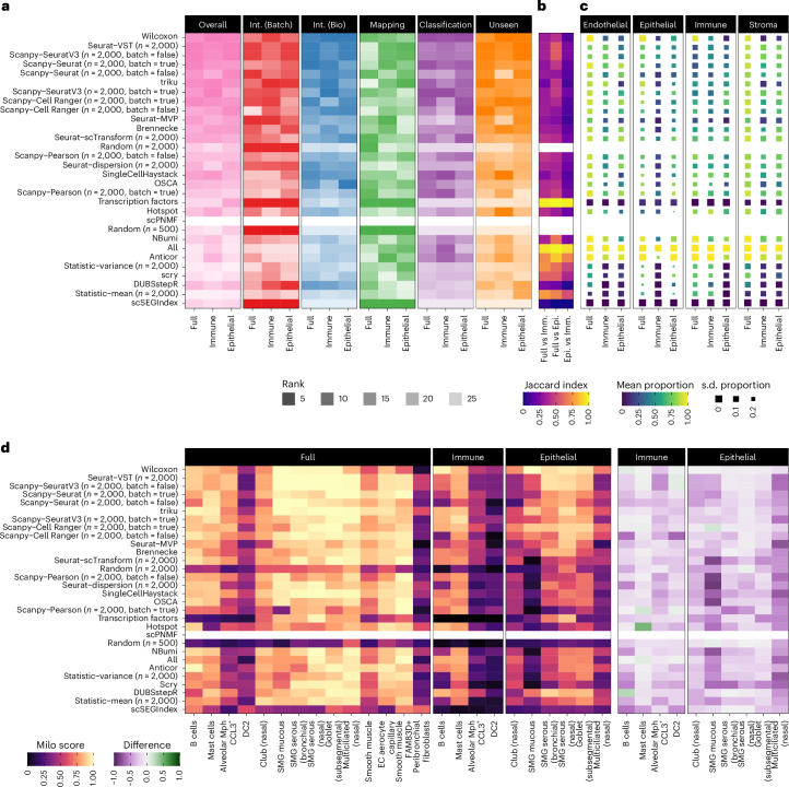
The availability of single-cell transcriptomics has allowed the construction of reference cell atlases, but their usefulness depends on the quality of dataset integration and the ability to map new samples. Previous benchmarks have compared integration methods and suggest that feature selection improves performance but have not explored how best to select features. Here, we benchmark feature selection methods for single-cell RNA sequencing integration using metrics beyond batch correction and preservation of biological variation to assess query mapping, label transfer and the detection of unseen populations. We reinforce common practice by showing that highly variable feature selection is effective for producing high-quality integrations and provide further guidance on the effect of the number of features selected, batch-aware feature selection, lineage-specific feature selection and integration and the interaction between feature selection and integration models. These results are informative for analysts working on large-scale tissue atlases, using atlases or integrating their own data to tackle specific biological questions.


Conflict of interest statement

Competing interests: F.J.T. consults for Immunai, Singularity Bio, CytoReason and Cellarity and has an ownership interest in Dermagnostix and Cellarity. A.F. is currently an employee of CytoReason. L.Z. has consulted for Lamin Labs, was an employee of iOmx Therapeutics and is currently an employee of Data Intuitive. R.K.-R. has consulted for iuvando Health. M.D.L. consults for CatalYm, has contracted for the Chan Zuckerberg Initiative and has received speaker fees from Pfizer and Janssen Pharmaceuticals. The other authors declare no competing interests.

Figures

Fig. 1
Fig. 1. Overview and results of the metric selection step.
a, Diagram of the metric selection workflow. b, Results of the metric selection step. Densities for the observed range and correlation with the number of features across datasets and integrations are shown for each metric. Colors indicate the mean value and vertical lines represent the median. The middle heatmap shows the mean correlation with technical dataset features (Extended Data Fig. 3a). Color indicates the mean correlation, and the size of squares is the s.d. (larger points are less variable). The heatmap on the right shows the mean correlation between metrics grouped by metric type (Extended Data Fig. 3b). The color bar on the left indicates which metrics were selected for the final benchmark. This indication is continued as shaded areas in the other plots.
Fig. 2
Fig. 2. Establishing baseline ranges and scaling and aggregating metrics.
a, Baseline ranges for selected metrics. Each panel shows baseline scores for all datasets for a single metric. Shaded areas colored by metric type show the baseline ranges, and points show the values for individual baseline methods. b, The process for scaling and aggregating metrics using the scIB pancreas dataset as an example. The real baseline methods and theoretical ‘Good’ and ‘Bad’ methods are shown. First, the metrics are measured, and then the values are scaled using the baseline ranges. Scaled values greater than one or less than zero are possible if a method performs better or worse than the baselines. Average scores for each metric type are computed, and the overall score is calculated as a weighted average of the category scores using the equation below.
Fig. 3
Fig. 3. Effect of the number of selected features on metric performance.
a, Metric values standardized by dataset and method across different numbers of features for each metric category and overall scores. Points show individual standardized values and large diamonds connected by lines show the mean for each number of features. b, Heatmap of standardized values by metric type for each dataset (Extended Data Fig. 4a). Colors indicate mean standardized values and sizes of squares show the s.d. (smaller squares are more variable). Methods are ordered using hierarchical clustering. c, Similar heatmap to b but rows are methods rather than datasets (Extended Data Fig. 4b).
Fig. 4
Fig. 4. Results of the benchmark of feature selection methods.
a, Summary of method performance by metric type. Points show scores for individual datasets and diamonds show the mean values (Extended Data Fig. 5a). Methods are sorted by mean overall score, and baseline methods are indicated by gray shading. Shaded areas show scores less than (red) or greater than (blue) the baseline range (0–1). Average rankings for each metric type are shown on the right, with color indicating mean rank and size s.d. (smaller is more variable) (Extended Data Fig. 5b). b, Overlap of features selected by different methods. The heatmap shows the mean Jaccard index (JI) between feature sets selected by different methods (excluding random gene sets) (Extended Data Fig. 6). Sizes of squares indicate the s.d. (smaller is more variable). Mean JI values greater than 0.5 are highlighted with white borders. c, The number of features (on a log10 scale) selected by at least n methods (n = 25, 20, 15, 10 and 5) for each dataset. Colors indicate the number of methods. d, The number of features selected by different methods. Points are colored by dataset, and blue bars show the mean for each method. Only methods which automatically determine the number of features are shown. Most other methods were set to select 2,000 features, as indicated by the red line, except scPNMF, which uses 200 features. e, Heatmap of the relative performance of batch-aware variants of scanpy methods. Colors show the difference in score for each metric type on each dataset, with negative values (purple) indicating that the batch-aware variant performed worse than the standard approach and positive values (green) that it performed better.
Fig. 5
Fig. 5. Analysis of lineage subsets of the HLCA dataset.
a, Method rankings for the full HLCA dataset, the immune subset and the epithelial subset. Overall rankings are shown, along with rankings for each metric category. Methods are ordered by their overall performance across all datasets. b, Overlap of selected feature sets. The Jaccard index values between feature sets from each subset are shown as a heatmap. c, Overlap with marker genes. A heatmap of the mean proportion of marker genes selected by each method on each dataset subset. The mean is calculated for each lineage in the full dataset (endothelial, epithelial, immune and stroma). The size of squares shows the s.d. of proportion across cell types in each lineage (smaller is more variable) (Extended Data Fig. 7). Overlaps are not shown for random gene sets. d, Analysis of cell label Milo scores. A heatmap shows the Milo score for each unseen cell type on the full, immune and epithelial subsets. On the right is shown the difference in scores for each lineage subset compared to the full dataset.
Fig. 6
Fig. 6. Comparison of feature selection method performance for different integration and query mapping methods.
a, A heatmap of mean scores for each metric category for the evaluated methods for integration and query mapping with scVI, scANVI and Symphony (negative scores in gray). b, A heatmap of difference in mean scores for scANVI and Symphony compared to scVI. c, A heatmap of mean ranks for methods for each metric category. d, A heatmap of differences in mean ranks compared to scVI. In all heatmaps, colors represent values, and sizes of squares show s.d. across datasets (smaller is more variable). Methods are ordered by overall ranking for scVI.
Extended Data Fig. 1
Extended Data Fig. 1. Overview of the design for the feature selection benchmarking study.
The methods to be evaluated are applied to each dataset and integration is performed. The query dataset is then mapped to the integrated reference. Different metrics are applied to assess batch correction, biological conservation, mapping quality, label transfer and unseen population detection.
Extended Data Fig. 2
Extended Data Fig. 2. Schematic of the processing pipeline for the benchmark.
Light gray ovals show the processing steps and colored lines indicate the flow of information between them.
Extended Data Fig. 3
Extended Data Fig. 3. Metric selection correlations.
Further detail on correlations calculated during metric selection. a) Heatmaps of means and standard deviations for correlations between metric scores and technical dataset features. b) Heatmaps of means and standard deviations for correlations between metrics.
Extended Data Fig. 4
Extended Data Fig. 4. Metric scores for different numbers of features.
Further detail on standardized metric scores for different numbers of features.a) Heatmaps of means and standard deviations of standardized metric scores by metric type for different datasets and numbers of features. b) Heatmaps of means and standard deviations of standardized metric scores by method for different methods and numbers of features.
Extended Data Fig. 5
Extended Data Fig. 5. Benchmark metric category results.
Further detail on metric category scores and ranks for each dataset.a) Heatmap showing metric category scores for each method on each dataset. Colors indicate category scores. b) Heatmap showing metric category ranks for each method on each dataset. Colors indicate metric categories and transparency indicates rank. Baseline methods are indicated by grey shading.
Extended Data Fig. 6
Extended Data Fig. 6. Selected features overlaps.
Further detail on overlaps between feature sets from different methods.a) Heatmaps showing mean and standard deviation of the Jaccard Index between different feature selection methods over all datasets. b) Heatmaps of the Jaccard Index between methods for individual datasets.
Extended Data Fig. 7
Extended Data Fig. 7. Marker genes overlaps.
Further detail on overlaps between selected feature sets and marker genes for HLCA datasets.a) Heatmaps of mean and standard deviation of the porportion of markers selection by each method on the full HLCA, HLCA (Immune) and HLCA (Epithelial) datasets for the cell types from endothelial, epithelial, immune and stroma compartments. b) Proportion of markers selected by methods for individual cell types on each HLCA dataset.
Extended Data Fig. 8
Extended Data Fig. 8. Integration comparison metric category results.
Further detail on the comparison of metric category scores between integration methods (scVI, scANVI, Symphony).a) Heatmaps showing mean metric category scores, mean differences in scores compared to scVI, mean metric category ranks and difference in mean category ranks for each feature selection and integration method. b) Heatmaps showing the standard deviation in metric scores, score difference, rank and rank differences.

References

    1. Regev, A. et al. Human cell atlas meeting participants. The human cell atlas. eLife10.7554/elife.27041 (2017).
    1. Zappia, L., Phipson, B. & Oshlack, A. Exploring the single-cell RNA-seq analysis landscape with the scRNA-tools database. PLoS Comput. Biol.14, e1006245 (2018). - PMC - PubMed
    1. Luecken, M. D. et al. Benchmarking atlas-level data integration in single-cell genomics. Nat. Methods10.1038/s41592-021-01336-8 (2021). - PMC - PubMed
    1. Tran, H. T. N. et al. A benchmark of batch-effect correction methods for single-cell RNA sequencing data. Genome Biol.21, 12 (2020). - PMC - PubMed
    1. Mereu, E. et al. Benchmarking single-cell RNA-sequencing protocols for cell atlas projects. Nat. Biotechnol.38, 747–755 (2020). - PubMed

LinkOut - more resources