. 2025 Mar 20;16(1):2740.
doi: 10.1038/s41467-025-57992-3.

Integrative single-cell metabolomics and phenotypic profiling reveals metabolic heterogeneity of cellular oxidation and senescence

Affiliations

Integrative single-cell metabolomics and phenotypic profiling reveals metabolic heterogeneity of cellular oxidation and senescence

Ziyi Wang et al. Nat Commun. .

Abstract

Emerging evidence has unveiled heterogeneity in phenotypic and transcriptional alterations at the single-cell level during oxidative stress and senescence. Despite the pivotal roles of cellular metabolism, a comprehensive elucidation of metabolomic heterogeneity in cells and its connection with cellular oxidative and senescent status remains elusive. By integrating single-cell live imaging with mass spectrometry (SCLIMS), we establish a cross-modality technique capturing both metabolome and oxidative level in individual cells. The SCLIMS demonstrates substantial metabolomic heterogeneity among cells with diverse oxidative levels. Furthermore, the single-cell metabolome predicted heterogeneous states of cells. Remarkably, the pre-existing metabolomic heterogeneity determines the divergent cellular fate upon oxidative insult. Supplementation of key metabolites screened by SCLIMS resulted in a reduction in cellular oxidative levels and an extension of C. elegans lifespan. Altogether, SCLIMS represents a potent tool for integrative metabolomics and phenotypic profiling at the single-cell level, offering innovative approaches to investigate metabolic heterogeneity in cellular processes.


Conflict of interest statement

Competing interests: The authors declare no competing interests.

Figures
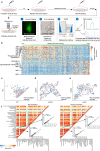
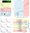
Fig. 1
Fig. 1. The cross-modality analysis platform integrating single-cell metabolome and cellular phenotype.
a A workflow and experimental setup of the cross-modality analysis. Cells were first labeled with DCFDA and photographed with a fluorescent microscope, followed by sampling and single-cell MS analysis. The oxidative levels were reflected by DCFDA fluorescent intensity and the metabolic information was acquired by SCMS. b Heatmap showing relative abundance of representative metabolites corresponding to single-cell DCFDA intensity. DCFDA intensity was indicated by color: dark green, relative high intensity; light green, relative low intensity. Metabolite abundance was represented by color: red, relative high abundance; blue, relative low abundance. ce PCA score plot (c), UMAP analysis (d), and tSNE analysis (e) showing no significant difference in metabolome of DCFDA incubated (n = 257, pink) and non-incubated cells (n = 325, blue). f Correlation heatmap illustrating Pearson’s correlation coefficient (r) between metabolites in non-incubated (left, n = 325) and DCFDA incubated (right, n = 257) cells. Glutamate was correlated with GABA and glutamine (inset). Two-sided Pearson’s correlation analysis was performed. P values were not adjusted. For (ce), Source data are provided as Source Data files.
Fig. 2
Fig. 2. The correlation analysis of intracellular metabolome and cellular OS level.
a The diagram illustrates the pairing of metabolic data and OS levels, as well as the subsequent correlation analysis. The DCFDA intensity indicated the specific level of OS in each cell, while single-cell MS was employed to determine the abundance of metabolites. Here, the metabolite GSH in Cells 1–4 was used as an illustrative example. Data from Cell 1–4 was normalized to Cell 1. The vectors for x and y were constructed based on single-cell OS levels and metabolite abundances, followed by calculation of Pearson’s coefficient (r) and significance (P). In correlation analysis, the data was z scored. Scale bar, 15 μm. b Metabolites that were inversely and positively correlated with the level of OS. Metabolites are shown as dots by color: red, positively correlated (P < 0.05); blue, inversely correlated (P < 0.05). The representative metabolites are annotated adjacent to the corresponding dots. P values were not adjusted. Two-sided Pearson’s correlation analysis was performed. ch The correlation analysis between the scaled levels of OS and the scaled intensities of representative metabolites including ATP (c), PCr (d), UTP (e), GTP (f), Hypt (g), and energy charge (h). The data were standardized by calculating z score. P values were not adjusted. Two-sided Pearson’s correlation analysis was performed. i The metabolic pathways enriched by the MSEA analysis of metabolites exhibiting a reverse correlation with OS levels. Only metabolites with MS/MS confirmation were included in the analysis. Only pathways with P < 0.05 in the MSEA analysis were included. P values were not adjusted. Related metabolic processes are annotated on the left. Dot size represents enrichment ratio, and dot color represents significance of the enrichment (P value). Yellow, relatively high significance; Blue, relatively low significance. n = 190 cells in (a) and (ch). For (ah), Source data are provided as Source Data files. ATP adenosine triphosphate, PCr phosphocreatine, UTP uridine triphosphate, GTP guanosine triphosphate, Hypt hypotaurine, GSH glutathione, CTP cytosine triphosphate, O-PE O-phosphoethanolamine, G-3-P glycerol 3-phosphate, AMP adenosine monophosphate.
Fig. 3
Fig. 3. Subtype-specific metabolic signatures and dynamic change of metabolome revealed by cross-modality analysis.
a UMAP visualization of six cellular subtypes based on the single-cell metabolome. Each point represents a single cell, color represents different subtypes. n = 55, 34, 14, 41, 29, and 17 for C1, C2, C3, C4, C5, and C6 respectively. b Average OS levels (indicated by the normalized DCFDA fluorescence intensity) of the six metabolic subpopulations. n = 55, 34, 14, 41, 29, and 17 for C1, C2, C3, C4, C5, and C6, respectively. F(5, 184) = 5.880, P = 4.57e−5 in One-way ANOVA (labeled in the plot). Data was normalized to values of the respective control (Cluster C1). Data is presented as mean ± s.e.m. Color represents different subtypes and each dot represents a cell. c Single-cell trajectory of pseudotime analysis showing temporal progression of cell subtypes originating from C1 and gradually transitioning towards C2/3, C4, and C5/6. Each subtype is represented by a distinct color. For (ac), Blue: C1; yellow: C2; purple: C3; green: C4; brown: C5; red: C6. d Heatmap of characteristic metabolites and their corresponding relative intensities in each subtype. Color indicates z scores of metabolite abundance. Red: relatively high abundance; blue: relatively low abundance. e Representative metabolic pathways significantly (P < 0.05) enriched in Cluster C1 and C6 through the MSEA analysis. Only metabolites with MS/MS confirmation were included in the analysis. Dot size represents enrichment ratio, while dot color indicates significance (−log10 P value) of the enrichment. Red: relatively high significance; blue: relatively low significance. P values were not adjusted. For (ac), Source data are provided as Source Data files. Data was collected from at least three biological replicates.
Fig. 4
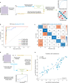
Fig. 4. Machine learning-guided prediction of OS levels based on single-cell metabolome.
a Flowchart of classification analysis with machine learning. The training and testing dataset were randomly assigned according to a ratio of 2:1. The model was trained and built with the training dataset with 5-fold cross validation. The testing dataset was held out and used for the evaluation of model accuracy independently. The performance of the model was evaluated with ROC curve and confusion matrix. b ROC curve of model testing. AUC for each cluster was determined separately by the classification model. Higher AUC value indicates a better performance of the model in predicting the clusters. The average AUC represented an overall performance of the model. The color represents classification of a certain subtype. Blue: C1; yellow: C2; purple: C3; brown: C4; green: C5; red: C6. c Confusion matrix of model testing, illustrating the distribution of errors in multi-class prediction. The average accuracy was used to evaluate the overall performance of the model. The color depth indicates the proportion of correct (blue) and incorrect (red) predictions, as displayed in the bar chart. d Flowchart of building a regression model with machine learning. The training and testing datasets were randomly assigned according to a ratio of 2:1. The model was trained and built with the training dataset with 5-fold cross validation. The testing dataset was held out and used for the evaluation of the model independently. e The correlation of real values and values predicted by the regression model (n = 61). Dash line represents the perfect fit (predicted values = real values). The model performance was evaluated by the correlation coefficient (r) and P value (P). Two-sided Pearson’s correlation analysis was performed. P = 1.45e−20. P value was not adjusted. For b and e, Source data are provided as Source Data files. AUC area under curve.
Fig. 5
Fig. 5. Metabolic heterogeneity in initial cells.
a Distribution and box plot (inset) of DCFDA intensity in initial cells and cells under OS. Data in distribution plot was z scored. Variance was indicated by IQR and MAD values in Supplementary Table 1. W = 58627, P < 2.2e-16 in unpaired two-tailed Wilcox rank sum test. The data presented in the inset was normalized to the values of initial cells. Box plots extend from 25th to 75th percentiles; central lines represent medians; whiskers extend over 1.5 times the interquartile range (IQR, the distance from 25th to 75th percentile); dots represent outliers. For single-cell DCFDA intensity, a total of 1740 initial cells (blue) and 960 oxidative stressed cells (gray) from 3 independent experiments were analyzed. b UMAP visualization of metabolic subtypes in initial cells. Green: cells of Cluster-I (n = 43). Purple: cells of Cluster-II (n = 183). c Heatmap of potential metabolic markers in Cluster-I and Cluster-II. The data was z score scaled. The color represents relative abundance of metabolites. Yellow: relatively high abundance; green: relatively low abundance. Each row represents a metabolite and each column represents a cell. The representative metabolites are labeled on the left and the clusters are labeled on the top. ATP: adenosine triphosphate; GSH: glutathione; GSSG: oxidized glutathione; Hypt: hypotaurine; O-PE: O-phosphoethanolamine; UTP: uridine triphosphate. d A heatmap illustrating the metabolic similarity between subtypes of initial cells (Cluster-I/II) and subtypes of oxidative stressed cells (C1 to C6). Each row represents an initial cell (subtypes are labeled on the left) and each column represents an oxidative stressed cell (subtypes are labeled on the top). The heatmap was plotted with similarity (1/distance) and the data was z score scaled. The distance between cells was calculated based on single-cell metabolome. The color represented the relative similarity: red, relative high similarity; blue, relative low similarity. Cells of Cluster-I is more similar to the cells with lower OS levels (cells of C1 and part of C2). e Enrichment of GSH in cells of Cluster-I visualized on the UMAP plot. Each dot represents a cell, the color of the dots represents the relative GSH abundance. Red: relatively high abundance; blue: relatively low abundance. Data was z score scaled. f Quantification of GSH abundance in Cluster-I (n = 43, green) and Cluster-II (n = 183, purple). Data was normalized to values in Cluster-I. Data is represented as mean ± s.e.m. Data were collected from at least three biological replicates. W = 7843, P = 5.85e−43 in unpaired two-tailed Wilcox rank sum test. g The correlation of every two metabolites were calculated (reflected as Pearson’s r) and the network was constructed based on the correlation data for initial cells belonging to Cluster-I (left) and Cluster-II (right) subtypes. In the network, each node represents a metabolite while an edge connecting two nodes indicates their correlation. The big green dot denotes GSH and the small blue dots denote GSH correlated metabolites. Blank-colored dots indicate metabolites without any correlation to GSH. h Rewiring score calculated with DyNet algorithm. Metabolites with higher scores were more rewired in topology in the correlation network of initial cells. For (a, b, e, f), Source data are provided as Source Data files. GSH: glutathione.
Fig. 6
Fig. 6. Role of intracellular metabolic features in determining the cellular fate in OS and OS induced senescence.
a A flowchart showing the process of the analysis. The initial cells were clustered based on their metabolomic features with unsupervised clustering, revealing Cluster-I (blue palette) and Cluster-II (red palette). Then cells with top (blue strip) and bottom (red strip) 5%-50% GSH levels were projected to the UMAP scatter plot. The correct matches were defined as cells with top 5%-50% GSH levels to Cluster-I (blue dots), and cells with bottom 5–50% GSH levels to Cluster-II (red dots). Incorrect matches were labeled as green dots. Finally, the fraction of correct matches was calculated. bf, The visualization of projection of cells with top/bottom 5% (b), 15% (c), 25% (d), 35% (e), and 50% (f) GSH levels into Cluster-I and Cluster-II. Correct matches were labeled as blue (cells with top 5–50% GSH levels vs Cluster-I) and red (cells with bottom 5%-50% GSH levels vs Cluster-II) dots. Incorrect matches were labeled as green dots. Cells with intermediate GSH levels were labeled as gray dots. g Quantification of fraction of accurate matches between cells with top/bottom 5%-50% GSH levels and Cluster-I and Cluster-II. Blue: correct matches; green: incorrect matches. h, Experimental setup of FACS separation of MROR and MROS cells and gating of the FACS: cells with top 5% (MROR, blue) and bottom 5% (MROS, red) GSH intensity were collected according to their fluorescent intensity. i, j Representative images (i) and quantification (j) of DCFDA staining of MROR and MROS cells before and after OS induction. F(1, 8) = 7.405, P = 0.0262 in two-way ANOVA. k, l Representative images (k) and quantification (l) of SA-β-Gal staining of MROR and MROS cells before and after induction of OS-induced senescence. F(1, 8) = 9.177, P = 0.0163 in two-way ANOVA. Scale bar, 50 μm. P values in two-way ANOVA with Turkey’s multiple comparisons were labeled in the plot. n = 3 for each group. All P values were reported as multiplicity adjusted P values for multiple comparisons. Data was normalized to the values of MROR group in control cells. Data is presented as mean ± s.e.m. For (j, l), Source data are provided as Source Data files. Blue: MROR cells; red: MROS cells. OS: oxidative stress. MROR cells: initial cells exhibiting a metabolome resembling that of OS-resistant cells. MROS cells: initial cells exhibiting a metabolome resembling that of OS-sensitive cells.
Fig. 7
Fig. 7. Effects of key metabolites on OS and induced senescence.
a, b Representative images (a) and quantification (b) of DCFDA staining of control cells and oxidative stressed cells with indicated treatments. n = 5 for each group. Scale bar, 50 μm. F(4, 20) = 5.991, P = 0.0024 in One-way ANOVA. P values in one-way ANOVA with multiple comparison were labeled in the plot. Data was normalized to values of control group. c, d Representative images (c) and quantification (d) of SA-β-Gal staining of control and oxidative stressed cells with indicated treatments. n = 9, 9, 3, 3, and 3 for Control, Vehicle treated, Hypt treated, PCr treated, and O-PE treated group respectively. Scale bar, 50 μm. F(4, 22) = 17.29, P = 5.50e-9 in One-way ANOVA. P values in one-way ANOVA with multiple comparison were labeled in the plot. Data were normalized to values of control group. e, f Representative images (e) and growth curve (f) of control and oxidative stressed cells with indicated treatments at indicated time points. Growth curve was plotted with at least 15 random fields from 3 independent biological replicates for each group at each indicated time point. Scale bar, 50 μm. F(4, 520) = 41.26, P < 2.2e−16 in two-way ANOVA. P values in two-way ANOVA with Turkey’s HSD comparison were labeled in the plot. Each group was compared with vehicle-treated oxidative stressed cells. Data were normalized to values of control group at 0 h. g, h Representative images (g) and quantification (h) of TMRE staining of control and oxidative stressed cells with indicated treatments. n = 9, 9, 5, 5, and 4 for Control, Vehicle treated, Hypt treated, PCr treated, and O-PE treated group respectively. Scale bar, 50 μm. F(4, 27) = 26.12, P = 6.14e−9 in one-way ANOVA. P values in one-way ANOVA with multiple comparison were labeled in the plot. Data was normalized to values of control group. All data are presented as mean ± s.e.m. OS: oxidative stressed cells; Hypt: hypotaurine (1 mM); PCr: phosphocreatine (0.5 mM); O-PE: O-phosphoethanolamine (40 μM). All P values were reported as multiplicity adjusted P values for multiple comparisons. For (b, d, f, h), Source data are provided as Source Data files. Blue: control; red: OS+vehicle; green: OS+Hypt; purple: OS+PCr; yellow: OS + O-PE.
Fig. 8
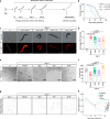
Fig. 8. Metabolic intervention extends lifespan and promotes healthy aging in C. elegans.
a A flowchart of experimental setup of lifespan and healthspan assay of C. elegans. b Lifespan of C. elegans treated with vehicle (n = 221), 0.4 mM hypotaurine (Hypt) (n = 320), 0.2 mM phosphocreatine (PCr) (n = 225) and 0.1 mM O-Phosphoethanolamine (O-PE) (n = 387). P values in two-tailed log rank test compared with vehicle-treated worms were labeled in the plot, P < 2.2e−16 for all comparisons indicated in (b). c, d Representative images (c) and quantification (d) of DHE staining of L4 (young adult) (n = 14) and Day-9 (aged) worms with indicated treatments (n = 21, 23, 19, and 24 for vehicle, Hypt, PCr, and O-PE treated worms respectively). Scale bar, 200 μm. F(4, 96) = 65.74, P < 2.2e-16 in One-way ANOVA. P values in One-way ANOVA with multiple comparison were labeled in the plot. P values were reported as multiplicity adjusted P values for multiple comparisons. Data was normalized to values of vehicle treated group at Day 9. Data is presented as mean ± s.e.m. e, f Representative images (e) and quantification (f) of L4 (n = 12) and aged C. elegans thrashing under treatment of vehicle (n = 19), 0.4 mM hypotaurine (Hypt) (n = 28), 0.2 mM phosphocreatine (PCr) (n = 23) and 0.1 mM O-Phosphoethanolamine (O-PE) (n = 13). Arrows indicate immobilized worms. Scale bar, 1 mm. F(4,90) = 27.58, P = 6.00e−15 in One-way ANOVA. P values in One-way ANOVA with multiple comparison were labeled in the plot. P values were reported as multiplicity adjusted P values for multiple comparisons. g, h Representative traces (g) and quantification (h) of free moving C. elegans. The traces showed the track of free moving worms in 1 min. At day 1, data of tracks was derived from 294, 368, 317, and 391 worms for vehicle, Hypt treated, PCr treated, and O-PE treated group, respectively. At day 5, data of tracks was derived from 184, 284, 175, and 305 worms for vehicle, Hypt treated, PCr treated, and O-PE treated group, respectively. At day 9, data of tracks was derived from 176, 309, 316, and 153 worms for vehicle, Hypt treated, PCr treated, and O-PE treated group, respectively. Scale bar, 1 mm. F(3,26296) = 73.15, P = 4.17e−47 in Two-way ANOVA. P values in Two-way ANOVA with Turkey’s HSD comparison (vehicle vs O-PE, Hypt, and PCr, respectively) were labeled in the plot. P values were reported as multiplicity adjusted P values for multiple comparisons. Data were collected from 3 independent biological replicates. For (b, d, f, h), Source data are provided as Source Data files. For (b and h), blue: Vehicle treated worms; green: Hypt treated worms; purple: PCr treated worms; yellow: O-PE treated worms. For d and f, gray: L4 worms; red: vehicle treated aged worms; green: Hypt treated aged worms; purple: PCr treated worms; yellow: O-PE treated aged worms. Hypt: 0.4 mM hypotaurine; PCr: 0.2 mM phosphocreatine; O-PE: 0.1 mM O-Phosphoethanolamine.

References

    1. Cheng, S. et al. Single-Cell RNA-seq reveals cellular heterogeneity of pluripotency transition and X chromosome dynamics during early mouse development. Cell Rep.26, 2593–2607.e2593 (2019). - PubMed
    1. Cao, J. et al. The single-cell transcriptional landscape of mammalian organogenesis. Nature566, 496–502 (2019). - PMC - PubMed
    1. Magee, J. A., Piskounova, E. & Morrison, S. J. Cancer stem cells: impact, heterogeneity, and uncertainty. Cancer Cell21, 283–296 (2012). - PMC - PubMed
    1. El-Sayes, N., Vito, A. & Mossman, K. Tumor heterogeneity: a great barrier in the age of cancer immunotherapy. Cancers (Basel)13, 806 (2021). - PMC - PubMed
    1. Olbrecht, S. et al. High-grade serous tubo-ovarian cancer refined with single-cell RNA sequencing: specific cell subtypes influence survival and determine molecular subtype classification. Genome Med.13, 111 (2021). - PMC - PubMed

LinkOut - more resources