. 2025 May 8;230(1):iyaf047.
doi: 10.1093/genetics/iyaf047.

Performance of qpAdm-based screens for genetic admixture on graph-shaped histories and stepping stone landscapes

Affiliations

Performance of qpAdm-based screens for genetic admixture on graph-shaped histories and stepping stone landscapes

Olga Flegontova et al. Genetics. .

Abstract

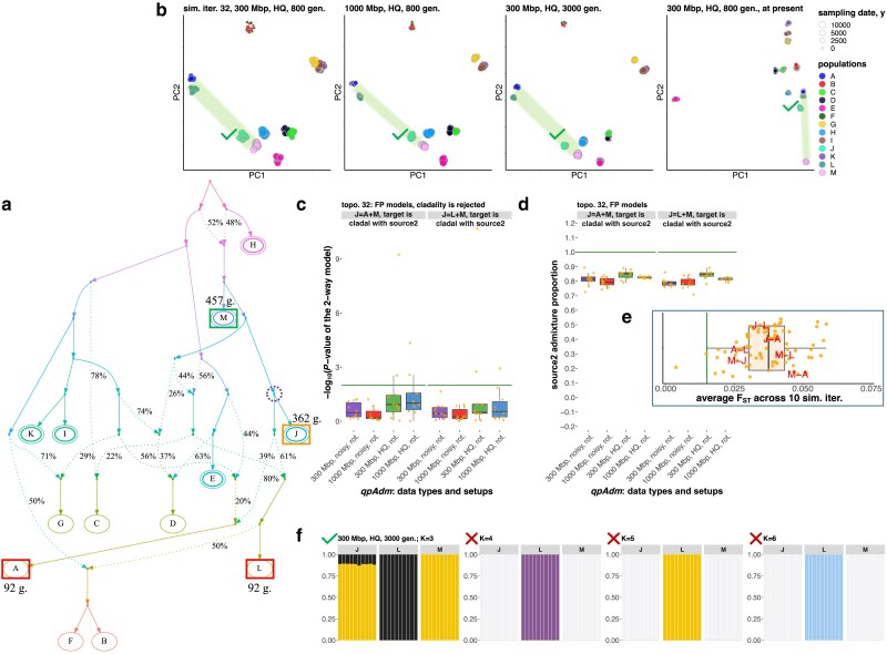
qpAdm is a statistical tool that is often used for testing large sets of alternative admixture models for a target population. Despite its popularity, qpAdm remains untested on 2D stepping stone landscapes and in situations with low prestudy odds (low ratio of true to false models). We tested high-throughput qpAdm protocols with typical properties such as number of source combinations per target, model complexity, model feasibility criteria, etc. Those protocols were applied to admixture graph-shaped and stepping stone simulated histories sampled randomly or systematically. We demonstrate that false discovery rates of high-throughput qpAdm protocols exceed 50% for many parameter combinations since: (1) prestudy odds are low and fall rapidly with increasing model complexity; (2) complex migration networks violate the assumptions of the method; hence, there is poor correlation between qpAdm P-values and model optimality, contributing to low but nonzero false-positive rate and low power; and (3) although admixture fraction estimates between 0 and 1 are largely restricted to symmetric configurations of sources around a target, a small fraction of asymmetric highly nonoptimal models have estimates in the same interval, contributing to the false-positive rate. We also reinterpret large sets of qpAdm models from 2 studies in terms of source-target distance and symmetry and suggest improvements to qpAdm protocols: (1) temporal stratification of targets and proxy sources in the case of admixture graph-shaped histories, (2) focused exploration of few models for increasing prestudy odds; and (3) dense landscape sampling for increasing power and stringent conditions on estimated admixture fractions for decreasing the false-positive rate.

Keywords: qpAdm; admixture graphs; archaeogenetics; genetic admixture; simulation; stepping stone models.


Conflict of interest statement

Conflicts of interest: The author(s) declare no conflicts of interest.

Figures

Fig. 1.
Fig. 1.
Admixture graphs showing an exhaustive list of assumption violations of the standard qpAdm protocol that may lead to rejection of the true simple model and thus prompt the researcher to test overly complex models. a) A gene flow from an outgroup (OG) O* to a proxy source after the divergence of the latter from the true source. b) A gene flow from an unsampled source to a proxy source after the divergence of the latter from the true source. This case is problematic only if the OGs are differentially related to the unsampled source. c) A gene flow from a proxy source to an OG after the divergence of the former from the true source. d) A gene flow from a target to an OG. e) An OG is cladal with a proxy source.
Fig. 2.
Fig. 2.
A case study illustrating the most common class of FP qpAdm models supported by the proximal rotating protocol. Models of this type include at least one proxy ancestry source that is simulated as fully cladal with the target. The other proxy source may be simulated as a descendant of the target lineage (as shown here), may belong to an unrelated lineage (Supplementary Fig. 6a), or may be also cladal with the target. Both models shown here, “J = A + M” and “J = L + M,” are also fully supported by 3D PCA and by an unsupervised ADMIXTURE analysis at 1 or more K values. a) Simulated AGS history (only topology is shown here; for divergence/admixture dates and effective population sizes, see the respective simulated history shown in Supplementary Fig. 3). Sampled populations are marked by letters. The target population from the qpAdm models illustrated here is enclosed in an orange rectangle; correct proxy source is in a green rectangle, and inappropriate proxy sources are in red rectangles. Sampling dates for these groups (in generations before present) are shown beside the rectangles (the dates are from the simulations up to 800 generations deep). True simulated ancestry source(s) for the target are enclosed in dashed violet circles. Six populations used as outgroups for the nonrotating qpAdm protocol are enclosed in double ovals. b) Two-dimensional PCA plots for 4 simulated high-quality datasets are indicated in plot titles. Simulated populations are colored according to the legend on the right, and larger points correspond to older sampling dates. The space between the proxy sources is shaded in green. If admixture model(s) are supported by 3D PCA (PC1 vs PC2 vs PC3) according to the criteria listed in Methods, a green tick mark is placed beside the target group in the plot, and a red cross mark is placed otherwise. c) Boxplots summarizing P-values of 2-way qpAdm models (indicated in plot titles) across simulation or subsampling replicates, grouped by simulation setups and qpAdm protocols as indicated on the x-axis. Green lines show the P-value threshold of 0.01 used in this study for model rejection. The qpAdm models shown here were not tested using the nonrotating protocol since the target falls into the set of 6 “right” populations chosen for that protocol. d) Boxplots summarize EAF across simulation or subsampling replicates, grouped by simulation setups and qpAdm protocols. The admixture proportions are shown either for the 1st or 2nd proxy source, as indicated on the y-axis; green lines show the simulated admixture proportion. e) All FST values for population pairs from the simulated history. Average FST values are shown across 10 simulation replicates for 1,000-Mb-sized genomes and high-quality data. Population pairs formed by components of the illustrated 2-way qpAdm model(s) are labeled in red. The green line shows median FST (0.015) for the Bronze Age West Asian populations analyzed by Lazaridis et al. (2016) as an example of human genetic diversity at the subcontinental scale. f) Ancestry proportions estimated with unsupervised ADMIXTURE for the groups constituting the qpAdm model(s). For brevity, results are shown for 1 or 2 qpAdm models, for 1 simulated dataset indicated in the plot title, and for 4 selected K values. If admixture model(s) are supported by this analysis at a given K value, a green tick mark is placed beside the target group in the plot, and a red cross mark is placed otherwise.
Fig. 3.
Fig. 3.
Distributions of FDR values over 10 simulation replicates (for high-quality data) or over 10 subsampling replicates derived from a single simulation replicate (for low-quality data). The distributions are summarized as violin plots with medians and stratified by qpAdm protocols (rotating and nonrotating); by model subsets (proximal, distal, or both model types included); by data quality; and by 3 combinations of simulated genome sizes (300, 1,000, or 3,000 Mb) and maximal simulation depths (800 or 3,000 generations). The following statistical comparisons were performed with the 2-sided Wilcoxon test: across genome sizes, with protocol and data quality fixed (36 nonpaired tests); across data qualities, with protocol and genome size fixed (18 nonpaired tests); and across protocols, with genome size and data quality fixed (90 paired tests). Paired tests were used in the latter case since the corresponding sets of models are not independent: nonrotating models form a subset of rotating models, and distal and proximal models can be considered together. P-values (adjusted for multiple testing using the Holm method) are coded in the following way: ns > 0.05; * ≤ 0.05; ** ≤ 0.01; *** ≤ 0.001; **** ≤ 0.0001. Most comparisons across protocols are significant at the 0.05 level (omitted for clarity), and only nonsignificant comparisons of this type are shown with dashed lines.
Fig. 4.
Fig. 4.
Diagrams summarizing principles of SSL simulations, SSL-based qpAdm setups, and approaches we used for interpreting qpAdm results in this context. Key features of the simulations are as follows: (1) origin of all the demes via a multifurcation; (2) the 2D space is quantized into 64 demes of small and stable effective population size; (3) gene flow intensities between neighboring demes are generated by random sampling from normal or uniform distributions (in certain intervals), at the beginning of “gene flow epochs”; (4) at least 3 gene flow epochs were simulated (“pre-LGM,” “LGM,” and “post-LGM”); and (5) all the demes are sampled at 3 time points (“slices” of the landscape) in the 2nd half of the “post-LGM” epoch. qpAdm experiments (rotating and nonrotating, distal, and proximal) were constructed by subsampling this initial set of deme samples randomly or systematically, as illustrated by the examples on the left and the right, respectively. Each qpAdm model (2- to 6-way) was then characterized by 9 numbers: 3 of those were derived from qpAdm outputs, and 6 were properties of the model in the context of the landscape. The former metrics are as follows: max|EAF−EF|, max. SE, and P-value. Five of the latter numbers are termed “model optimality metrics”: min. STS angle, max. ST distance, average ST distance, Euclidean distance to the ideal symmetric model (marked by the orange circle) in the space of model optimality metrics (illustrated in the lower left corner of the figure) based on min. STS angle and max. or average ST distance. Yet another metric is defined on the landscape but is not included in the optimality metrics, that is average distance from demes in the “left” set to demes in the “right” set (average “left–right” distance).
Fig. 5.
Fig. 5.
Randomized 2 to 4-way qpAdm models in the space of max|EAF−EF| and P-values (both axes are logarithmic). Results for all qpAdm protocols are combined but stratified by model complexity and landscape type. Two sections of the space are shown: P-values from 10−55 to 1 (the upper 5 rows of plots) and from 3.16 × 10⁻⁶ to 1 (the 4 rows below them). The space is divided into rectangular bins (50 × 50 for the larger section and 35 × 35 for the smaller section), and they are colored by density of individual qpAdm models populating this space (logarithmic color scale) or by median values of model optimality metrics in those bins: max. ST distance, min. STS angle, and Euclidean distance to the ideal symmetric model. Density of ideal symmetric models (in the case of 4-way models, the most optimal nonideal models available on our SSL) in this space is also shown (in 75 × 75 bins). To assess if distributions of ideal symmetric models over P-values are uniform, we use a nonlogarithmic P-value scale (the bottom row of plots). The vertical lines (or the tick marks) mark max|EAF−EF| = 0.5, and the horizontal lines mark the lowest and highest P-value thresholds used in this study (0.001 and 0.5).
Fig. 6.
Fig. 6.
Randomized 2- to 4-way qpAdm models in the space of model optimality metrics: max. ST distance and min. STS angle (models with the latter metric undefined were excluded from this analysis). Results for all qpAdm protocols are combined but stratified by model complexity and landscape type. The upper row of plots shows density of all randomized models tested, and the other rows show density of fitting models satisfying selected composite feasibility criteria listed in the captions on the right (7 of 36 criteria tested in this study, from the least stringent on top to the most stringent at the bottom). All the color scales are logarithmic. The space was divided into 9 bins on the x-axis (bin width = 1), and 18 bins on the y-axis (intervals [0°, 10°], (10°, 20°], and so forth). Spearman's correlation coefficients for counts of all models vs fitting models in these bins are shown in each panel in brown (bins not populated by any models were not considered). The horizontal lines mark the “ideal” min. STS angles for 3- and 4-way models (120° and 90°). The numbers above each plot on the right and on the left stand for counts of rejected and fitting models in those analyses, respectively.
Fig. 7.
Fig. 7.
Prestudy odds a), FPR b), FNR c), and FDR d) are shown for 2 composite model feasibility criteria. The violin plots with medians visualize distributions of these metrics across simulation replicates. The results are grouped by SSL sparsity and model complexity (all qpAdm protocols are considered together). Results of pairwise comparisons of the FDR distributions are shown in the matrix form in e) (P-values of nonpaired Wilcoxon tests were adjusted for multiple testing using the Holm method).
Fig. 8.
Fig. 8.
Randomized qpAdm results at the level of experiments visualized for “dense” landscapes (10−3 to 10−2). The results are stratified by qpAdm protocols and landscape sampling density (13 or 18 demes in rotating sets and 10 or 15 demes in nonrotating “right” and proxy source sets, respectively) and also by model complexity level at which experiments generate positive results, by conditions on EAF, and by P-value thresholds (results for 3 thresholds only are shown: 0.001, 0.05, and 0.5). We show as bar plots fractions of experiments producing positive results (at least one fitting model per target) at each complexity level and fractions of those experiments with positive outcomes classified as potentially misleading (see Methods for a definition based on Euclidean distances in the space of optimality metrics: max. ST distance and min. STS angle). In the case of “bad” experiments, the most optimal model (according to ST distances and STS angles) available in the chosen deme set was rejected, but a much less optimal model emerged as fitting. The error bars show 3 SE intervals calculated on 10 simulation replicates. Fractions of experiments falling into these different classes (producing positive results at complexity levels from 1 to 4 and classified as either misleading or not misleading) are visualized by the stacked bar plots. Error bars are not shown for visual clarity in the latter plot.
Fig. 9.
Fig. 9.
a) Systematic 2- to 4- and 6-way qpAdm models on the “10−5 to 10−2” landscapes in the space of max|EAF−EF| and P-values. Results are stratified by model complexity, qpAdm protocol, and number of target's nearest neighbors in a model, which is the only optimality metric in this analysis. A part of the whole space is shown (P-values from 3.16 × 10⁻⁶ to 1), and for a wider section of the space and for 1-way models, see Supplementary Fig. 35a. The space is divided into rectangular bins (50 × 50), and they are colored by density of individual qpAdm models populating this space (see the logarithmic color scales on the right). The vertical lines (or the tick marks) mark max|EAF−EF| = 1−EF; for 3-way and more complex models, this boundary is similar but not identical to the boundary between EAF within (0, 1) and outside (0, 1). The horizontal lines mark the P-value threshold used in all our systematic experiments (0.01). b) We show as bar plots fractions of tested models that satisfy 3 kinds of feasibility criteria marked on the x-axis. The fractions are also indicated below the bars.
Fig. 10.
Fig. 10.
qpAdm performance in the case of systematic and symmetric landscape sampling, interpreted at the level of experiments. Results for the distal rotating (a and c) and distal nonrotating (b and d) protocols are shown. The protocols relied on the following composite feasibility criterion: P-value threshold at 0.01, EAF between 0 and 1. In a) and b), distributions of experiments over model complexity levels at which thier ends are shown, and experiments are grouped by the number of target's nearest neighbors (demes from the 1st circle) available. The other proxy sources and “right” groups were taken from the 3rd circle around the target. The error bars show standard deviation calculated on simulation replicates. In c) and d), each experiment is represented by only one fitting model with the highest P-value. We show distributions of P-values for these models (the scale on the left) as violin plots with medians, stratified by 2 variables: model complexity level at which an experiment ends (the scale on top), and number of target's nearest neighbors included in a model that was chosen to represent an experiment (the scale at the bottom). For each model complexity level, all pairs of the distributions were compared using the 2-sided nonpaired Wilcoxon test, and only significant P-values (adjusted for multiple comparisons with the Holm method) are shown. The asterisks stand for the following significance levels: * ≤ 0.05; ** ≤ 0.01; *** ≤ 0.001; **** ≤ 0.0001. The numbers above the bar plots and below the violin plots in panels a–d) stand for the number of experiments in the respective categories in all simulation replicates combined.
Fig. 11.
Fig. 11.
Comparing qpAdm models analyzed by the high-throughput protocols from the studies by Zeng et al. (2023) and Speidel et al. (2024) and results of the randomized qpAdm protocol on the “10−5 to 10−2” and “10−3 to 10−2” landscapes, respectively, by placing them in the spaces of optimality metrics (average ST distance vs min. STS angle). Results are stratified by model complexity. The upper row of plots shows density of all published models in this space (all models tested in the case of Zeng et al. and models with EAF ∈ [0, 1] in the case of Speidel et al.) and the other rows show density of fitting models satisfying selected composite feasibility criteria listed in the captions on the right (6 of 36 criteria tested in this study, from the least stringent on top to the most stringent at the bottom). All the color scales are logarithmic. The x-axis is divided into 20 or 22 bins in the case of the real data and 18 bins in the case of the simulated data; the y-axis is divided into 18 bins (intervals [0°, 10°], (10°, 20°], and so forth). Spearman's correlation coefficients for counts of all published models vs fitting models in these bins are shown in each panel in brown (bins not populated by any models were not considered). The horizontal lines mark the “ideal” min. STS angles for 3- and 4-way models (120° and 90°). The numbers above each plot on the right and on the left stand for counts of rejected and fitting models in those analyses, respectively, and the vertical lines mark the average ST distance (4.5) that equals the radius of the landscape on simulated data and the midpoints (5,000 or 1,200 km) between minimal and maximal average ST distances on the real landscapes. The distances and angles on the real data (great circle distances in km and angles between 2 bearings) are based on centroids of groups calculated using an R implementation of the Mean Center tool from ArcGIS Pro. We considered ST distances ≤50 km to be negligible, and for such models, min. STS angles were not defined (following the approach we applied to zero-length ST distances on the simulated data), excluding them from this analysis.

Update of

Similar articles

Cited by

  • Ancient DNA reveals the prehistory of the Uralic and Yeniseian peoples.
    Zeng TC, Vyazov LA, Kim A, Flegontov P, Sirak K, Maier R, Lazaridis I, Akbari A, Frachetti M, Tishkin AA, Ryabogina NE, Agapov SA, Agapov DS, Alekseev AN, Boeskorov GG, Derevianko AP, Dyakonov VM, Enshin DN, Fribus AV, Frolov YV, Grushin SP, Khokhlov AA, Kiryushin KY, Kiryushin YF, Kitov EP, Kosintsev P, Kovtun IV, Makarov NP, Morozov VV, Nikolaev EN, Rykun MP, Savenkova TM, Shchelchkova MV, Shirokov V, Skochina SN, Sherstobitova OS, Slepchenko SM, Solodovnikov KN, Solovyova EN, Stepanov AD, Timoshchenko AA, Vdovin AS, Vybornov AV, Balanovska EV, Dryomov S, Hellenthal G, Kidd K, Krause J, Starikovskaya E, Sukernik R, Tatarinova T, Thomas MG, Zhabagin M, Callan K, Cheronet O, Fernandes D, Keating D, Candilio F, Iliev L, Kearns A, Özdoğan KT, Mah M, Micco A, Michel M, Olalde I, Zalzala F, Mallick S, Rohland N, Pinhasi R, Narasimhan VM, Reich D. Zeng TC, et al. Nature. 2025 Aug;644(8075):122-132. doi: 10.1038/s41586-025-09189-3. Epub 2025 Jul 2. Nature. 2025. PMID: 40604287 Free PMC article.
  • The genomic footprints of migration: how ancient DNA reveals our history of mobility.
    Williams MP, Huber CD. Williams MP, et al. Genome Biol. 2025 Jul 16;26(1):206. doi: 10.1186/s13059-025-03664-w. Genome Biol. 2025. PMID: 40671036 Free PMC article. Review.
  • Ancient DNA indicates 3,000 years of genetic continuity in the Northern Iranian Plateau, from the Copper Age to the Sassanid Empire.
    Amjadi MA, Özdemir YC, Ramezani M, Jakab K, Megyes M, Bibak A, Salehi Z, Hayatmehar Z, Taheri MH, Moradi H, Zargari P, Hasanpour A, Jahani V, Sharifi AM, Egyed B, Mende BG, Tavallaie M, Szécsényi-Nagy A. Amjadi MA, et al. Sci Rep. 2025 May 13;15(1):16530. doi: 10.1038/s41598-025-99743-w. Sci Rep. 2025. PMID: 40360796 Free PMC article.

References

    1. Al-Asadi H, Petkova D, Stephens M, Novembre J. 2019. Estimating recent migration and population-size surfaces. PLoS Genet. 15(1):e1007908. doi:10.1371/journal.pgen.1007908. - DOI - PMC - PubMed
    1. Alexander DH, Novembre J, Lange K. 2009. Fast model-based estimation of ancestry in unrelated individuals. Genome Res. 19(9):1655–1664. doi:10.1101/gr.094052.109. - DOI - PMC - PubMed
    1. Allentoft ME, Sikora M, Refoyo-Martínez A, Irving-Pease EK, Fischer A, Barrie W, Ingason A, Stenderup J, Sjögren KG, Pearson A, et al. 2024. Population genomics of post-glacial western Eurasia. Nature. 625(7994):301–311. doi:10.1038/s41586-023-06865-0. - DOI - PMC - PubMed
    1. Antonio ML, Gao Z, Moots HM, Lucci M, Candilio F, Sawyer S, Oberreiter V, Calderon D, Devitofranceschi K, Aikens RC, et al. 2019. Ancient Rome: a genetic crossroads of Europe and the Mediterranean. Science. 366(6466):708–714. doi:10.1126/science.aay6826. - DOI - PMC - PubMed
    1. Baumdicker F, Bisschop G, Goldstein D, Gower G, Ragsdale AP, Tsambos G, Zhu S, Eldon B, Ellerman EC, Galloway JG, et al. 2022. Efficient ancestry and mutation simulation with msprime 1.0. Genetics. 220(3):iyab229. doi:10.1093/genetics/iyab229. - DOI - PMC - PubMed

LinkOut - more resources