doi: 10.1109/MCG.2024.3509293.
Empowering Communities: Tailored Pandemic Data Visualization for Varied Tasks and Users
- PMID: 40227911
- PMCID: PMC12075951
- DOI: 10.1109/MCG.2024.3509293
Item in Clipboard
Empowering Communities: Tailored Pandemic Data Visualization for Varied Tasks and Users
IEEE Comput Graph Appl.
2025 Jan-Feb.
Abstract
Data visualization methodologies were intensively leveraged during the COVID-19 pandemic. We review our design experience working on a set of interdisciplinary COVID-19 pandemic projects. We describe the challenges we met in these projects, characterize the respective user communities, the goals and tasks we supported, and the data types and visual media we worked with. Furthermore, we instantiate these characterizations in a series of case studies. Finally, we describe the visual analysis lessons we learned, considering future pandemics.
Figures

August 2020: Luxembourg ministers Franz Fayot and Claude Meisch view a pandemic Cross-Functional Dashboard demonstration, implemented in DEBORAH. A tabletop control panel sets the what-if scenario analyzed on the wall display.
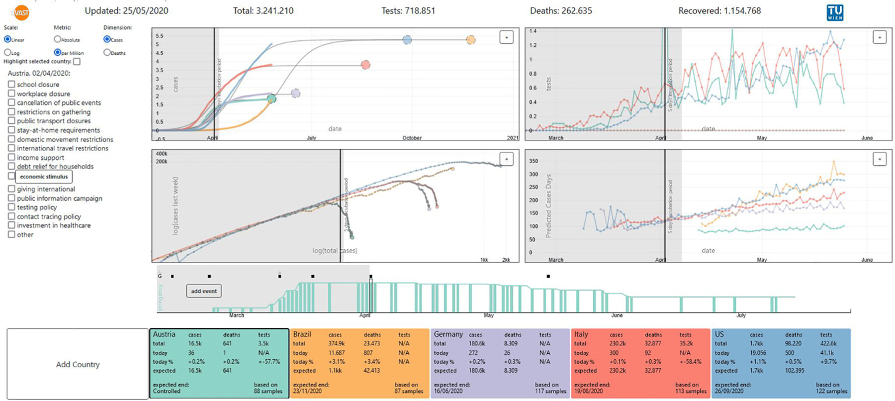
COVis’s charts display the temporal evolution of actual/projected cases/deaths, tests, and total cases/deaths × last week’s cases/deaths. The event panel displays information and source references. The events time chart presents policy changes over time. Countries can be excluded or included into analysis.
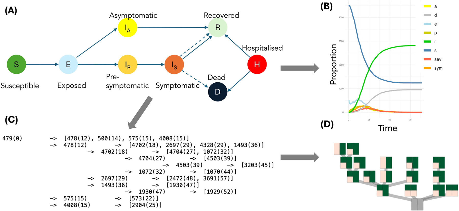
(A) Contact Tracing Model: Epidemiological compartments. (B) Example output at the population scale for a simulated policy. (C) Example of model output of complex transmission chains at the individual scale at time (t). (D) Comparison of impact of two control policies on individual transmission chains using representative trees. Trees are split into two sides to represent individual policies; green colors indicate the proportions of prevented infection routes.
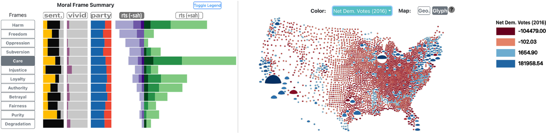
Custom encodings in MOTIV, a web application for analyzing the U.S. population response to Stay-at-Home (SAH) orders from a moral frame perspective, based on social media. (Left) Barcharts show the distribution of moral frames, with Care being most predominant. (Right) Custom glyphs show the distribution of electoral votes along with SAH support across the U.S.
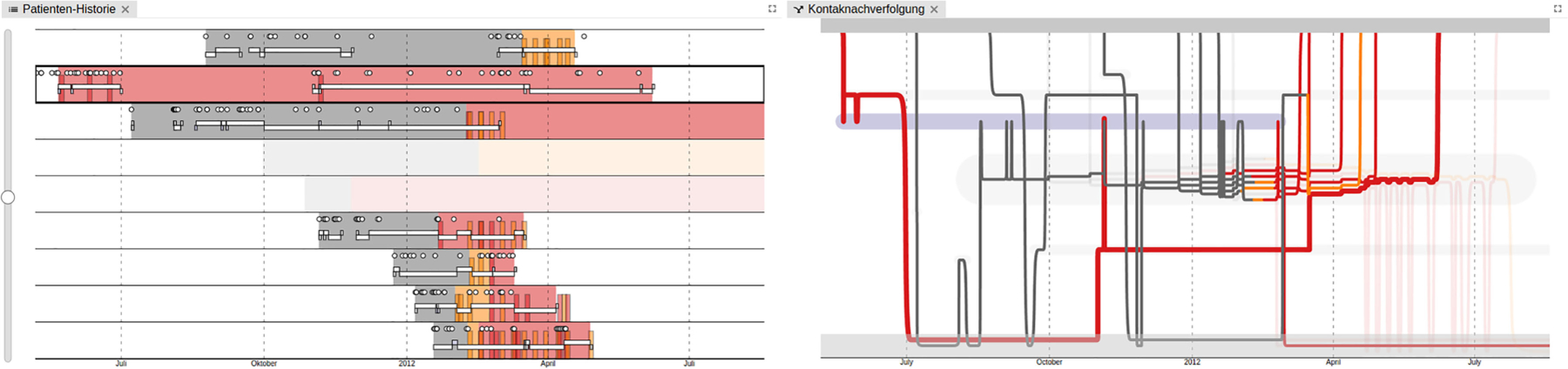
Part of the SmICS Visualization Dashboard. (Left) Timeline of individual patients, showing their infection status, test results, and ward stays. (Right) Storyline visualization of individual patients, encoding patient contacts as line bundles to show possible transmission pathways via patient contact.
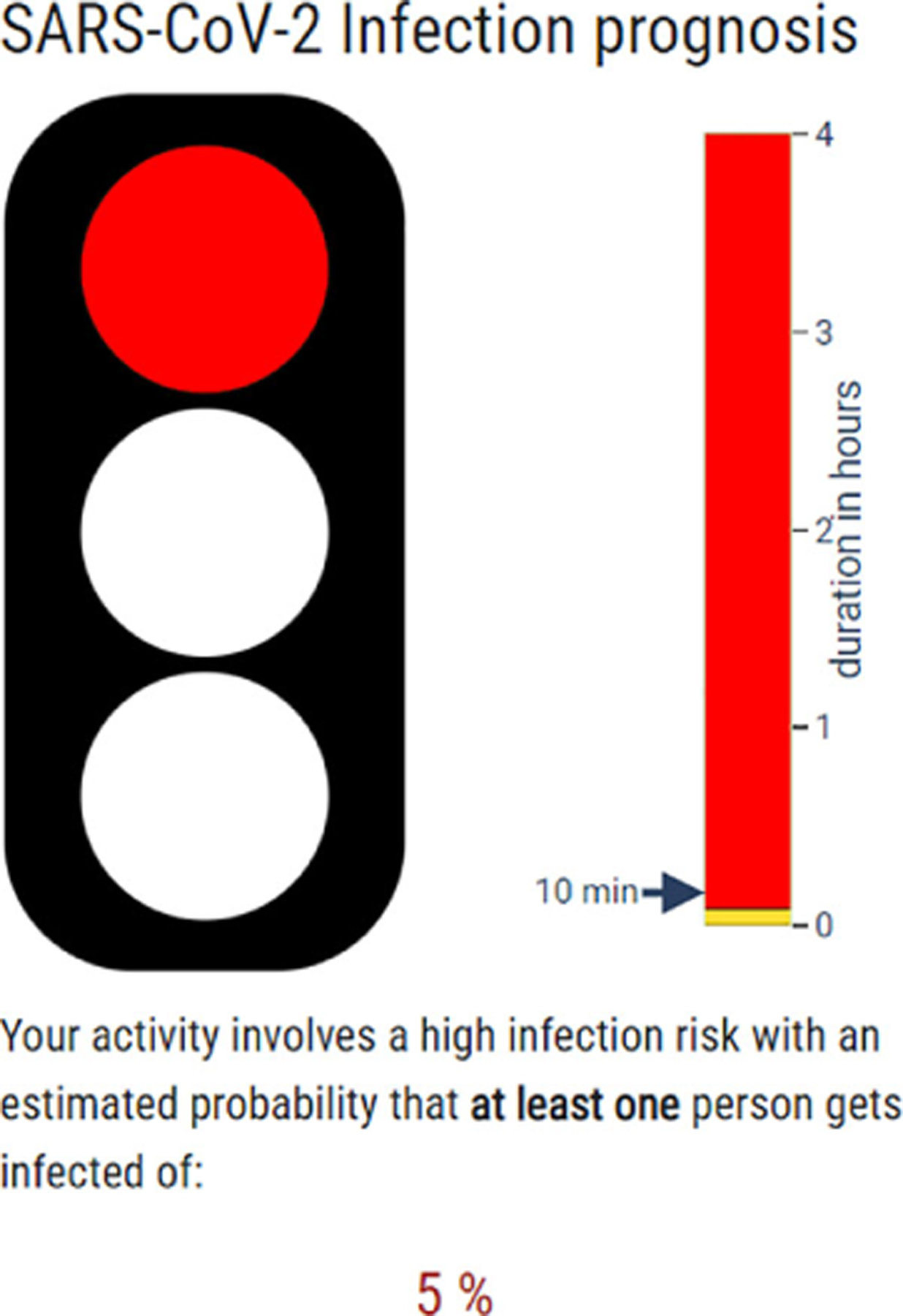
SARS-CoV-2 Infection Prognosis for High-Risk Activities: The red traffic light visual indicates a high infection risk related to activities lasting over 10 min, with a 5% chance of at least one person becoming infected.
Similar articles
-
Reflections on the Use of Dashboards in the COVID-19 Pandemic.IEEE Comput Graph Appl. 2025 Mar-Apr;45(2):135-142. doi: 10.1109/MCG.2025.3538257. IEEE Comput Graph Appl. 2025. PMID: 40504737
-
Measures implemented in the school setting to contain the COVID-19 pandemic.Cochrane Database Syst Rev. 2022 Jan 17;1(1):CD015029. doi: 10.1002/14651858.CD015029. Cochrane Database Syst Rev. 2022. Update in: Cochrane Database Syst Rev. 2024 May 2;5:CD015029. doi: 10.1002/14651858.CD015029.pub2. PMID: 35037252 Free PMC article. Updated.
-
Antibody tests for identification of current and past infection with SARS-CoV-2.Cochrane Database Syst Rev. 2022 Nov 17;11(11):CD013652. doi: 10.1002/14651858.CD013652.pub2. Cochrane Database Syst Rev. 2022. PMID: 36394900 Free PMC article.
-
Physical interventions to interrupt or reduce the spread of respiratory viruses.Cochrane Database Syst Rev. 2023 Jan 30;1(1):CD006207. doi: 10.1002/14651858.CD006207.pub6. Cochrane Database Syst Rev. 2023. PMID: 36715243 Free PMC article.
-
Unintended consequences of measures implemented in the school setting to contain the COVID-19 pandemic: a scoping review.Cochrane Database Syst Rev. 2024 Dec 12;12(12):CD015397. doi: 10.1002/14651858.CD015397.pub2. Cochrane Database Syst Rev. 2024. PMID: 39665337
References
-
- Wentzel A et al. “MOTIV: Visual exploration of moral framing in social media,” Comput. Graphics Forum, vol. 43, 2024, Art. no. e15072.
-
- Baumgartl T et al. “In search of patient zero: Visual analytics of pathogen transmission pathways in hospitals,” IEEE Trans. Vis. Comput. Graphics, vol. 27, no. 2, pp. 711–721, Feb. 2021. - PubMed
-
- Sondag M, Turkay C, Xu K, Matthews L, Mohr S, and Archambault D, “Visual analytics of contact tracing policy simulations during an emergency response,” Comput. Graphics Forum, vol. 41, pp. 29–41, 2022.
Publication types
MeSH terms
Grants and funding
LinkOut - more resources
Full Text Sources
Medical
Miscellaneous