. 2025 Dec;14(1):2494705.
doi: 10.1080/22221751.2025.2494705. Epub 2025 May 6.

Reading of human acute immune dynamics in omicron SARS-CoV-2 breakthrough infection

Affiliations

Reading of human acute immune dynamics in omicron SARS-CoV-2 breakthrough infection

Haibo Li et al. Emerg Microbes Infect. 2025 Dec.

Abstract

The dynamics of the immune response to severe acute respiratory syndrome coronavirus 2 (SARS-CoV-2) breakthrough infections remain unclear, particularly when compared to responses in naive individuals. In this longitudinal prospective cohort study, 13 participants were recruited. Peripheral blood samples were collected every other day until day 7 after symptom onset. Transcriptome sequencing, single-cell sequencing, T-cell receptor (TCR) sequencing, B-cell receptor (BCR) sequencing, Olink proteomics, and antigen-antibody binding experiments were then performed. During the incubation periods of breakthrough infections, peripheral blood exhibited type 2 cytokine response, which shifted to type 1 cytokine response upon symptom onset. Plasma cytokine levels of C-X-C motif chemokine ligand 10, monocyte chemoattractant protein-1, interferon-γ, and interleukin-6 show larger changes in breakthrough infections than naïve infections. The inflammatory response in breakthrough infections rapidly subsided, returning to homeostasis by day 5 after symptom onset. Notably, the levels of monocyte-derived S100A8/A9, previously considered a marker of severe disease, physiologically significantly increased in the early stages of mild cases and persisted until day 7, suggesting a specific biological function. Longitudinal tracking also revealed that antibodies anti-Receptor Binding Domain (anti-RBD) in breakthrough infections significantly increased by day 7 after symptom onset, whereas cytotoxic T lymphocytes appeared by day 5. This study presents a reference for interpreting the immunological response to breakthrough infectious disease in humans.

Keywords: Breakthrough Infection; COVID-19; Early stage; Immune response; Innate immunity; SARS-CoV-2.


Conflict of interest statement

No potential conflict of interest was reported by the authors.

Figures

Figure 1.
Figure 1.
Symptoms development and dynamic of antibody response (a) Sample collection time points. Each coloured row represents a patient, and each point represents a sample collection. (b) The experiments conducted after collecting the samples, sample number = the sample number of for each experiment. n = the number of subjects for each experiment. (c) A dotted line graph shows the number of symptoms changing over time. The dot represents the mean. n = 13, the lines connect the means, and the error bars represent the standard error. (d) Changes in the percentage of just noticeable symptoms over time. (e-g) Area Under Curve (AUC) of spike RBD–specific IgG against WT (e), BA.5 (f), and BF.7 (g). (h) AUC of spike RBD–specific IgG against WT, BA.5, and BF.7. The line represents the mean and the error bars represent the standard error. (i) The ratio of day(X) AUC to uninfected baseline for RBD(WT), RBD(BA.5), and RBD(BF.7) in Patient 1 and 3 from days 1, 3, 5, and 7 post-symptom onset, illustrating the relative rise in antibody titers across variants.Sample number  = 47.
Figure 2.
Figure 2.
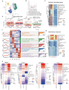
Profile of bulk transcriptome during the breakthrough of the infection course. (a) Heatmap from the gene expression of bulk RNA transcriptomics and hierarchical clustering of samples; sample number = 47. The colour bar on the right represents the group of samples. The groups were defined through hierarchical clustering on scaled and filtered gene expression data, using K = 9 based on silhouette coefficients. (b) Venn diagram comparing different genes of each day to the pre-symptoms by bulk transcriptome sequencing following the exclusion of samples from patient 4. Sample number = 42. Each colour represents one day. The ratio inside the parentheses represents the proportion of that quantity among all differentially expressed gene. (c) Top 8 enriched Gene Ontology (GO) terms in each day. Colours represent enrich gene counts in this term. Red represents a higher quantity, while blue represents a lower quantity. Asterisks denote the P-adjust value, with three asterisks indicating an adjusted P-value < 0·001. Sample number = 42.
Figure 3.
Figure 3.
The trends of temporal changes in four types of plasma cytokines. (a) Heatmap displaying the four dynamic expression patterns of genes belonging to inflammatory panel of Olink proteomics during different days. Left. Z-score of different classes of cytokines in each day, Middle, trends in variation among different Class and the number of cytokines they contain. Right, cytokines are categorized from the Class 1(C1) to Class4(C4). Sample number  = 42. (b) Representative genes of differing trends. Left, data are presented using fourth-order polynomial fitting. Right, each line represents the data from one patient. Solid lines represent the fitted curves, while the light-coloured areas represent the 95% confidence intervals. Sample number  = 42.
Figure 4.
Figure 4.
Compare the key cytokine changes between breakthrough and naïve infections. (a – h) Temporal changes in eight plasma inflammatory cytokines among breakthrough and naïve infections. For each graph, red lines represent cytokines from breakthrough infection, and blue lines represent cytokines from naïve infection. Left, Solid lines represent fourth-order polynomial fitting curves for the cytokines corresponding to the two patient groups. Light-coloured areas indicate the 95% confidence intervals. Right, raw Olink proteomic/ELISA profiles for breakthrough and naïve infections. The black arrows indicate a secondary rise. n = 12 for breakthrough infection; n = 18 for naïve infection. (i) Comparison of the relative expression changes between naïve and breakthrough infections. For naïve infections, the change in relative expression levels was calculated by subtracting day 10 data from day 4 data. For breakthrough infections, the change in relative expression levels was calculated by subtracting day 7 data from day 1 data.
Figure 5.
Figure 5.
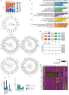
Myeloid cells shift from an antiviral response to alarmin response. (a) UMAP of the classification of myeloid cells and lymphocytes based on the cell marker in Fig. S4a. (b) The line chart of the monocytes sub-classification percentage of myeloid cells. (c) Scores of the interferon stimulated genes between different cell subsets over time. Samples exceeding the ThresholdActivation marked with black dots, clearly distinguishing between “activated” and “returned to baseline or not activated” states. ThresholdActivation = Xpre-symptom + 1 × σ pre-symptom, Xpre-symptom represents the mean expression score in the pre-symptom phase, σ pre-symptom represents the standard deviation. (d) Scores of the inflammatory response of GO term between different cell subsets at each time point. (e) The volcano plot shows the top five expressed genes of classical monocytes at each time point. (f) Heatmap showing the five dynamic expression patterns of genes belonging to the inflammatory response GO term in cMono across different days. The middle gray area shows the top five KEGG pathways that are enriched on the corresponding day. The vertical numbers represent the quantity of genes belonging to that pattern. The straight line in the left area represents the fitted curve for this cluster. The bar chart on the right represents the number of genes enriched in corresponding KEGG pathways. (g) Observed-to-Expected Ratio (Ro/e) analysis to quantify the association between immune cell subsets and clinical symptoms.Sample number  = 25.
Figure 6.
Figure 6.
Early detection of B cell and T cell expansion by BCR and TCR repertoire analysis. (a) Proportion of different antibody subtypes in plasma cells over time as determined by BCR analysis. (b) Top five enriched Gene Ontology (GO) terms each day. Counts and P-adjust values were labelled in the bar corresponding to the term. The X-axis represents the proportion of all differentially expressed genes. (c) The polar plot shows the mean usage proportion of VH genes on the day of pre-symptoms to day7. (d) Mutation rate analysis of IGHV3-23 and IGHV4-59. (e) Clonotypes of TCRs between different T cell subsets. (f) Changes in cell proportion and clonotypes within clones that were singular prior to symptom onset and began to expand post-symptom emergence. (g) Highly expressed genes at various time points for the clones selected in Figure 5(f). Sample number = 25.

Similar articles

References

    1. COVID-19 Vaccines Advice . https://www.who.int/emergencies/diseases/novel-coronavirus-2019/covid-19... [accessed 2024 May 1].
    1. Lipsitch M, Krammer F, Regev-Yochay G, et al. . SARS-CoV-2 breakthrough infections in vaccinated individuals: measurement, causes and impact. Nat Rev Immunol. 2022;22(1):57–65. doi:10.1038/s41577-021-00662-4 - DOI - PMC - PubMed
    1. Flannery B, Clippard J, Zimmerman RK, et al. . Early estimates of seasonal influenza vaccine effectiveness – United States, January 2015. MMWR Morb Mortal Wkly Rep. 2015;64(1):10–15. - PMC - PubMed
    1. Jacobs SE, Lamson DM, St George K, et al. . Human rhinoviruses. Clin Microbiol Rev. 2013;26(1):135–162. doi:10.1128/CMR.00077-12 - DOI - PMC - PubMed
    1. Shah MM, Winn A, Dahl RM, et al. . Seasonality of common human coronaviruses, United States, 2014-2021. Emerg Infect Dis. 2022;28(10):1970–1976. doi:10.3201/eid2810.220396 - DOI - PMC - PubMed